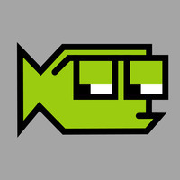
Long Posts

    Comfort Star Trek

    I’m home sick today and was thinking about shows I watch when I’m just killing time. Episodes I love to just put on in the background when I’m working (or sick). Most of the time, I open Paramount+ and play Star Trek. I figured I’d share my favorite “comfort” episodes. Warning: A couple of mild spoilers below for really old episodes.1

    Mariner and Boimler on the USS Enterprise.

    Star Trek: The Original Series

    • S1 E15 Balance of Terror. A “submarine” battle between Kirk and the Romulan commander.
    • S2 E6 The Doomsday Machine. The race to stop a machine before it destroys more planets.
    • S2 E15 The Trouble with Tribbles. My parents loved this episode when I was growing up and it’s one of my favorites. Sometimes, I pair it with DS9’s Trials and Tribble-Ations.

    Star Trek: The Next Generation

    • S2 E10 The Defector. More Romulan manipulation.
    • S4 E26 and E27 Redemption, Part 1 and 2. The Romulans try to destabilize the Klingon Empire.
    • S6 E4 Relics. A Dyson Sphere, and a somewhat believable way to resurrect an old character.

    Star Trek: Deep Space Nine

    • S5 E6 Trials and Tribble-Ations. The DS9 crew goes back in time to the middle of The Trouble with Tribbles.
    • S6 E6 Sacrifice of Angels. I love the action and pacing of this episode. The end of one of the arcs that dominate DS9.

    Star Trek: Voyager

    • S4 E14 Message in a Bottle. The Doctor is transmitted back into the Alpha Quadrant, and works with another Emergency Medical Hologram to liberate a Federation ship.
    • S7 E25 Endgame Parts 1 and 2. The series finale. The Voyager makes it home… twice.

    Star Trek: Discovery

    • S1 E7 Magic to Make the Sanest Man Go Mad. A great time loop episode, with some great performances.
    • S2 E2 New Eden. Captain Pike. Mysterious Earth colony. Prime directive debates. Love it all.

    Star Trek: Lower Decks

    • S2 E7 Where Pleasant Fountains Lie. All about evil AI, but in the funniest possible way.
    • S3 E5 Reflections. Starfleet Recruiting Booth. Rutherford’s implant malfunctions.
    • S3 E6 Heal All, Trust Nothing. A visit to DS9, and Tendi goes full Orion to save the day.
    • S4 E4 Something Borrowed, Something Green. Tendi goes home for her sister’s wedding, and chaos ensues.

    Star Trek: Strange New Worlds

    • S1 E2 Children of the Comet. A comet that’s worshipped as a live bringing god. Such an old school Star Trek story.
    • S2 E7 Those Old Scientists. A Lower Decks/Strange New World crossover that works far better than it should.
    • S2 E9 Subspace Rhapsody. The musical episode, that also works far better than it should.

    Star Trek: Picard

    • S3 E10 The Last Generation. A fan-service finale that’s full of fun.

    Bob Wertz is a creative director, type designer, Ph.D. student and researcher living in Columbia, South Carolina.


    1. Or Star Wars: Rebels, but that’s a post for another day. ↩︎

    Dead Mall Memories

    I know that enclosed shopping malls have fallen out of fashion, but I’m of an age where malls played a major role in my childhood. An abandoned mall in Columbia is being torn down and I was thinking today about all the malls that have played a role in my life. I figured I’d share a couple of memories of malls that are no more…

    • Richland Fashion Mall. The mall that’s being torn down is in Forest Acres, South Carolina. I drove past it today so I’ll start with this one. Being close to the University of South Carolina campus and my first apartment, I took a bunch of trips to Richland Fashion Mall.1 We occasionally visited the movie theater on the rooftop before nicer theaters came to Columbia. Liz and I frequented the Barnes and Noble when we were dating and registered for our china at the Dillards when we got engaged. Liz even got her hair done at the Belk’s salon for a few years. Lots of good memories, but the mall had been pretty much abandoned for years and it’s good to see the redevelopment finally starting with the demolition of the old structure.

    • Dutch Square Mall. We lived in Illinois when I was in elementary school, but our family was still in South Carolina so we’d travel down twice a year to see everyone. One reliable stop was always Dutch Square Mall in Columbia, South Carolina near the intersection of I-26 and I-20. Back when Chick-fi-A was only in the South and only in mall food courts, this was an easy option for some delicious chicken sandwiches. Cromer’s Peanuts had a location in the mall where we could buy bags of boiled peanuts and see some monkeys.2 (I’m pretty sure my parents wanted to wear us out before we got to my grandparent’s house about an hour away.) Much later, the mall was renovated to have a 14-theater movie theater and the Dutch Square Theater became our go-to theater. I saw countless movies there including a midnight showing of Star Wars: The Phantom Menace. With the opening of nearby Columbiana Mall, shoppers and retailers moved to the trendy new spot. Years later, I worked at an insurance company nearby and would occasionally run over to the Chick-fil-A, but it was clear by then that the mall was slowly dying and AMC closed the theater. The mall is actually still open and the movie theater is operated by a small chain now, but there’s not much out there any more. A nearby church is in the process of purchasing it and has plans to completely redevelop it.

    Shoppers at the Aiken Mall
    Shoppers at the Aiken Mall. Photo by Tim Dominick accessed via the Walker Local and Family History site at Richland Library.
    • Aiken Mall. This mall in Aiken, SC opened right as I started high school. For a small town, it was a big deal. It had a bunch of undersized anchor stores, but it also had everything a teenage me needed: an arcade, a Babbage’s video game store, a B. Dalton bookstore and a music store. My mom had us get family portraits taken at the Sears Portrait Studio many, many times. My car broke down in the parking lot at least once. As anchor stores JC Penny, Sears and Phar-Mor started to close, they tried to reconfigure it a couple of times, but the mall was already in a death spiral. At some point, they added a Books-a-Million and my in-laws would take our children there when they were babysitting. Redevelopment was promised for years, but they’ve finally torn most of it down and have started building a mixed-use development. Apparently, a Chicken Salad Chick will be opening soon in the new development.

    All three of these locations are finally being redeveloped and I’m really happy about that, but as a kid that grew up in the 1980s and 1990s, these old hangouts will always hold a special place in my heart.


    Bob Wertz is a creative director, type designer, Ph.D. student and researcher living in Columbia, South Carolina.


    1. Originally, there was an open air mall on this spot called Richland Mall. Then it was redeveloped and the name was changed to Richland Fashion Mall. Eventually its name was changed back to Richland Mall. ↩︎

    2. Seriously! The store had a display high in the back with several monkeys. ↩︎

    Micro.Blog as my home base

    I was thinking this week about how Micro.Blog has become the home base for all of my online activity. I’ve had an account since I backed the Kickstarter in 2017, but recently, I’ve started slowly moving everything from my old Squarespace1 site:

    • Blog Hosting. This blog is hosted on Micro.Blog. I’m in the process of migrating my favorite old posts from Sketchbook B here so everything is in one place. At the $10/month premium subscription level, I can even add a few more blogs if I want to.

    • Site Hosting. SbBFonts.com is a static site hosted on Micro.Blog that features my typeface designs. I’ve got other ideas for simple sites I want to build. These “single page sites” are completely underrated feature of Micro.Blog and included with the premium plan. I love the flexibility of adding these kind of sites quickly and easily.

    • Social timeline. I use Micro.Blog’s timeline to interact with other Micro.Blog users and to follow Mastodon and other Fediverse accounts. It’s not the most active timeline because there is no algorithm pushing content at you. I consider that a feature, not a drawback. It’s not a replacement for other social sites like Mastodon, Threads or Bluesky, but it is a nice alternative.

    • Crossposting. Social media is fragmenting. When I post to Micro.Blog, I have it configured to automatically crosspost to Bluesky and Threads. I could also crosspost to LinkedIn, but I don’t want everything I post copied over there. People on Mastodon can follow my Micro.Blog posts at bobwertz@bobwertz.com. And the service keeps evolving. Micro.Blog founder Manton Reese is great about adding features as new APIs are released or updated.

    • My Tweet Archive. Just because I left Twitter didn’t mean I wanted to lose all my tweets. Manton built a way to import my tweets and I now have a searchable archive of 15 years of Twitter posts on my own site.

    • Third-party Tools. The web interface for Micro.Blog is fine, but I like using different apps, too. I can post directly to Micro.Blog from Ulysses and MarsEdit. Feedbin has a nice little integration, too, but I don’t use it much. It’s nice to have options, something that Squarespace doesn’t offer.2

    There are other features that I don’t take advantage of yet like email newsletters, podcasts and narrated posts. All of these are included with my plan, I just haven’t gotten around to using them yet.


    I know that Micro.Blog isn’t for everyone. It’s easy to get started, but to get maximum customization, you need to be comfortable with tinkering. The text editor uses Markdown, which I like, but many people have never heard of. It’s worth noting that Micro.Blog has no built in metrics. This is by design and I think it’s a good thing, but if you are the type of person who wants to dig into the metrics of every post, this probably isn’t the service for you.3

    Micro.Blog is exactly what I want in a service. A home for all of my random thoughts, projects and experiments. The service provides an incredible amount of value for $5 or $10 a month and it feels like the web I fell in love with. If it aligns with your needs, there really isn’t a better service.


    Bob Wertz is a creative director, type designer, Ph.D. student and researcher living in Columbia, South Carolina.


    1. Squarespace seems to be trying to serve a business audience with a ton of features that I really don’t need. Plus, they recently announced they are going private again with the help of private equity. This makes me nervous. ↩︎

    2. When I first started using Squarespace, there was an API, but they phased out support for that a long time ago. ↩︎

    3. You can add metrics through some other third party services, but I personally want to remain blissfully ignorant. Maybe I’ll write a post about that some day. ↩︎

    SbB Fonts: My new two-color type design site hosted on Micro.Blog

    I decided a while back that I wanted to separate my typeface designs onto their own site. They’ve always lived alongside my blog and other creative projects, but they needed a home of their own, especially since I plan to expand the offerings in the near future. I’ve been noodling around with options, but today, I’m finally ready to release SbBFonts.com out into the world with a design inspired by two-color printing.

    screenshot of sbbfonts.com

    The Inspiration

    When I became a designer in the mid-1990s, the web was just becoming a thing, and printed documents were the primary job of a designer. Two-color projects used only two spot ink colors — say green and black — for the entire job. (You also had a “third” color with the paper, which was usually just white.) Four-color printing or full-color printing was reserved for only the most important pieces with the largest budgets. For young designers in a pre-web world, two-color work paid the bills. Two-color printing presented challenges, but the process had a particular look. Designers who knew what they were doing could use duotones for images or print on colored paper to get a different look.

    Two-color printing isn’t dead. Screen printing and letterpress still use spot colors, but full color printing has gotten cheaper and as a society, we don’t print nearly as many marketing materials as we used to. The craft of designing has moved past the lowly two-color press run.

    I guess that’s why when I started to design a home for my typeface designs, I knew I wanted the site to resemble a two-color print job. Much of the inspiration for my type designs comes from my nostalgia for old tech. Two-color printing seemed like the perfect inspiration.

    The Execution

    The first question was what two “ink” colors to use? Since I wanted to use a dark background, I chose white and the bright green since I use that color for all of my Sketchbook B projects. I picked two dark greens to be backgrounds — essentially a dark mode and a darker mode.1 Accommodating the two background colors meant that I also needed to use transparency on all of my example graphics, including my fake “duotones” and my animated GIFs. You can see the example below of one of the images I used placed over white, dark green and darker green backgrounds. I’m happy with the result, even if there are far easier ways to accomplish this look.2

    three examples of the duotone approach using an image with shipping containers and a crane

    This site is hosted as a “single page” on Micro.Blog. This might be the worst named feature on Micro.Blog since you can absolutely have more than one page. It’s simply a static Hugo site that doesn’t include a blog. I built everything on the Tiny theme by Matt Langford — the same version that I use for bobwertz.com. This feature is included in my Micro.Blog subscription, so my additional cost is essentially nothing.3

    To get the look I wanted, I had to write a bunch of HTML and CSS. My old site was on Squarespace, so it has been a while since I worked so closely with markup. I spent a good bit of time digging through reference guides to make sure I was doing everything correctly. But honestly, if you look under the hood, it’s probably a mess. Just a warning.4

    I still have a little refinement left, but I’m happy with where the site is. I need to finish proofreading and rework some of the copy. I’m thinking about future development… I’ve got a plan on how to change the home page when I add a few more typefaces. Right now, I think the five fonts currently presented in this way is about the maximum.

    Head over to SbB Fonts and let me know what you think.


    Bob Wertz is a creative director, type designer, Ph.D. student and researcher living in Columbia, South Carolina.


    1. The print designer in me would like to acknowledge that I’d likely need to use two hits of white on dark paper to get this effect. Meaning that it would likely need to be a three-color job. I’m ignoring that inconvenient truth. ↩︎

    2. Or, you know, not having a “light mode” version… ↩︎

    3. I did choose to buy a domain name. ↩︎

    4. The last time I built a site by hand, tables were an acceptable construction method. ↩︎

    15 years of Fontstruct

    I realized this morning that I’ve been using Fontstruct for 15 years. Fontstruct is an online tool for building modular typefaces. My first typeface design — Big Thursday — debuted on May 26, 2009. Since then, I’ve publicly released 49 fonts on Fontstruct and 19 have been selected as “Staff Picks.”

    The original version didn’t have a lot of flexibility,1 but over time developer Rob Meek has added new brick types, construction methods, kerning, support for color fonts and other features to Fontstruct to make it more powerful. My work tends to be a little brutalist, but if you want to understand the flexibility of the tool, check out the gallery to see what amazing creations people can craft with this online tool.

    I don’t use the most complicated features, but I sometimes use Fontstruct to prototype an idea for a new typeface. One of Fontstruct’s best integrations is that I can download a file that I can open and refine in Glyphs.2 I recently created a design, moved it to Glyphs and built a variable font out of it.

    Balancing work, family, grad school and other obligations, I don’t have a ton of time to spend in Fontstruct. But when they rolled out the Patron level of support for 5 euro a month, I subscribed immediately. I’m happy to support independent tools that are constantly improving.

    I pulled together a sample of some of the designs I’ve created over the years on Fontstruct. Feel free to head over to my page and download anything you like. Or better yet, sign up for an account and start experimenting.

    Examples of typefaces designed with Fontstruct

    Bob Wertz is a creative director, type designer, Ph.D. student and researcher living in Columbia, South Carolina.


    1. And was built in Flash! ↩︎

    2. Glyphs is my type design software of choice. I love it. ↩︎

    Project Repost: Moving select posts from Squarespace to Micro.Blog

    I started a blog in early 2008. Over the years, I wrote hundreds of posts and articles. Some of it good. Much of it forgettable. I authored a bunch of InDesign tips that generated search traffic, but over time, I became less interested in writing about Adobe Creative Cloud and design issues. A few years ago, I moved all my writing over to this site. As part of some work I’m doing this summer to clean up my various sites, I wanted to figure out how to save the posts from this old Squarespace site.

    I tried to export the entire archive, but had limited success. The Squarespace export uses the Wordpress export format. And the export kinda works, but Squarespace’s software has inserted random code blocks throughout that would have to be removed manually. I thought about just shutting down the whole blog, but changed my mind. As I scanned over the list of articles, there were too many posts that I didn’t want to lose.

    As I mentioned in the earlier post, a friend of mine (who also happened to have an old Squarespace site) mentioned that he moved selected posts manually to a new site, and let go of the stuff he no longer focused on. The more I looked at my old writing, the more this seemed like the logical path forward.

    I’ve decided that I’m going to slowly move selected posts to bobwertz.com. Several of them were written at a particular time, about specific events so I’ve decided to post them on the new site with the original date. I’ve added a sentence at the top, to explain that the post has been moved. I’ll make minor grammar or spelling corrections, but otherwise I plan to leave the posts as they are now.

    As a test, I’ve moved two posts already: B.A.R.E. (Bad Acronyms aRe Everywhere) from 2015 and I made a red velvet cake from 2018. I’ve got about 70 posts that I want to move, and I plan to move a couple of posts each week.

    I think it’s worth noting that one of the reasons I feel comfortable moving everything to Micro.Blog is Manton’s commitment to ensuring the content you create can easily be moved, archived or backed up. I’ve turned on Micro.Blog’s Github backup feature, and I know I can export my content in a number of formats if I need to, including the blog archive format that Manton proposed. I wish more services realized the value of allowing easy export of content, and I’m appreciative of Micro.Blog’s commitment to portability and interoperability.

    I’m happy with this solution and even though it will take time to move the posts manually, I truly believe it’s the best option for this situation.


    Bob Wertz is a creative director, type designer, Ph.D. student and researcher living in Columbia, South Carolina. He’s been blogging since 2008.

    Reading back over 14 years of blog posts... and deciding what to do with them.

    Several years ago, I moved all of my blog posting from my Squarespace-hosted sketchbookb.com to my Micro.Blog-hosted bobwertz.com. I’ve been happy with the move. My plan was to switch my Squarespace blog over to more professional posts, but that never really happened — and I don’t really feel like posting more InDesign and Creative Cloud tips. Last week, I decided that I need to do something with the old site and I’m working through my options.

    One of the options was just to bring the site down and redirect sketchbookb.com to a new site. I’ve got over 600 posts, though, and while most of them don’t see any traffic, I’d hate to see them all disappear. I started to go back through the site to see what I’d lose.

    My first post is in 2008 and my last post was at the end of 2021. There are many tips and tricks for InDesign that generate significant traffic even though they are very old. I also have a large number of reviews for iPhone apps that no longer exist. I wouldn’t miss those posts, but reading back through my writing, there is much that I do not want to part with. A reflection about being on a beach on a moonless night. My series of Twitterless posts and a handful of somewhat prescient rants about social media. My 52 Shirts project. New typeface introductions. Writing about our COVID reality. My original attempt at hosting my microblogging on Sketchbook B. My successful attempt to bake my mom’s red velvet cake recipe.1

    So what should I do? I’m not going to delete Sketchbook B without saving the posts somehow. I have first drafts of most of the writing in Ulysses, the app where I’ve done most of my writing for almost a decade.2 But the final posts often have custom illustrations or additional copy edits, so the Ulysses version is somewhat incomplete. I’ve experimented with trying to export and move the posts from Squarespace, but that hasn’t gone well. One of my friends recommended saving the posts that matter to me and moving them manually to bobwertz.com. That would work for some of the posts, but it would be a tedious process. A couple of them — like my examination on viewscreens and interfaces in Star Trek — really could be updated. I may start updating and reposting select articles to bobwertz.com and just add a note to the beginning about when and where they were originally posted. We’ll see how that goes.

    I will still try to move them to another site. I have a full backup of my tweets, and I’d love to have Sketchbook B as well. The problem is that Squarespace exports using the Wordpress format, but they have some extra code in the export that causes problems.

    Finally, the print designer part of me wants to pull together all the posts that matter and make a physical book. Place a copy on my bookshelf. It seems appropriate as a way to close an old chapter and start a new one.


    Bob Wertz is a creative director, type designer, Ph.D. student and researcher living in Columbia, South Carolina. He’s been blogging since 2008.


    1. I’d link to them, but I may be moving them somewhere else. ↩︎

    2. I know because there’s a post on Sketchbook B from 2015 about starting to use Ulysses. ↩︎

    What value does a national organization offer?

    I’m noticing a tension growing between national organizations and their local affiliates. Just three recent examples that have crossed my path:

    • I was once an AIGA1 chapter president and stepped down to go back to graduate school, but I was also disillusioned with the mission and how the national organization treated its chapters. Now AIGA National is struggling with finances and relevance, while member’s loyalty (and all the value of the membership) is tied up at the local level.

    • Churches are going through the same thing. When the massive Methodist church near us left the denomination, they didn’t join one of the new organizations. They essentially became a non-denominational church. And pointed out in the news article that they get to keep all of the money they used to send to the churchwide organization.

    • The organizers of the local NaNoWriMo2 group in our area became frustrated with the national organization, and essentially became an independent writing support group. They were running a year-round organization anyway, and didn’t see the need for the national organization. Their Facebook group wiped all mention of NaNoWriMo

    National organizations were once necessary to provide credibility, structure and support. Local organizations could provide local services and the relationship was mutually beneficial. Over time, that equation has shifted. Less value is provided by the national organization. Loyalties are with the local clubs, churches or groups. If the local leadership and the national leadership disagree, the local leadership has the leverage to take their organization independent. And in many cases, that seems like it’s happening.

    I do think there is value in national organizations, but organizations like AIGA need to better understand what value they bring to the table and strike a new balance with their local partners. Or risk becoming irrelevant.


    Bob Wertz is a creative director, type designer, Ph.D. student and researcher living in Columbia, South Carolina.


    1. Formerly the American Institute for Graphic Arts, but now just “The Organization for Design.” ↩︎

    2. National Novel Writing Month ↩︎

    Why didn’t the airbags deploy?

    An incredibly strange accident, but my wife and son are fine.

    SUV in a car accident surrounded by emergency vehicles.

    Two weeks ago, Liz and Ryan were driving to school early in the morning in a midst of a rain storm when a pine tree blew into their path and impaled their 2020 Buick Envision. The tree was about 24 feet tall, passed through the headlight, through the engine, through the firewall, through the dashboard and extended several feet into the passenger cabin, between the front headrests.

    SUV in junkyard impaled by a tree. Tree embedded in SUV with the hood up. Interior of an SUV with a tree going through the dashboad and between the headrests.

    By some miracle, Liz needed only four stitches on her hand, caused by a ring that had to be cut off her thumb. And my 12-year-old son, who was in the front passenger seat, was completely untouched. Numerous people from firefighters and policemen to tow truck drivers and insurance adjusters have said they’ve never seen anything like it.

    After people processes the shock of the accident, and the relief that everyone is okay, most people look at the picture of the interior and have the same reaction: “Wait, why didn’t the airbags deploy?”

    The airbags did not deploy. And everyone has a theory about why.

    • Theory #1: The airbags didn’t deploy because they failed. The airbags should have deployed, but must have been defective. Most people who believe this want me to share a picture of the damage with Buick and complain. “They should have to compensate you” is a common refrain. “You should sue."1

    • Theory #2: The airbags didn’t deploy because the tree missed the sensors. This theory was floated by the tow truck operator. Because the tree went through the headlight where there are no airbag sensors, the airbags didn’t deploy. In this scenario, the headlights are essentially a weakness in the car’s safety design.

    • Theory #3: The airbags worked as designed. They should not have gone off because the accident wasn’t a typical head on collision. The car was immediately spun around in a lateral motion. The physics of the accident were weird and disorienting. It’s worth noting that my wife’s iPhone’s crash detection didn’t trigger either despite the fact that it was thrown to the floor from the center console. Several people have theorized that the force of the airbags could have made injuries worse.

    My gut reaction is that the airbags behaved as designed, but I also could understand if the car wasn’t engineered to withstand such a strange, one-in-a-million accident.

    Here’s the thing, though. I don’t know how airbag systems work. Most people don’t, but that hasn’t stopped us all from speculating. We imagine the airbag systems in modern cars to be this protective cloud that inflates around us, but I know it’s more complicated than that. We want to know why the airbags didn’t deploy because we want to be reassured that if it happens to us, we’ll be safe. But it’s just not that simple. There are too many variables.

    We’ll never know why the airbags didn’t deploy, but Liz and Ryan are lucky to be alive and I’m incredibly thankful for that.


    Bob Wertz is a creative director, type designer, Ph.D. student and researcher living in Columbia, South Carolina.


    1. That’s not at all how this works. ↩︎

    Buffy the Vampire Slayer, Chocolate Cake for Breakfast, and Gill Sans: Separating work from their creator?

    I watched a couple of my favorite episodes of Buffy the Vampire Slayer tonight. The show was once one of my favorites and creator Joss Whedon could do no wrong. I loved Buffy, Firefly, The Avengers and Dr. Horrible’s Sing-Along Blog. I even watched Agents of SHIELD. But eventually, it came to light that Joss wasn’t the feminist he claimed to be, repeatedly cheated on his wife, and verbally abused many of the people he worked with, especially Charisma Carpenter.

    Chocolate Cake for Breakfast is one of my favorite stand up routines. Bill Cosby’s family-inspired standup — long before the Cosby Show — was hilarious. But later in life, he was credibly accused of drugging and sexually assaulting several women.

    Gill Sans is a legendary typeface, created by author, artist and typographer Eric Gill. I’ve worked for several companies for which Gill Sans was a key element of their corporate visual identity. But Eric Gill noted in his diary that he had numerous affairs, sexually assaulted two of his daughters… and his dog.

    These are three examples, but they are far from the only examples. Many works of art and entertainment have been created by people who turn out to be despicable. How do you separate the creator from their work? Can you?

    For me, I can separate Joss Whedon from Buffy and his other creations. He didn’t write every word and the show isn’t just him. The actors, writers, and staff brought the show to life and crafted the characters who I loved so much. But I have to admit that I’m now less likely to watch old episodes of Buffy, and I no longer hold the show on the pedestal that I once did.

    It’s different for Bill Cosby and Eric Gill, though. Their creations are sole creative endeavors. As much as I might like Cosby’s old standup routines or Gill Sans, I can’t separate the creation from the person who created it. I don’t listen to old Cosby standup, and I don’t share it with my kids. I don’t use Gill Sans (or any Eric Gill typefaces) if I can avoid it. If I cite some of Eric Gill’s writings on typography like I did a couple of months ago, I include a comment that he was a horrible human being.1

    I’m not 100% sure this dichotomy makes sense, treating collaborative works differently than sole creations, but it’s where I am right now.


    Bob Wertz is a creative director, type designer, Ph.D. student and researcher living in Columbia, South Carolina.


    1. I almost didn’t post the article referencing Gill’s quote, but his writings on the craftsmanship during the Industrial Revolution are incredibly relevant in today’s generative AI world. ↩︎

    Inherent. Indestructible. Permanent.

    Almost 100 years ago, in the middle of the Industrial Revolution, typographer Eric Gill 1 wrote “An Essay on Typography” and addressed the tension between art and industrialization:

    “But tho’ industrialism has now won an almost complete victory, the handicrafts are not killed, & they cannot be quite killed because they meet an inherent, indestructible, permanent need in human nature.”

    I’ve been thinking about this as the internet fills with AI-generated garbage and popular social media sites are monetized by hate.

    Inherent. Indestructible. Permanent.

    While Eric Gill never imagined the internet, I think his statement applies just as much to our modern world as it did in the Industrial Revolution. Much of the internet might become cheaply-produced, AI-generated, SEO-approved content, but people all over the world who care about creativity and writing will still produce great work and share it.

    I’m probably being naive, but I’m still hopeful that the human need for creativity will overwhelm the capitalistic urge to industrialize content.


    Bob Wertz is a creative director, type designer, Ph.D. student and researcher living in Columbia, South Carolina.


    1. Eric Gill was insightful about human nature, but was, himself, an awful human. ↩︎

    The Jobification of Volunteer Work

    Almost 20 years ago, I was in San Francisco for my first AIGA Leadership Retreat. AIGA is a national organization for design1 and I was a first-time president for the South Carolina chapter. I’d just finished attending a session on leadership and one of my new friends who’d been a president before pulled me aside and gave me some advice: “This is supposed to be fun. If it stops being fun, ask for help. You are giving up a bunch of your free time and if you aren’t having fun, it’s not worth it.”

    I’ve been thinking about that advice a lot lately and I’ve come to a realization. Our volunteer “opportunities” have become unpaid part-time jobs. (Maybe they always were…) We are saddled with job descriptions and expectations. We dedicate our time and energy to a cause because we believe in it, but we manage volunteer organizations following the only model we have: business.

    I see it in churches, who are looking for people to fill roles and run programs to keep the organization functioning.

    I see it in our professional organizations, like AIGA, where we expect a level of excellence and professionalism on par with what we would expect from our corporate colleagues.

    I see it in academia, where professors do a massive amount of additional service work in reviewing journal submissions and organizing conferences.

    I see it in recreational youth sports, where people dedicate nights and weekends to coaching kids year-after-year.

    I see it in our organizational boards that are increasingly trying to recruit people with particular backgrounds and skill sets to provide professional guidance.

    This problem is compounded by how we talk about these volunteer positions:

    • You are giving back, not using your free time.

    • You are offering your skills and abilities, not providing free labor that other people would pay you for.

    • You are providing service to the community, not working for free.

    We talk about this volunteer jobs more like a calling, not a job. And that makes it so much harder to separate from a position that is overwhelming.

    The result of this structure is almost always burnout. Frustration. We often become stuck in our volunteer positions, unable to find someone to take over the incredibly complex structure or programming we have built or maintained. Unsurprisingly, most people — even if they care about deeply about an organization or cause — are unwilling to step up and commit massive time and energy to a cause when they are already juggling their own jobs and family commitments. The volunteer opportunity that you were excited about is now weighing you down and causing stress and anxiety. It’s no longer fun.

    This situation isn’t good for the organizations either. After someone manages to escape from a volunteer position, how often does that person significantly decrease their involvement? I can’t tell you how many people I know who disappear after a long stint on a church council. Or how many former AIGA presidents I know who now have nothing to do with AIGA only a couple of years after their term is over. How many board members step away completely after their service is complete?

    The mission of the organization then shifts from serving the community to finding the volunteers to sustain the organization.

    We need to rethink volunteer leadership.

    The realignment starts at the top. If the leadership of an organization is overworked and burned out, the other volunteers will assume that’s normal. Some will try to emulate the behavior. Others will leave knowing they can’t commit that much. Our presidents, executive directors and other leadership need to model an appropriate work/life/volunteer balance. Working around the clock isn’t always the long-term, sustainable answer.

    We need to spend less time crafting our job descriptions and more time building relationships. We’re following the model we know, based on how our business organizations are structured, but I’m not sure that model works in today’s volunteer organization. While we need to make sure expectations are clear, we also need to worry less about the business-like hierarchy and spend more energy on engaging our community. Focus on doing good work, aligned with the mission of the organization.

    We need to be realistic about what we are asking people to do. Recruit more people to do smaller jobs instead of asking one person to commit a massive amount of time. Maybe in the past, you recruited one or two people to run an event. Maybe you should instead recruit 5-10 to cover the same amount of work. And if we can’t find the needed volunteers, it is time to scale back the project or event to be more reasonable.

    We need to be thankful for the contributions of others, no matter how small. Too often, we thank volunteers by presenting them with opportunities to embrace an ever-increasing volunteer workload. We need to actively discourage overcommitment… and never ask for more than anyone should rationally be able to give.

    We need to be thoughtful to fellow volunteers. It’s easy to get frustrated when people drop the ball. We need to check in on each other, be supportive and remember that we are all doing this for free, in our spare time, because we support the same cause and the same mission. We need to be understanding, not judgmental. We need to offer support, not criticism.

    Understand the difference between governance and micromanagement. Yes, we need boards to make sure that the money is being handled properly and the mission is well-defined. But the board shouldn’t micromanage everything. We need to let people do the tasks we ask them to do.

    Be flexible. Life can change in the blink of an eye. Be flexible with expectations. Be understanding when things don’t turn out the way you wanted. And realize that every volunteer is balancing life and work and family.

    And finally, we need to remember to have fun. These organizations and boards that we support, love and commit our time to… they should be enjoyable. And if they aren’t, it’s time to fix them.


    Bob Wertz is a creative director, type designer, Ph.D. student and researcher living in Columbia, South Carolina. Bob is currently taking a break from board service and volunteer opportunities, after getting burned out.


    1. AIGA used to stand for American Institute for Graphic Arts. Now, it’s just the organization for design. ↩︎

    How big is the Rivian R3?

    Rivian R3 profile image

    Electric truck and SUV manufacturer Rivian announced their new R2 SUV today, but surprised everyone with a smaller R3 version as well. I love smaller cars and I’ve been waiting for new smaller EVs to hit the market, hopefully at a lower price point. The R3 looks adorable and it reminds me of a VW Rabbit, which I used to drive.1 But Rivian didn’t publish any specs so it’s hard to gauge how big R3 is.

    Thankfully, they provided high res imagery and it’s easy to see the tire details — Pirelli Scorpion MS 235/55 R20. So based on a 20-inch rim size, and with a nice profile shot,2 it’s possible to estimate the size with a little bit of simple math.

    These numbers are rough, obviously. But here’s what I got:

    Rivian 3
    Length: 149 in.
    Height: 55 in.
    Wheelbase: 102 in.

    That length looks a little short, but as you can tell from the picture, there is very little overhang in front or behind the wheels. For a point of reference, I compared those numbers with the specs of another EV model that I like a lot:

    2024 Hyundai IONIQ 5
    Length: 182.5 in.
    Height: 63 in.
    Wheelbase: 118.1 in

    The Rivian R3 looks to be a good bit smaller than the IONIQ 5 in all dimensions. In fact, the R3 looks closest to the size of a four-door gas-powered Mini Cooper:

    2024 Mini Cooper Four-Door
    Length: 158.5 in.
    Height: 56.1 in.
    Wheelbase: 101.1 in

    Of course, there are lots of caveats to this comparison. My numbers are rough, the car is a prototype, and things can change as the car moves to production. Who knows when it will be available to purchase, but I’m excited about the Rivian R3. I’m not in the market right now, but my next car purchase will be an EV. That size is actually perfect for what I want – a small EV to commute back and forth to work. Now we’ll see where the price falls.3


    Bob Wertz is a creative director, type designer, Ph.D. student and researcher living in Columbia, South Carolina. And Bob likes small cars.


    1. And loved. ↩︎

    2. Which they thankfully provided. ↩︎

    3. And maybe they will offer it in green. ↩︎

    That time my 89-year-old grandmother “helped someone old”

    I used to dread calling my grandmother on her birthday. My mom died on that day and so every time I’d call, she’d start with “Well, you know, I wish Nancy was still here.” And that always bothered me and usually made me tear up, so I would wait as long as I could to call. I was pretty sure that I was the last grandkid to call each year.

    Twelve years ago today, I called GiGi1 to wish her happy 89th birthday. She answered the phone upbeat and excited, telling me about all the people who had called her earlier in the day (including my siblings and all of my cousins, letting me know that I was, in fact, the last grandchild to call.) But she closed with a surprising statement, subtly mentioning that she “helped someone old today.” I was intrigued and asked for details.

    GiGi was at the gas station filling up when she noticed an “old” man struggling to take the money up to the cashier. She took the money up for him and they struck up a conversation. The man was recovering from a double knee replacement. He was upset with his doctor that they’d done both knees at the same time, and told him that “next time, we’re doing them one at a time.” The doctor told him “Mr. Jones. You are 99 years old. We aren’t doing another knee replacement.”

    I tell that story often, but realized I’ve never written it down. I love how many lessons about attitudes, expectations and perspective are packed into one story. GiGi passed away a few years ago, living to the age of 98. Today would have been her 101st birthday. There are many stories to tell, but this is the story I tell about her most often and wanted to share it on her birthday.


    Bob Wertz is a creative director, type designer, Ph.D. student and researcher living in Columbia, South Carolina.


    1. Growing up, I called her “Grandmother Caldwell.” My cousin called her “Granny.” But once the grandkids arrived, she became “GiGi.” ↩︎

    Retiring “International Bob is Grumpy Day”

    March 3, many years ago, my mom died unexpectedly. In perhaps one of the greatest understatements ever, I struggled with her loss. Some days, I still struggle with her loss.

    I discovered that on March 3, every year, I was grumpy. Kinda pissed off. And in general, not a fun person to be around. So I declared the day “International Bob is Grumpy Day.” Gave it a silly name. Explain to people how I’m feeling. I told coworkers that it probably wasn’t the best day to ask me challenging questions. Or rely on me to be particularly tactful. In short, March 3 was the one day a year that it’s best to leave me alone. It worked. People left me alone, and I, predictably, was grumpy.

    March 3 was also my grandmother’s birthday. I’d call her and she’d mention how much she missed mom. And usually, I’d tear up. Maybe the anticipation of the call was what made me grumpy. I don’t know. Over time, I became less grumpy on March 3. Still sad, but I was able to understand the grief a little better. Decades heal. In my most recent job, my coworkers understood, but also didn’t let me sit in my office alone.1 They worked hard to keep my spirits up.

    This year, I’ve decided that it’s time to retire International Bob is Grumpy Day. Instead of sulking, we are taking a day trip with the whole family — my oldest is home from college on Spring Break — and I’m going to enjoy the company of the people that I love. And take pictures. Because honestly, that’s the way mom would have wanted it.


    Bob Wertz is a creative director, type designer, Ph.D. student and researcher living in Columbia, South Carolina.


    1. Mostly because I didn’t really have an office. Open floor plan… ↩︎

    The end of the Apple Car: This isn’t the revolution they thought it was…

    Apple has canceled its decade-long program to build an electric car. And while I think it’s probably the right call to end the program, I do understand why Apple tried.

    Ten years ago when Apple started the project, it was the perfect moment to rethink the automobile. With the change to battery powered electric powertrains, many of the traditional constraints of car design were no longer relevant. You no longer need a motor, or a gas tank. Cars are more reliant on their technology stack. There were very few competitors and they were almost all selling cars at the high end of the market. It seemed like a perfect time for Apple to step into revolutionizing the design of cars, questioning the established conventions of the past. Changing how cars were designed, manufactured and sold.

    And yet, today, that’s not what happened. In general, electric cars today look like gas-powered cars, but without the tailpipes. There are reasons for this, I think — consumer buying habits, aerodynamics and federal safety laws — but the result is that this isn’t the revolution that it looked like it might be. Couple that with the fact that the no-steering-wheel, self-driving tech that Apple was rumored to be pursuing is decades away from being truly reliable.1 Battery advances are slow. When they started, there were few competitors, but that’s changed and lots of established car makers are committing to electric cars, with the addition of new upstarts like China’s BYD.

    I understand why Apple started their car program. But after a decade of being stuck in neutral, I also understand why they finally ended it.


    Bob Wertz is a creative director, type designer, Ph.D. student and researcher living in Columbia, South Carolina.


    1. If it ever actually happens. ↩︎

    The Church Sign Problem: An extended metaphor for many things in business and life.

    An established church in a small town has a simple sign by the side of the road. The town is growing and the road in front of the church is getting much busier. A new church down the road installs a large sign. Not wanting to fall behind the times, the established church installs a new sign, too. This sign allows the church to add custom messages to the sign by manually arranging letters.

    At first, the church simply puts up their service times, but some people think that’s boring. The church needs more catchy information on their sign. Something that people driving by will engage with. The pastor recommends putting the sermon title on the sign, but after a few weeks, realizes that she’s got to come up with a catchy sermon title every single week. Someone volunteers to update it with a new bible verse each week, but they get tired of updating it and eventually stop. Another person finds a list of attention-grabbing church sign messages on the internet and volunteers to put those on the sign. But theologically, some of the quotes don’t align with the church’s teachings and others of them aren’t exactly welcoming. Some people driving by are offended by some of the messages. After a couple of years, everyone is sick of dealing with the sign, but the sign is very visible on the main road into town. The sign must be updated.

    A handful of members decide to get together. They don’t exactly call themselves the “sign committee,” but they meet every so often to talk about the sign and what to put on it. After months of discussing the sign, they realize that the real problem is that they have to manually update the sign each week. Going out to the sign with those letters on cards takes time and a better solution would be to have a digital sign that could be updated remotely through the internet. As a bonus, one of these signs can cycle through multiple messages.

    They raise the money and update their sign to have a beautiful glowing digital display. The sign is bright, but some people think it’s too bright. They start by including the service times each week. And bible verses. And sermon titles. And upcoming events. At first, lots of people are excited about the new sign and have lots of ideas, but over time, that excitement fades. Some people think the sign changes messages too quickly. While the sign is easier to update, keeping track of multiple messages, chasing down information, and updating the graphics takes more time than the old sign did. The sign becomes more than a weekly task. It’s a job. Sometimes, the sign glitches and a technician has to come fix it. Everyone is frustrated with the sign, but the money was spent and the sign is there. It needs to be updated.

    Finally, the pastor decides that they are spending too much time dealing with the sign. She switches the sign to share a single message: “All are welcome.” Some people complain that the church isn’t using the sign to its fullest potential. But secretly, everyone is glad they don’t have to deal with it anymore.


    I’ve used a shorter version of this metaphor to talk about social media feeds that suck time and energy from an organization that doesn’t really need one (and usually doesn’t have the resources to support one). But I’ve been thinking that this parable/extended metaphor actually has a broader application. A couple of reflection questions:

    • How many times do we take something on because we want what someone else has?
    • How often do we chase a new solution because it’s shiny and bright?
    • How often do you let the opinions of “some people” change how you feel about decisions?
    • What decision could you make that would simplify your life?
    • What have you built that you no longer need, but that you continue to spend significant time on?
    • When have you made a decision that turned out to be much more work than you planned? How did you handle it?
    • Has someone made a decision your secretly agree with? Why haven’t you told them?

    Bob Wertz is a creative director, type designer, Ph.D. student and researcher living in Columbia, South Carolina.

    Honda shows off EV concepts – and two new logos

    A new look and branding for Honda EVs

    Honda showed off two new EV concepts under the new Honda Zero brand at CES — the Saloon and the Space-Hub. Most of the coverage is focused on the futuristic looks of the concept cars. As someone who grew up going to the Chicago Auto Show and seeing the cars of the future, I’d temper any expectations that the final designs will be this radical.

    Image of a Honda Zero Saloon electric vehicle

    But as a branding researcher, what caught my attention is that they also rolled out a new Honda “flying H” logo to be used on all new electric cars. From the official Honda press release:

    The current Honda “H mark” has a long history, dating back to 1981. In launching the next-generation EVs, Honda designed a new H mark, to express the company’s determination to undergo a historic transformation as well as the ability to constantly pursue new challenges and advancements. This new design expression, which symbolizes two outstretched hands, represents Honda’s commitment to expand the possibilities of mobility and continue to meet the needs of its customers. The new H mark will be applied on future Honda EV models, including the Honda 0 Series.

    New Honda logo

    The logo simplifies Honda’s current H, removing the outer bounding box and reshaping the mark. It does feel like a more modern mark and seems appropriate on the futuristic vehicles. As logo introductions go, this might be the slowest roll out in the history of visual branding since the first Honda Zero cars won’t be released until 2026. And since the logo is intended for just electric vehicles, that means that Honda is choosing to fragment their brand for a period of time.

    Honda 0 logo.

    It’s worth noting that the Honda Zero brand had its own mark at introduction. I’d be surprised if this is used in marketing when the models debut in 2026. I’m not sure what’s going on here, since the elements don’t really match anything.

    Electric car branding is fascinating to me. VW and BMW add a letter or letters to the model number. Hyundai is using the Ioniq brand name for most, but not all of their EVs. Many vendors are rolling out EVs alongside their internal combustion engine lineup. VW is resurrecting the old Scout brand for a line of electric SUVs.1 But to my knowledge, Honda is the first company to create a version of their corporate logo especially for electric vehicles. As the transition to electric vehicles continues, it will be interesting to see how EV branding continues to shift and evolve.


    Bob Wertz is a creative director, type designer, Ph.D. student and researcher living in Columbia, South Carolina.


    1. Scout SUVs will be manufactured just north of my hometown – Columbia, South Carolina. ↩︎

    Reset, Continued: 2024

    I adopt a theme each year and last year, the theme was Reset. That theme included focusing on physical and mental health, writing more, getting organized and rediscovering creative endeavors. I made progress with three out of four goals.

    • I wrote more, getting my first journal article published and I have several others in the works. I’ve written more here on Micro.Blog in 2023. So mission accomplished.
    • I did a good job getting organized, but I need to stay organized. There are still some areas I need to work on, but I feel like I made some progress.
    • I worked on a bunch of my typeface designs and even though I’m not ready to release anything, I feel like I was able to dedicate some time to visual projects.

    That leaves physical and mental health. I was particularly physically active for the first few months of the year, but hit a rough spot around April and lost momentum. I never got back in a rhythm.

    This year, more of the same

    As I started to plan for 2024, I felt like my focus was going to be solely on health. I felt great at the beginning of 2023 when I was more physically active, and I definitely want to get back to that level of activity. Combine that with processing the unexpected death of a coworker a few days ago — who was younger than I am — and I’m solidly committed to getting healthier in 2024.

    But as I read over the list of my goals from last year, I still see room to improve in those areas, too. I’m still working on my Ph.D. and carving out time to write is critical. I still need to work on personal organization. And I need to work on creative projects — especially getting into a routine with my sketchbook.

    So I go into 2024 with four goals… basically the same goals that I had last year:

    • Get healthy. I’m not trying to run any races or achieve some incredible physical feat, but I do need to eat healthier and make time for physical activity. This is, without a doubt, my number one priority.

    • Write more. Continue to write here, and work toward my Ph.D.

    • Get organized and stay organized. Continue to refine and evolve my methods and tools for staying organized.

    • Explore creative endeavors. Keep working on typefaces, but also, get back into the habit of sketching regularly.

    I’ve got a lot to be excited about in 2024, including my 25th wedding anniversary in August. I’m looking forward to a healthy and productive year.


    Bob Wertz is a creative director, type designer, Ph.D. student and researcher living in Columbia, South Carolina.

    2023 Favorite Eight

    A montage of eight images, each of which representing my favorite pictures from 2023

    I always pull together my favorite eight shots of the year (as a contrast to those algorithmically generated “Best Nine” posts). I love that it gives me an excuse to go back over all of my images from the last year and relive a lot of great memories.

    1. Our oldest decided to attend the University of South Carolina and had a great first semester.
    2. Liz and I are notably bad a selfies, but this outtake was better than the actual selfie and I love it.
    3. The girls were a little excited about seeing Taylor Swift in concert. (It was an amazing concert and I’m glad we all got to go.)
    4. We have a high school graduate.
    5. This is a big kitty yawn, but it looks so fierce.
    6. Ryan is still playing lacrosse and bounced back after some adversity this summer to have a great rec season.
    7. We attended my nephew’s football playoff games. This was the final play in overtime that sent them to the state championship. They won that game, and won a state championship.
    8. Birthday hike for my oldest included a stop at Looking Glass Falls in Pisgah National Forest. It was so cold, that the rocks were covered with ice.

    This is the fifth year I’ve done a Favorite 8. You can see my previous posts from 2018, 2019, 2020 and 2021 on my other site, Sketchbook B. And I posted my 2022 here on bobwertz.com.


    Bob Wertz is a creative director, type designer, Ph.D. student and researcher living in Columbia, South Carolina.

    Milestone: My first published research paper is now online

    I’ve reached a big milestone in my academic career: my first published research paper.

    Brand new: How visual context shapes initial response to logos and corporate visual identity systems has bene published in the Journal of Product and Brand Management. It’s available now online and will eventually be assigned to an issue. If you have access to journal articles through a university or public library, you can access the article.

    If you can’t access the article, here’s the abstract:

    When a new logo is released, it does not have an established meaning in the mind of the viewer. As logos have become more highly scrutinized by consumers and critics, it has become more important to understand viewers’ initial response to logos. While other studies have researched the impact of aesthetic choices on viewer reaction to logos, this study aims to understand the effect of the surrounding visual identity system when a new logo is introduced. This study combines a content analysis of 335 posts on the logo review website Brand New with the voting data from their polls to understand how visual context correlates with a viewer’s initial response. Increased amounts of visual context correlate to an improved response from viewers. Different types of context that can be presented – from logo variations and environmental examples to videos and animation – have varied effects.

    Basically, my study finds that people respond better to new logos when they are shown more examples of the logo in use. This is one of those things that seems intuitive to designers, but hasn’t been researched or quantified. Because I’m a designer, most people are surprised that my research includes a fair amount of statistical analysis, but I’ve really taken to the quantitive side of things. This paper has been in review for over a year, working it’s way through the revision process.

    It’s fitting that this is my first paper to be published. When I started grad school, I didn’t really know anything about scholarly research. In the spring of 2019 — my second semester as a grad student — I took a content analysis class with Carol Pardun. I was the only master’s level student in a class full of Ph.D. students. I felt so overwhelmed by the pressure to come up with an idea and learn methods and theories on the fly. The paper I wrote for that class was the first version of this paper. It was accepted to the AEJMC Conference that August and I presented in Toronto — my first academic conference presentation. I loved the concept for the study and got great feedback, but I was still learning and felt like I could improve it. I scrapped everything, started over with a larger sample and better methodology. After Dr. Pardun retired, I started working with Tara Mortensen on the next evolution of this work, which turned into my thesis. And that thesis eventually became this paper.

    Thanks go out to so many people who’ve help me along the way:

    • Dr. Pardun for supporting my bizarre little project, especially in the early days when the project was taking shape.
    • All of the Ph.D. students in that content analysis class who helped me figure things out and took me under their wing.
    • Dr. Mortensen for taking over as my thesis director and helping guide me through the publication process.
    • Kevin Hull and Van Kornegay for serving on my committee and providing helpful feedback.
    • Robert McKeever and Jacob Long for giving me an appropriate foundation for analyzing data.
    • Editor Cleopatra Veloutsou who guided me through the process with the Journal of Product and Brand Management.
    • All of the reviewers and discussants at the conference level for AEJMC and in the peer review process whose feedback legitimately made this paper better.

    And of course, this couldn’t have happened without the rest of Team Wertz. Liz and the kids have been so supportive and patient while I have embarked on this grad school journey. (And occasionally, Norah and Jill even joined me at Starbucks when I had to write.) I simply could not have done it without them.

    I’ve still got a few years left until I finish my classwork and dissertation, but I’m exceptionally proud of this milestone and excited to see where my research goes next.


    Bob Wertz is a creative director, type designer, Ph.D. student and researcher living in Columbia, South Carolina.

    Absurd Ahsoka Finale Speculation

    Tomorrow night, the Ahsoka finale airs on Disney+. I’m looking forward to it. I’ve enjoyed the show. It’s not perfect, but I love Star Wars Rebels and it’s great to see a continuation of the story line.

    I’ve got a few absurd ideas about the finale that I figured I’d share. Our heroes are on Peridea, in another galaxy. Thrawn is ready to come back to the core galaxy, partnered with the Nightsisters, to restore the Empire.

    Here are 9 absurd things that are not going to happen on the season finale of Ahsoka:

    1. Our heroes (and maybe villains) will remain stuck in the Peridea galaxy. That would at least explain where they were during the Rise of Skywalker.

    2. Force ghost Kanan Jarrus appears to… Ezra? Hera? Jacen?

    3. Yoda’s species is actually from this new galaxy, and they are the enemies of the Nightsisters.

    4. There is an even darker power in the new galaxy that is stronger than the Nightsisters and Thrawn… which is why they want to escape.

    5. Huyang helps Ezra make a new lightsaber, and the blade is… yellow or purple.

    6. All those New Republic ships are actually filled with Imperial technology and spies and Thrawn will be able to control them.

    7. There’s a Jedi temple on Peridea… with a portal that transports our heroes to Lothal via wolf ride.

    8. Post credit scene features Hera assembling a team to fight Thrawn… including Zeb, the Mandalorian, Grogu, the surviving members of the Bad Batch and Rex.

    9. Baylan Skoll actually does have a plan.

    I warned you they were absurd, but the list was fun to come up with. Looking forward to seeing where the show lands. There is no way they can resolve all the various plot threads, so I assume there will be another season, or the storyline will be continued in another series. Eventually, we already know this leads to a new Dave Filoni-directed movie.


    Bob Wertz is a creative director, type designer, Ph.D. student and researcher living in Columbia, South Carolina.

Older Posts →