Embracing old tools in new ways + two new Fontstruct designs
Recently, I started playing around on Fontstruct again. The tool has evolved massively in the 17 years I’ve used it, but I interacted with it largely the same way — placing blocks on grids. I’ve been thinking about how I use design tools lately. I use apps like Photoshop and InDesign the same way I used them a decade ago. In general, this works fine, but I don’t really take full advantage of the advancements in the software. I’ve been trying to explore new features in Photoshop and Glyphs lately, and I decided I wanted to try out some of the features I haven’t used in Fontstruct, too. I just made two designs public: SbB Vertica and SbB Roundabout.
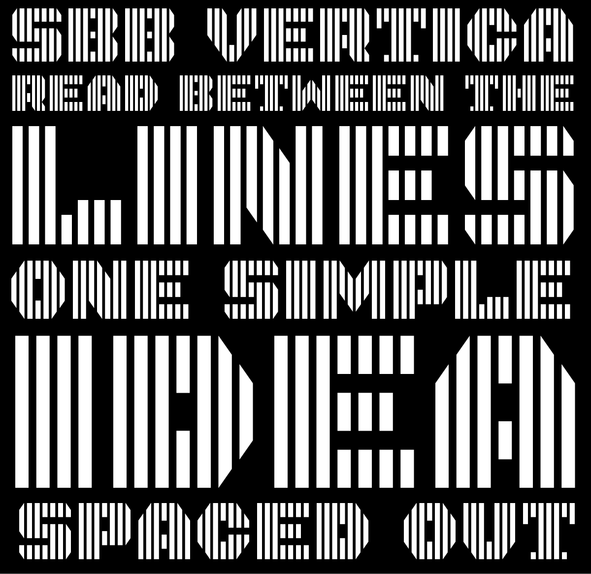
SbB Vertica. A bold all-caps display font consisting of vertical bands. I used the brick size and grid spacing filters to create the banding effect through the letters. To get the angled corners to line up, I needed to use the nudge command to bump bricks up or down.

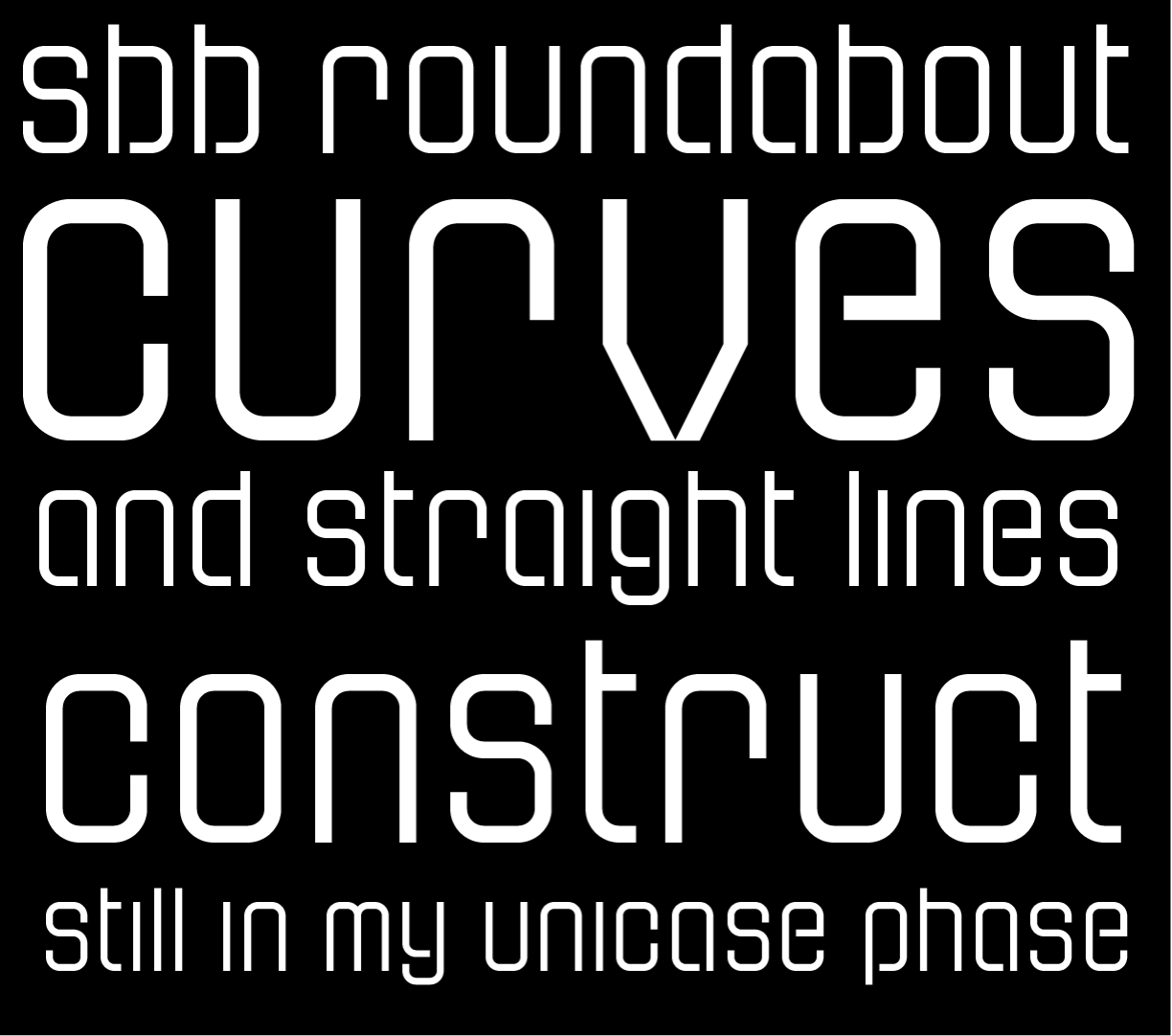
SbB Roundabout. A thin pseudo-stencil unicase design using rounded corner bricks that I don’t think I’ve ever tried before. This approach also required some nudging, and composite bricks to make everything line up.

Both designs are incomplete and I plan to keep working on them, but I’m happy with how they’ve turned out and wanted to share them. Both would have been impossible or very challenging without these techniques and bricks. It’s a reminder that unused features in my favorite software applications might be just what I need to execute a particular idea or concept.
Bob Wertz is a type designer, Ph.D. student and researcher living in Columbia, South Carolina. He’s been blogging since 2008.