My Three Fontstruct Color Competition Entries
Every so often, Fontstruct has a themed competition and the current competition focuses on the new color features. I’ve pulled together three color designs that try to use color in different ways — a pattern, a bright multicolor whimsical design and a 3D effect.
One of the fun things about the competitions is the amazing creativity that comes out of the community. Fonstructors can interpret the theme is very different ways and it’s always amazing to see the varied approaches driven by a simple prompt. I’ve entered a few times and even got an honorable mention once in the “Reverse” Competition for SbB Codebreaker. I will also note that I’ve been impressed with how Affinity Designer has handled the color fonts. Seems to work flawlessly.
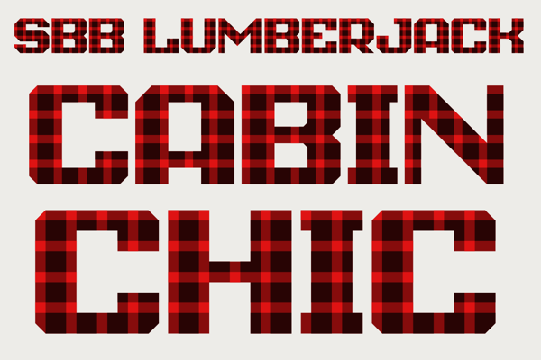
SbB Lumberjack
My first idea for a colored font was to make a pattern. I played with a couple of different patterns, but settled relatively quickly on making a plaid. One challenge was related to the scale of the pattern in relation to the size of the letters. My original plaid pattern was much bigger, but didn’t work well with some letters. I tried a couple of different sizes, but ended up with this one. This pattern is often associated with lumberjacks, but I think my wife has pajamas with this plaid pattern.

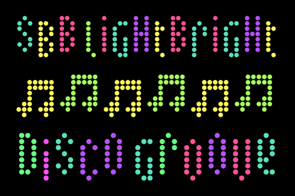
SbB Lightbright
I wanted to create a bright multicolored design. Really lean into the color theme. (And I always love to create Fontstruct designs that use a single brick.) I started with a square pixel, but eventually switched to a circle. The round dot reminded me of a Lite-Brite. I used Adobe Color to pick a color palette that would work on a black background. I wanted some whimsy, so I created a bouncing effect… Uppercase letters create a character in a higher position. Lowercase letters drop them down a block. So if you alternate case, the letters bounce up and down.

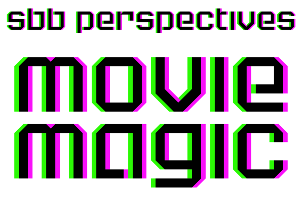
SbB Perspectives
Another random idea was to build a font that would work with 3D glasses. To be honest, I don’t have any 3D glasses laying around, but this feels like watching a 3D movie without the special glasses. So mission accomplished. I kept the design simple, because the type needs to be large to experience the effect.
 ---
---
Not sure if any of these will be selected as winners or honorable mentions, but I’m really happy with how they turned out. And I can’t wait to see what everyone else does.
Bob Wertz is a type designer, Ph.D. student and researcher living in Columbia, South Carolina. He’s been blogging since 2008.