Finlay Park on a cool morning.
Finlay Park on a cool morning.
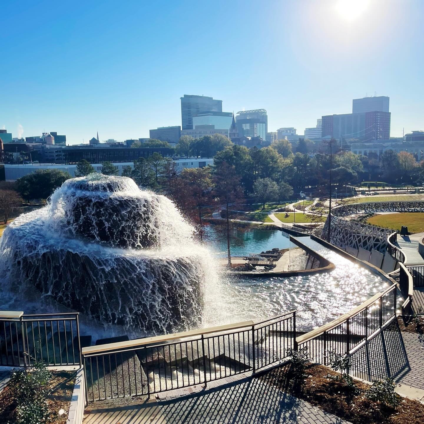
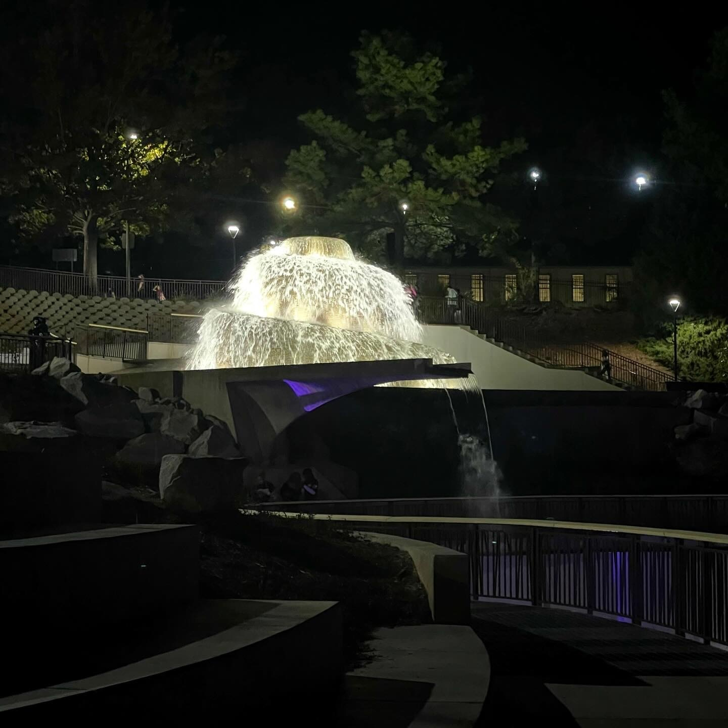
Finally got by to see the new Finlay Park. Beautiful.
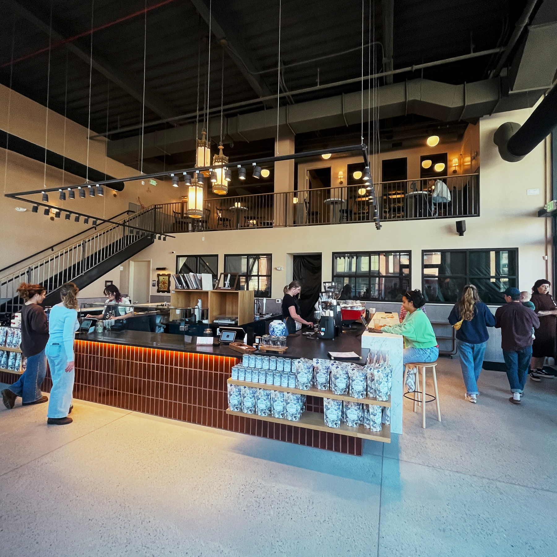
Impressed with the new Methodical Coffee in The Bull Street District in Columbia. Really awesome to see this area finally coming together.
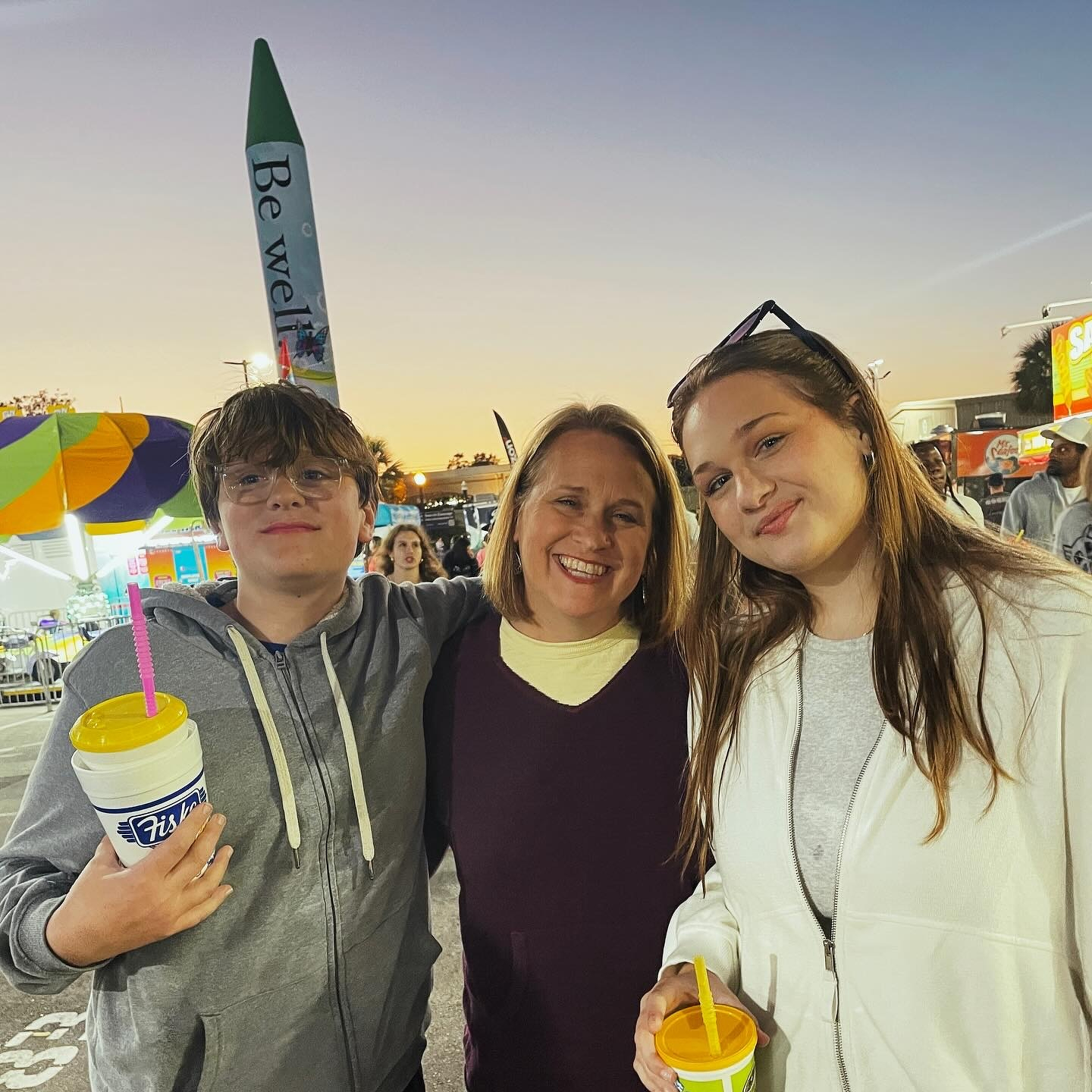
My family loves the State Fair. I love how much they love the State Fair. (I don’t actually love the State Fair.)
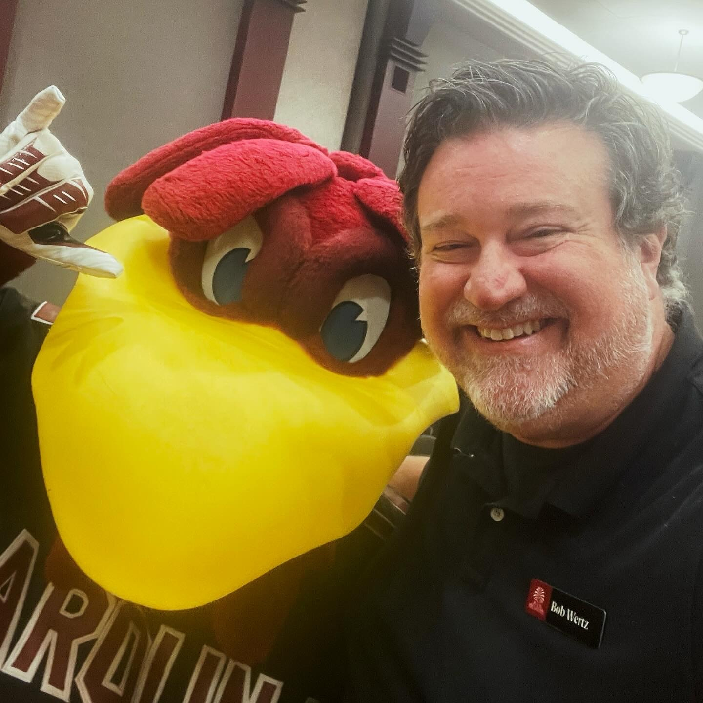
Every year at the USC State of the University address, I get a selfie with Cocky.
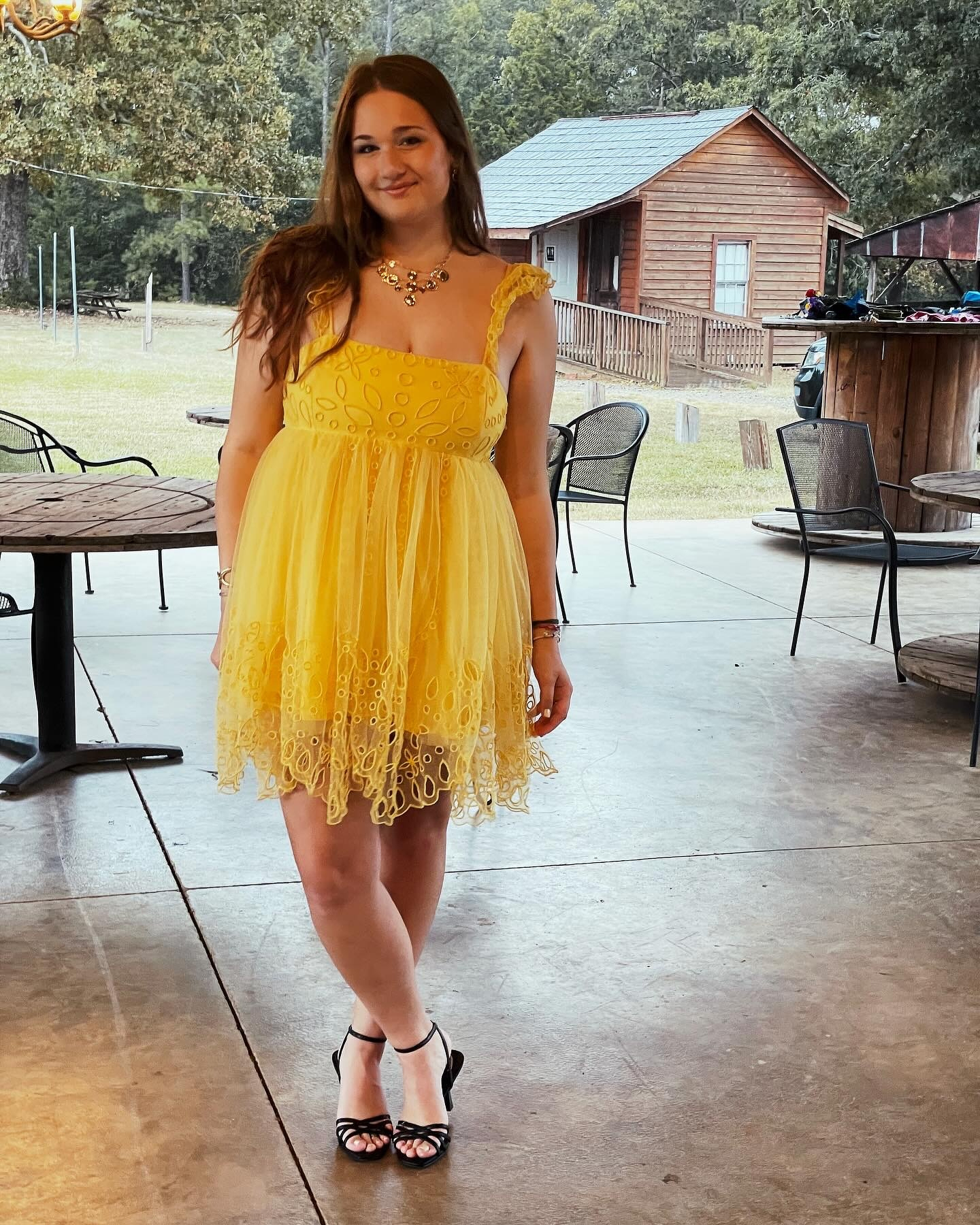
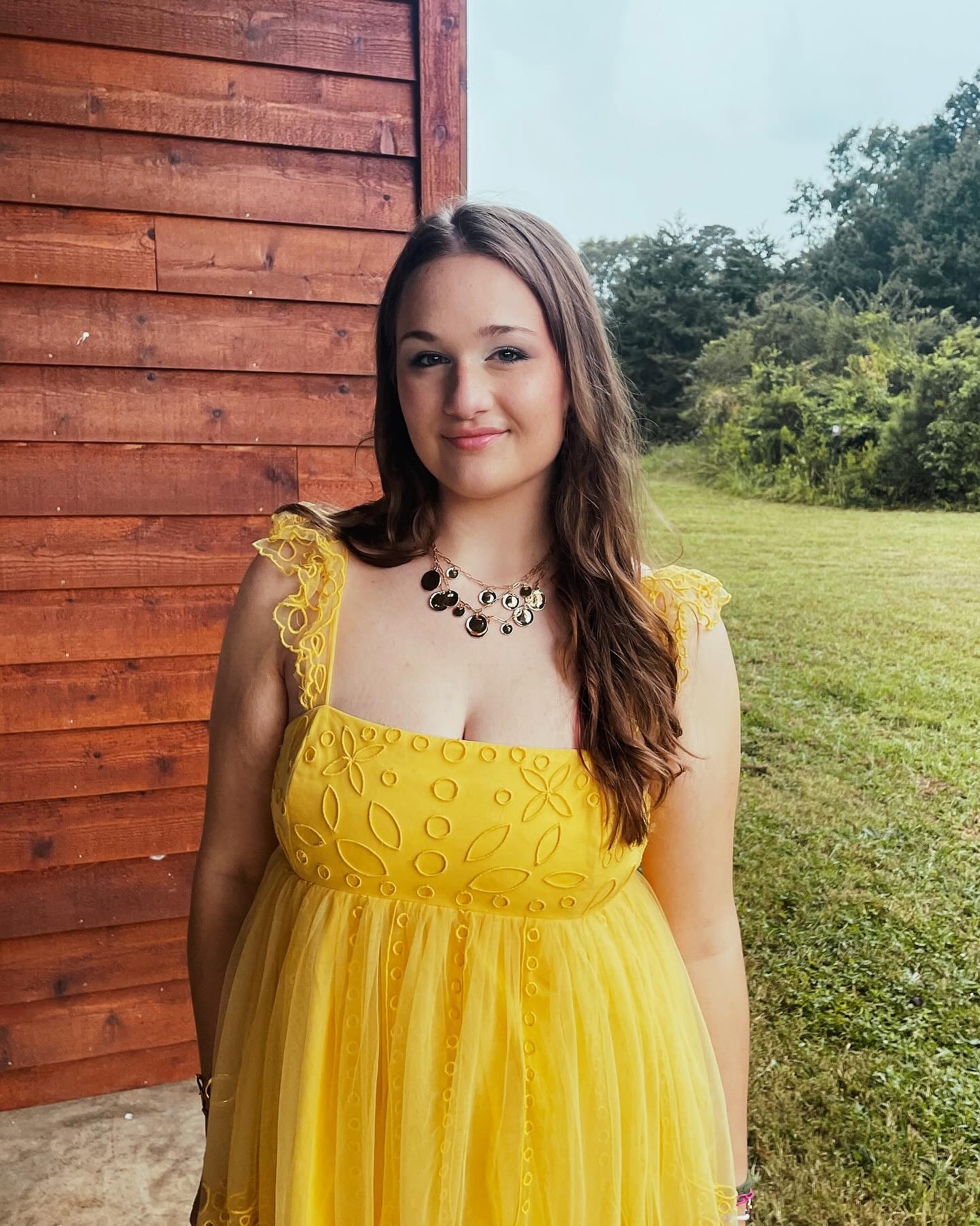
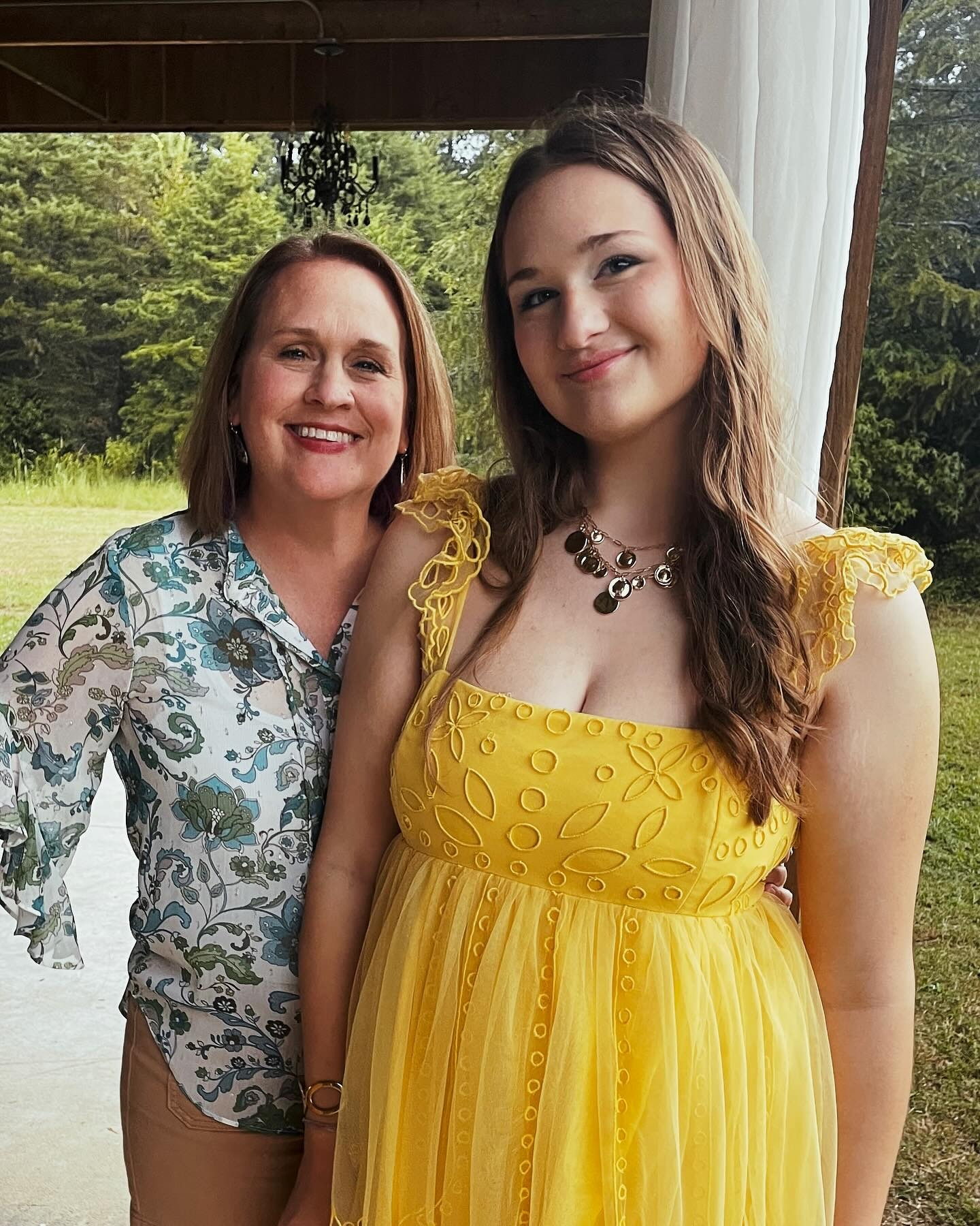
Happy 18th birthday, Jilly!
Scout Motors partnered with local coffee shops to buy coffee for Columbia today. Pretty cool event, and we are happy to have Scout in our community. Thanks for the free drink today! (And the stickers.)

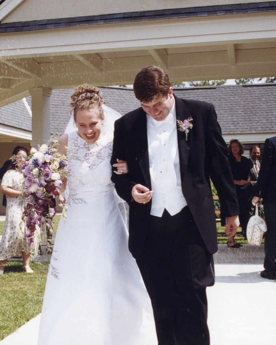
26 years ago today! Happy anniversary @lizzy_wertz.
Unplanned dinner date.
I love these moments when Team Wertz is all together. Getting all three kids together at the same time is getting tougher and tougher.
Team Wertz’s traditional “it’s still dark” first day of school picture. Jill’s a senior. Ryan is in 8th. Liz is teaching kindergarten.
8/2/25 • 4 min read
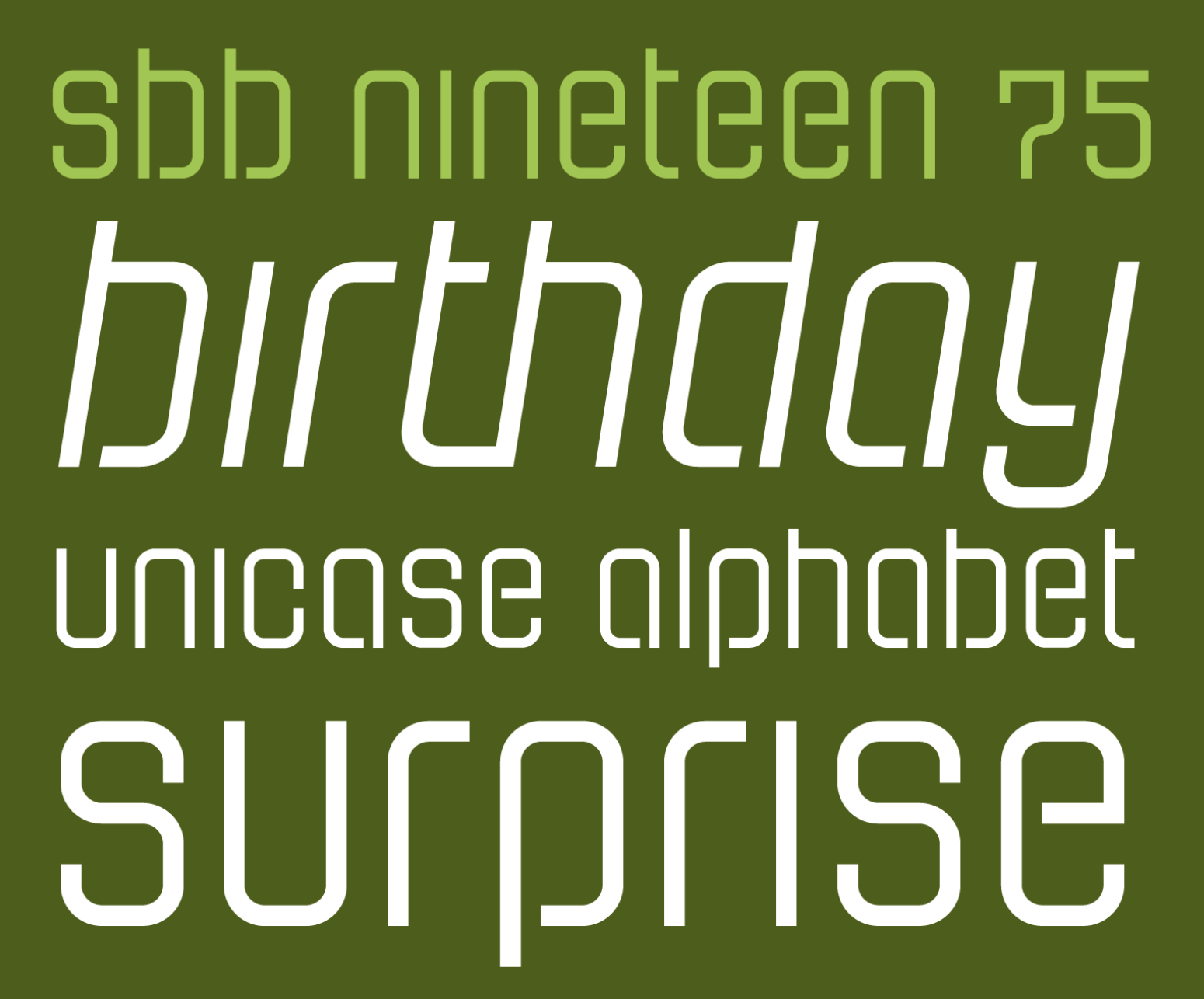
Yesterday I turned fifty. And to celebrate, I released a typeface for free. SbB Nineteen 75 is a fun little faux-stencil display font that is available for free. I had also planned to release a commercial font, but the scheduled release on MyFonts hasn’t happened yet. SbB Certiphica is my blackletter-inspired font that you will soon be able to purchase at MyFonts.
UPDATE: SbB Certiphica is finally available on MyFonts.
Many people won’t pay for fonts — even professional designers. There are so many typeface designs all over the web that you can find with a quick Google search. Many of them aren’t fully featured. Some are pirated. Software like Canva offers many excellent default options. Google Fonts and Adobe Fonts provide high quality options. So I understand why people hesitate to pay for quality type. There is, however, a vast marketplace of unique designs out there and I encourage you to explore beyond what’s already in your font menu.

I decided that I wanted to offer a typeface for free in honor of my 50th birthday that had some fun OpenType features. That free font is SbB Nineteen 75. It started life as a random Fontstruct prototype that I felt like would benefit from some additional development in Glyphs. I rebuilt it from the ground up and added an italic version, as well as some fun Opentype features — stylistic alternatives, discretionary ligatures, and a set of random icons.
The end result is a curvy faux-stencil with a vaguely 1970s feel – completely appropriate since I’m celebrating my 50th birthday and I was born in 1975. Why faux-stencil? I channeled some stencil design elements, but it wouldn’t work practically as a real stencil font. (Plus I skipped the stencil cuts on a couple of letters like O and Q because they were more readable without.)

The font is also a unicase design with the same upper and lower case. I’ve become slightly obsessed lately with unicase designs, especially ones that draw more from the lower case. I’ll probably need to write a blog post about that, but I’ll save it for another day.
The stylistic alternatives give some options for a handful of letters. The design of the letter t led to some interesting ligature designs. And I threw in a few fun icons of limited use. I have no idea who will use “Happy Frankenstein,” but I think he’s hilarious and it’s my birthday.

I wanted this font to actually be free so I chose to license this design under SIL Open Font License, version 1.1. Basically it allows you to use it in any project, personal or commercial. You can modify it and redistribute it as long as you offer it on the same terms. I’ve reserved the name SbB Nineteen 75, but other than that, it’s free to use. You can download your free copy at SbB Fonts.
I’m always baffled at the range of uses for blackletter typefaces — from heavy metal bands and newspapers to tattoo parlors and college diplomas. A true blackletter is defined by a calligraphic stroke, and SbB Certiphica isn’t really that. Instead, it takes inspiration from the boldness and compression of blackletter designs to create something modern. It’s a great option for a certificate or diploma where you want the feeling of a blackletter, but without the hundreds of years of baggage.

SbB Certiphica comes in three widths and three weights, with an italic version of each. 18 fonts in all. The design is unicase, meaning the upper and lower case are the same.

The ascenders and descenders are very short, meaning that you can use extremely tight line spacing to get a dense block of text. When you purchase the family, you also get the variable font that allows you to dial in the exact width, weight and slant that’s perfect for your project.

I’m really happy with how Certiphica turned out and hope you all like it, too. I scheduled it to release on Friday on MyFonts, but that didn’t happen for some reason. I’ll update this post when it is available.1 The best deal is to get the entire set plus the variable font for $49.

Hope you enjoy SbB Nineteen 75, and if you are in the market for a blackletter-inspired display typeface, check out SbB Certiphica.
Bob Wertz is a type designer, Ph.D. student and researcher living in Columbia, South Carolina. He’s been blogging since 2008.
It was scheduled to be released on August 1. In retrospect, I should have just had MyFonts release it when it was ready a week ago… ↩︎
In honor of my 50th birthday today, I decided to release a free font: SbB Nineteen 75.
7/25/25 • 3 min read
When Liz asked me what I wanted to do to celebrate my 50th birthday, I told her that I wanted to go to a Cubs game in Wrigley. I hadn’t been to Wrigley since 1988 when we moved back to South Carolina. Liz and I decided to make it happen, albeit a week before my birthday. Instead of dropping one image at a time, I figured I’d take more of a photo essay approach.
We dropped our kids off at Lutheridge in Arden, North Carolina. Our oldest is a counselor there and the kids have always been Christmas week campers. Once they were settled, Liz and I hit the road.


On the way up, we visited Buc-ee’s for the first time and eventually stopped for the night in Indiana. Liz had never seen Batavia, Illinois where I grew up, so that was our first stop. The next day, we got to Batavia around lunchtime and ate in a pub where the grocery store used to be. Spent some time driving around town and got to see our old house and the church that my dad was pastor. Crazy to see how much has changed and how much is still the same.

In retrospect, this workroom in the church was a great influence for me, filled with copiers, paper, folding machines. Everything a someday graphic designer might love. The door was exactly the same as I remember it.

We found the old windmill by the Fox River where we used to go sledding…

…and even paid a visit to the coolest school field trip location in the world, Fermilab.

Once we got to Chicago, we walked over to Lake Michigan and Navy Pier.


We walked along the Chicago River. And the John Hancock building was a couple of blocks from our hotel. We tried to walk as much as possible, but the heat was pretty bad the last day we were there.


We met a few dinosaurs at the Field Museum. I wanted to visit Sue, the T-Rex. But Liz loved Maximo, the Titanosaurus.


We made it to Wrigley for the Cubs game. I got to see the Cubs beat the Royals 6-0 in a game that included a little bit of everything including Suzuki stealing home.


To break up the trip on the way back, we stopped in Lexington, Kentucky and had an amazing dinner at Dudley’s on Short. I’ve never been to Lexington before and it was great.

We had a wonderful time, even if road construction threw us a couple of curveballs. Really thankful for Apple Maps, which made some time-saving route recommendations. The kids had a great time at camp. And we’re finally back home.
Next week, we celebrate my 50th birthday for real, but this experience was exactly what I wanted.
Bob Wertz is a type designer, Ph.D. student and researcher living in Columbia, South Carolina. He’s been blogging since 2008.
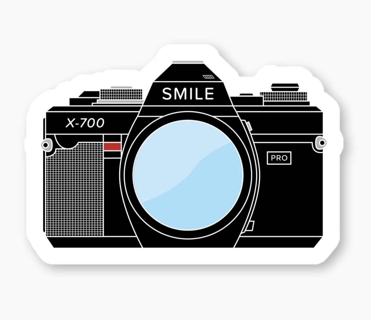
Excited that Cotton Bureau has finally added custom stickers. I added a few sticker designs, including my old film camera stickers.
7/6/25 • 2 min read
I mentioned a couple of days ago that I was playing around with some new-to-me features and bricks in Fontstruct. After I finished SbB Roundabout1, I decided those techniques would work really well on a symbol font. So I started playing around with building a couple of little faux emoji. Then decided that I needed to add some color. And before long, I’ve built an adorable set of icons in Fontstruct… SbB Emote.

I don’t know which my favorite is – either the robot or the minifig-inspired smiley. “Happy Frankenstein” is a classic, too. In total, the set has 63 glyphs. The build used over 140 different blocks and 6 colors. It’s probably the most complex Fontstruction I’ve made, since I normally like to keep it really simple.

One cool side effect of using the techniques and blocks from SbB Roundabout is that the two designs work really well together.

I think I’m at a stopping point for the time being. I’ll be honest, I really need to be working on my dissertation and independent study. But I’ve got some ideas for characters I could have drawn… so you never know when I’ll revisit the font. I’m still not sure what to make of color fonts, but I could see how a custom icon font could be useful.
I think you have to be a patron on Fontstruct to download color fonts, so most of you won’t be able to download SbB Emote, but SbB Roundabout is free to download with an account.
Bob Wertz is a type designer, Ph.D. student and researcher living in Columbia, South Carolina. He’s been blogging since 2008.
Now a “Top Pick” on Fontstruct. And by the way, I’m going to need a new name for Roundabout. It’s taken. ↩︎
7/5/25 • 1 min read
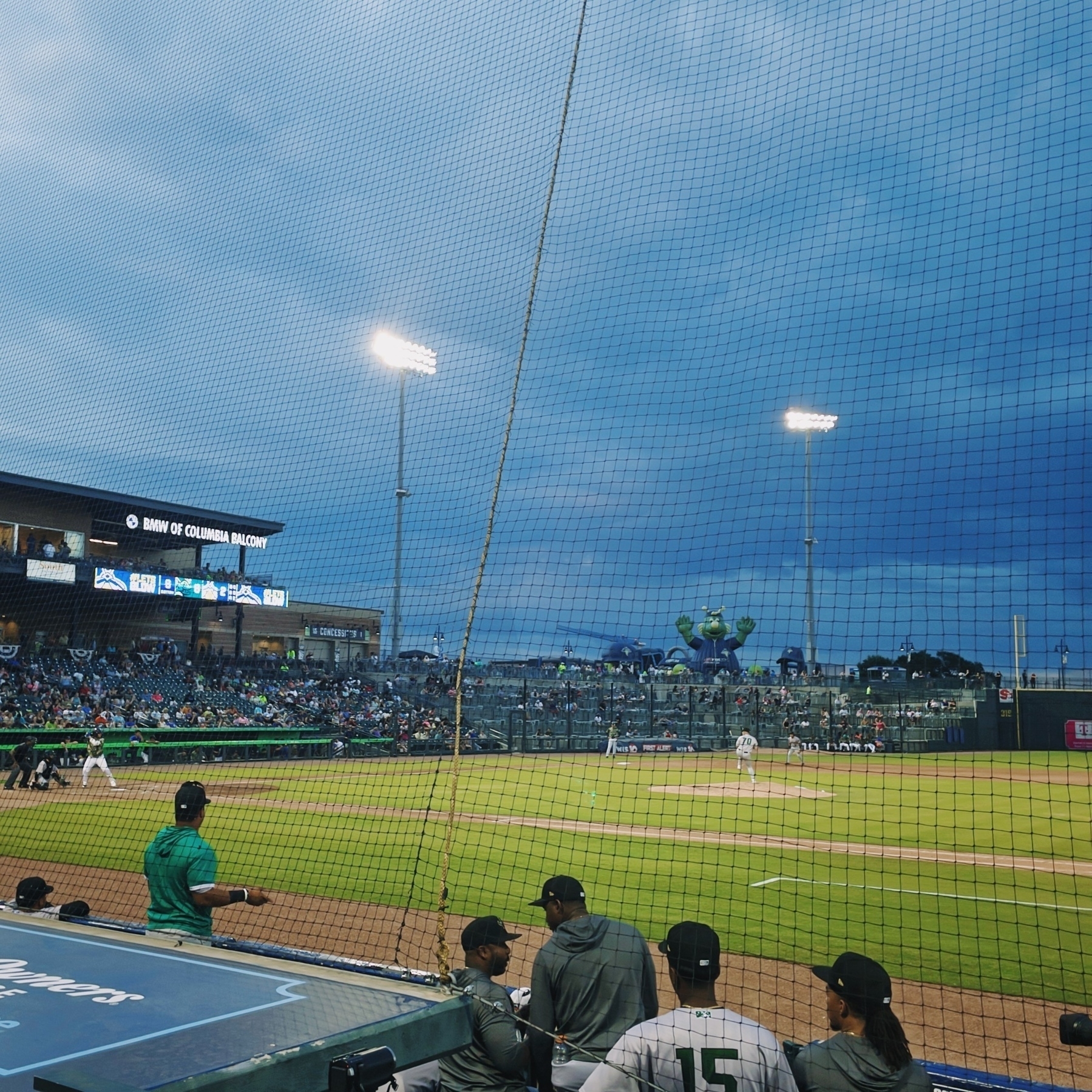
I’ve been playing around with Adobe’s Project Indigo computational camera app recently. I’ve got an old, but completely functional iPhone 12 Pro. Tonight at a minor league baseball game, while we were waiting for the game to end and the post-game fireworks to begin, I decided to try Project Indigo out in some challenging light. First, from our seats on the first base line, I took a shot with the iPhone’s stock camera app:

The shot’s fine, but it’s clear the net was an issue. The iPhone processing made it seem far more prominent than it really was. I then tried to take the exact same composition with Project Indigo:

This looks a lot closer to reality. It handles the sky and the net better. You can’t really tell from this upload, but detail is much cleaner with fewer artifacts. Project Indigo is still slow to process and occasionally overheats your phone, but in the right situation, it’s a great option.
Your mileage may vary, especially if you have a newer, more capable iPhone. But if you are trying to capture an image in some challenging light, give Project Indigo a shot.
Bob Wertz is a type designer, Ph.D. student and researcher living in Columbia, South Carolina. He’s been blogging since 2008.
Fireflies baseball. A beautiful night to catch a minor league game.
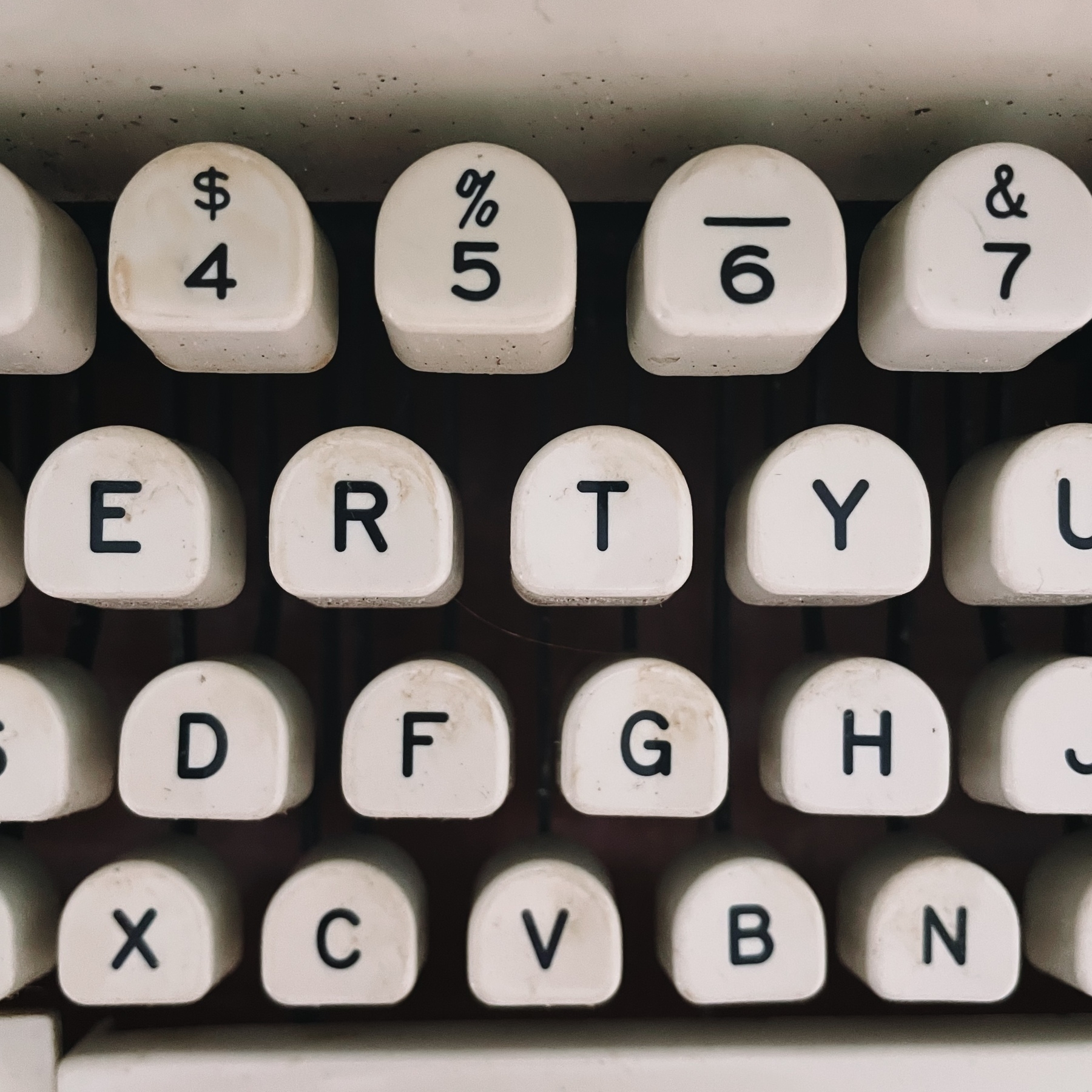
My dad randomly asked me if I wanted the typewriter my grandparents bought him when he graduated college. He used it in seminary and his first call. Uh, YES! So I now have a Royal Safari manual typewriter. Seems to work well. Just need a new ribbon.
7/3/25 • 2 min read
Recently, I started playing around on Fontstruct again. The tool has evolved massively in the 17 years I’ve used it, but I interacted with it largely the same way — placing blocks on grids. I’ve been thinking about how I use design tools lately. I use apps like Photoshop and InDesign the same way I used them a decade ago. In general, this works fine, but I don’t really take full advantage of the advancements in the software. I’ve been trying to explore new features in Photoshop and Glyphs lately, and I decided I wanted to try out some of the features I haven’t used in Fontstruct, too. I just made two designs public: SbB Vertica and SbB Roundabout.
SbB Vertica. A bold all-caps display font consisting of vertical bands. I used the brick size and grid spacing filters to create the banding effect through the letters. To get the angled corners to line up, I needed to use the nudge command to bump bricks up or down.

SbB Roundabout. A thin pseudo-stencil unicase design using rounded corner bricks that I don’t think I’ve ever tried before. This approach also required some nudging, and composite bricks to make everything line up.

Both designs are incomplete and I plan to keep working on them, but I’m happy with how they’ve turned out and wanted to share them. Both would have been impossible or very challenging without these techniques and bricks. It’s a reminder that unused features in my favorite software applications might be just what I need to execute a particular idea or concept.
Bob Wertz is a type designer, Ph.D. student and researcher living in Columbia, South Carolina. He’s been blogging since 2008.
6/21/25 • 5 min read
Bojangles is a fast food restaurant chain in the Southeastern United States that serves chicken and biscuits. Last year, I drove up to a Bojangles drive-thru in downtown Columbia, South Carolina and was greeted by a computerized voice. There were no signs indicating that they were using a new system, but it was clear that the voice wasn’t a human. I placed my order, the system asked for the drink on my combo, confirmed my order, told me my total and asked me to move forward. Quick and efficient.

A few months later, the Bojangles in Chapin near my daughter’s school switched to the same computerized system. I’d stop there occasionally to grab breakfast after dropping her off. This time, the system informed me that there was a 5-minute wait on my steak biscuit and asked if I wanted to switch to something else. I did not want to wait, so I changed my order. The system handled it, gave me a total, and I was intrigued.
A quick search revealed that this new system had a name: Bo-Linda. Bojangles website describes Bo-Linda as “a dynamic conversational drive-thru AI platform to augment human interaction with digital restaurant systems.” I also discovered that many people hadn’t had positive experiences with the new system when it debuted in Charlotte. I started to pay attention to the system any time I ordered and figured I’d share some observations about the system, and the potential societal impact of AI.
So, Bo-Linda works. It’s mostly fine. From the Bojangles perspective, I understand why they’d want to switch to an AI-based ordering system. Bojangles claims that the system improves accuracy, noting that Bo-Linda can take orders 96% of the time with no human interaction.1 They still need a person processing payments and giving patrons their food, but that employee can more easily handle other tasks like filling drinks if they aren’t also taking orders. I’m not sure how employees would feel about it. Are they hiring fewer staff because they’ve automated one of the jobs? Are some employees getting scheduled for fewer hours? Or are they happy that one annoying task simply has been automated? Taking orders at a fast food drive-thru can’t be an enjoyable experience.
From a broader perspective though, this is what people fear when they say that artificial intelligence will take away jobs. Bojangles isn’t the first to experiment with removing humans from the order experience and it won’t be the last.2 Companies of all sorts will look for jobs and positions that can be eliminated or replaced by an AI-driven system. And as they find those efficiencies, they will need fewer employees. I’m a little bit of a skeptic when it comes to AI completely replacing knowledge jobs, but I do think new AI-powered tools will help us get more done in less time. If employees are more efficient, companies will eventually need less people to get the same amount of work done.
With more efficient workers and potentially fewer jobs, the impacts to our society could be significant, especially for young adults. We need to start having serious conversations about universal basic income as a method of keeping our society stable. If employees can do more in less time, then maybe we need to start considering shorter work weeks. There will inevitably be tension between the traditionalists who want to keep a 40-hour work week and maximize efficiency, and the workers who will be asked to do more for the same amount of money. Right now, it’s hard to call AI ordering at a fast food restaurant revolutionary, but I do believe a technical revolution is coming. And as with all technical revolutions, cultural change will inevitably follow.
Bob Wertz is a type designer, Ph.D. student and researcher living in Columbia, South Carolina. He’s been blogging since 2008.