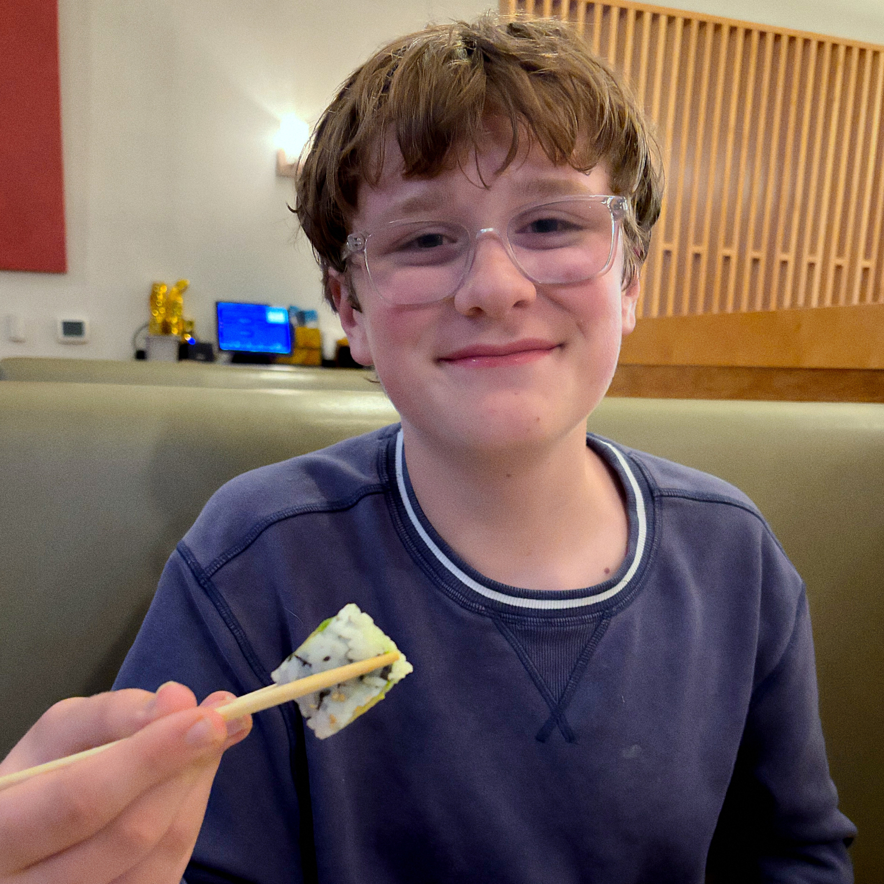
Got Ryan to try sushi for the first time tonight. Surprise: he likes it.
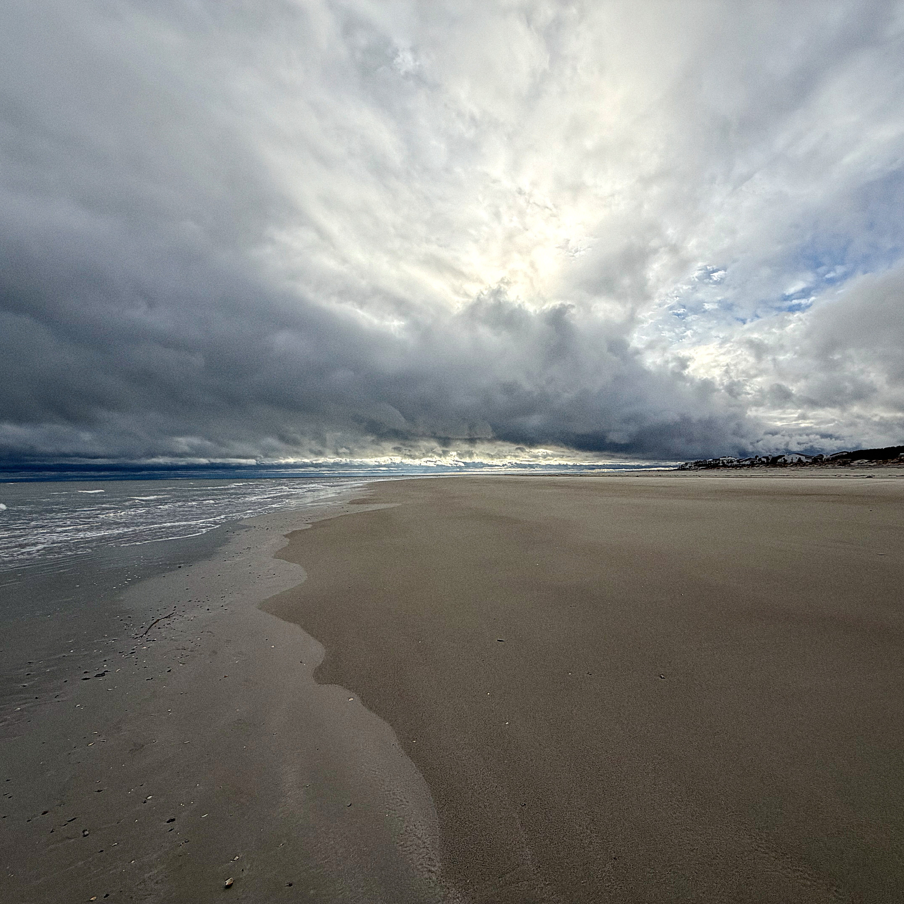
I’ve always loved photography.
Got Ryan to try sushi for the first time tonight. Surprise: he likes it.
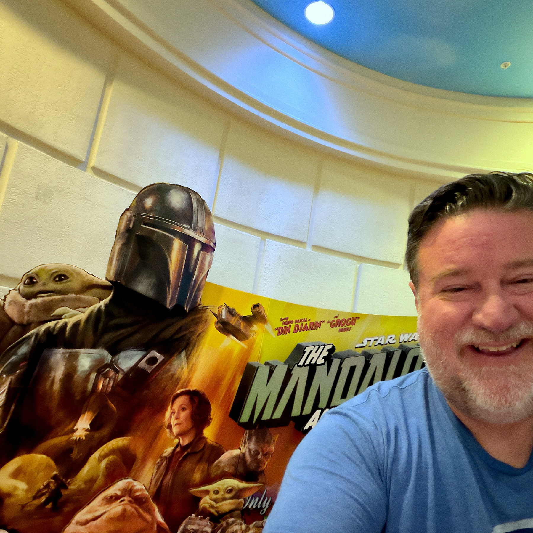
Mandolorian and Grogu was fun. I enjoyed it. 🍿
Our school district has a tradition where graduating seniors go back to their elementary school and walk through the halls. The kids make signs and cheer for them. Jill got to go through CES today. Such an incredible experience for the seniors and the elementary age kiddos.

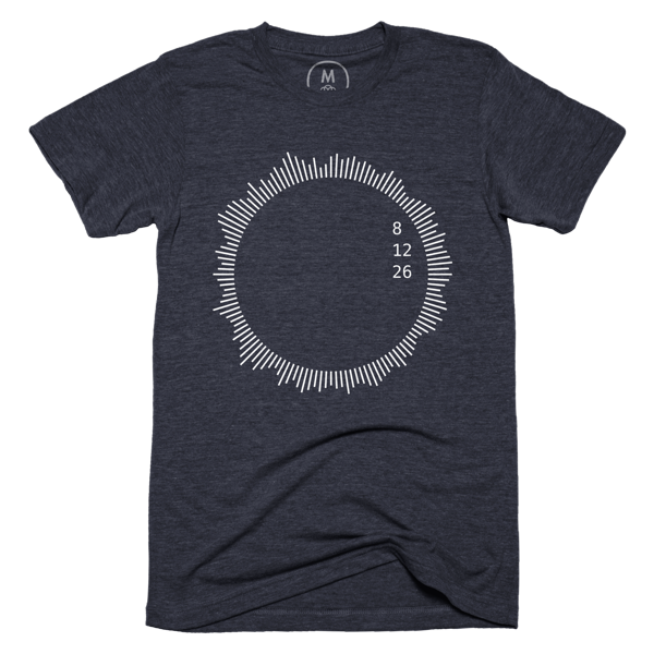
On August 12, 2026, a solar eclipse will appear over Greenland, Iceland, and Spain. Many shady vendors will sell incredibly tacky shirts to commemorate the occasion. Instead, order something a little more classy. Available on Cotton Bureau.
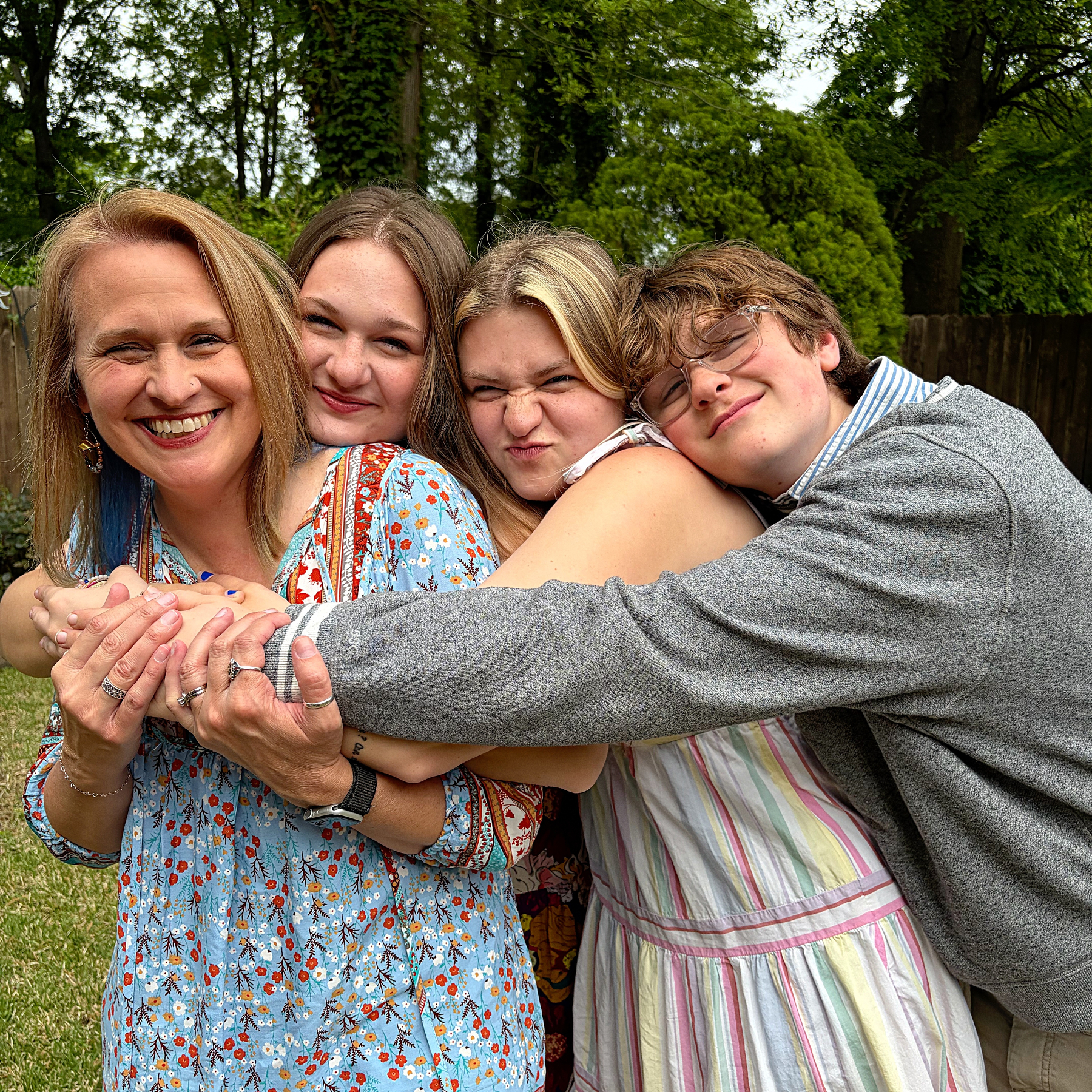
Happy Mother’s Day, Lizzy.
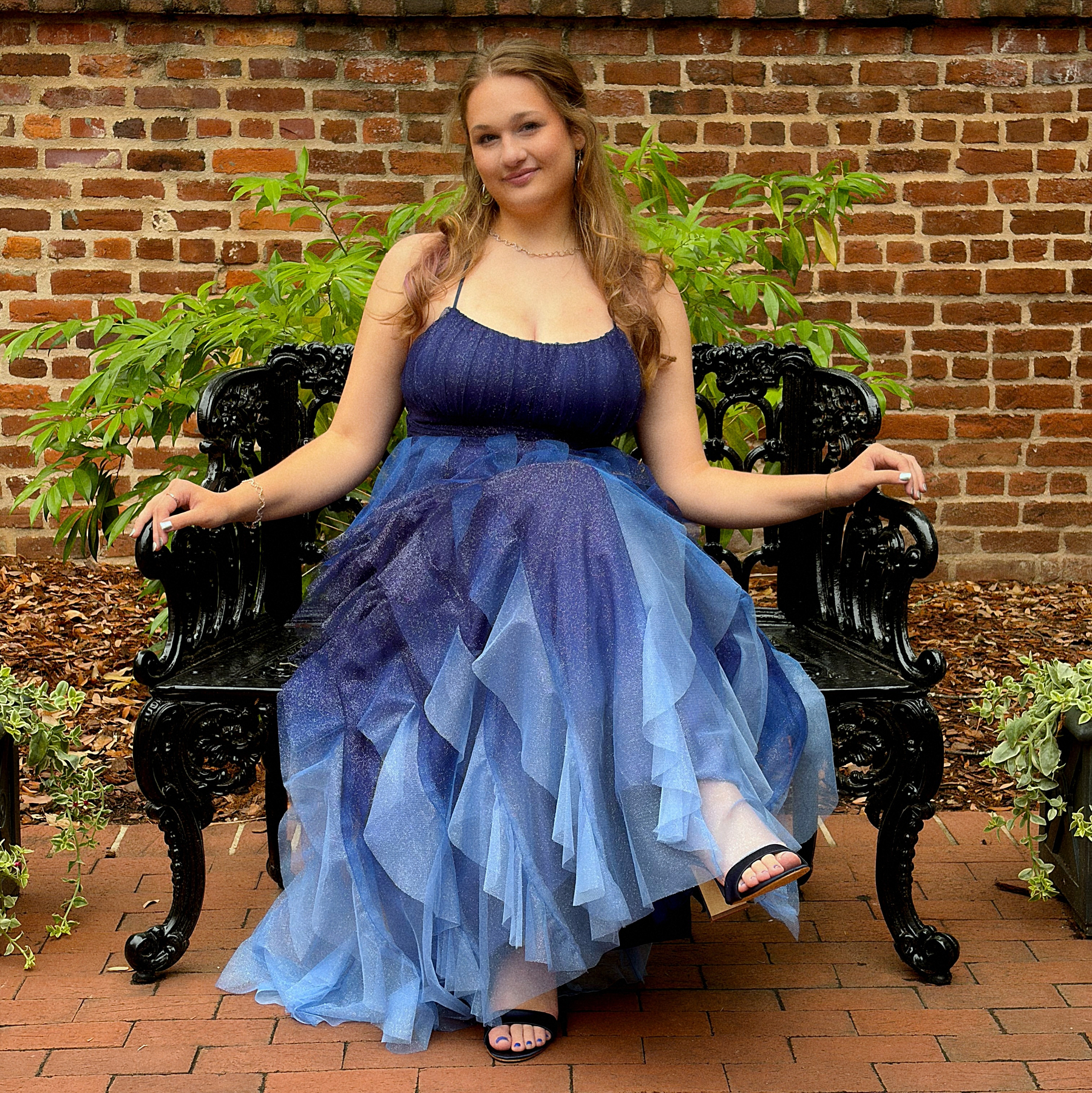
Prom 2026.
4/22/26 • 6 min read
In 2016, I wrote a post about the things I would miss if Twitter went out of business. I identified potential pain points, and identified what steps to take just in case. After Twitter was acquired, I was able to easily leave my account.
Now, I’m thinking about what it would take to leave Meta’s products. I don’t think they are going to go out of business. They are the social media equivalent of “too big to fail.” I’ve long believed that Meta is an unethical company that builds addictive products. They’ve been awful for a long time, though, so why have I just made the decision to plan my exit? I used to enjoy Instagram, but lately, not so much. I’m posting less, and at the same time, seeing less content from people I know. I think it’s time to start the process.
When we talk about Meta, I’m talking about three products that I currently use: Facebook, Instagram and Threads. I started using Facebook in 2008 and have used Instagram and Threads since they were released.1 I now rarely log into Facebook, but I use Instagram and Threads regularly. I don’t use What’s App or Messenger, so those aren’t an issue for me.
I will note that some of the systems I adopted to leave Twitter help me with this new attempt to leave Meta. Since 2022, I’ve essentially run a P.O.S.S.E.2 set up (Publish Own Site, Syndicate Elsewhere) where most of my posts start on bobwertz.com via Micro.Blog and are then shared to Bluesky, Mastodon and Threads. Threads is the only Meta app that allows for this type of API access so it tends to be a little more integrated into my daily routine.
Looking at the Meta apps individually, here’s what I need to do to move away from Meta:
Facebook. I’ve mostly already left Facebook. On my About Bob page, it’s listed under “Not Updated Social.” The only thing left there are my old posts. And some of those old post contain awesome stories from when my kids were little. I downloaded a file with all the content, but I’d really like an online archive. Manton with Micro.Blog has said before that building a Facebook importer should be relatively easy. If he builds an importer like he did for Twitter, I can probably go ahead and close my Facebook page.
Instagram. Over the last few years, I’ve slowed my posting to Instagram. These days, I mostly use Instagram to view content. Increasingly, the content is ads, TikTok influencers, and AI slop. I was never a TikTok user, but I now understand why people love (and are addicted to) the short video format. Once you get sucked in, it’s easy to just sit there scrolling and scrolling. That said, I have lots of content I want to see and I think I’d rather spend my time watching one of the dozens of TV shows on my list, reading through my RSS feed, or even watching long form YouTube videos.
I do have over 15 years of images on Instagram, and while they all likely exist in my photo library, I still want to keep a record of them. Thankfully, Micro.Blog does have a way to import Instagram posts. I’ll need to do some manual clean up, since some of my Micro.Blog images are duplicated on Instagram. I’ve already downloaded my images and run a couple of test imports. It’s going to take a little while, but it’s worth it.
While I may not immediately delete the account, I do feel like I’m already at a point where I can step away. Sometime soon, I’ll probably drop a note in the bio that my Instagram feed is no longer updated, and then delete the app from my phone. I actually just flipped my account to private. I’ve always had a public account, but recently, it just seems that every new follower is a spam bot that I have to block.
Threads. Weirdly, even though it’s the social media network I’ve been on for the shortest period of time, Threads might be the hardest to replace for me right now. It’s connected to Micro.Blog, so crossposting is easy. It’s is a great source for niche news that I care about, for example: women’s college basketball and F1. While I feel like I could easily leave Instagram, I believe that Threads still adds some value for me.
But more importantly, Threads is also the place where I get the most engagement on what I share through Micro.Blog crossposting. Part of this is the Threads algorithm, but I also do know a bunch of people on Threads who respond to my posts… which leads to the biggest problem of all…
Meta’s apps are where people I actually know share updates.
The real problem with leaving Meta is that my family, friends and acquaintances are there. Facebook and Instagram especially. If I leave Meta’s ecosystem completely, how will I communicate with friends and family? How will I know what’s going on in the communities around me? Sadly, I guess the simple answer is that I won’t. No other ecosystem has the extensive network that exists on Meta’s platforms and with today’s fragmented social media infrastructure, no singular alternative is going to form to rival the number of users that Facebook and Instagram have. A very small number of my friends are on Mastodon or Bluesky.3 A choice to leave Meta products entirely is a choice to cut off connections. And I’m not 100% ready to completely sever those ties.
Which means I can’t quite get rid of Meta yet. But I’m actually closer than I thought I was. My plan is to look again at ways to preserve my Facebook and Instagram posts. I want an archive of everything. I’ll then completely pause activity on those platforms for the foreseeable future. I’ve long since deleted the Facebook app from my phone. Instagram will be next. I won’t delete those accounts yet. I’ll continue crossposting to Threads4 for the time being, but start to look for ways to get the same content on other channels. I wrote a total of six Twitterless posts, so I’ll likely follow up on this one eventually. Check back in on non-Meta social media for updates. Or just follow my RSS feed.
Bob Wertz is a type designer, Ph.D. student and researcher living in Columbia, South Carolina. He’s been blogging since 2008.
I joined Instagram the month it was released in October 2010. I joined Threads minutes after it was open to the public in 2023 and is user #210,850. ↩︎
Yeah, I hate acronyms, too. ↩︎
I know a bunch of people on Linked In, but it’s Linked In. ↩︎
I think Threads still requires an Instagram account, so as long as I am using Threads, I have to at least have an active Instagram account. ↩︎
Thanks to Cotton Bureau for featuring my new “Happy Frank” shirt design in their T-Shirt Tuesday email. (And yes, I know his full name is Frankenstein’s Monster, but he just goes by Frank these days.)

Avett Brothers at the Township Auditorium.

4/8/26 • 1 min read
Being a type designer can be weird. You create your design. Share it with the world. And then someday, unexpectedly, it shows up again.
I designed SbB Powertrain over a decade ago and I was very surprised to see it pop up in a clip of Gamecock Women’s Basketball player Ali Tournebize dunking in the 2024 Eurobasket U18 bronze medal game. Turns out that FIBA uses Powertrain as part of the identity for their Eurobasket tournament. It was used heavily for the 2024 and it looks like they are still using it in some places. Here are a couple of examples that I stumbled across.


If you look closely to the videos, Powertrain is used for the 2024 at center court and on some of the courtside screens. So much fun to see my type design in use, especially in a global context. Learn more about SbB Powertrain and my other fonts at sbbfonts.com.
Bob Wertz is a type designer, Ph.D. student and researcher living in Columbia, South Carolina. He’s been blogging since 2008.
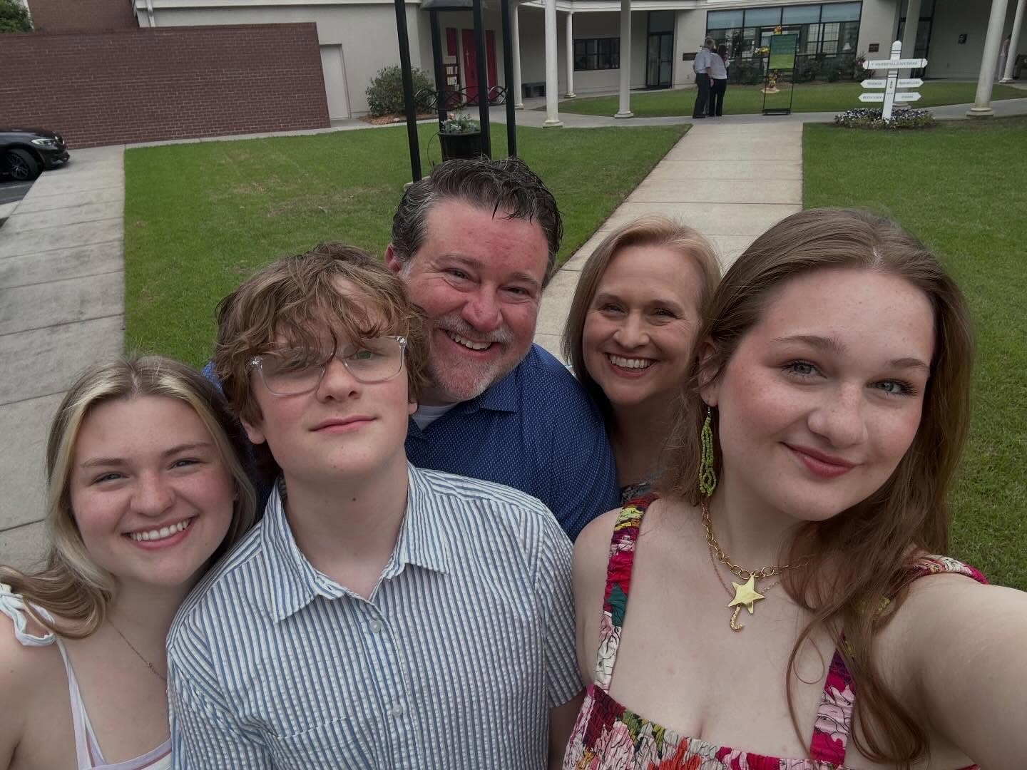
Happy Easter from Team Wertz. Always wonderful to worship at St. Paul Aiken when we are in town.
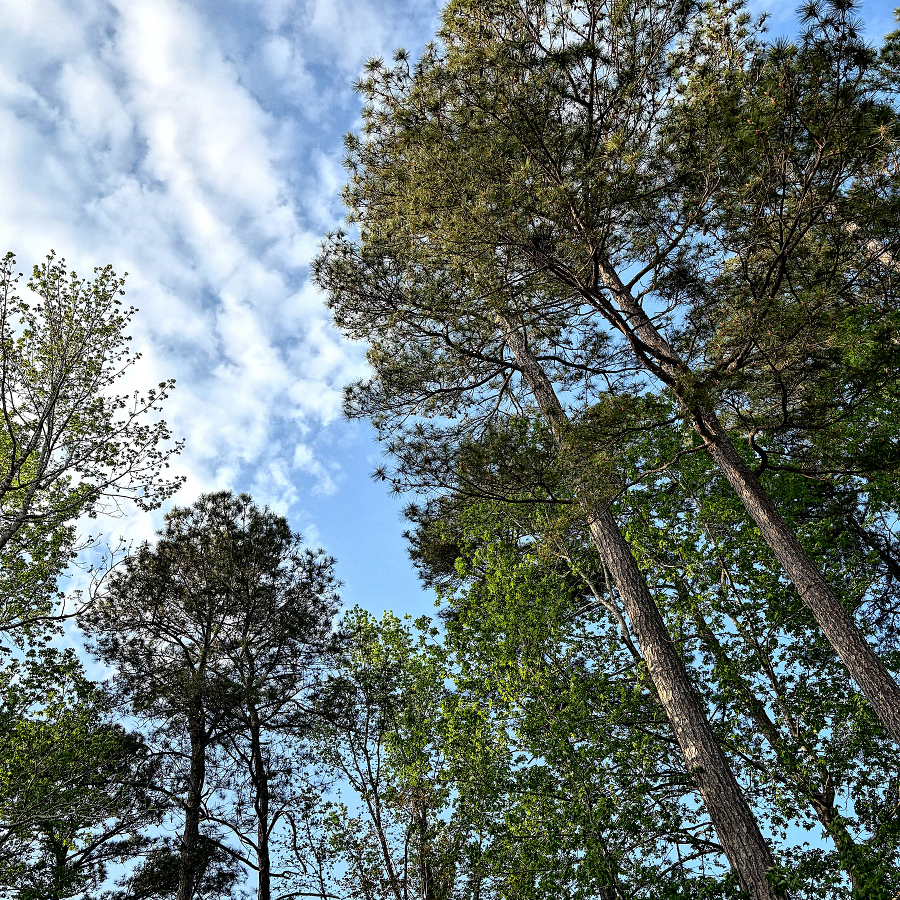
Spring is here. I looked up while grilling and noticed our backyard trees are finally all green again. 🍃🍃🍃
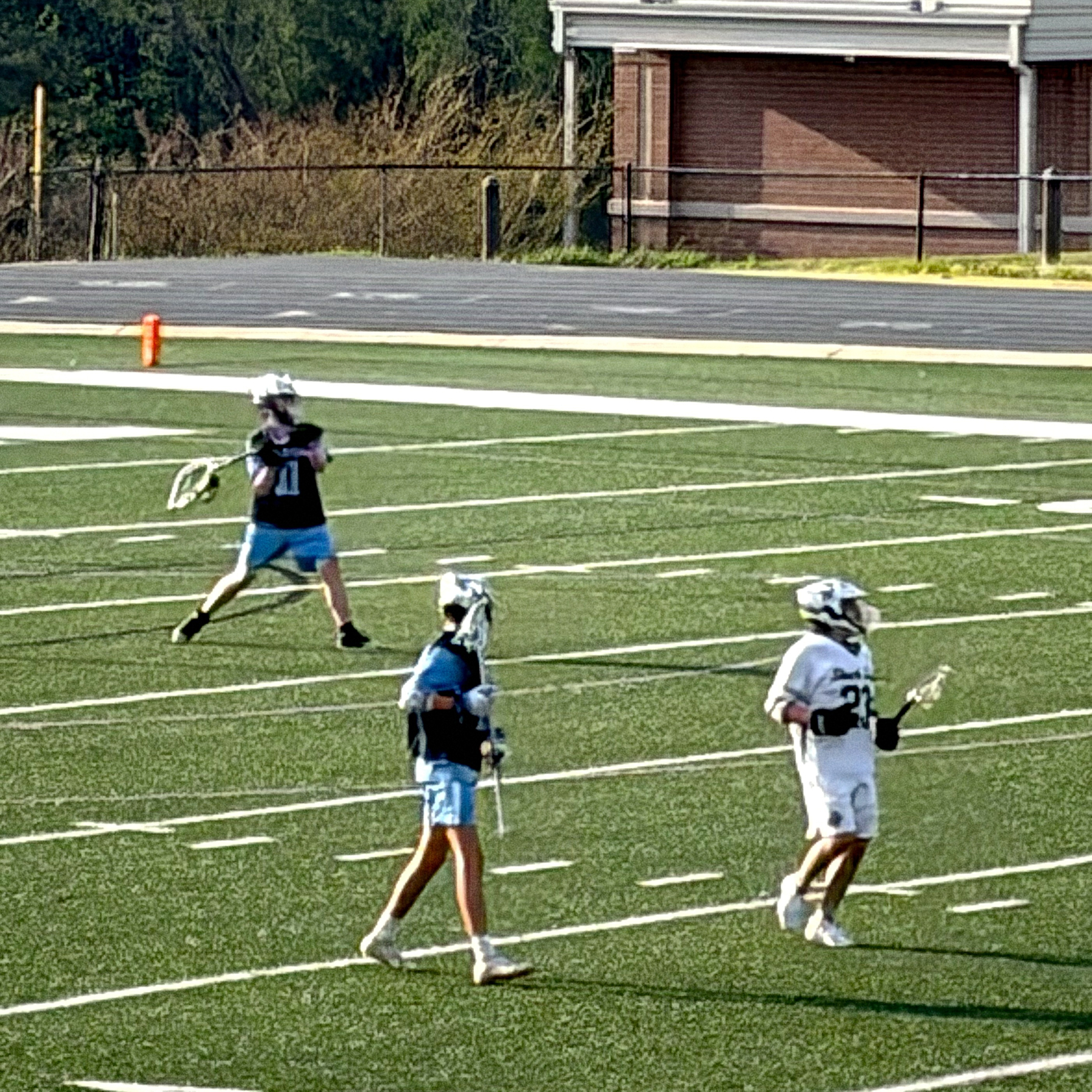
Ryan got his first high school start tonight when the starting goalie injured his hand in warm ups. He got the win and a shut out.
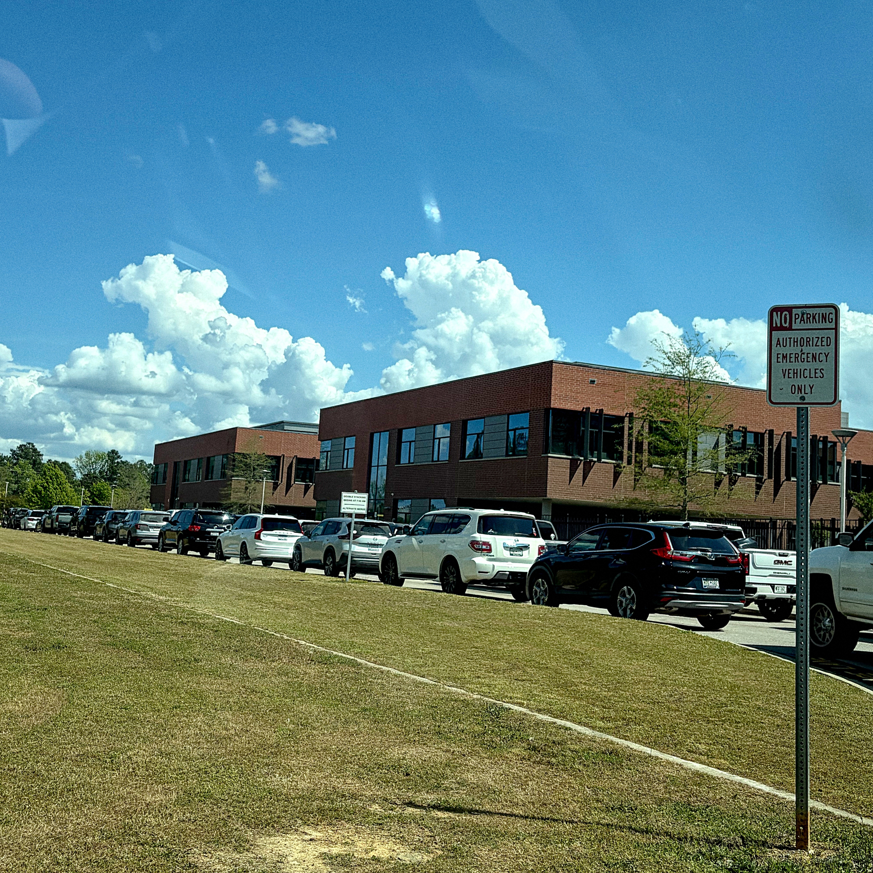
Bored, while sitting in a very long middle school car line. (I’m near the front.)
3/28/26 • 2 min read
Apple seems to be one of the most tightly managed brands in the world, but they actually use their logo much more whimsically than any other big brands. I’ve written in the past about logo usage that runs against typical brand management best practices. On the eve of their 50th anniversary, I’ve come across two more examples. I wanted to share them as a way to continue to document Apple’s approach to visual identity:
Apple has artwork that essentially serves as an alternate logo for their anniversary. It’s a stylized treatment of their logo (below), which includes a rainbow of colors that harkens back to their old six color rainbow logo.
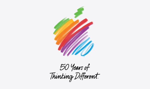
Apple shared an Instagram post with a series of animated takes on the Apple logo, but the sequence starts with the old six color logo.
Both examples take the Apple logo shape and use it as a structure for artwork. You typically don’t see large companies allowing or promoting this kind of variability with their logo. And you rarely see an old logo pop up, even during an anniversary. The artwork feels true to the Apple brand, but runs counter to what other brands do. In brand management, rigid consistency is king. As designers, it’s worth noting that Apple of all companies allows such flexibility within their visual identity guidelines, and maybe we can learn something from how they use their logo and brand creatively.
Bob Wertz is a type designer, Ph.D. student and researcher living in Columbia, South Carolina. He’s been blogging since 2008.
The parking garage is so eerily empty when I get in early.


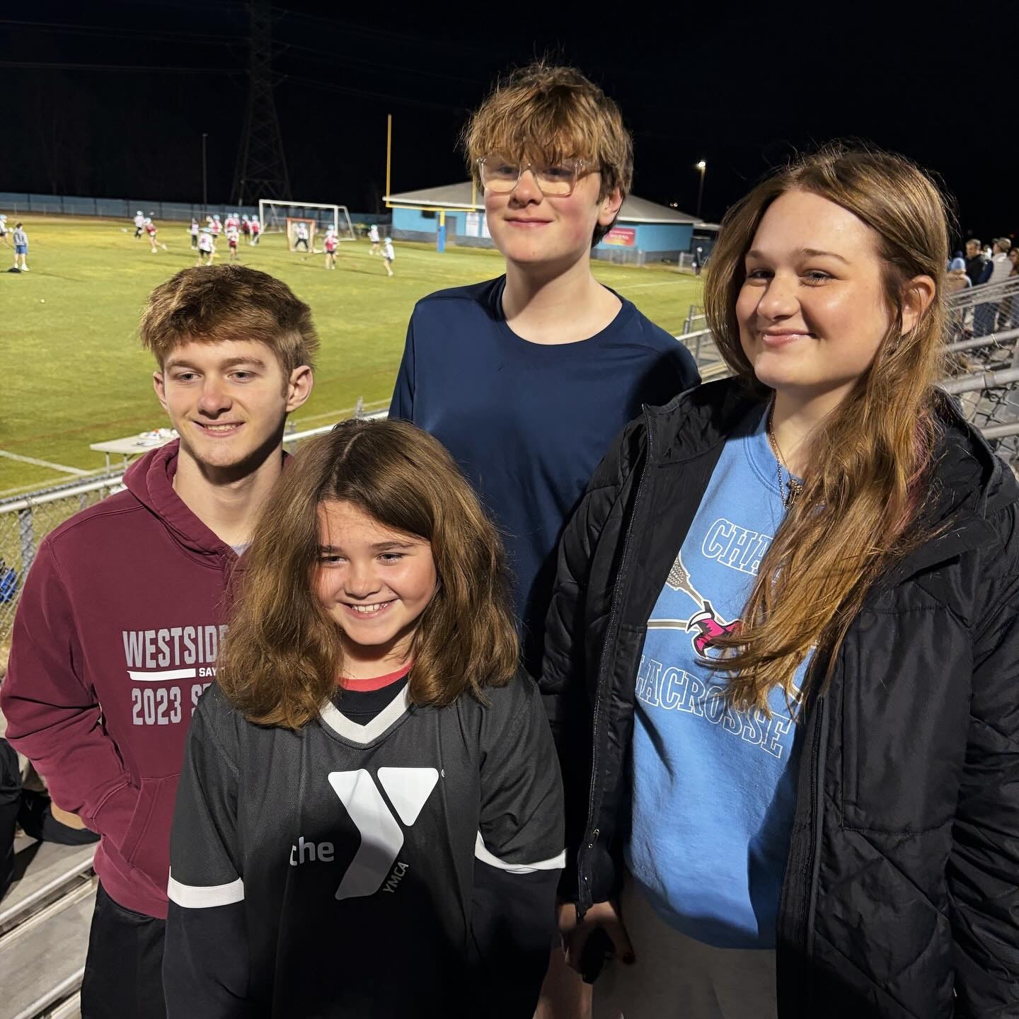
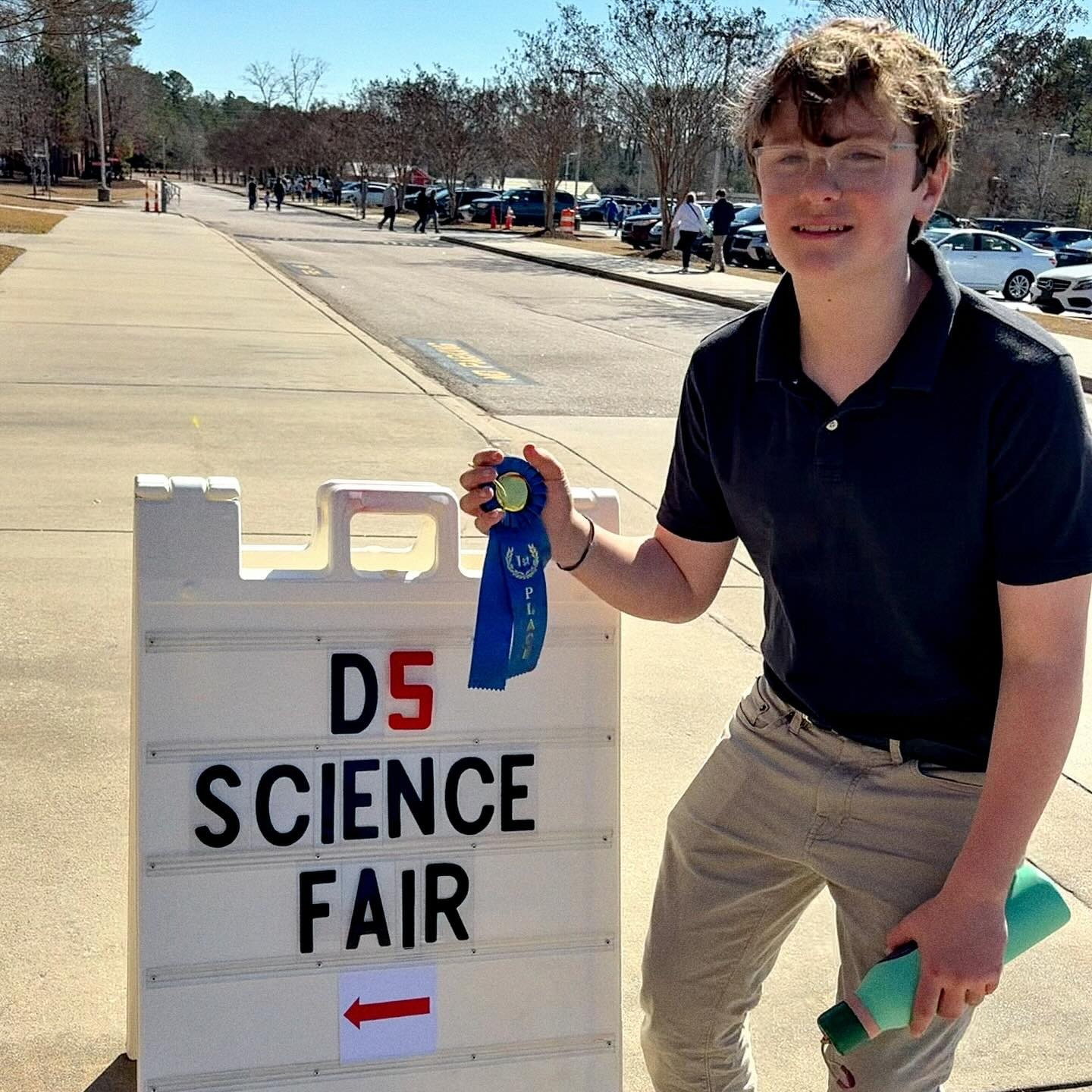
First place in the District 5 middle school science fair physical science category!
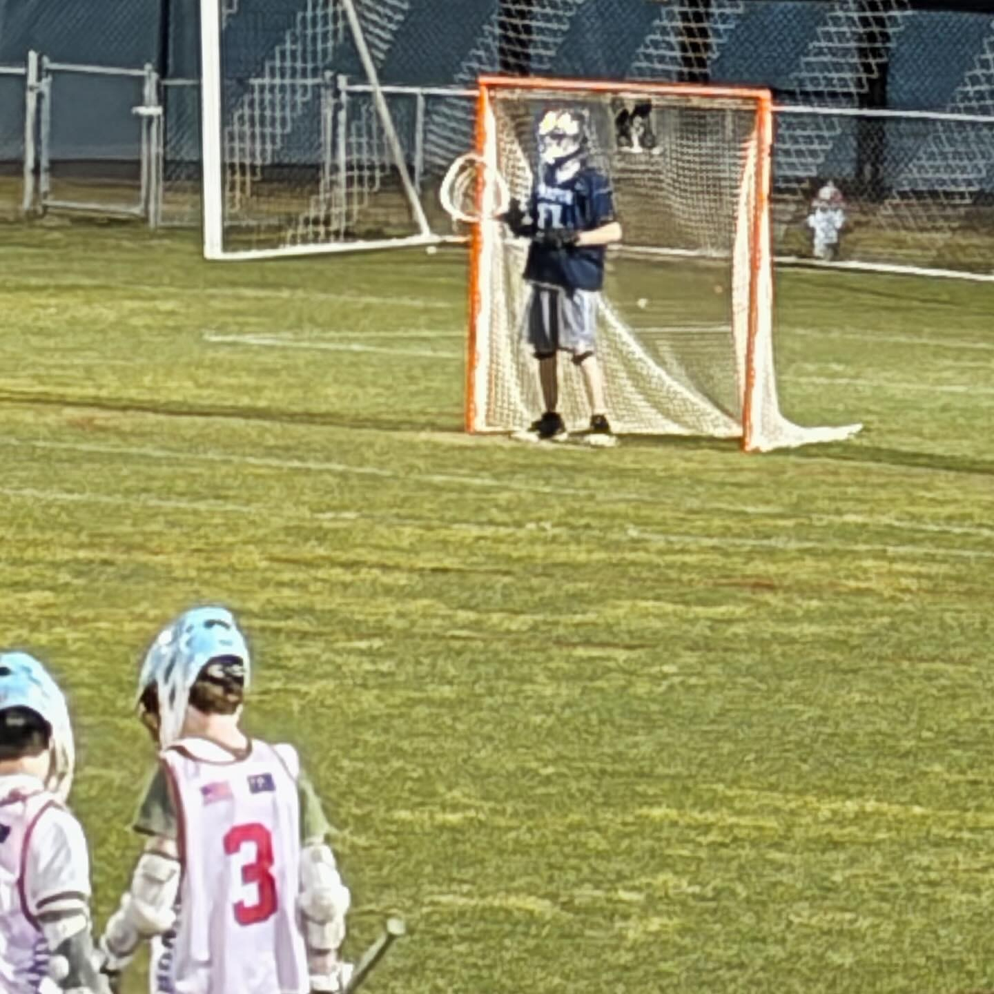
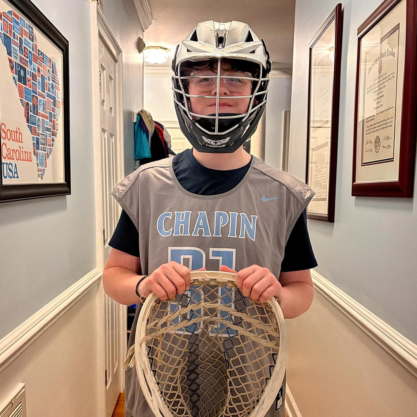
Proud of this kiddo. Ryan’s worked incredibly hard the last year to make Chapin’s JV team as a goalie. Late last night, we found out he made the team. And today, he got his new uniform. Excited for the season ahead.
Went for a stroll around Mungo Park (which happens to be in our backyard). Sun is out, but there is still lots of beautiful snow-covered terrain.

The trails at Mungo Park are great in the snow.

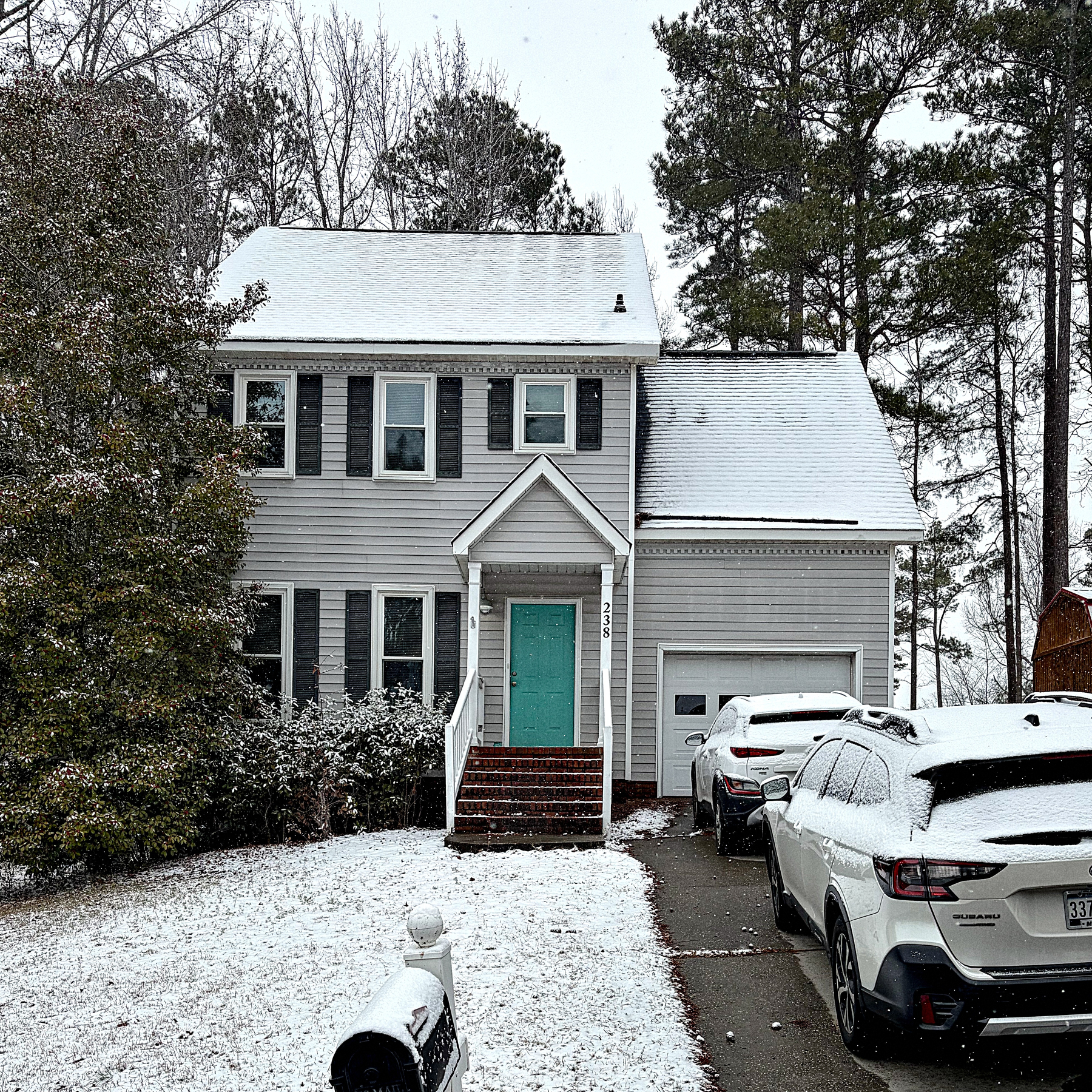
Snow is falling steadily here in Columbia.
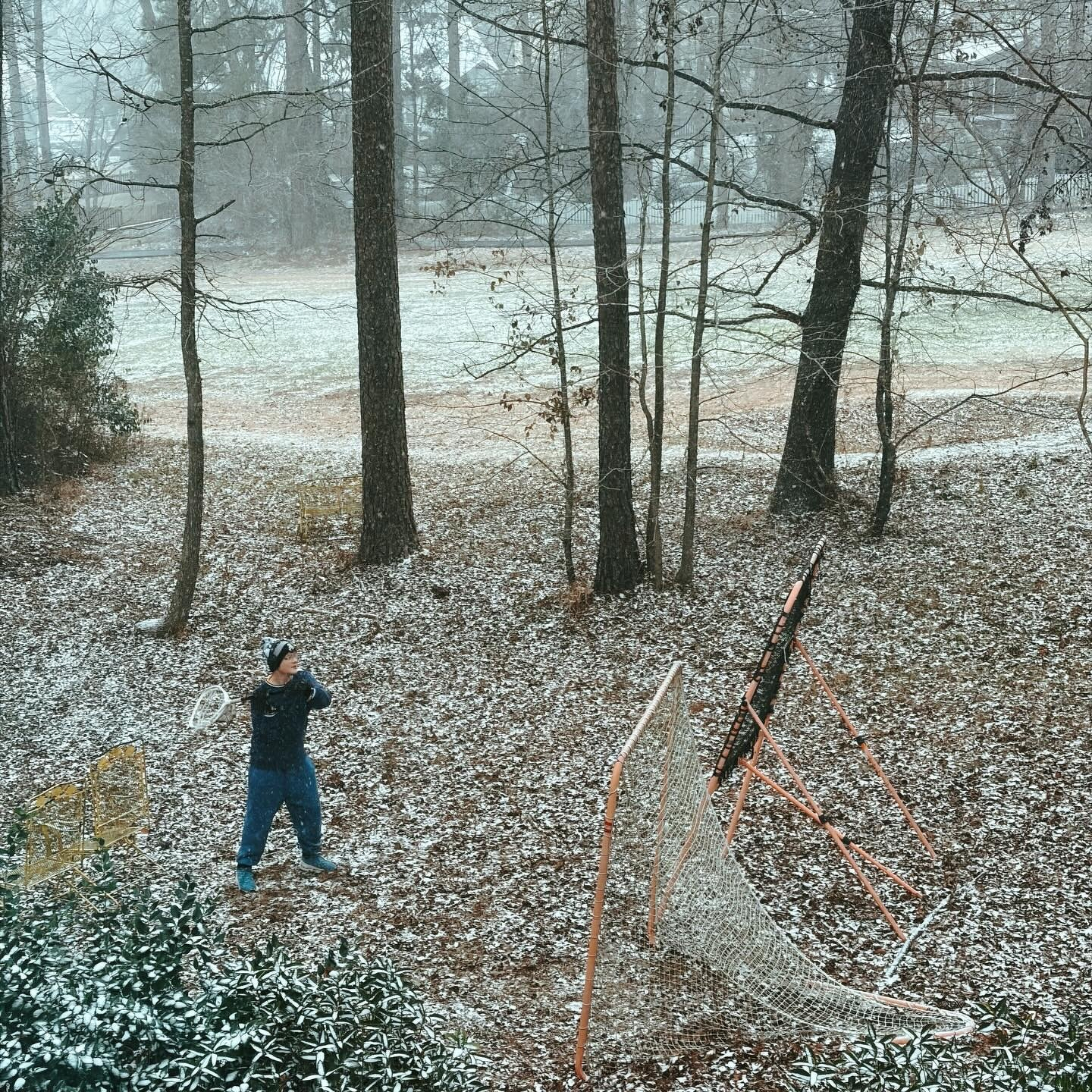
When lacrosse tryouts are next week and you get a freak snowstorm, you hit the bounce back before the snow really starts to fall.
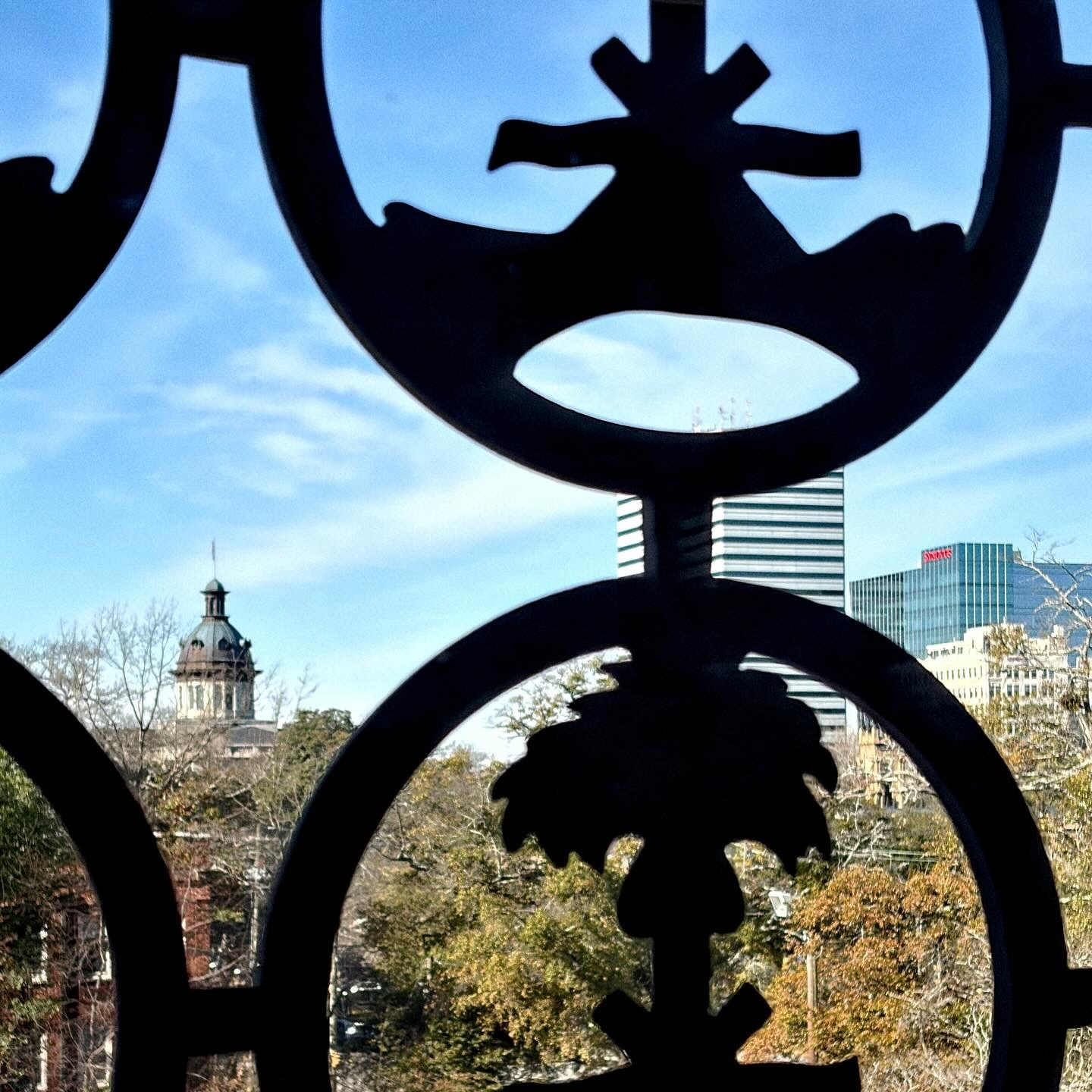
Realized I hadn’t shared a picture from the window of my new office on the third floor of the old State Archives Building. The Palmetto Tree screens are over all of the windows, but I can see the Statehouse dome clearly from my chair.
1/25/26 • 1 min read
I recently created a couple of new fonts over on Fontstruct: SbB Crunch’d and SbB Papaya 26.
SbB Crunch’d is a little random. Normally when I start working on a type design, I have an idea of how it will be used. In this case, I started with the shape of the “scalloped edges” and built out the font from there. I like how it turned out, even if I have no idea how I’d use it in a layout.

Last year, I built a font based on the numerals on McLaren’s F1 livery. The new SbB Papaya 26 updates the font to align with the look of the 2026 preseason McLaren social media graphics. Compared to my original interpretation, the 2026 font is a little more conservative and more readable.
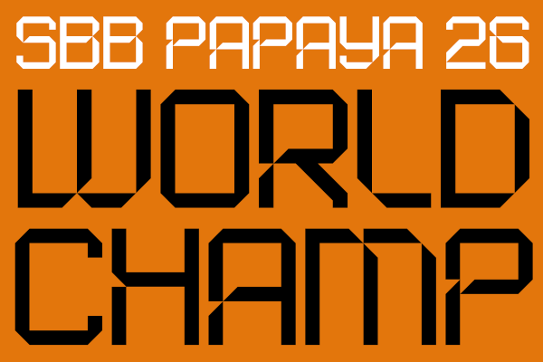
You can download SbB Crunch’d and SbB Papaya 26 at Fontstruct with a free account.
Bob Wertz is a type designer, Ph.D. student and researcher living in Columbia, South Carolina. He’s been blogging since 2008.
1/24/26 • 2 min read
I shared a post earlier today about Honda’s logo change and included two inline links to connect something I wrote in 2024 with a recent press release. Micro.Blog posted it to my site, and then crossposted it to Bluesky, Threads, and Mastodon. Here’s how it looked on the Micro.Blog timeline:
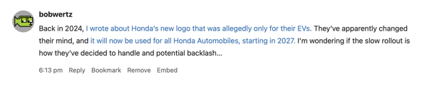
Including multiple links is how the web works, but I know that’s not how social media typically works. So how did other services render the two links?
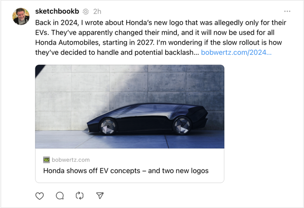
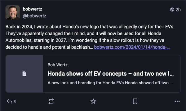
Threads and Mastodon take the typical social media approach. They only shared the first link, and instead of it being an inline link, it was in a box below the post.
Threads:
Mastodon:
Bluesky, however, handled it perfectly, including both inline links. I was pleasantly surprised:
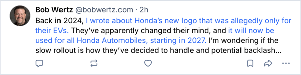
In this case, the links were just to provide background for anyone that wanted it. To share two links using the social media approach, I’d need to post the first link and then follow up with a comment and second link. In my opinion, that approach puts way too much emphasis on the links.
Hopefully, these newer social media sites will realize that communication is more clear when they allow basic HTML including inline links. And while they are at it, these services should allow basic formatting like bold and italic. Availability of basic formatting is one thing I really like about Micro.blog, and it really does enhance the reading and writing experience.
Bob Wertz is a type designer, Ph.D. student and researcher living in Columbia, South Carolina. He’s been blogging since 2008.
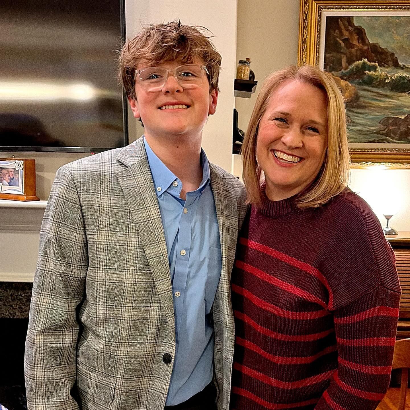
Ryan ready for 8th grade semiformal.
I love the beach in winter. A few shots from Isle of Palms this weekend.