Two new typefaces for my 50th birthday
Yesterday I turned fifty. And to celebrate, I released a typeface for free. SbB Nineteen 75 is a fun little faux-stencil display font that is available for free. I had also planned to release a commercial font, but the scheduled release on MyFonts hasn’t happened yet. SbB Certiphica is my blackletter-inspired font that you will soon be able to purchase at MyFonts.
UPDATE: SbB Certiphica is finally available on MyFonts.
SbB Nineteen 75
Many people won’t pay for fonts — even professional designers. There are so many typeface designs all over the web that you can find with a quick Google search. Many of them aren’t fully featured. Some are pirated. Software like Canva offers many excellent default options. Google Fonts and Adobe Fonts provide high quality options. So I understand why people hesitate to pay for quality type. There is, however, a vast marketplace of unique designs out there and I encourage you to explore beyond what’s already in your font menu.
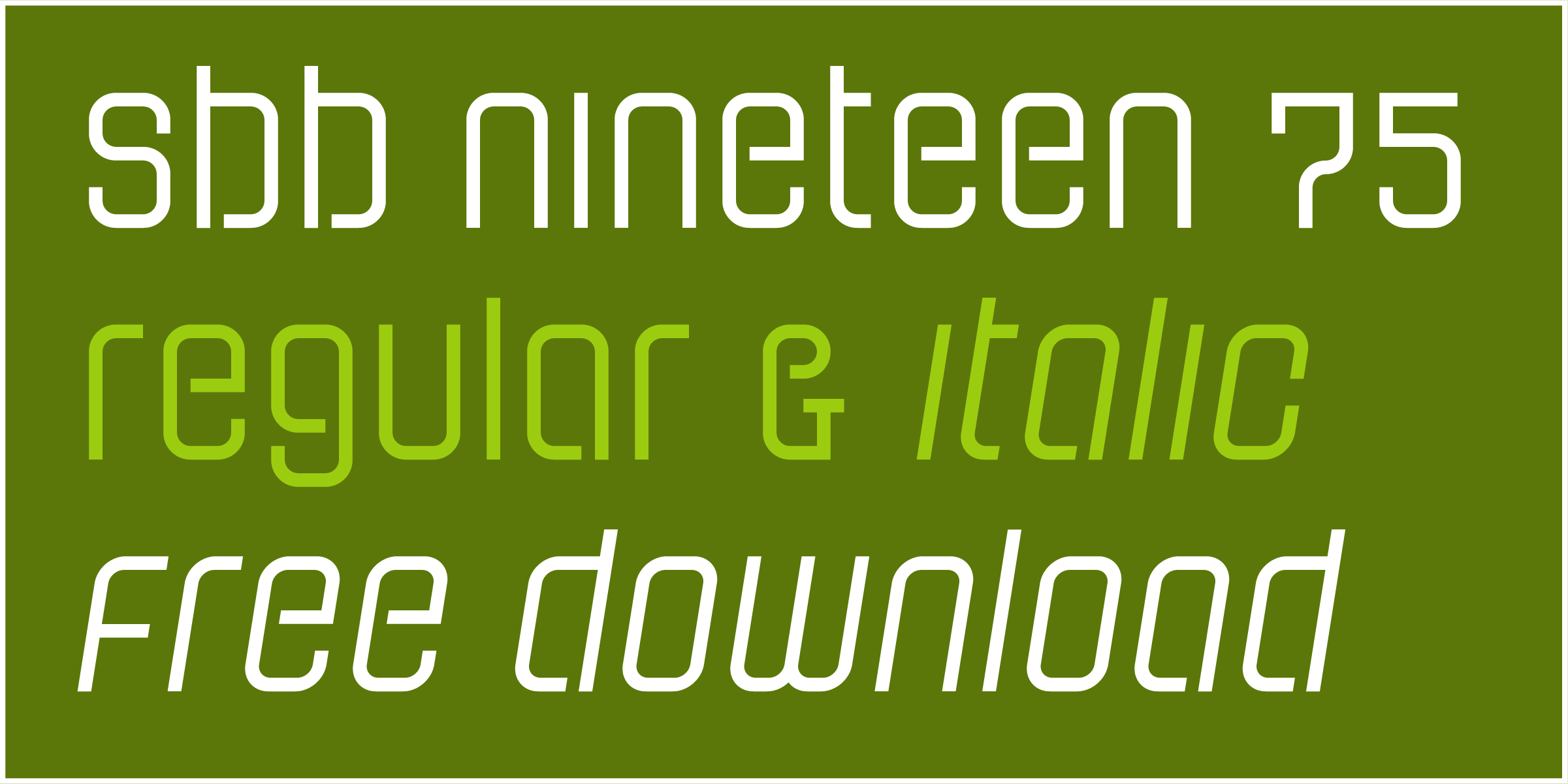
I decided that I wanted to offer a typeface for free in honor of my 50th birthday that had some fun OpenType features. That free font is SbB Nineteen 75. It started life as a random Fontstruct prototype that I felt like would benefit from some additional development in Glyphs. I rebuilt it from the ground up and added an italic version, as well as some fun Opentype features — stylistic alternatives, discretionary ligatures, and a set of random icons.
The end result is a curvy faux-stencil with a vaguely 1970s feel – completely appropriate since I’m celebrating my 50th birthday and I was born in 1975. Why faux-stencil? I channeled some stencil design elements, but it wouldn’t work practically as a real stencil font. (Plus I skipped the stencil cuts on a couple of letters like O and Q because they were more readable without.)
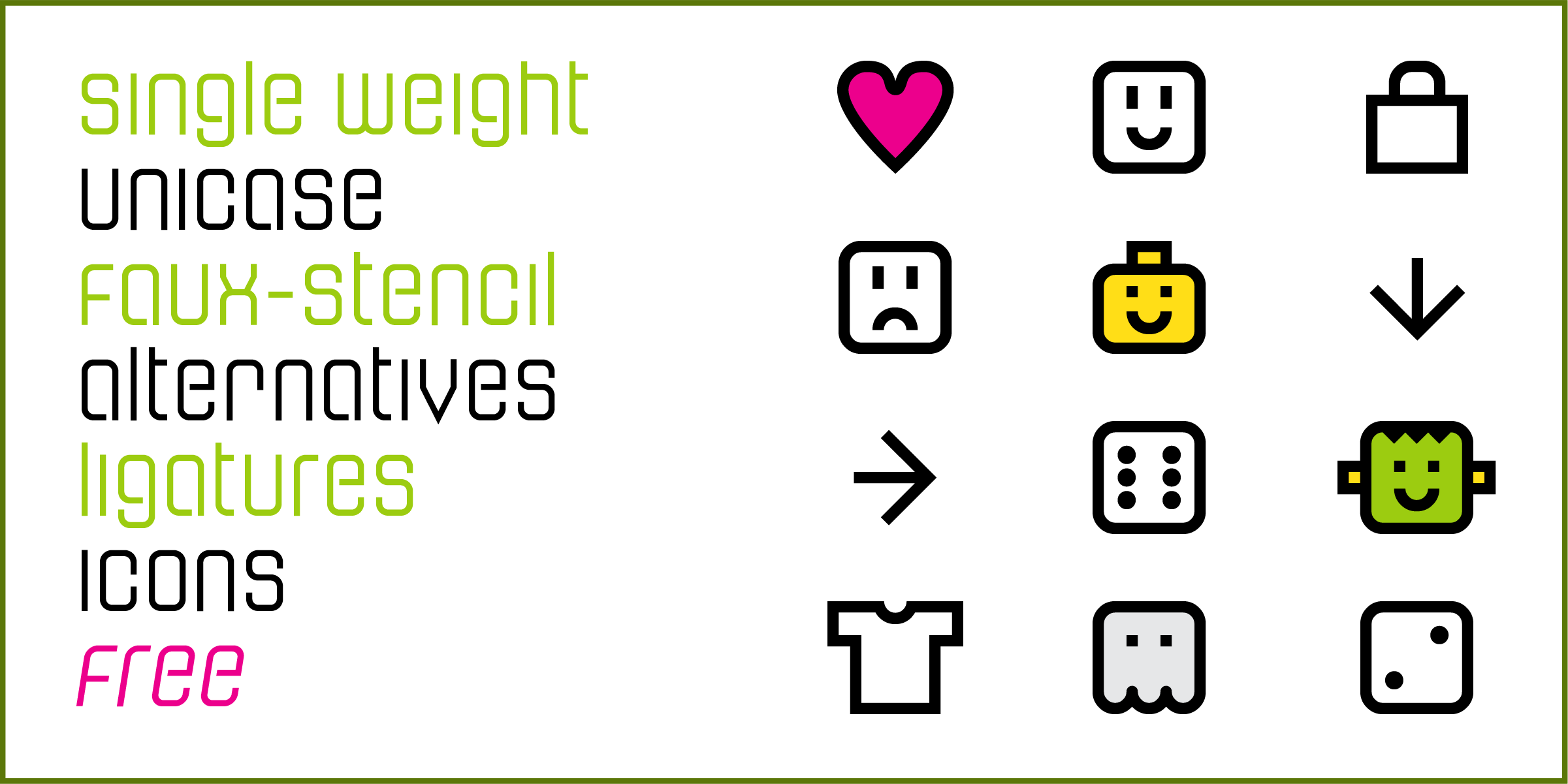
The font is also a unicase design with the same upper and lower case. I’ve become slightly obsessed lately with unicase designs, especially ones that draw more from the lower case. I’ll probably need to write a blog post about that, but I’ll save it for another day.
The stylistic alternatives give some options for a handful of letters. The design of the letter t led to some interesting ligature designs. And I threw in a few fun icons of limited use. I have no idea who will use “Happy Frankenstein,” but I think he’s hilarious and it’s my birthday.
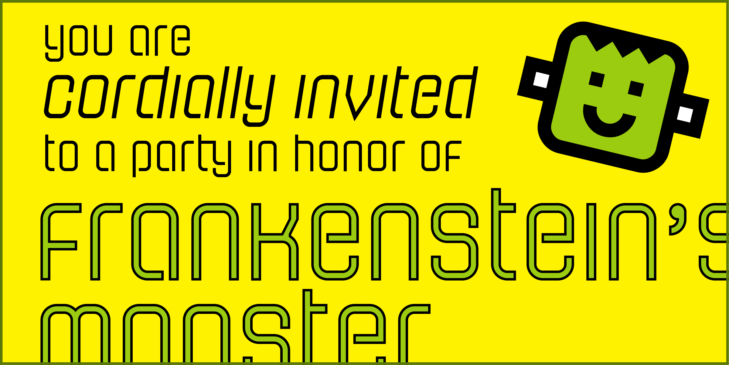
I wanted this font to actually be free so I chose to license this design under SIL Open Font License, version 1.1. Basically it allows you to use it in any project, personal or commercial. You can modify it and redistribute it as long as you offer it on the same terms. I’ve reserved the name SbB Nineteen 75, but other than that, it’s free to use. You can download your free copy at SbB Fonts.
SbB Certiphica
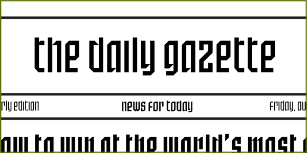
I’m always baffled at the range of uses for blackletter typefaces — from heavy metal bands and newspapers to tattoo parlors and college diplomas. A true blackletter is defined by a calligraphic stroke, and SbB Certiphica isn’t really that. Instead, it takes inspiration from the boldness and compression of blackletter designs to create something modern. It’s a great option for a certificate or diploma where you want the feeling of a blackletter, but without the hundreds of years of baggage.
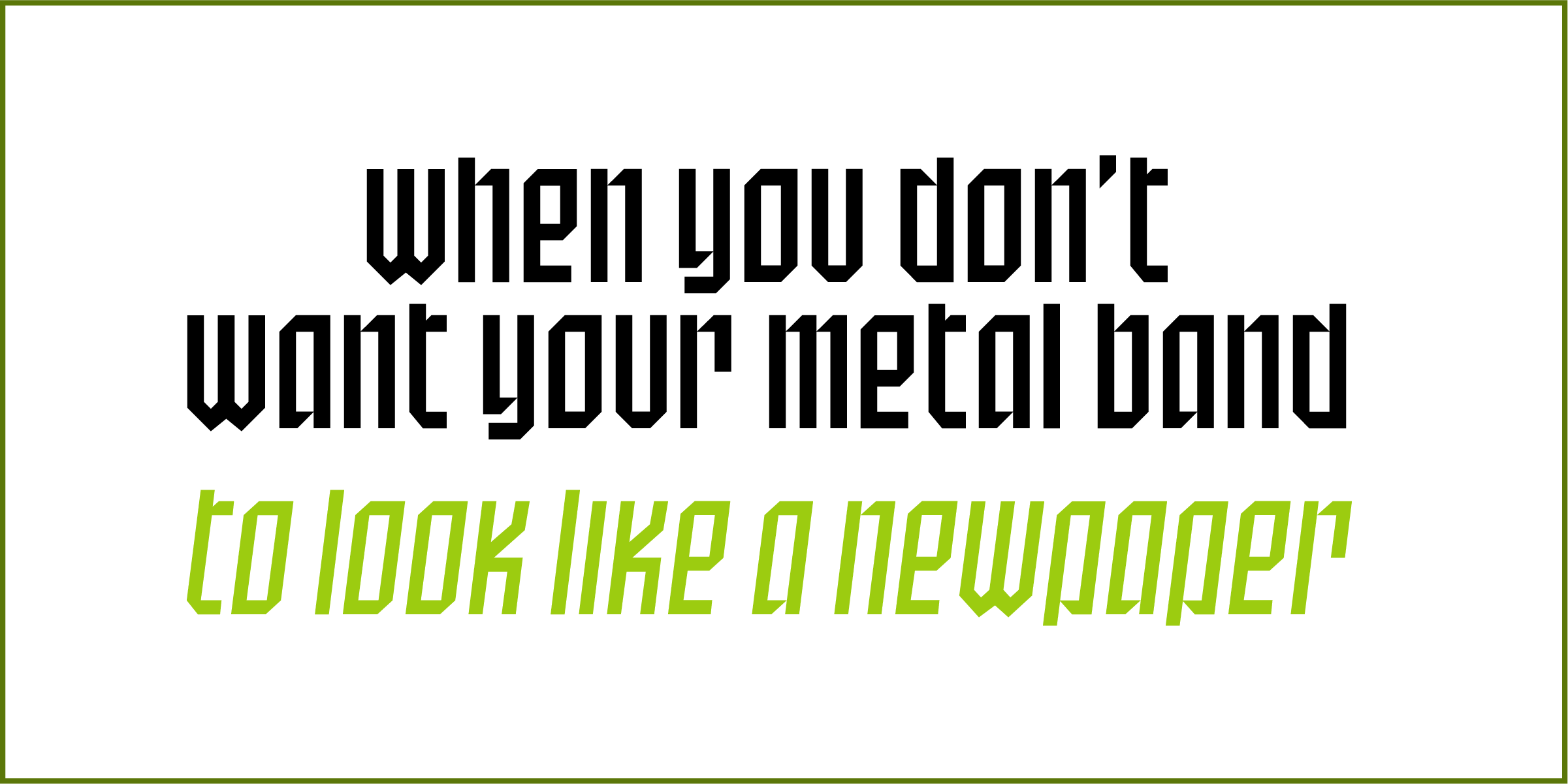
SbB Certiphica comes in three widths and three weights, with an italic version of each. 18 fonts in all. The design is unicase, meaning the upper and lower case are the same.
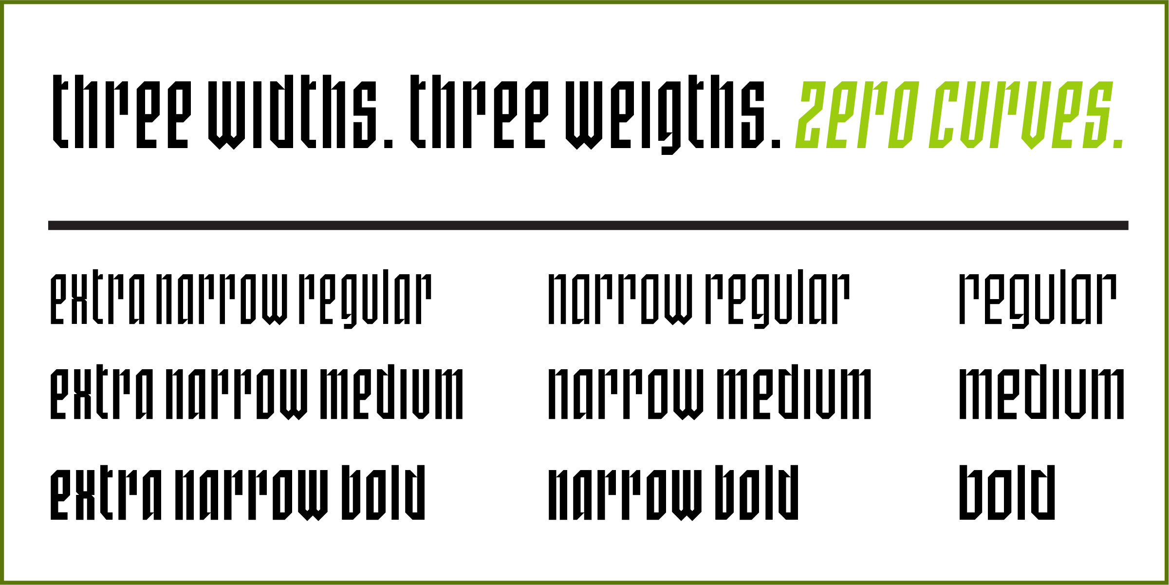
The ascenders and descenders are very short, meaning that you can use extremely tight line spacing to get a dense block of text. When you purchase the family, you also get the variable font that allows you to dial in the exact width, weight and slant that’s perfect for your project.
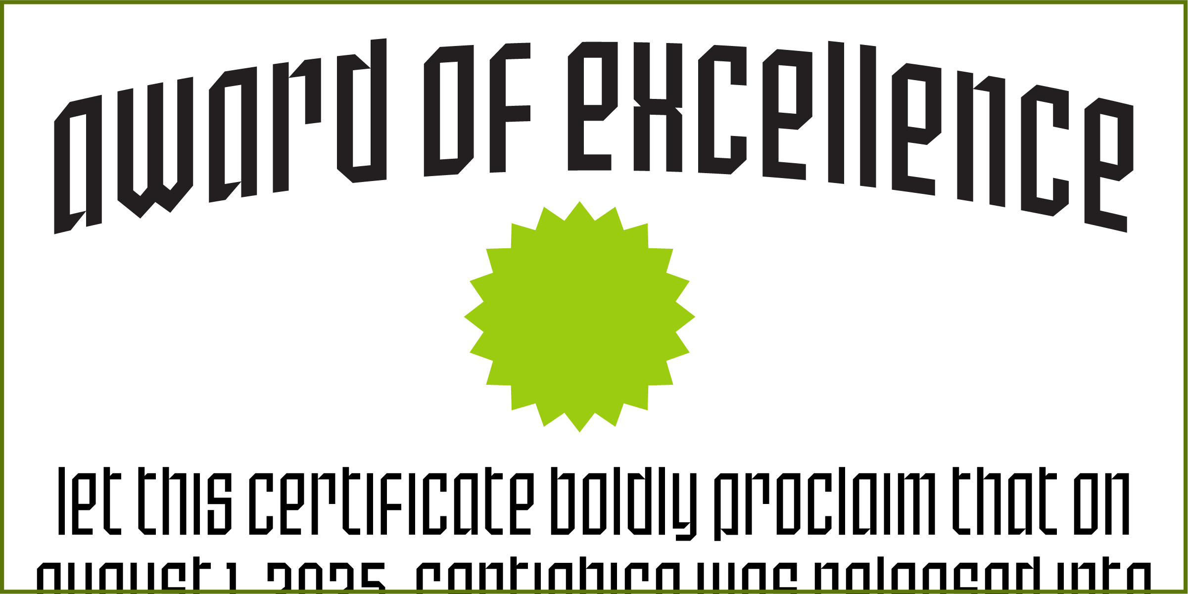
I’m really happy with how Certiphica turned out and hope you all like it, too. I scheduled it to release on Friday on MyFonts, but that didn’t happen for some reason. I’ll update this post when it is available.1 The best deal is to get the entire set plus the variable font for $49.
Hope you enjoy SbB Nineteen 75, and if you are in the market for a blackletter-inspired display typeface, check out SbB Certiphica.
Bob Wertz is a type designer, Ph.D. student and researcher living in Columbia, South Carolina. He’s been blogging since 2008.
-
It was scheduled to be released on August 1. In retrospect, I should have just had MyFonts release it when it was ready a week ago… ↩︎