This post was originally posted on April 28, 2014 on Sketchbook B. It’s reposted here as part of a project to move some of my favorite writing to my new site.
Last week, Apple reported that they had sold more than a few truckloads of iPads. Of course, some Wall Street types weren’t impressed. Which led some tech writers to question the iPad’s future, Apple’s innovation, Tim Cook’s leadership style, Steve Jobs’ legacy and Jony Ive’s accent. (You can catch up here.)
Which got me thinking about my iPad and the fact that it’s the least critical computer I own.
I say this as someone who loves their iPad. I’ve got a first generation iPad mini. The non-retina one. I use it regularly. But it’s one of three machines that I own. I’ve got a MacBook Pro and an iPhone, too.
My MacBook had a hard drive failure recently. I repaired it within hours. If my iPhone was lost or stolen, I’d be at the Verizon store quickly. And if something happened to my iPad… well… I’d wait to replace it. I would miss it. I prefer the iPad for several daily tasks, but it doesn’t serve a critical function for me. I can live without it.
I don’t see this as a problem with the iPad, though. It’s a testament to how useful the iPhone and MacBook are. I need the MacBook for Creative Cloud and type design software. I need my iPhone for phone calls, messaging and taking pictures. And I use the iPhone as the network connection for my iPad and MacBook when I can’t get reliable wifi.
Not too long ago, I had a desktop and a laptop. Laptops were slow and underpowered. The screens were too small. You had a laptop for convenience, but you had a desktop to get things done. Over time, laptops improved. They got faster and had better screens. The prices came down. Battery life improved. I used the laptop more and more. And when it was time to replace my desktop, I didn’t. I bought a new laptop.
So all this chatter about whether the iPad has lost momentum? Give it time. These type of transitions take a long while.
I believe that the iPad can replace a laptop for many people. Personally, I have specific software that I want to use. It will be a long, long time before an iPad can run the design software that I need. But someday, I could see my kids with tablets as their primary computers instead of laptops.
I can confidently say that today, my iPad isn’t as critical to me as my iPhone and my MacBook. I’m not sure, however, that will be true in 5 to 10 years.
This post was originally posted on April 26, 2014 on Sketchbook B. It’s reposted here as part of a project to move some of my favorite writing to my new site.
The oldest advice about photography is still the best. A “fast 50” is the cheapest, best lens. On your inexpensive DSLR, 50mm is a portrait lens, which means it’s good for taking pictures of people—which are the only pictures anyone cares about.
It’s a good collection of sensible advice and you should absolutely read it… especially if you are a designer that ends up having to take a lot of pictures.
A couple of comments:
His recommendation to buy a fast 50mm lens is a great one. Yes, zooms are convenient, but shooting with a faster lens is wonderful, especially if you can use natural light and not use a flash. Plus, the 50mm lens is affordable.
I wouldn’t throw away the kit zoom. But lens quality does matter.
Yes, shooting in RAW is worth the extra file size. If you want great results, shoot in RAW.
He mentions that Lightroom will cost you about $100. But if you have Creative Cloud, it’s one of the apps that Adobe included in the subscription.
When I first started shooting, a 50mm lens was always included when you bought a camera. Now, it’s all about zooms. I’m planning on upgrading my camera system soon and I’ll definitely take some of Stu’s advice.
This post was originally posted on April 24, 2014 on Sketchbook B. It’s reposted here as part of a project to move some of my favorite writing to my new site.
In the early 1980’s, we lived in a slightly mountainous area of North Carolina. And our community had an early version of cable. The cable box on our TV has 13 push buttons, each representing a different channel.
Among those 13 channels were WOR (New York), TBS (Atlanta) and WGN (Chicago). In the early 80’s, all three channels had contracts to carry baseball games. WOR had the Mets, TBS showed the Braves and WGN aired the Cubs games. This is pre-ESPN, so your other option was to catch a random Game of the Week broadcast on one of the networks.
I loved baseball. I’d come home from school and turn on the TV and try to find a baseball game. And more often than not, there would be a Cubs game on. Why? Because Wrigley Field didn’t get lights until 1988. All home games were day games. The Braves and Mets played a bunch of night games so even though I saw some of their games, I didn’t develop the same connection that I did with the Cubs.
(Geographically, it would have made sense for me to be a Braves fan. We weren’t too far from Atlanta. But at the time, they were in the NL West division and played a bunch of night games on the West coast. So those games started after my bed time.)
I fell in love with Wrigley Field, Harry Carey, Ryne Sandberg and “Take Me Out to the Ball Game” during the seventh inning stretch. And then we moved to Chicago and my die-hard-Cubs-fan status was cemented.
Wrigley Field turns 100 this week. And even though Harry Carey is no longer with us, Ryne Sandberg is the manager of the Phillies and Wrigley has lights, I still love my Cubbies.
This post was originally posted on April 23, 2014 on Sketchbook B. It’s reposted here as part of a project to move some of my favorite writing to my new site.
NOTE: While this page may have useful insights, be aware that it was published more than 10 years ago and may not be relevant for current software versions.
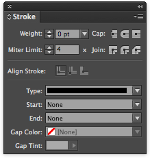
In the middle of the Stroke palette are the Align Stroke options.
InDesign lets you determine where the stroke is located on a box or shape. In the middle of the stokes palette is the “Align Stroke” option. By default, the stroke is centered on the path. So a 2 point line with have 1 point outside the box and 1 point inside the box.
With thicker strokes, the placement of the stroke really matters. Below are three boxes that are drawn to be exactly the same size. The only difference is the alignment of the stroke.
These three boxes are the same size. Only the alignment of the stroke varies. From left to right: Inside, Centered, Outside.
It’s helpful to use these settings when you are trying to get precisely measured shapes. I use the inside alignment option all the time.
This post was originally posted on April 15, 2014 on Sketchbook B. It’s reposted here as part of a project to move some of my favorite writing to my new site.
NOTE: While this page may have useful insights, be aware that it was published more than 10 years ago and may not be relevant for current software versions.
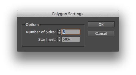
Stars and polygons are easy to build in InDesign. Most people, myself included, set the angles and number of sides by double clicking on the Polygon tool. Which brings up a dialog box allowing you to set the number of sides and star inset percentage.
But let’s say you want to change the number of sides or the star inset angle while you are drawing the shapes? Easy. Start to draw the shape. Press the spacebar and then use the arrow keys to adjust the shape without opening the dialog box. Right and left arrows change the angle of the star inset. Up and down changes the number of sides.
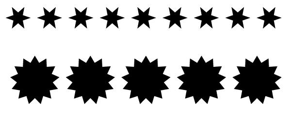
**But here’s the really awesome tip.**Start to draw a star or polygon. Don’t push the space bar like you did above. Simply push the arrow keys right or left. InDesign creates a horizontal line of identical shapes. If you use just the up and down arrows, the shapes form a vertical line. Or use both sets of arrows and create a grid of shapes.
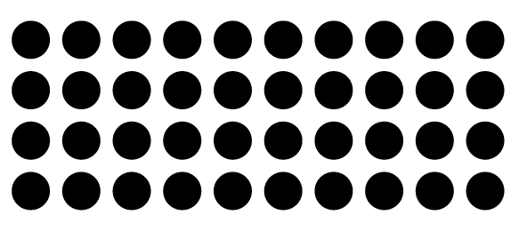
Even better, the grid tip also works on rectangles and circles, too. It’s magic.
A couple of rows of shapes created with the arrow keys.
A grid of circles created using the arrow keys while drawing.
FYI: The spacebar acts like a toggle. So you can easily switch between the two modes.
This post was originally posted on April 9, 2014 on Sketchbook B. It’s reposted here as part of a project to move some of my favorite writing to my new site.
NOTE: While this page may have useful insights, be aware that it was published more than 10 years ago and may not be relevant for current software versions.
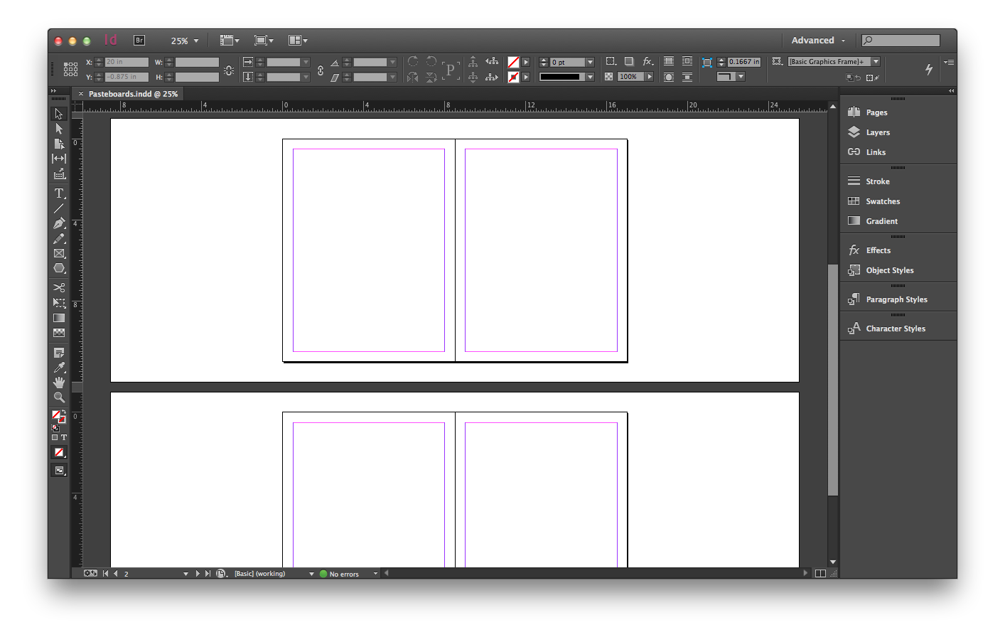
The InDesign pasteboard is narrow on the top and bottom and wide on the sides. But it can be changed. Before…
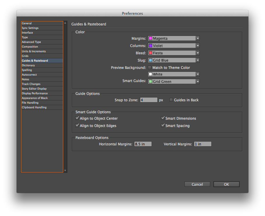
Go to InDesign > Preferences > Guides & Pasteboard… and change the “Pasteboard Options” at the bottom of the preference screen.
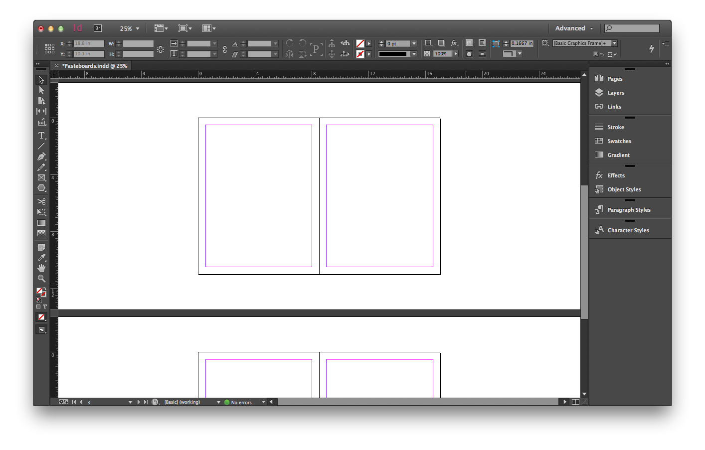
Change the horizontal margins to 10 inches and the vertical margins to 2.5 inches and it looks a little different…
I’m not sure how often I’ll change the margins. The defaults have always worked pretty well for me. But especially on large format designs, it will be nice to have the option.
This post was originally posted on April 2, 2014 on Sketchbook B. It’s reposted here as part of a project to move some of my favorite writing to my new site.
NOTE: While this page may have useful insights, be aware that it was published more than 10 years ago and may not be relevant for current software versions.
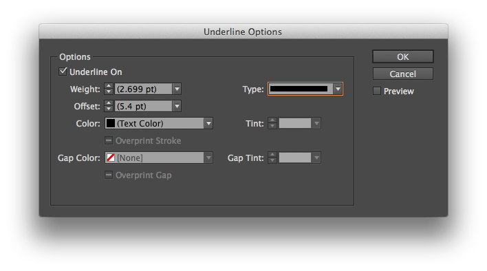
I don’t typically underline much. I usually don’t like the default thickness of the line or the positioning. But in InDesign, you can completely customize your underline styles.
To change the appearance of an underline, select some text. Go to the flyout menu on the far right of the Control palette. (That’s the wide palette docked by default underneath the menu bar.) Choose “Underline Options….” from the menu to pull up a dialog box:
Change the weight, stroke style, positioning and color of the underline.
You can easily change the appearance of the underline – the thickness, positioning, color, stroke style and more.
Two additional tips:
If you have created a custom stroke, you can use it as an underline too. (See last week’s tip for how to create a custom stroke pattern.)
You can save “Underline Options” in a paragraph style to apply it throughout your document. And you can save style sheets and load them into other files.
This post was originally posted on March 29, 2014 on Sketchbook B. It’s reposted here as part of a project to move some of my favorite writing to my new site.
I had one of those geek out moments with a client this week. I mentioned that I typically drink a cup of Earl Grey tea each morning. To which he responded: “Tea. Earl Grey. Hot.” After we stopped laughing, we had to explain Captain Picard’s obsession with Earl Grey tea to some confused coworkers.
Afterwards, I had to come to the realization that a TV show that aired in 1987 affects my behavior today.
I was in middle school when the fictional Star Trek captain first ordered his beverage of choice from the replicator. At the time, we had hot tea in the house, but it was Mint or Lemon-flavored. I mostly would drink it when I was sick. But there was no Earl Grey that I remember.
Star Trek: The Next Generation ran for a long time and still runs in syndication today. I’m not sure when I started to drink Earl Grey, but it was sometime during or just after college. I’m sure I decided to buy some tea and when faced with too many options, I simply went with the option I “knew.”
It makes me wonder just how many other choices I’ve made are directly or indirectly traced back to television and media. I know I have a slight Nike bias because I grew up in Chicago during the Michael Jordan years. But other than Earl Grey and an affinity for Nike, I can’t think of any other long lasting influence that a show or movie has made on me. I’m sure there are many more but I can’t piece them together right now.
That said, I really like my Earl Grey tea. And I’ll happily have a cup every morning. But I’ll probably never think of it the same way again.
Bob Wertz is a creative director, type designer, Ph.D. student and researcher living in Columbia, South Carolina. His blogging journey started in 2008 with a Squarespace hosted blog.
This post was originally posted on March 26, 2014 on Sketchbook B. It’s reposted here as part of a project to move some of my favorite writing to my new site.
NOTE: While this page may have useful insights, be aware that it was published more than 10 years ago and may not be relevant for current software versions.
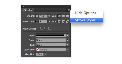
Need to build a custom stroke in InDesign? Easy. Go to the flyout menu on the Stroke palette and choose “Stroke Styles…”
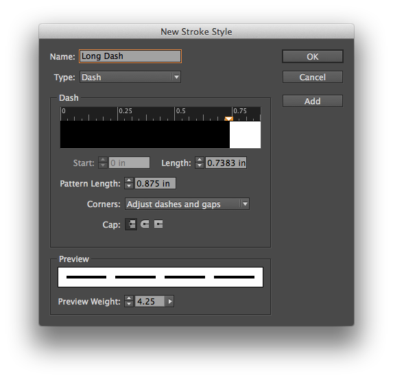
A dialog box will open with several options and a list of custom strokes. Choose “New…” to get the stroke editor. You can make dashed, dotted or lined patterns, change the length and pattern of the stroke and preview your designs at different weights.
InDesign provides lots of options for designing custom strokes.
The custom strokes are saved on a document level, but you can save your designs and load strokes into other documents. If you want a custom stroke to be added to all new documents by default, simply add the stroke with no documents open.
This post was originally posted on March 12, 2014 on Sketchbook B. It’s reposted here as part of a project to move some of my favorite writing to my new site.
NOTE: While this page may have useful insights, be aware that it was published more than 10 years ago and may not be relevant for current software versions.
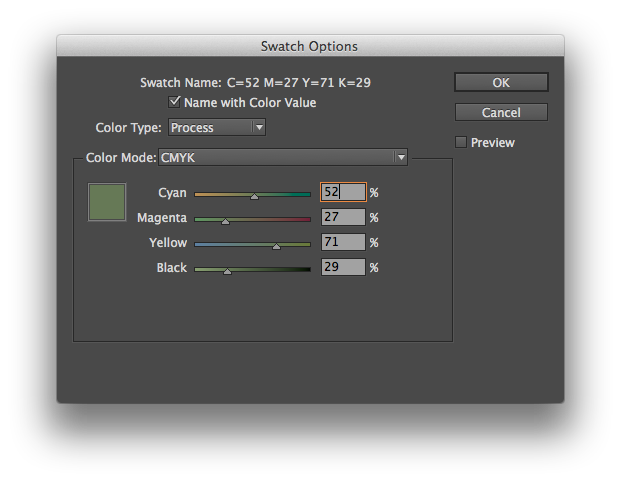
In InDesign, you want to modify a color slightly, keeping it in the same basic hue. Maybe you’ve duplicated a color and need a slightly lighter or darker color to complement your design. You double click the swatch in the palette and you get this:
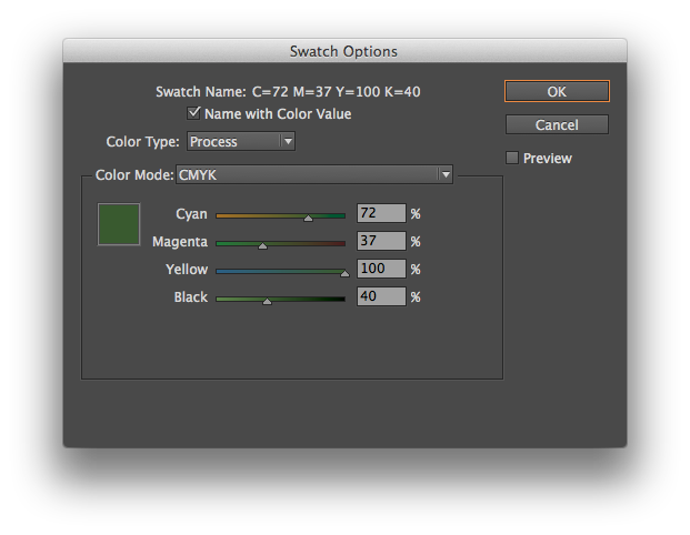
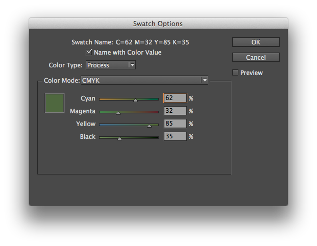
Moving the sliders individually will radically alter the color. You need to move all the sliders at once, keeping them in proportion. And InDesign has a way to do this. Simply hold down the shift key as you click and drag the sliders. They will all move together:
Look at the numbers in the screenshot above. I simply clicked on the Cyan slider and moved it to the left while holding down the shift key. All of the sliders moved in proportion. Cyan went from 72% to 62%. And the other colors moved, too. Here’s another screenshot where I’ve moved the Cyan slider to 52%:
And the same trick works in Illustrator, too. Just hold the shift key to move the Color palette sliders together. It’s a simple and powerful way to adjust your color palette.
This post was originally posted on March 5, 2014 on Sketchbook B. It’s reposted here as part of a project to move some of my favorite writing to my new site.
Many designers think they are bad at math. Thankfully, InDesign is good at math.
Input fields in InDesign can do simple math. For example:
Addition, subtraction, multiplication and division. Have a box that is 4.25 inches wide and you want it to be 1 inch wider? Just type “+1” after the curent measurement. Need to resize a box to 1/3 the current width. Type “/3” behind the measurement in the width field.
Conversions. InDesign will also convert measurements for you. If your document is set up for picas and you need to input a measurement in something other than picas, just type the measurement AND the unit of measure (for example, “7 in” or “3 mm”) and InDesign will convert it to picas. This works for lots of different units – inches, millimeters, centimeters, points and more. You can even do addition or subtraction between numbers with different units of measure and InDesign will figure it out for you. For example, typing “7 in + 3 pts” will yield 7.0417 inches.
Enjoy. I’m sure this is a reminder for many of you, but I run across people everyday that don’t know that InDesign can do simple math. I typically use unit conversion and division a lot in InDesign. As a bonus, most Adobe apps have fields that can do math – not just InDesign. I use it in Illustrator all the time.
This post was originally posted on February 26, 2014 on Sketchbook B. It’s reposted here as part of a project to move some of my favorite writing to my new site.
NOTE: While this page may have useful insights, be aware that it was published more than 10 years ago and may not be relevant for current software versions.
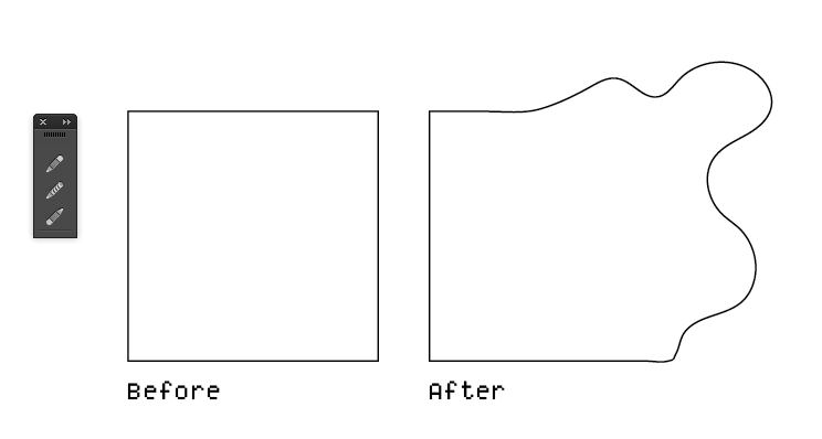
Here is my first Wednesday Quick Tip for Adobe Illustrator. Using the pencil tool, you can quickly reshape any path. Select the object that you want to edit. Then using the pencil tool, draw a new shape for the path. You MUST start drawing on (or very close to) the original path AND finish on the path.
Below is an example. I took a normal square and using the pencil tool, reshaped it into some half-blob thing.
Using the pencil tool, reshape an existing path.
If you are having issues with this tip, make sure that your path was selected before you started to redraw the path and make sure that you start and finish redrawing on or very close to the path.
While the example is somewhat extreme, it’s a very handy tip for polishing shapes or cleaning up rough edges.
This post was originally posted on February 19, 2014 on Sketchbook B. It’s reposted here as part of a project to move some of my favorite writing to my new site.
NOTE: While this page may have useful insights, be aware that it was published more than 10 years ago and may not be relevant for current software versions.
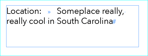
Let’s say you are working on a poster in InDesign and you have something that looks like this:
Wouldn’t it be great to line all that type up under the “S” in “Someplace…” Shown here with “Show Hidden Characters” turned on.
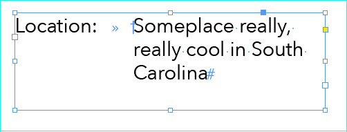
You want the text on the right to align neatly. There are lots of ways to accomplish this, but the easiest is the “Indent to Here” character. You find it under Type > Insert Special Character > Other > Indent to Here. (If you prefer keyboard shortcuts like I do, it’s Command - .) This awesome invisible marker wraps everything underneath it back to that character.
The “Indent to Here” character is signified by the cross symbol when you turn on “Show Hidden Characters.”
It’s handy when there is only one or two lines to do. With lots of lines or complex lists, there are, of course, better ways to handle the indent. I find that I tend to use it most often on posters, fliers or invitations.
This post was originally posted on January 29, 2014 on Sketchbook B. It’s reposted here as part of a project to move some of my favorite writing to my new site.
NOTE: While this page may have useful insights, be aware that it was published more than 10 years ago and may not be relevant for current software versions.
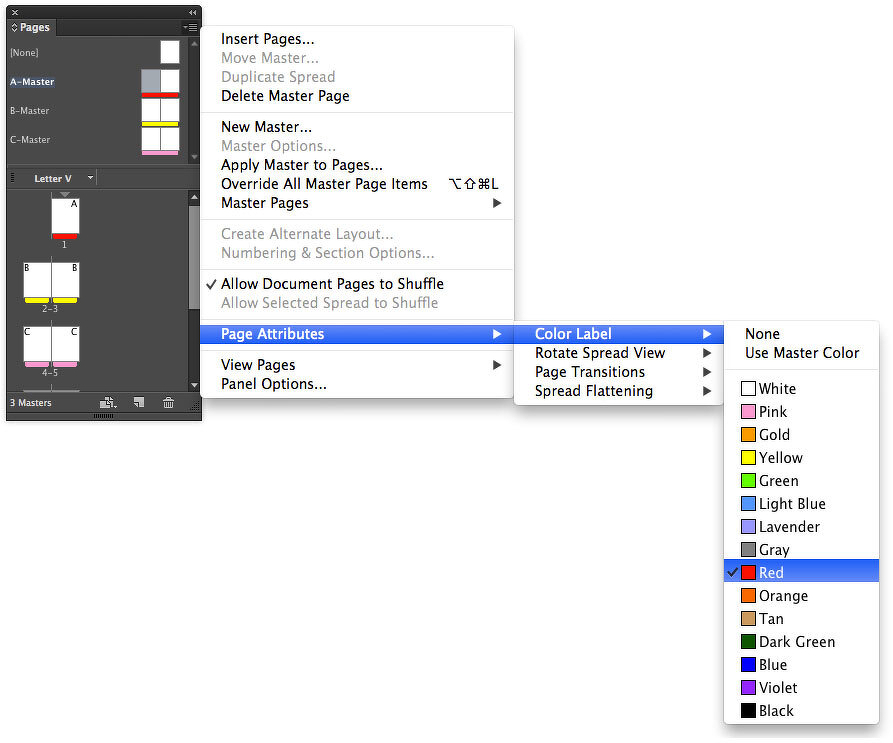
If you use master pages in InDesign, it can be difficult to see what master is applied to each page. But you can easily color code your master pages.
Buried in the Pages palette flyout menu (Page Attributes > Color Label) is a command to color code a page. When it’s applied to a Master page, it’s automatically applied to all of the pages that use that Master page. (Color coding can be applied to individual pages as well.)
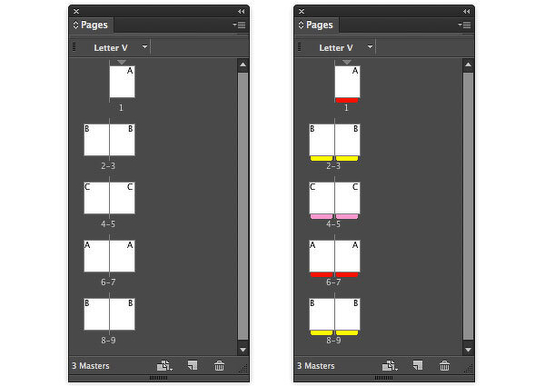
Selecting colors for each of your masters makes it much easier to see which master is applied to each page.
Before and after: It’s now much easier to tell which pages have master pages applied.
This post was originally posted on October 29, 2013 on Sketchbook B. It’s reposted here as part of a project to move some of my favorite writing to my new site.
My not-quite-two-year-old son dropped my laptop the other day after I left it unattended for a few minutes. The end result was an ominous clicking sound that I instantly knew meant the hard drive was gone.
I’m pretty serious about backing up. I have too many pictures of my children that I couldn’t stand to lose. In the end, I didn’t lose a thing. But I figured I’d reflect on the process and Apple’s pretty outstanding set up for recovery.
When my wife bought her MacBook Air this summer, I decided to purchase an Apple Time Capsule, too. It was hard enough for me to remember to plug my portable hard drive into my laptop for Time Machine to back up. I couldn’t imagine both my wife and I remembering. Time Capsule seemed like a good option for us.
I’ve never had to restore from a Time Capsule. And I’ve never had to restore after replacing a hard drive. My MacBook Pro is new enough, that it didn’t ship with system disks and instead supports Internet Recovery. Never done that before either.
(I’ll be honest. I was freaking out. Even though I knew I had backed up everything, I was still anxious to see all my files.)
iFixIt had great step-by-step instructions. I swapped the hard drive out after an adventure with Best Buy. (I’ll leave that rant for another blog post.) And started the Internet Recovery process. On restart, the computer lets you select your wireless network and then you download a slimmed down OS X that lets you boot up, use Disk Utility or restore from your Time Capsule. I formatted the new hard drive, found my Time Machine back up, clicked restore and waited.
It obviously took a very long while to download the contents of my old hard drive. I should have plugged the laptop directly into the ethernet port on the back of the Time Capsule to speed things up, but didn’t think of it until after the restore had started.
In the end, the upgrade process was as smooth as replacing a hard drive can be. Internet Recovery is slick and really helpful. Not having to hunt for old system CDs when you’re in a panic is great. And once you boot up in to Internet Recovery mode, you have all the options that you need.
As easy as the process is, I would imagine that a novice would still be completely intimidated by this. But if you back up regularly with Time Capsule, you can rest assured that your data is safe and someone will be able to help you recover it.
This post was originally posted on August 5, 2013 on Sketchbook B. It’s reposted here as part of a project to move some of my favorite writing to my new site.
A little math problem for you…
One 15-minute PowerPoint1 presentation has 5 slides. Another 15-minute PowerPoint presentation has 15 slides. Which presentation is shorter?
Obviously, both are 15-minute presentations. They are the same length.
But time and again, I talk to people who reduce the number of slides in their PowerPoint because they want to make the presentation “shorter.” They think that if they have fewer slides, they will talk for a shorter amount of time. Often, they don’t take material out, as much as they condense it on the remaining slides.2
That’s completely the wrong way to think about it.
Next time you have a presentation, think about how long you have to present and build your story to fill the allotted time. Then create an appropriate number of slides to support your presentation. You may have more slides and move through them quickly. Or only a handful of slides.
But remember that the length of your presentation has almost nothing to do with how many slides you have.
Bob Wertz is a creative director, type designer, Ph.D. student and researcher living in Columbia, South Carolina. He’s been blogging since 2008.
This applies to you even if you are using Keynote, Prezi or a PDF. ↩︎
I’ve seen people cut slides and have their presentations grow longer, rambling as they try to squeeze in all that they’ve “cut.” ↩︎
This post was originally posted on June 23, 2013 on Sketchbook B. It’s reposted here as part of a project to move some of my favorite writing to my new site.
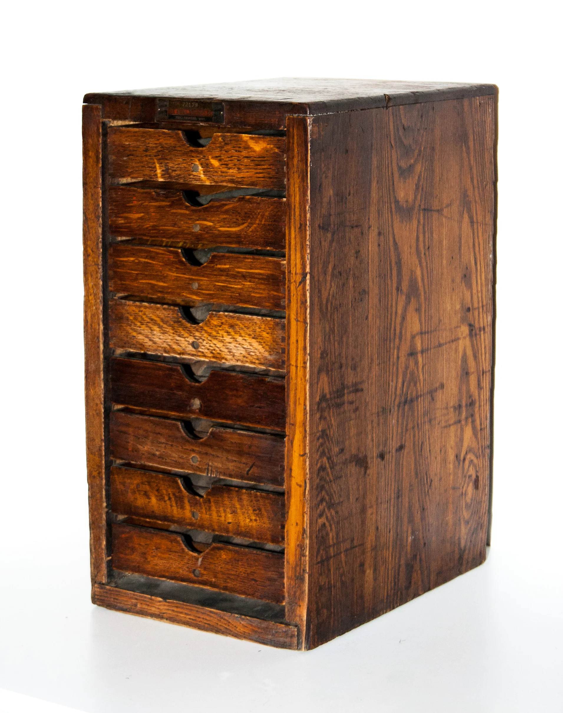
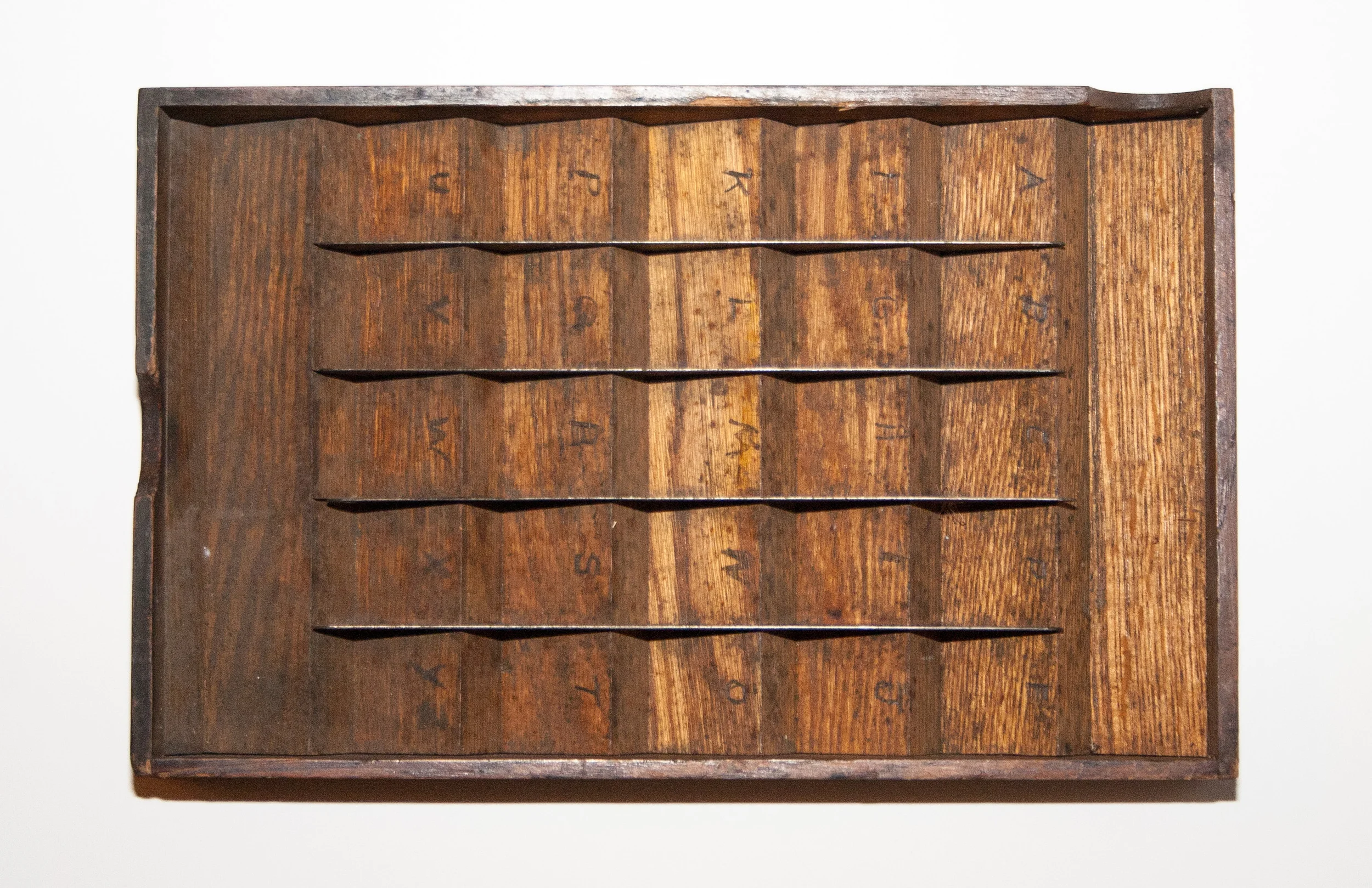
A small Hamilton type case
I’ve mentioned before that my dad is always on the lookout for type and printing antiques for me. Recently he found a small Hamilton type case. I’m familiar with large cabinets, but this case is much smaller. It’s about 17 inches high, 9 inches wide and 12 inches deep.
I did a quick google search and couldn’t find any other cases this size. I’m guessing this case was intended for a hobbyist. It would only fit a few small fonts of type. Hopefully I can find out some more about it…
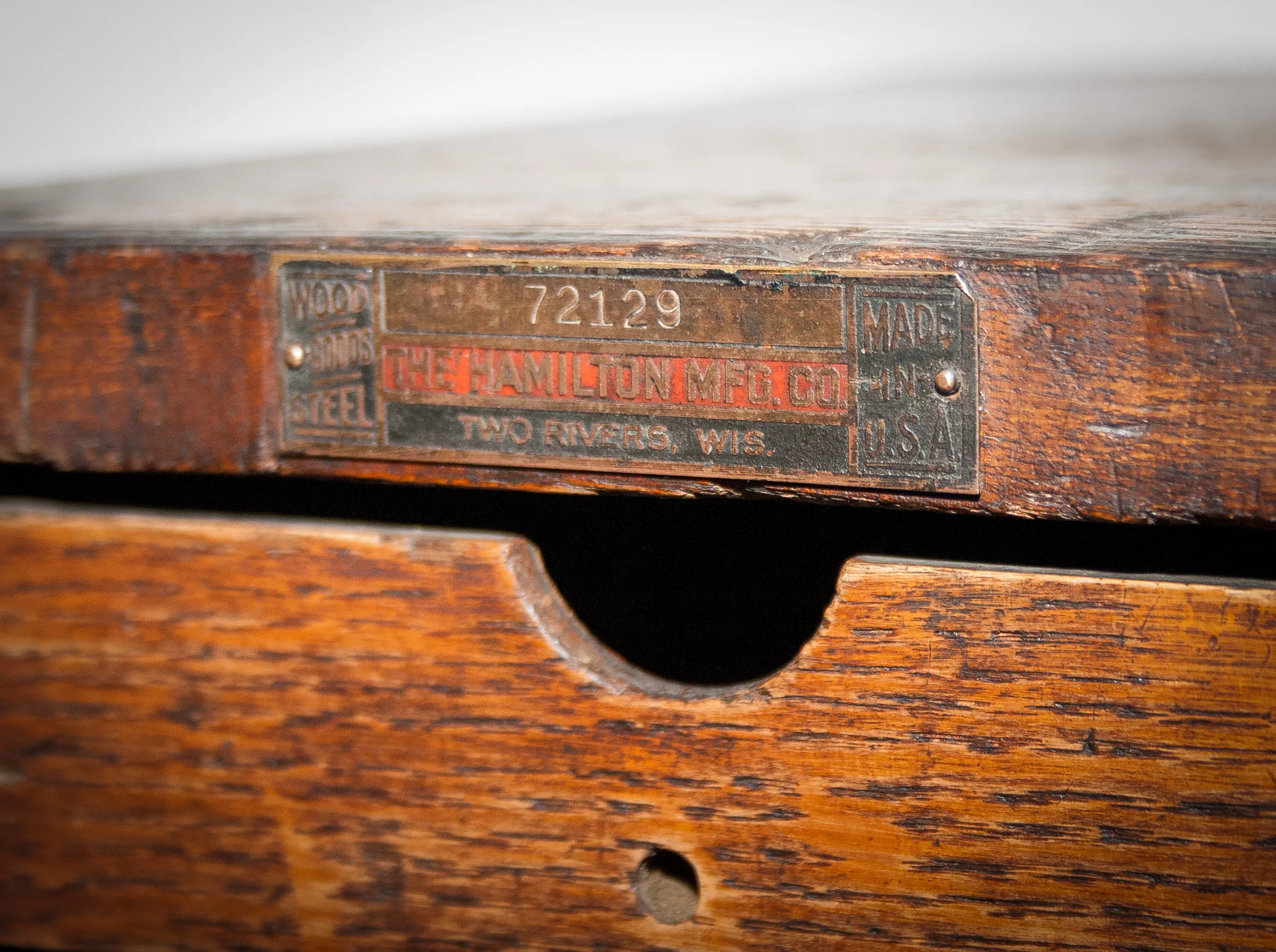
UPDATE! My friend Nikki Villagomez happened to run into some folks from Hamilton at HOW and asked about the case. The last two digits of the serial number indicates that it was made in 1929. Also, it probably wasn’t intended for type and was instead made to hold metal spaces used in typesetting. But they hadn’t actually seen a case like this before so they were just speculating. If you know more about this amazing find, post in the comments below.
Made in the USA by Hamilton.
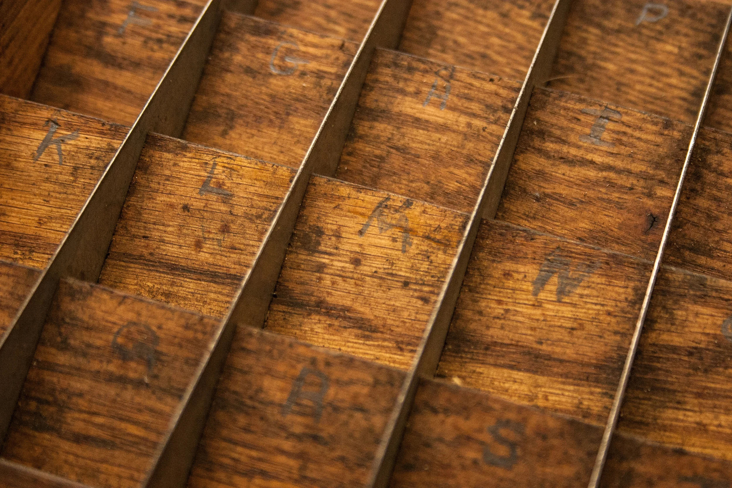
Each try has 25 divisions. Y and Z shared a spot.
You can still see the pencil marks denoting where the individual letters should go.
This post was originally posted on June 11, 2013 on Sketchbook B. It’s reposted here as part of a project to move some of my favorite writing to my new site.
When Max Miedinger and Eduard Hoffmann developed Neue Haas Grotesk (eventually renamed Helvetica) in 1957, I’m sure they never imagined that a version of their typeface would be used on a mobile, handheld computer operating system.
And that the use of Helvetica would spark a worldwide bickering match over whether it was the right typeface for the task. And that the bickering match would take place across a global communications network using a microblogging service.
I’m not sure what I think of the iOS redesign. And I won’t form any opinions until it is installed on my iPhone and iPad. I imagine I’ll find design elements that I like and a few things I don’t like.
But I started to think about the fact that Helvetica, originally designed to be cast in metal and printed with letterpress, is in use today on a device that would have seemed like pure science fiction when the typeface was designed. Imagine for a second what Miedinger and Hoffmann would think?
Type has the ability to outlive its creators and be adapted for purposes far outside the original intent of the design. (The version that Apple is using - Helvetica Neue - was developed in 1983 to improve rendering on new devices.) In 50 years, are we going to be arguing about the proper use of Gotham? Or Neutraface? Or Proxima Nova? Or will we still be arguing about Helvetica?
This post was originally posted on January 21, 2013 on Sketchbook B. It’s reposted here as part of a project to move some of my favorite writing to my new site.
Mom and me in August 1976. Yes, that’s me with the crazy curls.
I was about to graduate from college and was at home telling my Mom about my decision to be a designer. For most of my college career, my major had been journalism or public relations. But near the end of my college career, I fell in love with design and changed my major. Mom was normally the most supportive person in the world, but that day, she was skeptical. “Bob, you don’t exactly handle criticism well.”
Michael Bierut came to speak at an AIGA South Carolina event several years back. I remember him talking honestly about the challenges of pitching work to clients. It was the first time I could remember a “rock star” designer expressing that sometimes, you are limited by a client.
It resonated with me. As designers, I think we often fall into the trap of thinking that our solution is perfect and flawless and that the client should just trust us. But it doesn’t always happen that way, even for famous designers.
His point in telling the story is that he understood Futurebrand’s challenges with the UPS redesign. But I took something else from it: No matter how large and well-respected you and your firm are, you still have to convince a client that your solution is right for them. Sometimes, you will fail.
I have students and friends that absolutely explode with frustration when their work is criticized. Or when clients ask for significant changes. But this is part of the job and part of the environment that we live in today. This is part of the career we have chosen. We have to deal with the criticism as constructively as possible and move on.
Futurebrand released a redesign of American Airlines last week, replacing the iconic Massimo Vignelli mark. Personally, I love the redesign. (And I love the original.) Commentary from designers seems to be split and there are many who are harshly criticizing it. Even Massimo Vignelli. It doesn’t matter who you are, you can’t please everyone.
My mom was very astute to realize that if I was going to be successful as a designer, I needed to understand that criticism is part of the job. I’ve worked really hard to deal with criticism in a positive way and to encourage others to do the same.
My oldest daughter is very creative and interested in design or art as a career when she grows up. I’ve thought about what advice I’ll give her about criticism if that’s the route she takes. I’ve settled on this:
You are a designer. Criticism is part of the job. Accept it. You will not always win. That’s okay. If there’s a better solution, find it. Stay focused. Keep creating. Love what you do.
This post was originally posted on January 13, 2013 on Sketchbook B. It’s reposted here as part of a project to move some of my favorite writing to my new site.
After my dad retired, he got into antiques. Knowing my love for type, design and printing, he’s always on the look out for something unique. Over the years, he’s found a bunch of great wood and metal type, type drawers and other printing materials.
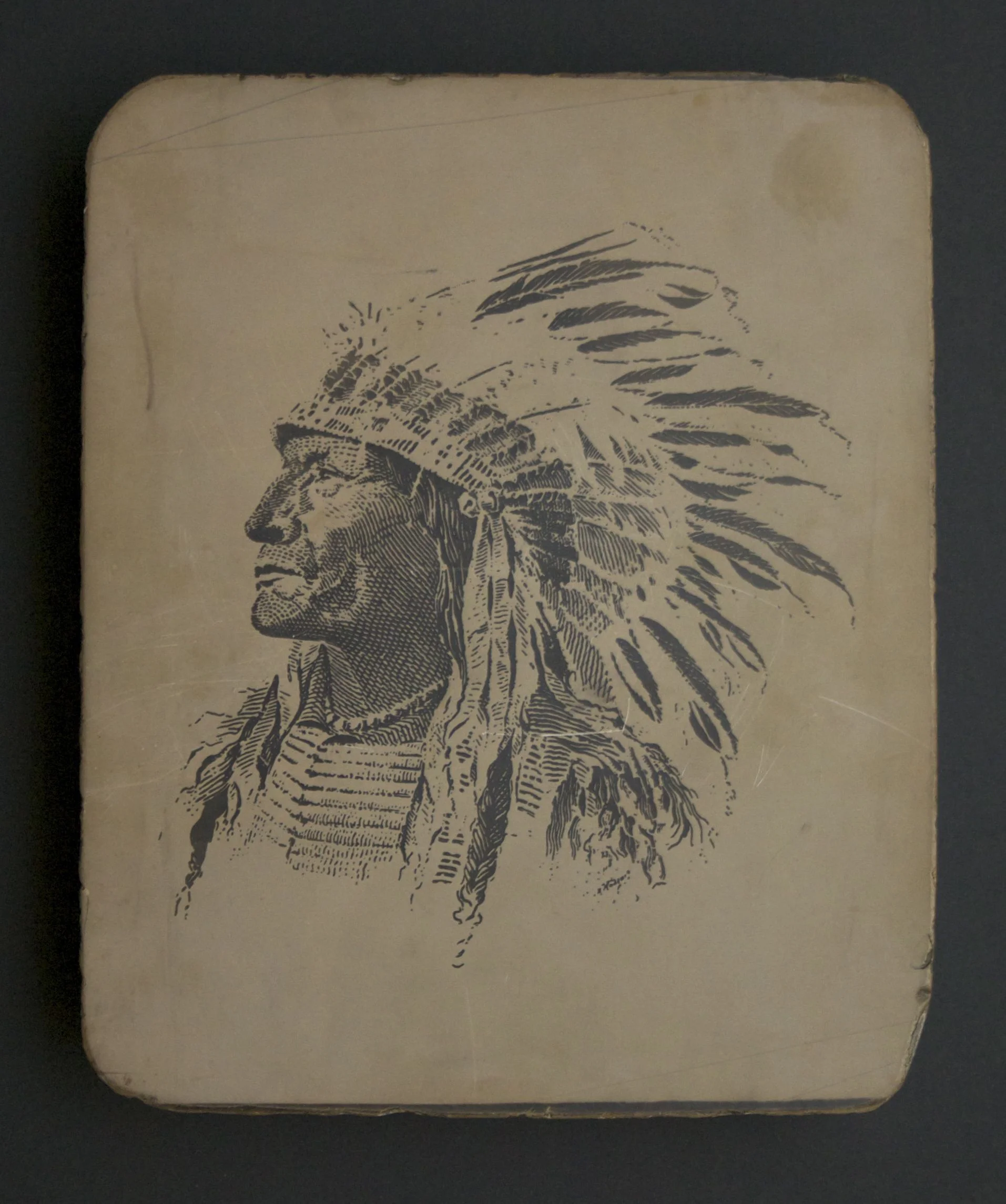
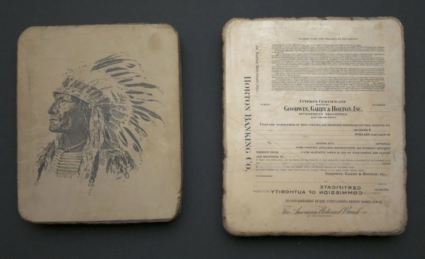
A 100-year-old litho stone. The logo for Carlisle and Co., a San Francisco printer. Note the name of the company in the feathers.
Before Christmas, he sent me an email that he had purchased my Christmas present, but wasn’t sure exactly what it was. The auction listed the lot as “printing stones” and no one really knew anything about them. He had one for me, but to get it, he had to buy the entire lot. 11 stones in all.
I knew immediately that he had litho stones. But I wasn’t prepared for how remarkable they were. (If you don’t know about stone lithography, here’s somebackground.)
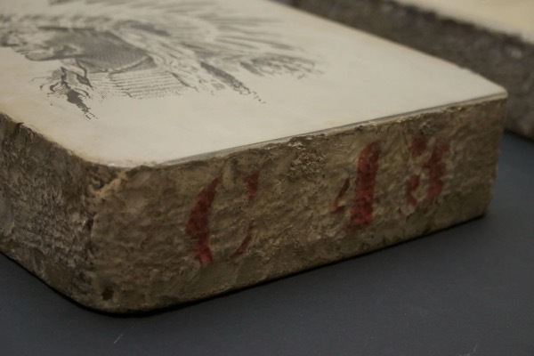
Each block is limestone and about 10 x 12 inches and about 2.5 inches deep. They weigh around 30 lbs. each. They are marked on the side with a red identification number.
My Christmas present had a large Native American illustration on one side and stock certificates on the other side.
I didn’t see it at first, but the feathers of the head dress spell the name “Carlisle and Co.” A quick Google search and I was able to find A. Carlisle and Co., a printer still in operation and currently located in Reno. Thanks to a corporate history published on their 100th anniversary in 1953, I was able to find out a lot about the company, the Indian and the stones.
The “Carlisle Indian” was drawn by the wife of the founder, Eleanor Majors. Interestingly, her father was one of the co-founders of the Pony Express.
Carlisle (and several companies that they acquired over the years) were located in San Francisco for over 100 years.
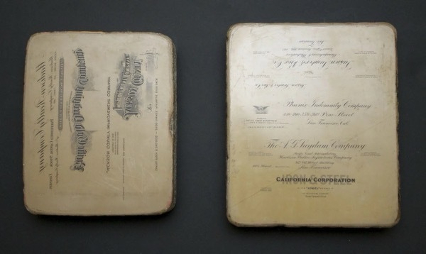
Carlisle was a top producer of government and corporate printed materials. Most of the stones are letterhead and stock certificates. Some of the stones are in Chinese.
Based on the dates on these stones, they look like the art is from the early 1920s. Some of the stock certificates are dated from even earlier.
Several different designs are on each stone. Both sides of the stone are used.
I have no idea how these stones made it from San Francisco to an auction in South Carolina. I’m assuming at some point they were given to an employee who then moved east.
The corporate history, A. Carlisle and Company: The First Hundred Years is an amazing look at the history of printing, detailing the process with lots of photos of old equipment. It’s been scanned and made available through the University of California. If you are interested in printing or design, check it out.
I’m going to try to research the other stones. I’ve actually only seen 2 of the 11 stones. They are an interesting snapshot of the growth of industry in California at the turn of the century. I’ll post pictures and background on them here as soon as I can catalog them all.
This post was originally posted on November 5, 2012 on Sketchbook B. It’s reposted here as part of a project to move some of my favorite writing to my new site.
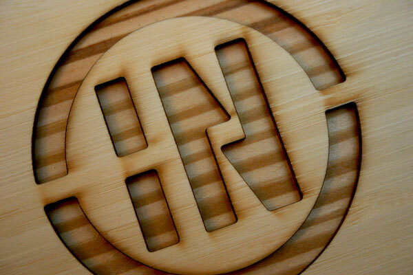
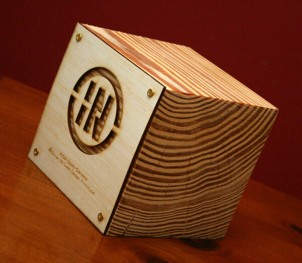
Laser cut InShow logo
AIGA South Carolina’s InShow design awards were held last weekend. The award is always a cube — constructed from a different material every year.
I’ve been involved in the design and assembly of cubes in the past, designing the junction box cube in 2008 and helping with the pillow cubes last year. So I was really excited to design this year’s InShow cubes.
Maria Fabrizo was creating the supporting materials and was taking a rustic approach. Over the years, I’ve created a small collection of rejected cube prototypes. One prototype that I had experimented with previously was a wood block, made from a 6x6 timber cut into cubes. It seemed like a perfect fit for the theme.
I looked at a couple of different ways to add the logo and winner’s information to the blocks and settled on a plan to fabricate face plates and bolt them onto the solid blocks of wood.
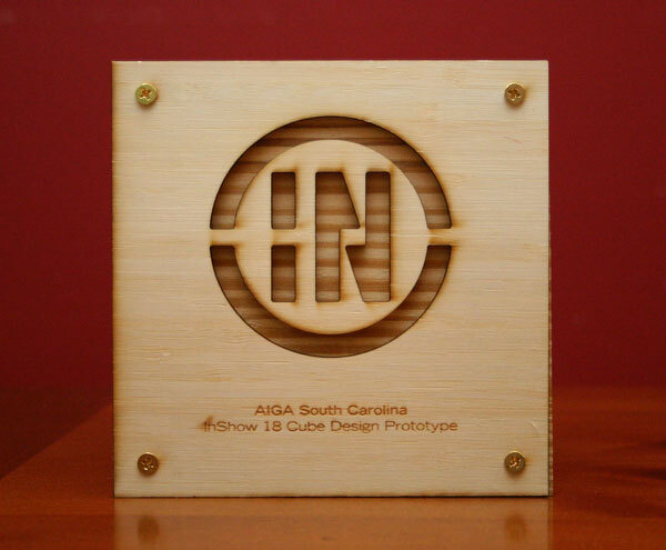
The face plate — laser cut and engraved.
I used Ponoko to laser cut and engrave the face plates, cutting the InShow logo into a sheet of bamboo plywood. And the cutting and engraving were done at one time so personalization was really easy.
Ponoko is a really interesting service — just upload an EPS file and they cut your design into a material of your choice. And they provided great service and support. (I’ve used Ponoko before. See my 2009 blog post about building a book shelf with their service.)
Once we got the face plates, we just had to screw them onto the cubes. Brynley Farr from ByFarr Design was able to get some awesome remnant wood from Southland Log Homes and had it cut into cubes. In all, we assembled almost 70 cubes.
The face plates were screwed onto a solid block of wood. Check out the awesome wood grain on the side.
On the best of show and the special judges awards, the background of the InShow logos were painted — red for best of show and gold for the special judges award. (Check out this blog post from Fuzzco who won 10 cubes including best of show.)
This post was originally posted on January 2, 2012 on Sketchbook B. It’s reposted here as part of a project to move some of my favorite writing to my new site.
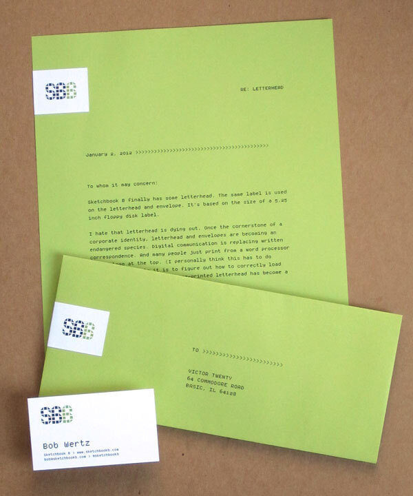
Finally, after at least 4 years of using the Sketchbook B name for my personal projects, I have letterhead and envelopes.
Once the cornerstone of a corporate identity, letterhead and envelopes are becoming an endangered species. Digital communication is replacing written correspondence. And many people just print from a word processor with a logo at the top. (I personally think this has to do with how impossible it is to figure out how to load letterhead into a laser printer.) Pre-printed letterhead has become a luxury.
I printed business cards earlier in the year, but I hadn’t even considered doing letterhead and envelopes. I just don’t send that much written Sketchbook B correspondence.
I started reading Letters of Note and Letterheady and was inspired to start working on concepts. Something that would work for small quantities. Maybe a stamp or a label. But I couldn’t quite settle on something I was happy with.
One day, I was helping clean out a cache of old materials at the office and ran across a bin of old media – CDs, SyQuest drives, Zip disks, 3.5 inch diskettes and even 5.25 inch diskettes.
The 5.25 inch disks brought back memories of my Commodore 64. Using Print Shop for the C64 was the first time I used a computer to create and print a “design.” And it was likely the first time I ever thought about typefaces.
I had found my inspiration:
I took the dimensions of a 5.25 inch floppy disk label and worked up a concept. I’m sure at some point in the not-so-distant past, a floppy disk label was part of the standard corporate identity package.
All of the type in the system was initially designed with Fontstruct and later refined with other software. SbB Periodic is used for the address information and SbB Dradis for the logo.
The labels are odd dimensions - you can’t exactly buy precut labels that size anymore - so I had a local vendor print them on crack-and-peel on their Indigo press. I ordered a small quantity of Pop-Tone Sour Apple paper and envelopes from French.
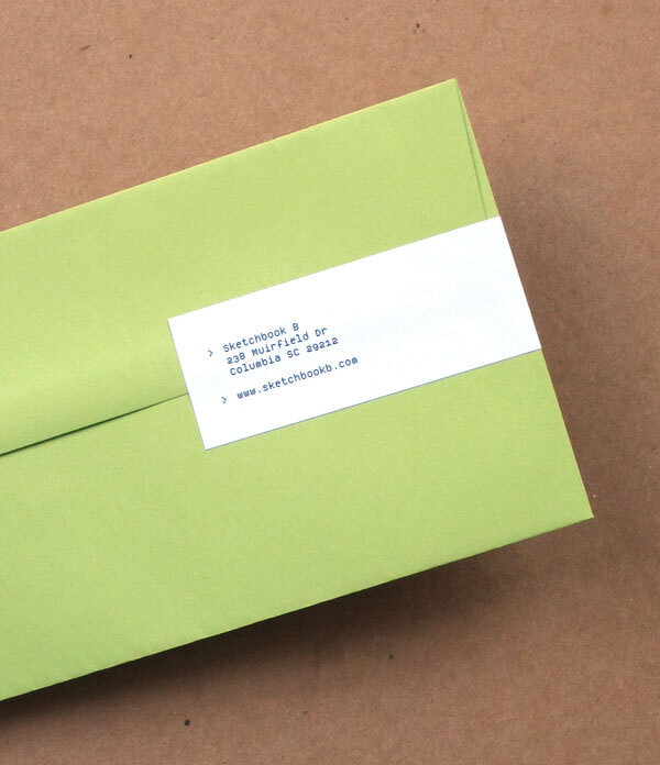
On the letterhead and envelopes, the label wraps around the paper so the address is on the back. And the label can be used on folders, CD cases, binders and more.
This post was originally posted on November 10, 2011 on Sketchbook B. It’s reposted here as part of a project to move some of my favorite writing to my new site.
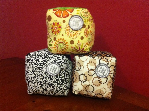
I was excited to help with the assembly of AIGA South Carolina’s InShow award for this year. Every year, the InShow “cube” is made of different materials or themes. Aluminum, concrete, cardboard, faux-quarium, ceramic, wood block, junction boxes, faux-cheese, a wrapped present and now…
The pillow cube was one we always wanted to do, but we never had the time to manufacture them all. So when Frances Grosse told me that they were going to finally do fabric cubes, I volunteered to help sew them. Frances picked out the fabric and patches and then she, Maria Fabrizio and I sewed cubes. The tags were created by Harrison Croft and pinned to the cube. (They aren’t in the picture above because these cubes are leftovers…) Definitely one of my favorite cubes.
Also: See my post from 2008 that details the process for making the junction box cubes.
This post was originally posted on July 5, 2011 on Sketchbook B. It’s reposted here as part of a project to move some of my favorite writing to my new site.
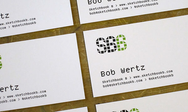
I’ve been wanting to get Sketchbook B business cards for a while. And I wanted to use my own fonts for the identity system. I’ve played around with several different looks, but never pulled the trigger and ordered them. Finally, my new cards are printed and they use two typefaces that started life on Fontstruct: SbB Dradis Alpha and Periodic.
I just released the SbB Dradis family. It’s an odd experimental display typeface that can be used without spaces in between the letters. I’ve updated the masthead on the site with a new Sketchbook B logo in Dradis.
Periodic is a monospaced, pixel font with old style numerals that I designed to be used in print. For most designs, visible pixels are a no-no, but I think they add some texture and interest. I’m using a version of Periodic that I’m still tweaking. It’s a refined version of the one I quietly released on FontStruct. Once I finish polishing Periodic, I’ll release it here.
This post was originally posted on September 29, 2010 on Sketchbook B. It’s reposted here as part of a project to move some of my favorite writing to my new site.
I purchased my iPhone just over three years ago. In fact, I purchased it the day Steve Jobs announced the $200 price cut and I snapped up a 4GB model from my local AT&T store that afternoon.
This was a big change for me. I had never really paid for a phone before. I got whatever Nokia was free with the plan… And I rarely used texting, camera or data.
When I first got the iPhone, it seemed like everywhere I went, I was demoing the phone. Everyone wanted to zoom in on maps and flip through pictures.
Several days after I got my new iPhone, my youngest daughter was born. And from the hospital, I took pictures and emailed them immediately to friends and family. (In fact, when my wife went into labor, I found myself without a watch and used the stopwatch to time contractions. It remains the only time I’ve ever used the stopwatch.)
Initially, I wasn’t interested in the camera. I had a high quality SLR and point and shoot. But I found time after time, when I needed a camera, the iPhone was with me. And the high end equipment wasn’t. I got lots of great candid shots with the iPhone.
I also stopped carrying my iPod. While I couldn’t store all my music on the 4GB iPhone, I was able to sync the stuff I listened too most. And found myself slowly using my iPod less and less.
Deteriorating
The first sign that my iPhone was starting to show it’s age was that after about two years, the speaker developed a minor issue where it was hard to hear when there was a lot of background noise. It wasn’t a deal breaker, but occasionally, I was frustrated. I contemplated replacing my iPhone with a shiny new 3G or 3Gs. But I didn’t.
A few months ago, I dropped the iPhone. I had dropped it previously without serious damage, but this time it hit just right… and the face cracked. It still worked. But now, a new phone was going to have to happen soon. At the time, the iPhone 4 was just out and with the reception issues, I decided to wait a little bit. After all, it still functioned fine. Plus the idea of replacing my reliable old iPhone made me a little sad.
A few weeks later, I dropped it again. This time, the screen didn’t crack. But the side bowed out a little bit. The side with the volume was bent so that the volume down button was constantly depressed. So the phone would turn the volume down at random times. My iPhone was no longer functional as a phone. It was time to replace my iPhone.
My new phone
I stopped into an AT&T store and upgraded. A shiny new iPhone 4. Shockingly they had some in stock and the transfer was painless.
The phone is faster. The screen is better. The camera is better. I don’t have to deal with slow data speeds. My reception is better and I haven’t had any of the antenna issues that are so well documented. In every way, the new iPhone is a better device. But, just a little bit, I miss my original iPhone.
How we relate to tech
I’ve had a lot of computers. And iPods. And other gadgets. But the iPhone is the first piece of technology that I’ve had with me constantly. I can take my laptop or my iPad with me, but I don’t always have it. I carried my iPod frequently, but if I forgot it, no big deal. However, my iPhone was indispensable. For 3 years, I carried and used it every day.
As gadgets become more portable, they become more a part of our lives. iPhones - and other smartphones - are becoming an integral part of how we experience, document and remember the world around us. My iPhone was with me for a whole range of monumental events over the last three years - my last year as president of AIGA South Carolina, numerous trips and vacations and the birth of my child. And often it was used to take pictures, make arrangements, get directions and even time contractions. And for that reason, I’ll always have a special place in my heart for my slow, well-worn first generation iPhone. (Even if I love my new phone…)
This post was originally posted on April 9, 2010 on Sketchbook B. It’s reposted here as part of a project to move some of my favorite writing to my new site.
I teach a college class on Visual Communication twice a week. So that means that twice a week, I pack up my laptop and haul it to class. It’s not that heavy, but since it is our main computer, taking the laptop wasn’t always convenient. So I figured I’d try using my new iPad (with the VGA adapter) and Keynote for the lecture.
Building the presentation
I’m really impressed with Keynote for the iPad. I was able to create a very simple presentation on the iPad in about 30 minutes. It’s intuitive and very easy to use.
Please note: This version of Keynote cannot do everything that the full version of Keynote can do. There are limitations - typeface selection, limited customization of templates, difficulty importing existing presentations. And the way you sync documents is exceptionally clumsy.
If you are wanting to build an amazingly complex presentation, you’ll need to do it on the Mac. If you need to access an existing library of Keynote or Powerpoint presentations, I’d stick to using the laptop. But for building (or importing) a simple presentation, it’s nice. And considering that it’s $10, I’d say it’s well worth the price.
Hooking up to the projector
The VGA adapter looks pretty simple. Plug it into the dock connector, connect the VGA cable and you are good to go… And for the most part, it is that simple. Be aware that when working from Keynote, video projection doesn’t start until you hit the play button.
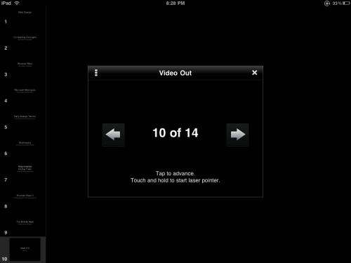
When the iPad is in presenting mode, your slides show through the projector and the iPad has a simple forward/back control. And you can simply tap to advance. If you push and hold on the iPad touch screen, a faux “laser” pointer pops up.
My only complaint is that the slide thumbnails are so small. In my classroom, the screen is behind me and over my head, so I occasionally had to turn around to see what slide was being presented.
A screenshot of the presentation screen for Keynote on the iPad.
Will I do it again?
Absolutely. I use relatively simple presentations for my classes. So Keynote is perfect for how I’m using it. Plus not having to lug my laptop to class is nice. I’m optimistic that Keynote will continue to improve on the iPad… But as a lightweight presentation setup, the iPad is absolutely a winner.
This post was originally posted on February 5, 2010 on Sketchbook B. It’s reposted here as part of a project to move some of my favorite writing to my new site.
NOTE: While this page may have useful insights, be aware that it was published more than 10 years ago and may not be relevant for current software versions.
I’m primarily a print designer. So when it comes to linked files in InDesign, I need to know two main things – what is the color space of the linked file and what is the resolution of the file. InDesign CS4 makes it easy to find this info. If you click the arrow in the lower left hand corner of the Links Panel, you’ll see a link information box that gives you all sorts of data about the selected link including color space, actual PPI and effective PPI. (Actual PPI measures what the resolution of the file in its native form. Effective PPI calculates the output resolution based on how it is scaled within InDesign.)
It’s great and very handy, but you can only see one link at a time. And if you are trying to scan a document quickly to find low-res or RGB files, you still have to click on each link. Thankfully, Adobe offers another option. On the Links Panel, go to the flyout menu and select “Panel Options.”
Select “Panel Options” from the flyout menu…
…and you can fully customize the appearance of your Link Panel.
Here you can customize what information is shown in the Link Info Box AND you can add information to show up in the Link Panel itself. Very handy for scanning a document quickly.
Link Panel showing color space and effective resolution.
This post was originally posted on November 12, 2009 on Sketchbook B. It’s reposted here as part of a project to move some of my favorite writing to my new site.
I went to Subway last week. I don’t typically eat at Subway, but there is one by my office and I didn’t have much time for lunch. As I walked in, on the door, there was a window cling encouraging me to order soup with a combo. When I got in line, I looked up and there on the menu was an ad encouraging me to order soup. At the register there was another sign.
So I ordered soup.
I grabbed a seat. And realized I didn’t have a spoon. I looked up by the straws and napkins. There were forks and knives, but no spoons. So I asked the woman behind the counter – the same woman who sold me the soup – if they had any spoons. After asking another employee, she confirmed that they had no spoons in the restaurant.
The big picture
It seems both silly and odd that a franchisee would go to all the trouble of putting up all the signs and ads and then mess up something as simple as having spoons.
But I think this type of thing is very common in business. Often, we see people obsess over seemingly insignificant details, only to completely overlook a major issue. They work on the details and lose sight of the big picture.
As designers, we see this a lot.
Clients spend time and energy critiquing minor elements of a design, but often forget to shore up the logistical issues that support a campaign. Marketing and design are critical, but so is customer service and support. Think about my Subway story for a second. The marketing worked. I entered the store. And I purchased soup. However because of a minor – but critical – oversight, I was a dissatisfied customer.
Social media and a lack of spoons
Right now, social media is all the rage. Everyone seems to be talking about how social media can help their business. Worrying that they’ll be left behind if they aren’t on Twitter or Facebook. Consultants are aggressively selling social media services.
But I fear many of these folks are losing sight of the big picture. Social media is a tactic. And yes, it can be an effective and powerful tactic. But as companies develop their social media plans, they cannot forget that it is just the beginning of the customer relationship. Strategically, you need to think through the entire customer experience. What are you going to do with your customers after you reach out to them through social media? How do you want to engage your customers on a continuing basis?
I’m not saying social media is bad or that it isn’t important. There are absolutely uses for social media in business and marketing. Just remember that the social media tactics are only the beginning. You and your company need to prepare for a long-term customer relationship.
Or in other words, when you decide to sell soup, make sure you are ready to provide spoons.
Bob Wertz is a creative director, type designer, Ph.D. student and researcher living in Columbia, South Carolina. He’s been blogging since 2008.
This post was originally posted on October 6, 2009 on Sketchbook B. It’s reposted here as part of a project to move some of my favorite writing to my new site.
NOTE: While this page may have useful insights, be aware that it was published more than 10 years ago and may not be relevant for current software versions. Sadly, links to other resources might be broken.
I received a file containing 100 pages of information in a table. The table needed to be placed into InDesign. No problem…
Well, of course there was one problem. Randomly, the lines began with spaces. Not every line, but most lines. So the left edge of the table looked ragged. So how do you take out random spaces at the beginning of text? In a table? Without doing it manually? (Because I have much better things to do than going through a 100+ page document line-by-line…)
What is GREP?
In InDesign CS3 and CS4, you can choose to do GREP find and change. GREP is a text search function originally written for UNIX. Basically, it lets you look for patterns and allows you to do find and replace based on those patterns.
So back to the random spaces…
What I had was a pattern. Find all spaces at the beginning of the paragraph and replace with nothing. GREP was the perfect solution.
Next to the find and change fields are flyout menus (marked with “@”) that give you shortcuts to all of the variables. For example, go to “Locations>Beginning of a Paragraph” and InDesign inserts a “^” into the field.
So I typed “^ ” (there is a space after the ^) in the “Find what” field – which tells InDesign to find one space at the beginning of any paragraph. I left the “Change to” field blank, clicked “Change All” and several thousand instances were changed instantly. Without having to go through line-by-line…
EDIT: Above, I set up the search with the ^ (to find the beginning of the paragraph) and a space after it. And while it works, a reader pointed out correctly that a better search would have been “^\s+” which would have found one or more spaces at the beginning of a line.
What else can GREP do?
I’ve used GREP to replace dashes or periods at the beginning of lines. And GREP is perfect for standardizing the formatting of a phone number across an entire document. GREP is amazingly powerful and you can build a GREP search for anything with a pattern. I’ve only scratched the surface…
You can save queries to be reused. (Several sample searches – including a phone number formatting query – are already saved as a sample searches in InDesign. It’s located at the top of the dialog box.)
InDesign also lets you apply GREP-based character styles – for example, telling it to find all prices in a document and apply a particular style.
It’s probably not for everyone.
You aren’t going to need GREP find/change unless you are doing some pretty heavy duty, long document work like magazines, catalogs and directories.
I’m pretty sure most InDesign users aren’t doing that kind of work. But if that type of project comes across your desk, keep in mind that GREP might be a great – and time-saving – solution for your project.
More resources
Want to learn more about what GREP can do for you? If you do a search for GREP, there are lots of resources out there. Two that I have found helpful:
This post was originally posted on July 29, 2009 on Sketchbook B. It’s reposted here as part of a project to move some of my favorite writing to my new site.
NOTE: While this page may have useful insights, be aware that it was published more than 10 years ago and may not be relevant for current software versions.
So let’s say you have a long text to place into InDesign – a magazine article or a training manual. In talking to some friends who are InDesign users, many of them place the text one frame at a time. But it can be so much easier than that…
Enlargements of InDesign’s text placement cursors. The cursors (and functions) change depending on what additional modifier keys are pressed. From left to right: Manual (default), Semi-Autoflow (Option/Alt), Autoflow (Shift) and Fixed-Page Autoflow (Shift + Option/Alt).
Default behavior…
When your cursor is loaded with text in InDesign, you can place the copy by clicking or by drawing a text box. You load your cursor by going to File>Place or by clicking on a text frame’s overset indicator (the red plus in the lower right “out port”).
If you click on the page, a text frame is created to fill either the page margins or a single column. (You set the margins and column settings when you open a new document.) If you draw a text frame, the text fills the new frame.
One more thing to note about the default behavior. When you are done placing the text, the tool reverts back to what it was before you went to File>Place. So if the Rectangle Tool was selected when you loaded your cursor, after you place the text, the tool becomes a rectangle again. Most of the time, that’s exactly the behavior you want.
Hold down the option key…
(Or the Alt key for you Windows users) If you are placing a long piece of text, you may want to draw a few text boxes and have the story flow between them. In this case, the default behavior of reverting back to original tool is irritating because it forces you to keep switching tools.
However, if you hold down the option key, the cursor stays loaded. You can continue to click or draw frames and the copy with automatically flow between them.
Or the shift key…
So let’s say you have a long training document that’s going to be several pages. When you place the copy, you keep having to add pages and link the text frames. If only InDesign would add the pages and frames for you…
Well, it can. Hold down the shift key when your text is loaded and click. InDesign will autoflow the copy, adding pages and text frames for the entire length of the copy.
Note: If you hold down the shift key and try to draw a text box, the default behavior kicks in and the tool reverts to what it was before you placed the text.
Use the shift key and the option/alt key together…
If you hold down the shift and option keys at the same time and click, InDesign autoflows the copy for that spread only, but it leaves the cursor loaded. If you draw a new text frame instead of just clicking, the copy doesn’t autoflow, but the cursor does stay loaded.






 Laser cut InShow logo
 The face plate — laser cut and engraved.
 The face plates were screwed onto a solid block of wood. Check out the awesome wood grain on the side.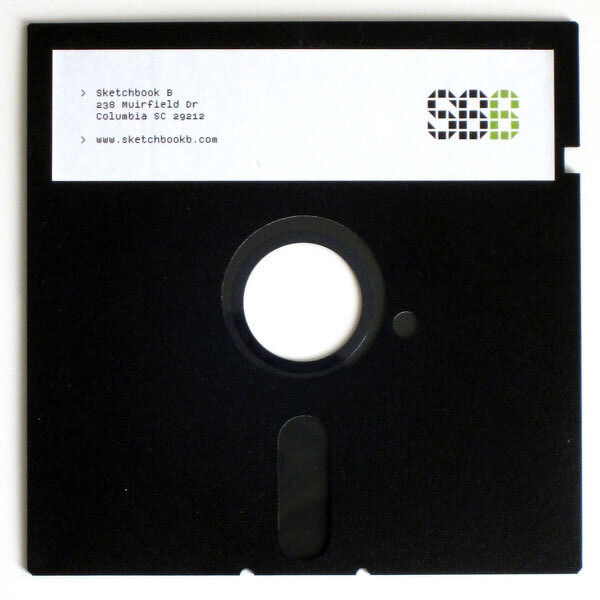
 A screenshot of the presentation screen for Keynote on the iPad.
 Select “Panel Options” from the flyout menu…
 …and you can fully customize the appearance of your Link Panel.
 Link Panel showing color space and effective resolution.

 Enlargements of InDesign’s text placement cursors. The cursors (and functions) change depending on what additional modifier keys are pressed. From left to right: Manual (default), Semi-Autoflow (Option/Alt), Autoflow (Shift) and Fixed-Page Autoflow (Shift + Option/Alt).