Keeping colors in proportion
This post was originally posted on March 12, 2014 on Sketchbook B. It’s reposted here as part of a project to move some of my favorite writing to my new site.
NOTE: While this page may have useful insights, be aware that it was published more than 10 years ago and may not be relevant for current software versions.
In InDesign, you want to modify a color slightly, keeping it in the same basic hue. Maybe you’ve duplicated a color and need a slightly lighter or darker color to complement your design. You double click the swatch in the palette and you get this:
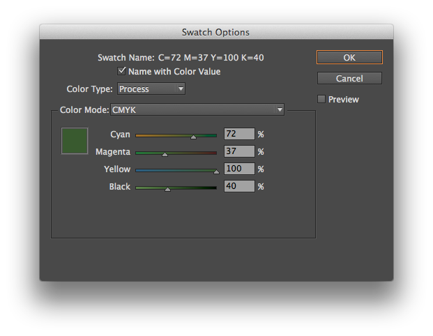
Moving the sliders individually will radically alter the color. You need to move all the sliders at once, keeping them in proportion. And InDesign has a way to do this. Simply hold down the shift key as you click and drag the sliders. They will all move together:
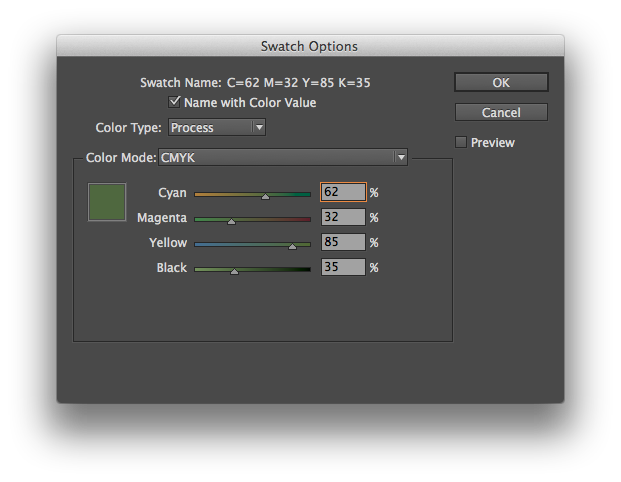
Look at the numbers in the screenshot above. I simply clicked on the Cyan slider and moved it to the left while holding down the shift key. All of the sliders moved in proportion. Cyan went from 72% to 62%. And the other colors moved, too. Here’s another screenshot where I’ve moved the Cyan slider to 52%:
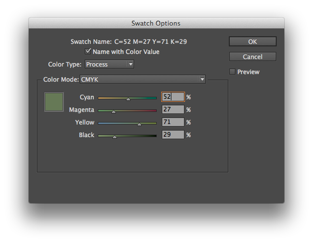
And the same trick works in Illustrator, too. Just hold the shift key to move the Color palette sliders together. It’s a simple and powerful way to adjust your color palette.