Rocky’s Hot Chicken in South Asheville
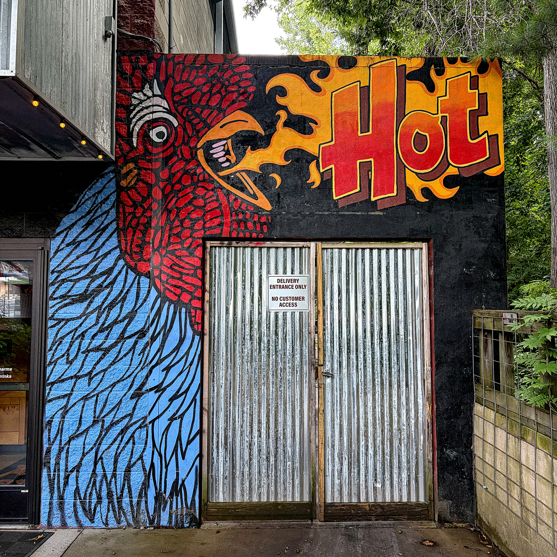
Rocky’s Hot Chicken in South Asheville
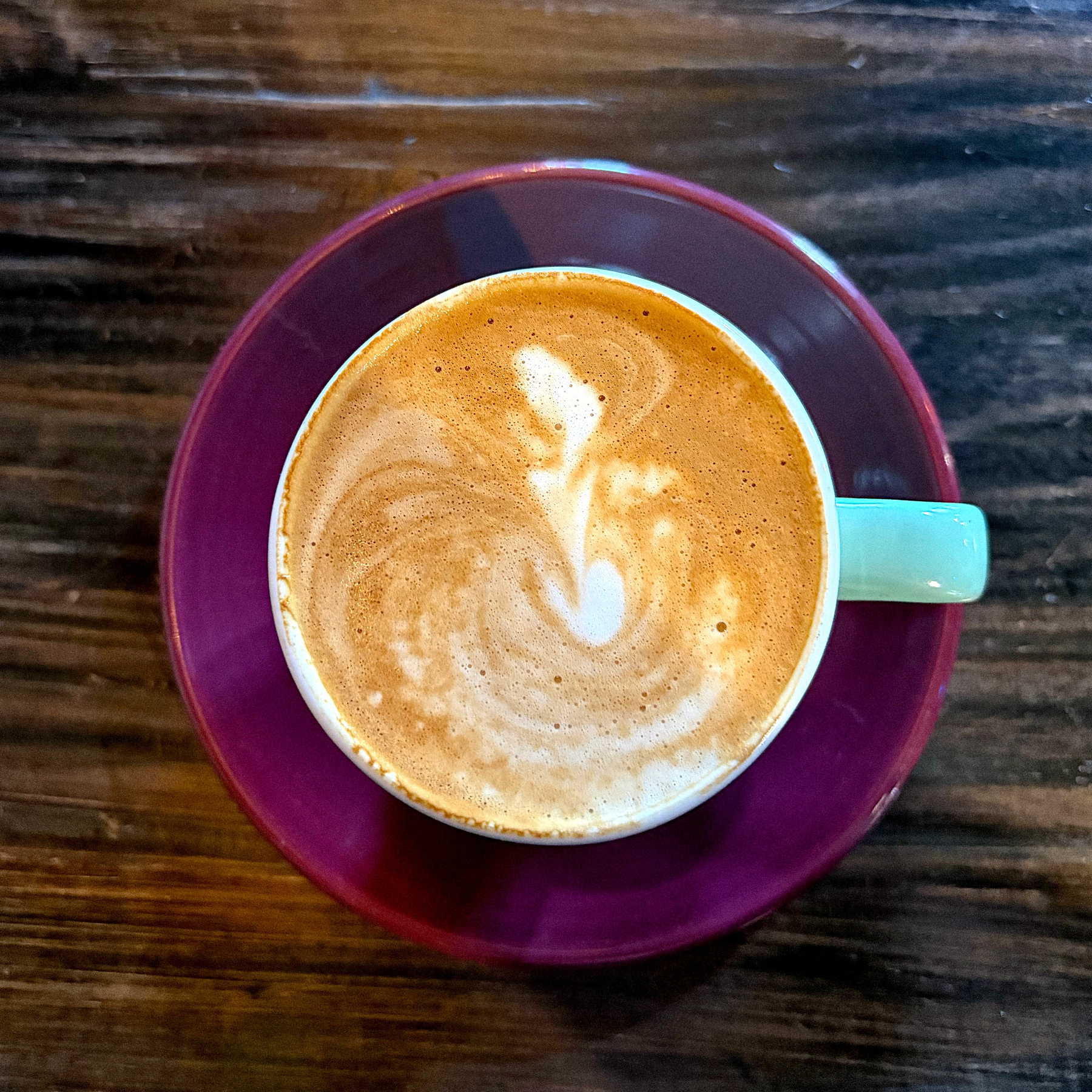
Cortado.
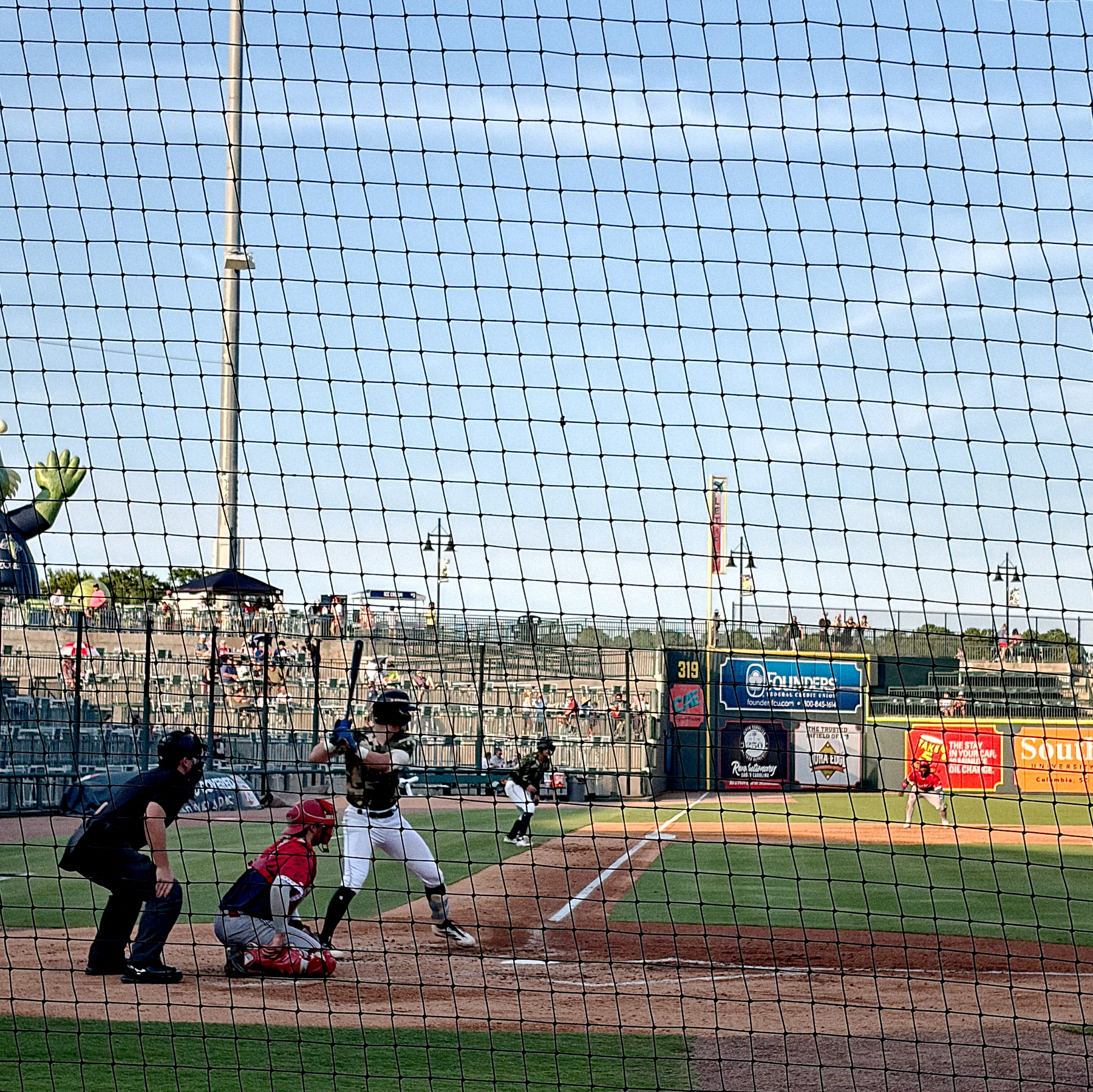
Our July 4th tradition… catching a Columbia Flieflies game. Although tonight, they are cosplaying as the Capital City Bombers. 🇺🇸⚾️🎇
7/4/26 • 3 min read

I was recently listening to The Rest is History’s series on national anthems. I knew that the Star Spangled Banner was inspired by the War of 1812, but what I did not know was that it wasn’t adopted as the National Anthem until 1931!
In fact, many of our national symbols are no where near as old as we think they are. Lots of Americans probably think that the symbols were created alongside the Constitution, but that’s not the case. Like any brand, the marks and symbols that represent it evolve over time. I also don’t think it’s a coincidence that many of them were codified after the rise of Communism and in the Cold War that followed World War II.
To celebrate the 250th anniversary of the United States, I’ve pulled together a list of our national symbols, and the date that the current version was adopted:
The Great Seal of the United States (1885). The original seal was adopted in 1782, but was refined in 1885. The current version remains faithful to the 1885 version.
National Anthem (1931). The anthem was written in 1814 after the British siege of Ft. McHenry, but it would be over 100 years before it officially became the U.S. National Anthem.
Current version of the Pledge of Allegiance (1954). The original version of the pledge was written in 1892, but Congress didn’t recognize it officially until 1942. Then 12 years later, they added the phrase “under God,” which is the version that is still in use today.
In God We Trust (1956). The national motto of the United States was adopted in 1956, replacing E Pluribus Unum (Out of many, one). It previously had been used on coins starting in 1864.
Current version of the US Flag with 50 stars (1960). The basic formula for the flag was set in 1777, but it’s changed over time as the US has grown and stars were added. The current version was adopted when Hawaii was added to the union.1
Bald Eagle (2024). The bald eagle has been part of the US identity since 1782 when it was included as part of the seal design, but the US didn’t have an official “national bird” until a couple of years ago. Joe Biden signed it into law in 2024.
While these symbols feel like they’ve always been here, they really aren’t that old. When my grandparents were born, there was no official national anthem. My parents were born when the U.S. had a 48-star flag. And when I started kindergarten, the version of the Pledge of Allegiance that we recited was just over 20 years old. This all serves as a nice little reminder that symbols change and evolve over time as our society changes.
Bob Wertz is a type designer, Ph.D. student and researcher living in Columbia, South Carolina. He’s been blogging since 2008.
There is a table on the Flag of the United States Wikipedia page with all of the different official flag configurations over the last 250 years. Many of the flags only lasted a year. And who thought an inverted pentagram star pattern was a good idea? ↩︎
7/1/26 • 3 min read
There’s been some discussion on Micro.Blog lately about the absence of likes and other typical social media features. I wanted to look at my experience with two recent posts and what they tell us about how posts are viewed on social media. My posts are shared to three timelines:1
As far as I can tell, the vast majority of my posts get limited to no engagement. Micro.Blog offers no engagement metrics. Bluesky shows likes and comments. Threads offers “Insights” on each post that includes engagement metrics.

The first was a post about accidentally landing in the middle of a Brazil-Morocco World Cup watch party.

The second was a comment on the Slate truck…
Clearly, if you want people to engage with your posts, the Threads algorithm can provide an audience. Bluesky didn’t generate much activity on either post, but I assume more than one person saw them. For the Slate post, Micro.Blog actually generated a conversation, and another blog post from one of the participants. I decided to follow up with a longer post as well.
These three timelines are different. I use them for different purposes. Is the Micro.Blog timeline quiet? Sure, but it’s full of unique and distinct voices including many I follow from Mastodon. I use Threads to follow pop culture, F1, WNBA, local news, and more. Bluesky has a bunch of academic and political experts that I enjoy following. Each timeline has a purpose. And the character of each is derived from the design of each service.
If I wanted to go all in on metrics, I’d be posting regularly to Facebook (823 friends), Instagram (707 followers), or LinkedIn (750 connections). I wouldn’t have deleted my Twitter account with over 1000 followers. But that’s not why I post on my blog.
I don’t think we’ll ever have a single dominant social media platform. The reality is that I’ve always had two or three different social media channels at a time. In the early days, I used Facebook, Instagram and Twitter. I still use three — Micro.Blog, Threads and Bluesky — but my current setup works better for me because everything is hosted on Micro.Blog and crossposted to other services. I value having all of my content on a single site.
We all use social media for different purposes. One great thing about today’s social media is that we have choices, but having more social media channels available means it’s harder to focus on a single outlet that meets all our needs. Each platform makes decisions that shape the experience, and that’s especially true in the case of Micro.Blog. In fact, I almost wrote a paper for a Ph.D.-level PR theory class a couple of years ago about how Micro.Blog’s structure aligns with Kent & Taylor’s framework for creating dialogic social media. Maybe someday, I’ll get around to writing it.
Bob Wertz is a type designer, Ph.D. student and researcher living in Columbia, South Carolina. He’s been blogging since 2008.
Honestly, four. I still share to Mastodon, but I don’t have any followers over there and don’t expect any engagement. ↩︎
6/24/26 • 2 min read
I don’t need a car right now, but in year or so, my daughter will need her car at college and I will need a car to take me back and forth to work. My wife won’t let me get a mini truck from local importer Japan Direct Motors, so maybe a Slate is the next best thing.
I’ve wanted an EV for a long while, but the timing just hasn’t been right. In a perfect world, I’d support Scout Motors which is building a factory outside of my hometown of Columbia, South Carolina. I love the way the Scouts look, but the starting price for a their very nice EV pickup is around $60,000. I’ve also eyeballed other cars like the Rivian R3, but who knows when that will finally hit the market. I like a small car, but many of the smallest EVs aren’t going to make it to the United States market.
And then there is the Slate. I’ve been interested in the bare bones basic truck since they announced it. I love the idea of an infinitely customizable vehicle that starts at a low price. Then add the features you want over time.
Slate hosted a media event today to announce the final pricing and configurator, so there are a bunch of articles and videos out now. I enjoyed an article from The Verge and Marques Brownlee’s video preview. If you want a deep dive, this 55-minute video packs lots of details.
I think the price is right at $25,000. (Imagine if the $7,500 EV tax credit was still available!) They originally planned to offer two battery packs, but settled on a single option with a range of just over 200 miles. That will work for my daily commute with plenty of range anxiety cushion to spare.

I’d want to add some options of course… Probably a full body vinyl wrap, some speakers and maybe a center console. I also really like the look of the fastback, which adds $6,000 to the cost of the car. Browsing the Slate online configuration app, you can see how large the accessory ecosystem could become.
I still have questions. I want to see the crash test results and some more reviews. But after all of the announcements today, I’m absolutely still interested.
Bob Wertz is a type designer, Ph.D. student and researcher living in Columbia, South Carolina. He’s been blogging since 2008.
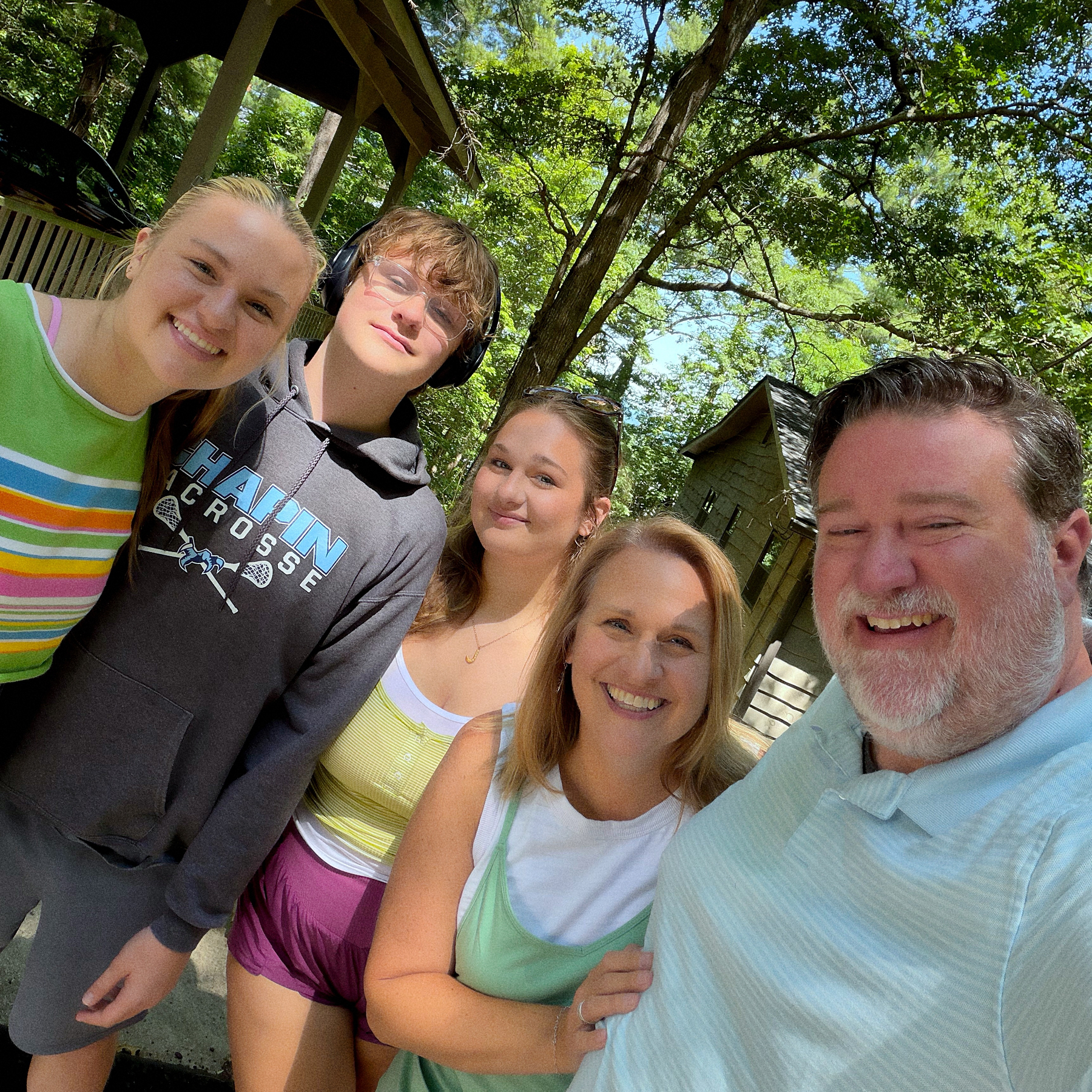
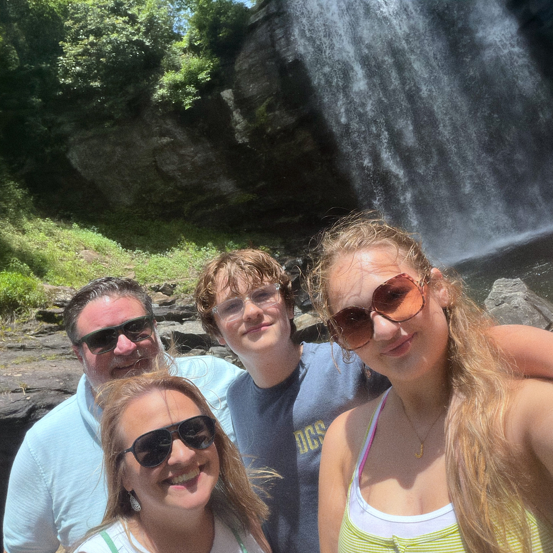
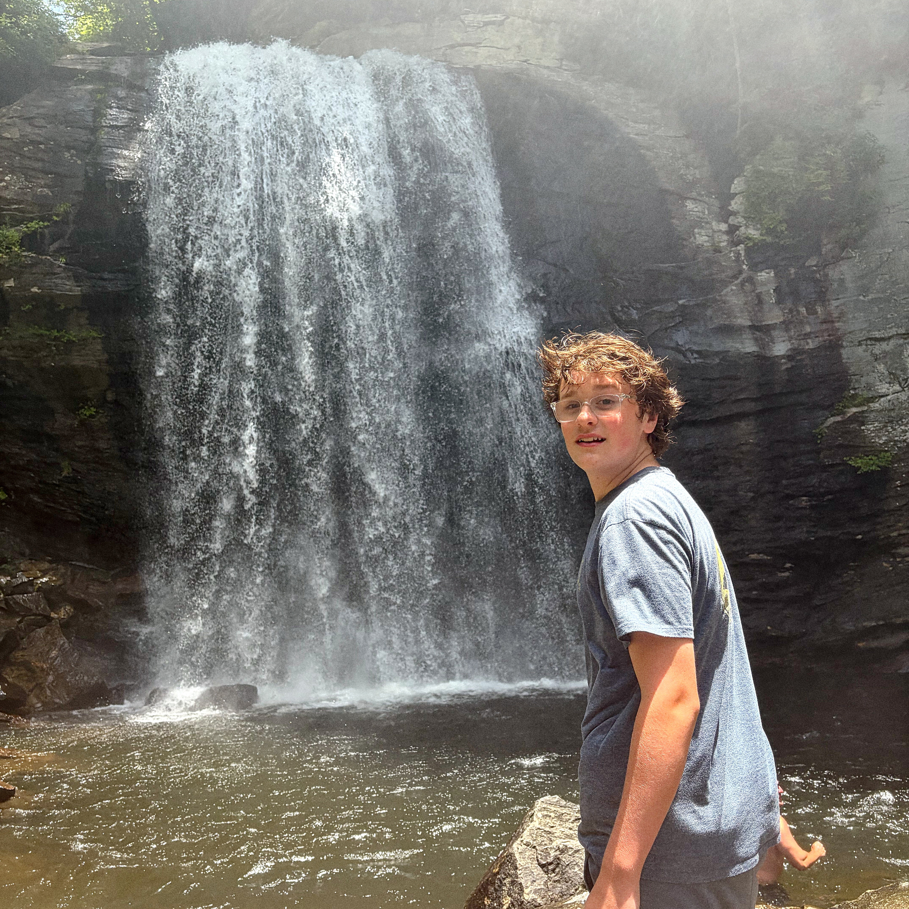
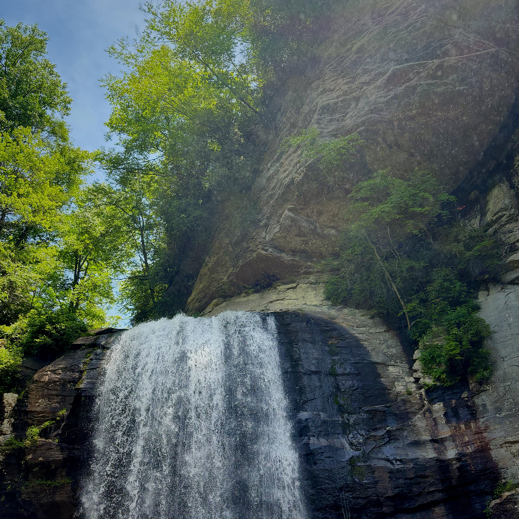
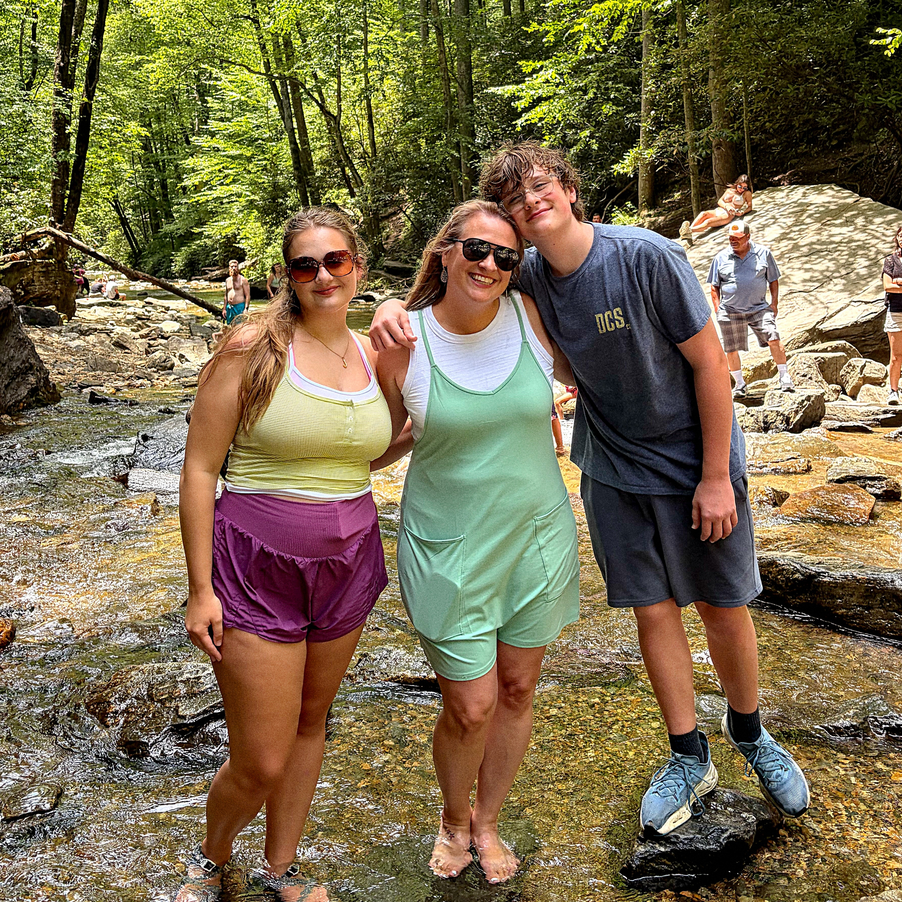
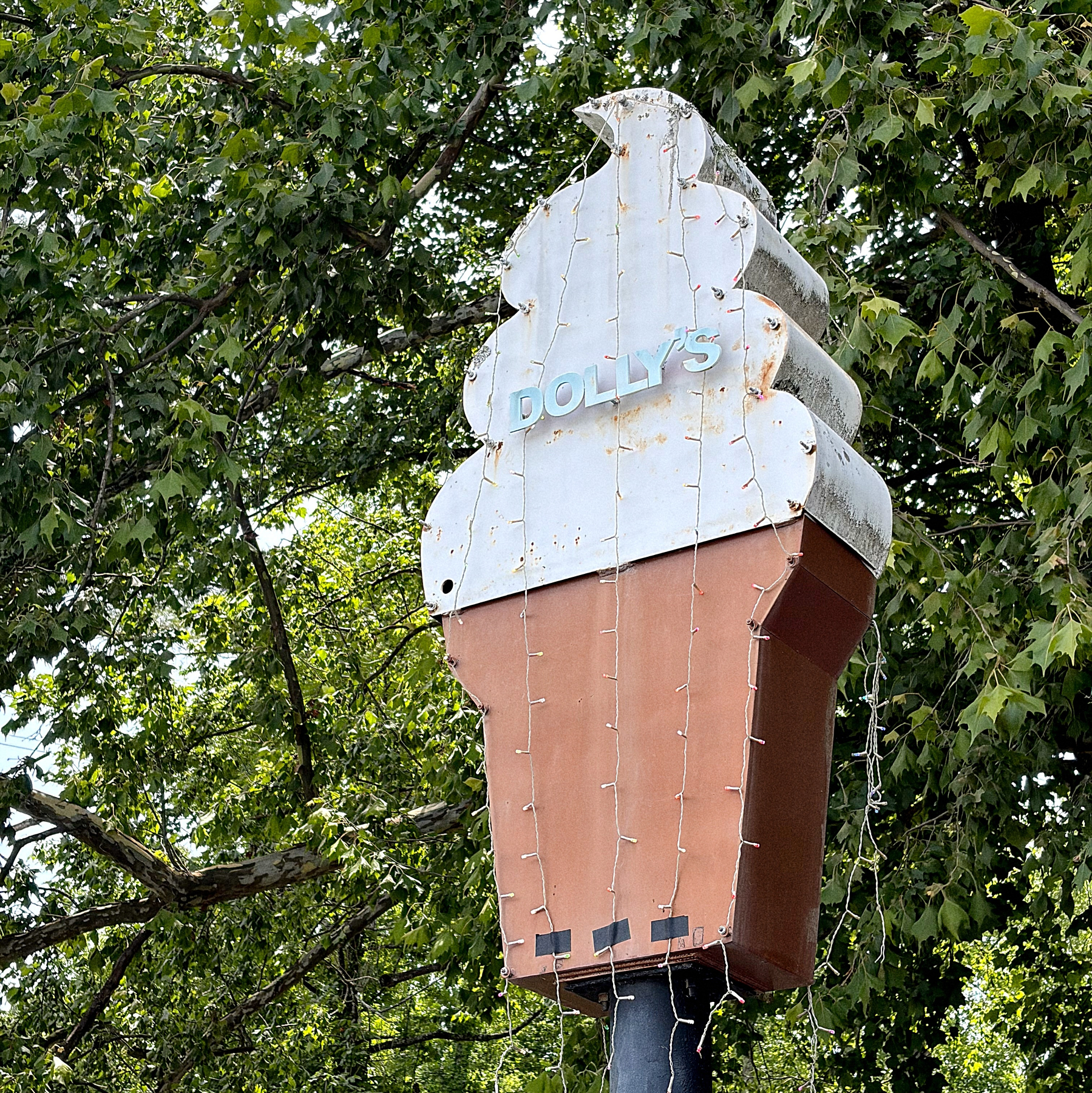
Fun Father’s Day. Drove up to Asheville to see Norah. Headed to Looking Glass Falls. Stopped by Dolly’s on the way out of Pisgah to get some ice cream.

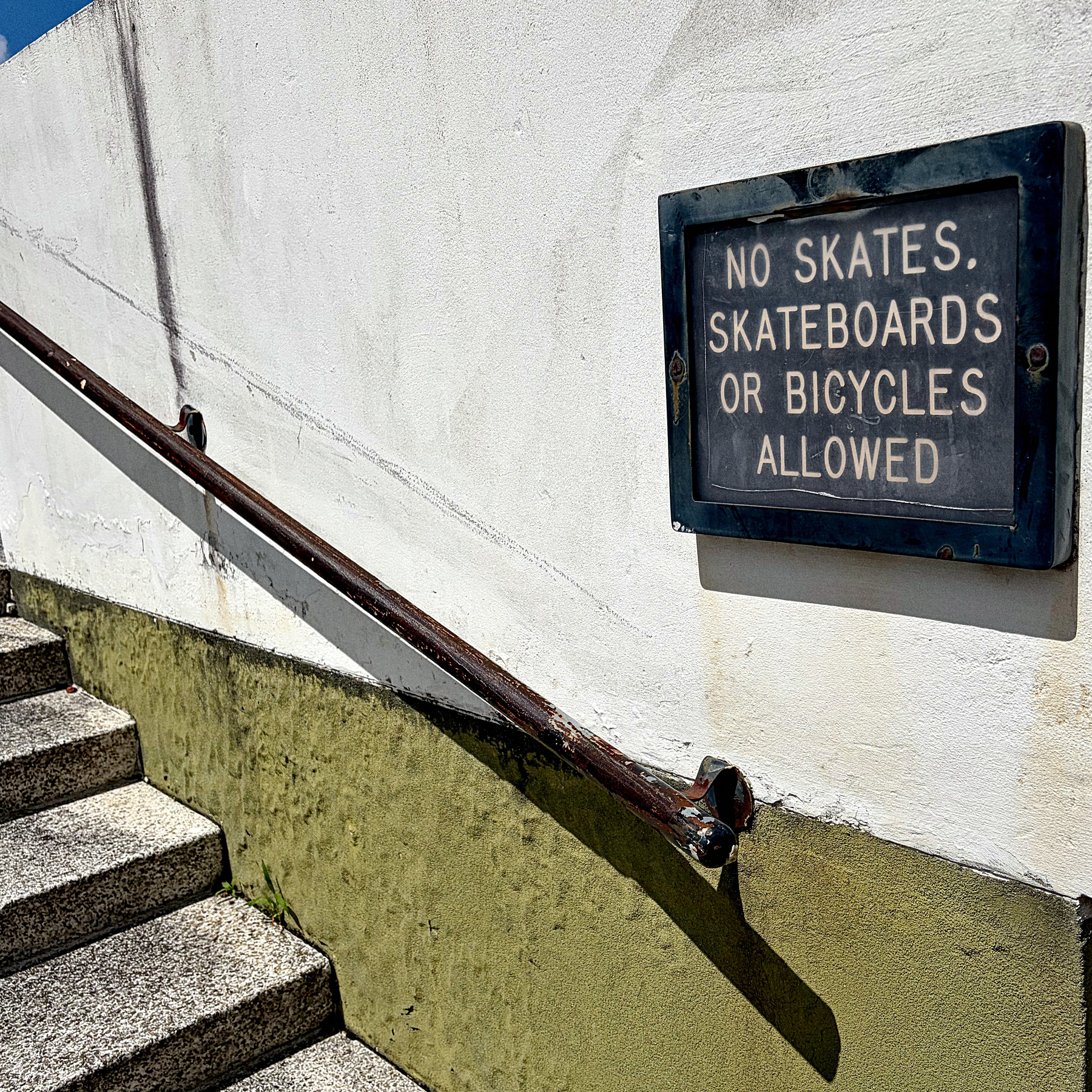
Old sign outside a state government building that isn’t currently occupied. I see skateboarders on these stairs frequently.
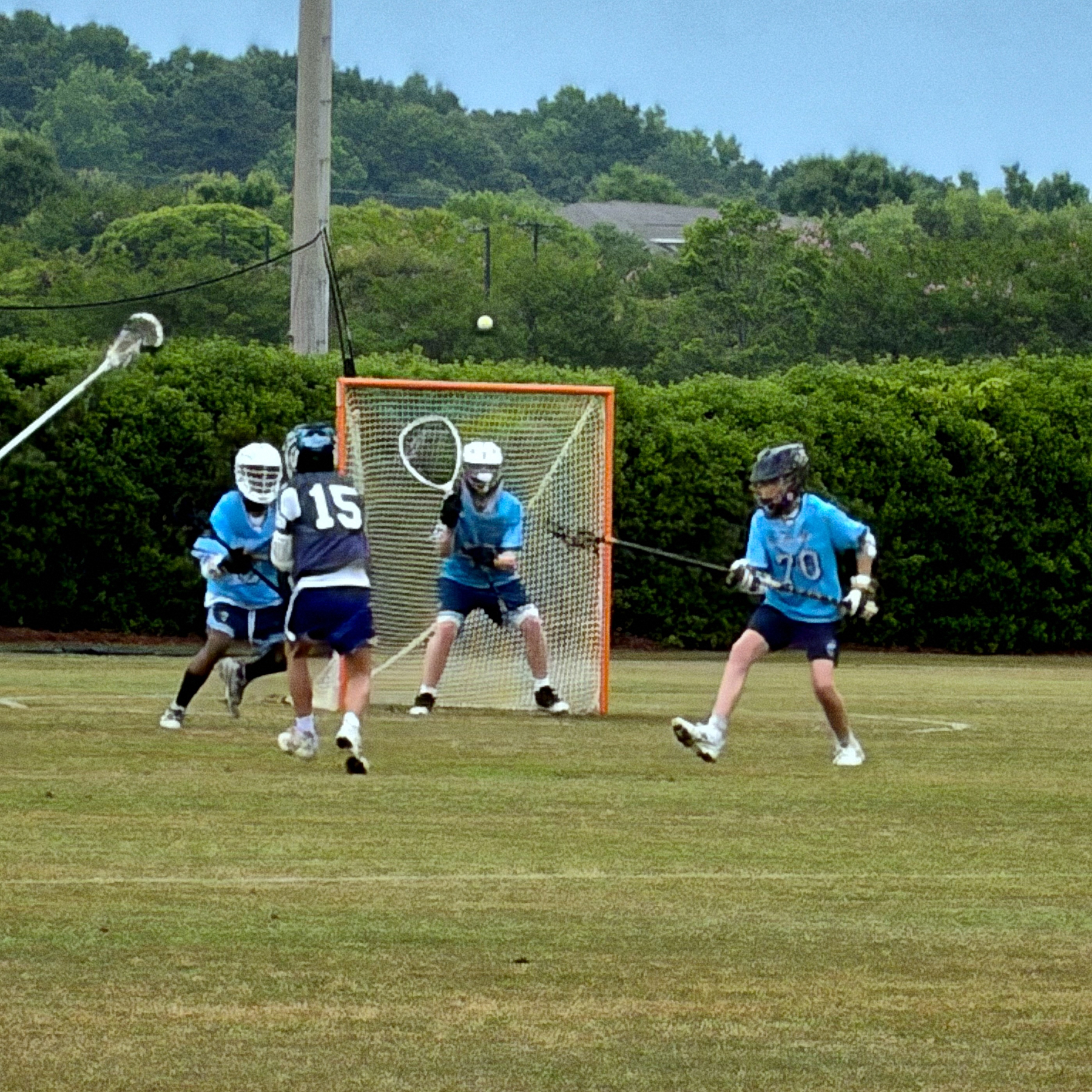
Survived Ryan’s lacrosse tournament in Mt. Pleasant this weekend. The heat was brutal, especially on Saturday. Ryan played well, and the team got a couple of wins. But honestly, I’m glad we are done with travel ball for the rest of the summer. It’s just too hot.
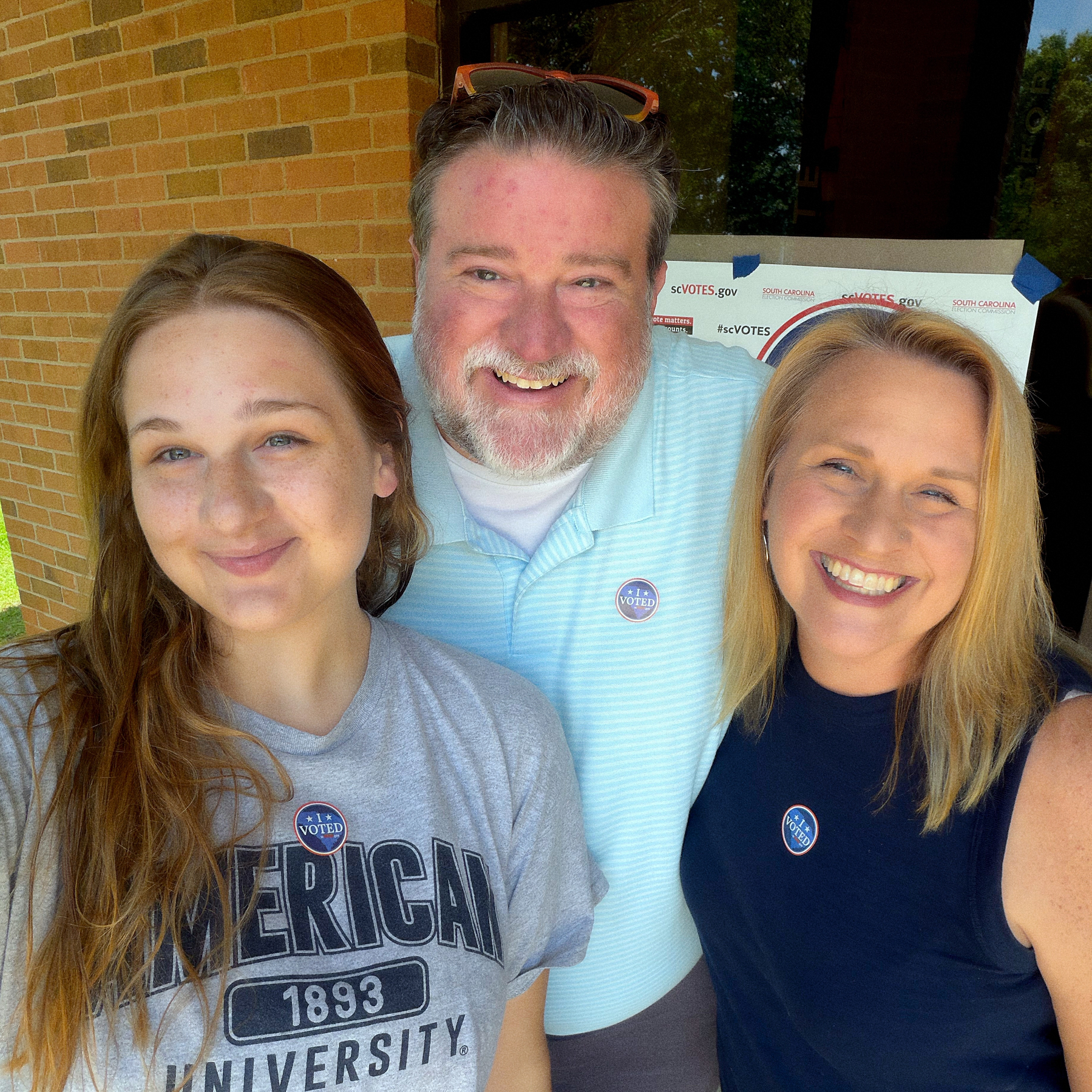
Voted today in South Carolina. And we got to take Jill so she could vote for the first time. 💙🇺🇸
The State Newspaper in Columbia, SC shares a news story on Threads about a fatal car accident. The picture that is included is a photo of the author of the article… who was not in an accident and is very much alive. This is an ongoing problem with automated posting and vague clickbait headlines.

6/4/26 • 1 min read
As part of my quest to get comfortable in Canva Affinity, I’ve been experimenting with some on-demand embroidery designs on Cotton Bureau. For embroidery, you are limited to a palette of 15 specific thread colors. When you create the product, Cotton Bureau tries to match the colors in your design to the available thread colors… which provides some unexpected results. Thankfully, Canva provides hex codes to approximate the thread colors.
To speed up my production, I made an Affinity Color Palette and figured I’d share. If you want to import the current Cotton Bureau thread palette into Affinity, here it is: 2026 Cotton Bureau Thread Colors.clr (ZIP archive).
Hopefully, it will save you a couple of minutes.
I’ve got one simple embroidered beanie on Cotton Bureau right now, my Dum Spiro Spero design, but I’ve got more embroidery designs in the works.

Bob Wertz is the Director of Research Training at the University of South Carolina, a Ph.D. student and typeface designer living in Columbia, South Carolina. He’s been blogging since 2008.
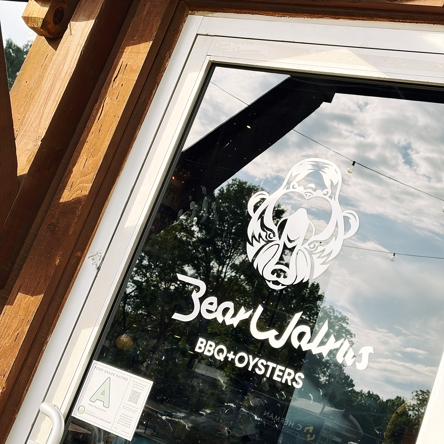
In Rock Hill, South Carolina for a lacrosse tournament and had dinner at BearWalrus. Weird name. Outstanding food. Highly recommend.
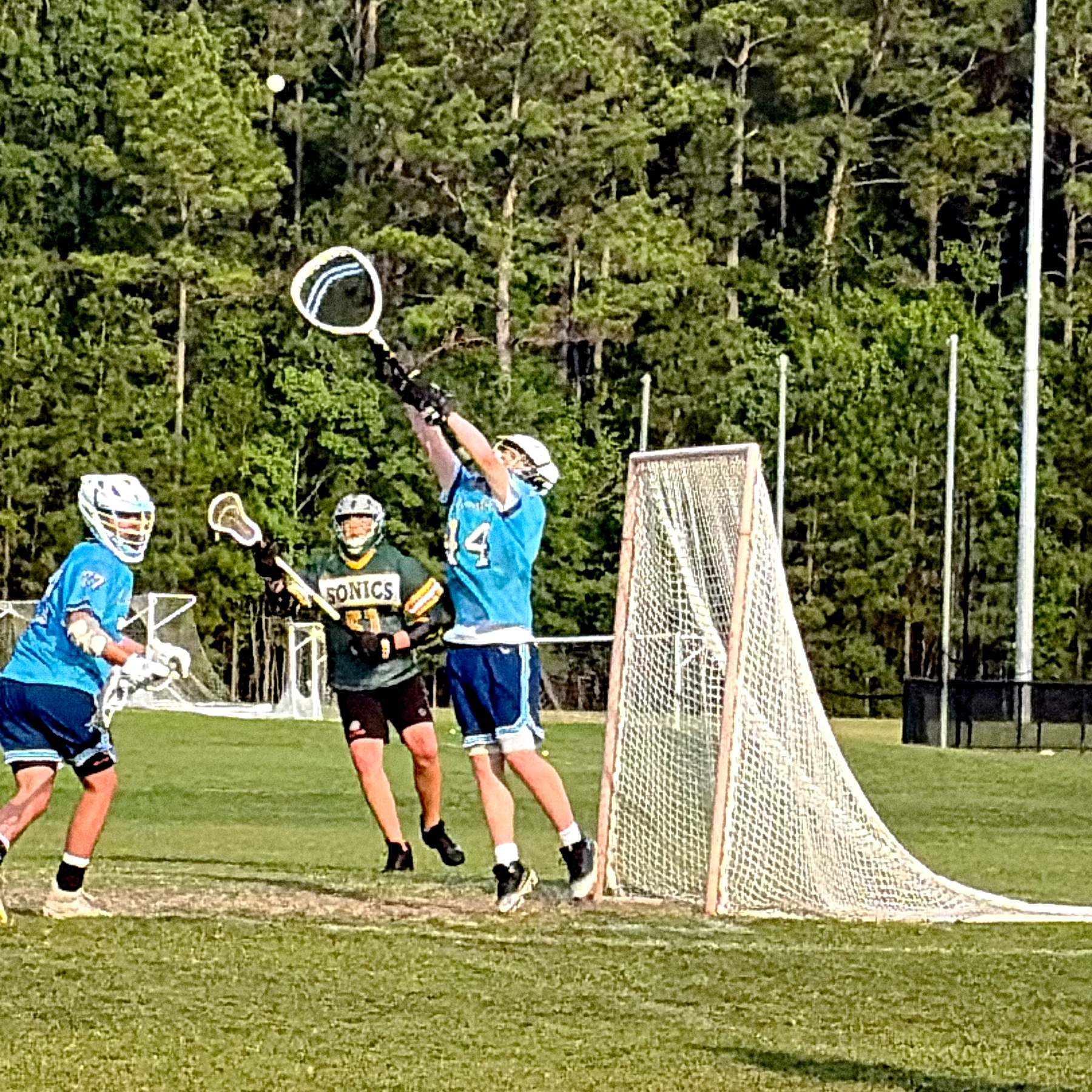
Lacrosse tournament for Ryan in Rock Hill this weekend. Some great saves today.
5/28/26 • 1 min read
I’m proud of my state this week. The South Carolina Senate defeated a reckless redistricting effort, and South Carolina voters have come out in droves for early voting. I wanted to make a shirt on Cotton Bureau to commemorate the hope I’ve felt in the state this week.

Dum Spiro Spero is the South Carolina state motto — “While I breathe, I hope.”1 It’s a beautiful statement of persistence and determination. Yes, the shirt is in Latin, and yes, that means you’ll have to explain it to people.2 I recommend ordering a nice indigo blue.
If t-shirts aren’t your speed, there will also be an embroidered beanie soon, but the artwork isn’t ready quite yet.
Bob Wertz is a Ph.D. student, typeface designer, and native South Carolinian. He’s been blogging since 2008.
And much better than our unofficial motto. ↩︎
Dum Spiro Spero is typeset in SbB Certiphica Bold, my faux blackletter type design. ↩︎
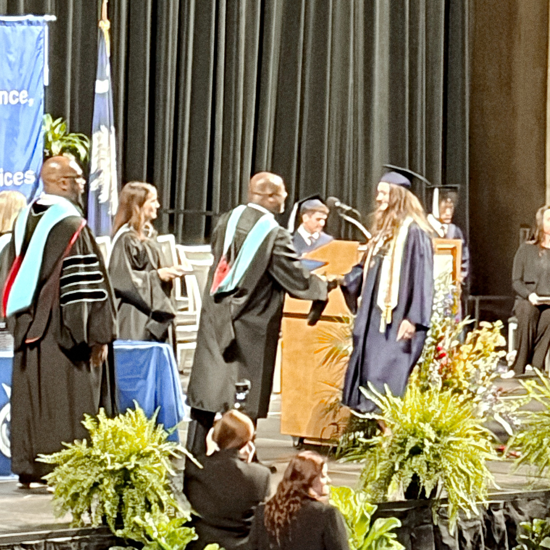
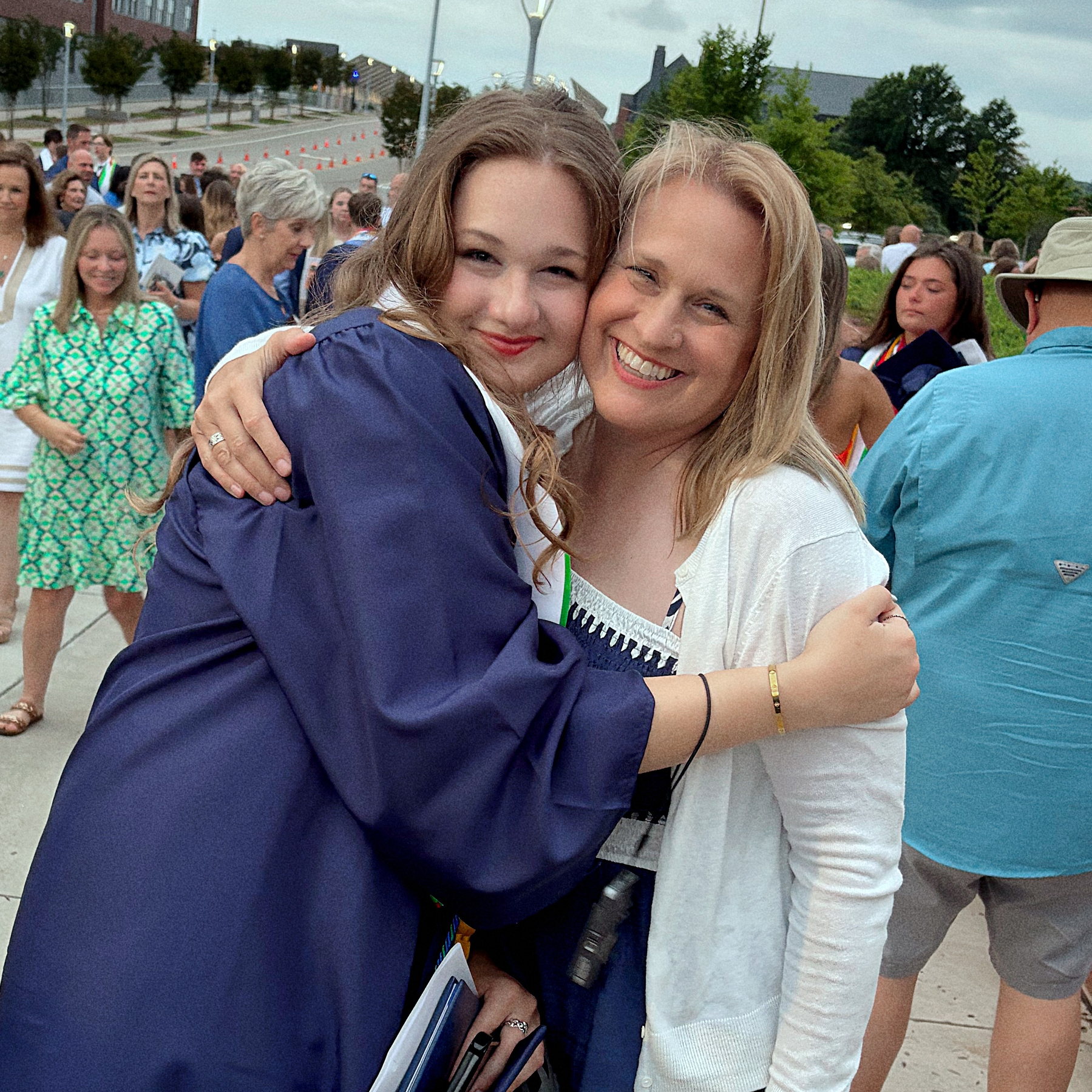
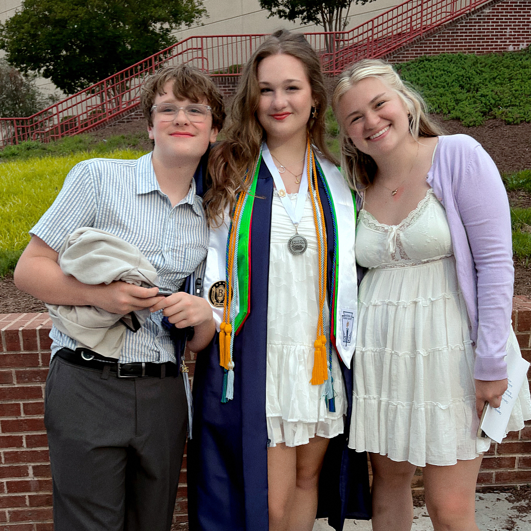
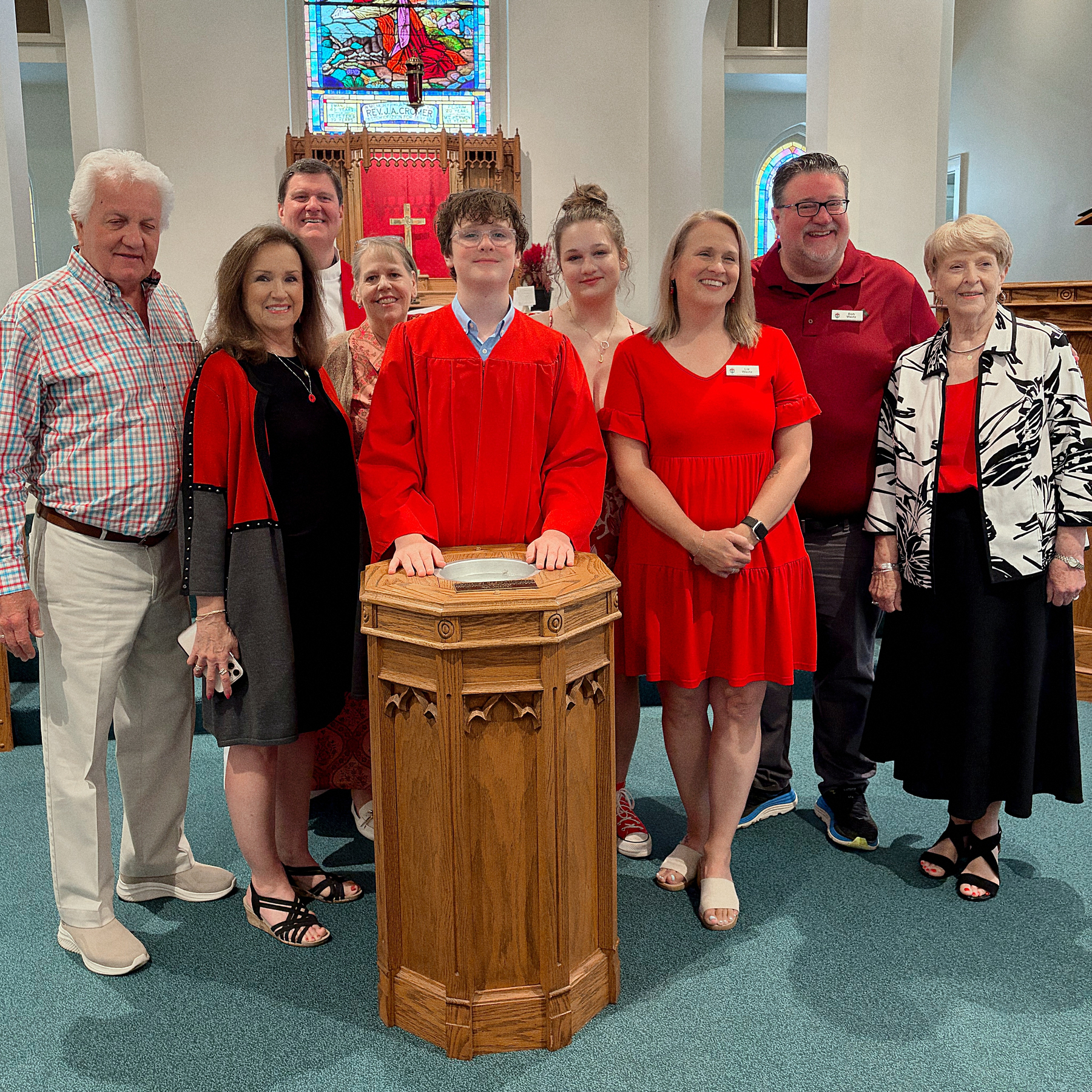
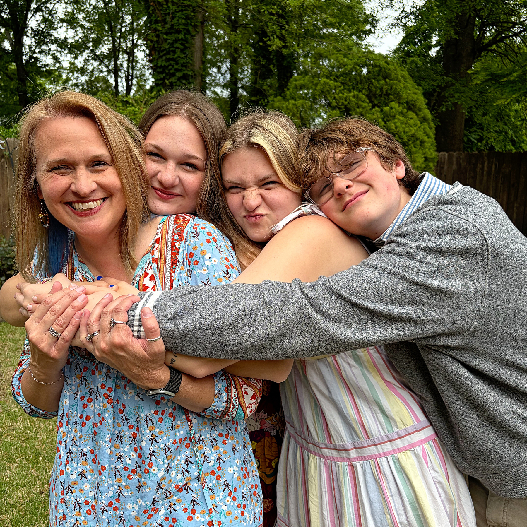
Busy weekend so far for Team Wertz. Jill’s graduation + Ryan’s confirmation.

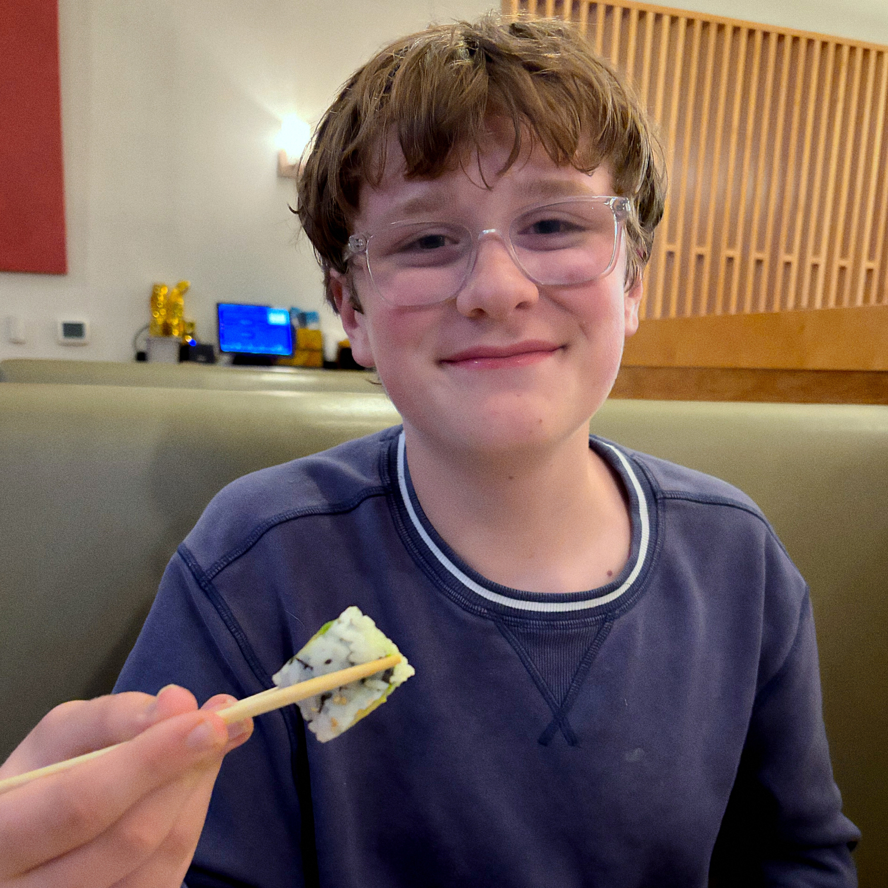
Got Ryan to try sushi for the first time tonight. Surprise: he likes it.
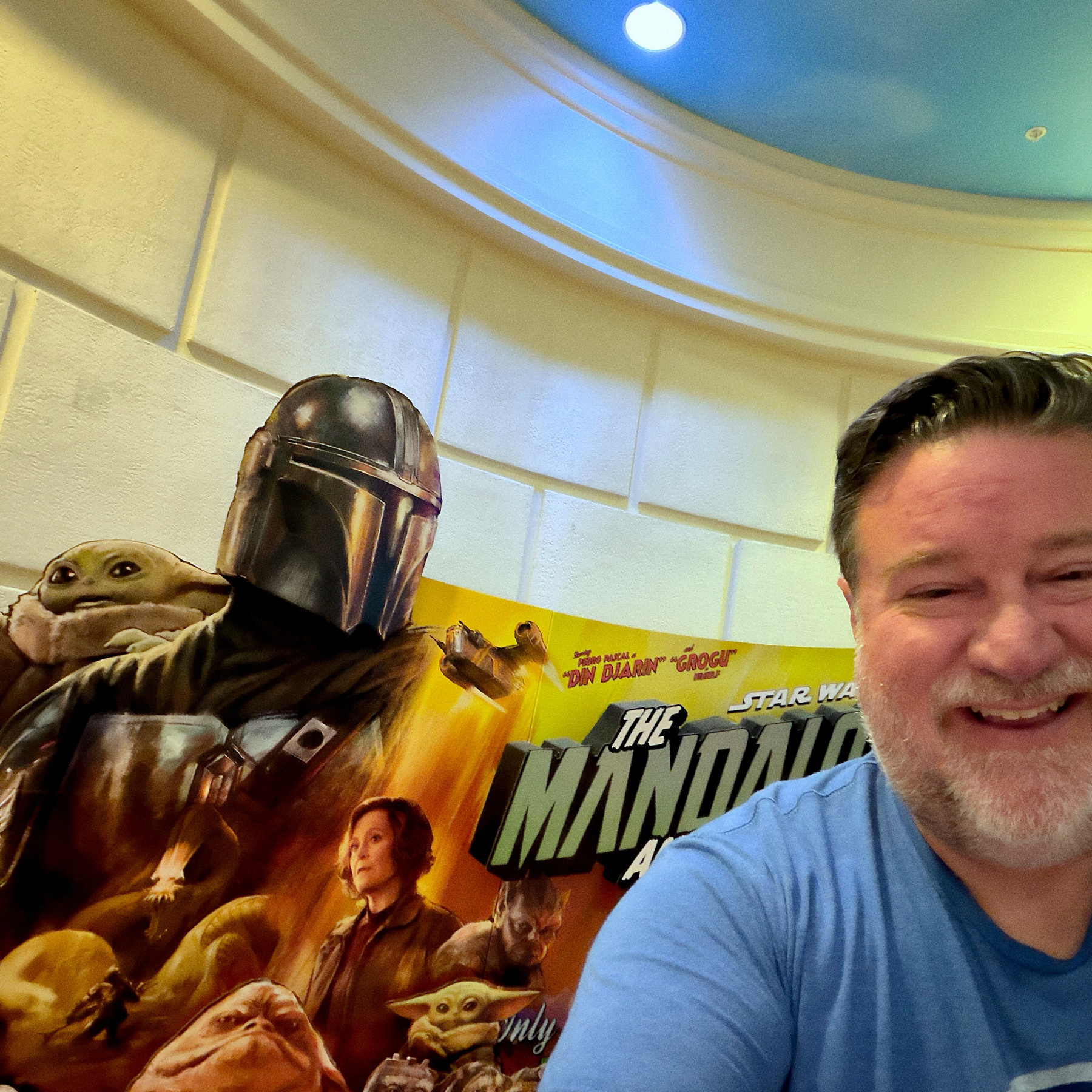
Mandolorian and Grogu was fun. I enjoyed it. 🍿
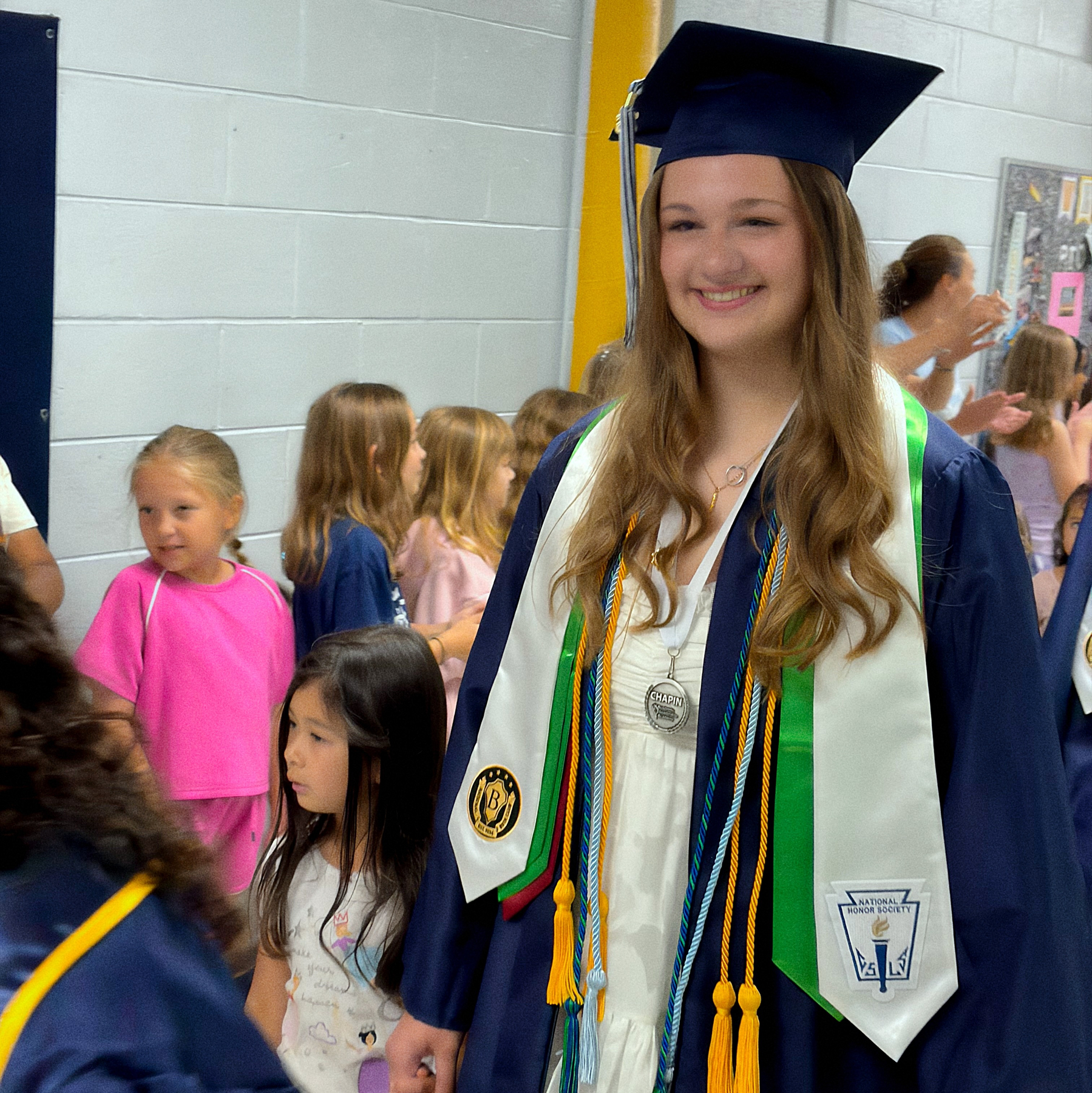
Our school district has a tradition where graduating seniors go back to their elementary school and walk through the halls. The kids make signs and cheer for them. Jill got to go through CES today. Such an incredible experience for the seniors and the elementary age kiddos.
On August 12, 2026, a solar eclipse will appear over Greenland, Iceland, and Spain. Many shady vendors will sell incredibly tacky shirts to commemorate the occasion. Instead, order something a little more classy. Available on Cotton Bureau.

Happy Mother’s Day, Lizzy.
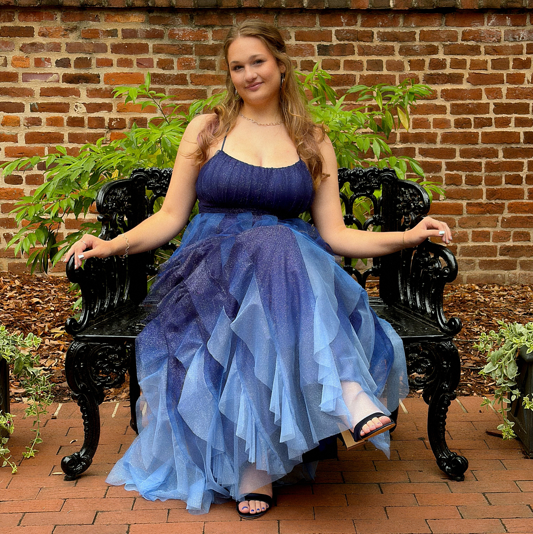
Prom 2026.
4/22/26 • 6 min read

In 2016, I wrote a post about the things I would miss if Twitter went out of business. I identified potential pain points, and identified what steps to take just in case. After Twitter was acquired, I was able to easily leave my account.
Now, I’m thinking about what it would take to leave Meta’s products. I don’t think they are going to go out of business. They are the social media equivalent of “too big to fail.” I’ve long believed that Meta is an unethical company that builds addictive products. They’ve been awful for a long time, though, so why have I just made the decision to plan my exit? I used to enjoy Instagram, but lately, not so much. I’m posting less, and at the same time, seeing less content from people I know. I think it’s time to start the process.
When we talk about Meta, I’m talking about three products that I currently use: Facebook, Instagram and Threads. I started using Facebook in 2008 and have used Instagram and Threads since they were released.1 I now rarely log into Facebook, but I use Instagram and Threads regularly. I don’t use What’s App or Messenger, so those aren’t an issue for me.
I will note that some of the systems I adopted to leave Twitter help me with this new attempt to leave Meta. Since 2022, I’ve essentially run a P.O.S.S.E.2 set up (Publish Own Site, Syndicate Elsewhere) where most of my posts start on bobwertz.com via Micro.Blog and are then shared to Bluesky, Mastodon and Threads. Threads is the only Meta app that allows for this type of API access so it tends to be a little more integrated into my daily routine.
Looking at the Meta apps individually, here’s what I need to do to move away from Meta:
Facebook. I’ve mostly already left Facebook. On my About Bob page, it’s listed under “Not Updated Social.” The only thing left there are my old posts. And some of those old post contain awesome stories from when my kids were little. I downloaded a file with all the content, but I’d really like an online archive. Manton with Micro.Blog has said before that building a Facebook importer should be relatively easy. If he builds an importer like he did for Twitter, I can probably go ahead and close my Facebook page.
Instagram. Over the last few years, I’ve slowed my posting to Instagram. These days, I mostly use Instagram to view content. Increasingly, the content is ads, TikTok influencers, and AI slop. I was never a TikTok user, but I now understand why people love (and are addicted to) the short video format. Once you get sucked in, it’s easy to just sit there scrolling and scrolling. That said, I have lots of content I want to see and I think I’d rather spend my time watching one of the dozens of TV shows on my list, reading through my RSS feed, or even watching long form YouTube videos.
I do have over 15 years of images on Instagram, and while they all likely exist in my photo library, I still want to keep a record of them. Thankfully, Micro.Blog does have a way to import Instagram posts. I’ll need to do some manual clean up, since some of my Micro.Blog images are duplicated on Instagram. I’ve already downloaded my images and run a couple of test imports. It’s going to take a little while, but it’s worth it.
While I may not immediately delete the account, I do feel like I’m already at a point where I can step away. Sometime soon, I’ll probably drop a note in the bio that my Instagram feed is no longer updated, and then delete the app from my phone. I actually just flipped my account to private. I’ve always had a public account, but recently, it just seems that every new follower is a spam bot that I have to block.
Threads. Weirdly, even though it’s the social media network I’ve been on for the shortest period of time, Threads might be the hardest to replace for me right now. It’s connected to Micro.Blog, so crossposting is easy. It’s is a great source for niche news that I care about, for example: women’s college basketball and F1. While I feel like I could easily leave Instagram, I believe that Threads still adds some value for me.
But more importantly, Threads is also the place where I get the most engagement on what I share through Micro.Blog crossposting. Part of this is the Threads algorithm, but I also do know a bunch of people on Threads who respond to my posts… which leads to the biggest problem of all…
Meta’s apps are where people I actually know share updates.
The real problem with leaving Meta is that my family, friends and acquaintances are there. Facebook and Instagram especially. If I leave Meta’s ecosystem completely, how will I communicate with friends and family? How will I know what’s going on in the communities around me? Sadly, I guess the simple answer is that I won’t. No other ecosystem has the extensive network that exists on Meta’s platforms and with today’s fragmented social media infrastructure, no singular alternative is going to form to rival the number of users that Facebook and Instagram have. A very small number of my friends are on Mastodon or Bluesky.3 A choice to leave Meta products entirely is a choice to cut off connections. And I’m not 100% ready to completely sever those ties.
Which means I can’t quite get rid of Meta yet. But I’m actually closer than I thought I was. My plan is to look again at ways to preserve my Facebook and Instagram posts. I want an archive of everything. I’ll then completely pause activity on those platforms for the foreseeable future. I’ve long since deleted the Facebook app from my phone. Instagram will be next. I won’t delete those accounts yet. I’ll continue crossposting to Threads4 for the time being, but start to look for ways to get the same content on other channels. I wrote a total of six Twitterless posts, so I’ll likely follow up on this one eventually. Check back in on non-Meta social media for updates. Or just follow my RSS feed.
Bob Wertz is a type designer, Ph.D. student and researcher living in Columbia, South Carolina. He’s been blogging since 2008.
I joined Instagram the month it was released in October 2010. I joined Threads minutes after it was open to the public in 2023 and is user #210,850. ↩︎
Yeah, I hate acronyms, too. ↩︎
I know a bunch of people on Linked In, but it’s Linked In. ↩︎
I think Threads still requires an Instagram account, so as long as I am using Threads, I have to at least have an active Instagram account. ↩︎
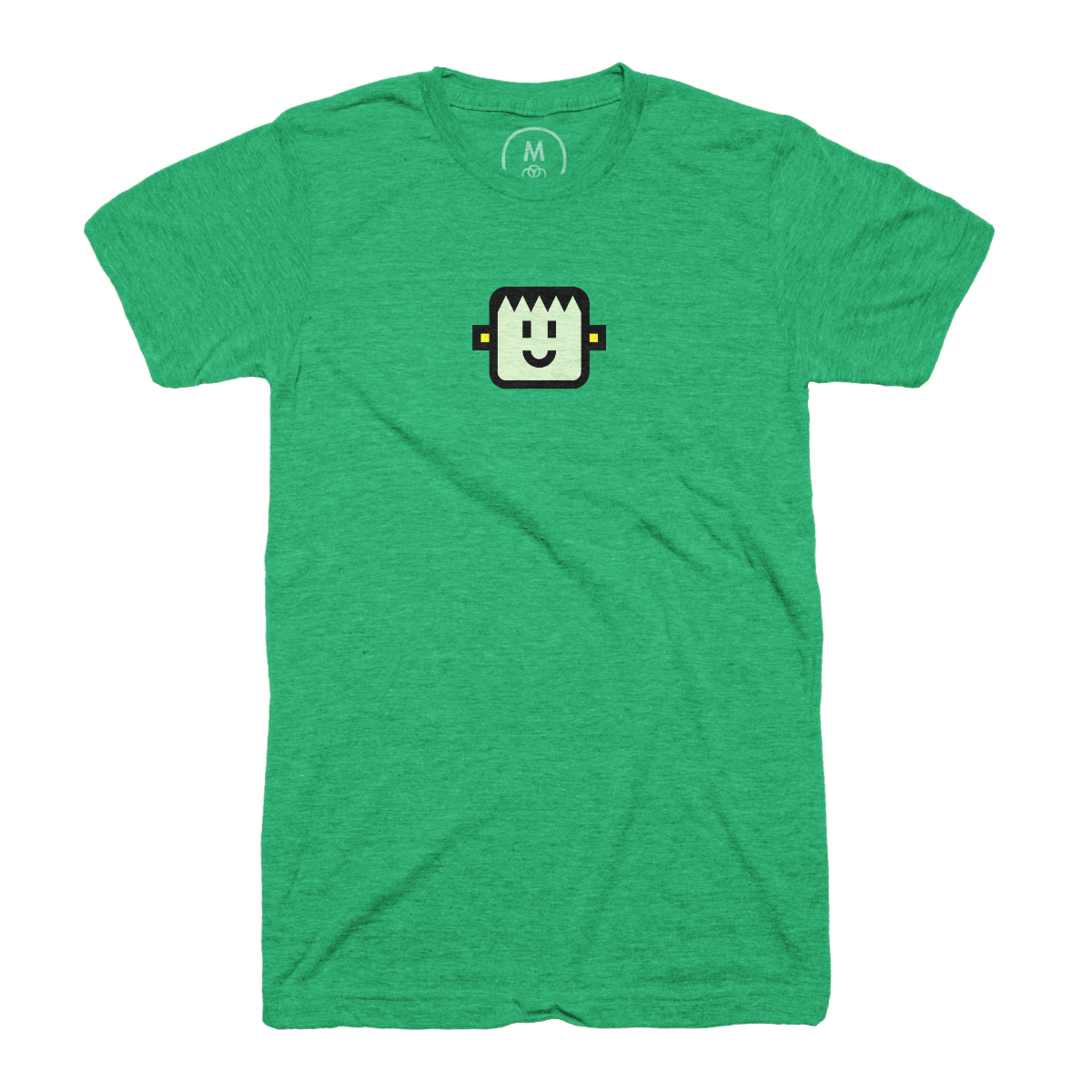
Thanks to Cotton Bureau for featuring my new “Happy Frank” shirt design in their T-Shirt Tuesday email. (And yes, I know his full name is Frankenstein’s Monster, but he just goes by Frank these days.)
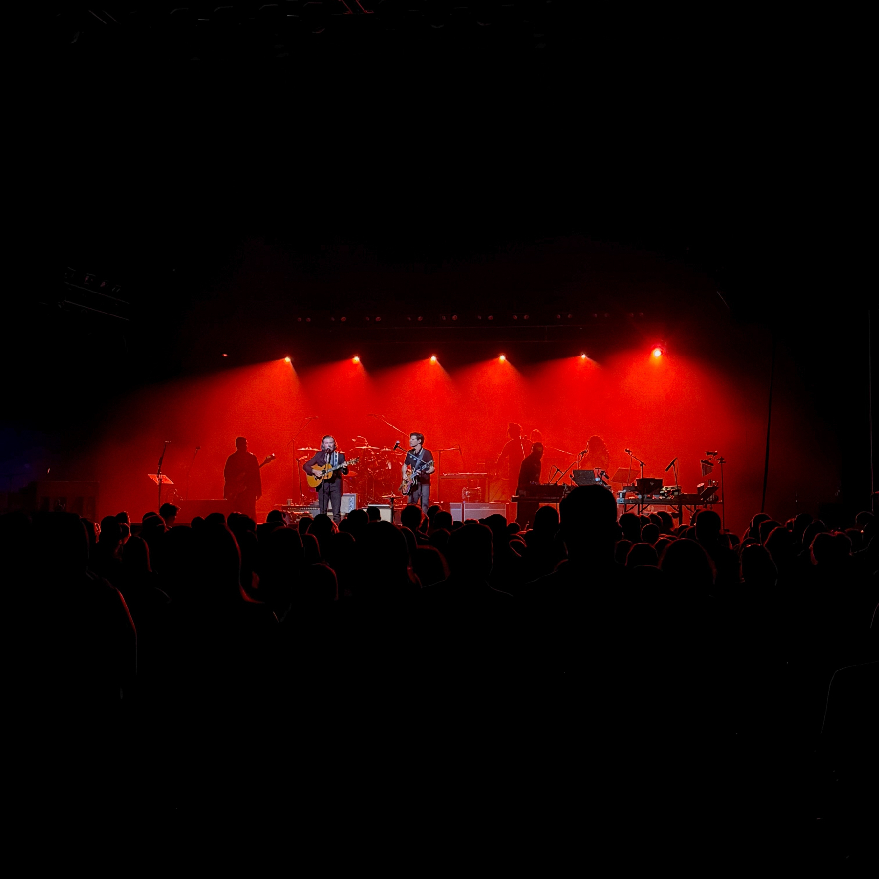
Avett Brothers at the Township Auditorium.
4/8/26 • 1 min read
Being a type designer can be weird. You create your design. Share it with the world. And then someday, unexpectedly, it shows up again.
I designed SbB Powertrain over a decade ago and I was very surprised to see it pop up in a clip of Gamecock Women’s Basketball player Ali Tournebize dunking in the 2024 Eurobasket U18 bronze medal game. Turns out that FIBA uses Powertrain as part of the identity for their Eurobasket tournament. It was used heavily for the 2024 and it looks like they are still using it in some places. Here are a couple of examples that I stumbled across.


If you look closely to the videos, Powertrain is used for the 2024 at center court and on some of the courtside screens. So much fun to see my type design in use, especially in a global context. Learn more about SbB Powertrain and my other fonts at sbbfonts.com.
Bob Wertz is a type designer, Ph.D. student and researcher living in Columbia, South Carolina. He’s been blogging since 2008.
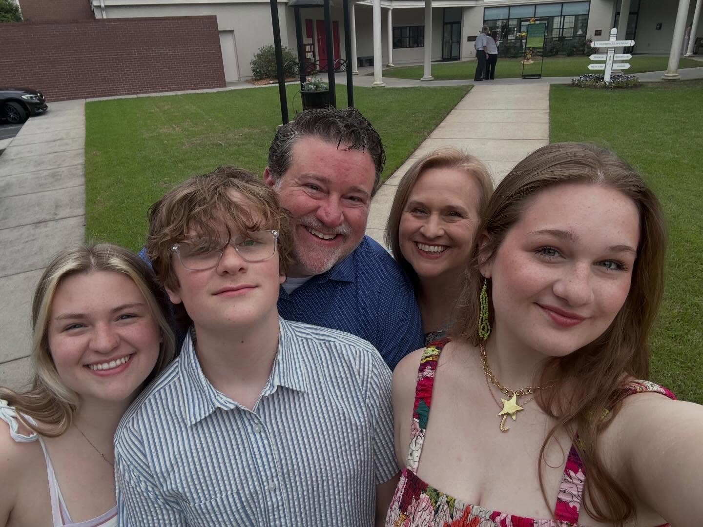
Happy Easter from Team Wertz. Always wonderful to worship at St. Paul Aiken when we are in town.
Spring is here. I looked up while grilling and noticed our backyard trees are finally all green again. 🍃🍃🍃

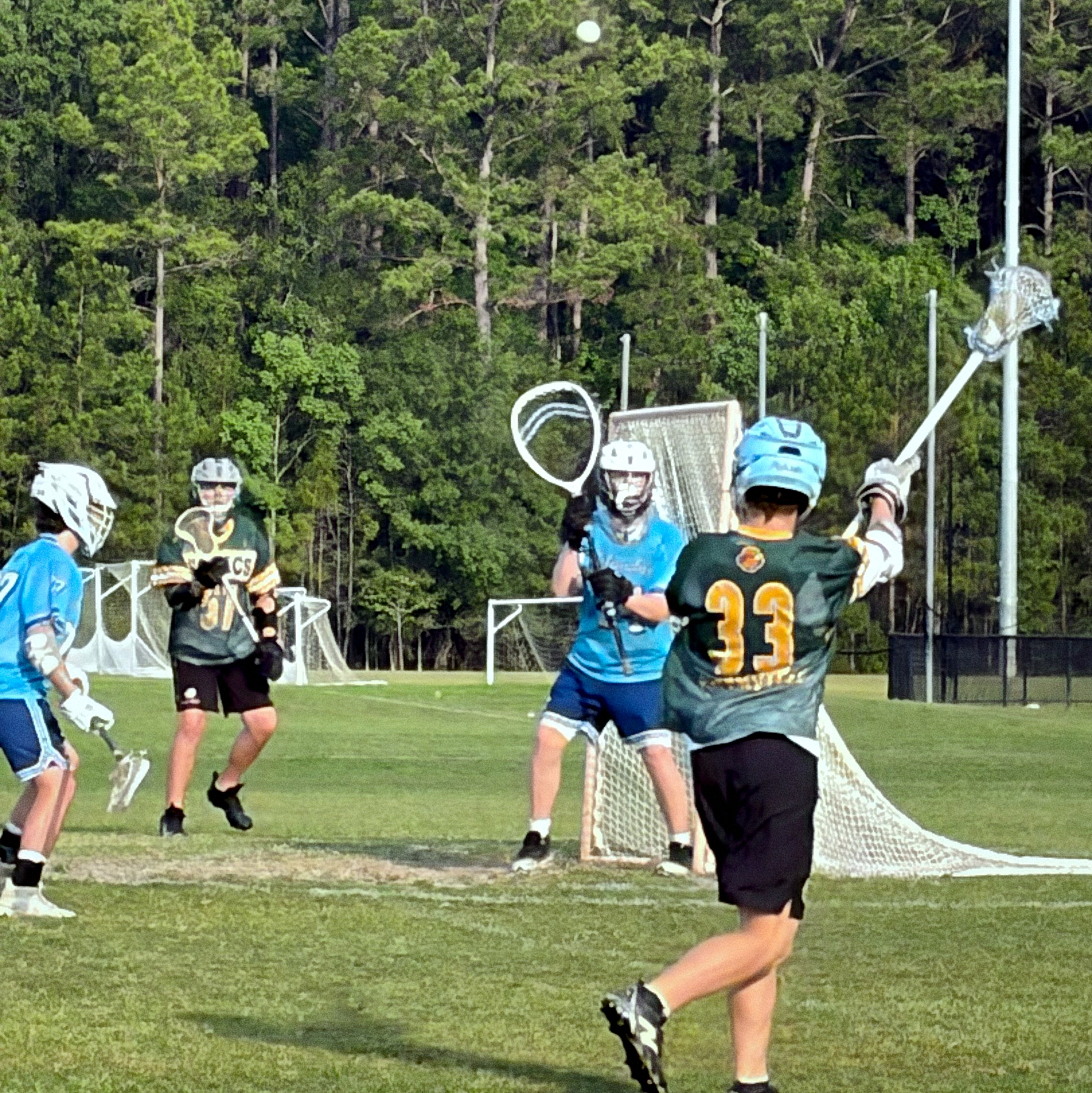
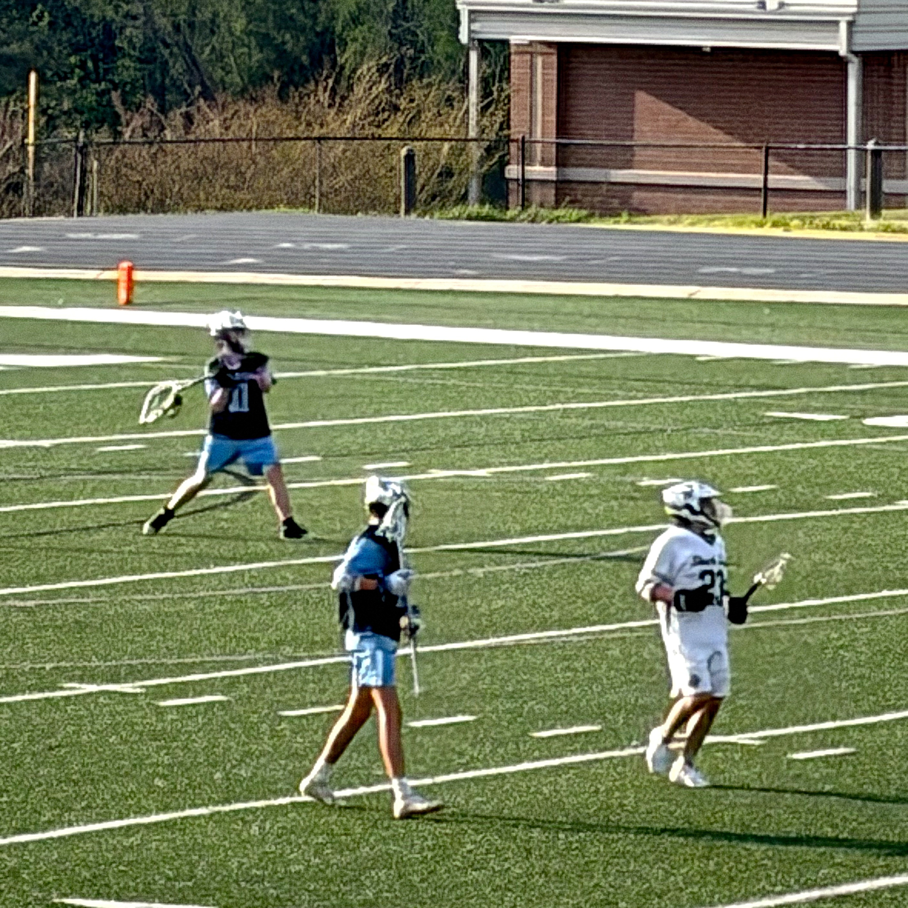
Ryan got his first high school start tonight when the starting goalie injured his hand in warm ups. He got the win and a shut out.
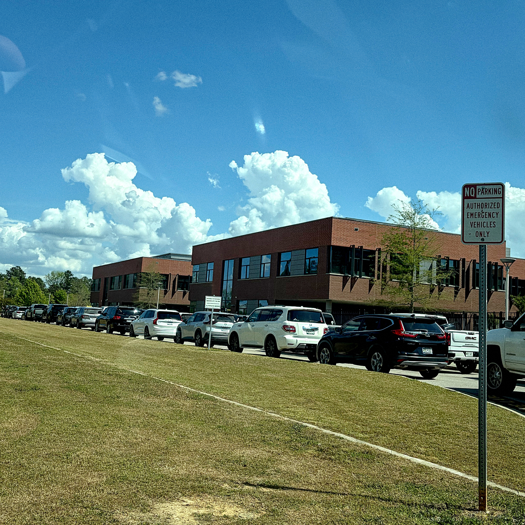
Bored, while sitting in a very long middle school car line. (I’m near the front.)