I’ve used Ulysses for long form writing since 2015, but completely forgot that I can post to Micro.Blog directly from inside of the app. (I even have a folder set up with the Micro.Blog icon.)
I’ve used Ulysses for long form writing since 2015, but completely forgot that I can post to Micro.Blog directly from inside of the app. (I even have a folder set up with the Micro.Blog icon.)
Over the last two days, my son and I watched all three Lord of the Rings movies. (Theatrical cuts, not the extended versions.) It has been a long time since I’ve seen them, and honestly, they were better than I remembered…
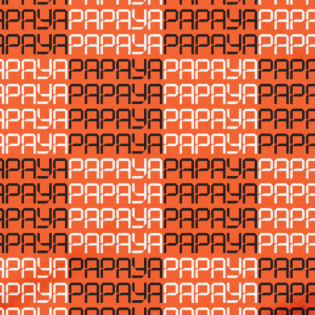
After Lando’s win this morning, I thought I needed a “papaya” shirt. Alas, I don’t wear orange, so this papaya shirt also comes in grey. Available on Cotton Bureau.


Fun race this morning. F1 is best when lots of teams are competing for the win. Congrats Lando on the win! 🧡
My next digital housekeeping project: sorting out my email situation.
I’ve finally finished the process of moving my old posts over to this site, hosted on Micro.blog. A couple of notes on the finishing touches:
And so now, I have everything in once place. Almost everything I’ve written on the web and every picture I’ve shared is here on bobwertz.com, gathered from Squarespace, Twitter, Instagram and Flickr. At some point soon, I’m going to write more about the changes in my philosophy over the years that drove me to this point, and where I want things to go. This was a significant amount of work and I’m glad to be done. I also completely understand why people abandon sites instead of migrating posts.
Bob Wertz is a type designer, Ph.D. student and researcher living in Columbia, South Carolina. He’s been blogging since 2008 and all of those posts are finally gathered on a single site.
Lando Norris! Pole position. Glad to see the new McLaren upgrades work.
Enjoyed the first episode of Star Trek Strange New Worlds Season 4. Warning: Stay spoiler free on this episode.
This visualization by Reuters of the drone kill zones in Ukraine is incredibly well done, and depressing. Drone use in the Ukranian War has changed warfare, and I’m sure every military strategist in the world is currently trying to understand this new drone-based reality.
I don’t have any metrics on bobwertz.com. I have no idea how many people read my posts on this site. I genuinely don’t care. But sketchbookb.com was setup when I was younger and cared about building an audience. I have Google Analytics installed and I can know exactly how many people are visiting there, if I want to look. I just don’t look.1
Yesterday, I noted that I was going to abandon most of the old Indesign posts that currently live on Sketchbook B. I was working through setting up redirects as I move things around and figured I’d see how much traffic was still heading to that site, which has been essentially inactive since 2022. Turns out, those Indesign posts still get a lot of traffic.
Which leaves me conflicted.
Also, there was a point in time when I thought I could build an audience by sharing weekly Adobe tips. I put a lot of time and energy building those posts. That’s part of my writing history, even if I don’t want to be a Adobe blogger any more…
So damn it, I’m going to keep them and add a disclaimer that these tips are very old. That means I need to move over another 20-30 posts that I’d planned to abandon, but I’ll feel better knowing they still exist.
And seriously, GREP Find and Replace is amazing.
Bob Wertz is a type designer, Ph.D. student and researcher living in Columbia, South Carolina. He’s been blogging since 2008 and has covered lots of topics over the years.
I could install a metrics package in Micro.Blog, but haven’t. I’m happier that way. I have recently thought about putting some simple metrics on sbbfonts.com, since that’s a business site. ↩︎
Before Adobe rebranded Creative Suite to Creative Cloud! ↩︎
I’ve mostly finished with my project to move selected posts over from my old Squarespace site, Sketchbook B. I’ve been working on this off and on since 2024.
Squarespace export is pretty rough, so it was a very manual process. It includes a bunch of random javascript and junk in a Wordpress format that makes clean import difficult. Recently I changed my approach and used Python to scrape my old site and create Markdown files for each post. Micro.Blog then takes a ZIP archive of .md files and converts them into posts, finding the links and moving them over. It worked reasonably well. I had three total pages where Micro.Blog struggled to move the images over.1 And I had to rebuild the site a couple of times. But now, I have 170+ old posts dating back to 2008. Pretty much every post and picture I care about lives on bobwertz.com.
So what did I choose to leave behind? I didn’t move InDesign tips from 2012. They got a lot of traffic on my old site, but I’m not interested in being an Adobe expert anymore and they’d have to be updated to be useful. I dropped a bunch of random link posts, mostly because the links were broken. I went through a phase where I wrote about my favorite gear, but again, most of those links are broken and the reviews weren’t extensive. I kept a few. I dropped anything about how I was changing or redesigning the site. When in doubt, I aired on the side of preserving the post.
There is one other section of my old site to move… I have years of microblog posts on Sketchbook B. From 2017-2022, my original microblogging setup was connected to my Squarespace blog, which would then crosspost from Micro.Blog to Twitter and Facebook.2 I deleted them from Micro.Blog when I rebooted everything in 2022 — dumb mistake. Much of this is already captured in my Twitter archive, so I’m not too worried about it, but I would like to move some of them over. Once I decide how to handle it, I’ll be ready to pull the plug on my Squarespace hosting plan (and the accompanying monthly charge).
I also need to figure out how to handle my sketchbookb.com domain name. Do I just redirect it to one of my domains? Or maybe I’ll just create a simple new page with links to both sites. I need to think that through for a little bit. I am going to try and use Cloudflare to redirect links so they aren’t broken. We’ll see how that goes.
Bob Wertz is a type designer, Ph.D. student and researcher living in Columbia, South Carolina. He’s been blogging since 2008.
After watching the Avengers: Doomsday trailer, I’ve decided to revisit some of the X-Men movies, starting with the 2000 version.
Before Thunderbolt, there was SCSI. Another t-shirt design for my retro tech merch collection.

Michael Tsai with an exhaustive summary of the icon discourse from the past few weeks.
CVS has Halloween candy… in July.
I assumed that people would abandon Twitter after Elon took over. Many people I followed moved to Mastodon, Bluesky or Threads. I moved, closing my account, but many Twitter users that I knew stayed. Even the ones that hate everything that Elon stands for. Even the ones who hate his bullshit white nationalist politics. Even after… everything.
It’s depressing, but the truth is that for many people, social media is an audience game, and it’s tough to abandon an audience. It’s even tougher to build a new audience. And people did the math, and sadly decided to stay.
I left Twitter and don’t regret it. I’m scaling back my Meta usage significantly. I don’t think these large social media companies are good for society. I’m content with alternative social media platforms, but I have to at least acknowledge that many, many, many people love these services. Even if they know the social media services are harmful to themselves and society, they won’t move to a new service. That’s tough to reconcile.
Bob Wertz is a type designer, Ph.D. student and researcher living in Columbia, South Carolina. He’s been blogging since 2008.
I’ve always thought that professors and researchers are an ideal target market for Micro.Blog. Many scholars have personal web sites, but they are often woefully out of date. I thought a plug-in that automatically updated academic publication listings could be helpful, but after a little research, I figured out that Google Scholar doesn’t have an API. I dropped the idea.
Last week, I was thinking about this project again and asked ChatGPT how to “pull information off of Google Scholar” to publish on a personal web site. After a couple of questions back and forth about how I was hosting my site and what I wanted to accomplish, it recommended pulling from ORCID instead. ORCID is basically a unique common identifier and profile for scholars and researchers and is often required when you submit articles to publications. Since Google Scholar doesn’t have an API, ORCID was the next best thing. Before I knew it, ChatGPT was providing instructions for creating a new shortcode template for Micro.Blog.
Some background… It hasn’t been part of my day-to-day job for a very long time, but I’m comfortable with HTML and CSS. I’ve played around with some programming, mostly Python. I’ve customized themes for Micro.Blog, and looked at the Hugo templating language to see what it would take to build my own theme. I wouldn’t consider myself an expert on any of this, but I did understand the code I was looking at. Also, as a University of South Carolina graduate student, I have free access to ChatGPT. So my choice of chatbot is less a matter of philosophy and more a matter of convenience.
I started by building something that would just work on my site. ChatGPT navigated the API documentation for Micro.Blog and ORCID. After some back and forth, I got it working. ChatGPT eventually recommended that we supplement the information on ORCID with metadata from CrossRef. The CSS was a little strange, so I had to manually adjust it. Once everything was stable, I asked it to walk me through the process of building a plug-in for Micro.Blog. I fired up BBEdit and GitHub. Within a few minutes, I had a working version of the plug-in. You can see the plug-in, Academia, in action on my new Publications page.1 I plan to make some refinements, make an icon, test the plug-in with some different themes, and then make it available to others. I honestly don’t know how many people would take advantage of the plug-in, but I’m excited that I was able to build it.
I’ve been an LLM skeptic, concerned about the environmental impacts of the technology and the implications for creators.2 But after playing around with this plug-in project off and on for the last couple of weeks, I completely understand why programmers view AI-assisted coding as revolutionary. I was able to build something quickly that I’d been wanting to build for a while. In the hands of a skilled programmer, I can’t imagine how powerful AI-assisted programming could be.
Look for more updates on Academia soon.
Bob Wertz is a type designer, Ph.D. student and researcher living in Columbia, South Carolina. He’s been blogging since 2008.
I replaced my CV/resume in the menu with the new Publications page. ↩︎
And I’m still concerned. The costs of this new technology is high. ↩︎
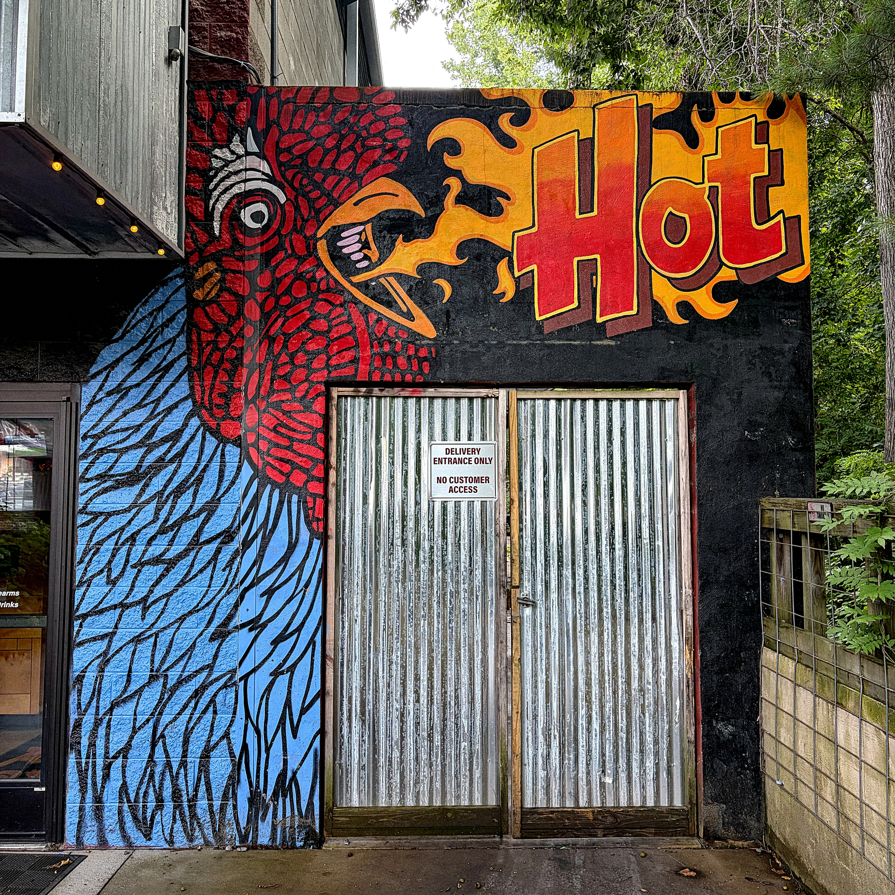
Rocky’s Hot Chicken in South Asheville
Zeldman’s incredible post on digital preservation and decay:
So what do we do? We own our own domains. We keep local copies. In triplicate. We choose open formats over proprietary ones. We treat every platform as temporary, because it is. We archive not out of paranoia but out of love—love for the things we’ve made, the conversations we’ve had, the small, stubborn act of leaving a mark.
The only way to square this Max to McLaren rumor:
This doesn’t make sense, but it makes more sense than replacing Oscar.