If you want to watch two of the best teams in baseball, Cubs v. Tigers is MLB.com’s free game of the day.
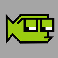
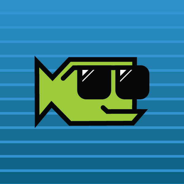
Switching my blog into summer mode. My fish logo is now the summer vacation version with sunglasses.
Google Scholar is blocking searches from my computer and phone if iCloud Private Relay is turned on, claiming that my “computer or network may be sending automated queries. To protect our users, we can’t process your request right now.”
Working in a Starbucks that’s just been renovated. It’s located at a major interstate interchange and was clearly designed to be primarily a drive thru location. Very small inside. The long bench is new, and probably a better use of space.

Dr. Annie Andrews is running for Senate in SC. She’s on Bluesky and someone knows what they are doing because her username is her domain name. 👍
Rewatching Arrow Season 1. So delightfully over the top. 📺
Everyone is excited about Apple renumbering the operating system version, but there are still ways they could mess with people:
macOS twentySIX
macOS XXVI
macOS Twenty6
macOS 20six
🤣
Sixteen years ago today, I shared my first Fontstruction… Big Thursday and it was selected as a Top Pick. Fontstruct has improved as a tool so much since those early days, but it’s still every bit as fun to play around with.
(Oh, and back then, the editor was built in Flash!)
Some creations are foundational. If you design a typeface, other people create things using that font. Photographers and illustrators create works of art that can be incorporated into other designs. Brand design crafts visual and verbal foundations that others can build on. These days, I’m much more interested in these foundational creations than I am designing ads or billboards.
Beware hype without details
Remember the invention that was going to revolutionize transportation in the early 2000s? Apparently not…
My Three Fontstruct Color Competition Entries
Every so often, Fontstruct has a themed competition and the current competition focuses on the new color features. I’ve pulled together three color designs that try to use color in different ways — a pattern, a bright multicolor whimsical design and a 3D effect.
One of the fun things about the competitions is the amazing creativity that comes out of the community. Fonstructors can interpret the theme is very different ways and it’s always amazing to see the varied approaches driven by a simple prompt. I’ve entered a few times and even got an honorable mention once in the “Reverse” Competition for SbB Codebreaker. I will also note that I’ve been impressed with how Affinity Designer has handled the color fonts. Seems to work flawlessly.
SbB Lumberjack
My first idea for a colored font was to make a pattern. I played with a couple of different patterns, but settled relatively quickly on making a plaid. One challenge was related to the scale of the pattern in relation to the size of the letters. My original plaid pattern was much bigger, but didn’t work well with some letters. I tried a couple of different sizes, but ended up with this one. This pattern is often associated with lumberjacks, but I think my wife has pajamas with this plaid pattern.

SbB Lightbright
I wanted to create a bright multicolored design. Really lean into the color theme. (And I always love to create Fontstruct designs that use a single brick.) I started with a square pixel, but eventually switched to a circle. The round dot reminded me of a Lite-Brite. I used Adobe Color to pick a color palette that would work on a black background. I wanted some whimsy, so I created a bouncing effect… Uppercase letters create a character in a higher position. Lowercase letters drop them down a block. So if you alternate case, the letters bounce up and down.

SbB Perspectives
Another random idea was to build a font that would work with 3D glasses. To be honest, I don’t have any 3D glasses laying around, but this feels like watching a 3D movie without the special glasses. So mission accomplished. I kept the design simple, because the type needs to be large to experience the effect.
 ---
---
Not sure if any of these will be selected as winners or honorable mentions, but I’m really happy with how they turned out. And I can’t wait to see what everyone else does.
Bob Wertz is a type designer, Ph.D. student and researcher living in Columbia, South Carolina. He’s been blogging since 2008.
Remember the hype leading up to the introduction of the Segway? Never believe the hype until you actually know what the product is…
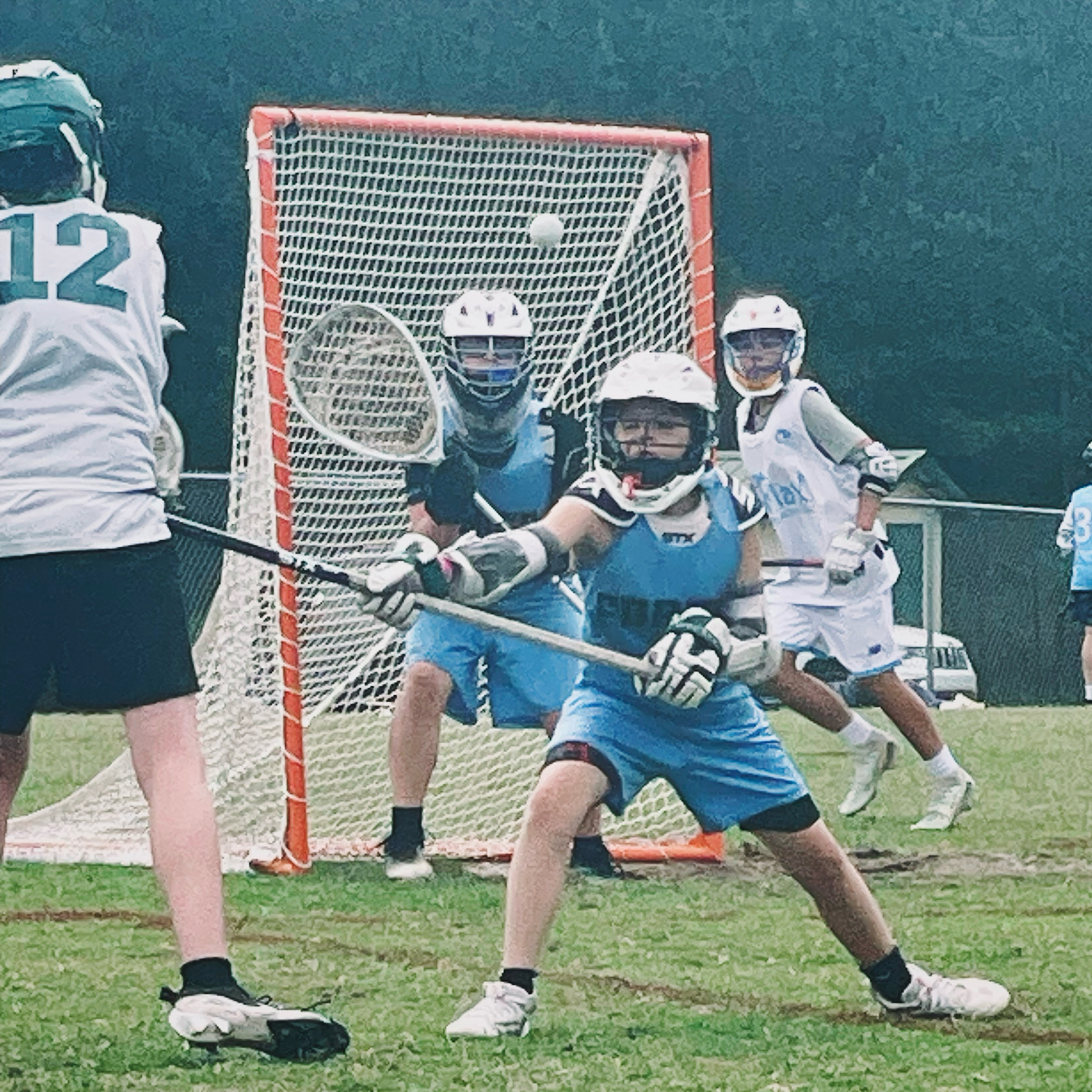
Wrapped up a really long middle school lacrosse season. Ryan had a great season in goal and he’s continuing to learn the craft, but I am incredibly glad that we’re done for a little while.
I’m taking a six-week summer grad school class for the first time… and damn, there is a lot of work in a short time.
Spending the morning at the Subaru dealership while they make a warranty repair to our Outback. It’s a pretty nice customer lounge with extremely average coffee.
Luxury experience
Reflecting on a favorite hotel in Charleston, SC that was just honored as one of the best in America.
Did some grad school work after watching the Andor finale… I had some weird dreams mashing up the two…
Color fonts and signal flags
I’ve been thinking about color fonts lately. Experimenting with the color fonts features in Fontstruct and Glyphs. Trying to better understand how to create color fonts. And while I’m starting to understand how they are made, I’m left with one major question… why?
Why do we need color fonts?
If you don’t know, fonts are typically monochromatic. Black and white only. Color is applied in software like Adobe Illustrator or Microsoft Office. The ability to customize is limitless.
Often, the case for color fonts is made for the web. A complex typeface design with color features that can be encapsulated as a vector font and customized via CSS would be appealing. But color web fonts support is inconsistent across browsers. I also think web-based design apps like Canva and Adobe Express that cater to more novice designers might have a use for some pre-colored fonts.
I did think of one application — nautical flags. I built a font on Fontstruct in 2009 with black and white flags, so with the new color font tools, I colorized the signal flags and updated the design. I called it SbB Foxtrot Sierra Charlie1 and I’m really happy with how it turned out.2 Fontstruct now allows you to download a COLR v1 color webfont and it’s free to download if you are a Fontstruct Patron.

I’m going to keep playing around with it, but I think color fonts will be a custom, niche tool with limited applications.
Bob Wertz is a type designer, Ph.D. student and researcher living in Columbia, South Carolina. He’s been blogging since 2008.
Loved this: Stop Trying to Raise Successful Kids. And start raising kind ones.
Overemphasizing individual achievement may cause a deficit of caring. But we don’t actually have to choose between the two. In fact, teaching children to care about others might be the best way to prepare them for a successful and fulfilling life.
I have no tolerance for people who preach compassion, but have no compassion.
Leo XIV is notably the first person named Bob to become Pope.
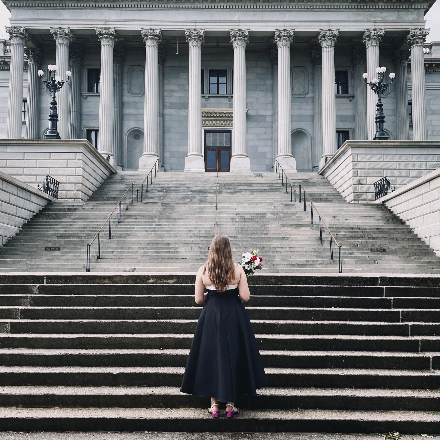
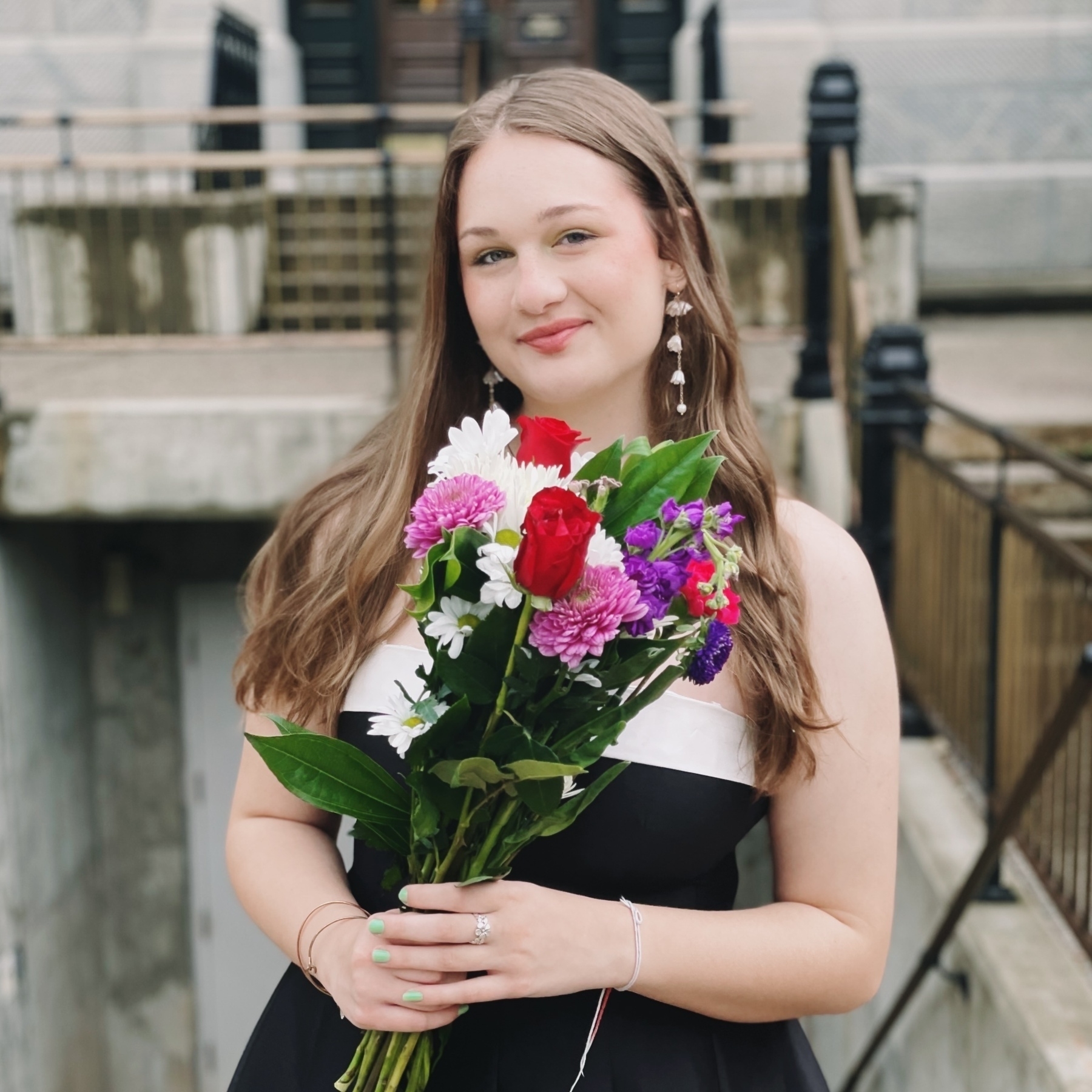
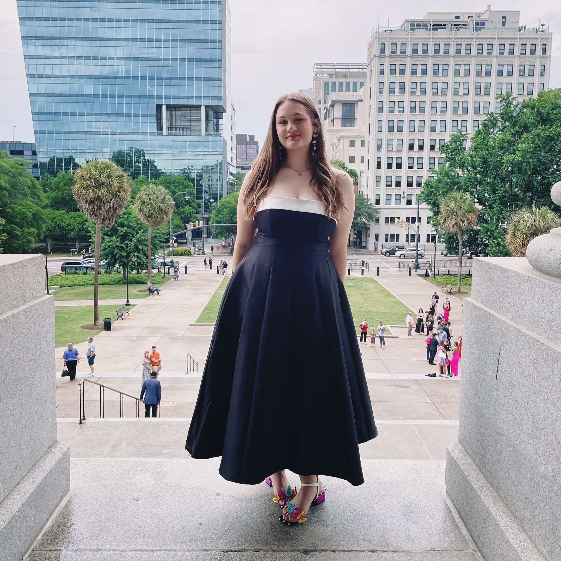
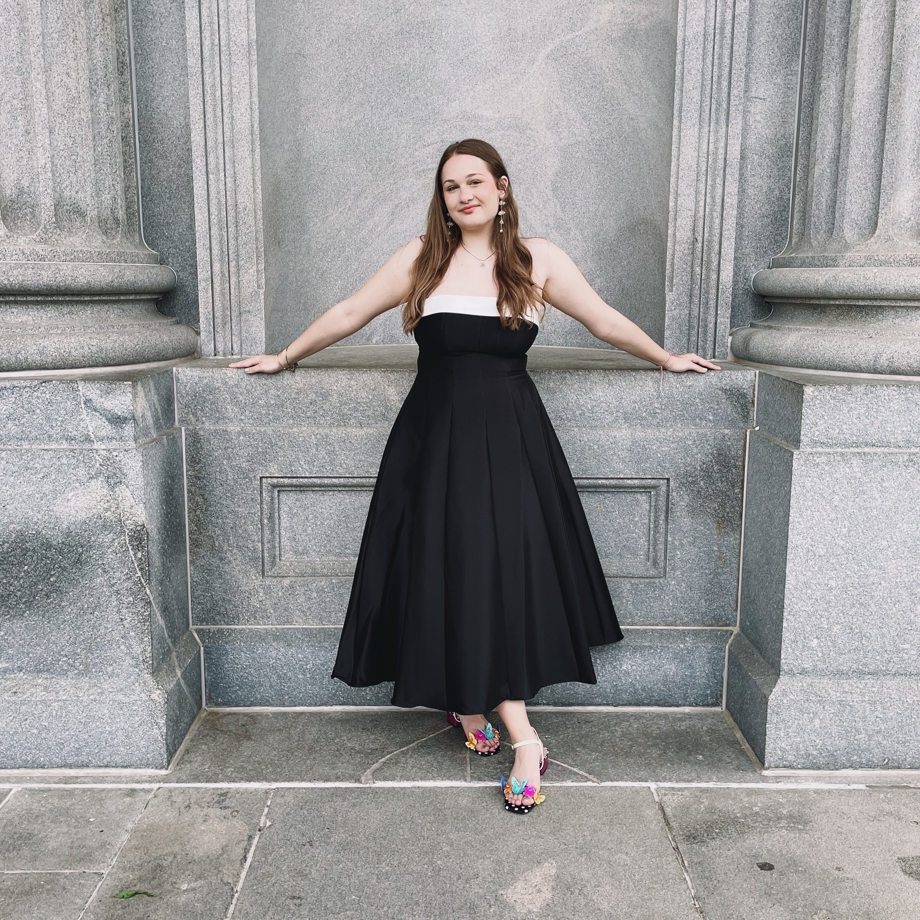
Prom pictures for my Jilly.
I’m writing a paper for class and I’ve just had to cite myself for the first time. That’s a pretty funny feeling…
I know that students love the food delivery robots, but my favorite campus robot is the little grass cutting bot over by the observatory.