I’m not the audience for Brian Recker’s Hell Bent. He’s writing for evangelicals (and former evangelicals) who are questioning their faith. I instead came to his book as a lifelong Lutheran who is baffled by how the Christianity that I grew up with has become warped by others who also profess to be Christian.
Brian’s thesis is that evangelical theology is so rooted in the fear of hell, that they struggle to see the message of love that is core to Jesus. I think it’s a pretty convincing argument. Brian breaks down all the ways that a fear of hell actually undermines having a relationship with God and sabotages healthy relationships with others. Faith rooted in fear leads to a very different place than faith rooted in love. I appreciated the exploration of evangelical theology, and all the personal examples of how Brian’s life changed when he started to question hell. It’s a very personal book. I learned a lot along the way, and was able to explore some of my own beliefs. I highly recommend that you check out Hell Bent.
When I became a designer 30 years ago, you needed three types of apps: a page layout app, a photo editing app and a vector app. You purchased those apps from whoever had the features you needed. Quark Xpress and Adobe Pagemaker1 were your options for page layout. Macromedia Freehand2 and Adobe Illustrator were your vector options. And while there were other photo apps, Adobe Photoshop was the dominant professional photo editor.
Quark missed the boat on Apple’s shift to OS X. Adobe purchased and discontinued Freehand. Without strong competition, Adobe’s Creative Suite app bundle essentially made InDesign free for designers who needed Photoshop and Illustrator anyway. Quark faded. Adobe switched to the subscription-based Creative Cloud model and became the only game in town.
But even with no competition, Adobe still offered separate apps for page layout, illustration and photo editing.
Affinity tried to be a non-subscription alternative to Adobe and so the original versions of Affinity tried to match the Adobe structure. Affinity Designer was Illustrator. Affinity Photo was Photoshop. Affinity Publisher was InDesign. However, the new Affinity is a single app, with vector, pixel and page layout modes. A completely different interface model. We don’t need three different apps any more. We just need one.
This unified model makes sense for the modern era of computing that is mostly focused on laptops and tablets. In playing with the new Affinity since its release, switching between modes is intuitive and I like the approach. (I was even able to easily hide the Canva AI tab that I wasn’t interested in.) Being able to freely switch between vector and pixel modes is liberating. On my M1 MacBook Pro, the Affinity app is absurdly fast.
I’ve been using Affinity off and on for 10 years mostly for personal projects.3 To be honest, I’ve mainly supported them because I wanted an Adobe alternative to exist. With Canva’s purchase and transformation of Affinity into a modern design app, I think they are posed to finally provide a realistic alternative to Adobe’s subscription model. It will be interesting to see how Adobe responds.
Bob Wertz is a type designer, Ph.D. student and researcher living in Columbia, South Carolina. He’s been blogging since 2008, an Adobe user since 1994, and an Affinity user since 2015.
I typically watch one or two NFL games a week, and yet, I don’t really have an NFL team. (I’m currently watching the Detroit Lions and Kansas City Chiefs on Sunday Night Football as I write this.)
When I was little, I was a Cowboys fan. We’re taking about the Tom Landry, Danny White, Tony Dorsett era Cowboys. When Jerry Jones bought the team and got rid of all my favorite players and their legendary coach, I decided I was no longer a Cowboys fan. I briefly pulled for the Bears when I lived in Chicago and they won the Super Bowl, but I was never fully invested and then, they fired Ditka.
In the early 2000s, I had a fantasy football team each season. That meant that I pulled for players, not teams. Every year, I’d pick a new team and have a new rooting interest.
I’m a South Carolina Gamecocks fan, so I’ve often pulled for teams with former Gamecocks. But trades and free agency happen. The Bears and Alshon Jeffrey became the Eagles and Alshon Jeffrey. The 49ers and Deebo Samuels became the Commanders and Deebo Samuels. Picking a team based on a player means that when a player leaves, your affinity for that team fades.
I’ve only been to one NFL game — a battle between the Miami Dolphins and New York Jets when my dad lived in Miami. Both teams were terrible and I can’t remember who won. I obviously didn’t develop an affinity for either of those teams.
Every so often, I feel like I’m missing out by not having a favorite NFL team. But how do I choose?
I’m not choosing the Cowboys. Also, I’m not choosing a team with orange as their primary color.1 As a Gamecocks fan, I do not wear orange.
I could pull for Chicago Bears since I grew up there and am already a Cubs fan and Bulls fan. I could probably live with their orange secondary color.
I could pick my team based on geographic proximity. The Carolina Panthers are a couple hours up I-77. I do live in South Carolina, and the Panthers are theoretically my “home” team despite being just across the border in Charlotte, North Carolina.
I could pick my team based on color palette. My favorite color is green. The Jets, Eagles, Packers and Seahawks are the only teams in the NFL with green incorporated in their team colors.
After thinking about it for a couple of weeks, I think that the most logical team for me to pull for is the Carolina Panthers. They have been terrible, but seem to be improving. (They just beat the Cowboys today.) They usually have a couple of Gamecocks on the roster. I do love their black and blue color scheme. And if I really do become a fan, I could easily catch a game up the road. I’m going to start making a point of watching Panthers games. We’ll see if it sticks.
And if being a Panthers fan doesn’t stick, I’ll just go back to pulling for good games and Gamecocks.
Bob Wertz is a type designer, Ph.D. student and researcher living in Columbia, South Carolina. He’s been blogging since 2008.
I did break this rule when I became a fan of McLaren’s F1 team. That said, I still haven’t purchased any McLaren merch. ↩︎
It’s always funny to me what pop culture symbols acquire added cultural meaning.
My son is a big fan of the manga series, One Piece. I haven’t watched much of it, but I know the basics… renegade pirates fighting against an authorization government in search of the ultimate treasure. It’s amazing to me that the One Piece Jolly Roger, with a grinning skull and a straw hat, has become the symbol of protests across the globe.
In a similar way, the logo for the Marvel vigilante and anti-hero Punisher has become a symbol controversially used by military, law enforcement and fascist groups. I often see it on pickup trucks, sometimes combined with an American Flag pattern. I doubt any of these people read the comics, but are instead attracted to concept of excessive violence that the symbol projects.
We live in a world now where our media outlets are owned by a small number of conglomerates. And while this is possibly a more profitable set up for the corporations that own these outlets, it also makes it easy for them to be manipulated by billionaires and governments.
Our distribution channels are corrupted as well. Social media and newsletter platforms are controlled by a small number of players all motivated by advertising profits. We find sites through search engines that increasingly favor AI summaries over original content.
It shouldn’t be like this. No venture-capital-funded start up is going to provide a solution. No existing player is going to erode their own platforms. Instead, it’s going to be a grassroots effort to embrace the open standards we have (for example, RSS). We need to promote discussion by sharing stories that are meaningful and powerful. We need to support platforms and creators who are trying to address these issues without trying to build the next Google. We need to embrace technologies that make society better.
Bob Wertz is a type designer, Ph.D. student and researcher living in Columbia, South Carolina. He’s been blogging since 2008.
My Ph.D. research is focused on consumer response to logos and visual identity, so as you can imagine, I’ve talked about Cracker Barrel1 a lot over the last few weeks. Everyone has an opinion and is eager to share it. I held off writing this because the social media chatter was just chaotic, but now that things have calmed down, I wanted to share some quick thoughts based on my research.
People care about logos.
In my forthcoming study on logo attitudes with a sample of 1,000 American consumers2, over 60% of respondents agreed that if their favorite brand changed their logo, they’d want to know why. Cracker Barrel did a really poor job of explaining why they were changing their logo. It seemed to consumers like change for the sake of change and when challenged by consumers (plus a really strange political sideshow), they had no story to tell. And with no official rationale, people concocted their own narratives.
Context matters
When I saw the news of the Cracker Barrel rebranding, I only saw a picture of the logo on a white background. When news outlets ran their stories, the only picture they used was of the front of a Cracker Barrel with the old logo. After Cracker Barrel had announced they were going back to the old mark, I saw examples of the new logo in action, and you know what, it looks nice. I can see what they were going for.
My study published in the Journal of Product & Brand Management found that viewers reacted more favorably when the logo was shown with additional context — examples of the new logo in use, behind-the-scenes sketches, and implementation details.
Cracker Barrel provided none of these images at launch. All consumers had to go on was the logo on a white square. And in general, people dislike new logos without context.
Armchair quarterbacks are everywhere
Everyone seemed to have a solution to Cracker Barrel’s problem. I lost track of how many hot takes I saw on social media. Young designers quickly providing their versions like it was a design school exercise. Branding consultants rushing to talk about how Cracker Barrel had abandoned their loyal fans. And most of these people weren’t fans of Cracker Barrel, they just wanted to capitalize on the attention.
This is the reality of design criticism these days. It comes from everywhere. I’ve been digging into the literature on deprofessionalization and the democratization of design for my dissertation and it’s clear that some of this criticism is rooted in a skeptical view of the design profession.
This level of criticism is going to accompany any major rebranding and companies like Cracker Barrel need to expect and prepare for the inevitable criticism.
The launch is critical
Cracker Barrel seemed surprised and unprepared for obvious criticism. With no story and no context, they weren’t able to respond to critics effectively. This has nothing to do with whether the logo was “good” or “bad.” Instead, it shows how critically important the launch is for any rebranding. People will always have opinions. Logos are the tangible representation of a brand’s relationship with their consumers.
A good launch can go a long way to softening criticism, but a bad launch might completely sidetrack your branding strategy.
Bob Wertz is a type designer, Ph.D. student and researcher living in Columbia, South Carolina. He’s been blogging since 2008.
And to a lesser degree, the MSNBC -> MSNOW rebranding. ↩︎
The study was presented at AEJMC Detroit in 2022 and has been peer-reviewed and accepted for publication in Visual Communication Quarterly. Sadly, it’s not published yet. Reach out if you want details about the study. ↩︎
A friend was digging through some college artifacts and found my 32-year-old business card from when I was an officer with Carolina Productions, the University of South Carolina student programming board. She sent me a picture and I noticed something funny: I still have the same email address.
I came to USC as a student in 1993 and got my first email address. I used that email address with a command line system until I graduated in 1997. At some point years later — I became an adjunct instructor and was able to reclaim that address and use it as an IMAP account. When I became full-time staff, I continued to use the same email address, this time connected to Microsoft 365.
I’ve had several home addresses and a couple of phone numbers since 1993. Those were connected to my physical location or my service provider so as I moved, things changed. By contrast, I’ve had two of my three main personal domains — sketchbookb.com and bobwertz.com — for almost two decades.1 I’ve changed my hosting service a couple of times, but the URL remains the same.
One of the benefits of domain-based identity systems used on the web and in email is permanence. Social media platforms come and go, and when you are connected to them, it’s like a physical address. When you move or the service disappears, the address changes. But as long as you renew the domains2, you can maintain your digital identity, even as technology advances or you change providers. I really like the domain-based usernames on Bluesky and I hope other services follow suit. Hopefully in 30 years, I’ll find one of my current Sketchbook B business cards and still be able to go to my website.
Bob Wertz is a type designer, Ph.D. student and researcher living in Columbia, South Carolina. He’s been blogging since 2008.
I added sbbfonts.com a couple of years ago to give my type designs their own site. ↩︎
I will note that for many people, the cost snd process of renewing domains is a legitimate issue. ↩︎
Yesterday I turned fifty. And to celebrate, I released a typeface for free. SbB Nineteen 75 is a fun little faux-stencil display font that is available for free. I had also planned to release a commercial font, but the scheduled release on MyFonts hasn’t happened yet. SbB Certiphica is my blackletter-inspired font that you will soon be able to purchase at MyFonts.
Many people won’t pay for fonts — even professional designers. There are so many typeface designs all over the web that you can find with a quick Google search. Many of them aren’t fully featured. Some are pirated. Software like Canva offers many excellent default options. Google Fonts and Adobe Fonts provide high quality options. So I understand why people hesitate to pay for quality type. There is, however, a vast marketplace of unique designs out there and I encourage you to explore beyond what’s already in your font menu.
I decided that I wanted to offer a typeface for free in honor of my 50th birthday that had some fun OpenType features. That free font is SbB Nineteen 75. It started life as a random Fontstruct prototype that I felt like would benefit from some additional development in Glyphs. I rebuilt it from the ground up and added an italic version, as well as some fun Opentype features — stylistic alternatives, discretionary ligatures, and a set of random icons.
The end result is a curvy faux-stencil with a vaguely 1970s feel – completely appropriate since I’m celebrating my 50th birthday and I was born in 1975. Why faux-stencil? I channeled some stencil design elements, but it wouldn’t work practically as a real stencil font. (Plus I skipped the stencil cuts on a couple of letters like O and Q because they were more readable without.)
The font is also a unicase design with the same upper and lower case. I’ve become slightly obsessed lately with unicase designs, especially ones that draw more from the lower case. I’ll probably need to write a blog post about that, but I’ll save it for another day.
The stylistic alternatives give some options for a handful of letters. The design of the letter t led to some interesting ligature designs. And I threw in a few fun icons of limited use. I have no idea who will use “Happy Frankenstein,” but I think he’s hilarious and it’s my birthday.
I wanted this font to actually be free so I chose to license this design under SIL Open Font License, version 1.1. Basically it allows you to use it in any project, personal or commercial. You can modify it and redistribute it as long as you offer it on the same terms. I’ve reserved the name SbB Nineteen 75, but other than that, it’s free to use. You can download your free copy at SbB Fonts.
SbB Certiphica
I’m always baffled at the range of uses for blackletter typefaces — from heavy metal bands and newspapers to tattoo parlors and college diplomas. A true blackletter is defined by a calligraphic stroke, and SbB Certiphica isn’t really that. Instead, it takes inspiration from the boldness and compression of blackletter designs to create something modern. It’s a great option for a certificate or diploma where you want the feeling of a blackletter, but without the hundreds of years of baggage.
SbB Certiphica comes in three widths and three weights, with an italic version of each. 18 fonts in all. The design is unicase, meaning the upper and lower case are the same.
The ascenders and descenders are very short, meaning that you can use extremely tight line spacing to get a dense block of text. When you purchase the family, you also get the variable font that allows you to dial in the exact width, weight and slant that’s perfect for your project.
I’m really happy with how Certiphica turned out and hope you all like it, too. I scheduled it to release on Friday on MyFonts, but that didn’t happen for some reason. I’ll update this post when it is available.1 The best deal is to get the entire set plus the variable font for $49.
Hope you enjoy SbB Nineteen 75, and if you are in the market for a blackletter-inspired display typeface, check out SbB Certiphica.
Bob Wertz is a type designer, Ph.D. student and researcher living in Columbia, South Carolina. He’s been blogging since 2008.
It was scheduled to be released on August 1. In retrospect, I should have just had MyFonts release it when it was ready a week ago… ↩︎
When Liz asked me what I wanted to do to celebrate my 50th birthday, I told her that I wanted to go to a Cubs game in Wrigley. I hadn’t been to Wrigley since 1988 when we moved back to South Carolina. Liz and I decided to make it happen, albeit a week before my birthday. Instead of dropping one image at a time, I figured I’d take more of a photo essay approach.
We dropped our kids off at Lutheridge in Arden, North Carolina. Our oldest is a counselor there and the kids have always been Christmas week campers. Once they were settled, Liz and I hit the road.
On the way up, we visited Buc-ee’s for the first time and eventually stopped for the night in Indiana. Liz had never seen Batavia, Illinois where I grew up, so that was our first stop. The next day, we got to Batavia around lunchtime and ate in a pub where the grocery store used to be. Spent some time driving around town and got to see our old house and the church that my dad was pastor. Crazy to see how much has changed and how much is still the same.
In retrospect, this workroom in the church was a great influence for me, filled with copiers, paper, folding machines. Everything a someday graphic designer might love. The door was exactly the same as I remember it.
We found the old windmill by the Fox River where we used to go sledding…
…and even paid a visit to the coolest school field trip location in the world, Fermilab.
Once we got to Chicago, we walked over to Lake Michigan and Navy Pier.
We walked along the Chicago River. And the John Hancock building was a couple of blocks from our hotel. We tried to walk as much as possible, but the heat was pretty bad the last day we were there.
We met a few dinosaurs at the Field Museum. I wanted to visit Sue, the T-Rex. But Liz loved Maximo, the Titanosaurus.
We made it to Wrigley for the Cubs game. I got to see the Cubs beat the Royals 6-0 in a game that included a little bit of everything including Suzuki stealing home.
To break up the trip on the way back, we stopped in Lexington, Kentucky and had an amazing dinner at Dudley’s on Short. I’ve never been to Lexington before and it was great.
We had a wonderful time, even if road construction threw us a couple of curveballs. Really thankful for Apple Maps, which made some time-saving route recommendations. The kids had a great time at camp. And we’re finally back home.
Next week, we celebrate my 50th birthday for real, but this experience was exactly what I wanted.
Bob Wertz is a type designer, Ph.D. student and researcher living in Columbia, South Carolina. He’s been blogging since 2008.
Years ago when I started selling my typefaces, my goal was to keep prices low. At the time, the prevailing wisdom on MyFonts was to set prices insanely high, then run massive promotions to lower the price to something reasonable. That seemed wrong to me. I just wanted to set the prices low to keep my typefaces affordable. Over the last decade or so, the situation has changed. MyFonts recommends that a single font start at $20. Apparently, if I set my prices too low, MyFonts won’t promote them. Subscription services are further complicating the pricing structure.
Setting prices for any artist is challenging, but I’ve noticed over time that most artists initially set their prices too low. I think I’ve fallen into that trap. I’m working on a new release right now1 and I’ve decided that I need to finally shift my pricing strategy. On August 1, 2025, the prices for all Sketchbook B fonts will increase. Single fonts will be $20. Small families will be $39. Large families will be $79. This increases them significantly from their current prices, but brings pricing more in line with the industry standards.
To provide a transition — and because August 1 is my 50th birthday — I’m going to run a 30% off promotion for the month of August.
Bob Wertz is a type designer, Ph.D. student and researcher living in Columbia, South Carolina. He’s been blogging since 2008.
I’ll also have a couple of birthday-related font announcements coming soon. ↩︎
I mentioned a couple of days ago that I was playing around with some new-to-me features and bricks in Fontstruct. After I finished SbB Roundabout1, I decided those techniques would work really well on a symbol font. So I started playing around with building a couple of little faux emoji. Then decided that I needed to add some color. And before long, I’ve built an adorable set of icons in Fontstruct… SbB Emote.
I don’t know which my favorite is – either the robot or the minifig-inspired smiley. “Happy Frankenstein” is a classic, too. In total, the set has 63 glyphs. The build used over 140 different blocks and 6 colors. It’s probably the most complex Fontstruction I’ve made, since I normally like to keep it really simple.
One cool side effect of using the techniques and blocks from SbB Roundabout is that the two designs work really well together.
I think I’m at a stopping point for the time being. I’ll be honest, I really need to be working on my dissertation and independent study. But I’ve got some ideas for characters I could have drawn… so you never know when I’ll revisit the font. I’m still not sure what to make of color fonts, but I could see how a custom icon font could be useful.
I think you have to be a patron on Fontstruct to download color fonts, so most of you won’t be able to download SbB Emote, but SbB Roundabout is free to download with an account.
Bob Wertz is a type designer, Ph.D. student and researcher living in Columbia, South Carolina. He’s been blogging since 2008.
Now a “Top Pick” on Fontstruct. And by the way, I’m going to need a new name for Roundabout. It’s taken. ↩︎
I’ve been playing around with Adobe’s Project Indigo computational camera app recently. I’ve got an old, but completely functional iPhone 12 Pro. Tonight at a minor league baseball game, while we were waiting for the game to end and the post-game fireworks to begin, I decided to try Project Indigo out in some challenging light. First, from our seats on the first base line, I took a shot with the iPhone’s stock camera app:
The shot’s fine, but it’s clear the net was an issue. The iPhone processing made it seem far more prominent than it really was. I then tried to take the exact same composition with Project Indigo:
This looks a lot closer to reality. It handles the sky and the net better. You can’t really tell from this upload, but detail is much cleaner with fewer artifacts. Project Indigo is still slow to process and occasionally overheats your phone, but in the right situation, it’s a great option.
Your mileage may vary, especially if you have a newer, more capable iPhone. But if you are trying to capture an image in some challenging light, give Project Indigo a shot.
Bob Wertz is a type designer, Ph.D. student and researcher living in Columbia, South Carolina. He’s been blogging since 2008.
Recently, I started playing around on Fontstruct again. The tool has evolved massively in the 17 years I’ve used it, but I interacted with it largely the same way — placing blocks on grids. I’ve been thinking about how I use design tools lately. I use apps like Photoshop and InDesign the same way I used them a decade ago. In general, this works fine, but I don’t really take full advantage of the advancements in the software. I’ve been trying to explore new features in Photoshop and Glyphs lately, and I decided I wanted to try out some of the features I haven’t used in Fontstruct, too. I just made two designs public: SbB Vertica and SbB Roundabout.
SbB Vertica.A bold all-caps display font consisting of vertical bands. I used the brick size and grid spacing filters to create the banding effect through the letters. To get the angled corners to line up, I needed to use the nudge command to bump bricks up or down.
SbB Roundabout. A thin pseudo-stencil unicase design using rounded corner bricks that I don’t think I’ve ever tried before. This approach also required some nudging, and composite bricks to make everything line up.
Both designs are incomplete and I plan to keep working on them, but I’m happy with how they’ve turned out and wanted to share them. Both would have been impossible or very challenging without these techniques and bricks. It’s a reminder that unused features in my favorite software applications might be just what I need to execute a particular idea or concept.
Bob Wertz is a type designer, Ph.D. student and researcher living in Columbia, South Carolina. He’s been blogging since 2008.
A brief “review” of Bo-Linda: Bojangles AI-based drive-thru ordering system
Bojangles is a fast food restaurant chain in the Southeastern United States that serves chicken and biscuits. Last year, I drove up to a Bojangles drive-thru in downtown Columbia, South Carolina and was greeted by a computerized voice. There were no signs indicating that they were using a new system, but it was clear that the voice wasn’t a human. I placed my order, the system asked for the drink on my combo, confirmed my order, told me my total and asked me to move forward. Quick and efficient.
A few months later, the Bojangles in Chapin near my daughter’s school switched to the same computerized system. I’d stop there occasionally to grab breakfast after dropping her off. This time, the system informed me that there was a 5-minute wait on my steak biscuit and asked if I wanted to switch to something else. I did not want to wait, so I changed my order. The system handled it, gave me a total, and I was intrigued.
A quick search revealed that this new system had a name: Bo-Linda. Bojangles website describes Bo-Linda as “a dynamic conversational drive-thru AI platform to augment human interaction with digital restaurant systems.” I also discovered that many people hadn’t had positive experiences with the new system when it debuted in Charlotte. I started to pay attention to the system any time I ordered and figured I’d share some observations about the system, and the potential societal impact of AI.
With normal orders, it works fine. I haven’t had any issues with it misunderstanding me, or having a severe lag time. It seems to be about as accurate as a person. The order is shown on the display so you can easily confirm that your order is correct.
My daughter’s order confused it. I was ordering something just for my high schooler who doesn’t eat much meat: two plain biscuits and a large seasoned fry. Bo-Linda heard two sausage biscuits and a large sweet tea. When I tried to correct it, the system just failed, gave me an incorrect total, and told me to pull to the window. I had to tell the employees what I actually ordered.
Loads of promotions. The order process starts with a promotion. “Would you like to try our new Bo-Berry biscuit?” This is no different than ordering with a human following a script, but sometimes, Bo-Linda would add several upgrade suggestions at the end. “Would you like to Bo-Size your order? Would you like to upgrade to our new flavored iced tea?” At one point in Chapin, I counted five upgrade or add-on suggestions. I just had to keep telling it no. It doesn’t happen at every location, but frequently enough to be annoying. I wonder if the number of suggestions can be controlled by a manager or franchisee? Or does the AI decide based on volume or sales metrics? No idea.
Humans are listening and can interrupt it. Once I had a person interrupt the order because I ordered something they were out of. Another time, the system just stopped working and a person took over. So humans are monitoring as a backup and stepping in when needed.
They named it, but that name is never used. Someone on their marketing team came up with Bo-Linda and they trademarked it, but they don’t have signs telling you to use their new Bo-Linda AI Ordering System. Bo-Linda doesn’t “introduce” herself when she takes your order. It just appeared one day. I think it’s highly likely that they didn’t want to deal with AI backlash and just tried to quietly make the switch. And honestly, I think that was probably the right call.
So, Bo-Linda works. It’s mostly fine. From the Bojangles perspective, I understand why they’d want to switch to an AI-based ordering system. Bojangles claims that the system improves accuracy, noting that Bo-Linda can take orders 96% of the time with no human interaction.1 They still need a person processing payments and giving patrons their food, but that employee can more easily handle other tasks like filling drinks if they aren’t also taking orders. I’m not sure how employees would feel about it. Are they hiring fewer staff because they’ve automated one of the jobs? Are some employees getting scheduled for fewer hours? Or are they happy that one annoying task simply has been automated? Taking orders at a fast food drive-thru can’t be an enjoyable experience.
From a broader perspective though, this is what people fear when they say that artificial intelligence will take away jobs. Bojangles isn’t the first to experiment with removing humans from the order experience and it won’t be the last.2 Companies of all sorts will look for jobs and positions that can be eliminated or replaced by an AI-driven system. And as they find those efficiencies, they will need fewer employees. I’m a little bit of a skeptic when it comes to AI completely replacing knowledge jobs, but I do think new AI-powered tools will help us get more done in less time. If employees are more efficient, companies will eventually need less people to get the same amount of work done.
With more efficient workers and potentially fewer jobs, the impacts to our society could be significant, especially for young adults. We need to start having serious conversations about universal basic income as a method of keeping our society stable. If employees can do more in less time, then maybe we need to start considering shorter work weeks. There will inevitably be tension between the traditionalists who want to keep a 40-hour work week and maximize efficiency, and the workers who will be asked to do more for the same amount of money. Right now, it’s hard to call AI ordering at a fast food restaurant revolutionary, but I do believe a technical revolution is coming. And as with all technical revolutions, cultural change will inevitably follow.
Bob Wertz is a type designer, Ph.D. student and researcher living in Columbia, South Carolina. He’s been blogging since 2008.
I’ll be honest, that percentage sounds low. That means there’s a failure every 25 orders or so. ↩︎
Just notice how many restaurants use kiosks now for people to order inside instead of having multiple cashiers. I’m looking at you, Panera and Whataburger. ↩︎
The other day, I referenced the hype leading up to the launch of a device in the early 2000s that was supposed to revolutionize personal transportation, but realized no one remembered the cautionary tail. Project Ginger was the creation of legendary inventor Dean Kamen. Word had leaked out about the secret project. Tech luminaries raved about it. Venture capitalists drooled at the potential. A 2001 article from Time was actually titled “Reinventing the Wheel” and captures the hype of the moment:
In a heartbeat, hundreds of stories full of fevered theorizing gushed forth in the press. Ginger was a hydrogen-powered hovercraft. Or a magnetic antigravity device. Or, closer to the mark, a souped-up scooter. Even the reprobates at South Park got into the act, spoofing Ginger in a recent episode–the details of which, sadly, are unprintable in a family magazine.
This revolutionary device was the Segway. Spoiler alert: it did not revolutionize transportation.
The Time article clearly explains all of the issues that plagued the Segway: cost, safety, sidewalks. Then conveniently ignores those issues to embrace the hype. In 2001, Segway promised a plant would produce 40,000 Segways a month, but in reality, the company only sold 140,000 in the product’s entire lifespan. Most of those weren’t sold to consumers.
Why do I bring this up? Because Jony Ive and Sam Altman are promising an AI device that will revolutionize how we use computers. Lots of people trust Ive and his track record with Apple. And Sam Altman has steered Open AI and ChatGPT to be the current leader of the AI industry. OpenAI is pushing the hype themselves, buying ad space to sell people… something?1 People are rushing to fill in the unspoken details with their hopes for a new device. Journalists are writing about all the things that this partnership could bring. And yet, there is nothing tangible.
I’m not buying the hype yet. Maybe this new device will be a true revolution and someday replace all of our computers. But based on rumors and Ive’s track record, it could just as easily be an expensive AI-powered necklace with lots of sensors that’s made of some special gold alloy and is voice controlled. The fact is that we don’t know any details, and I’m not even sure Ive and Altman know all the details. I believe they will release something, and when they do, we’ll see what happens.
In the meantime, beware hype without details.
Bob Wertz is a type designer, Ph.D. student and researcher living in Columbia, South Carolina. He’s been blogging since 2008.
I was served a really strange OpenAI+Jony Ive ad on one of the streaming platforms. I skipped it. ↩︎
Every so often, Fontstruct has a themed competition and the current competition focuses on the new color features. I’ve pulled together three color designs that try to use color in different ways — a pattern, a bright multicolor whimsical design and a 3D effect.
One of the fun things about the competitions is the amazing creativity that comes out of the community. Fonstructors can interpret the theme is very different ways and it’s always amazing to see the varied approaches driven by a simple prompt. I’ve entered a few times and even got an honorable mention once in the “Reverse” Competition for SbB Codebreaker. I will also note that I’ve been impressed with how Affinity Designer has handled the color fonts. Seems to work flawlessly.
My first idea for a colored font was to make a pattern. I played with a couple of different patterns, but settled relatively quickly on making a plaid. One challenge was related to the scale of the pattern in relation to the size of the letters. My original plaid pattern was much bigger, but didn’t work well with some letters. I tried a couple of different sizes, but ended up with this one. This pattern is often associated with lumberjacks, but I think my wife has pajamas with this plaid pattern.
I wanted to create a bright multicolored design. Really lean into the color theme. (And I always love to create Fontstruct designs that use a single brick.) I started with a square pixel, but eventually switched to a circle. The round dot reminded me of a Lite-Brite. I used Adobe Color to pick a color palette that would work on a black background. I wanted some whimsy, so I created a bouncing effect… Uppercase letters create a character in a higher position. Lowercase letters drop them down a block. So if you alternate case, the letters bounce up and down.
Another random idea was to build a font that would work with 3D glasses. To be honest, I don’t have any 3D glasses laying around, but this feels like watching a 3D movie without the special glasses. So mission accomplished. I kept the design simple, because the type needs to be large to experience the effect.
---
Not sure if any of these will be selected as winners or honorable mentions, but I’m really happy with how they turned out. And I can’t wait to see what everyone else does.
Bob Wertz is a type designer, Ph.D. student and researcher living in Columbia, South Carolina. He’s been blogging since 2008.
A number of years ago, Liz and I celebrated our anniversary in Charleston and stayed at an up and coming hotel — The French Quarter Inn. We loved our stay, the location is perfect, right in the middle of the downtown area. At the time, it was a little expensive, but reasonable for a luxury experience. Liz and I stayed there a few more times for anniversaries and birthdays and each time, we loved our experience. I found a shot I took from our balcony in 2013 with a iPhone:1
We weren’t the only one who loved the hotel. The French Quarter Inn was honored as one of the best in America by Travel and Leisure. After they were honored, it was tough to get a reservation and the prices increased dramatically. We moved on to other places that we loved, too.2 While it was disappointing to get priced out of one of our favorite places, honestly, the experience was so great, I’m just glad we had a number of years to enjoy it.
I’ve been thinking about color fonts lately. Experimenting with the color fonts features in Fontstruct and Glyphs. Trying to better understand how to create color fonts. And while I’m starting to understand how they are made, I’m left with one major question… why?
Why do we need color fonts?
If you don’t know, fonts are typically monochromatic. Black and white only. Color is applied in software like Adobe Illustrator or Microsoft Office. The ability to customize is limitless.
Often, the case for color fonts is made for the web. A complex typeface design with color features that can be encapsulated as a vector font and customized via CSS would be appealing. But color web fonts support is inconsistent across browsers. I also think web-based design apps like Canva and Adobe Express that cater to more novice designers might have a use for some pre-colored fonts.
I did think of one application — nautical flags. I built a font on Fontstruct in 2009 with black and white flags, so with the new color font tools, I colorized the signal flags and updated the design. I called it SbB Foxtrot Sierra Charlie1 and I’m really happy with how it turned out.2 Fontstruct now allows you to download a COLR v1 color webfont and it’s free to download if you are a Fontstruct Patron.
I’m going to keep playing around with it, but I think color fonts will be a custom, niche tool with limited applications.
Bob Wertz is a type designer, Ph.D. student and researcher living in Columbia, South Carolina. He’s been blogging since 2008.
In the NATO alphabet, Foxtrot Sierra is FS for Fontstruct. And the Charlie is C for color. ↩︎
And I love the little pirate flag I built… I might need to make a sticker out of it. ↩︎
I’m tired. It was a long semester — working full time and taking two classes is always challenging. But one of my classes was much more work than I expected. My son’s lacrosse experience was chaotic, poorly scheduled and quite frankly, not fun at all. I’ve failed at my goal to get healthy by my 50th birthday. Things haven’t gone great professionally. The world seems to be burning down around us. I’m tired. Exhausted. I feel it in every bone of my body.
I’ve always thought that the cure for tiredness was rest — and I will get some vacation time in this summer — but I think it’s more than just taking days off and ignoring work emails. I think the “cure” for this type of tiredness is hope. Hope that things will improve. Believing that I’m headed in the right direction. When things seem bleak, it’s easy to feel worn down. Tired. Hope lifts us up and moves us forward.
Over the last few months, I lost hope. I struggled to find the positives. It was so incredibly hard to move forward… to shake the tiredness… to focus… to be productive…
I need to remember why I’m working this hard.
I start a new summer class on Monday because I’m so close to being done with my Ph.D., I just need to keep going. Before I know it, I’ll be Dr. Bob. We have one more week of lacrosse and then we are basically done with organized sports until October. I’m still thinking about how to get healthier, even though I’ve failed time and time again, because I know I will feel better when I get there. I’ve got some new typeface designs that I’m working on that I’m excited about. Work is in the midst of yet another seismic shift, but I’m optimistic that the changes will be an improvement. Our government and the world is still a dumpster fire, but I’m hopeful for small signs of resistance.
Right now, I’m still tired. I’m hopeful that soon, I will get better.
Bob Wertz is a type designer, Ph.D. student and researcher living in Columbia, South Carolina. He’s been blogging since 2008.
Slate Auto announced their new electric pickup truck this week, and I’m intrigued. If you haven’t heard about it, the Slate is a barebones electric truck — intended to be customized — all for under $20,000 with current Federal EV incentives.1
Some of these ideas have been tried before. Jeeps have always promoted modularity and customization. The Slate uses plastic body panels like Saturn did. Toyota tried to target youth with Scion, which was intended to be heavily customizable. But Slate takes these concepts further. Much further:
The Slate comes in one color – gray – because they intend for you to customize it with a vinyl wrap. Wraps are apparently cheaper than paint and with a wrap, you can get any design or color you can imagine. (I built the green version above using their online configuration app.)
Hand crank windows.
No screen. No speakers. But you can add both if you want them. I’m fine using my phone as the entertainment system and adding speakers.
It starts as a pickup, but it can be converted into an SUV. Or a Fastback. Or a Jeep-style open air vehicle.
“Slate University” teaches you how to take care of your own vehicle and customize it.
I love the base pickup, but the fastback looks great too. 150-mile range is plenty for my commute. I’m sick of boring car colors, and as a designer, I’d love to customize the wrap. The base safety tech checks all the boxes. It’s a completely different direction than every other car manufacturer is taking, and I can’t wait to see how it all comes together.
Bob Wertz is a type designer, Ph.D. student and researcher living in Columbia, South Carolina. He’s been blogging since 2008.
That’s if the current administration doesn’t destroy the EV market. ↩︎
About 16 years ago, I started playing around with Fontstruct, an online tool for crafting modular typefaces. I’ve released 48 designs on Fontstruct and some of those have served as prototypes for designs that I finish in Glyphs, my favorite type design app. I tend to work in Fontstruct intensively for a while, and then disappear for a year or more. But I love the tool and contribute as a “Patron.”
Lately, I’ve been on quite the streak.
SbB Papaya. I was watching F1 and McLaren uses some modular numerals on their cars. Based on those numbers, I built an entire design. I wasn’t sure if the look was going to extend through the whole character set, but the design actually works pretty well. And as a bonus, the Fontstruct team selected it as a top pick.
SbB Powercore. I’ve had some drawings in my sketchbook of a unicase design that I like a lot, but haven’t gotten around to building. I wanted to see how the letterforms would work together so I built a quick pixel-font prototype.
SbB Astrometric. I took the basic letterform structure of Powercore and tried different approach. I thought this would look vaguely sci-fi when I started to build it, but as I built out the character set, it had a somewhat older feel. Not sure why. I’m really happy with it and this is one of those fonts that I’ll likely rebuild and polish in Glyphs. I think the design would work well as a variable font design.
SbB Theorem. I built this a few years ago, and forgot about it. So I dusted it off and added a few additional characters that I skipped over earlier.
SbB Greenlight. All the cool kids are building color fonts on Fontstruct. It’s a feature that’s available for Patrons. I’d played with it once before to add some color to my Dingbots and Monsters design, but I hadn’t tried to build a color typeface. I built SbB Greenlight to experiment with the process of building a color design. I’m still not 100% sure why we need color fonts, but it’s a fun process and a pretty accessible tool for anyone that’s worked with design software like Illustrator or Photoshop that use layers to organize art.
You can download and use any of these1 if you set up a free Fontstruct account. I don’t know if I’ll keep up the pace, but I’m really enjoying building typefaces right now and I’m inspired by the other designers in the Fontstruct community.
Bob Wertz is a type designer, Ph.D. student and researcher living in Columbia, South Carolina. He’s been blogging since 2008.
Except for the color font. That’s a Patron exclusive. ↩︎
The web was initially designed for writers. Styling, links, paragraphs, titles (at all levels). The ability to edit. No character limits. That’s what we had to work with when we started blogging in the mid-late 90s.
What happened to the writer-centric web I loved in the late 1990s? Building a regular readership is challenging. In the earliest days, sites linked to other sites. Bloggers shared work from other bloggers. RSS provided the ability to subscribe to sites, but after Google killed Reader, the focus turned exclusively to search engines and social media. The competition to be at the top of the search results reshaped writing on the web. The ever-changing social media algorithm provided an audience for writers, but maintaining that audience changed the nature of writing on the web.
Blogs became about ad revenue. Search engine traffic and optimization. Building a “side gig.” Success became about building an audience on each proprietary social media platform. Increasing your follower count. Becoming an influencer. Writing click bait headlines to maximize engagement. Getting subscribers for your newsletter. Blogging became “hard” because it wasn’t about writing anymore. It was about marketing.
Writing became secondary.
So how do we bring the emphasis on writing back to the web? The good news is that great writing is already all over the web. It’s just overwhelmed by all this platform-siloed, revenue-focused, engagement bullshit. It’s hidden among the sea of SEO-laden posts that flood the web. It’s bottled up on Medium or Substack, and other platforms that promise the exposure of social media.
If we value writing on the web, we need to link to good writing and thoughtful commentary. Share what we find through our own sites. Read independent writing and respond. Encourage others to share their thoughts outside of social media silos. I’m glad Dave specifically asked for people to respond to the concept of the “Writer’s Web” because it spurred me to write this post. And hopefully, others will keep this conversation going as well.
Bob Wertz is a type designer, Ph.D. student and researcher living in Columbia, South Carolina. He’s been blogging since 2008.
Our clothes dryer died on Thursday when my wife Liz was home sick trying to get some rest. She searched the web and diagnosed the problem right away — a broken belt. After finding a YouTube video showing how to fix it, she decided that we could fix it on our own.
This dryer is old by modern standards — 14 years old. We bought it before our youngest child was born. The store we purchased it from, H.H. Gregg, has long since closed.1 The washing machine that we bought to go with it died years ago. I wondered if it was even worth repairing, but I watched the video and agreed that it looked pretty straightforward. Our local Lowe’s had a compatible belt in stock and it was only $16.99. I figured if we couldn’t make it work, we’d invested less than $20 in the repair.
This afternoon, we watched the video together on the Apple TV and got to work.
The disassembly process wasn’t too hard, but was made more complicated by the limited space to work in the laundry room. We got the dryer disassembled and Liz kept track of all the parts and screws and where they went. This was critical, because some of the screws in each step were different.
The amount of lint and dust inside the dryer was a little insane. We took the time to vacuum in the inside and wipe down all of the surfaces. And in the process, we found 94 cents and a couple of small Legos.
We reassembled the dryer, remembering to reconnect all of the electrical connections and slid it back into position. It started right up. Total elapsed time was less than an hour.
Liz and I couldn’t have done it without working together. When we were first married, I was trying to fix some blinds in the apartment. It wasn’t going well until Liz started working with me. And from that point forward, we decided that we needed to work together on things like this. Better together. This repair was definitely a two-person job, especially getting the belt around the drum. We could have called an appliance repair person, but chose not to. I haven’t had great luck getting appliances fixed. The cost to repair is usually as expensive as purchasing a replacement.
We tend to live in an era where appliances like these are simply disposable. So I’m glad we were able to do a DIY repair. We couldn’t have done it without YouTube. It really does help to be able to see the process. I need to remember to think repair first, instead of mindlessly replacing something that still has life left in it.
Bob Wertz is a type designer, Ph.D. student and researcher living in Columbia, South Carolina. He’s been blogging since 2008.
In fact, the whole chain declared bankruptcy in 2017 and closed all of its stores. It lives on as an online retailer. ↩︎
Back in 2016, I had a blog about retail developments in the Columbia, South Carolina area. And one of the most popular topics was why there wasn’t an Apple Store in Columbia.
Yesterday I was at Columbiana Mall and realized that the large Forever 21 is closing.1 I’m always interested in Apple Store-sized vacancies in Columbia and I thought back to an analysis that I did almost 10 years ago2 and wanted to see if anything has changed. Is it odd that Columbia doesn’t have an Apple Store?
Comparing MSAs
I needed to look at some population data and decided to start by looking at Metropolitan Statistic Area (MSA). An MSA is a way of classifying an urban core and its surrounding population. It’s better than using city population because it includes suburbs and outlying areas that are closely connected to the urban core.
For 2025, Columbia is the 70th largest MSA in the country. For context: Greenville-Anderson-Greer ranks 57; Charleston-North Charleston is 71; Augusta is 92. You can see the full list at Wikipedia.
I cross referenced all of the MSAs with the Apple Store list. In the top 75 MSAs in the country, only two do not have an Apple Store: Columbia (70) and McAllen-Edinburg-Mission, Texas (65).
McAllen-Edinburg-Mission is a geographically large area in South Texas that has a slightly larger population than Columbia but is spread out over a wider area.
Many MSAs that are smaller than Columbia have Apple Stores: Boise, ID (74); Greensboro, NC (78); Colorado Springs, CO (79); Little Rock, AR (80); Akron, OH (85); Madison, WI (87); Toledo, OH (97); Lexington, KY (109); and many more.
I looked at Combined Statistical Areas (CSA), too. CSA is similar to MSA, but includes a wider geographic area. Columbia-Sumter-Orangeburg CSA ranks 58th and is the largest CSA without an Apple Store.
So what does this mean?
Yes, it’s strange that Columbia doesn’t have an Apple Store. Most cities similar in size to Columbia have Apple Stores. Lots of cities smaller than Columbia have Apple Stores.
But why?
I don’t know for sure, but I think it’s a combination of three factors:
There isn’t an ideal location for an Apple Store in Columbia. In most markets, Apple locates in established shopping malls. That leaves Columbiana Mall as the only option right now, but Apple’s had plenty of opportunities to locate there and they haven’t. I assume that it’s just not centrally located enough… Maybe someday, Bull Street or whatever is taking the place of Richland Mall will be an option, but it isn’t today.
Greenville, Charlotte, Augusta and Charleston all have stores. These stores are a drivable distance from Columbia. Apple may assume that Columbia customers are covered by these stores.
Apple isn’t adding new markets any more. Apple will occasionally put an additional store in a market they are already in. Or remodel an existing store. They will build large flagship stores in international metropolitan areas. But they aren’t really adding new stores in the U.S. markets they aren’t already in. Columbia simply missed the initial expansion rush and is now just out of luck.
Columbia is big enough to support an Apple Store. We’ll see if it ever happens. I think a future location near downtown — Bull Street or Forest Acres — makes the most sense.3
Bob Wertz is a type designer, Ph.D. student and researcher living in Columbia, South Carolina. He’s been blogging since 2008.
If I’m wildly speculating, that really strange mall Barnes and Noble that opened before Christmas might move to the Forever 21 space which would give them a more space and an external entrance for extended hours. ↩︎
That analysis isn’t online anymore, so I figured it would be worth updating and republishing here. ↩︎
Random aside… I kinda miss blogging about retail in Columbia. ↩︎
We’ve been visiting a new Lutheran Church since Christmas. Today during the children’s sermon, Pastor Emily was discussing the changing of the paraments to purple for the Lenten season. She then mentioned that the cross on the altar had changed, too. I noticed the paraments, but hadn’t noticed the different cross. It was black and very slightly warped on the right side. Turns out that the church had burned down in the 1940s, and this altar cross survived. During Lent, the blackened, slightly melted cross replaces the shiny cross that’s on the altar the rest of the year.
I love this. I love that they didn’t throw it out, or try to “fix” it. The cross was changed, and they found a new, appropriate use for it. I love how our worship space changes with the liturgical season, but this felt especially poignant.
We’ve been through a lot over the last decade or so. And I feel often like I’m changed. Different than I was. Slightly melted? And I’m not always sure where or how I fit in. This cross is a reminder that sometimes, after the drama and trauma, we are changed. Maybe we have a different purpose and place. Still valuable, but no longer the same. And that’s something to celebrate.
Bob Wertz is a type designer, Ph.D. student and researcher living in Columbia, South Carolina. He’s been blogging since 2008.
I mentioned earlier this week that the Edward Tufte workshop in Atlanta eight years ago was a driving factor in returning to graduate school, but that’s actually a partial truth. There were actually five lectures that sparked an interest in design research and grad school. All of them held in vast hotel meeting rooms with hundreds of attendees, but each of them connecting with me on a deeper level.
Jonah Lehrer, AIGA Gain Conference, October 2008, New York City
Gain was AIGA’s “Business of Design” conference1 and there was a roster of big wig, influential speakers. Jonah Lehrer was there to talk about his best-selling book, Proust was a Neuroscientist. Lehrer connected creativity with neuroscience advancements, arguing that artists often figured out how the brain worked before scientists did. This concept that neuroscience and creativity could be linked was fascinating to me. A few years after this talk, Lehrer was found to have plagiarized and fabricated quotes in his later works, making this a strange choice to start my list, but after his talk, I started to think about design work a little differently. There is a recording of the talk, but sadly, no audio for some reason.
Malcolm Gladwell, AIGA Gain Conference, October 2008, New York City
Same conference as Jonah Lehrer, but one day later. Malcolm Gladwell spoke about his forthcoming book, Outliers. People often criticize Gladwell for oversimplifying the research he builds on, but in that moment — combined with the Lehrer speech the day before — I could see connections between social sciences and design. I read Outliers afterwards and really enjoyed it, but could honestly never really get into Gladwell’s other work. Hidden somewhere on the AIGA servers is a complete recording of the lecture.
Kevin Larson, Typecon, July 2009, Atlanta
I loved Typecon Atlanta. Looking back at my notes and blog posts, I wrote about the inspiring speakers, the networking and the creative exploration of letterpress and hand lettering. I did not specifically note a lecture by Kevin Larson, which is really funny, because that’s the one that ended up being most influential for me. Larson is research scientist working for Microsoft and I remember his talk about the science of readability. How does the human brain process letterforms? And then form words and meaning? His general idea was that designers think they understand how readability works, but research shows that other factors are involved and room for improvement. There isn’t a recording around that I’m aware of, but I did find a 2013 talk with Larson and legendary designer Matthew Carter discussing collaborating on the design of a typeface using letter recognition testing. Like the Lehrer and Gladwell talks, the idea of using science to better understand type design was exciting to me.
Edward Tufte, Presenting Data and Information, February 2017, Atlanta
In 20172, I was becoming interested in how information is structured and I’d read a little bit about Edward Tufte’s work. I drove down to Atlanta for a one-day workshop, expecting to learn how to design better presentations. In actuality, I left pondering the difference between designing to persuade and designing to inform. Too often, we don’t try to communicate information and let viewers come to their own conclusions. Instead, when we make presentations, we’ve already drawn conclusions and are trying to persuade people that those conclusions are correct. After the lecture wrapped up, I hopped on I-20 for the normally a 3.5 hour drive. That night, however, it was a 6 hour drive because of an accident on a bridge on the interstate. I had plenty of time to think about what I wanted out of my career.
Khoi Vinh, AIGA Leadership Retreat, June 2017, Dallas
The AIGA Leadership Retreat is a strange event. Part conference, part pep-rally, part-training… chapter board members from all over the United States converge on a conference hotel in a random AIGA city. The 2017 confab was in Dallas and seemed almost entirely focused on IBM’s push into design thinking.3 So I was really surprised when Khoi Vinh showed up to talk about the importance of criticism in the design industry. I’d been a fan of Khoi Vinh for a long time since his days at The NY Times and I’d even used his short-lived app, Mixel. For me, this brief talk contrasted with the heavy design thinking push and made me question many of the assumptions I’d made about the design industry on a macro scale. I found a longer 2018 talk that covers many of the same themes.
At the end of that summer, I started to talk to people around campus trying to figure out which Master’s program I wanted to apply to. As an employee benefit, the University of South Carolina allows staff to take up to four classes a year. In January 2018, I connected with Camea, the graduate school coordinator in the School of Journalism and Mass Communications and learned about their research-focused MA program. I crammed for the math section of the GRE, applied and was accepted. I started the program in Fall 2018 and I fell in love with process of research. When I finished my MA in 2021, I rolled right into the Ph.D. program (which I’m still trying working on).
I’ve been to a bunch of talks, lectures and conferences over the years. Years later, I still think about these five and credit them with laying the groundwork for interest in MA and Ph.D. level research.
Bob Wertz is a type designer, Ph.D. student and researcher living in Columbia, South Carolina. He’s been blogging since 2008.
There’s a gap of eight years between the third lecture and the fourth… why? Our third child was born in that gap. I researched going back to school part-time, but I couldn’t figure out what to study and how to make it work. I actually took a graduate class in Architectural History in Spring 2016. I loved the class, but didn’t think art history was the right path for me. ↩︎
I think around the time of this conference, AIGA National lost its way. But that’s a story for another blog post. ↩︎
I realized the other day that our family tends to give places nicknames and that to an outside observer, our place names would be undecodable. Here are a few of my favorites.
St. Mary Ashley. In reality, this church is St. Mary Episcopal Church, but our former babysitter, Mary Ashley got married here. It’s on my drive home and when my wife would ask where I was, I’d say “I’m by St. Mary, you know, where Mary Ashley got married.” Eventually, I shortened it to St. Mary Ashley.
The Honeybaked Ham Plant. Not far past St. Mary Ashley is sprawling industrial facility. Once owned by Honeywell, it’s now operated by Shaw Industries and makes carpet fibers.1 It obviously does not “make” hams, but I guess at some point, Honeywell became Honeybaked. If I told my wife I was near the Shaw Industries plant, she’d have no idea where I was.
The Ballerina Gas Station. It’s in Ballentine, South Carolina and when Norah was very little, she misunderstood where we were stopping to fill up. It stuck.(I found out recently that at least one of my kids thought it was really called the Ballerina Gas Station.)
All the Starbucks. We have nicknames for all of our frequent Starbucks stops. “Neighborhood Starbucks” is by our house and is a typical new Starbucks. “Grad School Starbucks” is where I did all my grad school studying when I first went back to school. It was the closest to our house until Neighborhood Starbucks was built. It is also an icebox so it’s important to let the kids know if we are going to Grad School Starbucks because they will need a sweatshirt. “Ballerina Starbucks” is in Ballentine, obviously. (See above.) A Starbucks without a nickname is a Starbucks that we don’t visit.2
There are others. Are we the only family that does this? Or does your family have informal names for places that you visit?
Bob Wertz is a type designer, Ph.D. student and researcher living in Columbia, South Carolina. He’s been blogging since 2008.
It was also recently cited for dumping chemicals in the water. ↩︎
I’m currently writing this post in a no name Starbucks near where my wife is getting her hair done. I don’t come here often, so I’ve never given it a name. ↩︎
I still have Facebook, primarily to check my memories. Usually, it’s something funny that the kids said, or some family pictures. But today was different:
“Just left Columbiana in a stampede. Rumored shooting. Scary.”
We’d gone to Columbiana Mall near our house to do some shopping and stopped at the Red Robin near the exit to get some dinner before heading home. After dinner, we stepped out of the restaurant into a stampede of people running toward us. A woman yelled “Go! There was a shooting!” as she ran past. We darted back inside Red Robin and left through their exits. I had Norah and Jill, and we got briefly separated from Ryan and my wife, Liz as we left through different doors. We found each other, ran to the car and got the hell out of there as police and first responders poured into the parking lot from all directions.
That is one of Ryan’s earliest memories. Four years old. Being separated from his sisters. He actually brought it up the other day and commented that he still hates going to the mall.
Here’s the weird thing. The mall locked down, but a shooter was never found. In fact, there was no evidence of a shooting at all. Best guess was that there was a fight, and someone fired an Airsoft gun. It was enough to set off the panic and the stampede. And so there wasn’t a shooting, but there was a panic. (Sadly, in 2022, there actually was a shooting at the mall.)
So thanks for the memory, Facebook. That’s one I’d rather forget.
Bob Wertz is a type designer, Ph.D. student and researcher living in Columbia, South Carolina. He’s been blogging since 2008.
I attended a lecture tonight at the University of South Carolina with Helen Armstrong, professor and researcher from NC State. The talk was well attended… mostly students with a handful of professional designers sprinkled in. I didn’t take notes, but figured I’d share some quick impressions.
Designers need to learn to use AI. Think of artificial intelligence as a tool that we can wield to design more effectively. The point isn’t that AI will do the whole project, but that we can choose how to implement AI tools most effectively.
Designers need to partner with data scientists to maximize the impact of AI tools. Helen talked about the importance of partnering with data scientists to understand the tools and help focus AI products.
Designers can craft the interface to AI. Right now, we think of most AI tools as text prompts, but designers can work to help build the interfaces that allow people to get the most out of the tools.
Students are nervous. During the question and answer session, several students wanted to talk about the role of AI in hiring and worried that employers who might value young designers less because an AI can do it. The nervousness surprised me a little, but it shouldn’t have. The tasks that young designers are often given are likely easier to automate. But I thought Helen made a great point… AI in the hands of a designer will be more effective that AI in the hands of non-designer.
A great homework assignment. My friend Kris asked Helen for a homework assignment” for experimenting with AI and I loved her response. First, spend 15 minutes a day playing around with a large language model to familiarize yourself with the possibilities. Second, subscribe to a range of AI newsletters to keep up with advancements.
I tend to be skeptical about the ability of AI to completely automate the creative process, but I agree completely with Helen that artificial intelligence is a tool that is here to stay. And that tool will make us more efficient as designers. She drew a comparison to the popularization of computer driven design in the 1990s. Desktop publishing changed what we designed and how we designed, but there was still an important role for designers.
I pay attention to developments in AI and play around with tools, but I think I need to get more serious about trying to find opportunities to incorporate AI into my creative process. And I probably should start to think about academic research topics into user perception of AI.
Unrelated to the topic of AI… it was so nice to be in McMaster 214 tonight with a small crowd. Back when AIGA South Carolina was rolling, we had a bunch of great lectures in that space. While AIGA SC didn’t survive COVID, I’m glad to see USC’s School of Visual Art and Design leading the way with some great programming and bringing the creative community together. I’ve missed it.
Bob Wertz is a type designer, Ph.D. student and researcher living in Columbia, South Carolina. He’s been blogging since 2008.
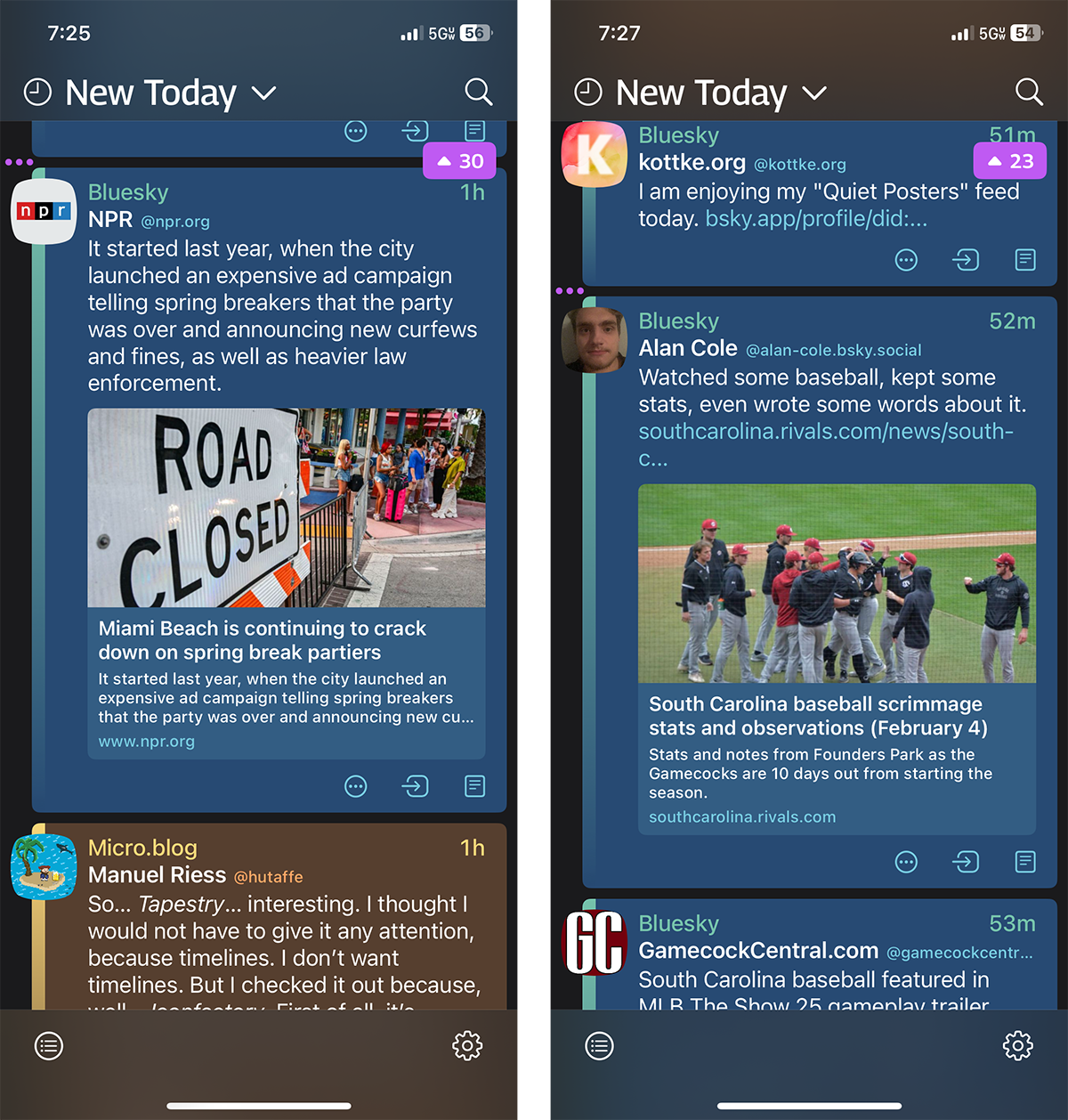
When the Iconfactory announced their Tapestry Kickstarter, I backed it immediately. I’ve been a fan of the Iconfactory’s work for decades, and was a loyal user of Twitteriffic before Musk cut off the API. I’ve had beta access for months as a Kickstarter perk and I’ve been using it daily.1Now that Tapestry is released to everyone, I wanted to write a little review with some thoughts about how it’s working for me.
One app for pretty much everything. Tapestry is a unified feed reader. You build a feed from a variety of sources and “connectors.” I’ve used connectors to bring in my Micro.Blog, Mastodon and Bluesky social timelines. I still use Feedbin as a traditional feed reader so I’ve also some of my favorite RSS feeds and some YouTube channels. I even have a podcast feed in there and, while I wouldn’t listen to a long podcast in Tapestry, it does works for short audio files. All of it pulled together into a single timeline.
You said “pretty much everything?” Correct. To be added to Tapestry, the sources need to connect to the open web. That means no Meta apps. So if you want to connect to Instagram, Facebook or Threads, there isn’t an API to allow for a connection. This isn’t a problem with Tapestry, it’s a problem with Meta. But don’t get me started on the importance of open APIs.
Algorithm free. Tapestry doesn’t add any annoying algorithms to your content feed. You decide who you want to follow, and you see their posts in the order in which they were shared. No engagement manipulation.
Interaction. You can’t like or comment directly from the Tapestry interface, but it’s easy to swipe and access a Safari web view. For example, if I see a Bluesky post I want to like, I swipe and Bluesky opens. I like the post, click done at the top left, and I’m back to my feed. It’s a smart solution to a complex problem. I’m not someone who likes or comments a bunch so this little bit of friction is completely acceptable to me. I understand if this isn’t enough for you, but it works for me. You can “Mark” items for follow up later, and I find that helpful for keeping track of good links and stories.
Muffle and Mute. You can build rules to muffle (collapse) or mute (hide) posts that contain keywords. I find this to be incredibly powerful. There’s a person I know — who I want to follow — who shares his Wordle every day. So I muffled “Wordle” in my feed. You can build those rules to hide whatever you don’t want to see. I loved it in Twitteriffic and will absolutely use this in Tapestry.2
Opportunities and rough edges. This is a 1.0 version. There are rough edges, but also clear opportunities for them to improve the app. The Iconfactory is committed to improving Tapestry and offering a Mac version eventually. I’m excited about where this is going.
I’ve really enjoyed Tapestry because I can just dip into the most recent information. And since Micro.Blog and Bluesky are currently my most used services, this integrates perfectly. It’s tough to explain, but it brings a social media style timeline together for a wider variety of sources. It’s not for everyone, but it is absolutely what I want.
Bob Wertz is a type designer, Ph.D. student and researcher living in Columbia, South Carolina. He’s been blogging since 2008.
If you tried the beta early and it wasn’t what you were expecting, now that it’s out of beta, try again. Tapestry got better and better over each iteration. ↩︎
I’ve also muffled any reference to “Clemson” or “Dabo.” Because Go Gamecocks. ↩︎


 ---
---