This post was originally posted on December 5, 2015 on Sketchbook B. It’s reposted here as part of a project to move some of my favorite writing to my new site.
This summer, I got an electric kettle for my birthday and I’m really getting into making tea and french press coffee. I started grinding beans and making coffee in the morning. I love the smell and process of making french press coffee and can’t believe it took me this long to discover it.
My newfound love of coffee at home had a limitation, though. I could never find a travel mug that I like. I always preferred the old school ceramic coffee mug and no travel mug felt like that.
I had a couple of stainless steel mugs, but I didn’t love them. I tried the Tervis tumbler style mugs, but I didn’t like them either. I was looking for a mug that was a little more substantial and didn’t have a plastic lid.
A few weeks ago, I was in Starbucks and noticed a ceramic travel mug. I hadn’t seen a mug quite like it and bought one. It didn’t take me long to figure out that it was exactly what I was looking for so I bought a second one, too.
The Starbucks Double Wall Traveler is a fully ceramic travel mug. Even the lid is ceramic. The lid has a silicone seal to keep the coffee from spilling. It’s heavier than most travel mugs and fits perfectly in my car cup holders. There’s a little rubber circle on the bottom to keep it from sliding around.
There are tradeoffs. It only holds 12 oz. of coffee (but it looks bigger than that). You can’t microwave it and they recommend washing by hand. But none of those issues are a problem for me.
The designs that I bought aren’t available online right now, although the Navy one is similar to the first one I purchased. Starbucks seems to continuously add and retire designs. There are a couple of nice designs in the store right now that weren’t available a couple of months ago.
If you are looking to give a gift this holiday season for a coffee-loving loved one, these mugs might be a cool gift.
This post was originally posted on December 4, 2015 on Sketchbook B. It’s reposted here as part of a project to move some of my favorite writing to my new site.
At the very end of October, I decided to participate in NaNoWriMo, an “event” where you commit to write a 50,000 word novel in the month of November. I started an account. I joined the local Facebook group. I was excited. I had an idea. I was ready to write.
In fact, I was going to write here about the experience of writing a novel.
As I started to read the advice from others, I realized that they had been planning for months. Working on outlines. Character concepts. They had a plan. I only had an idea. I was not ready to write.
No worries, I thought. I’ll rough together an outline quickly. Make some decisions about characters and I’ll catch up.
I never did.
This week marks the end of NaNoWriMo and I have virtually nothing written. My first attempt at NaNoWriMo* was a complete and total failure, although I have a sweet outline and a couple of (very bad) chapters.
But this failure was one of the driving concepts behind The Advent Resolution. If you aren’t prepared to tackle big goals, they won’t happen. And if you never set aside time to prepare, you’ll never be comfortable setting those ambitious goals.
I’ve got a lot of goals and ideas for the next year. I’m too often guilty of trying to tackle them all at the same time. Right now, I’m trying to work out which projects I will tackle and which ones will stay on the shelf.
So I’m committing this first week of Advent to thinking about focus. Wondering how to tackle these goals while still being a great dad and a husband. I’m reflecting on the influences in my life that strengthen and sustain me. I’m trying to remember how to focus in a multitasking world.
We’ll see where it leads me.
The Advent Resolution is simple: Prayerfully prepare for the coming year.
* I plan to try again. Next time, though, I’ll actually be prepared.
This post was originally posted on December 3, 2015 on Sketchbook B. It’s reposted here as part of a project to move some of my favorite writing to my new site.
When I purchased my second fountain pen, I started to think about purchasing a case to hold my pens, but I wasn’t impressed with most of the options on the market. They didn’t really fit my style and needs.
Finally, I came across cases from Nock Co., co-owned by Brad Dowdy from the Pen Addict podcast. Their cases were exactly what I was looking for. I also love that Nock Co. is located a few hours down I-20 from me in Atlanta* and all of their products are manufactured in the USA.
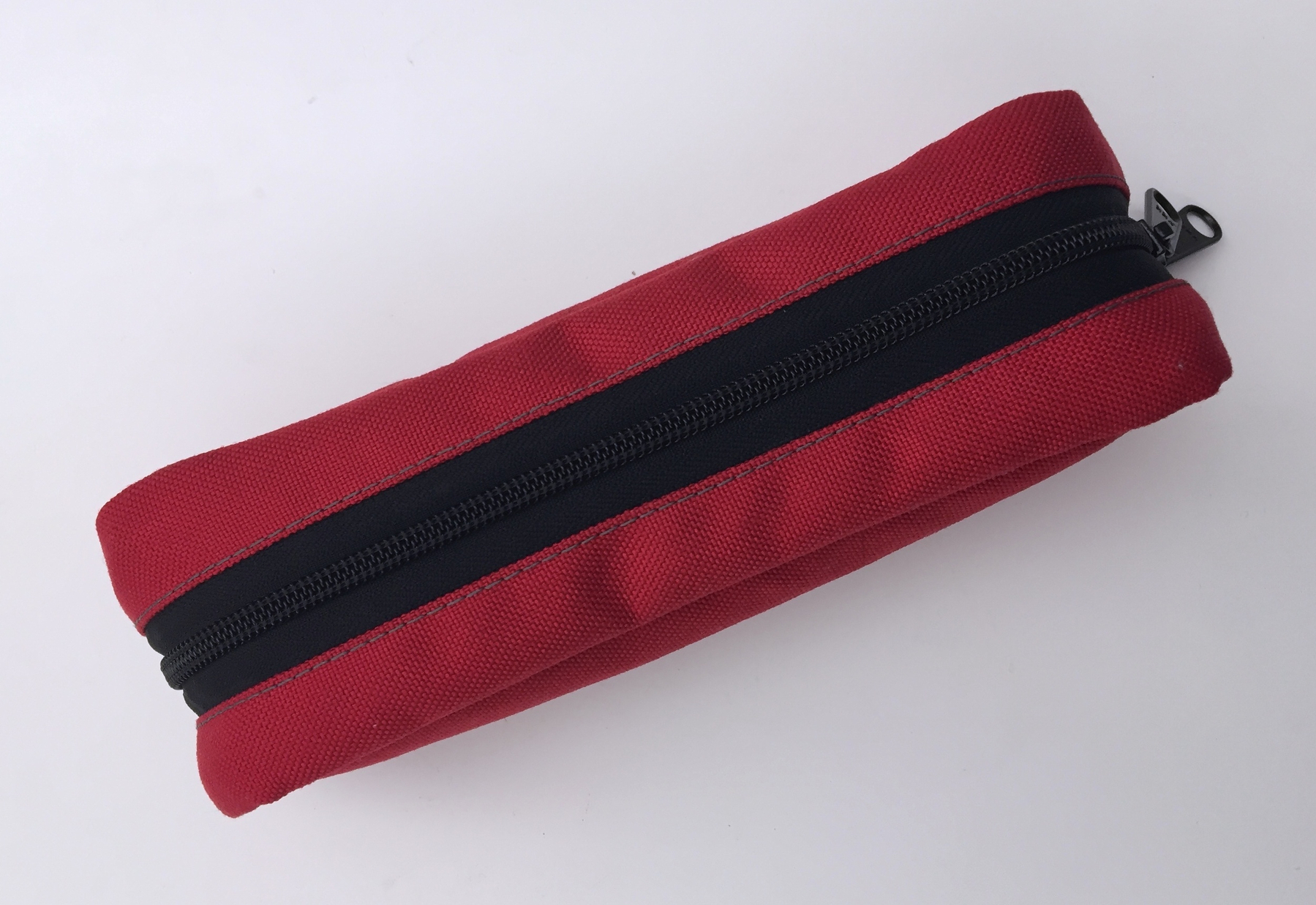
BRASSTOWN, closed
I was instantly drawn to the Brasstown, a durable nylon case zippered case with a fold out insert that holds six pens. (Material-wise, it reminds me of my beloved Timbuktu messenger bag.) The Brasstown looked perfect, but it seemed like overkill for my two pens so I ended up not buying anything.
Fast forward a few months and my collection of writing instruments had grown. I started looking for a case again, and this time, the Brasstown made sense.
Nock offers their cases in a selection of “colorways” — pairings of colors that span across all their products. I liked a couple of the options, but wasn’t sure which one to get. When I finally decided to order, though, all of the Brasstowns were out of stock.
After a couple of weeks, they restocked – and this time – with a new colorway: Red/Midnight. I instantly fell in love and ordered one.
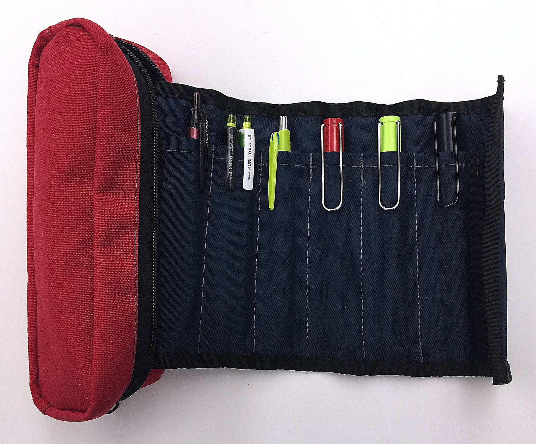
On the Red/Midnight Brasstown, the outside of the case is a bright red with a navy blue insert. The insert is sewn into the case and unrolls to reveal six slots. Each slot holds a single fountain pen but you can fit two smaller pens into each pocket if you want to.
The stitching is gray and looks sharp, especially on the navy insert. The zipper has two sliders and seems sturdy.
Brasstown, Open
I was pleasantly surprised by how much the Brasstown holds. As expected, it easily holds my three fountain pens, my mechanical pencils and a couple of gel pens. But you can also put other pens and accessories in the main compartment. I’ve got mechanical pencil lead, erasers and more in the bag. And there is plenty of room for more. I can’t imagine ever needing another bag.**
The Brasstown is $35 and I highly recommend one if you are looking for a larger case to tote around your precious writing instruments. I’m very happy with mine.
(If the Brasstown is too big for you, check out some of Nock Co.’s other options. The Chimneytop and Lookout are different approaches, but also look awesome.)
* Their cases are named for mountains in Georgia. Nice touch.
** If they ever release a black/neon green or garnet/black colorway, I’ll be buying the entire line.
This post was originally posted on November 29, 2015 on Sketchbook B. It’s reposted here as part of a project to move some of my favorite writing to my new site.
One candle
I’m a big fan of the season of Advent — the time in the church year where we wait and prepare for Christ to come. I remember opening Advent calendars when I was young, counting down the days to Christmas. Advent is also the beginning of the church year – the liturgical New Year’s Day.
Last year, I got this idea to make my New Year’s resolutions at the beginning of Advent.* It’s the beginning of the church year so I figured I’d make some appropriate resolutions for the “new” year and get a jump on 2015. But my “Advent Resolution” didn’t seem right. Advent’s about preparing and waiting. Starting my “New Year’s Resolutions” on the first Sunday in Advent was just taking action a month earlier. I never got around to making any “Advent Resolutions” last year.
This year, Advent starts on November 29. And I’ve got a plan. I’m going to use the start of the church new year to prepare for the calendar new year.
The Advent Resolution is simply this: Prayerfully prepare for the coming year.
I resolve to thoughtfully and prayerfully consider how to change the things I want to change in 2016. Then, take action on New Year’s Day.**
I’m not limiting this time of reflection to spiritual or religious changes. Everything is on the table. Diet, exercise, personal growth… pretty much anything. I’ll research and pray and think and write and plan. And when 2016 rolls around, I’ll be ready to act.
I’m excited to start my Advent journey. I’ll be writing about it and will post thoughts and reflections here.
* A quick Google search indicates that using Advent as “New Year” for religious resolutions has been done before…
** Advent ends on Christmas Day. So I suppose that I should start my New Year’s Resolutions on December 25. For various reasons, that would be difficult, so I’m starting January 1.
This post was originally posted on November 18, 2015 on Sketchbook B. It’s reposted here as part of a project to move some of my favorite writing to my new site.
NOTE: While this page may have useful insights, be aware that it was published more than 10 years ago and may not be relevant for current software versions.
I don’t think I’ve ever posted a tip for Adobe Acrobat, but I found something this week that was amazingly helpful.
I had a large file with many pages that I needed to email. (Dropbox and other sharing services weren’t an option for this client. Only email.) I needed to divide the PDF into several smaller PDFs. There are many ways to do this, but most require some trial and error.
I stumbled across a feature in Acrobat that lets you split a PDF into multiple files and allows you to set a maximum file size for each resulting file.
NOTE: I’m writing this tip about the current version of Acrobat that is included with Creative Cloud. The Adobe Acrobat DC (2015) interface is wacky and a radical departure from everything else Adobe makes.* It’s closer to the current version of Microsoft Office than Creative Cloud.
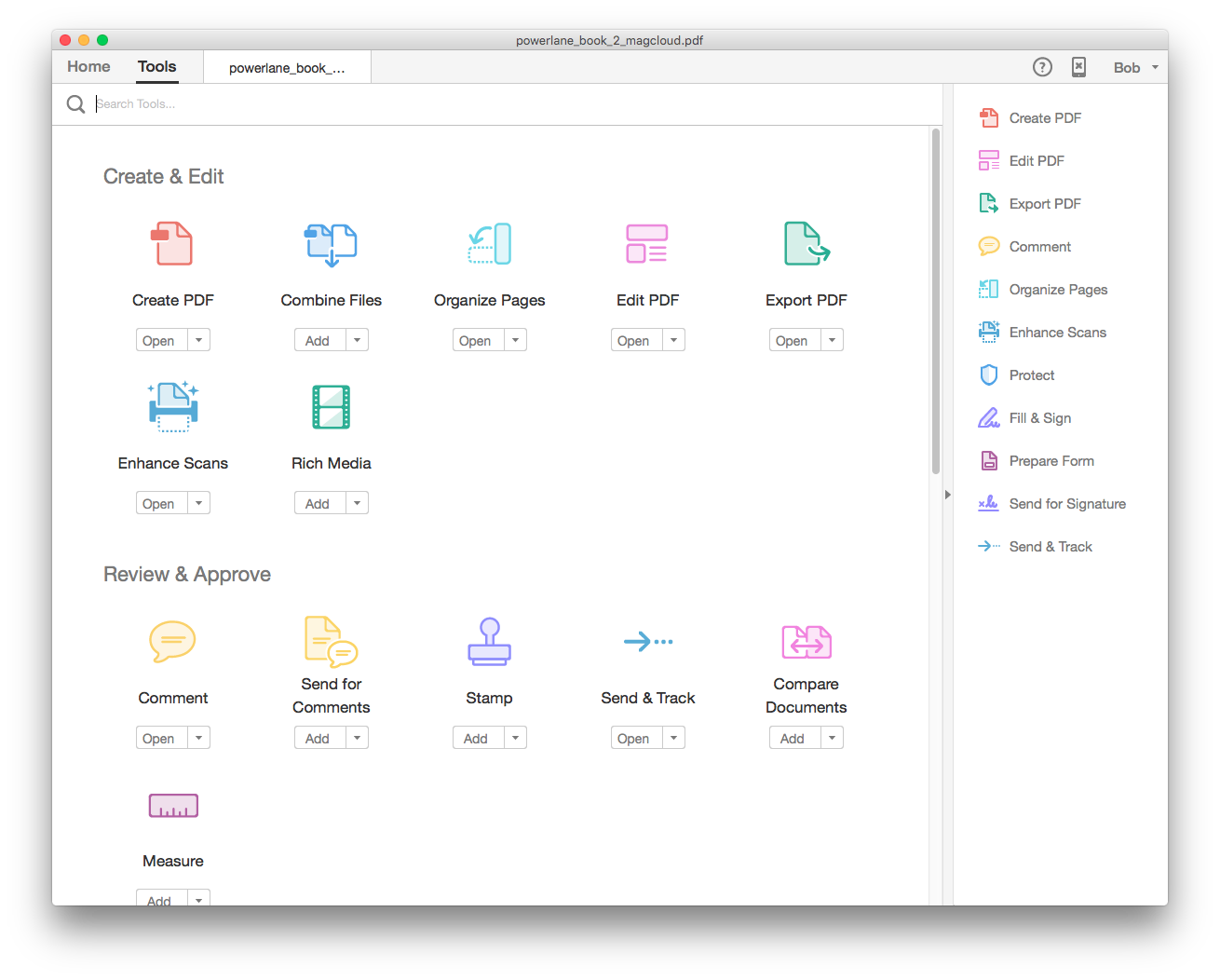
Open your massive PDF and then click “Tools” at the top of the open window. You’ll come to a page with lots of icons for editing functions. Select “Organize Pages” from the “Create & Edit” grouping.
Select “Organize Pages” from the top row.
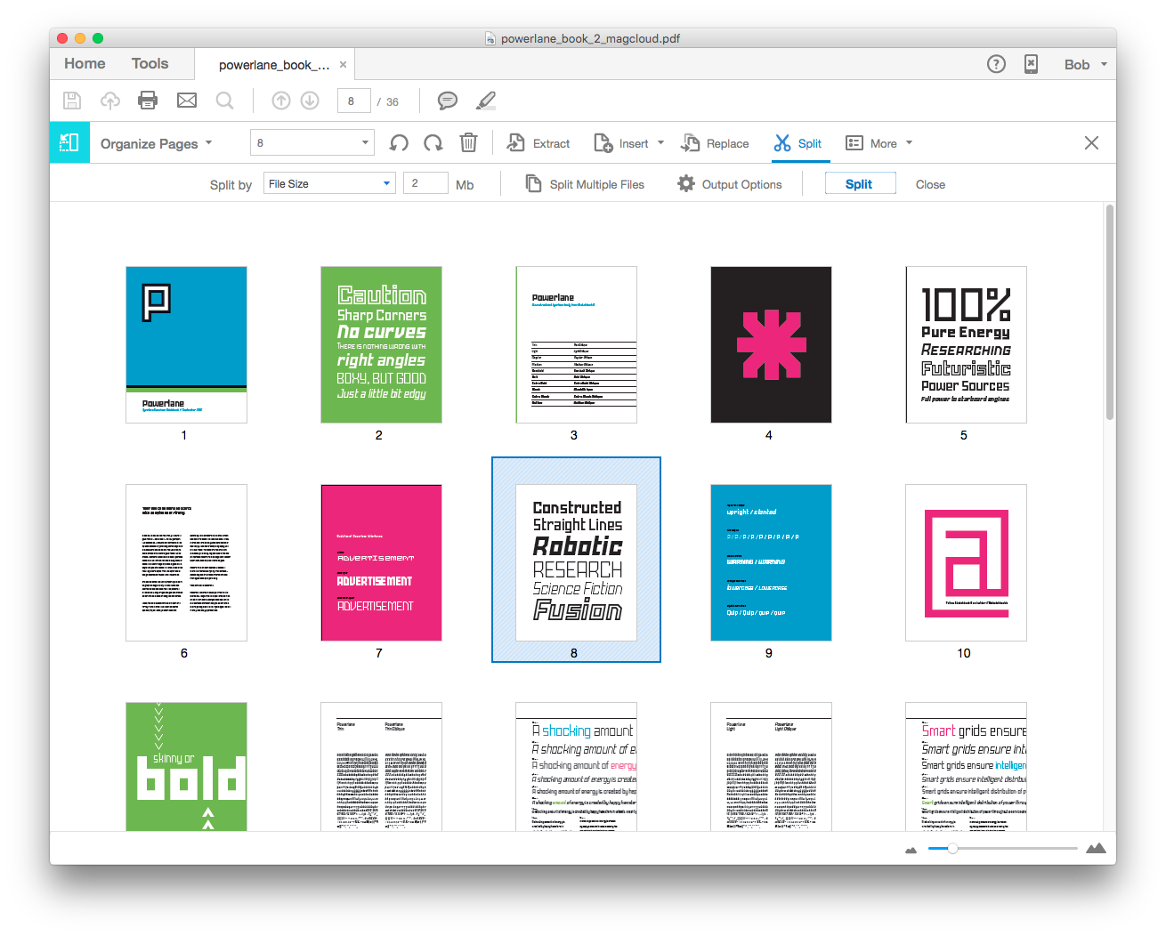
At the top of the window, you will now have an button for “Spilt.” Clicking “Split” opens up a row below with more options. By default, Acrobat will split your document into multiple files with an equal number of pages, but if you select the “Number of Pages” combo box, you get additional options: “File size” and “Top level bookmarks.”
The toolbar for “Organize Pages” has the “Split” command.
Choose file size and then set your maximum file size. Click the split button and the separated files will be saved to your desktop.
The options button for the “Split” row gives you complete control of how and where the files are saved. So if you need to use a particular naming convention or have Acrobat save the new file to a specific directory, you can make those changes there.
If you absolutely need to email a PDF and compressing or downsampling the file isn’t an option for you, then “Split” will absolutely save you time.
* I’ve been told the Acrobat team and the Creative Cloud team are completely separate. It looks like it.
This post was originally posted on November 13, 2015 on Sketchbook B. It’s reposted here as part of a project to move some of my favorite writing to my new site.
I get asked a lot what it’s like to have three kids. Mostly from people with two kids thinking about whether they want to have another. Sometimes, the question comes from younger couples who are thinking about having kids.1 And I always struggle to answer.
My standard answer is that when you have three kids, you have to switch from man-to-man to zone. You lose a little control. You are outnumbered. And while that is completely accurate, it sounds scary and intimidating, which isn’t at all what I want to communicate. I love having three kids.
My other answer is that with three kids, how far apart they are really matters. I’ve had friends with three kids under four years old. For us, our oldest was seven when her brother was born. Those are two radically different situations. But that doesn’t really answer the question.
Sunday morning, an interaction with the kids gave me the answer I was missing. We were waking up and getting ready for church.
Middle child: What are we doing for breakfast?
Me: I don’t know. We’ll probably have a small breakfast now and maybe go to brunch after church.
Youngest: WHAT! We can’t go to a restaurant! We need to go to church! (He LOVES Sunday School.)
Me: We are going to church. We might go out to eat after church.
Youngest: Why can’t we eat at church?
Me: Because they aren’t serving breakfast at church.2
Oldest (from another room): We’re having breakfast at church?!?
And that’s what it’s like having three kids — like adding a person to a game of telephone. It gets a little bit crazier. Funnier. Unpredictable. Often delightful and occasionally frustrating. But never boring.
Bob Wertz is a creative director, type designer, Ph.D. student and researcher living in Columbia, South Carolina. He’s been blogging since 2008.
When my wife and I got married, we weren’t sure we wanted kids. ↩︎
And I was very surprised when they actually had breakfast at church. ↩︎
This post was originally posted on November 11, 2015 on Sketchbook B. It’s reposted here as part of a project to move some of my favorite writing to my new site.
NOTE: While this page may have useful insights, be aware that it was published more than 10 years ago and may not be relevant for current software versions.
This week, I needed to copy pages from one InDesign file to another. Thankfully, it’s super easy.
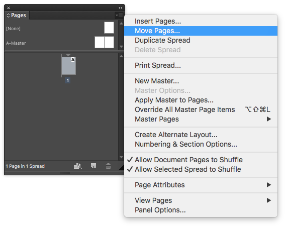
Select the page you want to copy from the pages palette. Choose “Move Pages…” from the flyout menu on the pages palette. (Or Layout > Pages > Move pages…)
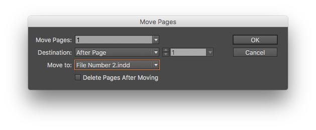
You can then choose which pages* you want to move and where you want to move it. The default is to move the pages to another spot in the same document, but you can select any document that is open.
Select the destination with the “Move to:” combo box.
And you are done. As a bonus tip, there’s a similar trick in Photoshop, too, that I’ve written about in the past.
* In case you were wondering, it doesn’t matter if the documents you are merging are different page sizes.
This post was originally posted on November 5, 2015 on Sketchbook B. It’s reposted here as part of a project to move some of my favorite writing to my new site.
I’ve been fascinated by stenciled type for a while. Stencils started as a practical necessity – an easy and utilitarian way to reproduce type. But the use of stencils has evolved and is now visually representative of industry and military.
A few weeks ago, I quietly rolled out my latest stencil typeface on Creative Market: Intermodal.
Intermodal started as an experiment. I wanted to create a design that had only vertical stencil cuts. I didn’t like how the cuts on other stencil designs didn’t line up cleanly. By only using vertical cuts, I didn’t have to worry about the horizontal alignment.*
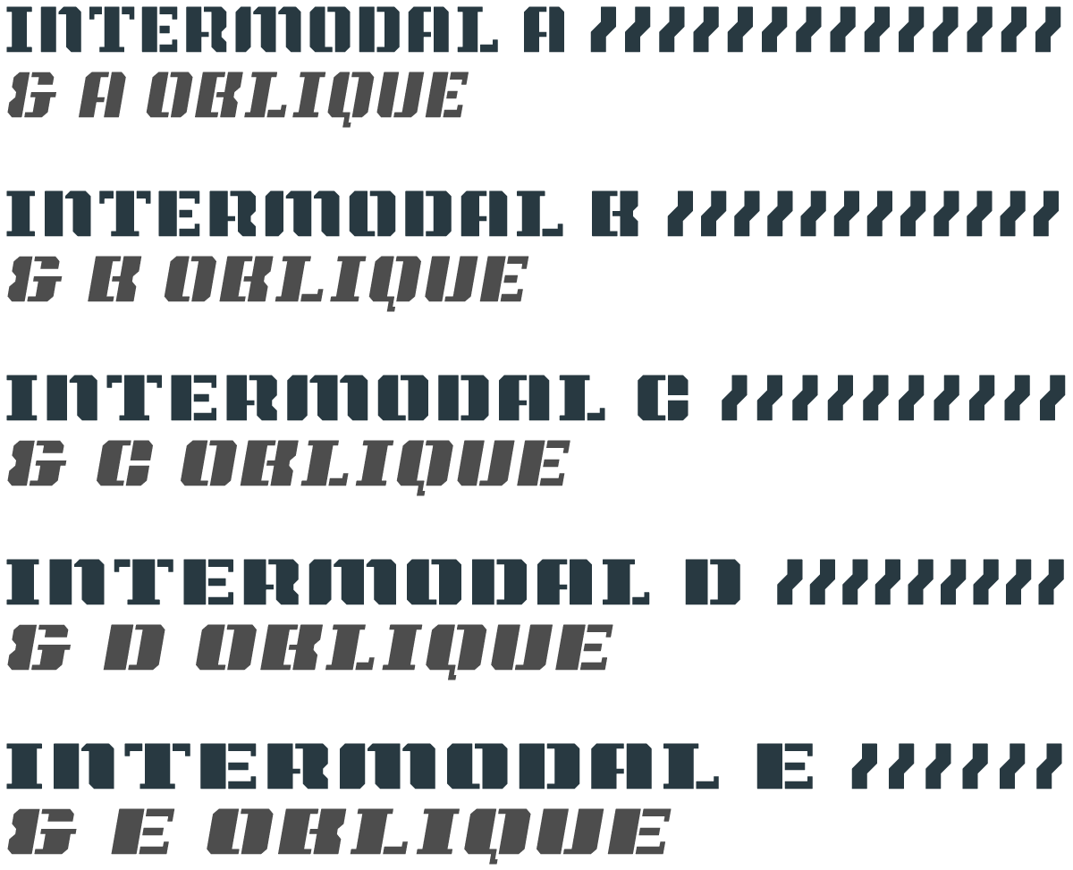
Intermodal is an all cap design, but includes a wide range of foreign language characters, a set of Opentype tabular numerals and an alternate “9.” Intermodal doesn’t have traditional weights. Instead, there are five widths, from A to E. A is more narrow and E is wider. The different versions can be used together to create a utilitarian look. I’ve also got an oblique version of each width for a total of 10 fonts in the family.
Intermodal is one of my favorite creations. I hope you like it.
* After my first set of sketches, I noticed that it was structurally very similar to Power Grid. So I added a stencil version to Power Grid 2.0 and I continued to refine Intermodal. Different look, but similar design approach.
This post was originally posted on November 3, 2015 on Sketchbook B. It’s reposted here as part of a project to move some of my favorite writing to my new site.
When I was a kid, I loved magazines. I was curious about everything and in the 80s and 90s – before the internet — there was a magazine for everything. I got magazines about photography, sailing, model railroading, computers, science, cars, bicycling, comics, art, baseball cards and more. If you wanted to learn about a topic, magazines were a cheap and easy way to find out more. In fact, I read MacUser before I could ever afford my first Mac.
I’d read them cover to cover. And that often included the ads. Ads were an integral part of the experience because they were targeted directly at the magazine’s audience. The ads complimented and supplemented the editorial content.
Some of those magazines are still around*, but blogs and online content are much more efficient ways to gather information, especially for beginners.
Today, ads on blogs are more like billboards than the niche, targeted magazine ads. Many of these blogs serve ads that are from a network and most of those ads have no real connection to the blog’s topic.
Network buys allow advertisers to serve ads only to a target demographic. This seems like a dream situation for many advertisers, but reaching niche audiences is much more difficult. It’s hard to identify from demographics or browsing history who is interested in a topic like cameras or fountain pens.
I’ve been listening to podcasts lately. Podcasts about topics like fountain pens, pencils and space. The ads that run on these podcasts are like the old magazine ads — they support and complement the editorial content. And as a result, I’ve made purchases based on recommendations from ads on podcasts. I can’t say that I’ve ever made a purchasing decision based on a random banner ad.
Context matters. If I was a media buyer today, I’d look closely at podcasting and tightly curated ad networks. They might be the best fit for online advertising to niche markets.
* Still around, but much harder to find. Newsstands are gone in most parts of the country. Bookstores aren’t as common. Grocery stores have smaller and smaller selections of publications.
This post was originally posted on October 28, 2015 on Sketchbook B. It’s reposted here as part of a project to move some of my favorite writing to my new site.
NOTE: While this page may have useful insights, be aware that it was published more than 10 years ago and may not be relevant for current software versions.
Over the last two weeks, a 2010 post of mine on rounding corners has suddenly become very popular.* I wrote it for CS4 and posted an updated version for CS5. But I wanted to revisit the tip and update it for Creative Cloud 2015.
The process for rounding corners is actually more complicated than I expected and is different depending on what shape you are working with.
Rounding corners on a square or rectangle
Rounding the corners** on a rectangle is straightforward and there are actually a couple of ways to do it.
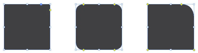
The yellow box method: When you click on a rectangle with the selection tool, a yellow box appears near the upper right hand corner. Click the yellow box and diamonds appear at the corners. Drag the corners inward to round the corners equally.
To round only one corner, click the yellow box and then, while holding down shift, click and drag on the corner you want to modify.
(1) Click the yellow box in the upper right hand corner to edit the corners. (2) Drag the diamonds to change the amount of the corner effect. (3) Hold the shift Key to change only one corner.
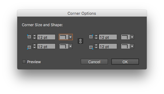
The dialog box method: If you prefer a little more precision, you can go to Object > Corner Options… and set the rounded corner to a specific value. And it’s easy to round one corner.
Set the amount and style of your corner effects with the corner options dialog box. Uncheck the chain icon to set corners independently.
The control palette method: You can set a rounded corner value for all four corners in the control palette.
View fullsize
The corner controls are easy to find… It’s the only icon in the Control Palette with blue dots.
Rounding all corners on polygons that are not squares or rectangles
So rounding corners on rectangles is easy, but what if you don’t have a rectangle. It’s still easy, but different.
The yellow box method: Doesn’t work. The yellow box appears only for rectangles. Triangle, trapezoid, hexagon… no yellow box.
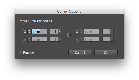
The dialog box method: Works just like it does for the rectangle with one, major exception. You can’t round individual corners. All of the corners have to be exactly the same.
Try to change the corner size or shape on a shape other than a rectangle and all but one input field is faded out.
The control palette method: Exactly the same as the rectangle method, with no control over individual corners.
Rounding individual corners on a polygon
So let’s say I want to round selected corners on any polygon. None of the normal methods will work, but thankfully, Adobe provides a script for this.
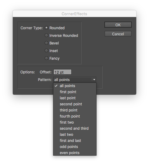
The scripting panel (Window > Utilities > Scripts) contains an Application folder with sample scripts in Applescript and Javascript. Select the “CornerEffects.applescript” or “CornerEffects.jsx.”
The top part of the dialog box essentially provides the same options as the “Corner Options” dialog box. And the offset box allows you to adjust the size of the corner. The Pattern combo box defaults to “all points,” but take a look at the options available: first point, last point, second point, third point, odd points, even points and more…
When applied to a box, it gives you the ability to round or bevel selected corners. Sometimes, it takes a little trial and error to figure out which point the “first” point is. The first point usually seems to be point in the upper left and then selection moves counterclockwise.
Pretty much the only way to make these shapes in InDesign is with the Corner Effects Script.
You can also use the odd and even points patterns on a star shape. “Odd points” effect the inside points. “Even points” modify the outside points.
That should help you round any corner you need. As an aside, Adobe Illustrator has a completely different and superior corner rounding process. Personally, I hope that Adobe adopts the Illustrator method in InDesign.
This post was originally posted on October 22, 2015 on Sketchbook B. It’s reposted here as part of a project to move some of my favorite writing to my new site.
I’m a die hard Cubs fan and have been since I was little. My heart has been broken many, many times. And this year, my Cubbies ran into the buzzsaw that is the 2015 New York Mets and got swept in dominating fashion.
This team reminds me of another Chicago sports team — the Michael Jordan-led Chicago Bulls — who couldn’t beat the Detroit Pistons for a number of years before winning six championships. In baseball and today’s sports environment, the window to win is so small. There’s a lot of pressure to win now because everyone else is getting better, too. But the Cubs will continue to improve with a ton of young talent. And that talent is only going to get better.
I enjoyed this season. It was fun to have my Cubs relevant again. And as much as I hate watching them swept out of the playoffs*, I’m confident that we are going to be good for years to come.
So, yes, I’ll give you the traditional Cubs fan refrain is always “Wait ’til next year!” But this year, it’s less lament and more warning. Next year, we’ll be even better.
Go Cubs!
* This year, we did beat the Pirates in a one game playoff and the Cardinals in the NLDS. And those wins were a lot of fun.
This post was originally posted on October 9, 2015 on Sketchbook B. It’s reposted here as part of a project to move some of my favorite writing to my new site.
Zero
About eight years ago, I discovered Merlin Mann’s Inbox Zero series at 43 Folders. At the time, I had no system for handling email and a corporate job that generated a lot of email. There was too much email volume and I had no idea how to manage it all.
Inbox Zero completely changed the way that I manage email. I’m not a hardcore Inbox Zero or GTD* user, but I’ve incorporated much of the Inbox Zero philosophy into my workflow.
I find that designers are particularly bad at managing email. They don’t want to spend time sorting and filing email when they can be sketching, coding or creating. For me, though, having a massive inbox hanging over my head completely stresses me out. A system for handling email helps me function better as both a creative director and a designer.
I’ve been talking with a bunch of folks lately about Inbox Zero. People with thousands of unread emails in their inbox. As we talked, I realized that I’ve never blogged about my personal email process.
First things first… If you haven’t read Inbox Zero, go read it now. It’s a series of blog posts written in 2006. I reread it recently and it’s dated, mentioning apps that no longer exist. It was written before the release of the iPhone, too, so you’ll see some references to Blackberry. (Remember those?) But even though the posts are old, the Inbox Zero philosophy is still as applicable as ever. (Especially pay attention to the section that tells you how to get from an thousands of messages to zero in a hurry.)
My list below is about my office email, which is Microsoft Exchange-based. My home email isn’t handled as rigidly, although I may change that.
Here’s my version:
My inbox stays at between 25-50 messages. Sometimes it gets to zero. Sometimes it gets to 100. But it rarely gets over 100. (I’m talking here about total messages, not unread messages.)
If it does get over 100 messages, I look to schedule some time to sort.
I sort all my mail into a number of folders. The most important is “action required.” I also have buckets for “future reference” and some specific project related folders. Set up a folder structure that makes sense for the type of email you get. These folders reside on the server so they still sync to my iPhone and iPad.
If something ends up in “action required,” it also ends up in Wunderlist. Wunderlist*** syncs a to do list between my home and office Macs, iPad and iPhone. That way, an “action required” item also ends up on my master to do list.
As projects are completed, I check them off Wunderlist and trash the corresponding email.
My “future reference” folder is where information goes that I don’t need to act on, but may need to refer to later. The bonus is that it’s easily searchable.
My inbox is always at zero when I leave for vacation.
I typically do most email work in the morning and late afternoon. I also do quick email sprints if I get a few minutes before a meeting.
I find that I sort email really quickly on my iPhone or iPad. But I prefer typing longer responses on my Mac. So I use all my devices in managing my email.
I don’t allow for email notifications on my phone, except for those people that I’ve tagged as VIPs. No beeps or buzzes. No pop-up windows.
I don’t subscribe to email newsletters or mailing lists that I don’t find absolutely critical.**
And that’s it. It’s not perfect. There are plenty of times that email gets away from me. (I get a lot of email.) But having a basic structure keeps me from drowning in electronic correspondence.
I’m always looking to adjust the system. I’m thinking about changing up my folder structure to better mirror the email I get. I’d love to find a way to automate copying a task from “action required” to Wunderlist. (I know I can forward the email to Wunderlist, but I don’t like the way it sets up the item on the to do list.) And I need to be more intentional about setting more rigid times for checking email and ignoring it the rest of the day.
There are newer email clients that try to make it easier to manage email.**** And while I’m interested in trying some of them like Mailbox or Inbox, they primarily work with Gmail or IMAP. Since most of my email volume is in Outlook/Exchange, they don’t work for me.
The hardest thing about Inbox Zero is finding balance and not obsessing about it. The sun will rise and the sun will set and you will get more email.
Remember that Newton’s Third Law applies to email, too. For every action, there is an equal and opposite reaction. If you send a lot of messages, you get a lot of messages. It’s really frustrating when you get caught up on email, send a bunch of responses, and within hours, you have a full inbox. Don’t get discouraged, that’s just the way things go sometimes.
Got any thoughts on my email process and how to improve it?
* GTD = Getting Things Done. It’s a wonderful system for staying organized and… well… getting things done. I suppose I use some GTD tactics, but I’m hardly a GTD fanatic.
** I do subscribe to mailing lists on my personal accounts, but I’m starting to be ruthless. I do have an Unroll Me account that I use on my main personal account and it does a great job of keeping junk mail under control.
*** I really like Wunderlist, but it could be any to do list or project management app. I’m a little nervous about Microsoft’s acquisition of Wunderlist, but maybe it will mean an easier connection between Outlook and Wunderlist.
**** The iOS version of Outlook is impressive, but it doesn’t support VIP notifications. Notifications are either all on or all off. That’s a deal breaker for me so I went back to using Apple’s default Mail app on my phone.
This post was originally posted on October 7, 2015 on Sketchbook B. It’s reposted here as part of a project to move some of my favorite writing to my new site.
NOTE: While this page may have useful insights, be aware that it was published more than 10 years ago and may not be relevant for current software versions.
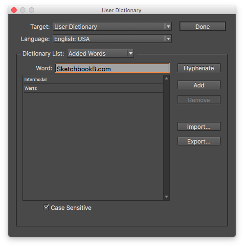
If you’re like me, your clients have all sorts of brand names, executive names, cities and URLs that give InDesign’s spell check fits. But you don’t have to just click “skip” repeatedly during a spell check. Add these to the user dictionary.
Pull up the user dictionary by going to Edit > Spelling > User Dictionary… and add your terms here. If you want a name or URL to be case sensitive, check the case sensitive box.
This is particularly helpful for URLs with creative capitalization. If I want “sketchbookb.com” to always be “SketchbookB.com,” I add “SketchbookB.com” to the dictionary and check the case sensitive box. Now if I type “sketchbookb.com” somewhere, spell check will recommend “SketchbookB.com” instead.
Bonus tip: Using the import and export buttons, you can share your user dictionaries with your coworkers.
This post was originally posted on October 6, 2015 on Sketchbook B. It’s reposted here as part of a project to move some of my favorite writing to my new site.
Bridge closed
My hometown of Columbia, South Carolina was pummeled by a once-in-a-lifetime storm this weekend. Over a foot of rain in less than 24 hours. Creeks, rivers and ponds overflowed. Dams gave way. Interstates were flooded and closed. Neighborhoods were evacuated.
Early Sunday — before I really understood the magnitude of what was going on — I walked down to check on the creek at the entrance to my neighborhood. As I walked down the hill, I could hear the roar of rushing water. The bridge was closed and the creek was massively overflowing. People were stopping and taking pictures. I stopped and took photos, too.
Normal people are documenting the terrible things happening around them and sharing them with friends and news outlets. Every person with a cellphone is a reporter.
As the day progressed, I got a constant stream of updates from Twitter, Instagram and Facebook. What roads are flooding? How much longer is it going to rain? Videos and pictures of roads underwater, bridges failing and daring rescues. It was a very personal and terrifying way to experience a natural disaster.
I remember Hurricane Hugo in 1989, which was the biggest natural disaster I had experienced personally. We followed the TV news and got updates from morning and afternoon papers. Without the internet, it was challenging to get much detail on what was going on.
Now, in 2015, I watched a little bit of storm coverage on the Columbia NBC affiliate, WIS, but most of my news came from Twitter. Getting information wasn’t a problem at all. Information was coming from all directions.
In a crisis, this flood of information from social media is disorienting. Immediate. Powerful. Raw. Intense. There is an overwhelming sense of anxiety. It’s also unfiltered. Serious news, alerts, hoax and rumors are mixed with NFL banter, cat videos, tech talk, ads and more.
As communicators in a social media environment, we need to accept this complex environment and figure out ways to help our audiences process what is happening around them. The goal should no longer be about simply adding more stories, pictures and videos to a vast virtual stream. Anyone with a iPhone can do that. Our value is in structuring and organizing information and in presenting clear, relevant messaging when our community needs it.
This post was originally posted on September 29, 2015 on Sketchbook B. It’s reposted here as part of a project to move some of my favorite writing to my new site.
A few years ago, I stopped at a fast food restaurant in rural, upstate South Carolina where a car was circling the drive thru over and over and over. She’d drive up to the ordering station and wait a second. Then the car would drive to the window, pause, and then drive around again. This happened a couple of times. It was very strange.
When I walked in, I nodded toward the car at the window and asked what was going on. The woman shrugged, obviously embarrassed, and said “Just improving the drive thru wait times…”
Lots of people wonder how something like the Volkswagen 1 emissions test scandal can happen. It’s actually very simple:
Set a specific goal.
Figure out a test to measure it: a survey, a timer, a standardized test, etc.
Make sure everyone knows how important the test is.
Provide rewards for people who achieve the test objectives. And penalize people who don’t meet the test objectives.
Smart people will eventually figure out how to do well on the test, even if it now has nothing to do with the original goal.
Management pats themselves on the back for great test results.
The test no longer reflects reality.
This cycle is everywhere in business today and manifests itself in different ways. Most of the time, it doesn’t involve fraud and cheating. But this process is why:
Engineers design products (cars, cell phones, etc.) that meet specific test objectives, but not real life usage.
Customer service reps in banks, car dealerships and retail stores remind you over and over to answer “highly satisfied” on a random survey.
Teachers teach to the test.
Managers make short sighted decisions to stay under budget.
Advertisers make really annoying online ads to improve click through rates.
Fast food workers fake drive thru response times.
If you connect success on a metric to an employee’s financial well being, that employee will change their behavior to meet the test objectives. And yes, sometimes, if the pressure is great enough, they cheat.
I’m sure those fast food workers wanted to have good drive thru response times to make their boss happy. I doubt there was a financial incentive. Maybe if the boss was happy, their life would be easier. Or perhaps they were afraid of being fired. Whatever the reason, they cheated to meet their test objectives. They lost sight of — or more likely, were never told — the reason for the test.
The test itself isn’t the problem. Testing and evaluation is a key part of management in a corporate environment. But today, it’s really easy to test and measure everything. Over reliance on metrics in management makes the test more important than the goal. And that never ends well.
You’ll simply get what you test for.
Bob Wertz is a creative director, type designer, Ph.D. student and researcher living in Columbia, South Carolina. He’s been blogging since 2008.
I’m a VW owner. My car is not a diesel, but I doubt that I’ll buy another Volkswagen even though I’ve been happy with my car… ↩︎
This post was originally posted on August 9, 2015 on Sketchbook B. It’s reposted here as part of a project to move some of my favorite writing to my new site.
Designers tend to be selective about what pens they use. I’ve recently fallen in love with fountain pens, but I rarely see other designers using them. A fountain pen is a great addition to a designer’s arsenal of writing implements.
Fountain pens allow you to select a design and color that fits you, a nib that works for your writing style and an unique ink color.
If you are a designer thinking about buying a fountain pen, here’s a quick guide to getting started.
Where do I buy a fountain pen
You typically won’t find fountain pens at the local Staples or Target. Online retailers like Goldspot Pens, Goulet Pens or Pen Chalet offer a wide range of brands and styles.
Depending on where you live, a local specialty store may be an option. There isn’t a store here in Columbia, but there’s a great store up the road in Asheville, NC. The obvious benefit of buying from a store is being able to see and try things out and talk to a knowledgable staff.
Fountain pens range in price from a few bucks to hundreds of dollars. You’ll find pens made from just about every material – from plastic to gold.
The least expensive pens are disposable, but the real fun comes with reusable pens.
There are pens for every design aesthetic. Clean and machined. Ornate and classic. Simple and practical. And everything in between. Some pens are skinny and light and others are more substantial.
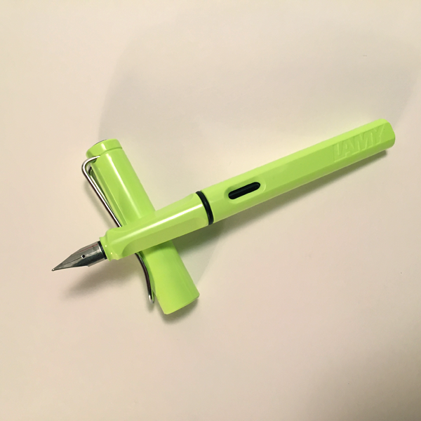
Lamy safari in Lime Green with a Fine Nib. My first fountain Pen.
Pick something that matches your personal style. I decided to start with a Lamy Safari. It’s on all the beginner pen lists and comes highly recommended. A Safari costs about $30 – not the cheapest entry level pen, but still affordable. Easy to use, writes wonderfully and comes in a number of colors and nib styles. I also own a Lamy AL-Star, which is similar in design to the Safari, but aluminum.
FYI: Podcasts and blogs sometimes offer discount codes that will save you 10% to 15% off your purchase.
Nib styles?
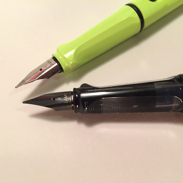
The writing point of a fountain pen is called a nib. While each manufacturer classifies their nibs a little differently, they typically start at Extra Fine and go through Broad. You can also get a calligraphy nib.
Fine Nibs on a Lamy Safari and a Lamy AL-Star.
Many pens have interchangeable nibs, which is great if you aren’t sure what kind of nib you’ll like.
I started with a fine nib and I’m now looking forward to trying out some different options. Lamy offers a bunch of nib options for my Safari and AL- Star. Personally, I’d like to pick up a broad nib and a calligraphy nib to play around with lettering styles.
Ink colors?
One of the best things about fountain pens is the wide variety of inks available. All sorts of colors are offered, from traditional colors like black and blue through less traditional options like purple and green. You can get permanent, waterproof inks, fast drying inks and even specially inks with odd color properties or embedded gold flakes.
Some pens companies use cartridges, like Lamy or Pilot. They offer a limited number of colors in easy to replace cartridges. If you buy a cartridge pen, you can often buy a converter (only about $5) that allows you to use any fountain pen ink you like.
Many beginner pens use Ink cartridges, like the green one above. A bottle of ink can be used with a converter, far right, to use bottled inks with cartridge pens.
When you buy online, it’s sometimes tough to tell what an ink is going to look like. There is no Pantone guide for ink colors, so it’s a little bit of trial and error. One of the first inks I purchased was a neon green, which is actually more of a highlighter ink. Oops. I’ve got another ink that is grey and looks like pencil when it dries.
Changing ink colors requires you to clean out the previous ink. It’s an easy process, but you need to let the pen dry before you add the new ink.
What kind of paper should you use?
If designers are particular about their paper, then fountain pen fans are fanatical. Writing with a fountain pen is a different experience than writing with a quality gel ink pen. Ink dries a little more slowly and can bleed through the page.
You will find no shortage of opinions on the best papers for use with fountain pens. I still use a Moleskine for note taking, although many folks feel there are better options. Some folks love designer-favorite Field Notes while others feel the paper is too thin. I have a new Rhodia pad that works great with a fountain pen.
In general, thick paper with a smooth surface seems to work better. My recommendation is to try paper, notebooks and pads that you like and see what you think. It all comes down to personal preference.
Remember: Be open to new options. As you wade into the fountain pen world, you’ll likely hear of brands you’ve never heard of before. Don’t be afraid to try them out. (I’d never heard of Rhodia before I got into fountain pens. Now it’s one of my favorite paper options.)
But I hate my handwriting…
I know many designers that hate their handwriting. I think we hold ourselves up to a standard of artistic perfection.
I’m one of those people that can’t stand my handwriting. (That’s why I design typefaces.) But I can honestly say that after writing for a few months with a fountain pen, I’m starting to like my handwriting again.
I don’t know if I’m just paying more attention to my handwriting or if the better pen really makes a difference. I seriously have no idea. But I enjoy writing on paper now, and that’s something that hasn’t been true for a long time.
But I like my current pen.
Most designers have a vast assortment of pens. I love a good pen and I’m a fan of gel ink pens like Uniball Signo 207’s and Pilot G2’s. (I like mechanical pencils, too, but that’s another blog post.)
It’s not an “either or” decision. A fountain pen is great for writing. I prefer the gel pens for sketching out concepts. And you’ll still need a Sharpie because everyone needs a Sharpie or two in their bag.
Bonus: Using a reusable fountain pen means you aren’t throwing away as many disposable pens, which is obviously a good thing.
That’s a cool pen…
Be prepared to talk about your choice of pen when you head to meetings. A fountain pen rarely goes unnoticed.
I’m hooked. What next?
Once you start with a nice fountain pen, you won’t want to go back. Obviously, you’ll probably want to experiment with different pen types and inks. Companies offer whole ranges of cases and accessories for fountain pen users. And if you get really serious, there are services and vendors that let you customize pens and nibs.
Blogs like the Pen Addict and edjelley.com are a great place to start. Retailers like Goldspot Pens, Goulet Pens and Jet Pens all have blogs that detail new products and review pens, inks and accessories. Many pen and ink manufacturers also have blogs.
I love the Pen Addict podcast. It’s one of my favorites. So if you listen to podcasts and are interested in pens, it’s one you should check out.
This post was originally posted on June 13, 2015 on Sketchbook B. It’s reposted here as part of a project to move some of my favorite writing to my new site.
I’m more of a college basketball fan, but lately, I’ve been watching some NBA playoff games. And now that the finals are upon us, we get to see the world’s best basketball player in LeBron James against the world’s best shooter in Steph Curry.
There’s a really interesting contrast here. LeBron James was anointed as the next Michael Jordan in high school and some of his games were televised. He was 18 years old when the Clevland Cavaliers drafted him first overall. He was an MVP in Cleveland. Took his talents to Miami and won two championships. This year, he returned home to Cleveland to try and win a title for his hometown. And now he’s led Cleveland to the finals to compete for the organizations’s first NBA championship.
Despite the fact that he was the son of a former NBA player, Steph Curry didn’t have a single major college scholarship offer. He was considered undersized by most programs. He played his college ball at Davidson near Charlotte, NC and made a name for himself in the NCAA tournament. He worked his way through the ranks, proving himself at every step along the way. And he’s now led his Golden State Warriors to the NBA Finals.
One player took a direct route to success. Another took a more circuitous path. And while it makes a great story, it doesn’t really matter. These two world class athletes took different paths. But now, they are in the same place. We tend to focus on the path someone has taken to succeed. But there is rarely a single path to success and that’s a great thing.
Some people are obsessed with corporate paths to success. They downplay the victories for companies they don’t like or understand.
Look at consumer’s perceptions of Apple and Google. Apple fans hate Google’s tendency to give products away and make money via advertising. And Google fans lament the perceived high cost of Apple products and their limited customization. Apple’s been around since the 1980s, grew fast, crashed and then grew into the most valuable company in the world. Google was founded in the 90’s, started fast and continues to expand into new markets. They have taken different paths to success, but they are both successful. Yet, commentators discount their successes because they don’t like or understand the path they have taken.
Other people are obsessed with paths to individual success. Getting into the best colleges. Belonging to the right organizations. Having the right things on their resume. This pressure starts very young. My kids have educational opportunities that didn’t exist for me. Inquiry-style preschools. Magnet elementary schools. Enrichment programs. But the result of this is that everyone is focusing on the “right” path earlier and earlier.
In the design world, I hear these all the time. You’ve got to go to a big market to be successful. You can never grow in an inhouse environment. You’ve got to work at an agency or large design firm before you strike out on your own. Someone actually once told me that I’d never get any where if I didn’t learn Flash. And while some of these bits of advice might be the most direct way to achieve success, it is by no means the only way to become successful.
You can’t completely disregard the path someone takes. It helps shape them and make them the person they’ve become. But we can learn something from Curry and James. Your path doesn’t really matter if you are focused on your goals.
Just because you don’t follow the accepted path doesn’t limit what you can accomplish. And if you do follow the direct path, it doesn’t minimize your accomplishments. Two amazing basketball players – Lebron James and Steph Curry – that have led their teams to the exact same place via two very different paths. But this week, they are both competing for an NBA championship.
Bob Wertz is a creative director, type designer, Ph.D. student and researcher living in Columbia, South Carolina. His blogging journey started in 2008 with a Squarespace hosted blog.
This post was originally posted on June 17, 2015 on Sketchbook B. It’s reposted here as part of a project to move some of my favorite writing to my new site.
NOTE: While this page may have useful insights, be aware that it was published more than 10 years ago and may not be relevant for current software versions.
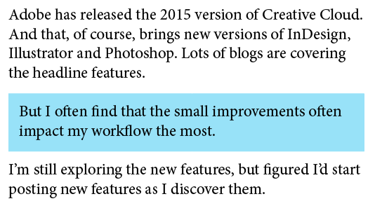
Adobe has released the 2015 version of Creative Cloud. And that, of course, brings new versions of InDesign, Illustrator and Photoshop. Lots of blogs are covering the headline features, but I often find that the small improvements often impact my workflow the most. I’m still exploring the applications, but figured I’d start posting new features as I discover them.
The first one in InDesign that jumped out at me is paragraph shading. You can now apply shading to any paragraph… so no more drawing a color block behind a block of text you want to highlight.
The blue box is created using paragraph shading. Here, I’ve ALSO inset the paragraph margins.
A couple of obvious advantages to this:
If you want to shade a paragraph within a long block of text, it will move and resize automatically as you make changes.
It can be completely controlled and modified through style sheets, making it infinitely more powerful.
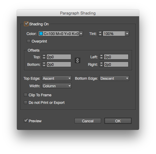
You can apply basic paragraph shading from the Control Palette or Paragraph Palette, but to gain full control, select “Paragraph Shading…” from the flyout menu on the Paragraph palette. The dialog box provides options to use a tint, set an offset and control how the shading is applied.
The full paragraph shading dialog box offers more options.
There is also an option for “Do not Print or Export*,” which is pretty cool if you want to highlight a passage that needs to be updated, but don’t want it to print. (I often set text that needs to be updated in 100% magenta. Now I have the option to shade it…)
This post was originally posted on May 14, 2015 on Sketchbook B. It’s reposted here as part of a project to move some of my favorite writing to my new site.
Why are so many people and organizations obsessed with acronyms? Especially acronyms that spell another word. From small nonprofits and churches to schools and large corporations, really bad acronyms are everywhere.
NASA’s Messenger Probe crashed into Mercury after a long and successful mission. And as I read CNN’s account of the mission, I was stunned by the fifth paragraph:
Messenger (an acronym for MErcury Surface, Space ENvironment, GEochemistry, and Ranging) was launched in 2004 and traveled more than 6½ years before it started circling Mercury on March 18, 2011.
Wait. So the Messenger probe is actually M.E.S.S.E.N.G.E.R.? Or is it Me.S.S.En.Ge.R.?
NASA designed a space probe to fly to a planet named after the messenger of the gods. And NASA feels like they need to construct some bogus acronym to justify the name “Messenger.”
Acronyms are fine if they really help people remember and understand the program or product name. But in most cases, the acronym simply becomes a name and slowly loses all connection to the meaning.
And the worse case scenario is that you are so obsessed with creating an acronym, that you select a poor name in the process. Avoid creating acronyms just to be clever or just to justify a name choice.
Your best bet is always to give products, organizations and programs strong, appropriate names.
–
Bob Wertz is a creative director, type designer, Ph.D. student and researcher living in Columbia, South Carolina. He’s been blogging since 2008.
This post was originally posted on October 8, 2014 on Sketchbook B. It’s reposted here as part of a project to move some of my favorite writing to my new site.
NOTE: While this page may have useful insights, be aware that it was published more than 10 years ago and may not be relevant for current software versions.
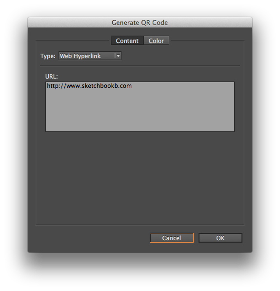
InDesign will let you create a QR codes without leaving the application. Go to Object > Generate QR code… You’ll have options for hyperlink, text message, email, business card or plain text.
Once you have all the information filled out, you can then place the QR code like you would an image.
I will freely admit that I tend to avoid QR codes like the plague. I’m not convinced of their effectiveness. But sometimes, you need to use one and generating one without leaving InDesign is helpful.
This post was originally posted on October 1, 2014 on Sketchbook B. It’s reposted here as part of a project to move some of my favorite writing to my new site.
NOTE: While this page may have useful insights, be aware that it was published more than 10 years ago and may not be relevant for current software versions.
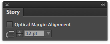
Tucked away in InDesign’s Window menu is a Story palette. This palette has exactly one function – to turn on and off optical margin alignment.
You can find the Story palette at Window > Type & Tables > Story. There are two settings. The first is a checkbox to activate optical margin alignment. And the second alters the intensity of the alignment.
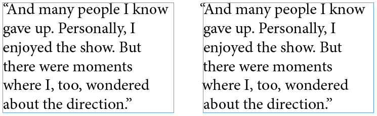
Optical margin alignment automatically adjusts the positioning of characters on the margin. It’s especially noticeable for punctuation and letters like “A” and “W” which look a little odd lined up exactly on the margin. See the example below.
Optical margin alignment. Off (left) and on (right). Notice how the quotation mark and the lower case “w” move in relation to the margin.
I’m not sure why Adobe didn’t just include it on the Paragraphs palette. Seems odd to hide such a powerful feature on a random single-function palette.
This post was originally posted on September 19, 2014 on Sketchbook B. It’s reposted here as part of a project to move some of my favorite writing to my new site.
When the iPhone was released in 2007, I had never paid more than $15 for a phone. Whatever phone was free with contract was what I purchased. I simply didn’t see the point of spending significant money on a phone. But when the iPhone was announced, I wanted an iPhone. And now, 7 years later, every two years or so, I drop significantly more than $15 on the newest model of iPhone.
I’ve never paid more than $150 for a watch. I don’t wear one every day. I really didn’t see the point in investing a significant amount of money on a watch. But now I look at the newly announced Apple Watch.
And I want a watch.
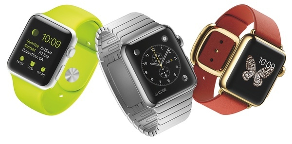
I read John Gruber’s thoughts on the new Apple Watch the other day. And what he’s thinking is what I was thinking. The Apple Watch Sport will be $349 and the prices will increase significantly from there. Luckily, I like the Sport. But I really like a bunch of the other models as well — especially the stainless steel Apple Watch with Milanese Loop.
Price increases significantly as you move from left to right.
I have lots of questions about the Apple Watch. But cost really isn’t the major concern. I expect a quality device with a premium price tag. But the more expensive the watch, the more these questions impact my decision.
Will the battery charge last for the entire day? For me to buy an Apple Watch, the charge has to last for at least a full day. And then hopefully, I’ll remember to charge it every night. (I stink at remembering to charge my devices nightly.)
Will the Genius Bar become a jewelry counter? If I’m going to spend this kind of money, I want to try it on. See how it feels on my wrist. Think about the current Apple Stores. How in the world would they accommodate that type of customer interaction? They are already incredibly crowded. Will other retailers sell the Apple Watch? Can you see Best Buy selling solid gold watches? My guess is that Apple will offer the Sport through various retail channels, but the more expensive models will be sold exclusively through the Apple Store.
What will the upgrade cycle be like? Most of us buy an iPhone every two years. But that’s because it’s tied into a contract. I update my iPads and my Mac less frequently. How frequently will I upgrade my Apple Watch? For me to invest in a more expensive version, it’s going to need to last more than two years.
Can I run with my Apple Watch without my iPhone? If I want to use my watch to workout, I don’t also want to have to carry my iPhone. If all the GPS and network connectivity is in the iPhone, won’t you need both with you to take advantage of apps like Nike Plus? And who wants to run with a giant iPhone 6 or an enormous iPhone 6 Plus? If I can leave behind my iPhone and run with just my Watch, then I’m interested. Otherwise, I’ll leave the watch at home and run with my iPhone like I do now.
As we get closer to the release, we’ll discover the answers to some of these questions. I have confidence that Apple will do its best to address these issues.
I intend to buy an Apple Watch. Will I spurge and go with the more expensive option? Probably not initially. I have trouble with the idea of investing in an expensive watch that is obsolete after a few years. But just like how Apple changed my attitude towards buying mobile phones, I think they will radically change my attitude towards buying watches.
This post was originally posted on September 17, 2014 on Sketchbook B. It’s reposted here as part of a project to move some of my favorite writing to my new site.
NOTE: While this page may have useful insights, be aware that it was published more than 10 years ago and may not be relevant for current software versions.
Most people don’t know how to use tabs properly. But tabs can be really powerful, especially if you are building a form or table of contents.
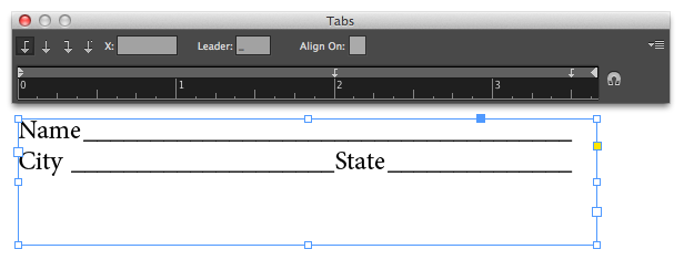
Below you see a simple form with the tab ruler above it. Select each tab and type an underscore in the “Leader” box. Whatever character you type in the “Leader” box will repeat all the way to the tab. The underscore becomes the lines on the form. Much quicker and more accurate than trying to draw the underlines yourself. And much, much easier to edit the form later.
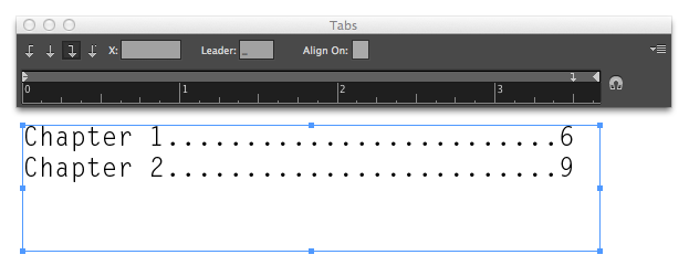
If you are building a table of contents, you may want to have a dotted line from the end of the chapter name to the page number. Don’t type a bunch of periods! Just set the “Leader” to a period. You can also use a right-justified tab to line up all your numbers correctly. Faster to build. Faster to edit.
This post was originally posted on September 11, 2014 on Sketchbook B. It’s reposted here as part of a project to move some of my favorite writing to my new site.
Does anyone still use TIFF (TIF/.tif) files? And if so, why? Back when I was a young designer, a TIFF file was the only real choice for exporting a high quality image. But I can’t really imagine why anyone would use one in today’s Adobe/Creative Cloud workflow.
InDesign’s support for directly placing native files – Photoshop, Illustrator, PDF and even other InDesign files – largely eliminates the need to export to another file before placing. (Although I still save logos as EPS files when they are final.) Many people don’t know that InDesign has the capability to place native files or assume that it will cause significant problems in production.
For high quality, high resolution im****ages, you can place a Photoshop file (PSD) directly into InDesign. This way you place the original image and you aren’t exporting a new TIF with each revision. One major benefit is that the PSD maintains all transparency when placed into InDesign. The only drawback I see here is that file size might get unwieldy if it’s a large image with a bunch of layers.
If you are sharing a high resolution image, a JPG will work fine. Many designers turn their nose up at JPGs because they associate them with low resolution, highly compressed web images. But a high quality JPG doesn’t have noticeable artifacts from compression and is much smaller than a TIFF.
Greyscale and bitmap files might be the only remaining use for a TIFF. When placed into InDesign, a greyscale or bitmap TIFF can be colored. So if you are wanted to colorize a grayscale image with a spot color, a TIFF is still your best option. But as 2-color print jobs become less common, I rarely use this technique for anything except screen printing.
This post was originally posted on August 27, 2014 on Sketchbook B. It’s reposted here as part of a project to move some of my favorite writing to my new site.
NOTE: While this page may have useful insights, be aware that it was published more than 10 years ago and may not be relevant for current software versions.
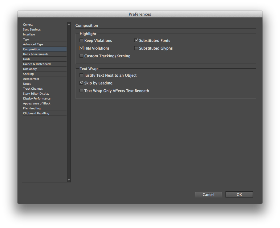
InDesign can highlight lines of text that are spaced badly. By default, the highlighting is turned off for justification issues. To turn it on, go to InDesign > Preferences > Composition… The highlighting options are at the top of the window:
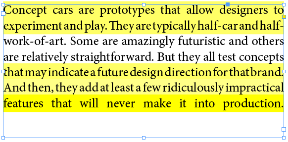
Turning on “H&J Violations” will highlight in yellow any place where InDesign can’t meet your hyphenation and justification settings. Here’s an example of a block of justified text with hyphenation turned off:
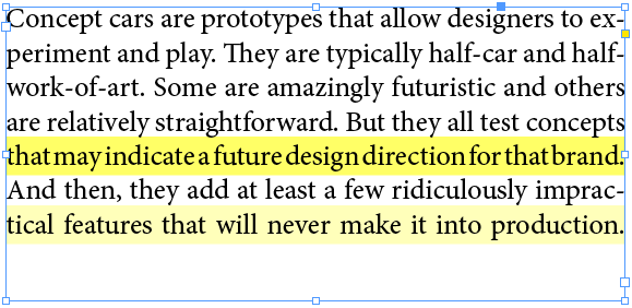
The worse the violation, the darker the yellow highlight is. Here is the same passage with hyphenation turned on:
Obviously, allowing InDesign to hyphenate and handle the bad breaks results in much better spacing.
I try to avoid full justification because of the issues that almost always come up with the spacing. But sometimes, you have to justify. And when you do, it’s easier to spot and fix badly spaced lines with the highlighting turned on.
This post was originally posted on July 30, 2014 on Sketchbook B. It’s reposted here as part of a project to move some of my favorite writing to my new site.
NOTE: While this page may have useful insights, be aware that it was published more than 10 years ago and may not be relevant for current software versions.
The Wednesday Quick Tip is back with a simple Photoshop tip. I use a lot of layers in Photoshop. And so I frequently duplicate layers by selecting one or more layers and selecting “Duplicate Layer…” from the flyout menu on the Layers palette.
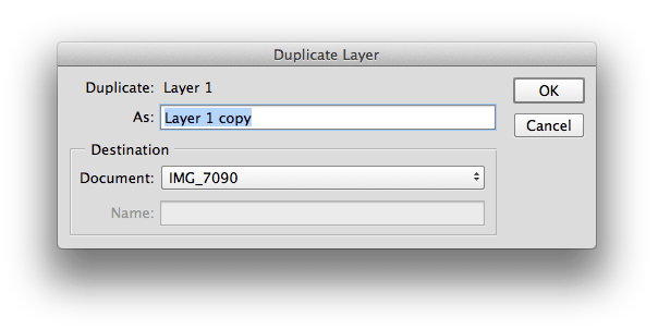
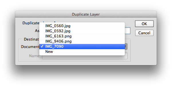
But Photoshop also lets you duplicate layers to other destinations. By default, the destination for your duplicate layer is set to the current file that you are in:
But you can change the destination to any other open file or even create a new document with the layer:
You’re not just duplicating the layer… you’re kind of teleporting it to a different file. It’s especially helpful when you want to copy an adjustment layer to a similar photo or combine a few images into a new document.
It’s a simple feature that many people don’t even notice.
This post was originally posted on June 25, 2014 on Sketchbook B. It’s reposted here as part of a project to move some of my favorite writing to my new site.
NOTE: While this page may have useful insights, be aware that it was published more than 10 years ago and may not be relevant for current software versions.
The new versions of Creative Cloud are out, and InDesign has picked up a few new features. One of the minor tweaks will be really welcomed by obsessive compulsive designs.
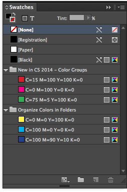
InDesign CC (2014) now lets you group your colors into folders. Just click the folder icon at the bottom of the Swatches palette to make a new color group.
While it’s a small thing, having the ability to group colors will be helpful or large and complex documents.
This post was originally posted on June 4, 2014 on Sketchbook B. It’s reposted here as part of a project to move some of my favorite writing to my new site.
NOTE: While this page may have useful insights, be aware that it was published more than 10 years ago and may not be relevant for current software versions.
InDesign has a built-in ruler – the Measurement tool that hides behind the Eyedropper. You can use it in a couple of ways.
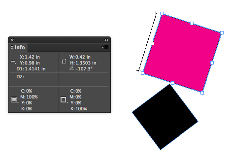
Select the Measurement tool and draw a line to measure something. The Info palette should open. Your measurement results will appear in the Info palette.
Below, measuring the left side of the magenta box, you can see the length (D1) and the angle. Also note that the width and height of the shape, the coordinates and the colors are also shown in the Info palette. And once you’ve drawn a measurement line, you can move it around to compare to other shapes.
Distance and angle is easy to find.
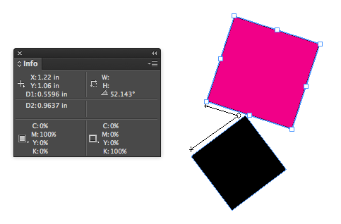
But that’s not all. You may need to measure the angle between two lines. If I want to measure the angle between the pink and black boxes, InDesign has a hidden “protractor” measurement mode. Draw your first line. Then, holding down the option key, draw a second line that starts at the endpoint of the first line. Your cursor should change into a protractor that looks suspiciously like a compass. When you draw both lines, your measurements for the first line (D1), second line (D2) and the angle between them is shown.
Protractor measurement mode in action.
Oddly, this ruler is more capable than the one in Illustrator where I would use it more often. The Illustrator measurement tool lacks a protractor mode. Seems like it would be an easy addition for them. (And if Adobe really wanted to improve the ruler in their apps, they should take some tips from the type design app, Glyphs, which has an amazingly functional measurement tool.)
This post was originally posted on May 25, 2014 on Sketchbook B. It’s reposted here as part of a project to move some of my favorite writing to my new site.
As a kid, I loved going to the Chicago Auto Show every year. All of the car manufacturers in the world would show up with their current models. Celebrities signing autographs. And while it was cool to see all of that, the concept cars always stole the show.
Concept cars are prototypes that allow designers to experiment and play. They are typically half-car and half-work-of-art. Some are amazingly futuristic and others are relatively straightforward. But they all test concepts that may indicate a future design direction for that brand. And then, they add at least a few ridiculously impractical features that will never make it into production.
Mini released a concept car this week, the Mini Superleggera Vision. It’s a pure concept car – an electric sports car with a distinctly British roadster feel. It’s an elegant and clear design evolution of the Mini brand.
The Mini Superleggera concept car.
But it is clearly a concept car with lots of impractical features. The chassis and aluminum skin are produced in a way that could never be mass produced. It’s got a driver/passenger selfie camera. No door handles. Some awesome Union Jack tail lights and a rear fin.
Union Jack tail lights! And a rear fin!
And it’s beautiful. I absolutely love it. Even the fin.
That said, it’s always interesting to see where these design experiments land. Based on feedback from car show audiences, media and the web, the companies figure out what resonates with potential buyers. It then can attempt to simplify and refine those concepts into another concept car or a production model.
Or it may simply be a one-off experiment that goes no where, even if people love the concept. (For example, check out the Mini Rocketman. People are still clamoring to get that car produced.)
This post was originally posted on May 7, 2014 on Sketchbook B. It’s reposted here as part of a project to move some of my favorite writing to my new site.
NOTE: While this page may have useful insights, be aware that it was published more than 10 years ago and may not be relevant for current software versions.
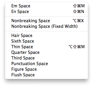
InDesign offers 14 different types of spaces. Just go to Type > Insert White Space… A very old post on Adobe’s site explains the differences. I don’t use them very often. For me, the Thin Space, Nonbreaking Space and the Figure Space can be quite helpful. It’s nice to know they are there.