Being a type designer can be weird. You create your design. Share it with the world. And then someday, unexpectedly, it shows up again.
I designed SbB Powertrain over a decade ago and I was very surprised to see it pop up in a clip of Gamecock Women’s Basketball player Ali Tournebize dunking in the 2024 Eurobasket U18 bronze medal game. Turns out that FIBA uses Powertrain as part of the identity for their Eurobasket tournament. It was used heavily for the 2024 and it looks like they are still using it in some places. Here are a couple of examples that I stumbled across.
If you look closely to the videos, Powertrain is used for the 2024 at center court and on some of the courtside screens. So much fun to see my type design in use, especially in a global context. Learn more about SbB Powertrain and my other fonts at sbbfonts.com.
Bob Wertz is a type designer, Ph.D. student and researcher living in Columbia, South Carolina. He’s been blogging since 2008.
I recently created a couple of new fonts over on Fontstruct: SbB Crunch’d and SbB Papaya 26.
SbB Crunch’d
SbB Crunch’d is a little random. Normally when I start working on a type design, I have an idea of how it will be used. In this case, I started with the shape of the “scalloped edges” and built out the font from there. I like how it turned out, even if I have no idea how I’d use it in a layout.
SbB Papaya 26
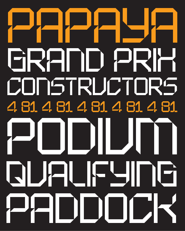
Last year, I built a font based on the numerals on McLaren’s F1 livery. The new SbB Papaya 26 updates the font to align with the look of the 2026 preseason McLaren social media graphics. Compared to my original interpretation, the 2026 font is a little more conservative and more readable.
Rian Hughes is one of my favorite type designers. This brief interview covering his 30 years of type design and promoting his Kickstarter was wonderful. (Also, I completely backed the Kickstarter!)
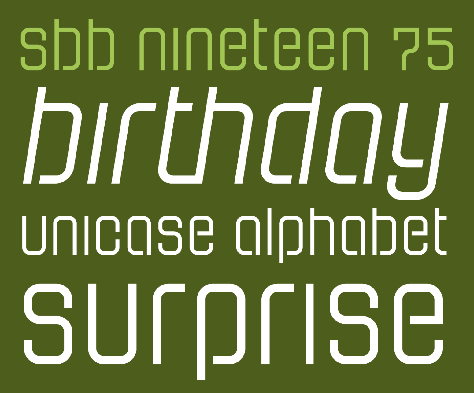
Yesterday I turned fifty. And to celebrate, I released a typeface for free. SbB Nineteen 75 is a fun little faux-stencil display font that is available for free. I had also planned to release a commercial font, but the scheduled release on MyFonts hasn’t happened yet. SbB Certiphica is my blackletter-inspired font that you will soon be able to purchase at MyFonts.
Many people won’t pay for fonts — even professional designers. There are so many typeface designs all over the web that you can find with a quick Google search. Many of them aren’t fully featured. Some are pirated. Software like Canva offers many excellent default options. Google Fonts and Adobe Fonts provide high quality options. So I understand why people hesitate to pay for quality type. There is, however, a vast marketplace of unique designs out there and I encourage you to explore beyond what’s already in your font menu.
I decided that I wanted to offer a typeface for free in honor of my 50th birthday that had some fun OpenType features. That free font is SbB Nineteen 75. It started life as a random Fontstruct prototype that I felt like would benefit from some additional development in Glyphs. I rebuilt it from the ground up and added an italic version, as well as some fun Opentype features — stylistic alternatives, discretionary ligatures, and a set of random icons.
The end result is a curvy faux-stencil with a vaguely 1970s feel – completely appropriate since I’m celebrating my 50th birthday and I was born in 1975. Why faux-stencil? I channeled some stencil design elements, but it wouldn’t work practically as a real stencil font. (Plus I skipped the stencil cuts on a couple of letters like O and Q because they were more readable without.)
The font is also a unicase design with the same upper and lower case. I’ve become slightly obsessed lately with unicase designs, especially ones that draw more from the lower case. I’ll probably need to write a blog post about that, but I’ll save it for another day.
The stylistic alternatives give some options for a handful of letters. The design of the letter t led to some interesting ligature designs. And I threw in a few fun icons of limited use. I have no idea who will use “Happy Frankenstein,” but I think he’s hilarious and it’s my birthday.
I wanted this font to actually be free so I chose to license this design under SIL Open Font License, version 1.1. Basically it allows you to use it in any project, personal or commercial. You can modify it and redistribute it as long as you offer it on the same terms. I’ve reserved the name SbB Nineteen 75, but other than that, it’s free to use. You can download your free copy at SbB Fonts.
SbB Certiphica
I’m always baffled at the range of uses for blackletter typefaces — from heavy metal bands and newspapers to tattoo parlors and college diplomas. A true blackletter is defined by a calligraphic stroke, and SbB Certiphica isn’t really that. Instead, it takes inspiration from the boldness and compression of blackletter designs to create something modern. It’s a great option for a certificate or diploma where you want the feeling of a blackletter, but without the hundreds of years of baggage.
SbB Certiphica comes in three widths and three weights, with an italic version of each. 18 fonts in all. The design is unicase, meaning the upper and lower case are the same.
The ascenders and descenders are very short, meaning that you can use extremely tight line spacing to get a dense block of text. When you purchase the family, you also get the variable font that allows you to dial in the exact width, weight and slant that’s perfect for your project.
I’m really happy with how Certiphica turned out and hope you all like it, too. I scheduled it to release on Friday on MyFonts, but that didn’t happen for some reason. I’ll update this post when it is available.1 The best deal is to get the entire set plus the variable font for $49.
Hope you enjoy SbB Nineteen 75, and if you are in the market for a blackletter-inspired display typeface, check out SbB Certiphica.
Bob Wertz is a type designer, Ph.D. student and researcher living in Columbia, South Carolina. He’s been blogging since 2008.
It was scheduled to be released on August 1. In retrospect, I should have just had MyFonts release it when it was ready a week ago… ↩︎
Years ago when I started selling my typefaces, my goal was to keep prices low. At the time, the prevailing wisdom on MyFonts was to set prices insanely high, then run massive promotions to lower the price to something reasonable. That seemed wrong to me. I just wanted to set the prices low to keep my typefaces affordable. Over the last decade or so, the situation has changed. MyFonts recommends that a single font start at $20. Apparently, if I set my prices too low, MyFonts won’t promote them. Subscription services are further complicating the pricing structure.
Setting prices for any artist is challenging, but I’ve noticed over time that most artists initially set their prices too low. I think I’ve fallen into that trap. I’m working on a new release right now1 and I’ve decided that I need to finally shift my pricing strategy. On August 1, 2025, the prices for all Sketchbook B fonts will increase. Single fonts will be $20. Small families will be $39. Large families will be $79. This increases them significantly from their current prices, but brings pricing more in line with the industry standards.
To provide a transition — and because August 1 is my 50th birthday — I’m going to run a 30% off promotion for the month of August.
Bob Wertz is a type designer, Ph.D. student and researcher living in Columbia, South Carolina. He’s been blogging since 2008.
I’ll also have a couple of birthday-related font announcements coming soon. ↩︎
I mentioned a couple of days ago that I was playing around with some new-to-me features and bricks in Fontstruct. After I finished SbB Roundabout1, I decided those techniques would work really well on a symbol font. So I started playing around with building a couple of little faux emoji. Then decided that I needed to add some color. And before long, I’ve built an adorable set of icons in Fontstruct… SbB Emote.
I don’t know which my favorite is – either the robot or the minifig-inspired smiley. “Happy Frankenstein” is a classic, too. In total, the set has 63 glyphs. The build used over 140 different blocks and 6 colors. It’s probably the most complex Fontstruction I’ve made, since I normally like to keep it really simple.
One cool side effect of using the techniques and blocks from SbB Roundabout is that the two designs work really well together.
I think I’m at a stopping point for the time being. I’ll be honest, I really need to be working on my dissertation and independent study. But I’ve got some ideas for characters I could have drawn… so you never know when I’ll revisit the font. I’m still not sure what to make of color fonts, but I could see how a custom icon font could be useful.
I think you have to be a patron on Fontstruct to download color fonts, so most of you won’t be able to download SbB Emote, but SbB Roundabout is free to download with an account.
Bob Wertz is a type designer, Ph.D. student and researcher living in Columbia, South Carolina. He’s been blogging since 2008.
Now a “Top Pick” on Fontstruct. And by the way, I’m going to need a new name for Roundabout. It’s taken. ↩︎
Recently, I started playing around on Fontstruct again. The tool has evolved massively in the 17 years I’ve used it, but I interacted with it largely the same way — placing blocks on grids. I’ve been thinking about how I use design tools lately. I use apps like Photoshop and InDesign the same way I used them a decade ago. In general, this works fine, but I don’t really take full advantage of the advancements in the software. I’ve been trying to explore new features in Photoshop and Glyphs lately, and I decided I wanted to try out some of the features I haven’t used in Fontstruct, too. I just made two designs public: SbB Vertica and SbB Roundabout.
SbB Vertica.A bold all-caps display font consisting of vertical bands. I used the brick size and grid spacing filters to create the banding effect through the letters. To get the angled corners to line up, I needed to use the nudge command to bump bricks up or down.
SbB Roundabout. A thin pseudo-stencil unicase design using rounded corner bricks that I don’t think I’ve ever tried before. This approach also required some nudging, and composite bricks to make everything line up.
Both designs are incomplete and I plan to keep working on them, but I’m happy with how they’ve turned out and wanted to share them. Both would have been impossible or very challenging without these techniques and bricks. It’s a reminder that unused features in my favorite software applications might be just what I need to execute a particular idea or concept.
Bob Wertz is a type designer, Ph.D. student and researcher living in Columbia, South Carolina. He’s been blogging since 2008.
Sixteen years ago today, I shared my first Fontstruction… Big Thursday and it was selected as a Top Pick. Fontstruct has improved as a tool so much since those early days, but it’s still every bit as fun to play around with.
(Oh, and back then, the editor was built in Flash!)
Some creations are foundational. If you design a typeface, other people create things using that font. Photographers and illustrators create works of art that can be incorporated into other designs. Brand design crafts visual and verbal foundations that others can build on. These days, I’m much more interested in these foundational creations than I am designing ads or billboards.
Every so often, Fontstruct has a themed competition and the current competition focuses on the new color features. I’ve pulled together three color designs that try to use color in different ways — a pattern, a bright multicolor whimsical design and a 3D effect.
One of the fun things about the competitions is the amazing creativity that comes out of the community. Fonstructors can interpret the theme is very different ways and it’s always amazing to see the varied approaches driven by a simple prompt. I’ve entered a few times and even got an honorable mention once in the “Reverse” Competition for SbB Codebreaker. I will also note that I’ve been impressed with how Affinity Designer has handled the color fonts. Seems to work flawlessly.
My first idea for a colored font was to make a pattern. I played with a couple of different patterns, but settled relatively quickly on making a plaid. One challenge was related to the scale of the pattern in relation to the size of the letters. My original plaid pattern was much bigger, but didn’t work well with some letters. I tried a couple of different sizes, but ended up with this one. This pattern is often associated with lumberjacks, but I think my wife has pajamas with this plaid pattern.
I wanted to create a bright multicolored design. Really lean into the color theme. (And I always love to create Fontstruct designs that use a single brick.) I started with a square pixel, but eventually switched to a circle. The round dot reminded me of a Lite-Brite. I used Adobe Color to pick a color palette that would work on a black background. I wanted some whimsy, so I created a bouncing effect… Uppercase letters create a character in a higher position. Lowercase letters drop them down a block. So if you alternate case, the letters bounce up and down.
Another random idea was to build a font that would work with 3D glasses. To be honest, I don’t have any 3D glasses laying around, but this feels like watching a 3D movie without the special glasses. So mission accomplished. I kept the design simple, because the type needs to be large to experience the effect.
---
Not sure if any of these will be selected as winners or honorable mentions, but I’m really happy with how they turned out. And I can’t wait to see what everyone else does.
Bob Wertz is a type designer, Ph.D. student and researcher living in Columbia, South Carolina. He’s been blogging since 2008.
I’ve been thinking about color fonts lately. Experimenting with the color fonts features in Fontstruct and Glyphs. Trying to better understand how to create color fonts. And while I’m starting to understand how they are made, I’m left with one major question… why?
Why do we need color fonts?
If you don’t know, fonts are typically monochromatic. Black and white only. Color is applied in software like Adobe Illustrator or Microsoft Office. The ability to customize is limitless.
Often, the case for color fonts is made for the web. A complex typeface design with color features that can be encapsulated as a vector font and customized via CSS would be appealing. But color web fonts support is inconsistent across browsers. I also think web-based design apps like Canva and Adobe Express that cater to more novice designers might have a use for some pre-colored fonts.
I did think of one application — nautical flags. I built a font on Fontstruct in 2009 with black and white flags, so with the new color font tools, I colorized the signal flags and updated the design. I called it SbB Foxtrot Sierra Charlie1 and I’m really happy with how it turned out.2 Fontstruct now allows you to download a COLR v1 color webfont and it’s free to download if you are a Fontstruct Patron.
I’m going to keep playing around with it, but I think color fonts will be a custom, niche tool with limited applications.
Bob Wertz is a type designer, Ph.D. student and researcher living in Columbia, South Carolina. He’s been blogging since 2008.
In the NATO alphabet, Foxtrot Sierra is FS for Fontstruct. And the Charlie is C for color. ↩︎
And I love the little pirate flag I built… I might need to make a sticker out of it. ↩︎
About 16 years ago, I started playing around with Fontstruct, an online tool for crafting modular typefaces. I’ve released 48 designs on Fontstruct and some of those have served as prototypes for designs that I finish in Glyphs, my favorite type design app. I tend to work in Fontstruct intensively for a while, and then disappear for a year or more. But I love the tool and contribute as a “Patron.”
Lately, I’ve been on quite the streak.
SbB Papaya. I was watching F1 and McLaren uses some modular numerals on their cars. Based on those numbers, I built an entire design. I wasn’t sure if the look was going to extend through the whole character set, but the design actually works pretty well. And as a bonus, the Fontstruct team selected it as a top pick.
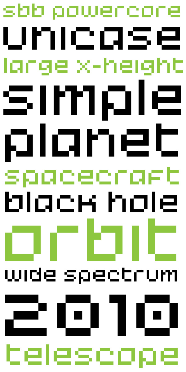
SbB Powercore. I’ve had some drawings in my sketchbook of a unicase design that I like a lot, but haven’t gotten around to building. I wanted to see how the letterforms would work together so I built a quick pixel-font prototype.
SbB Astrometric. I took the basic letterform structure of Powercore and tried different approach. I thought this would look vaguely sci-fi when I started to build it, but as I built out the character set, it had a somewhat older feel. Not sure why. I’m really happy with it and this is one of those fonts that I’ll likely rebuild and polish in Glyphs. I think the design would work well as a variable font design.
SbB Theorem. I built this a few years ago, and forgot about it. So I dusted it off and added a few additional characters that I skipped over earlier.
SbB Greenlight. All the cool kids are building color fonts on Fontstruct. It’s a feature that’s available for Patrons. I’d played with it once before to add some color to my Dingbots and Monsters design, but I hadn’t tried to build a color typeface. I built SbB Greenlight to experiment with the process of building a color design. I’m still not 100% sure why we need color fonts, but it’s a fun process and a pretty accessible tool for anyone that’s worked with design software like Illustrator or Photoshop that use layers to organize art.
You can download and use any of these1 if you set up a free Fontstruct account. I don’t know if I’ll keep up the pace, but I’m really enjoying building typefaces right now and I’m inspired by the other designers in the Fontstruct community.
Bob Wertz is a type designer, Ph.D. student and researcher living in Columbia, South Carolina. He’s been blogging since 2008.
Except for the color font. That’s a Patron exclusive. ↩︎
I’m back to playing around on Fontstruct. Just published SbB Powercore, a unicase, pixel-inspired design. I’m digging this combination of unicase characters. Still a work in progress.
Spent the evening troubleshooting some fonts that I’m going to sell through MyFonts. Finally think I’ve got everything fixed, but I want to look at again with clear eyes in the morning.
I missed that Lego released a refined visual identity a couple of weeks ago that includes a new typeface, Lego Typewell, based on brick proportions. I really like it. The best detail I’ve found on the typeface is on this review from BP&O.
I decided a while back that I wanted to separate my typeface designs onto their own site. They’ve always lived alongside my blog and other creative projects, but they needed a home of their own, especially since I plan to expand the offerings in the near future. I’ve been noodling around with options, but today, I’m finally ready to release SbBFonts.com out into the world with a design inspired by two-color printing.
The Inspiration
When I became a designer in the mid-1990s, the web was just becoming a thing, and printed documents were the primary job of a designer. Two-color projects used only two spot ink colors — say green and black — for the entire job. (You also had a “third” color with the paper, which was usually just white.) Four-color printing or full-color printing was reserved for only the most important pieces with the largest budgets. For young designers in a pre-web world, two-color work paid the bills. Two-color printing presented challenges, but the process had a particular look. Designers who knew what they were doing could use duotones for images or print on colored paper to get a different look.
Two-color printing isn’t dead. Screen printing and letterpress still use spot colors, but full color printing has gotten cheaper and as a society, we don’t print nearly as many marketing materials as we used to. The craft of designing has moved past the lowly two-color press run.
I guess that’s why when I started to design a home for my typeface designs, I knew I wanted the site to resemble a two-color print job. Much of the inspiration for my type designs comes from my nostalgia for old tech. Two-color printing seemed like the perfect inspiration.
The Execution
The first question was what two “ink” colors to use? Since I wanted to use a dark background, I chose white and the bright green since I use that color for all of my Sketchbook B projects. I picked two dark greens to be backgrounds — essentially a dark mode and a darker mode.1 Accommodating the two background colors meant that I also needed to use transparency on all of my example graphics, including my fake “duotones” and my animated GIFs. You can see the example below of one of the images I used placed over white, dark green and darker green backgrounds. I’m happy with the result, even if there are far easier ways to accomplish this look.2
This site is hosted as a “single page” on Micro.Blog. This might be the worst named feature on Micro.Blog since you can absolutely have more than one page. It’s simply a static Hugo site that doesn’t include a blog. I built everything on the Tiny theme by Matt Langford — the same version that I use for bobwertz.com. This feature is included in my Micro.Blog subscription, so my additional cost is essentially nothing.3
To get the look I wanted, I had to write a bunch of HTML and CSS. My old site was on Squarespace, so it has been a while since I worked so closely with markup. I spent a good bit of time digging through reference guides to make sure I was doing everything correctly. But honestly, if you look under the hood, it’s probably a mess. Just a warning.4
I still have a little refinement left, but I’m happy with where the site is. I need to finish proofreading and rework some of the copy. I’m thinking about future development… I’ve got a plan on how to change the home page when I add a few more typefaces. Right now, I think the five fonts currently presented in this way is about the maximum.
Head over to SbB Fonts and let me know what you think.
Bob Wertz is a creative director, type designer, Ph.D. student and researcher living in Columbia, South Carolina.
The print designer in me would like to acknowledge that I’d likely need to use two hits of white on dark paper to get this effect. Meaning that it would likely need to be a three-color job. I’m ignoring that inconvenient truth. ↩︎
Or, you know, not having a “light mode” version… ↩︎
Here’s the other one I’m finishing up: SbB Directorate. Inspired by scifi bureaucracy and named after the government in Buck Rogers. Weight, width and slant axes.
I’ve been working on a couple of variable typeface designs lately. This one is SbB Departure Mono, based on a old Fontstruct design of mine. Two axes: Weight and Slant.
Working on a typeface design tonight and I’m really grateful for the comprehensive documentation available for Glyphs 3. Good user manuals are a lost art, and sometimes, you just need a reference guide to look something up.
I realized this morning that I’ve been using Fontstruct for 15 years. Fontstruct is an online tool for building modular typefaces. My first typeface design — Big Thursday — debuted on May 26, 2009. Since then, I’ve publicly released 49 fonts on Fontstruct and 19 have been selected as “Staff Picks.”
The original version didn’t have a lot of flexibility,1 but over time developer Rob Meek has added new brick types, construction methods, kerning, support for color fonts and other features to Fontstruct to make it more powerful. My work tends to be a little brutalist, but if you want to understand the flexibility of the tool, check out the gallery to see what amazing creations people can craft with this online tool.
I don’t use the most complicated features, but I sometimes use Fontstruct to prototype an idea for a new typeface. One of Fontstruct’s best integrations is that I can download a file that I can open and refine in Glyphs.2 I recently created a design, moved it to Glyphs and built a variable font out of it.
Balancing work, family, grad school and other obligations, I don’t have a ton of time to spend in Fontstruct. But when they rolled out the Patron level of support for 5 euro a month, I subscribed immediately. I’m happy to support independent tools that are constantly improving.
I pulled together a sample of some of the designs I’ve created over the years on Fontstruct. Feel free to head over to my page and download anything you like. Or better yet, sign up for an account and start experimenting.
Bob Wertz is a creative director, type designer, Ph.D. student and researcher living in Columbia, South Carolina.
Now that the semester is over and I’m not teaching classes or taking classes, I’m really looking forward to working on some personal projects. I want to do a little more customization to my Micro.Blog theme, I’ve got some fonts to finalize, and some merch to design.


 ---
---