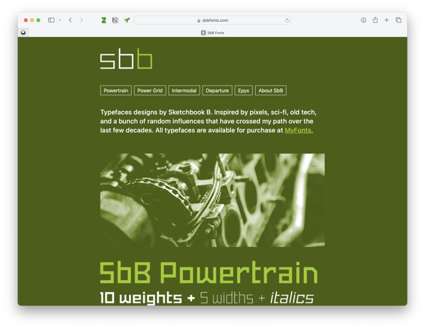
SbB Fonts: My new two-color type design site hosted on Micro.Blog
I decided a while back that I wanted to separate my typeface designs onto their own site. They’ve always lived alongside my blog and other creative projects, but they needed a home of their own, especially since I plan to expand the offerings in the near future. I’ve been noodling around with options, but today, I’m finally ready to release SbBFonts.com out into the world with a design inspired by two-color printing.

The Inspiration
When I became a designer in the mid-1990s, the web was just becoming a thing, and printed documents were the primary job of a designer. Two-color projects used only two spot ink colors — say green and black — for the entire job. (You also had a “third” color with the paper, which was usually just white.) Four-color printing or full-color printing was reserved for only the most important pieces with the largest budgets. For young designers in a pre-web world, two-color work paid the bills. Two-color printing presented challenges, but the process had a particular look. Designers who knew what they were doing could use duotones for images or print on colored paper to get a different look.
Two-color printing isn’t dead. Screen printing and letterpress still use spot colors, but full color printing has gotten cheaper and as a society, we don’t print nearly as many marketing materials as we used to. The craft of designing has moved past the lowly two-color press run.
I guess that’s why when I started to design a home for my typeface designs, I knew I wanted the site to resemble a two-color print job. Much of the inspiration for my type designs comes from my nostalgia for old tech. Two-color printing seemed like the perfect inspiration.
The Execution
The first question was what two “ink” colors to use? Since I wanted to use a dark background, I chose white and the bright green since I use that color for all of my Sketchbook B projects. I picked two dark greens to be backgrounds — essentially a dark mode and a darker mode.1 Accommodating the two background colors meant that I also needed to use transparency on all of my example graphics, including my fake “duotones” and my animated GIFs. You can see the example below of one of the images I used placed over white, dark green and darker green backgrounds. I’m happy with the result, even if there are far easier ways to accomplish this look.2

This site is hosted as a “single page” on Micro.Blog. This might be the worst named feature on Micro.Blog since you can absolutely have more than one page. It’s simply a static Hugo site that doesn’t include a blog. I built everything on the Tiny theme by Matt Langford — the same version that I use for bobwertz.com. This feature is included in my Micro.Blog subscription, so my additional cost is essentially nothing.3
To get the look I wanted, I had to write a bunch of HTML and CSS. My old site was on Squarespace, so it has been a while since I worked so closely with markup. I spent a good bit of time digging through reference guides to make sure I was doing everything correctly. But honestly, if you look under the hood, it’s probably a mess. Just a warning.4
I still have a little refinement left, but I’m happy with where the site is. I need to finish proofreading and rework some of the copy. I’m thinking about future development… I’ve got a plan on how to change the home page when I add a few more typefaces. Right now, I think the five fonts currently presented in this way is about the maximum.
Head over to SbB Fonts and let me know what you think.
Bob Wertz is a creative director, type designer, Ph.D. student and researcher living in Columbia, South Carolina.
-
The print designer in me would like to acknowledge that I’d likely need to use two hits of white on dark paper to get this effect. Meaning that it would likely need to be a three-color job. I’m ignoring that inconvenient truth. ↩︎
-
Or, you know, not having a “light mode” version… ↩︎
-
I did choose to buy a domain name. ↩︎
-
The last time I built a site by hand, tables were an acceptable construction method. ↩︎