I never thought I needed to install a clipboard manager on my Mac. I was wrong. I absolutely love the clipboard history integrated into Spotlight on macOS Tahoe.
I never thought I needed to install a clipboard manager on my Mac. I was wrong. I absolutely love the clipboard history integrated into Spotlight on macOS Tahoe.
It’s always funny to me what pop culture symbols acquire added cultural meaning.
My son is a big fan of the manga series, One Piece. I haven’t watched much of it, but I know the basics… renegade pirates fighting against an authorization government in search of the ultimate treasure. It’s amazing to me that the One Piece Jolly Roger, with a grinning skull and a straw hat, has become the symbol of protests across the globe.
In a similar way, the logo for the Marvel vigilante and anti-hero Punisher has become a symbol controversially used by military, law enforcement and fascist groups. I often see it on pickup trucks, sometimes combined with an American Flag pattern. I doubt any of these people read the comics, but are instead attracted to concept of excessive violence that the symbol projects.
In both cases, the creators of these symbols have no control over how they are now used. Marvel’s trying to regain control, deciding to change the Punisher logo to separate itself from their co-opted symbol. However, these symbols have taken on a life of their own and I imagine it’s impossible to fully reign them back in.
Bob Wertz is a type designer, Ph.D. student and researcher living in Columbia, South Carolina. He’s been blogging since 2008.
This statement from the ELCA bishops is strong:
Love insists on the dignity of every human being. Love insists on justice for the marginalized and oppressed. Love insists that the church must reflect God’s diverse, life-giving community. Love insists that we listen, speak, and act with respect, even in disagreement.
This article is about software development, but I think this passage relates to leadership, too:
When you go too far up, abstraction-wise, you run out of oxygen. Sometimes smart thinkers just don’t know when to stop, and they create these absurd, all-encompassing, high-level pictures of the universe that are all good and fine, but don’t actually mean anything at all.
An interesting post from Simon Sinek on leadership.
Most of us want to be noticed. We want our efforts to matter, to be acknowledged. But the best leaders I’ve ever met are the ones who don’t need the spotlight. They’re the ones who understand that leadership is the awesome responsibility to see those around us rise. It’s not about rank or authority. It’s about caring for the person to your left and the person to your right. It’s about making the choice, every day, to help others succeed, even if no one is watching.
I thought college football fans were intense on social media. F1 fans are on a different planet. Goodness…
The economics of academic publishing are strange. The whole thing seems powered by lots of free (or low paid) labor in the name of service to your field.
Hanging out on the back porch and enjoying a glass of bourbon after a long week.
Seth Godin on leadership today:
Weak leaders (bosses, parents, captains and shift managers) resort to authority because they don’t trust themselves and their team enough to actually lead.
This is so incredibly true. And just because someone has lots of “experience,” it doesn’t mean they know how to lead.
Maybe longevity isn’t a liability. (If you know, you know.)
Me: I can’t believe no one is talking about Clemson losing to Syracuse.
Also Me: I forgot that I blocked “Clemson” and “Dabo” in my social media apps so I didn’t have to listen to people talk about Clemson.


We live in a world now where our media outlets are owned by a small number of conglomerates. And while this is possibly a more profitable set up for the corporations that own these outlets, it also makes it easy for them to be manipulated by billionaires and governments.
Our distribution channels are corrupted as well. Social media and newsletter platforms are controlled by a small number of players all motivated by advertising profits. We find sites through search engines that increasingly favor AI summaries over original content.
It shouldn’t be like this. No venture-capital-funded start up is going to provide a solution. No existing player is going to erode their own platforms. Instead, it’s going to be a grassroots effort to embrace the open standards we have (for example, RSS). We need to promote discussion by sharing stories that are meaningful and powerful. We need to support platforms and creators who are trying to address these issues without trying to build the next Google. We need to embrace technologies that make society better.
Bob Wertz is a type designer, Ph.D. student and researcher living in Columbia, South Carolina. He’s been blogging since 2008.
F1 Qualifying is sometimes more exciting than a regular race. Today’s quali was incredible. Going to be tough to beat Max tomorrow.
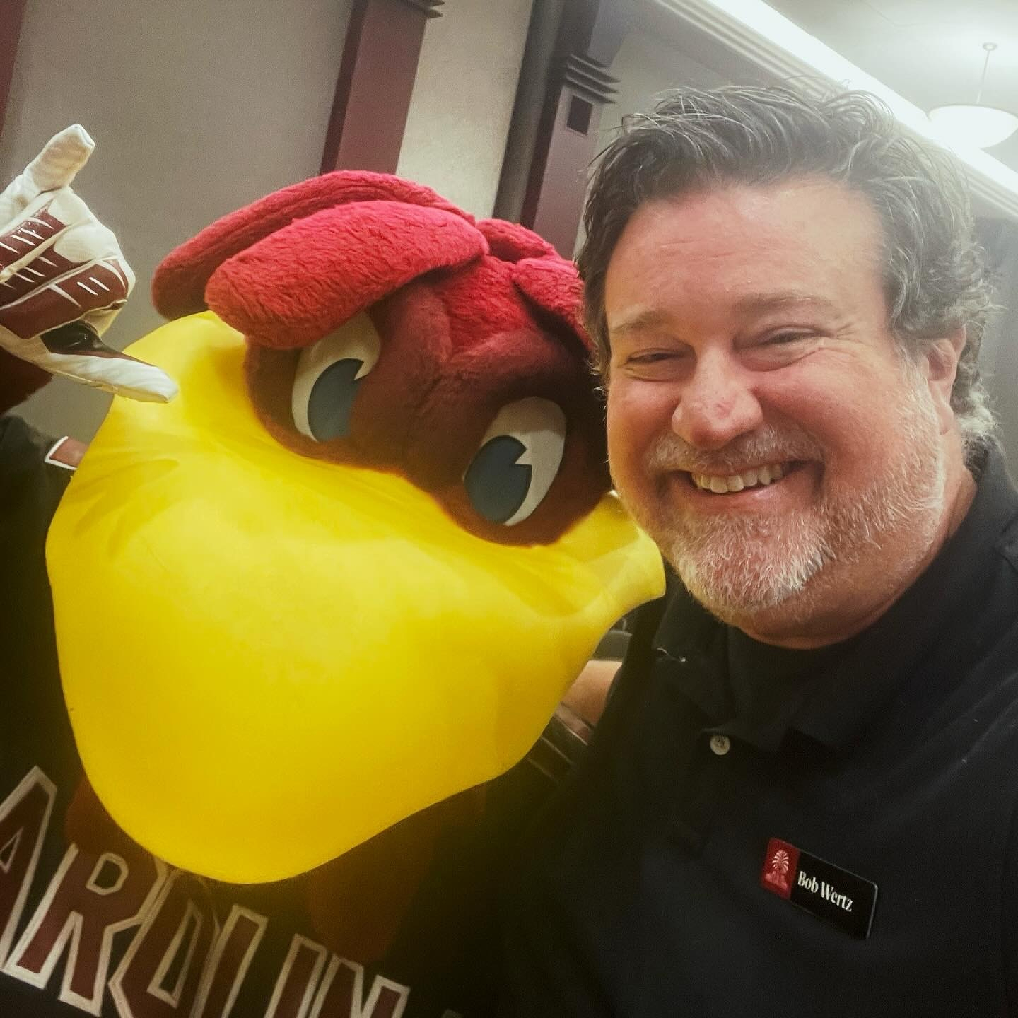
Every year at the USC State of the University address, I get a selfie with Cocky.

It’s finally cool enough that I can drink my coffee on the back deck.
Home today for a warranty repair to our AC unit that developed a slow leak over the summer. Service is expected to take 3-5 hours. Goodness, they must be disassembling the whole thing.
I think I’ll likely stick with the base model iPhone 17 this year. It will be a massive upgrade from my iPhone 12 Pro. I’ll probably pick up a new Apple Watch, too, to replace my ancient Series 4, which I still wear every day.