This post was originally posted on March 29, 2014 on Sketchbook B. It’s reposted here as part of a project to move some of my favorite writing to my new site.
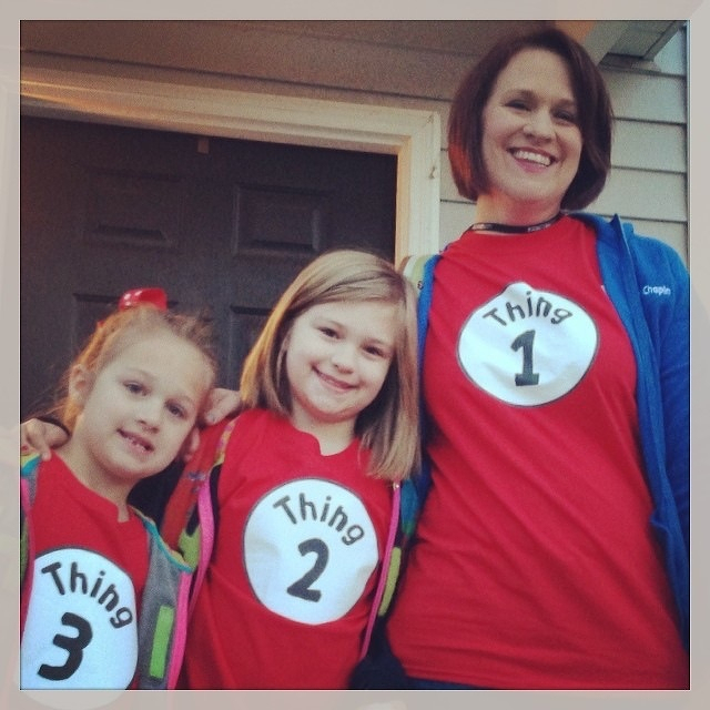
I had one of those geek out moments with a client this week. I mentioned that I typically drink a cup of Earl Grey tea each morning. To which he responded: “Tea. Earl Grey. Hot.” After we stopped laughing, we had to explain Captain Picard’s obsession with Earl Grey tea to some confused coworkers.
Afterwards, I had to come to the realization that a TV show that aired in 1987 affects my behavior today.
I was in middle school when the fictional Star Trek captain first ordered his beverage of choice from the replicator. At the time, we had hot tea in the house, but it was Mint or Lemon-flavored. I mostly would drink it when I was sick. But there was no Earl Grey that I remember.
Star Trek: The Next Generation ran for a long time and still runs in syndication today. I’m not sure when I started to drink Earl Grey, but it was sometime during or just after college. I’m sure I decided to buy some tea and when faced with too many options, I simply went with the option I “knew.”
It makes me wonder just how many other choices I’ve made are directly or indirectly traced back to television and media. I know I have a slight Nike bias because I grew up in Chicago during the Michael Jordan years. But other than Earl Grey and an affinity for Nike, I can’t think of any other long lasting influence that a show or movie has made on me. I’m sure there are many more but I can’t piece them together right now.
That said, I really like my Earl Grey tea. And I’ll happily have a cup every morning. But I’ll probably never think of it the same way again.
Bob Wertz is a creative director, type designer, Ph.D. student and researcher living in Columbia, South Carolina. His blogging journey started in 2008 with a Squarespace hosted blog.
This post was originally posted on March 26, 2014 on Sketchbook B. It’s reposted here as part of a project to move some of my favorite writing to my new site.
NOTE: While this page may have useful insights, be aware that it was published more than 10 years ago and may not be relevant for current software versions.
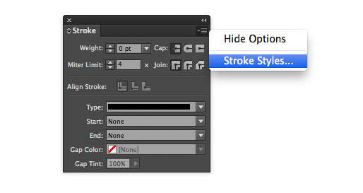
Need to build a custom stroke in InDesign? Easy. Go to the flyout menu on the Stroke palette and choose “Stroke Styles…”
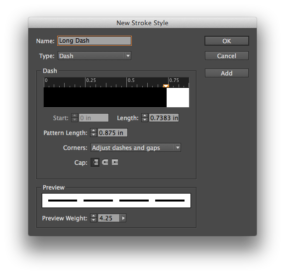
A dialog box will open with several options and a list of custom strokes. Choose “New…” to get the stroke editor. You can make dashed, dotted or lined patterns, change the length and pattern of the stroke and preview your designs at different weights.
InDesign provides lots of options for designing custom strokes.
The custom strokes are saved on a document level, but you can save your designs and load strokes into other documents. If you want a custom stroke to be added to all new documents by default, simply add the stroke with no documents open.
This post was originally posted on March 12, 2014 on Sketchbook B. It’s reposted here as part of a project to move some of my favorite writing to my new site.
NOTE: While this page may have useful insights, be aware that it was published more than 10 years ago and may not be relevant for current software versions.
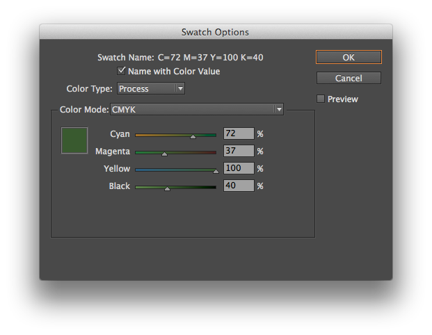
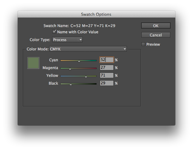
In InDesign, you want to modify a color slightly, keeping it in the same basic hue. Maybe you’ve duplicated a color and need a slightly lighter or darker color to complement your design. You double click the swatch in the palette and you get this:
Moving the sliders individually will radically alter the color. You need to move all the sliders at once, keeping them in proportion. And InDesign has a way to do this. Simply hold down the shift key as you click and drag the sliders. They will all move together:
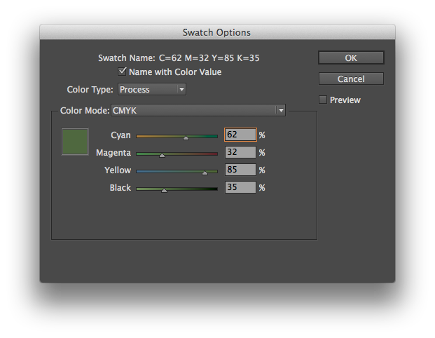
Look at the numbers in the screenshot above. I simply clicked on the Cyan slider and moved it to the left while holding down the shift key. All of the sliders moved in proportion. Cyan went from 72% to 62%. And the other colors moved, too. Here’s another screenshot where I’ve moved the Cyan slider to 52%:
And the same trick works in Illustrator, too. Just hold the shift key to move the Color palette sliders together. It’s a simple and powerful way to adjust your color palette.
This post was originally posted on March 5, 2014 on Sketchbook B. It’s reposted here as part of a project to move some of my favorite writing to my new site.
Many designers think they are bad at math. Thankfully, InDesign is good at math.
Input fields in InDesign can do simple math. For example:
Addition, subtraction, multiplication and division. Have a box that is 4.25 inches wide and you want it to be 1 inch wider? Just type “+1” after the curent measurement. Need to resize a box to 1/3 the current width. Type “/3” behind the measurement in the width field.
Conversions. InDesign will also convert measurements for you. If your document is set up for picas and you need to input a measurement in something other than picas, just type the measurement AND the unit of measure (for example, “7 in” or “3 mm”) and InDesign will convert it to picas. This works for lots of different units – inches, millimeters, centimeters, points and more. You can even do addition or subtraction between numbers with different units of measure and InDesign will figure it out for you. For example, typing “7 in + 3 pts” will yield 7.0417 inches.
Enjoy. I’m sure this is a reminder for many of you, but I run across people everyday that don’t know that InDesign can do simple math. I typically use unit conversion and division a lot in InDesign. As a bonus, most Adobe apps have fields that can do math – not just InDesign. I use it in Illustrator all the time.
This post was originally posted on February 26, 2014 on Sketchbook B. It’s reposted here as part of a project to move some of my favorite writing to my new site.
NOTE: While this page may have useful insights, be aware that it was published more than 10 years ago and may not be relevant for current software versions.
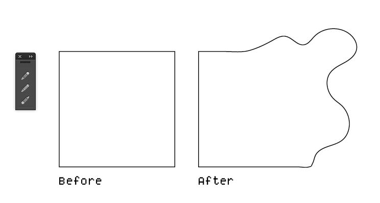
Here is my first Wednesday Quick Tip for Adobe Illustrator. Using the pencil tool, you can quickly reshape any path. Select the object that you want to edit. Then using the pencil tool, draw a new shape for the path. You MUST start drawing on (or very close to) the original path AND finish on the path.
Below is an example. I took a normal square and using the pencil tool, reshaped it into some half-blob thing.
Using the pencil tool, reshape an existing path.
If you are having issues with this tip, make sure that your path was selected before you started to redraw the path and make sure that you start and finish redrawing on or very close to the path.
While the example is somewhat extreme, it’s a very handy tip for polishing shapes or cleaning up rough edges.
Jill has finally lost her first tooth!
Woodgrain
Beautifully restored and awesomely pink Thunderbird.
This post was originally posted on February 19, 2014 on Sketchbook B. It’s reposted here as part of a project to move some of my favorite writing to my new site.
NOTE: While this page may have useful insights, be aware that it was published more than 10 years ago and may not be relevant for current software versions.
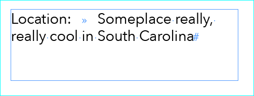
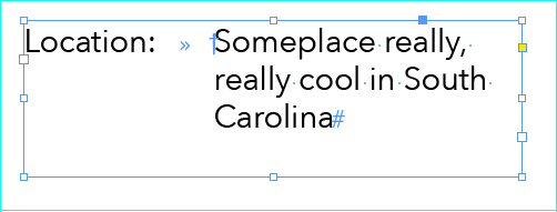
Let’s say you are working on a poster in InDesign and you have something that looks like this:
Wouldn’t it be great to line all that type up under the “S” in “Someplace…” Shown here with “Show Hidden Characters” turned on.
You want the text on the right to align neatly. There are lots of ways to accomplish this, but the easiest is the “Indent to Here” character. You find it under Type > Insert Special Character > Other > Indent to Here. (If you prefer keyboard shortcuts like I do, it’s Command - .) This awesome invisible marker wraps everything underneath it back to that character.
The “Indent to Here” character is signified by the cross symbol when you turn on “Show Hidden Characters.”
It’s handy when there is only one or two lines to do. With lots of lines or complex lists, there are, of course, better ways to handle the indent. I find that I tend to use it most often on posters, fliers or invitations.