This post was originally posted on April 26, 2014 on Sketchbook B. It’s reposted here as part of a project to move some of my favorite writing to my new site.
The oldest advice about photography is still the best. A “fast 50” is the cheapest, best lens. On your inexpensive DSLR, 50mm is a portrait lens, which means it’s good for taking pictures of people—which are the only pictures anyone cares about.
It’s a good collection of sensible advice and you should absolutely read it… especially if you are a designer that ends up having to take a lot of pictures.
A couple of comments:
His recommendation to buy a fast 50mm lens is a great one. Yes, zooms are convenient, but shooting with a faster lens is wonderful, especially if you can use natural light and not use a flash. Plus, the 50mm lens is affordable.
I wouldn’t throw away the kit zoom. But lens quality does matter.
Yes, shooting in RAW is worth the extra file size. If you want great results, shoot in RAW.
He mentions that Lightroom will cost you about $100. But if you have Creative Cloud, it’s one of the apps that Adobe included in the subscription.
When I first started shooting, a 50mm lens was always included when you bought a camera. Now, it’s all about zooms. I’m planning on upgrading my camera system soon and I’ll definitely take some of Stu’s advice.
This post was originally posted on April 24, 2014 on Sketchbook B. It’s reposted here as part of a project to move some of my favorite writing to my new site.
In the early 1980’s, we lived in a slightly mountainous area of North Carolina. And our community had an early version of cable. The cable box on our TV has 13 push buttons, each representing a different channel.
Among those 13 channels were WOR (New York), TBS (Atlanta) and WGN (Chicago). In the early 80’s, all three channels had contracts to carry baseball games. WOR had the Mets, TBS showed the Braves and WGN aired the Cubs games. This is pre-ESPN, so your other option was to catch a random Game of the Week broadcast on one of the networks.
I loved baseball. I’d come home from school and turn on the TV and try to find a baseball game. And more often than not, there would be a Cubs game on. Why? Because Wrigley Field didn’t get lights until 1988. All home games were day games. The Braves and Mets played a bunch of night games so even though I saw some of their games, I didn’t develop the same connection that I did with the Cubs.
(Geographically, it would have made sense for me to be a Braves fan. We weren’t too far from Atlanta. But at the time, they were in the NL West division and played a bunch of night games on the West coast. So those games started after my bed time.)
I fell in love with Wrigley Field, Harry Carey, Ryne Sandberg and “Take Me Out to the Ball Game” during the seventh inning stretch. And then we moved to Chicago and my die-hard-Cubs-fan status was cemented.
Wrigley Field turns 100 this week. And even though Harry Carey is no longer with us, Ryne Sandberg is the manager of the Phillies and Wrigley has lights, I still love my Cubbies.
This post was originally posted on April 23, 2014 on Sketchbook B. It’s reposted here as part of a project to move some of my favorite writing to my new site.
NOTE: While this page may have useful insights, be aware that it was published more than 10 years ago and may not be relevant for current software versions.
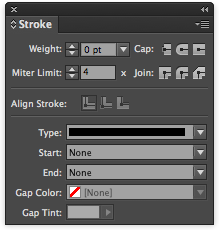
In the middle of the Stroke palette are the Align Stroke options.
InDesign lets you determine where the stroke is located on a box or shape. In the middle of the stokes palette is the “Align Stroke” option. By default, the stroke is centered on the path. So a 2 point line with have 1 point outside the box and 1 point inside the box.
With thicker strokes, the placement of the stroke really matters. Below are three boxes that are drawn to be exactly the same size. The only difference is the alignment of the stroke.
These three boxes are the same size. Only the alignment of the stroke varies. From left to right: Inside, Centered, Outside.
It’s helpful to use these settings when you are trying to get precisely measured shapes. I use the inside alignment option all the time.
This post was originally posted on April 15, 2014 on Sketchbook B. It’s reposted here as part of a project to move some of my favorite writing to my new site.
NOTE: While this page may have useful insights, be aware that it was published more than 10 years ago and may not be relevant for current software versions.
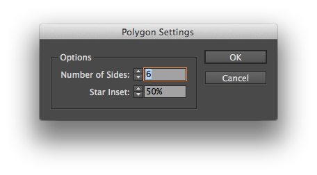
Stars and polygons are easy to build in InDesign. Most people, myself included, set the angles and number of sides by double clicking on the Polygon tool. Which brings up a dialog box allowing you to set the number of sides and star inset percentage.
But let’s say you want to change the number of sides or the star inset angle while you are drawing the shapes? Easy. Start to draw the shape. Press the spacebar and then use the arrow keys to adjust the shape without opening the dialog box. Right and left arrows change the angle of the star inset. Up and down changes the number of sides.
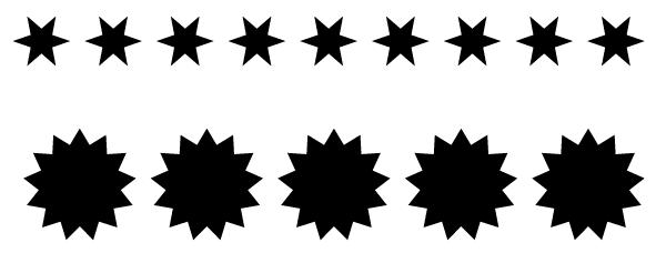
**But here’s the really awesome tip.**Start to draw a star or polygon. Don’t push the space bar like you did above. Simply push the arrow keys right or left. InDesign creates a horizontal line of identical shapes. If you use just the up and down arrows, the shapes form a vertical line. Or use both sets of arrows and create a grid of shapes.
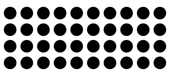
Even better, the grid tip also works on rectangles and circles, too. It’s magic.
A couple of rows of shapes created with the arrow keys.
A grid of circles created using the arrow keys while drawing.
FYI: The spacebar acts like a toggle. So you can easily switch between the two modes.
Slide!
Cousins + Penguins
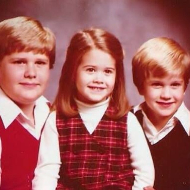
Happy Siblings Day! My kid sister posted this to Facebook. No filter necessary…
This post was originally posted on April 9, 2014 on Sketchbook B. It’s reposted here as part of a project to move some of my favorite writing to my new site.
NOTE: While this page may have useful insights, be aware that it was published more than 10 years ago and may not be relevant for current software versions.
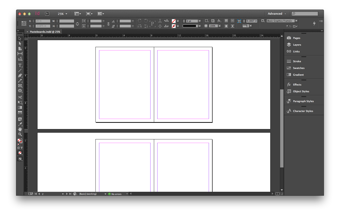
The InDesign pasteboard is narrow on the top and bottom and wide on the sides. But it can be changed. Before…
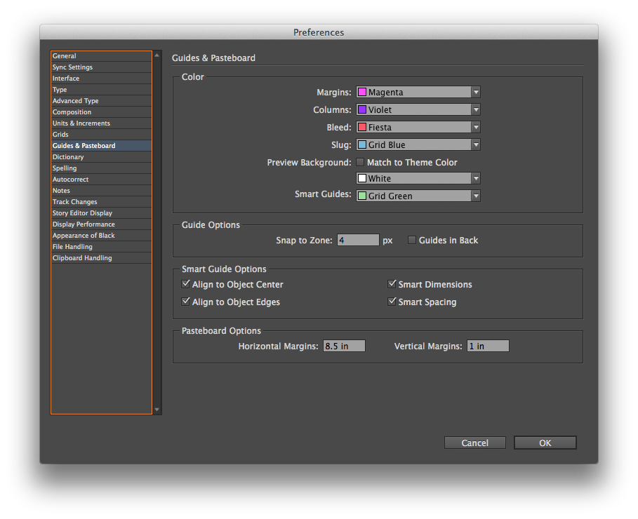
Go to InDesign > Preferences > Guides & Pasteboard… and change the “Pasteboard Options” at the bottom of the preference screen.
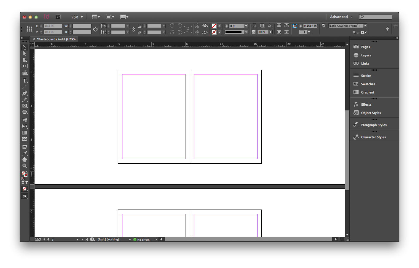
Change the horizontal margins to 10 inches and the vertical margins to 2.5 inches and it looks a little different…
I’m not sure how often I’ll change the margins. The defaults have always worked pretty well for me. But especially on large format designs, it will be nice to have the option.
This post was originally posted on April 2, 2014 on Sketchbook B. It’s reposted here as part of a project to move some of my favorite writing to my new site.
NOTE: While this page may have useful insights, be aware that it was published more than 10 years ago and may not be relevant for current software versions.
I don’t typically underline much. I usually don’t like the default thickness of the line or the positioning. But in InDesign, you can completely customize your underline styles.
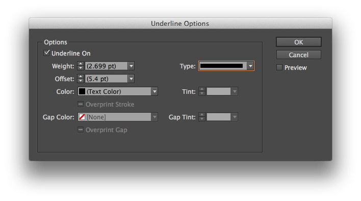
To change the appearance of an underline, select some text. Go to the flyout menu on the far right of the Control palette. (That’s the wide palette docked by default underneath the menu bar.) Choose “Underline Options….” from the menu to pull up a dialog box:
Change the weight, stroke style, positioning and color of the underline.
You can easily change the appearance of the underline – the thickness, positioning, color, stroke style and more.
Two additional tips:
If you have created a custom stroke, you can use it as an underline too. (See last week’s tip for how to create a custom stroke pattern.)
You can save “Underline Options” in a paragraph style to apply it throughout your document. And you can save style sheets and load them into other files.