I’ve been in two active shooter situations. One turned out to be a false alarm, but it caused a real stampede in a crowded mall. The other was a murder-suicide on campus that caused a lockdown. While I wasn’t really in danger in either situation, the feeling of panic sticks with you.
An active shooter on the University of South Carolina campus. I know my daughter is safe, but so incredibly terrifying.
According to Facebook, I started grad school seven years ago today. I finished my master’s degree in 2021, and have a single independent study and my dissertation left before I finish my PhD, hopefully in 2026. It’s been a long process – I feel like I’ve been a grad student forever – but I’m thankful for my wife, kids, friends and coworkers who have been incredibly patient with me on this seemingly endless journey.
My PhD research is on how people respond to logos. One factor for a successful rollout appears to be context. How will the logo be used? What’s the story behind the change? More context = better response. Neither Cracker Barrel nor MSNBC gave any real context. Here’s my published study on context.
Excited to see South Carolina switch from Under Armor to Nike next year.
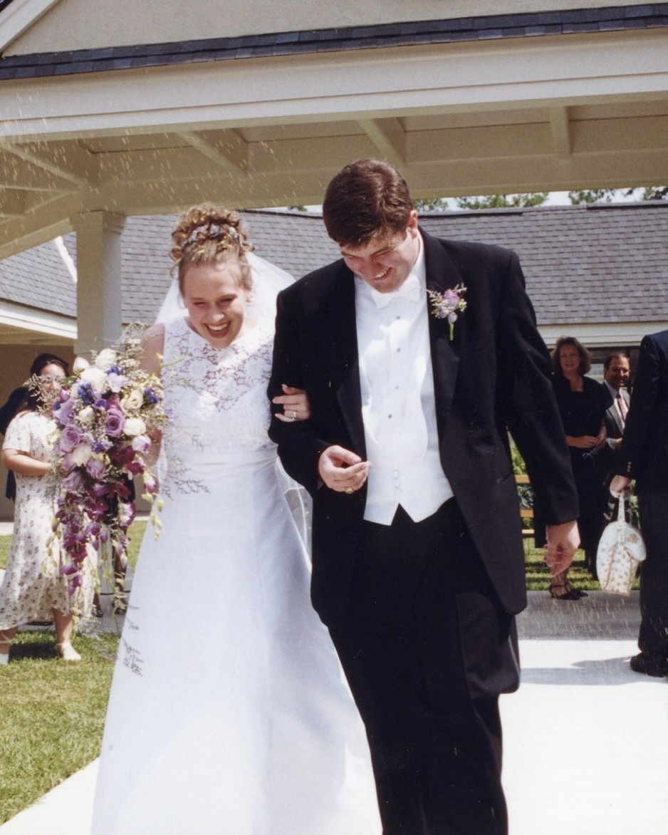
26 years ago today! Happy anniversary @lizzy_wertz.
Thanks Cracker Barrel and MSNBC! I needed some more recent logo backlashes for my dissertation.
My daughter and I are discussing the best fictional bands. And now, I’ve discovered Julie and the Phantoms and KPOP Demon Hunters. So what other fictional bands belong on my hypothetical list?
Working on a new typeface design that I started six years ago.
Modern cars have all the problems of a car, plus all the problems of a computer.
A friend was digging through some college artifacts and found my 32-year-old business card from when I was an officer with Carolina Productions, the University of South Carolina student programming board. She sent me a picture and I noticed something funny: I still have the same email address.
I came to USC as a student in 1993 and got my first email address. I used that email address with a command line system until I graduated in 1997. At some point years later — I became an adjunct instructor and was able to reclaim that address and use it as an IMAP account. When I became full-time staff, I continued to use the same email address, this time connected to Microsoft 365.
I’ve had several home addresses and a couple of phone numbers since 1993. Those were connected to my physical location or my service provider so as I moved, things changed. By contrast, I’ve had two of my three main personal domains — sketchbookb.com and bobwertz.com — for almost two decades.1 I’ve changed my hosting service a couple of times, but the URL remains the same.
One of the benefits of domain-based identity systems used on the web and in email is permanence. Social media platforms come and go, and when you are connected to them, it’s like a physical address. When you move or the service disappears, the address changes. But as long as you renew the domains2, you can maintain your digital identity, even as technology advances or you change providers. I really like the domain-based usernames on Bluesky and I hope other services follow suit. Hopefully in 30 years, I’ll find one of my current Sketchbook B business cards and still be able to go to my website.
Bob Wertz is a type designer, Ph.D. student and researcher living in Columbia, South Carolina. He’s been blogging since 2008.
I added sbbfonts.com a couple of years ago to give my type designs their own site. ↩︎
I will note that for many people, the cost snd process of renewing domains is a legitimate issue. ↩︎
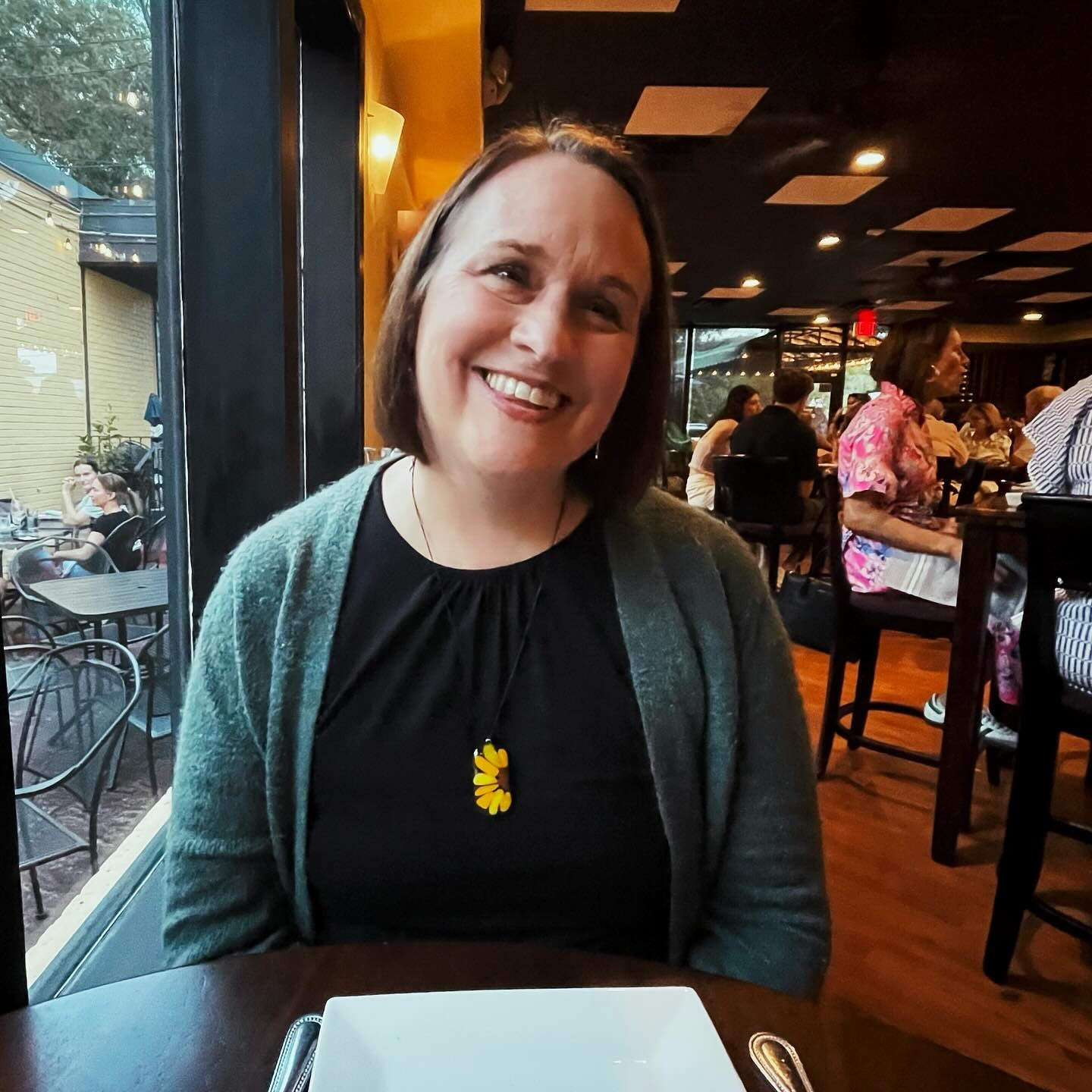
Unplanned dinner date.
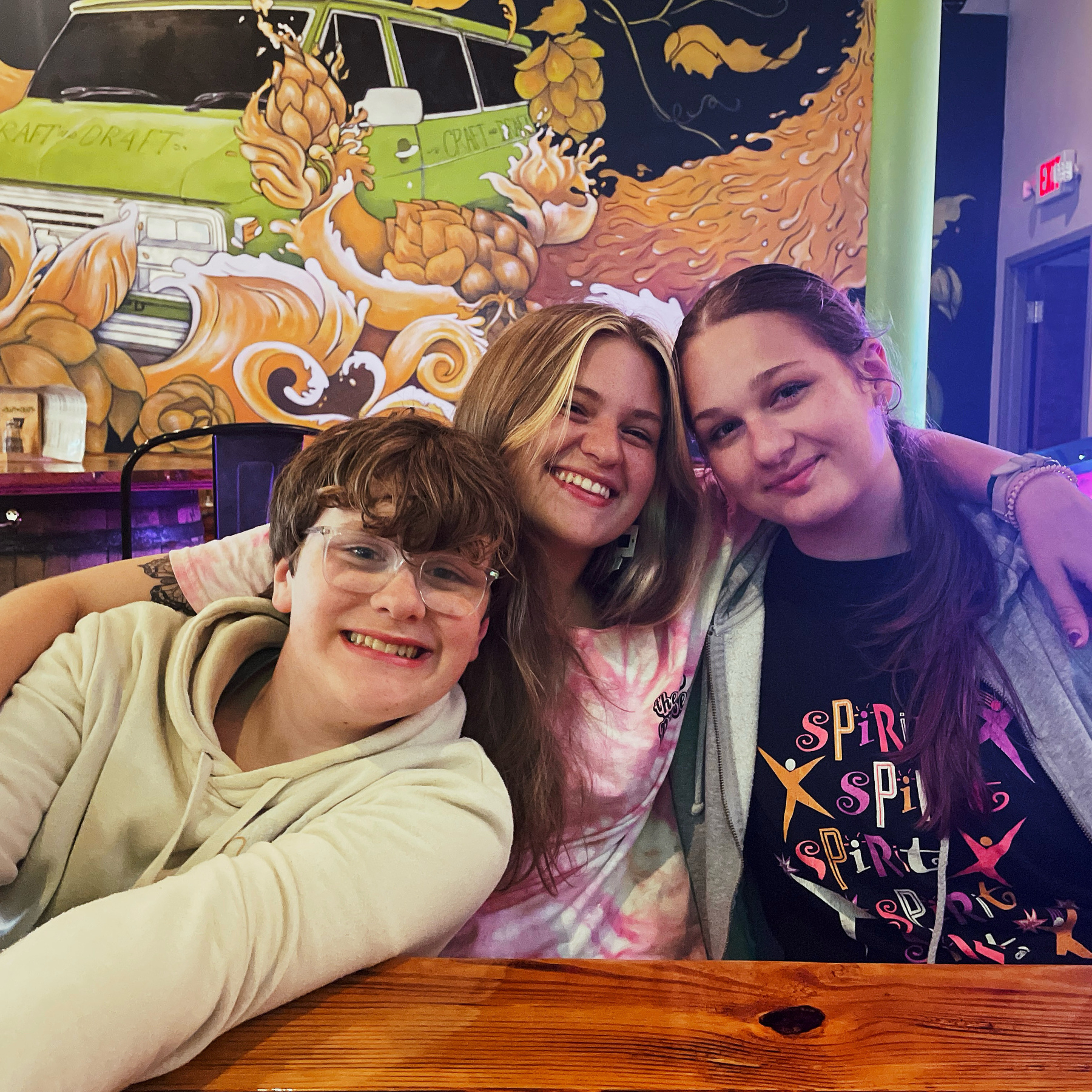
I love these moments when Team Wertz is all together. Getting all three kids together at the same time is getting tougher and tougher.
Went to campus. Got caught in a rain storm. Now sitting at my desk completely soaked…
I can’t think of a sports parallel to F1 summer break. In the middle of the season, they take 2 weeks off where NO ONE on the team can work. They can’t even send an email. Everyone gets a 2-week vacation by rule. (I wonder if social media teams schedule the posts that appear during break.)
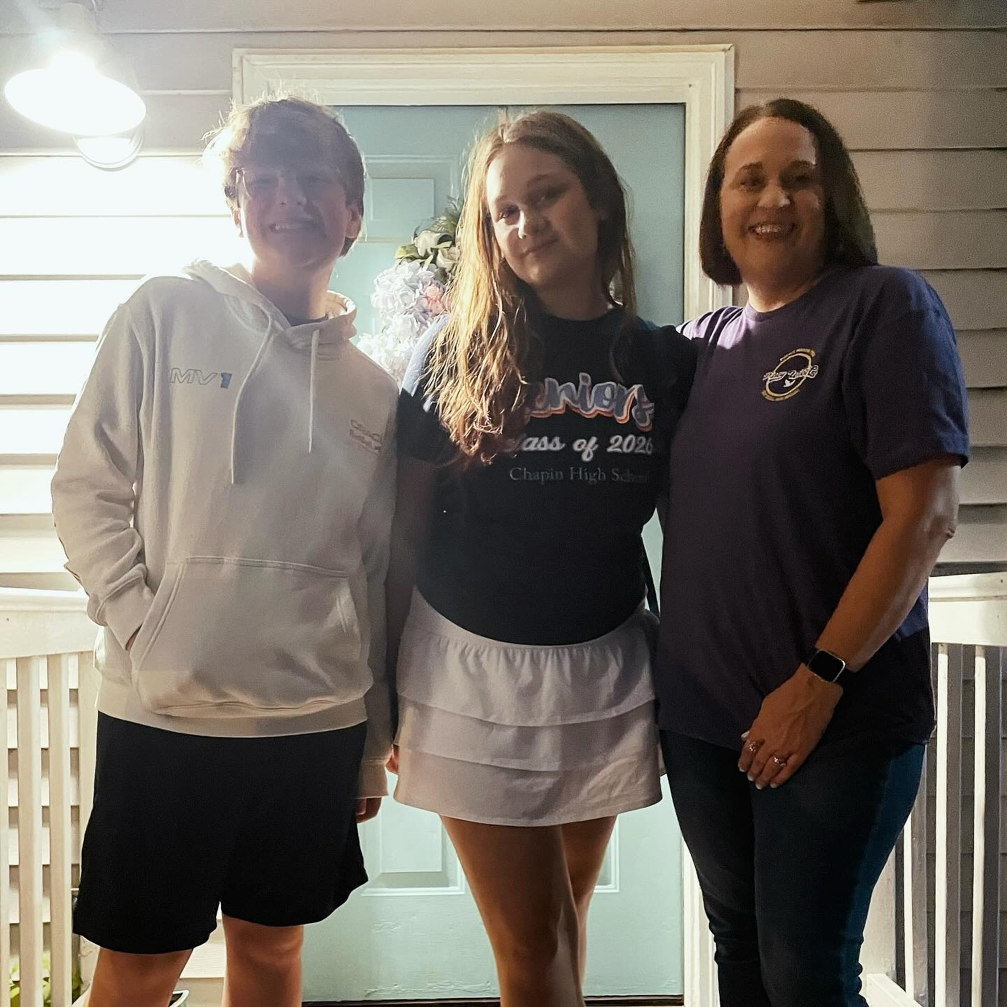
Team Wertz’s traditional “it’s still dark” first day of school picture. Jill’s a senior. Ryan is in 8th. Liz is teaching kindergarten.
An insightful read from the Nieman Lab on NY Times v Sullivan, the 1960s Supreme Court decision that is the foundation of modern American press freedom. Worth a read to understand how lawsuits were weaponized by politicians, and how NYT v Sullivan changed that.
This blog post about additive and extractive technologies by Cal Newport makes me think about the different tools I use daily. I specifically thought of @manton and some of the choices he’s made with Micro.Blog to be less extractive.
Really enjoyed the Fantastic Four. Fun story with great art direction. I adore anything retro futuristic.