I always pull together my favorite eight shots of the year (as a contrast to those algorithmically generated “Best Nine” posts). I love that it gives me an excuse to go back over all of my images from the last year and relive a lot of great memories.
Our oldest decided to attend the University of South Carolina and had a great first semester.
Liz and I are notably bad a selfies, but this outtake was better than the actual selfie and I love it.
The girls were a little excited about seeing Taylor Swift in concert. (It was an amazing concert and I’m glad we all got to go.)
We have a high school graduate.
This is a big kitty yawn, but it looks so fierce.
Ryan is still playing lacrosse and bounced back after some adversity this summer to have a great rec season.
We attended my nephew’s football playoff games. This was the final play in overtime that sent them to the state championship. They won that game, and won a state championship.
Birthday hike for my oldest included a stop at Looking Glass Falls in Pisgah National Forest. It was so cold, that the rocks were covered with ice.
This is the fifth year I’ve done a Favorite 8. You can see my previous posts from 2018, 2019, 2020 and 2021 on my other site, Sketchbook B. And I posted my 2022 here on bobwertz.com.
Bob Wertz is a creative director, type designer, Ph.D. student and researcher living in Columbia, South Carolina.
I’ve reached a big milestone in my academic career: my first published research paper.
Brand new: How visual context shapes initial response to logos and corporate visual identity systems has bene published in the Journal of Product and Brand Management. It’s available now online and will eventually be assigned to an issue. If you have access to journal articles through a university or public library, you can access the article.
If you can’t access the article, here’s the abstract:
When a new logo is released, it does not have an established meaning in the mind of the viewer. As logos have become more highly scrutinized by consumers and critics, it has become more important to understand viewers’ initial response to logos. While other studies have researched the impact of aesthetic choices on viewer reaction to logos, this study aims to understand the effect of the surrounding visual identity system when a new logo is introduced. This study combines a content analysis of 335 posts on the logo review website Brand New with the voting data from their polls to understand how visual context correlates with a viewer’s initial response. Increased amounts of visual context correlate to an improved response from viewers. Different types of context that can be presented – from logo variations and environmental examples to videos and animation – have varied effects.
Basically, my study finds that people respond better to new logos when they are shown more examples of the logo in use. This is one of those things that seems intuitive to designers, but hasn’t been researched or quantified. Because I’m a designer, most people are surprised that my research includes a fair amount of statistical analysis, but I’ve really taken to the quantitive side of things. This paper has been in review for over a year, working it’s way through the revision process.
It’s fitting that this is my first paper to be published. When I started grad school, I didn’t really know anything about scholarly research. In the spring of 2019 — my second semester as a grad student — I took a content analysis class with Carol Pardun. I was the only master’s level student in a class full of Ph.D. students. I felt so overwhelmed by the pressure to come up with an idea and learn methods and theories on the fly. The paper I wrote for that class was the first version of this paper. It was accepted to the AEJMC Conference that August and I presented in Toronto — my first academic conference presentation. I loved the concept for the study and got great feedback, but I was still learning and felt like I could improve it. I scrapped everything, started over with a larger sample and better methodology. After Dr. Pardun retired, I started working with Tara Mortensen on the next evolution of this work, which turned into my thesis. And that thesis eventually became this paper.
Thanks go out to so many people who’ve help me along the way:
Dr. Pardun for supporting my bizarre little project, especially in the early days when the project was taking shape.
All of the Ph.D. students in that content analysis class who helped me figure things out and took me under their wing.
Dr. Mortensen for taking over as my thesis director and helping guide me through the publication process.
Kevin Hull and Van Kornegay for serving on my committee and providing helpful feedback.
Robert McKeever and Jacob Long for giving me an appropriate foundation for analyzing data.
Editor Cleopatra Veloutsou who guided me through the process with the Journal of Product and Brand Management.
All of the reviewers and discussants at the conference level for AEJMC and in the peer review process whose feedback legitimately made this paper better.
And of course, this couldn’t have happened without the rest of Team Wertz. Liz and the kids have been so supportive and patient while I have embarked on this grad school journey. (And occasionally, Norah and Jill even joined me at Starbucks when I had to write.) I simply could not have done it without them.
I’ve still got a few years left until I finish my classwork and dissertation, but I’m exceptionally proud of this milestone and excited to see where my research goes next.
Bob Wertz is a creative director, type designer, Ph.D. student and researcher living in Columbia, South Carolina.
Tomorrow night, the Ahsoka finale airs on Disney+. I’m looking forward to it. I’ve enjoyed the show. It’s not perfect, but I love Star Wars Rebels and it’s great to see a continuation of the story line.
I’ve got a few absurd ideas about the finale that I figured I’d share. Our heroes are on Peridea, in another galaxy. Thrawn is ready to come back to the core galaxy, partnered with the Nightsisters, to restore the Empire.
Here are 9 absurd things that are not going to happen on the season finale of Ahsoka:
Our heroes (and maybe villains) will remain stuck in the Peridea galaxy. That would at least explain where they were during the Rise of Skywalker.
Force ghost Kanan Jarrus appears to… Ezra? Hera? Jacen?
Yoda’s species is actually from this new galaxy, and they are the enemies of the Nightsisters.
There is an even darker power in the new galaxy that is stronger than the Nightsisters and Thrawn… which is why they want to escape.
Huyang helps Ezra make a new lightsaber, and the blade is… yellow or purple.
All those New Republic ships are actually filled with Imperial technology and spies and Thrawn will be able to control them.
There’s a Jedi temple on Peridea… with a portal that transports our heroes to Lothal via wolf ride.
Post credit scene features Hera assembling a team to fight Thrawn… including Zeb, the Mandalorian, Grogu, the surviving members of the Bad Batch and Rex.
Baylan Skoll actually does have a plan.
I warned you they were absurd, but the list was fun to come up with. Looking forward to seeing where the show lands. There is no way they can resolve all the various plot threads, so I assume there will be another season, or the storyline will be continued in another series. Eventually, we already know this leads to a new Dave Filoni-directed movie.
Bob Wertz is a creative director, type designer, Ph.D. student and researcher living in Columbia, South Carolina.
Recently, we started rewatching Alias, the 2000s ABC spy thriller by J.J. Abrams.1 All five seasons are on Disney+ and we started from the beginning. Season 1 has 22 episodes, which was once considered a “full season.” Now, a streaming show rarely has more than 8 or 10 episodes a season.
Alias became a hit and attracted new viewers over the first season. But in the broadcast TV era, there wasn’t an easy way for people to go back and watch the episodes they’d missed. I remember ABC trying to rerun episodes as it gained popularity. And the “previously on” section got hilariously longer to try and catch people up.
The 17th episode of season 1, “Q&A,” is an exposition-filled clip show where a skeptical FBI agent quizzes super spy Sydney Bristow (played by Jennifer Garner). She answers his questions, explaining the premise of the series while showing clips from previous episodes. Sydney basically tells the viewer everything they need to know in the lead up to the season finale. There’s a reveal at the end of the episode… a revelation to keep the newly updated viewer hooked to come back next week.
As I watched it, I realized that this type of clip show episode — once a staple of 20+ episode network TV seasons — will likely fade from existence. Streaming services like Disney+ allow people to go back and watch the whole season easily. And shorter seasons mean that you don’t need a budget-friendly recap episode. In today’s streaming world, there is simply no longer a reason to make a clip show.2
We are in the midst of a huge shift in television. Most of the attention is directed at the financial aspects of the streaming era. The demise of the clip show episode is a comparatively minor shift, but it demonstrates how the changing financial model of the television industry directly shapes the creative product itself.
Bob Wertz is a creative director, type designer, Ph.D. student and researcher living in Columbia, South Carolina.
When the exodus from Twitter first started last year, many tech-savvy people were moving to Mastodon and I wondered if brands would move their accounts to self hosted instances. After all, from a branding standpoint, @offical@starbucks.com is better than @starbucks@mastodon.social. At the end of that post, I posited that someone would come along with a service that handled the fediverse complexity for companies.
That service is Threads.
Lots of people have asked why Meta was interested in providing ActivityPub support. I honestly think part of the story is so Meta can tell brands – their advertisers – that they can just publish on Threads and it will eventually be accessible on any other non-Twitter platform. Of course, they’ve still got to deliver on that promise… right now Threads doesn’t have ActivityPub support.
So far, branded accounts have flocked to Threads. If @BRAND-NAME@threads.com becomes the default for official branded social content, Meta benefits. I still think companies would be better off owning their instance with a branded domain, and maybe we will get there some day, but for now, it looks like Threads is where the brands are headed.
(I think that eventually, Meta will offer an upgraded “brand tier” that allows companies to use their own domain instead of @threads.com. for a substanial fee, of course.)
Bob Wertz is a creative director, type designer, Ph.D. student and researcher living in Columbia, South Carolina.
I’ve been preparing for Twitter’s demise for seven years, but I didn’t see ‘X’ coming.
I’ve been preparing for the end of Twitter since 2016, when Twitter was struggling with some financial issues and the future was uncertain. I pondered what would happen of Twitter went away suddenly.
Which got me thinking, what if we woke up one morning and Twitter was gone. Or more likely, what if Twitter changed so radically, that it was unusable?
I’m more concerned that Twitter, or a company that buys Twitter, will change it so completely, that it becomes useless.
Fast forward a little over a year later. Twitter’s financial issues were less dire, but they were struggling with flat user growth, coupled with a rise in abuse and hate on the platform.
As Twitter tries to jumpstart the service, I still believe the likelihood of Twitter imploding within the next few years is high.
When Elon Musk bought Twitter, I assumed he’d shake things up, but I was concerned about the direction he would take Twitter in. I wrote a third Twitterless post to recap the changes that I’d made to deal with the hypothetical demise of Twitter.
If Twitter ceases to be enjoyable, I’ll leave. To be honest, I’ll miss it. I joined in 2008 and 14 years is a long time to use any service. It’s part of my daily routine. At the end of the day, though, if a service isn’t making my life better, I’m better off without it.
Once Twitter abruptly cut off third party clients, my Twitter usage dropped dramatically. I was a Twitteriffic user for over a decade, and it was obvious from the way he handled that situation that Elon Musk’s Twitter wasn’t going to be what I wanted. I moved on.2
Now, he’s changing the name of Twitter to X. I always assumed that someone would buy Twitter for the brand equity and change the service to make it more profitable. Instead, Musk changed the service and destroyed an iconic brand, all while making it less profitable.
I feel like I’ve prepared adequately for the Twitter apocalypse, but there is one area in particular where the loss of Twitter will still hurt. A common thread through all three Twitterless posts was a lament that there aren’t other services optimized for following breaking news or live events. This is still true. Maybe Threads,3 Bluesky or Mastodon can step in, but until then, I’ll miss Twitter most when watching a sporting event, an Apple keynote or following a local news story. For the last few months, I’ve been viewing Twitter to check in during big events, but the time has come to move on.
Twitter is finally dead.
Bob Wertz is a creative director, type designer, Ph.D. student and researcher living in Columbia, South Carolina.
The illustration at the top is the one that accompanied the 2018 post. ↩︎
New social media outlets prove the viability of indie social.
The invention of the printing press made mass media possible. Printing houses produced popular books and bibles, but they also spread the writing that powered the Reformation. Major newspapers became was the dominant media for decades, but there have always been community and independent newspapers. Self-publishing, indie music, art house films and college radio are all forms of independent media.
Economy of scale1 pushes these systems toward consolidation. But as these media outlets consolidate into a few major players, there is always a market for an alternative. Why should social media be any different?
When the internet became popular, personal sites and blogs were the ultimate form of independent media. Economy of scale kicked in like it always does. Large news sites dominate and Google Search drives the traffic to the largest most well established sites.2 Blogs became less popular, but there are still many independent blogs and personal sites around the internet.
With social media, consolidation drove us to a handful of sites. Facebook, Instagram, Twitter, LinkedIn, TikTok and Snapchat. The funding model drove this as well… Venture capital investment bet on the next big social media winner, and sites either made it big, or disappeared. (RIP: Path, Vine, Periscope, Gowalla, Google+, Google Wave.) I wasn’t sure there was space for independent social media.
All of the attention right now is on Meta’s Threads and the cage match with Twitter, but there’s a lot more going on in the space. Elon’s purchase and erosion of Twitter3 has opened the doors to alternatives. ActivityPub is starting to take root that will allow some interoperability between sites. I’ve been a Micro.Blog subscriber for years and it’s a wonderful independent social space.4 Mastodon and Bluesky are both putting forward their visions for an open web. And users are adapting Discord and other sites to create smaller, independent communities.
These sites now have a large enough user base to stick around, and technical solutions like ActivityPub allow easy access to creators on other networks. The businesses aren’t (currently) poisoned by the venture capital desire to grow fast and get rich. This is how a healthy independent social media ecosystem develops.
Bob Wertz is a creative director, type designer, Ph.D. student and researcher living in Columbia, South Carolina.
The idea that businesses become more efficient as they get larger. ↩︎
Or the ones that have loaded their sites with SEO friendly keywords. ↩︎
I get Apple News+ with my Apple One bundle and I actually use it frequently on my Mac. My local newspaper, The State, in included in News+ and I can read articles that are normally behind a paywall. Once I’m there, I tend to find other things to read and share. But sharing Apple News story links on social media isn’t always helpful since it obscures the real URL behind a redirect.
On a Mac, it’s easy to share the original URL. Click the share button in the upper right hand corner of the interface, and choose Safari. It opens the original article on the web and you can then share that URL instead of a link to Apple News.
On the iPhone, it’s not as simple. Click the ellipses in the upper right and select Share Story. Then from the list of apps that appears, select Safari. (You may need to click More and scroll down to find it.) The result is the same as the Mac, a new Safari window with the original URL.
Bob Wertz is a creative director, type designer, Ph.D. student and researcher living in Columbia, South Carolina.
Yesterday, I mentioned I was interested in the media narrative surrounding the introduction of Instagram Threads. I wanted to expand on what I’m looking for, and to do that, I need to start with some mass communications theory.
I’m a Ph.D. student that mostly researches visual effects, but I’ve taken a few classes that look at how media effects work. There are levels to media effects, but essentially, you can break it into three types of effects.1
Agenda Setting tells you what to think about.
Framing tells you how to think about it.
Priming prompts you to take an action.
Everyone teaches this a little differently, but this is how I like to think about it. As I look at how the media covers Instagram’s Thread, I think it’s worth thinking about the coverage in these terms.
Agenda Setting
The media is very good and setting the “agenda” for what people are thinking about. If the media you watch or read is covering a topic, you are more likely to care about the topic.
We know that the tech media like The Verge have picked up the thread and predictably, tech circles online are discussing what Instagram Threads will mean for social media and the Fediverse. This is agenda setting in action.
But will the mass media cover it? Will the CNN website run a story about Instagram Threads? Will The NY Times run an explainer about how to use Threads? Will South-Carolina-native and all-around good guy Craig Melvin talk about Threads on the Today Show? I don’t know.
While “agenda setting” sounds a little nefarious, it isn’t always. There are many factors that go into story selection. One major challenge right now is the crowded media environment. Take a look at the front pages of major news websites and what do you see? Supreme Court rulings. Mass shootings. Russia’s mutiny. Ukraine’s counteroffensive. Trump’s indictments. Protests in France. The U.S. relationship with China. Interest rates. Inflation. These topics all compete for space and time in a news organization. Does the introduction of a new service from Meta really rank up there in importance with these other topics?
News media also pay attention to metrics about their readership. If viewers are reading stories about Threads, editors will assign more stories. If people aren’t interested in the topic, it will fade. There seems to be general interest in the Elon Musk’s mismanagement of Twitter and his rivalry with Mark Zuckerberg. If people are reading the stories about Threads, maybe Meta does get a little more coverage than something like this would normally merit.2
Honestly, I’ll know if there is mass media coverage when my wife asks me what I think about it.
Framing
The next level relates to how the stories are positioned. We know that tech media is framing the release of Instagram Threads as the latest change in a rapidly changing social media world. The stories right now seem to be largely framed as a contrast with existing Twitter alternatives, especially given the conversations within Mastodon admins about whether to preemptively block access to a service that may support ActivityPub.
But for a mass media audience, that’s all too nuanced. Given the high profile implosion of Twitter, and the bravado between Musk and Zuckerberg, I think pretty much every story is going to frame Instagram Threads as a Twitter-killer.
I do imagine that they’ll at least mention Mastodon and Bluesky. Beyond that, who knows.
Priming
If the mass media covers the introduction of Threads – and the framing is positive – the coverage may be enough to prompt people to sign up for accounts. This priming effect is typically short-lived, but if Meta is able to get a lot of news coverage, there may be a surge in sign ups not too dissimilar to the surge in interest surrounding Mastodon and Bluesky. This won’t necessarily translate into engaged customers, but getting people to download the app and try the service is the first hurdle for Meta.
So as you look at the media coverage surrounding the launch of Instagram Threads, think about it in terms of agenda setting, framing and priming. (And actually, as you look at media bias in general, these three concepts are helpful in understanding how it works and why it happens.)
Bob Wertz is a creative director, type designer, Ph.D. student and researcher living in Columbia, South Carolina.
I’ve massively simplified things, so if one of my professors sees this… I’m sorry. ↩︎
Unlike Twitter, Facebook actually has a public relations team. They should be able to round up some significant coverage. ↩︎
I looks like Meta will release their text-based, Instagram-branded Twitter competitor this week. Am I excited about Instagram Threads? Not really. I’m happy with the current state of my social media usage.
Am I curious about it? Absolutely. We are in a fascinating period of change in the services we use online and the ways we share information. Specifically, I’m interested in three questions:
Will Instagram users actually adopt it? This is the big question. Will the people I follow on Instagram start accounts? And will they post content that I’m interested in? What will the demographics of the user base be? So many question about what this audience might look like.
How will the ActivityPub implementation work? As a devoted Micro.Blog user, I’m interested in the rumored ActivityPub integration. Will I be able to follow Threads users on Micro.Blog? Can I cross post from Micro.Blog? As the first mainstream ActivityPub implementation, it will be interesting to see how they connect with the larger Fediverse.
What’s the media narrative? It’s guaranteed that there will be a direct contrast with the dumpster fire that Twitter has become, but what other media narratives will take shape. How will it be compared to Mastodon and Bluesky? Will media coverage increase consumer knowledge about the ActivityPub? Sounds like a research paper for grad school.
I’ll probably sign up for an account, since Instagram is pretty much the only social media I use other than Micro.Blog. And we’ll see what happens.
Bob Wertz is a creative director, type designer, Ph.D. student and researcher living in Columbia, South Carolina.
Our neighbors installed a new security system a couple of weeks ago. When you walk anywhere near it – and that radius includes our driveway – a recording plays: “You are currently being recorded.”
We have great neighbors, but when I first heard it, I was a little annoyed. My wife was irritated, too. Every time we walked to our cars… “You are currently being recorded.”
A few days after this started, I was walking out to the car with my kids and the alarm system informed us that we were being recorded… and my 15-year-old daughter waived in the general direction of the camera, yelled “Hello camera” and got in the car. She repeats this greeting every day when she leaves for school, choosing to be amused instead of irritated.1
There are two lessons in this story:
Don’t install a talking alarm system. It’s annoying. (My neighbor isn’t happy either. He says it is way too sensitive and goes off at the slightest movement.)
We can choose to be amused instead of irritated. Sometimes, it’s best to greet the metaphorical camera and go on with your day.
Bob Wertz is a creative director, type designer, Ph.D. student and researcher living in Columbia, South Carolina.
We asked our neighbor if the camera records audio. It doesn’t. Jill knows this. She says hello anyway. ↩︎
Not everything is going to change the world tomorrow
I’m not sure when the “hot take” era started. It predates the internet1, but social media really seems to have kicked it into the stratosphere. There’s a rush to hype everything as the next disruptive invention. Wearable devices. Foldable displays. Ride sharing and self-driving cars. Blockchain and cryptocurrency. Artificial intelligence and machine learning. AR and VR. Federated social media.
While social media drives the hype train, it’s powered by money. Major companies are afraid of missing a big trend and becoming irrelevant. Small companies see an opportunity to move fast and take advantage of the new tech. VC firms are willing to gamble on the technology in hopes of a big pay day. Entrepreneurs sell grand visions with hopes of making it big. All of these entities benefit from building the hype around every new technology.
What technology really needs is time to mature. Time to work the bugs out. To discover the downsides and figure out how to address them. To build a sustainable business model. Instead, too often, the money-powered hype train moves too fast and the whole thing just derails.
I love reading about technology and learning about all the latest advancements, but I’ve been following technology long enough to know that slow and steady usually wins the race.2
Bob Wertz is a creative director, type designer, Ph.D. student and researcher living in Columbia, South Carolina.
I’ve done some research on printing technology and let me tell you, the newspaper reports from the late 1800s about the Linotype are the definition of “hot take.” ↩︎
Do you remember the TV show Beyond 2000? How many of those featured technologies actually became successful products? Not many. ↩︎
WARNING: Spoilers and speculation about Star Trek: Picard.
In Star Trek Picard season 3, episode 6, The Bounty, the USS Titan jumps to the Starfleet Ship Museum to get help from Commodore Geordi La Forge. The first exterior shot of the museum includes a selection of familiar ships (like the Enterprise A, Voyager and the Defiant) positioned in rings around the exterior of the space dock. There was one empty ring, and so the Titan “hides” in plain sight among the museum ships.
When Geordi and his daughter Alandra beam aboard the Titan, they reveal that the Titan and all modern Federation ships are networked with each other. Starfleet will find them. Picard is pleading with Geordi to help when his daughter interrupts.
Alandra (quietly): “Dad. What about Hanger Bay 12?”
Geordi (exasperated): “Alandra. Please.”
And the dialog continues. I assumed that what was in Hanger Bay 12 would be the key to the episode, but it’s not. Jack Crusher steals the cloaking device from Star Trek IV’s Klingon Bird of Prey and the Titan rushes off to rescue Raffi, Riker and Worf on Daystrom Station. Hanger Bay 12 is never mentioned again.
So, what’s in Hanger Bay 12? Likely a new ship for the museum that was intended for that empty circle that the Titan parked in. Alandra clearly thinks the ship would be helpful — maybe because it’s not networked. I assume that the ship in Hanger Bay 12 was likely intended to be unveiled as part of the Frontier Day ceremony and then intended to fill the empty ring at the Fleet Museum. Instead, I imagine that Picard and crew are going to come riding to the rescue in that ship…
My guess: The Enterprise 1701-D.
I can’t think of any other ships that are significant enough and aren’t already represented in fleet museum. The 1701-D was destroyed in Star Trek: Generations, though. How could it reappear? Well, at least one of the ships they show in the museum, The Enterprise 1801-A, is a replica since the original was destroyed in Star Trek III. The new Enterprise-D could simply be a retrofitted Galaxy-class starship. Or the original 1701-D saucer section paired with a different Galaxy-class body.
It might seem like excessive fan-service, but if done well, I think it would be incredible to see the crew save the day in the ship from the TV show. Picard, Riker and Troi in the three command seats. Worf at tactical. Data at helm. Geordi in engineering. It would be a fun conclusion to this final season of Star Trek Picard.
Bob Wertz is a creative director, type designer, Ph.D. student, researcher and Star Trek fan living in Columbia, South Carolina.
The beta service gives some insight into how Adobe views AI’s role in the creative process.
I recently got access to Adobe Firefly, a beta generative AI system. It’s not a surprise at all that Adobe is experimenting with generative creative tools. Adobe is clearly looking at ways AI can integrate with the tools that they already offer. Thankfully, unlike an earlier wave of visual AI tools, Adobe has trained their AI model on properly-licensed images. Generated images are restricted to non-commercial use and a label is added to exported images, but you shouldn’t see a Getty Images watermark anywhere.
I’ve been following news about generative AI, but I haven’t really experimented with any of the other tools. It’s been more of an abstract curiosity. Now after playing with Adobe Firefly, I can see some of the practical implications of generative AI tools and started to think about how those features could fit into a design workflow. Also, as a Ph.D. student trying to settle on a dissertation topic, I see lots of research questions when I look at generative AI and Adobe Firefly.
Right now, the service has two features: Text to Image and Text Effects. I’ve spent a little bit of time experimenting with Adobe Firefly and wanted to share some initial impressions.
Text to image
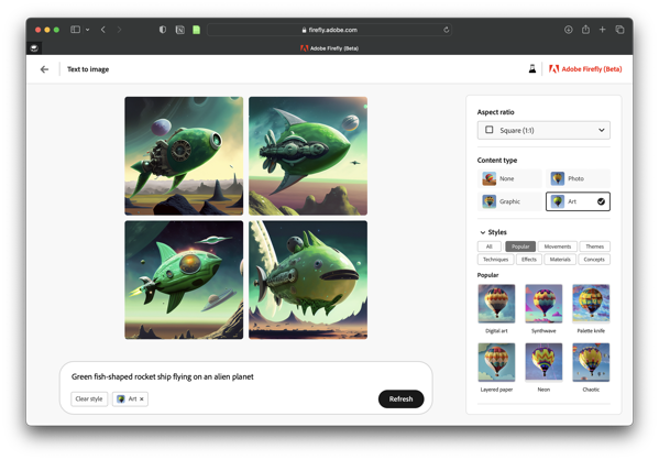
The text to image feature is straightforward. Type in a prompt and Firefly generates four images. On the right, there is a palette with options that lets you refine your request. You can choose the aspect ratio, content type, style, lighting and composition. Below is a screenshot of the interface and a few examples of what it can do:
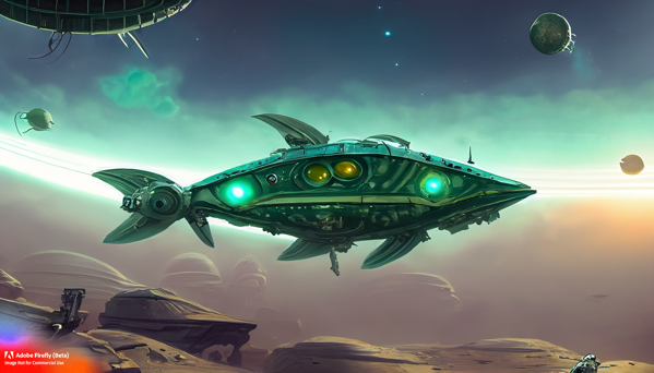
Prompt: green metal fish-shaped spaceship on an alien planet Styles: art, concept art, dramatic light, flat colors
Prompt: green hot rod racing through the desert Styles: photo, muted, blurry background, backlighting, science fiction
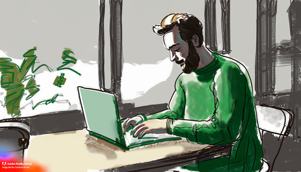
Prompt: loose sketch of a white male with a green sweater and a stubble beard typing on a laptop in a coffee shop Styles: art
A couple of quick reflections on using Firefly’s Text to Image feature:
For the content type, I feel art worked best for the creations I generated.
The select similar button lets you refine easily
Realistic people and animals are a struggle. I accidentally generated a person with two noses. And sometimes, an arm connects in the wrong spot.
If you include too many prompts, Firefly often doesn’t know how to resolve them all and you get strange results.
Text Effects
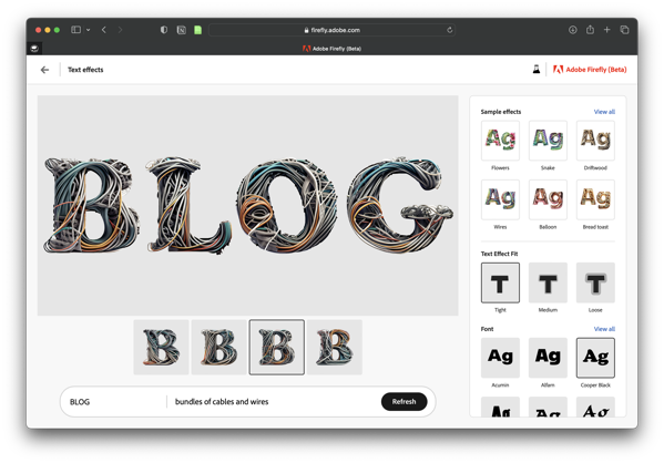
Text Effects lets you specify and apply an AI-generated effect to some text. Firefly has a few sample effects that give you a good idea of what the feature can do. You can choose from 12 different fonts.
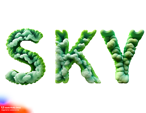
Prompt: Green fluffy clouds, tight fit, transparent background
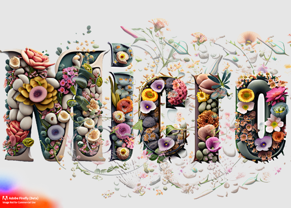
Prompt: Flowers and Rocks, loose fit, white background
A couple of notes:
If you have two of the same letter, they are identical. And while I understand that, it ruins the hand-created art look. Hopefully they’ll change this in future versions.
The transparent background works well when you use the loose fit because elements overflow the shape of the letters.
I could see this feature being built into Adobe apps eventually.
What’s next?
Adobe Firefly is definitely a work in progress – it is a beta – but there are more features in development. The Adobe Firefly site lists one feature as coming soon, Recolor Vectors. I’m not sure how that will differ from the Recolor Artwork feature in Adobe Illustrator, but I’m looking forward to trying it out. Several other features are teased as “In exploration” and some of them look interesting. No idea how close to release these are — for all I know, they are ideas on a white board — but “text to vector” and “extend background” could be fun to play with. I’ll likely write additional posts as new features are introduced.
Bob Wertz is a creative director, type designer, Ph.D. student and researcher living in Columbia, South Carolina.
Customize your navigation with filtered categories
When I first moved my blogging over to Micro.Blog, I struggled with the perceived rigidity of the navigation. It took me a little time to refine it, but I eventually figured it out. I’ve had a couple of people ask about my solution, so I figured I’d share a quick summary of how I set it up my navigation.
It shouldn’t matter what theme you are using, but for my site, I use the Pure plug in, which is a good foundation to build from. By default, the template presents a home page that includes all of your posts. Instead, I wanted to have different links in my navigation for my longer “blog” posts and my shorter “tweet-like” status posts.
It’s actually pretty easy to do, but it takes a few steps.
Create the categories you want. I created two categories: Quick Updates and Long Posts. You can create as many categories or group them differently, but this worked for me.
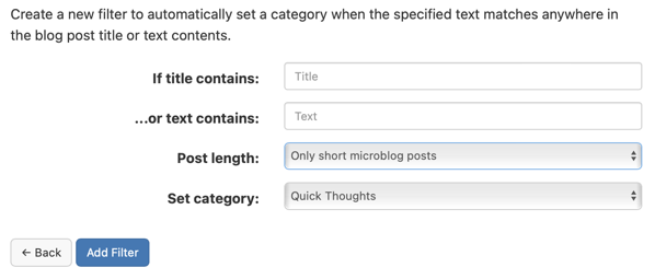
Set up filters. Filters will automatically apply categories based on different parameters. Click the “Edit Filters” button beneath the list of categories. I set up two filters. One that sorted untitled posts into my “Quick Thoughts” category and a second that grouped together all of my long posts with titles. This way, my posts are automatically grouped into one of the two categories. In the screenshot below, I used the “Post Length” setting.
Determine the URL for each category. Each category in Micro.Blog has a URL, typically formatted as http://DOMAIN-NAME/categories/CATEGORY-NAME. Find the URLs for each of the categories you want in the navigation.
Create a new page. Name the page and then paste the category URL into the content box. Make sure “Include this page in your blog navigation” is checked. Repeat for all of your categories. You’ll then have a navigation item for each of your categories.
This technique works really well when paired with the Custom Home Page plug in. You can see the result in the navigation on my site. I know that I could do this by building a custom template. At some point, maybe I will. But right now, I’d like to keep it as simple as I can, and this works really well for me.
Bob Wertz is a creative director, type designer, Ph.D. student and researcher living in Columbia, South Carolina.
One of my goals for this year is being healthier. Eating better. Moving more. The hope was that by breaking some bad habits I developed during COVID, I could lose some weight and feel better. I wanted to post occasional updates to keep myself accountable.
Two months in, things are going great. I feel significantly better — that’s the “metric” I care about most — and I’ve dropped a significant amount of weight. I’m not doing any trendy diet or counting calories. I’ve adapted some principles from intuitive eating.1 I’m making smarter decisions about food and listening to my body. One example, I’ve pretty much stopped drinking beverages with calories. At Starbucks, I get a black coffee or hot tea. Unsweetened tea instead of sweet tea.2 I’m not drinking sodas. I’ve generally avoided alcoholic drinks, but had a glass of bourbon at our Valentine’s Dinner. My energy level feels more consistent through the day without the sugary sodas and extra caffeine. And I’m sleeping better. Wins all around.
Exercise wise, I’m just focused on movement.3 I’m walking regularly. My wife and I have started taking long walks on the weekends, exploring the trails that are literally in our backyard. I’m trying to walk at lunch and walk to meetings around campus. I’m not running on a treadmill — or running at all. I might get to that point, but that’s down the road.
I do want to address the tech side of this. I purchased a Withings Body+ scale, and it syncs my weight to my Apple Health account. I use Happy Scale to track weight because it does a nice job of showing averages instead of just focusing on the lowest weigh in. I’m tracking activity and workouts with Apple Watch. I tend to be a data person, and I like having all these metrics. I just need to make sure I’m not fixated on the metrics. Again, the main goal is feeling better and developing healthy habits.
Two months in, I feel like I’m heading in the right direction. I’m making long-term lifestyle changes, and I know this is just a start. I plan to check back in here every month or so with an update.
Bob Wertz is a creative director, type designer, Ph.D. student and researcher living in Columbia, South Carolina. And he’s trying to be healthier.
Clearly, I’ve not bought in to intuitive eating 100%. I’m still trying to lose weight and I still weigh myself regularly. If you want to learn more about intuitive eating, I recommend Rachael Hartley’s blog.↩︎
I’m in South Carolina, y’all. Around here, sweet tea is the default. ↩︎
This is another intuitive eating thing. More here.↩︎
Star Trek is all about the characters and relationships on the ship. With all the new series on Paramount+, they’ve introduced a bunch of interesting characters that I’ve grown to love. With Season 3 of Star Trek: Picard starting next week, I figured I’d share five new characters1 who I’m glad are part of the Star Wars Universe.
WARNING: A HANDFUL OF SPOILERS BELOW FOR DISCOVERY, STRANGE NEW WORLDS, PRODIGY AND LOWER DECKS.
Played by Mary Wiseman on Star Trek: Discovery. When Star Trek first relaunched with Discovery, Tilly was such a different type of crew member. For all of the great Star Trek characters over the years, very few were quirky and likable.2 Her relationships with Burnham, Stamets and Saru are wonderful. I wasn’t happy how they used her over the last season — eventually shipping her off to Starfleet Academy — but I hope next season includes a healthy dose of Tilly.
Voiced by Rylee Alazraqui on Star Trek: Prodigy. If you haven’t seen Prodigy, you’re missing out. Rok-Tahk is my favorite character from the crew. At first, Rok appears to be a fierce creature, but once the universal translator kicks in, you figure out that despite her intimidating form, she’s actually just a young girl with an interest in science. Her relationship with the Janeway hologram was encouraging and nurturing and I loved every minute of it. I look forward to seeing how she interacts with Admiral Janeway next season.
Jes Bush on Star Trek: Strange New Worlds. I know Nurse Chapel appears in the Original Series and a couple of movies, but Jes Bush’s interpretation of the character is so different and distinctive. Chapel is incredibly smart and capable. And yes, she has a crush on Spock, but their relationship is much more nuanced and complex. We know where this character is heading, but I look forward to seeing how this version of Chapel develops.
Voiced by Tawny Newsome on Star Trek: Lower Decks. Lower Decks has so many great characters, but Mariner is my favorite. She’s a screw up, who also happens to be incredibly capable when she wants to be. Her relationship with her friends, her rivals and her mom are all complex and delightful. Depending on the episode, Beckett may create a massive problem — or she could be the one to save the day. The end of last season was heartbreaking when her mom and friends thought she’d sold out the Cerritos crew. Many of the relationships were patched up in the finale, but I wonder if there will be lasting repercussions.
Doug Jones on Star Trek: Discovery. Look, I know Captain Michael Burham is the star of the show, but Saru is the captain I’d want to serve under. Intelligent, thoughtful and competent. His personal backstory is wonderful, and I’m really interested to see his relationship with the leader of Vulcan develop. I’m not sure how Doug Jones can express so much emotion through all of that makeup. It’s seriously impressive.
Finally, while it’s not a character, I want to give a shoutout to Lower Deck’s California class ships, especially the U.S.S. Cerritos. The idea that there are some average ships in the fleet is great. Other Star Trek shows focus on the glamorous flagship, but not every ship is the U.S.S. Enterprise.
Well… Five new and one reimagined.
You could argue that Barclay was quirky, but he was intentionally annoying. Neelix was intended to be quirky, but he was really just creepy.
Bob Wertz is a creative director, type designer, Ph.D. student and researcher living in Columbia, South Carolina.
I decided to add a now page to my site. My challenge was deciding what to include on the page. I already had a pretty complete about page. After looking at a collection of now pages, I realized that there isn’t a single formula or approach. So for my first attempt, here’s what I decided to add.
What I’m working on
Recently written
Recent media favorites
Active websites and profiles
Social media accounts
I also moved the status of the fish in the header to this page. The fish changes from time to time based on my mood so that explanation makes more sense on my “now” page.
I’m sure my approach will change over time. Everything needs to be manually updated and I’m thinking I’ll update every month or so.
Bob Wertz is a creative director, type designer, Ph.D. student and researcher living in Columbia, South Carolina.
I feel like I always write things that are either “tweet” length or “long.” I don’t feel like I ever post anything in between. This tendency isn’t new… I’ve always written that way and I’m not sure why. Most of my favorite online writers routinely share posts of various lengths, but I’ve never changed my approach. As I try to get back in the rhythm of writing, I think I need to embrace the middle ground. Opting to post reflections more than complete essays. Questions instead of answers. Paragraphs instead of pages. We’ll see how it goes.
Bob Wertz is a creative director, type designer, Ph.D. student and researcher living in Columbia, South Carolina.
For years, I listened to local sports talk radio on my commute home. I live in the middle of SEC country, and — especially during football season — the talk shows were full of callers who were mostly annoying and overly opinionated.1 The host of the show was great and I really enjoyed his commentary, so I kept listening. One day, after a particularly obnoxious sequence of callers, I tweeted something like “I’d love a sports talk show without callers” and tagged him. He responded, thanked me for listening, but said that most people didn’t want to listen to him talk for a couple of hours. They tuned in for the callers. That was the format.
Audience commentary is part of every type of media. With newspapers, we’ve long had editorial pages, op-eds and letters to the editor. Radio has a whole sub-genre of talk radio that features callers giving their opinions and arguing with hosts. Television never really developed a feedback format because of obvious technical limitations, but developed something similar. Panel discussion shows are basically talk radio with a standard roster of characters, arguing with each other and representing viewer opinions.
The internet made commentary even easier. In the early days of the web, every news site and blog added comments to their stories to encourage feedback. The feedback quickly turned to meaningless noise, filled with extreme opinions and spam. Social media took it one step further. Facebook and Twitter are essentially just the comments section. Commentary became the media.
Some people love to read the letters to the editor and listen to talk radio. Many people — judging by ratings — watch television shows with a panel of guests arguing with each other about news or sports. There are people want to read the comments on news sites, although I don’t understand why anyone would subject themselves to that. And there are people who truly enjoy social media. This is all commentary-driven media.
I’ve realized that I don’t like any of those things.
I like to read articles that provoke thought. I visit news sites and blogs that cover my (many) areas of interest. I use an RSS reader to track all of these sites. I follow photographers, videographers and creators who make original art. I listen to podcasts that add value and knowledge. I follow people on social media who are experts in their field, but I rarely respond or comment on their posts. Yes, I want to be entertained, but I also want to learn and be challenged. In contrast to the commentary-driven media, I suppose this is expert-driven media.
The reality is that most people prefer the commentary-driven approach. They feel part of the conversation. They can contribute if they want. They want to hear the opinions of others and argue about topics. Our current social media landscape was designed for them. They want to feel that their opinion is a vital part of the conversation. That is the format.
Cultivating an expert-driven media environment is tougher and it appeals to a smaller audience. But there is a significant audience. There are plenty of people who want to read posts and articles from people who know what they are talking about. An ample audience of people who want to listen to podcasts and watch informative videos. We just have to design a system that prioritizes meaningful content and encourages sharing well-thought out responses over quick, thoughtless knee-jerk commentary.
With the implosion of Twitter, I feel like we have an opportunity to build something different. I’m happy with Micro.Blog right now and look forward to its continued development. I’m interested in the resurgence of RSS 2 and the momentum behind new indie-web protocols like ActivityPub. I’m encouraged that so many people are experimenting with different approaches to “social” media. I can’t wait to see what comes next.
Every third caller wants their team to throw more to the tight end.
Some of us never let RSS go.
Bob Wertz is a creative director, type designer, Ph.D. student and researcher living in Columbia, South Carolina.
I’ll be honest, I’m not sure I ever found my footing after the pandemic shut everything down. I’ve been trucking along keeping everything going, but the last half of 2022 was especially challenging. This rhythm and pace is not sustainable and it’s time to reset the balance between family, work and school.
Family is first, as always, but even more so now that my oldest is about to head off to college. I want to spend quality time with her before she moves out and heads to school. Work is going well, but is constantly busy. With graduate school, I’m taking the spring semester off to spend some time getting into a new routine.
For 2023, I need to focus on four areas: health, writing, organization and creativity.
Focus on physical and mental health
I’ve got a list of things to work on — from getting enough sleep to finding time to walk at lunch. I feel like I know what I need to do, but making time for a healthy life has been challenging over the last year. I need to develop consistent, healthy habits.
Write more
I’ve been writing for school almost constantly for the last year. And that’s great, but it’s come at the expense of writing for myself. I’ll still be writing for grad school, and hopefully getting some journal articles published this year, but I want to expand the type of writing I’m doing and improve my skills. Writing on bobwertz.com (via Micro.Blog) is going to be my primary personal writing outlet for the year.
Smartly organized
In general, I’m organized, but there are some areas that are an absolute train wreck. I’m working on some using the tools I have — like Notion and Tot — more effectively. There’s a fine line here, though. Time spent on getting organized is time that I’m not working out, writing or designing.
Rediscover creative endeavors
I’m a designer, but I’m not designing much right now. I have a bunch of projects, from stickers to typefaces that I want to work on. These always end up on the back burner when family commitments and grad school deadlines take priority. I need to carve out some time for visually creative projects that I’ve been neglecting.
I’m looking forward to hitting the reset button and restoring some balance to my slightly chaotic life. In past years, I’ve shared a check-in post at the midpoint of the year to evaluate how I’m doing on my theme and goals. This year, I’m going to try and post quarterly to keep myself accountable.
Bob Wertz is a creative director, type designer, Ph.D. student and researcher living in Columbia, South Carolina.
I get this question a lot. I balance a full-time job, my family and grad school. I’ve been in grad school part time since I started my Master’s program in 2018 and I’ve become pretty good at carefully planning out and scheduling my time.
In 2022, I never really had a chance to achieve a balance. At work, there was a lot of change. My boss resigned in January and I assumed some of his responsibilities. I took over managing photography and videography staff again. We rolled out a new logo, which was — and still is — a lot of work. All of these things were positive developments, but required increasingly more of my time and attention.
At home, things were challenging. My wife tore her bicep in January and then had to have surgery in the summer, right as she was moving to a different school. My oldest started her senior year of high school and is trying to figure out where she wants to go to college, but then tore her ACL in a lacrosse tournament and also had to have surgery. My two youngest each started a new school, which changed our morning routine significantly. Everyone is doing great, but there is always a lot going on.
And grad school has been fine. I’ve done well. I’ve written lots of papers that I am proud of and had research accepted to a conference. I’m trying to get my papers edited and submitted to journals. Classes have been good, but honestly, I haven’t enjoyed grad school for the last year. And that has been weighing on me.
The balance is off.
I’ve been in grad school part-time for 4.5 years straight at this point — 3 for the Master’s and 1.5 for the Ph.D. With all the changes in my job and life, I wasn’t getting the most out of my Ph.D. studies.1 So I’ve decided to take the spring semester off. It’s a tough decision — I’ve been steadily working on my degrees one or two classes at a time — but it’s the right decision. I need to pause and reset the balance between work, home and school. I’m not quitting, just taking a break. I know I’ll start back up in the summer or fall, fully recharged and ready to continue to the finish.
One of my professors told me that by working on my Ph.D. part time, I had the “gift of time.” Most people have to sprint through their program so they can get a teaching job. By not rushing through my program, I could get the most out of it and enjoy it.
Bob Wertz is a creative director, type designer, Ph.D. student and researcher living in Columbia, South Carolina.
I haven’t had this Micro.Blog site for long, but I’ve written at my other site – Sketchbook B – for almost 15 years.1 Over time, my long form blog posts there developed a pattern. I had a basic structure with headers, footnotes, divider lines and a bio at the end. And I want to replicate some of that here and needed a post to experiment with. This is that post.2
I’ve already been using an H2 as a subhead and I like the way that looks. Like many writers, I often want to add footnotes as I write. Over on Sketchbook B, I used asterisks, but since I’m writing in Markdown, that’s kind of a pain in the ass. So I figured I’d go with superscript numbers, which is more conventional anyway.3 I continue to use divider lines to separate the body of the post from the footnotes, and a second divider line between the footnotes and a bio.
I’m not sure what I want to do with the bio. I found that most of my traffic came from Google, so the reader was dropping in on my site with no idea who I was. For now, I’ve decided to go with the shortest one sentence bio that I could and set it at the end in italics.
One aspect that I haven’t yet decided on is images. On my Squarespace-hosted site, each post had a preview image and I’d include a post image. So far on bobwertz.com, I don’t need a preview image, but I do think I want to create some type of standard post image to include under the subhead. I’ll keep experimenting, but I feel good about my basic post format.
I’m going to keep writing at Sketchbook B, but the content will be mostly Adobe Creative Cloud tips.
I’m using a trial of MarsEdit right now. And I really love the preview engine that lets me see how this is going to look, even before I post it. Looks like I’ll be purchasing a license.
I don’t love how the superscripts mess with the overall line spacing. It just feels wrong. I may try to come up with another approach.
Bob Wertz is a creative director, type designer, Ph.D. student and researcher living in Columbia, South Carolina.
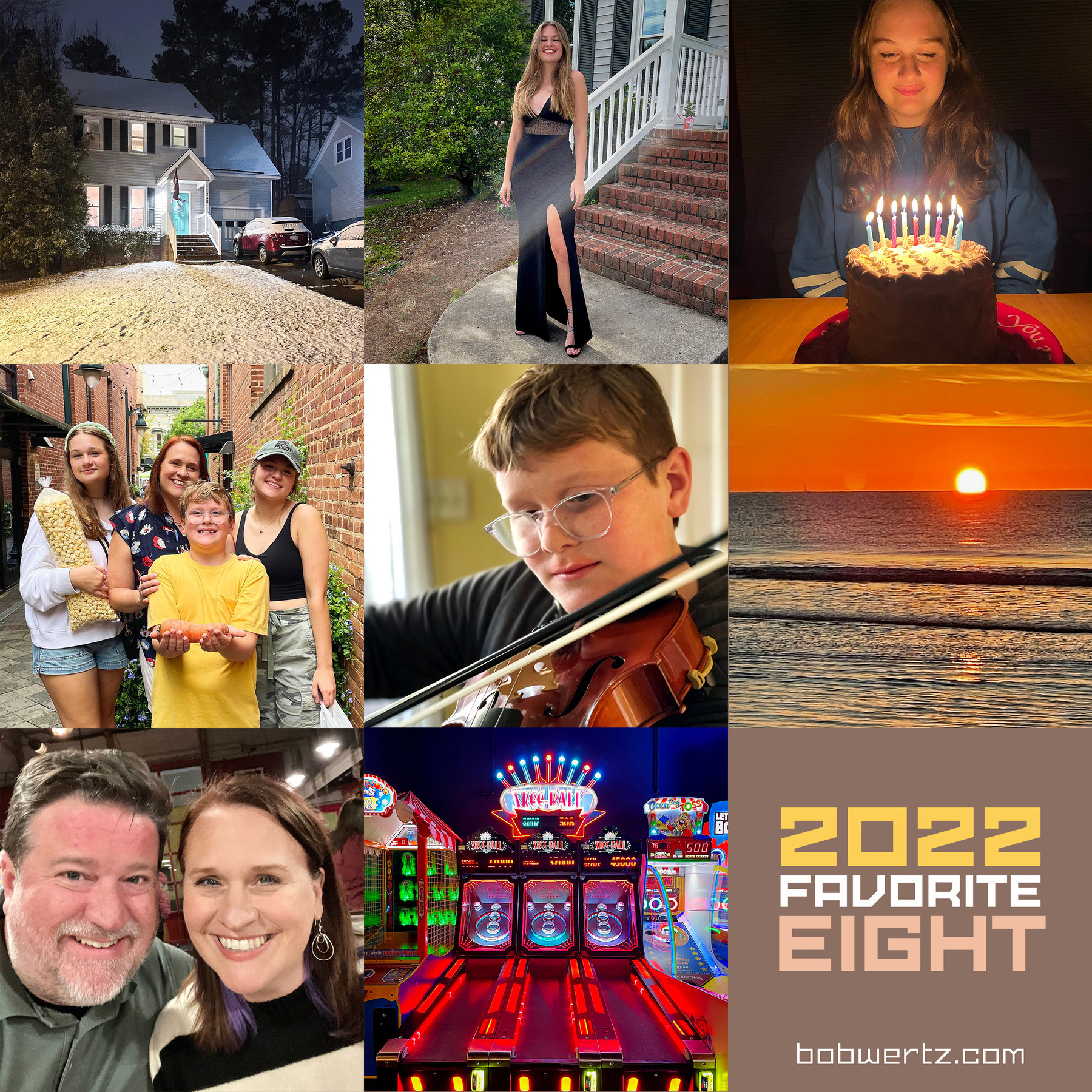
This year was unexpected. Just about nothing went as planned — sometimes better, sometimes worse. Looking back over my photos, I took fewer “artsy” shots and mostly focused on my family. Here are my favorite shots from the past year, starting top left:
Evening snowfall. We don’t get much snow in Columbia, South Carolina. When it snowed in the evening in January, every thing was peaceful and serene… and then it was fun and chaotic, when all neighborhood kids came outside to play in the snow.
Norah’s prom. Our oldest headed to prom and had a great time with her friends.
Jill’s birthday. There are nine candles on the cake. Not the correct number of candles, but the perfect amount of light.
Soda City Market. We headed to our local market and took this picture as we were leaving. I’m not exactly sure what’s going on here — Jill hugs her kettle corn while Ryan proudly presents a giant carrot — but I love the shot.
Ryan playing the viola. Ryan started playing the viola this year and seems to enjoy it.
Sunrise at Hilton Head. Took a trip to Hilton Head with the family and woke up early enough to catch sunrise.
Lizzy’s birthday selfie. Here’s the thing… Our selfies are typically terrible and we have to take a bunch to get anything usable, but I grabbed this shot at Liz’s birthday dinner and we both like it. So it has to be one of my favorites.
Skee-Ball. I love skee-ball, and this beautiful skee-ball machine was at the arcade where we had Ryan’s birthday party.
This is the fifth year I’ve done a Favorite 8. You can see my previous posts from 2018, 2019, 2020 and 2021 on my other site, Sketchbook B.
Picking out my favorite pictures from the last year.
Back in 2018, Instagram users started posting their algorithmically-generated “Best Nine” — essentially the nine shots from the year that had the most likes. When I looked at mine, the images that everyone else liked weren’t necessarily my favorite pictures from the previous year. I enjoyed the process of digging through all the images from the previous year — many of which I had forgotten about. I curated and built my #Fav8 in 2018, 2019, 2020 and 2021. If you are interested in learning more about the thought process behind Favorite 8, the 2018 post has the most detail.
This year, I’m not posting to Twitter, so I’m ditching the #Fav8 hashtag and just going with “Favorite 8.” Although on Micro.Blog, I’m thinking ❤️8️⃣ might be appropriate.
In the past, several friends have done this too, so this is just a reminder that it’s time to start working on selecting your Favorite 8 shots from 2022. I’ll probably post mine next week.
There’s lots of hype about Mastodon as people flee Twitter, but lately, I’ve been thinking about how brands will function on federated social sites.
If the big brands in the world are going to give Mastodon a shot, they aren’t going to just join an existing instance… they’ll host their own server for all of their related accounts. Let’s say you are a large international brand like Starbucks. Are you going to use @starbucks@mastodon.social? Not when you can have @official@starbucks.com, @news@starbucks.com, and @customercare@starbucks.com. If you run your own instance, you never have to worry about someone grabbing a handle you wanted to use. No worries about the content moderation policy on the instance you’ve selected. And because of the way ActivityPub works, your posts will be visible across Mastodon and other compatible services. As a bonus, it’s much harder for a fraudulent account to spoof you if you connect your federated social account to your primary domain name.
(In reality, someone will create a service to manage this for brands and charge big money for it, because there is no way a corporate IT department is going to accept the risk of running a Mastodon instance.)
When the internet was becoming popular, I remember being told that traditional media was just broadcasting. The internet promised more than just broadcasting, it offered “engagement.”
Don’t let people fool you. Engagement happened before the internet. People read the newspaper and talked about stories with their family and friends. They watched the evening news and discussed it at the water cooler at work the next day. They wrote letters to the editor to express their agreement or disapproval. They called radio shows to ask questions. They bought classified ads to share a job listing or sell a car. People engaged with media before the internet.
Instead, what the internet offered was an instant, two-way feedback loop between publisher and audience. Comments on blogs and news sites led the way. Then, social media provided the ultimate in real time engagement with metrics that let you track everything.
Instant response. Maximum engagement. Integrated with the content.
And how has that worked out? Thoughtful comments on blogs were quickly drowned out with spam. News sites were filled with reactionary opinions. Social media offered both reactionary opinions and spam and as a bonus channeled hate and harassment. Managing commentary takes as much staff and resources as creating the content, but people love providing their opinion and arguing their point of view, which drives traffic. And that traffic was the most important thing to the companies like Facebook and Twitter that sell the advertising that surrounds the hate.
As Twitter implodes and some people look for what’s next, I think we need to reexamine the relationship between publishing and engagement. Creation and commentary. True engagement is what follows when we create high-quality, beneficial content. We need to restore a focus on publishing the content, not just on the commentary. And our new technologies need to support that balance.
P.S. One of the things I like about Micro.Blog is the absence of metrics. No follower counts. No likes. No retweets. If you are used to obsessively checking how many likes your last post got, the absence of metrics takes a little getting used to, but it resets the balance between publishing and engagement.
P.S.S. It occurs to me that the most profitable company in the world, Apple, creates a lot of content without maintaining a traditional social media presence.
I’m been an AIGA member for much of my professional career. I was active at a chapter level for over a decade. Over that time, people repeatedly tried to reimagine the central organization, its chapter system and its funding mechanisms. No one was ever satisfied. They wanted to make it better, and then every designer would want to join and help change the world.
And yet, the organization got smaller.
AIGA has meant a lot to me and it definitely helped my career, but structurally, it’s been broken for a long time. It was built in a pre-Internet era. A time when the only way you got to see a legendary designer was to go to a conference or have them come to a local AIGA chapter. When networking was done primarily at the local bar. A time when being aligned with a large national organization gave you needed credibility and clout.
But now, YouTube means you can see all of your favorite designers deliver inspirational talks from the comfort of your own home. You can network with anyone, anywhere, anytime. The world changed, but the structure remained, and that was before the pandemic hit.
AIGA isn’t alone. Lots of member-based organizations are trying to figure out how to move forward. These organizations can bring value to their members, but they will need to embrace a different approach, building valuable online communities that may or may not be connected with local chapters.
In the end, we’ll see how AIGA’s latest re-envisioning works out. I’m optimistic, but time will tell if they are able to make the hard choices.
It seems like everything is going to subscription pricing. I subscribe to a whole host of streaming services, bundles, news sites, and software. Many of them don’t always seem worth the money, but as I look at what I subscribe to, I realize that I don’t mind supporting products and creators that I love. So here are a list of services that I really, really like and happily pay for:
I backed the Micro.Blog Kickstarter and I’ve had a paid subscription ever since — even when I wasn’t using it every day. I’m happy to support a product with a viewpoint that aligns with my values, and Micro.Blog is that type of service. Now that Twitter is unstable, I’m glad Micro.Blog is my home base.
I’ve listened to Myke Hurley and Jason Snell talk about Apple and the larger tech industry on Upgrade since 2014. I listen to a lot of podcasts, but this is the one I listen to every Monday. Paying for the “+” gets me ad-free episodes and an extra segment, but, I’m just happy to support a show I love.
Jason Snell and Dan Moren write Six Colors. I get additional articles and an extra podcast on Friday afternoons, but again, a way to support writers that I like. (Dan also writes a series of science fiction spy novels that I like a lot. Check them out, too.)
A distraction-free writing app that lets me write in Markdown. I’ve used Ulysses for a long time and almost everything I write starts here (including this post).
I don’t spend a ton of time over on Fontstruct, but I love it dearly. Fontstruct lets you build modular fonts and export them. Tons of fun and a great community. It’s free to use, but the 5 euros helps pay the bills.
Notion is… a lot of different things in one package. I use it for tracking tasks, managing grad school projects, jotting notes and planning for the future. Well worth the $5 a month.
I’m a Ph.D. student. Zotero is a citation manager that lets me track all of the sources I need for my papers. It’s not the prettiest app, but it’s incredibly powerful. Free to use, but by $20/year gets me more cloud storage. In a couple of years, I’ll happily upgrade to the $60/year plan. Worth every penny.
I’ve been preparing for the demise of Twitter since long before Elon Musk made the offer to purchase it. In 2016, I wrote a post — Twitterless — about what would happen if Twitter “disappeared tomorrow.” I outlined a couple of key areas that would be problematic for me and possible solutions.
A year and a half later, I wrote a follow up post — Twitterless, Part II — that noted my progress on replacing the role Twitter plays for me, and the challenges that still existed.
Times are changing, though, and I honestly believe that we all need to be diversifying — and if possible, owning — our social media presence. Becoming less reliant on the big social media behemoths is the first step.
I ended that post with a promise to follow up on my progress, but as Facebook became more and more evil, I focused on moving away from Facebook. Replacing Twitter was pushed to the back burner.
Now that Twitter armageddon may or may not be here, it’s clearly time that I renew my quest to find an alternative. I figured I’d check back in on those questions that I asked back in 2016 and see how I’ve done:
I’d lose a bunch of contacts. Yep. I’m going to lose a bunch of people who follow me on Twitter. I’ve tried to connect with people on other platforms like LinkedIn, Facebook and Instagram, but I can’t find everyone, and you know what, I’m okay with that.
I’d change how I watch live events. This is still a problem as I noted yesterday. Live events are fun to follow with other people, and Twitter is great for that. No other service is quite like Twitter for those instant commentary events.
I’d have to rethink how I find articles and stories. I use Feedbin as an RSS reader, but that’s not my only solution. I subscribe directly to The New York Times and The Washington Post. And — as shocking as it might seem — I also get a lot of value out of Apple News+, which I get with our Apple One bundle. My local paper, The State, is included in with Apple News+ and I catch a random assortment of articles from sources I don’t normally read. It’s a nice way to diversify the news I see every day.
I’d have to rethink how I share content. When I wrote this, I felt like traffic to my blog was coming primarily from Twitter, but over time, that lessened and most come through search engines. I’ll still create and share, but I’ll just use whatever channels are available at the time.
I’d change the way I use Facebook/Instagram. I once thought that Facebook and Instagram might provide a solution. I’ve mostly left Facebook, and Meta seems to only care about the Metaverse now anyway. I’m not that interested in Instagram now that it’s trying to be TikTok. I don’t feel any better about Facebook than I do about Twitter.
I’d try to find a replacement. I backed the Micro.Blog Kickstarter back in 2017 and I’ve had a paid account ever since. I originally connected Micro.Blog to my Squarespace site, which worked well over the years. I believe in the idea of a feed-based, open social media platform, but because I was still using Twitter, I didn’t fully commit to using Micro.Blog.
I’ve still got Sketchbook B and it’s still hosted on Squarespace, but I made the decision this summer that all of my future blog and short-form posting will be hosted on Micro.Blog, specifically, bobwertz.com. Why? I love the community, and the platform lets me easily post my content and crosspost to other services if I want to. It also lets me follow people who post on Mastodon, and they can follow me at @bobwertz@bobwertz.com. I like writing my blog posts in Ulysses in Markdown and the just post them directly to my site. I feel Micro.Blog gives me the best of all of the potential options and I’m happy with that choice.
Looking back, I think I’ve prepared pretty well for the potential downfall of Twitter. I’m not leaving completely, but I’ve got one foot out the door and I feel good about the solutions I’ve worked out for me.
If Twitter ceases to be enjoyable, I’ll leave. To be honest, I’ll miss it. I joined in 2008 and 14 years is a long time to use any service. It’s part of my daily routine. At the end of the day, though, if a service isn’t making my life better, I’m better off without it.