It looks like the button on the SC Legislature website to send a message to your representative isn’t visible on mobile. So if you want to send your SC Senator an email, use a desktop computer.
It looks like the button on the SC Legislature website to send a message to your representative isn’t visible on mobile. So if you want to send your SC Senator an email, use a desktop computer.
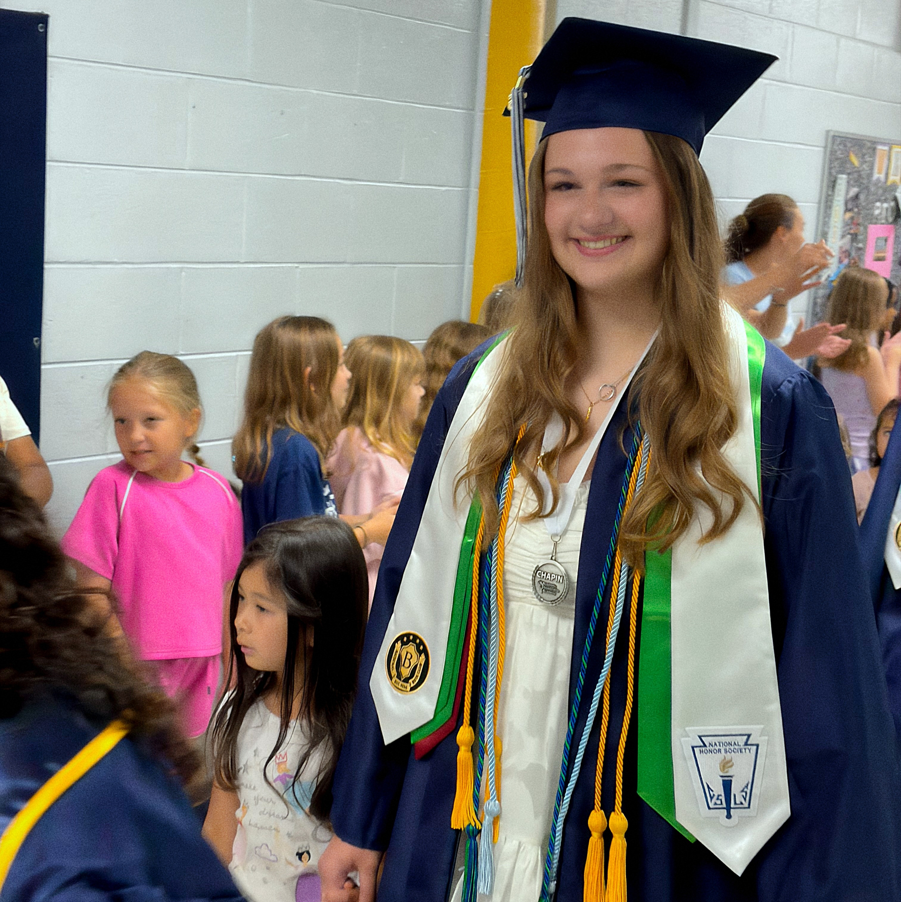
Our school district has a tradition where graduating seniors go back to their elementary school and walk through the halls. The kids make signs and cheer for them. Jill got to go through CES today. Such an incredible experience for the seniors and the elementary age kiddos.
Interesting read from Bloomberg Businessweek on OpenTable’s struggles. And really, an insight into how reservation services work. FYI: Link is to the Apple News story.
I’ve gone down a rabbit hole for the last few weeks. It started with a post about using Bluesky PDS servers to create a new method of scientific publishing.1
"The properties that make AT Protocol compelling for social networking are the same properties the research community has been asking for"
Exciting vision for the future of science publishing on ATProto @row1.ca @opensci.dev @nokome.bsky.social #ATScience
— Ronen Tamari (@ronentk.me) April 21, 2026 at 7:36 AM
[image or embed]
As someone who has embraced the ActivityPub and ATProto ecosystems, I wondered about what that process could look like, but kept getting stuck on how the peer review process would have to evolve to accommodate an open publishing environment.
Since then, I’ve read up on the continuous science movement, modular peer review and programs like PREreview. Watched videos from conferences and even joined a Discord server about the OXA lexicon for Bluesky PDS. I’ve gone back to academic articles from the dawn of the internet discussing alternatives to peer review. A handful of recent posts have randomly popped up in my RSS reader about the current state of academic publishing in a newly AI-flooded research environment.
Building an alternative academic publishing ecosystem isn’t only a technical issue. It’s an enormous cultural issue. How do you get academia to accept that anything other than double blind peer review as an acceptable form of quality control?
But with the new flood of AI articles and a lack of willing reviewers, at some point, academia will need to accept some alternatives to double blind peer review. It’s just not sustainable.
In my reading, I latched on to a specific issue that I think can be straightforwardly addressed. Once you’ve settled on an alternate method, how do you document an alternative review process in a manuscript that is self published in this hypothetical Bluesky-PDS-powered social environment?2
When a journal publishes something, you know that it lives up to their editorial standards, but when you use an alternative peer review process, transparency is critical. Within the methods, you’d need to clearly state that this paper was subject to an alternative peer review. Here, I’m calling this hypothetical Bluesky review an “open social peer review”:
Prior to publication, this study was subject to an open social review process. Full details of the review are included in Appendix A.
I don’t think you need to include more than a few details here – basically just note the process used.
At the end of your paper, it’s appropriate to note the review process as a limitation.
Because this study was not published in a traditional journal, peer review was handled through an open social review process. Every effort was made to ensure that thoughtful feedback was sought and incorporated into this paper. A full detail of the review process is included in Appendix A.
Include the review process as a limitation of the study, just like you might note any other sample or method limitation. No need to go into details, because that should all be in the appendix…
In the appendix, start by describing the process in detail. For my hypothetical open social review, I’d included the timeframe of the review period, and explain how you found reviewers. Then provide a summary of the number of actionable comments and the number of qualified reviewers. An actionable comment is specific and can be addressed by the author. “I love this!” or “I hate this!” are not actionable comments. A qualified reviewer is simply someone who has deep interest in your project, likely with a terminal degree, who can provide valuable feedback about your background, methods or analysis. Finally summarize the themes of the comments and how you addressed them in the current draft. Here’s an fictional example from my hypothetical open social peer review process:
Appendix A: Open Social Review Summary
This study was shared on Bluesky PDS for open social review from March 22, 2026 to May 22, 2006. During this two-month period, 64 actionable comments were provided by 7 qualified reviewers. Reviewers were solicited through a series of requests on Bluesky during the review period. Each comment was reviewed and considered. Below is a summary of changes made to the manuscript based on the actionable comments.
- Reviewers recommended that the article undergo a thorough proofread. Numerous edits were made to correct spelling and grammar.
- Reviewers felt the study simply used “peer review” when it specifically was referring to “double blind peer review.” I have added a paragraph to clarify the definition and usage throughout the paper.
- Reviewers recommended several citations that would be appropriate for inclusion. All noted literature was reviewed, and relevant summaries were added and cited.
This paper was published on May 30, 2026 based on the feedback listed above and is considered the final draft. While the original draft and all comments remain accessible on Bluesky, any feedback offered after May 22, 2026 was not included in the final paper.
This appendix section is similar to a letter that you would send to an editor after receiving a revise and resubmit detailing how you’ve addressed reviewers’ concerns. Seeing the comments and responses will allow readers to judge how rigorous and critical the review was.
Include any detail that you think might be necessary. For example, one note that would be important for my hypothetical Bluesky scenario is the end date of the review process. It’s possible that people might continue to comment and critique for years after an author has completed a draft. Clearly stating an end date for comments in the paper would be important since any Bluesky interactions will continue to be public.
So if you’ve ever gone through the academic publishing process, you’ve likely gone through multiple rounds of reviews. What if you want to send your paper through another round of reviews? Again, I think you just note it in your paper and detail it in your appendix:
Prior to publication, this study was subject to a two-month long open social review process. Based on those comments, significant revisions were made and the paper was shared with a peer researcher to confirm that the changes were adequately addressed. Full details of the review are included in Appendix A.
If you are going to go through multiple rounds of reviews, why not change up the type of alternative review. The whole point is to transparently communicate your review process for the readers. Let them decide if the level of review was sufficient enough.
Building an alternative peer review system is challenging, but I think the documentation approach for alternative review is comparatively simple. By placing a pair of notes in the narrative, you disclose your choice to use an alternative review process. Full documentation in the appendix — including both positive and negative feedback — will help you win the trust of the reader.
When Amazon popularized the eBook with the Kindle and .mobi format, they created an ecosystem perfect for self-publishing. Today, self-published ebooks are commonly sold and marketed on Amazon’s marketplace. It’s notable that the introduction of the ebook didn’t supplant traditional book publishing. They complemented them.3
Could a Bluesky PDS solution provide a workflow for self-published research? I’m not sure, but given the right tools, I think a self-published paper using some type of social-driven alternative peer review could become an intermediate step between a draft paper on a preprint server and a completed published paper. Google Scholar and other databases could easily provide discoverability for this new class of document. Similar to the rise of the ebook, this method of publishing won’t replace traditional academic publishing, but could instead complement it.
The reality is that alternative approaches might be appropriate for some types of science, but completely inappropriate for other disciplines. Can academic culture shift enough to allow a self-published manuscript to be something you could include on a CV without ridicule?
What do you think? Comment below using Bluesky, Mastodon, or Micro.blog.
Bob Wertz is the Director of Research Training at the University of South Carolina, a Ph.D. student and typeface designer living in Columbia, South Carolina. He’s been blogging since 2008.
Alas, I should be working on my dissertation. ↩︎
I should disclose somewhere that this blog post was “peer-reviewed” by my amazing wife, a kindergarten teacher and education Ph.D. student who was justifiably concerned by my casual tone and use of dramatic sentence fragments. ↩︎
If you are interested in the growth of the Amazon Kindle ecosystem, read Four Shades of Gray: The Amazon Kindle Platform by Simon Peter Rowberry. ↩︎
“When the Web was young, a common complaint was that it was full of junk.” This paper from 2002 is amazing: What Are The Alternatives To Peer Review? Quality Control in Scholarly Publishing on the Web. Everything he writes is still relevant today, plus screenshots from the early web.
SC State Senate Majority Leader Shane Massey on redistricting:
“Crushing the minority opposition is not a demonstration of strength,” Massey said. “It’s an admission of fear and a show of weakness, and I don’t think it’s successful in the long term.”
I found 11 images on Flickr that pre-date my use of Instagram and any of my blogs.1 I downloaded them and moved them to this site, preserving the original captions. My favorite from this bunch was actually the oldest… a shot from 2008 of a neon sign in a rain storm taken with my original iPhone from my car. I’m pretty sure I’ve reached the beginning of my public online presence with the addition of these images. I’m guessing that before these pictures, I used Apple .Mac galleries to share family pictures online — and those galleries are long gone.2 I did have a couple of portfolio sites — including one built in Flash — that are also not accessible, thankfully.
So why is it important to me to bring these all in one timeline? Because when I look at the complete picture — the blog, the early iPhone images, my tweets — I can get real snapshot of how I felt about things in that moment. This consolidation process is all about my desire to have a complete record of my online digital life, in one place. It’s a lot of work, but it makes me happy to have everything brought together. It feels like the digital equivalent of my Mom’s photo albums.
I still need to move a bunch of posts over from Sketchbook B. I’m wondering if I can automate some of the more time consuming parts of the process. We’ll see.
Bob Wertz is a type designer, Ph.D. student and researcher living in Columbia, South Carolina. He’s been blogging since 2008.
On August 12, 2026, a solar eclipse will appear over Greenland, Iceland, and Spain. Many shady vendors will sell incredibly tacky shirts to commemorate the occasion. Instead, order something a little more classy. Available on Cotton Bureau.

Happy Mother’s Day, Lizzy.
Learned from my teenage son today that hacky sack has become popular again.
Three walk-off wins in a row for the Cubs. What a wild season so far… now if we can just keep our pitchers healthy.
Three sports videos I will stop and watch whenever they pop up: Javy Baez “stealing” first, Jadeveon Clowney’s hit against Michigan, and Kamilla Cardoso hitting a three in the SEC tournament at the buzzer to beat Tennessee.
I think this is a particularly insightful post… Emotional regulation is a dying art:
Phones reward a specific kind of nervous system, twitching first and thinking later. The dopamine architecture that hooks you on slot machines hooks you on outrage, and the platforms have figured out that a regulated person is a bad customer. The regulated close the app, but the dysregulated person scroll until four in the morning, bleeding cortisol and efficiently monetized.
Pluralistic: In praise of vultures:
Monopoly is to capitalism as gerrymandering is to democracy, a way to strip out any meaningful choice.
Do cell phone bans in schools work? The NY Times reports on a new study looking at school cell phone bans. Kids used their phones less, but no real shift in student engagement or test scores.
From Cal Newport’s blog: On Bottlenecks and Productivity. This is the second time recently that I’ve come across the “Theory of Constraints.” I like how Newport translates the concept to personal productivity.
Watched: Monarch: Legacy of Monsters Season 2. Enjoyed the second season of Monarch on Apple TV. I don’t know if there will be another season, but if not, I’m happy with how they ended things.🍿
I’m intrigued by the idea of using Bluesky PDS as a social enabled database for academic publication. But I’m afraid that technical possibilities are blinding people to how entrenched the traditional academic publishing ecosystem is…
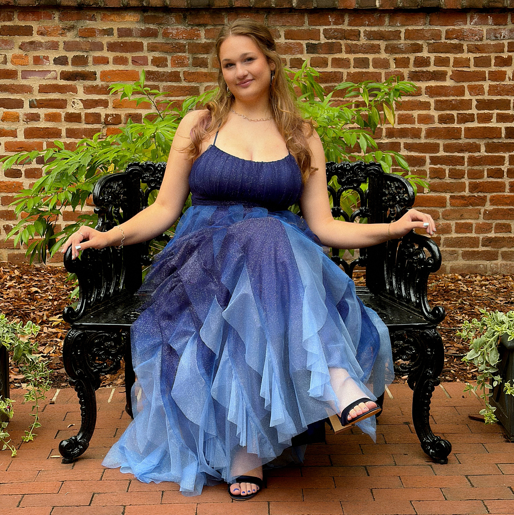
Prom 2026.
Great Sprint Qualifying run for Lando. Hopefully this newfound quickness will translate into race pace this weekend.