My daughter just declared that her favorite font is Times New Roman, and I can’t think of a bigger sign that the kid is destined to be an academic.
My daughter just declared that her favorite font is Times New Roman, and I can’t think of a bigger sign that the kid is destined to be an academic.
I’m at a local coffee shop that’s normally packed with college students. But students aren’t back in town yet. Completely different clientele. It’s funny how a college town changes when school isn’t in session.
My academic research is primarily in branding and visual communication, but I’m discovering that as a media scholar today, part of my research always overlaps with social media in some way.
Spent my morning working on some typeface designs in Glyphs. I really enjoy working with fonts, and I have several designs that I’ve started and not finished. I need to prioritize creative time – not just writing, but also sketching and type design.
When the exodus from Twitter first started last year, many tech-savvy people were moving to Mastodon and I wondered if brands would move their accounts to self hosted instances. After all, from a branding standpoint, @offical@starbucks.com is better than @starbucks@mastodon.social. At the end of that post, I posited that someone would come along with a service that handled the fediverse complexity for companies. That service is Threads. Lots of people have asked why Meta was interested in providing ActivityPub support.
The University of Georgia School of Journalism took over a community newspaper that was about to go out of business in nearby Oglethorpe and started running it with students. This reflection digs into what has worked, what hasn’t and what smaller communities want as news…
Finally got around to adding a fonts page to my Micro.Blog site.
I’ve been reading the coverage of the Twitter rebranding and the most interesting framing is related to legal issues. It’s not an issue typically covered when a company rebrands… but it’s not a typical rebranding.
A coworker of mine took Twitter off her iPhone home screen today and replaced it with Threads. She’s been a heavy Twitter user for a very long time. More and more people I know are making the jump away from the service formerly known as Twitter.
Last day of vacation. Caught a Columbia Fireflies minor league baseball game. Had a great time and my son chased down two foul balls.
Back to work tomorrow.
I’ve worn contacts since 10th grade, but for some reason a few months ago, I decided to just wear glasses and see if I wanted to switch back. I gave it a few months, but I missed my contacts. Had my eye doctor appointment his morning and I’m back to contacts.
I’ve been preparing for Twitter’s demise for seven years, but I didn’t see ‘X’ coming. I’ve been preparing for the end of Twitter since 2016, when Twitter was struggling with some financial issues and the future was uncertain. I pondered what would happen of Twitter went away suddenly. 2016: Twitterless: Which got me thinking, what if we woke up one morning and Twitter was gone. Or more likely, what if Twitter changed so radically, that it was unusable?
Road-trip to Charleston and saw a bunch of cool EVs. One Rivian, a Mercedes EQS, a BMW iX and a car carrier with (6!) Cadillac Lyriq SUVs heading to a dealership somewhere.
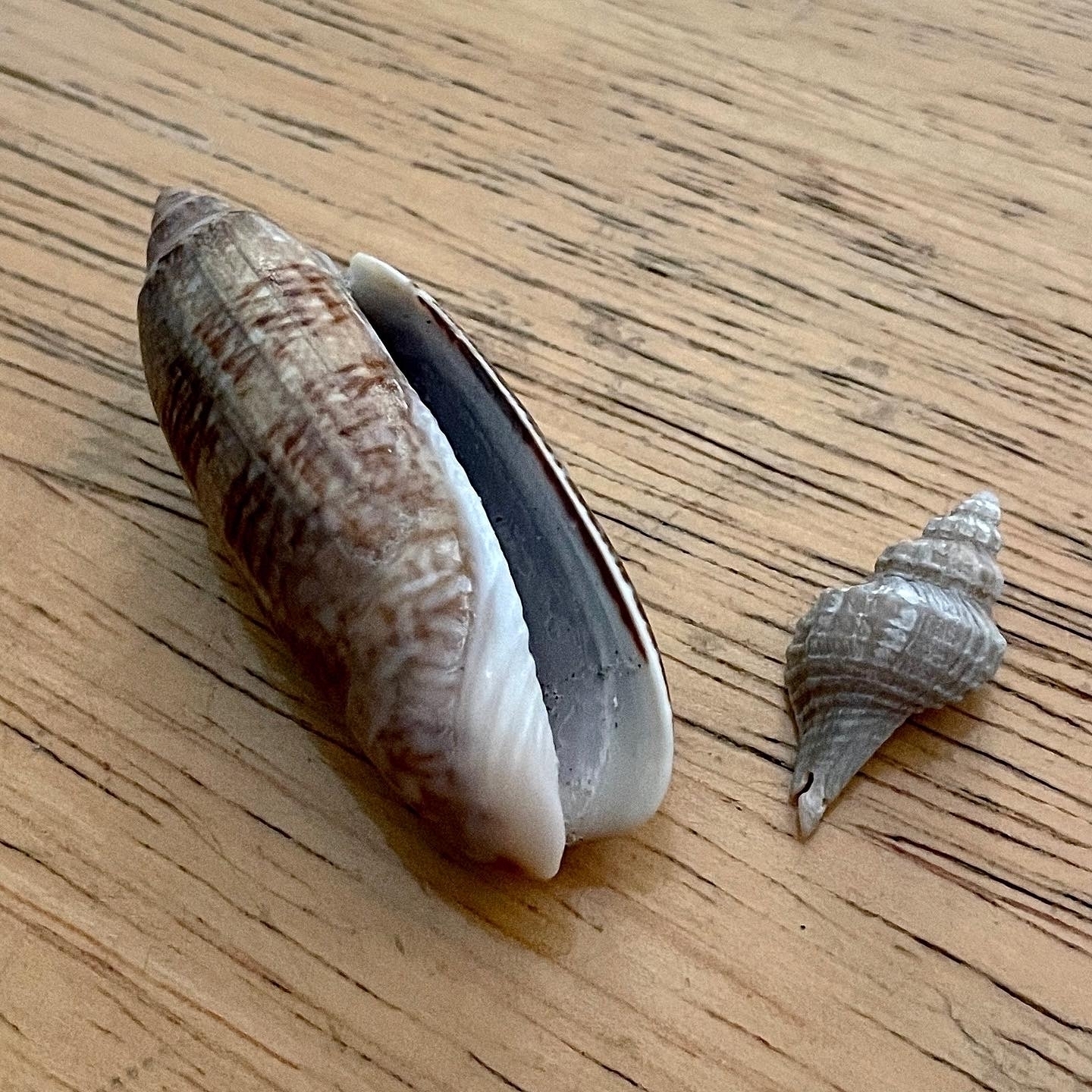
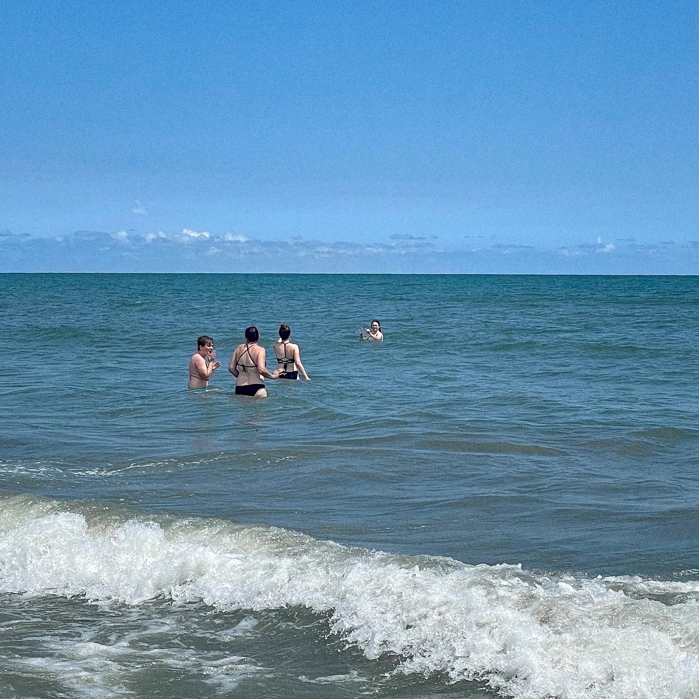
Beach day today at Isle of Palms. Found a couple of nice shells, too.
Back in 2018, I wrote a second blog post about preparing for the sudden demise of Twitter. The illustration I did for the post seems appropriate to reshare today.

My academic research is typically focused on logos and branding. When I look at the Twitter-to-X rebranding, all I see is future citations and research questions.
New social media outlets prove the viability of indie social. The invention of the printing press made mass media possible. Printing houses produced popular books and bibles, but they also spread the writing that powered the Reformation. Major newspapers became was the dominant media for decades, but there have always been community and independent newspapers. Self-publishing, indie music, art house films and college radio are all forms of independent media.
I don’t know why the Star Trek: Strange New Worlds/Lower Decks crossover came out early, but it’s delightful. 🖖
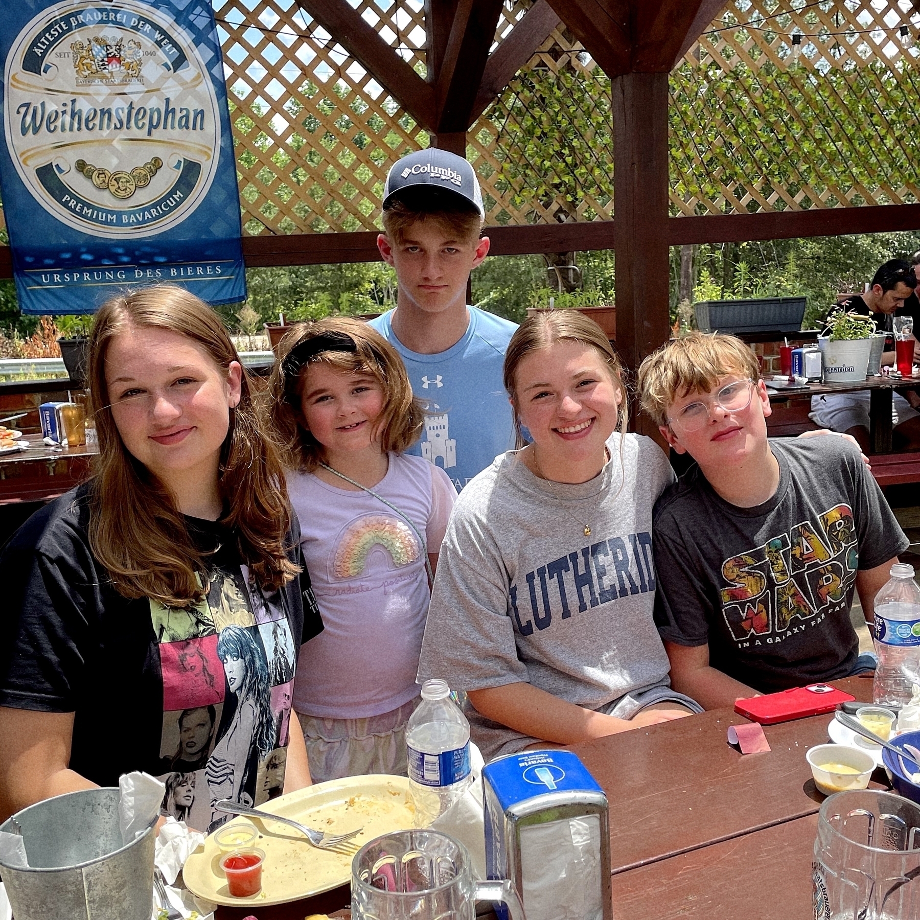
Day two of vacation: Caught up with my sister and her family. Always fun to get the cousins together.
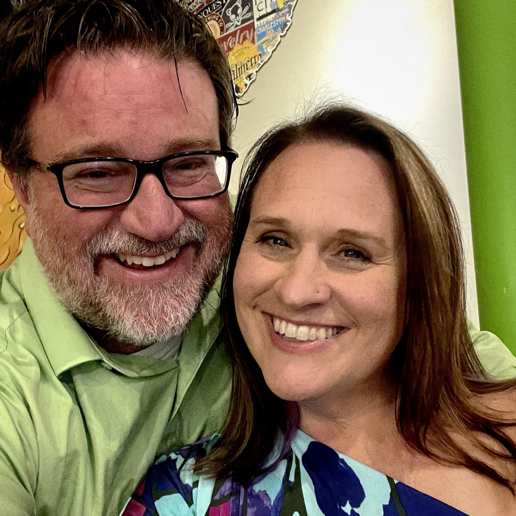
When we got married, Liz wasn’t planning on being a teacher… so a late August anniversary wasn’t a big deal. Now our anniversary falls on the first week of school every year and we never really get to celebrate. This year, we decided we would celebrate our 24th anniversary a little early.