Photo
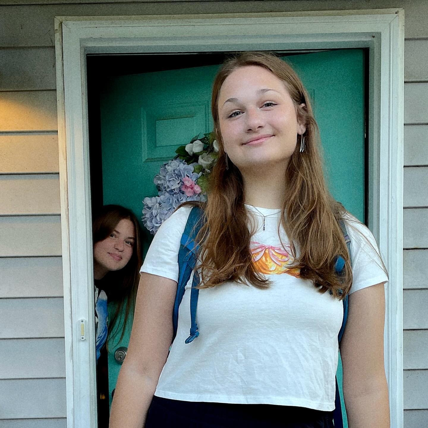
I got coffee, and Norah’s first day of school picture.
(It’s convenient when her first class is a block away from my office.)
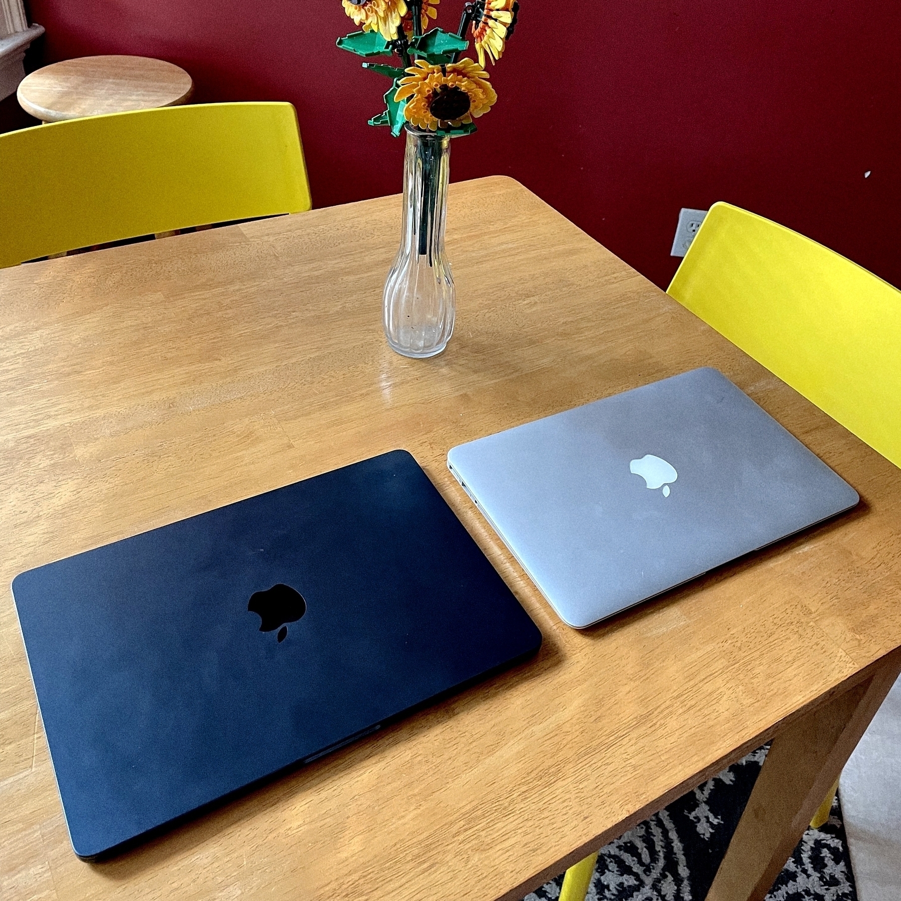
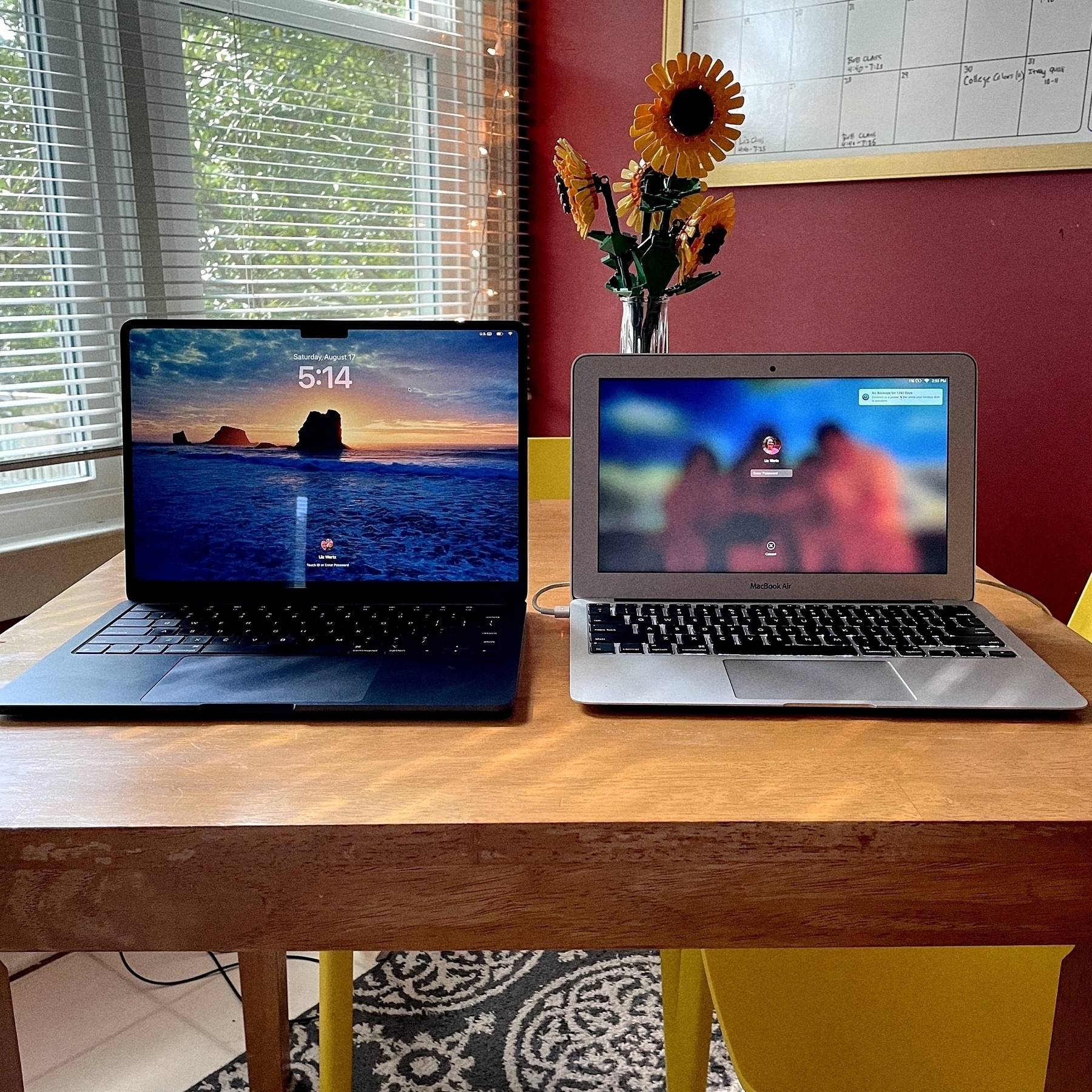
Found my wife’s old 11-inch MacBook Air and compared it to her new 13-inch MacBook Air. She used the 11 for a very long time and loved it, but when she started grad school, she upgraded. That 11-inch still feels impossibly light and tiny.
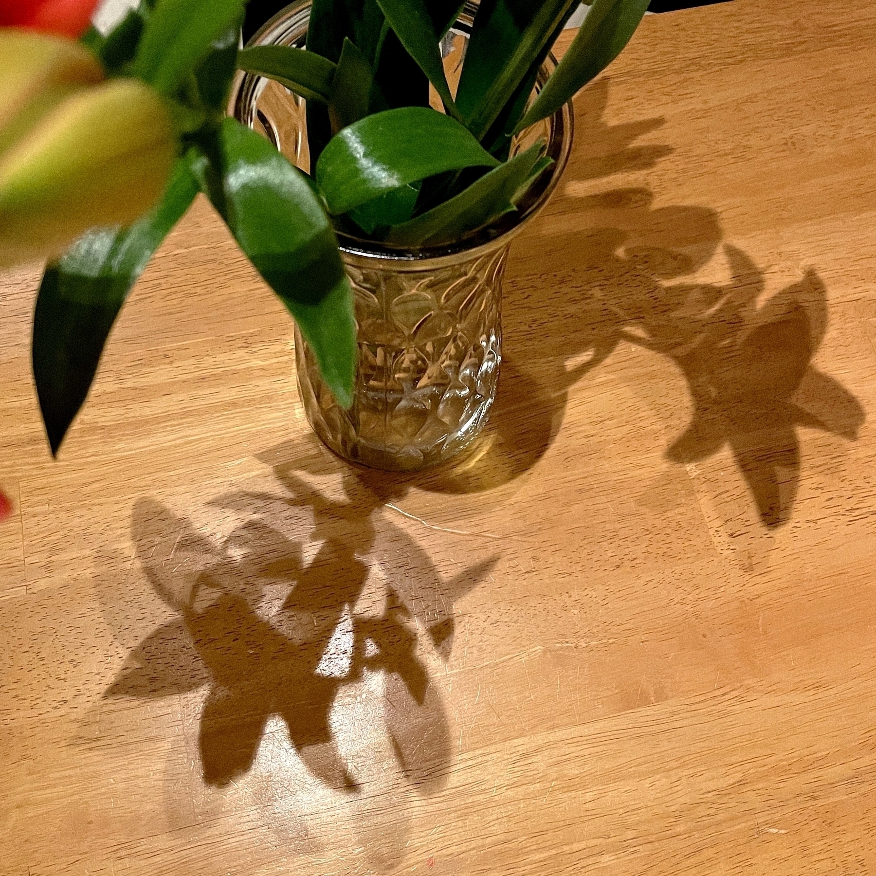
Shadows.
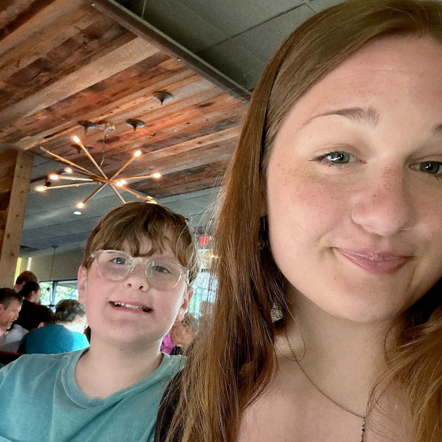
Liz and the kids think I look like Jedi Bob. I don’t see the resemblance. ð¤£
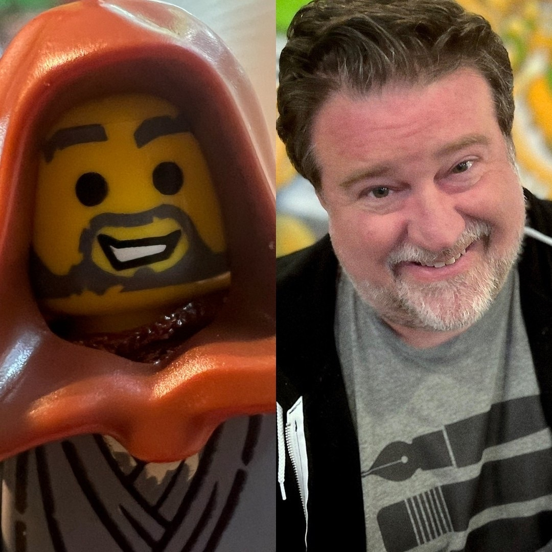
Liz and the kids think I look like Jedi Bob.

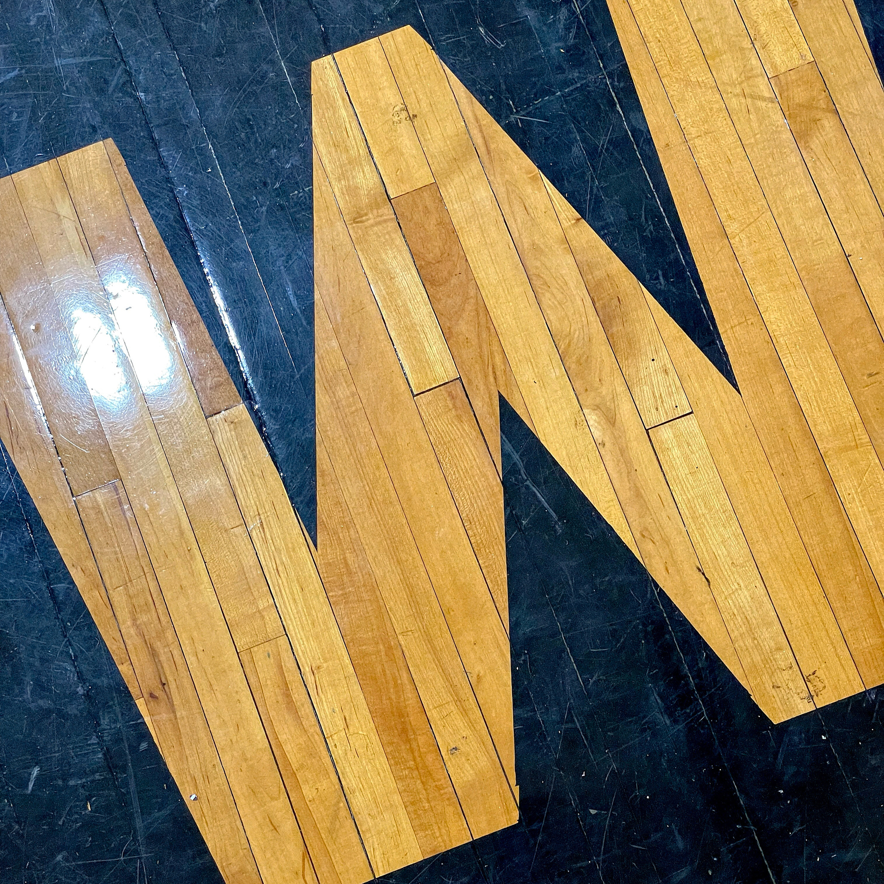
Gym floor lettering.
Trying out a new taco place.
Comfort Star Trek
7/17/24 • 3 min read
I’m home sick today and was thinking about shows I watch when I’m just killing time. Episodes I love to just put on in the background when I’m working (or sick). Most of the time, I open Paramount+ and play Star Trek. I figured I’d share my favorite “comfort” episodes. Warning: A couple of mild spoilers below for really old episodes.1

Star Trek: The Original Series
- S1 E15 Balance of Terror. A “submarine” battle between Kirk and the Romulan commander.
- S2 E6 The Doomsday Machine. The race to stop a machine before it destroys more planets.
- S2 E15 The Trouble with Tribbles. My parents loved this episode when I was growing up and it’s one of my favorites. Sometimes, I pair it with DS9’s Trials and Tribble-Ations.
Star Trek: The Next Generation
- S2 E10 The Defector. More Romulan manipulation.
- S4 E26 and E27 Redemption, Part 1 and 2. The Romulans try to destabilize the Klingon Empire.
- S6 E4 Relics. A Dyson Sphere, and a somewhat believable way to resurrect an old character.
Star Trek: Deep Space Nine
- S5 E6 Trials and Tribble-Ations. The DS9 crew goes back in time to the middle of The Trouble with Tribbles.
- S6 E6 Sacrifice of Angels. I love the action and pacing of this episode. The end of one of the arcs that dominate DS9.
Star Trek: Voyager
- S4 E14 Message in a Bottle. The Doctor is transmitted back into the Alpha Quadrant, and works with another Emergency Medical Hologram to liberate a Federation ship.
- S7 E25 Endgame Parts 1 and 2. The series finale. The Voyager makes it home… twice.
Star Trek: Discovery
- S1 E7 Magic to Make the Sanest Man Go Mad. A great time loop episode, with some great performances.
- S2 E2 New Eden. Captain Pike. Mysterious Earth colony. Prime directive debates. Love it all.
Star Trek: Lower Decks
- S2 E7 Where Pleasant Fountains Lie. All about evil AI, but in the funniest possible way.
- S3 E5 Reflections. Starfleet Recruiting Booth. Rutherford’s implant malfunctions.
- S3 E6 Heal All, Trust Nothing. A visit to DS9, and Tendi goes full Orion to save the day.
- S4 E4 Something Borrowed, Something Green. Tendi goes home for her sister’s wedding, and chaos ensues.
Star Trek: Strange New Worlds
- S1 E2 Children of the Comet. A comet that’s worshipped as a live bringing god. Such an old school Star Trek story.
- S2 E7 Those Old Scientists. A Lower Decks/Strange New World crossover that works far better than it should.
- S2 E9 Subspace Rhapsody. The musical episode, that also works far better than it should.
Star Trek: Picard
- S3 E10 The Last Generation. A fan-service finale that’s full of fun.
Bob Wertz is a creative director, type designer, Ph.D. student and researcher living in Columbia, South Carolina.
-
Or Star Wars: Rebels, but that’s a post for another day. ↩︎
Stopped by Rutledge on my way across campus today.
Dead Mall Memories
7/5/24 • 4 min read
I know that enclosed shopping malls have fallen out of fashion, but I’m of an age where malls played a major role in my childhood. An abandoned mall in Columbia is being torn down and I was thinking today about all the malls that have played a role in my life. I figured I’d share a couple of memories of malls that are no more…
-
Richland Fashion Mall. The mall that’s being torn down is in Forest Acres, South Carolina. I drove past it today so I’ll start with this one. Being close to the University of South Carolina campus and my first apartment, I took a bunch of trips to Richland Fashion Mall.1 We occasionally visited the movie theater on the rooftop before nicer theaters came to Columbia. Liz and I frequented the Barnes and Noble when we were dating and registered for our china at the Dillards when we got engaged. Liz even got her hair done at the Belk’s salon for a few years. Lots of good memories, but the mall had been pretty much abandoned for years and it’s good to see the redevelopment finally starting with the demolition of the old structure.
-
Dutch Square Mall. We lived in Illinois when I was in elementary school, but our family was still in South Carolina so we’d travel down twice a year to see everyone. One reliable stop was always Dutch Square Mall in Columbia, South Carolina near the intersection of I-26 and I-20. Back when Chick-fi-A was only in the South and only in mall food courts, this was an easy option for some delicious chicken sandwiches. Cromer’s Peanuts had a location in the mall where we could buy bags of boiled peanuts and see some monkeys.2 (I’m pretty sure my parents wanted to wear us out before we got to my grandparent’s house about an hour away.) Much later, the mall was renovated to have a 14-theater movie theater and the Dutch Square Theater became our go-to theater. I saw countless movies there including a midnight showing of Star Wars: The Phantom Menace. With the opening of nearby Columbiana Mall, shoppers and retailers moved to the trendy new spot. Years later, I worked at an insurance company nearby and would occasionally run over to the Chick-fil-A, but it was clear by then that the mall was slowly dying and AMC closed the theater. The mall is actually still open and the movie theater is operated by a small chain now, but there’s not much out there any more. A nearby church is in the process of purchasing it and has plans to completely redevelop it.

- Aiken Mall. This mall in Aiken, SC opened right as I started high school. For a small town, it was a big deal. It had a bunch of undersized anchor stores, but it also had everything a teenage me needed: an arcade, a Babbage’s video game store, a B. Dalton bookstore and a music store. My mom had us get family portraits taken at the Sears Portrait Studio many, many times. My car broke down in the parking lot at least once. As anchor stores JC Penny, Sears and Phar-Mor started to close, they tried to reconfigure it a couple of times, but the mall was already in a death spiral. At some point, they added a Books-a-Million and my in-laws would take our children there when they were babysitting. Redevelopment was promised for years, but they’ve finally torn most of it down and have started building a mixed-use development. Apparently, a Chicken Salad Chick will be opening soon in the new development.
All three of these locations are finally being redeveloped and I’m really happy about that, but as a kid that grew up in the 1980s and 1990s, these old hangouts will always hold a special place in my heart.
Bob Wertz is a creative director, type designer, Ph.D. student and researcher living in Columbia, South Carolina.
Twitterless: An Epilogue
7/3/24 • 2 min read

I wrote a post in 2016 asking how I would deal with the inevitable demise of Twitter. And followed up with posts in 2018, 2022 and 2023.1
In each of the post, one common refrain kept resurfacing. There is no equal for following a live event on Twitter. The last month or so, there have been several events in tech and sports that I would have followed closely on Twitter.
You know what? I didn’t miss Twitter at all.
Instead, I stuck with Micro.Blog and Threads. On Micro.Blog, I follow not only other Micro.Blog users, but I also follow a number of Mastodon users who I previously followed on Twitter. Most of those people are journalists or experts who I do not know personally. On Threads, I follow mostly people that I know personally, many of whom have common interests. These two services combined provided everything I needed. I didn’t even think about logging back into Twitter.
Finally, I’m baffled by friends who remain active on Twitter despite everything that Musk has said and done. They seem addicted to their “audience” and are scared to lose “engagement.” There are other options and it’s time to move on. The sooner you start building a new audience, the sooner you can leave Twitter.
Bob Wertz is a creative director, type designer, Ph.D. student and researcher living in Columbia, South Carolina.
-
I’ve added all of these posts to bobwertz.com as part of my project to move older posts to this site. ↩︎
SbB Fonts: My new two-color type design site hosted on Micro.Blog
6/30/24 • 4 min read
I decided a while back that I wanted to separate my typeface designs onto their own site. They’ve always lived alongside my blog and other creative projects, but they needed a home of their own, especially since I plan to expand the offerings in the near future. I’ve been noodling around with options, but today, I’m finally ready to release SbBFonts.com out into the world with a design inspired by two-color printing.

The Inspiration
When I became a designer in the mid-1990s, the web was just becoming a thing, and printed documents were the primary job of a designer. Two-color projects used only two spot ink colors — say green and black — for the entire job. (You also had a “third” color with the paper, which was usually just white.) Four-color printing or full-color printing was reserved for only the most important pieces with the largest budgets. For young designers in a pre-web world, two-color work paid the bills. Two-color printing presented challenges, but the process had a particular look. Designers who knew what they were doing could use duotones for images or print on colored paper to get a different look.
Two-color printing isn’t dead. Screen printing and letterpress still use spot colors, but full color printing has gotten cheaper and as a society, we don’t print nearly as many marketing materials as we used to. The craft of designing has moved past the lowly two-color press run.
I guess that’s why when I started to design a home for my typeface designs, I knew I wanted the site to resemble a two-color print job. Much of the inspiration for my type designs comes from my nostalgia for old tech. Two-color printing seemed like the perfect inspiration.
The Execution
The first question was what two “ink” colors to use? Since I wanted to use a dark background, I chose white and the bright green since I use that color for all of my Sketchbook B projects. I picked two dark greens to be backgrounds — essentially a dark mode and a darker mode.1 Accommodating the two background colors meant that I also needed to use transparency on all of my example graphics, including my fake “duotones” and my animated GIFs. You can see the example below of one of the images I used placed over white, dark green and darker green backgrounds. I’m happy with the result, even if there are far easier ways to accomplish this look.2

This site is hosted as a “single page” on Micro.Blog. This might be the worst named feature on Micro.Blog since you can absolutely have more than one page. It’s simply a static Hugo site that doesn’t include a blog. I built everything on the Tiny theme by Matt Langford — the same version that I use for bobwertz.com. This feature is included in my Micro.Blog subscription, so my additional cost is essentially nothing.3
To get the look I wanted, I had to write a bunch of HTML and CSS. My old site was on Squarespace, so it has been a while since I worked so closely with markup. I spent a good bit of time digging through reference guides to make sure I was doing everything correctly. But honestly, if you look under the hood, it’s probably a mess. Just a warning.4
I still have a little refinement left, but I’m happy with where the site is. I need to finish proofreading and rework some of the copy. I’m thinking about future development… I’ve got a plan on how to change the home page when I add a few more typefaces. Right now, I think the five fonts currently presented in this way is about the maximum.
Head over to SbB Fonts and let me know what you think.
Bob Wertz is a creative director, type designer, Ph.D. student and researcher living in Columbia, South Carolina.
-
The print designer in me would like to acknowledge that I’d likely need to use two hits of white on dark paper to get this effect. Meaning that it would likely need to be a three-color job. I’m ignoring that inconvenient truth. ↩︎
-
Or, you know, not having a “light mode” version… ↩︎
-
I did choose to buy a domain name. ↩︎
-
The last time I built a site by hand, tables were an acceptable construction method. ↩︎
Voted in the primaries on the way in to work.
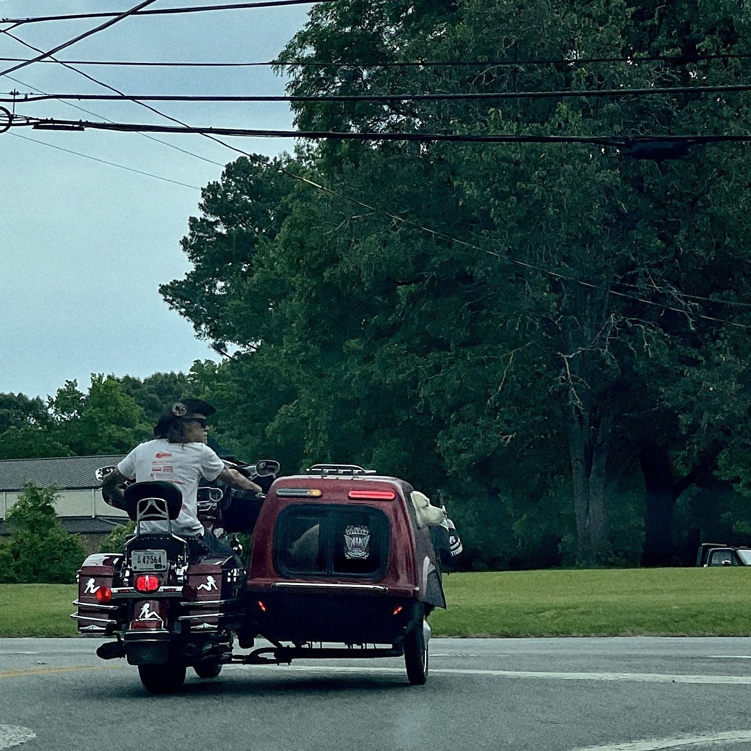
A neighbor has built a custom motorcycle sidecar for his golden retriever. I’ve never seen a dog that happy.
15 years of Fontstruct
5/27/24 • 2 min read
I realized this morning that I’ve been using Fontstruct for 15 years. Fontstruct is an online tool for building modular typefaces. My first typeface design — Big Thursday — debuted on May 26, 2009. Since then, I’ve publicly released 49 fonts on Fontstruct and 19 have been selected as “Staff Picks.”
The original version didn’t have a lot of flexibility,1 but over time developer Rob Meek has added new brick types, construction methods, kerning, support for color fonts and other features to Fontstruct to make it more powerful. My work tends to be a little brutalist, but if you want to understand the flexibility of the tool, check out the gallery to see what amazing creations people can craft with this online tool.
I don’t use the most complicated features, but I sometimes use Fontstruct to prototype an idea for a new typeface. One of Fontstruct’s best integrations is that I can download a file that I can open and refine in Glyphs.2 I recently created a design, moved it to Glyphs and built a variable font out of it.
Balancing work, family, grad school and other obligations, I don’t have a ton of time to spend in Fontstruct. But when they rolled out the Patron level of support for 5 euro a month, I subscribed immediately. I’m happy to support independent tools that are constantly improving.
I pulled together a sample of some of the designs I’ve created over the years on Fontstruct. Feel free to head over to my page and download anything you like. Or better yet, sign up for an account and start experimenting.

Bob Wertz is a creative director, type designer, Ph.D. student and researcher living in Columbia, South Carolina.