Easy Category Pages in Navigation on Micro.Blog
Customize your navigation with filtered categories
When I first moved my blogging over to Micro.Blog, I struggled with the perceived rigidity of the navigation. It took me a little time to refine it, but I eventually figured it out. I’ve had a couple of people ask about my solution, so I figured I’d share a quick summary of how I set it up my navigation.
It shouldn’t matter what theme you are using, but for my site, I use the Pure plug in, which is a good foundation to build from. By default, the template presents a home page that includes all of your posts. Instead, I wanted to have different links in my navigation for my longer “blog” posts and my shorter “tweet-like” status posts.
It’s actually pretty easy to do, but it takes a few steps.
-
Create the categories you want. I created two categories: Quick Updates and Long Posts. You can create as many categories or group them differently, but this worked for me.
-
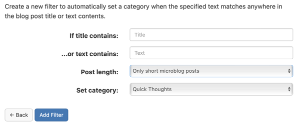
Set up filters. Filters will automatically apply categories based on different parameters. Click the “Edit Filters” button beneath the list of categories. I set up two filters. One that sorted untitled posts into my “Quick Thoughts” category and a second that grouped together all of my long posts with titles. This way, my posts are automatically grouped into one of the two categories. In the screenshot below, I used the “Post Length” setting.

-
Determine the URL for each category. Each category in Micro.Blog has a URL, typically formatted as
http://DOMAIN-NAME/categories/CATEGORY-NAME.Find the URLs for each of the categories you want in the navigation. -
Create a new page. Name the page and then paste the category URL into the content box. Make sure “Include this page in your blog navigation” is checked. Repeat for all of your categories. You’ll then have a navigation item for each of your categories.
This technique works really well when paired with the Custom Home Page plug in. You can see the result in the navigation on my site. I know that I could do this by building a custom template. At some point, maybe I will. But right now, I’d like to keep it as simple as I can, and this works really well for me.
Bob Wertz is a creative director, type designer, Ph.D. student and researcher living in Columbia, South Carolina.