Excited/nervous to get his stitches out.
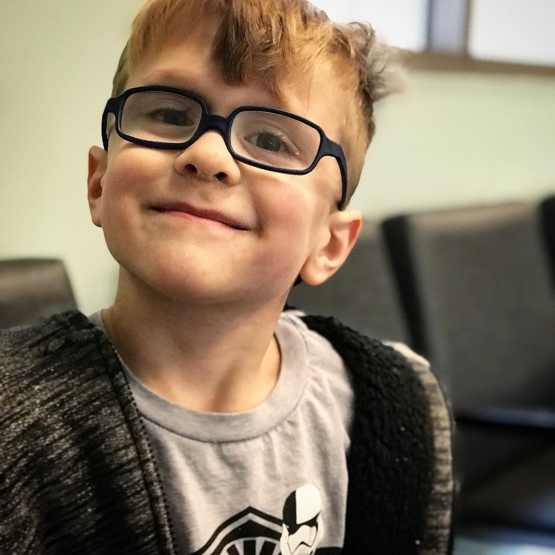
Excited/nervous to get his stitches out.
This post was originally posted on January 7, 2018 on Sketchbook B. It’s reposted here as part of a project to move some of my favorite writing to my new site.
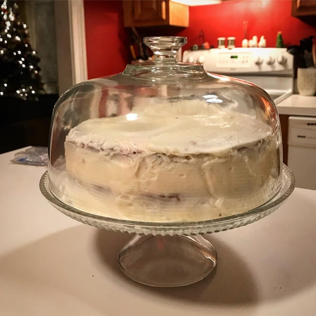
I made a red velvet cake last week.
From scratch. It was a recipe that my mom made when I was growing up, but it was originally my Grandmother Wertz’s recipe. My grandmother died when I was very young, so to me, red velvet always makes me think of my mom.
My mom passed away almost 17 years ago. She taught me to cook many things, but this red velvet cake was not one of them. All I knew was that it was difficult, and that she messed up the icing the first time she tried to make it. I can make pretty much anything that she made, but I had never tried to make the red velvet cake. I’ll be honest – I was scared. Scared to fail. Afraid that if I messed it up, I wouldn’t have someone to call for advice. I was on my own. So I never attempted it.
A few weeks ago, I started thinking about making her red velvet cake. I don’t know what triggered my urge to bake the unbakeable, but I couldn’t get the idea out of my head. I got the recipe from my sister and decided to bake the cake Christmas Eve. (Because obviously, we had nothing else to do that night…) I ran to the grocery store and got the ingredients. I found our fanciest cake stand. And I pulled out the Kitchen Aid mixer that my parents gave us as a wedding gift.
The recipe wasn’t that hard, but like most older recipes, it was procedural. Lots of steps and precise measurements. The cake batter came together okay, but the icing was another story. This recipe doesn’t use a cream cheese icing like a lot of modern red velvet cakes do. It’s more like a butter cream. I ruined the first batch of icing and had to make a second batch. About 1:00 Christmas morning, I finished icing the cake. It looked exactly like I remembered.
Christmas evening, after dinner, we cut into the red velvet cake – giant pie-sized wedges like my mom used to cut. It tasted like I remembered. Not too sweet, perfect texture. Even the kids loved it. I will freely admit that I teared up a little upon realizing that I had successfully pulled it off.
As I think about the year ahead, I realize that many of the things I’ve been scared of… many of the things I’ve put off attempting… the fear is all in my head. In 2018, I’m going to put those fears aside, branch out and try new things.
(And now that I can make the red velvet cake, I’m definitely going to bake it again.)
Bob Wertz is a creative director, type designer, Ph.D. student and researcher living in Columbia, South Carolina. He’s been blogging since 2008.
This post was originally posted on January 7, 2018 on Sketchbook B. It’s reposted here as part of a project to move some of my favorite writing to my new site.
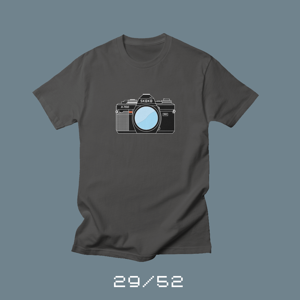
Each week for a year, I’m designing a shirt and releasing it on my Threadless store. This is the design for week 29.
I was a photographer long before I was a designer. My father loved cameras and had a selection of Minolta 35mm cameras, lens, flashes and other accessories. They were often used for family pictures after church and vacation photos. My parents kept tons of photo albums around and so I grew up with photography everywhere.
When I started high school, I took pictures for the yearbook and newspaper. I signed up for a class at Midlands Tech on photography and darkroom skills. I worked in USC Aiken’s darkroom some — my high school didn’t have it’s own darkroom — but I eventually got an enlarger at home and printed my own images in the bathroom.
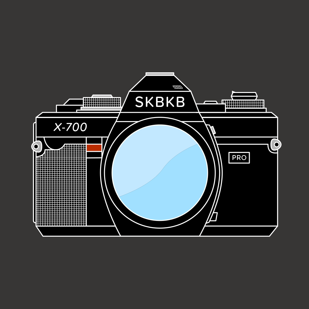
I used my dad’s cameras for most of this, but at some point during my senior year, I picked up a used Minolta X-700 to be my camera. I shot a bunch of high school sports and needed a long, but affordable lens so I used an old 200mm f3.5 lens that we purchased from KEH in Atlanta. I borrowed one of my dad’s motor drives and that combo was my primary camera set up for a number of years. When I went to college at the University of South Carolina, I worked in student media and shot football and basketball games with it. I also worked a bunch of concerts with that camera — Beastie Boys, Nine Inch Nails, Gin Blossoms, Green Day and more.
I discovered design when I was in college, but photography was my first love and one of my oldest artistic influences. I’m glad I got the experience of shooting on film and working in a darkroom. I’m grateful that I had to learn to shoot with manual focus before autofocus happened. I’m thankful for autofocus and digital photography, but I feel like I understand photography better because I had to do things manually.
“I discovered design when I was in college, but photography was my first love and one of my oldest artistic influences.”
At some point, I switched to Canon autofocus when I purchased an A2E with “eye-control focus.” And then to digital SLRs when my oldest child was born. I gave my old Minolta gear to my dad who collected cameras and he had them displayed with other old cameras he had used or found at yard sales. A couple of years ago, he was cleaning out some things and asked if I wanted some of his old camera gear. I took several of the old Minolta bodies, including my X-700, and displayed them in my office — next to my darkroom clock.
I wanted to create a shirt based on my love of photography. And that X-700 kept popping in my head. So I recreated it, taking some editorial license. It’s one of the most detailed vector illustrations I’ve ever done and I had a blast with it.
You can purchase “First Camera” from my Threadless store in a range of colors.
Bob Wertz writes about design, technology and pop culture at Sketchbook B. Bob is a Columbia, South Carolina-based designer, creative director, college instructor, husband and dad. He’s particularly obsessed with typography, the creative process and the tools we use to create. He’s currently in the middle of a project to design a new shirt a week for an entire year.

This post was originally posted on January 3, 2018 on Sketchbook B. It’s reposted here as part of a project to move some of my favorite writing to my new site.
A little over a year ago, I wrote a blog post pondering what would change in my workflow if Twitter disappeared. At the time, Twitter was actively looking for buyers and had just shut down Vine. I identified what I would miss without Twitter and decided to start looking for options to address some potential pain points.
In the last year, the narrative has shifted from Twitter’s possible sale to issues with abuse and hatred. Twitter increased the character count to 280 and that’s worked out fine, but its user growth is still flat. As Twitter tries to jumpstart the service, I still believe the likelihood of Twitter imploding within the next few years is high.
I thought I’d revisit my areas of concern from my previous post and share what I’ve done to mitigate those issues.
I’d lose a bunch of contacts. My first concern was that I’d lose a bunch of contacts that I only had on Twitter. I’m a little less concerned about this than I was a year ago. I’ve slowly started to connect with more people, experts and brands on other services like LinkedIn and Facebook. I’ve still got a ways to go and will continue to expand the roster of people I follow on other services.
I’d change how I watch live events. I’m still using Twitter during live events. For me, this is the hardest to replace. During the Sugar Bowl and the Rose Bowl this week,1 I kept up with commentary from reporters and friends on Twitter. Following commentary on live events is challenging through Facebook. Posts don’t appear in sequential order because of their algorithm.
Twitter is simply the best option to handle streaming written commentary during an event. I’m sure I could use something like Snapchat, but I don’t know enough people on Snapchat for it to be useful for me.2
I’d have to rethink how I find articles and stories. This was a big issue for me, but I’ve kind of solved it… by cheating a little bit. I’ve started using Nuzzel3 to surface headlines from my social media services. Not familiar with Nuzzel? It’s a pretty simple service. You connect your social media services — Twitter, Facebook and LinkedIn — and Nuzzel tells you what links your friends (and friends of your friends) are sharing. This works really well for finding the links and articles that your social circle is talking about… without actually going into Twitter or Facebook. It’s cheating because 95% of the links that come up are from people I follow on Twitter. I really like the service and I see lots of links I would have otherwise missed. I highly recommend it.
I’ve upgraded to Feedly Pro and I’m being more intentional about subscribing to interesting RSS feeds. I’m going to continue to expand my use of Feedly.
I find Facebook useless for finding actual news stories unless I want to know “27 Secrets from The Last Jedi” or some crappy, clickbait slideshow link. And LinkedIn seems equally useless for finding content that I’m interested in.
I need to give Medium another chance, but for some reason, I just haven’t been interested in building an account on Medium with people I follow and read regularly. Maybe that’s something to look into more in 2018.
I’d have to rethink how I share content. Sharing the content I create is another issue. I’m sharing more widely on other services, but I’m still using Twitter. For 2018, I’m shifting most of my short format posting to Micro.Blog with automatic cross posting to Twitter.
And to promote most of my blog posts or interesting content, I schedule posts through Buffer to several different services.
I’ve thought about reposting my blog posts and articles on Medium, but it seems like a lot of work to post everything twice. (And only posting to Medium is not an option for me. I want everything hosted on my site.) I may try Medium again.
I’ve tried and I’ve tried, but I can’t get into Dribbble. I love the concept and I love the community, but it just doesn’t match up with the way I work. Still, the community is great so maybe I’ll give it another shot in 2018.
And finally, Pinterest. For some of my content — specifically my shirt and product designs — Pinterest is a great service. But I haven’t really spent that much time in Pinterest personally, so that might be another avenue I explore in 2018.
I’d change the way I use Facebook. So Facebook… I really do think that we’ve reached the point where you have to have a Facebook account, unfortunately. In today’s communications environment, Facebook is a necessary evil. Over the last year, Facebook has had its own problems with hatred, fake news and discrimination, though, and I’d love to reduce my reliance on Facebook, too.
Facebook is a great place to share family photos, but for serious content, I don’t think it works well. I’ve started to build an audience for the Sketchbook B Facebook page and I’m going to continue to promote the page and hopefully expand the number of followers. That said, I feel like Facebook’s algorithm is going to hide my content unless I pay to promote it, which I may start to do selectively.
I’d spend more time on Instagram. I still love Instagram.4 A couple years ago, I switched my account from a personal account to a business account. The bonus was that I could see viewer metrics, but the drawback was that it would only let me cross post to my Facebook Sketchbook B business page, not my personal profile. Since most of my Instagram shots are family or fun shots, I want to cross post those to my personal Facebook page. I don’t really care about metrics so I recently switched back to the personal account.
I plan to cross post my fun family Instagram images to Twitter and Facebook more regularly. I also plan to manually repost from Instagram to Micro.Blog. It’s a little bit of work, but I like having everything on my site.
I’d try to find a replacement. A little over a year ago, I was guessing that if Twitter disappeared, someone would rise up and meet the needs of its former user base. I didn’t have to wait until Twitter disappeared. A few months after I wrote my post, Manton Reece launched his Micro.Blog Kickstarter project. Micro.Blog is a service that allows me to host my microblog posts — basically, tweets — on my own site and then share through a social media service. Manton’s done a great job so far, and I really think that Micro.Blog is the tip of the iceberg for a resurgence of the independent web. The service isn’t for everyone and it’s in the early days. Manton is still figuring out how some features will work, but I think it’s a great fit for me. (I’m going to write a lot more about Micro.Blog this month, including why I’m excited about it, and detailing how I configured my Squarespace blog to work with Micro.Blog.)
Reality check. I’m not completely giving up on Twitter, though. I’ve been a Twitter user since 2007 and Twitter is part of my daily routine. It’s just a less enjoyable part of my daily routine now. This year, I backed Twitteriffic for Mac on Kickstarter because I wanted my favorite Twitter client on my Mac.
Times are changing, though, and I honestly believe that we all need to be diversifying — and if possible, owning — our social media presence. Becoming less reliant on the big social media behemoths is the first step.
I look forward to revisiting my progress next year.
Bob Wertz is a creative director, type designer, Ph.D. student and researcher living in Columbia, South Carolina. He’s been blogging since 2008.
I joke that I’m a grouchy old guy that doesn’t “get” Snapchat. The truth is that very few of my friends are on Snapchat and so it really isn’t that useful to me. If I had a bunch of friends active on Snapchat, I’d be there. Even if the interface is crap. ↩︎
I tried out Nuzzel based on Jason Snell’s recommendation on one of his many podcasts. ↩︎
Owned by Facebook. Sigh. ↩︎
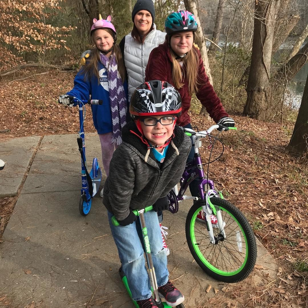
Scooters and bikes.
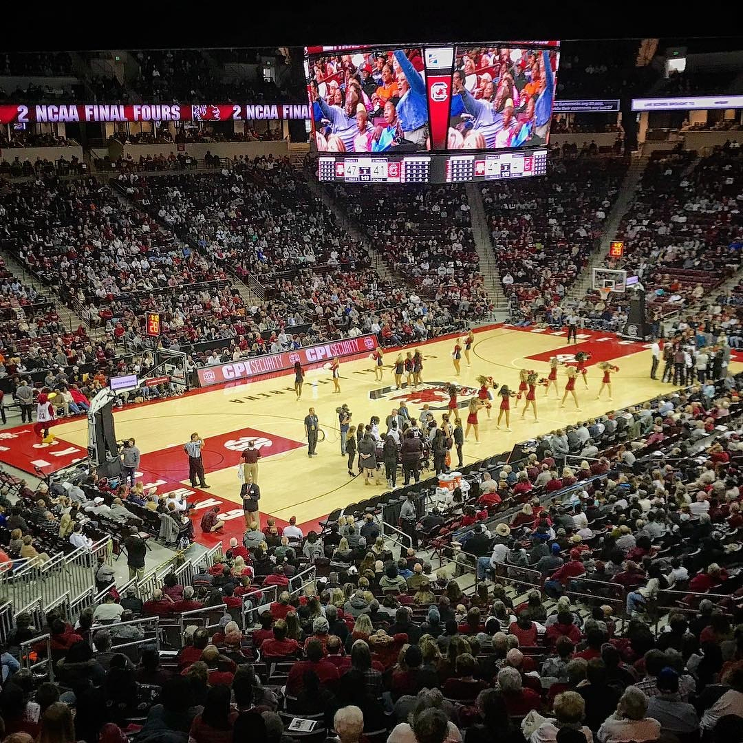
Gamecocks Women’s Basketball on New Year’s Eve.
This post was originally posted on December 31, 2017 on Sketchbook B. It’s reposted here as part of a project to move some of my favorite writing to my new site.
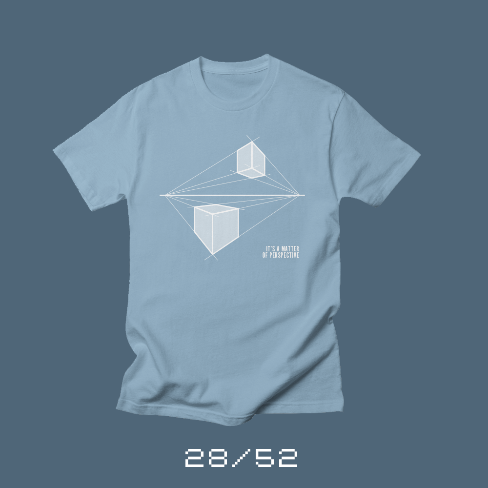
Each week for a year, I’m designing a shirt and releasing it on my Threadless store. This is the design for week 28.
I can’t remember what year of elementary school I was introduced to the concept of perspective. All I know is that once I was introduced to single point perspective, I drew cubes on everything. Later, when I was introduced to two-point perspective, I’d break out a ruler and draw massive cityscapes.
Perspective, for some reason, was an early art lesson that made an impression. I think it was because once you understood the concept of perspective, you looked at the world in a different way. What something looks like depends entirely on your point of view.
Perspective, it turns out, is more than just an art lesson. Learning to take into account other people’s point of view is critical to understanding and working with other people. Everything is a matter of perspective.
You can buy, Perspective, from my Threadless store. It’s available in a wide range of colors.
Bob Wertz writes about design, technology and pop culture at Sketchbook B. Bob is a Columbia, South Carolina-based designer, creative director, college instructor, husband and dad. He’s particularly obsessed with typography, the creative process and the tools we use to create. He’s currently in the middle of a project to design a new shirt a week for an entire year.
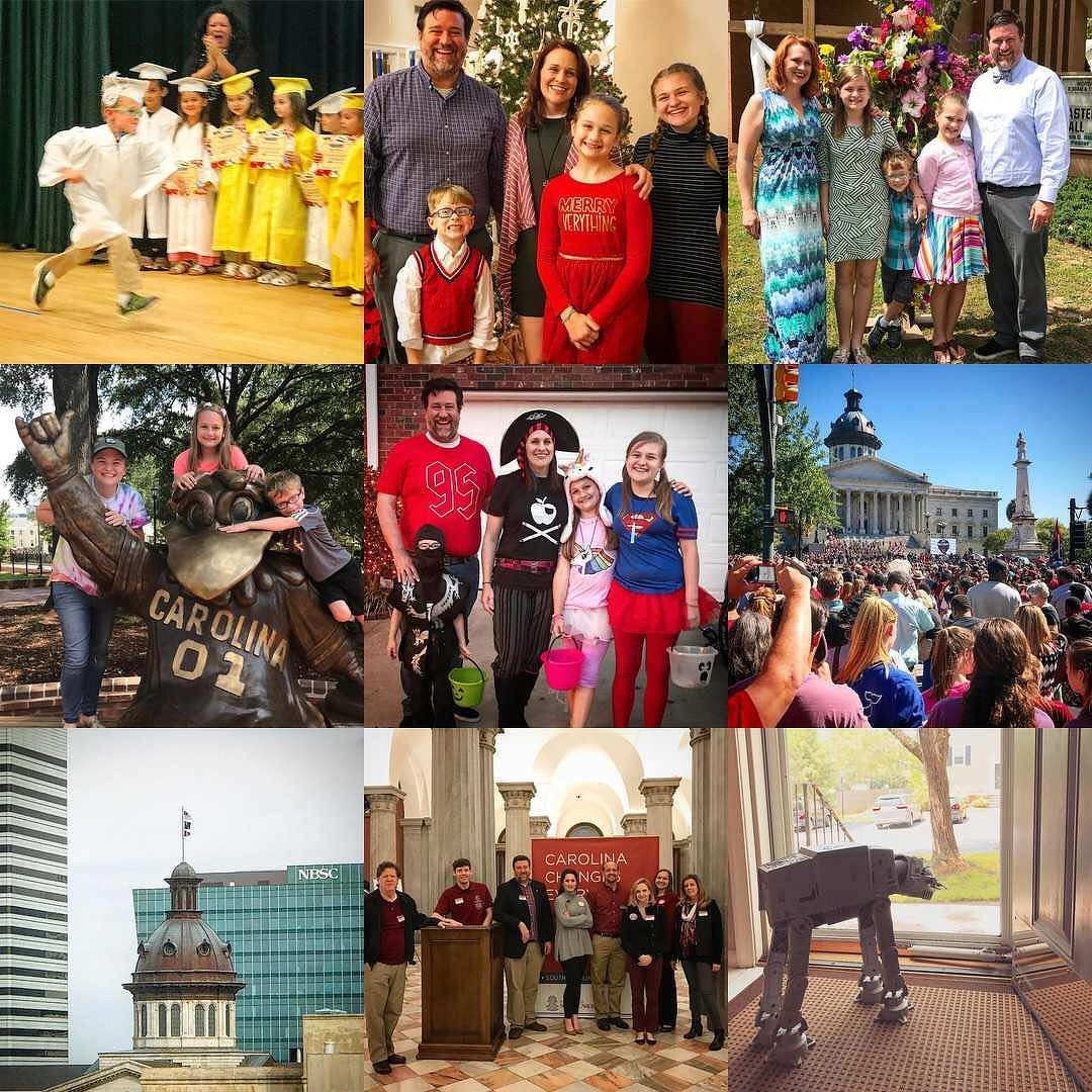
My Best Nine for 2017. #2017bestnine
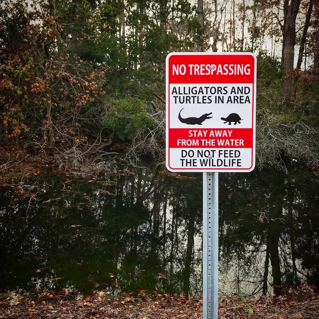
Alligators AND turtles.
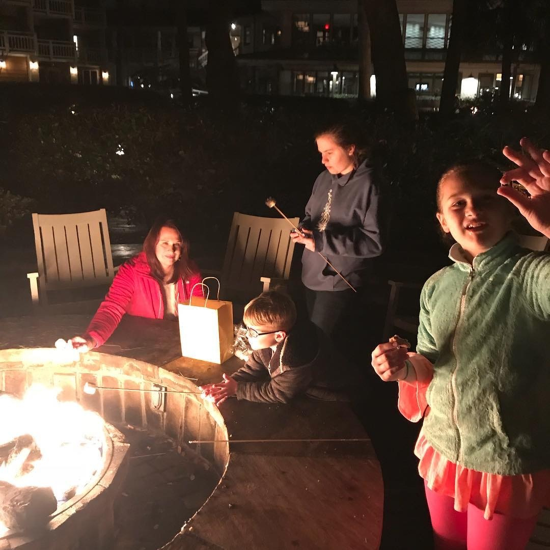
Team Wertz smores.
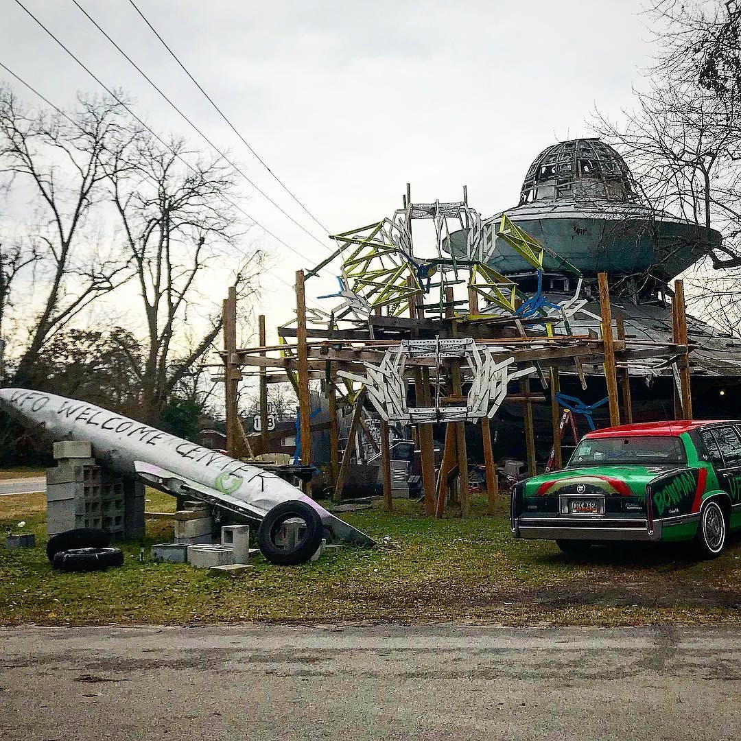
Welcome, aliens.
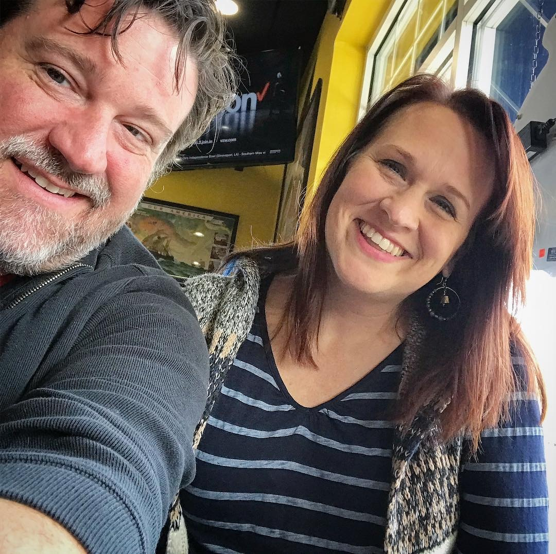
Selfie at lunch.
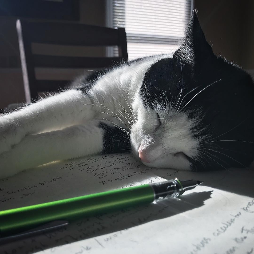
I’m trying to work, here.
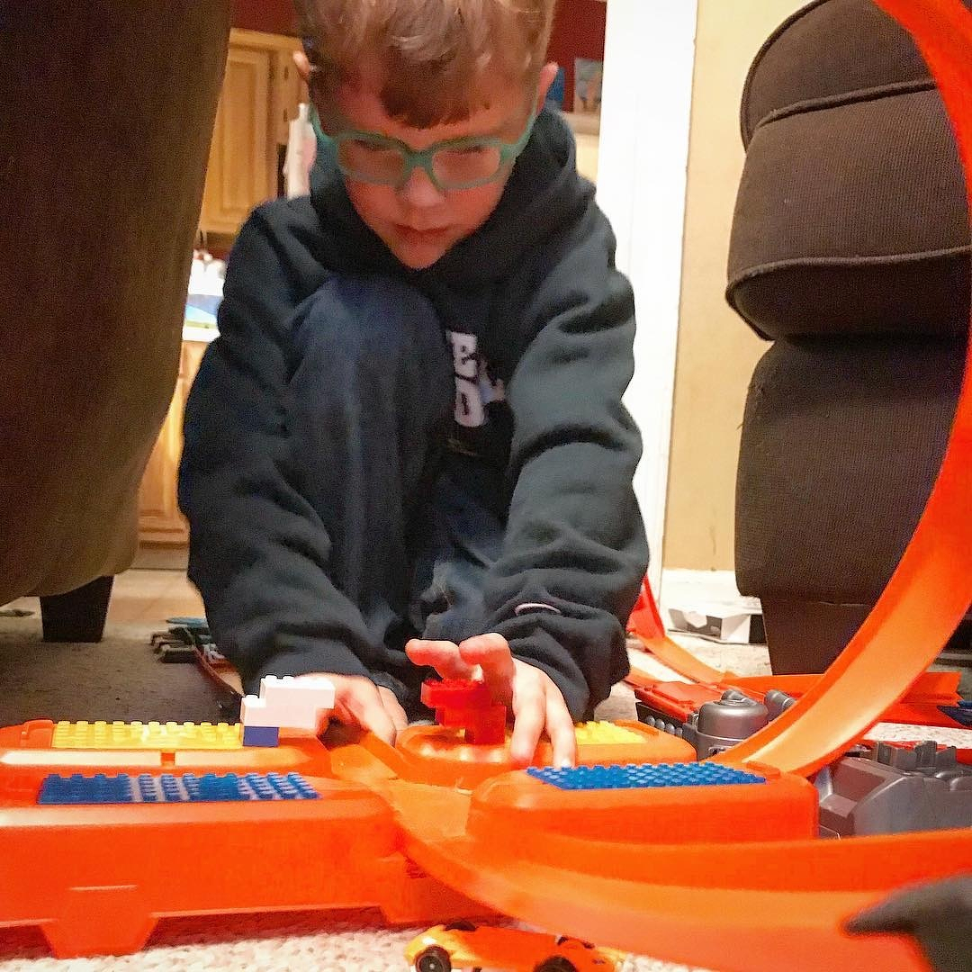
Hot Wheels everywhere.
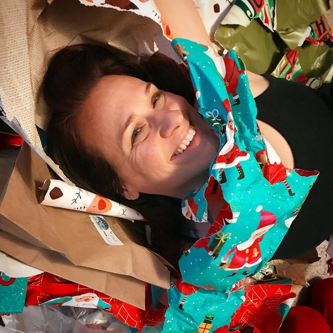
A sea of wrapping paper.
Achievement unlocked: I made my grandmother’s red velvet cake from scratch tonight. Took a little longer than I planned, since it’s 1:00 in the morning. But it looks like I remember. Hopefully, it will taste like I remember.
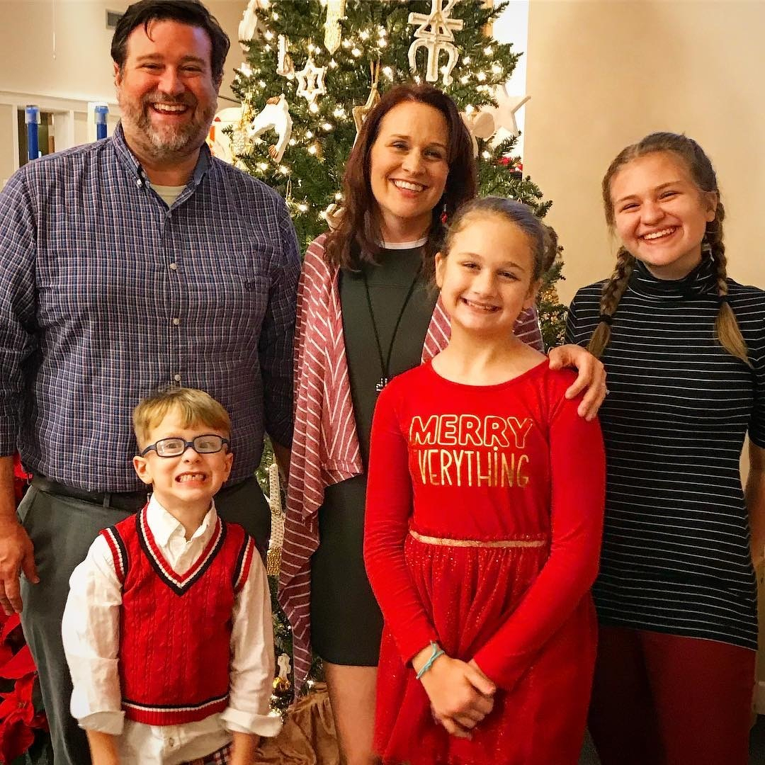
Merry Christmas from Team Wertz
This post was originally posted on December 24, 2017 on Sketchbook B. It’s reposted here as part of a project to move some of my favorite writing to my new site.
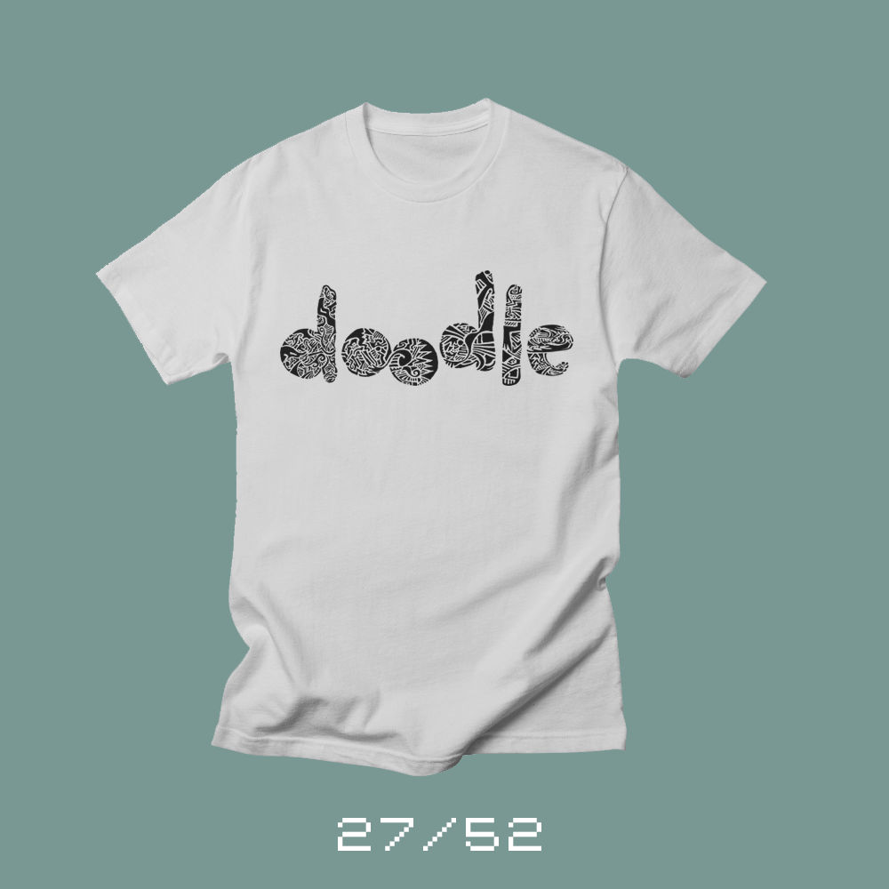
Each week for a year, I’m designing a shirt and releasing it on my Threadless store. This is the design for week 27.
First of all, Merry Christmas. Today is Christmas Eve and I wish all of you a joyous Christmas and a Happy New Year. I released a couple of Christmas shirts earlier — First Tree and Secret Santa. I released them early so people could have them in time for Christmas if they wanted to order them, so it feels a little odd releasing a non-Christmas shirt on Christmas Eve.
I love to doodle. During a conference call or a long meeting, I’ll fill the margin of my notes with mindless little sketches that just kind of flow from the discussion. Sometimes I’ll sketch ideas out that are stuck in my head. But often, I create patterns. Really detailed patterns that form some kind of shape.
These sketches rarely leave my sketchbook or notes. I once did a massive pattern for an InShow poster, but I don’t use the pattern in my artwork much. When I started to think of ideas for this shirt, I was struggling to finalize an idea that I was happy with when my wife mentioned that she’d love to see me do something with my pattern doodles.
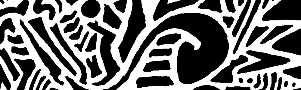
Close up of the pattern.
I broke out the Microns and some smooth, heavyweight paper. And I spent the evening doodling the word “doodle.” I photographed the pattern in sections, assembled it in Photoshop and cleaned it up slightly. I really love the look of the pattern and I need to find other ways to use this technique.
This week’s shirt, Doodle, is best in lighter colors. (Personally, I love the black ink on the white shirt…) You can purchase Doodle from my Treadless store.
Bob Wertz writes about design, technology and pop culture at Sketchbook B. Bob is a Columbia, South Carolina-based designer, creative director, college instructor, husband and dad. He’s particularly obsessed with typography, the creative process and the tools we use to create. He’s currently in the middle of a project to design a new shirt a week for an entire year.
This post was originally posted on December 23, 2017 on Sketchbook B. It’s reposted here as part of a project to move some of my favorite writing to my new site.
I saw Star Wars: The Last Jedi for the second time the other night. I caught a late showing on opening night and then a matinee this week with my whole family. I’ve got a few thoughts I want to share… spoiler-filled thoughts…
So if you still haven’t seen the movie, don’t read any further…
…seriously…
…spoilers coming…
…last chance….
…
I really enjoyed The Last Jedi. It has flaws and a couple of scenes seem unnecessary. But it was a blast. Honestly, I think I enjoyed it more than The Force Awakens. It was even better on the second viewing. There are lots of reviews, blog posts and commentary on the internet that break it down in detail. You can read those if you want specific commentary, but I’ve got a couple of things I wanted to mention specifically.
The retreat! The entire movie is a retreat. The rebels are running away and trying everything just to stay alive. I suppose the Empire Strikes Back is somewhat similar, but the retreat from Hoth goes well compared to the retreat in The Last Jedi. At the end of the movie, the entire resistance can fit on the Millennium Falcon.
Evil BB-8! Its name is officially BB-9E, but to me, he’s the evil BB-8. We don’t see much of it, but BB-9E makes the best of the time on screen.*
The ships! I’m one of those science fiction fans that love the space ships. And the production design on The Last Jedi is great. From the Rebel bombers and First Order dreadnaught to Snoke’s ship and Kylo Ren’s Tie Silencer. I can’t wait to head to a bookstore and take a look at the cross sections book and visual encyclopedia for The Last Jedi.
“This is not going to go the way you think.”
— Luke Skywalker
The women! When I was in college, I took a class on gender and language. And one of our assignments was to take an element of popular culture and dissect its use of gender and language. I chose the original Star Wars trilogy.** And other than Leia, only one woman had a speaking part — Mon Mothma in Return of the Jedi. All men. Well, that’s not a problem any more. Many of the main characters in The Last Jedi are women. From main characters to background characters, the new Star Wars world is much richer and more diverse. And the series is better because of it.
The action sequences! Poe’s pyrrhic victory against the dreadnaught. Rey and Kylo fighting back-to-back in Snoke’s chamber. The standoff at Crait with the red sand.*** All beautiful, complex battle scenes that were fun and unpredictable.
Yoda! Snoke’s guards! Porgs! Luke and R2 on the Falcon! Holdo slamming into the First Order fleet at light speed! Everything you just said is wrong! Rey lifting rocks! There’s so much I love about The Last Jedi.
I’m looking forward to seeing where J.J. Abrams takes the series in the next film. I assume that some time will have passed between The Last Jedi and Episode 9. I have a feeling that the plan was for Episode 9 to be all about Leia, but with the loss of Carrie Fisher, I think the focus will be solidly on Rey as leader of a new Jedi Order. But this entire new trilogy has surprised me at every turn, and I’m sure they’ve got something up their sleeve for the final installment of this trilogy.
* I’ve seen the droid’s name jokingly listed as BB-H8, which is hysterical.
** I had the original trilogy on VHS. I’m old.
*** On second viewing, Luke’s feet don’t disturb the red sand. Nice touch.
Bob Wertz writes about design, technology and pop culture at Sketchbook B. Bob is a Columbia, South Carolina-based designer, creative director, college instructor, husband and dad. He’s particularly obsessed with typography, the creative process and the tools we use to create. He’s currently in the middle of a project to design a new shirt a week for an entire year.
This post was originally posted on December 17, 2017 on Sketchbook B. It’s reposted here as part of a project to move some of my favorite writing to my new site.
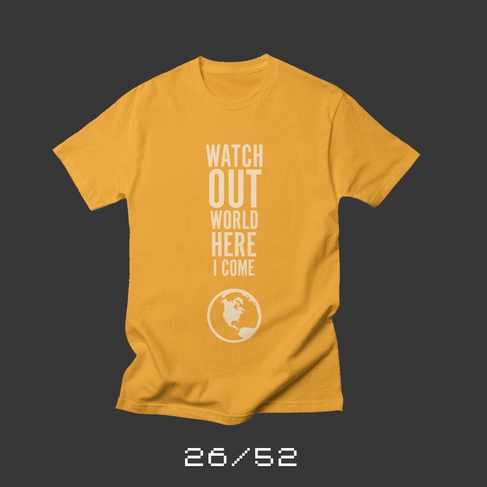
Each week for a year, I’m designing a shirt and releasing it on my Threadless store. This is the design for week 26 and marks the halfway point for my 52 Shirts project.
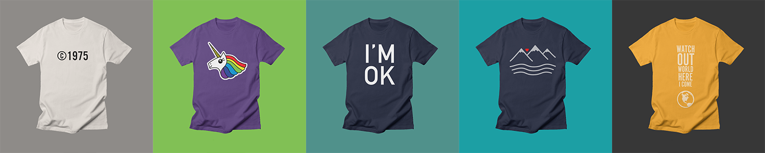
My oldest became a teenager this week, so it was her turn to work with me to design a shirt.* We had everything completely planned out, but when I finished it, neither of us liked it.** While we sat at the dining room table trying to improve the design, she doodled on a sheet of paper “Watch out world, here I come.”
“What’s that?” I asked, pointing to her doodle.
“I don’t know. Sometimes, you need a plan B, right? It’s always good to have a plan B.”
It was, indeed, time for plan B. I took her phrase and shaped it into an exclamation point.
Norah’s determined. She’s one of those kids who just won’t quit. Smart, strong and kind. “Watch out world, here I come” seemed perfectly appropriate to celebrate her 13th birthday.
You can purchase “Watch out world” from my Threadless store in a wide range of colors. And happy birthday, Norah!
* Now that Norah’s shirt is done, we’ve completed birthday shirts for all of Team Wertz — Me, Jill, Ryan, Liz and now, this shirt for Norah. It’s been fun — and challenging — partnering with each of them on their shirt.
** The original shirt was going to say: “I’m afraid of clowns, snakes and being like everyone else.” Alas, choosing a typeface we both liked proved to be impossible.
Bob Wertz writes about design, technology and pop culture at Sketchbook B. Bob is a Columbia, South Carolina-based designer, creative director, college instructor, husband and dad. He’s particularly obsessed with typography, the creative process and the tools we use to create. He’s currently in the middle of a project to design a new shirt a week for an entire year.