I have to pack up my cube to move to a new office in a couple of weeks. While I’m looking forward to having walls and a door again, I’m not ready to pack everything up. I’ve been in this spot for six years – longer than I’ve ever been in a work space before. Going to feel strange to move.
When I see people arguing about Mastodon vs. Bluesky, I realize that we need to ask an important question:
What do you want from social media?
It’s not about what service is best. It’s about what’s best for you. And that answer is going to differ from person to person.
I’ve been sick for the past few days. Pretty minor symptoms. Pre-COVID, I would have just toughed it out, but now I take even minor symptoms seriously. I don’t want to get anyone sick.
(FYI: Just got back from the doctor. All the tests were negative. I just have a bad cold.)
Not everything is going to change the world tomorrow I’m not sure when the “hot take” era started. It predates the internet1, but social media really seems to have kicked it into the stratosphere. There’s a rush to hype everything as the next disruptive invention. Wearable devices. Foldable displays. Ride sharing and self-driving cars. Blockchain and cryptocurrency. Artificial intelligence and machine learning. AR and VR. Federated social media.
While social media drives the hype train, it’s powered by money.
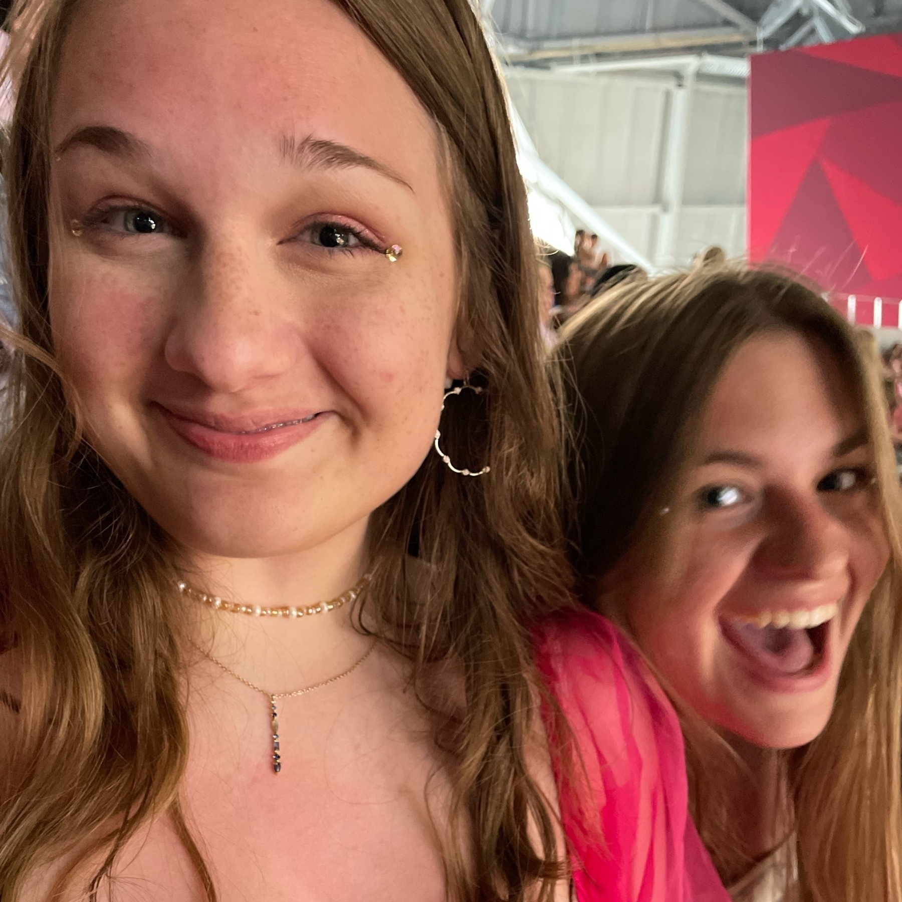
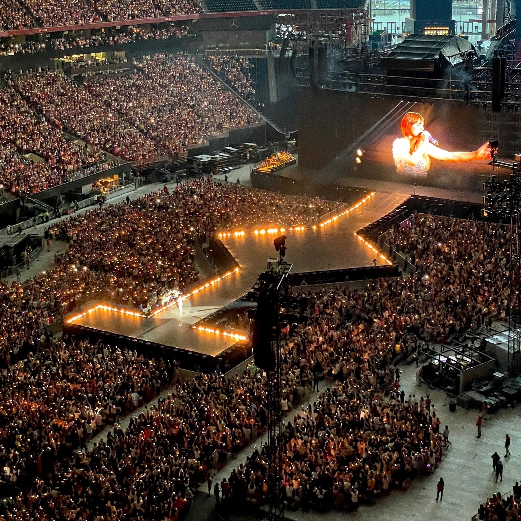
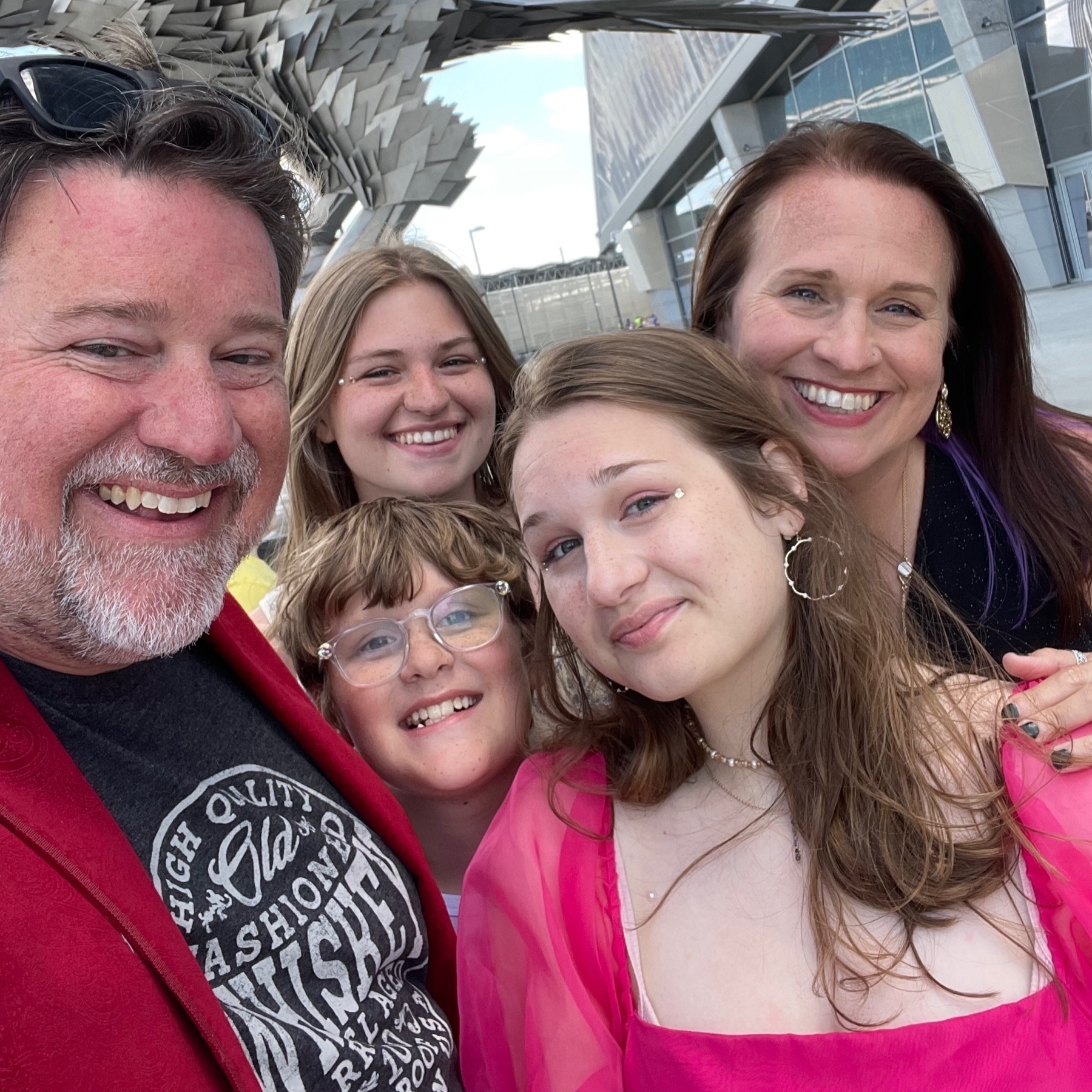
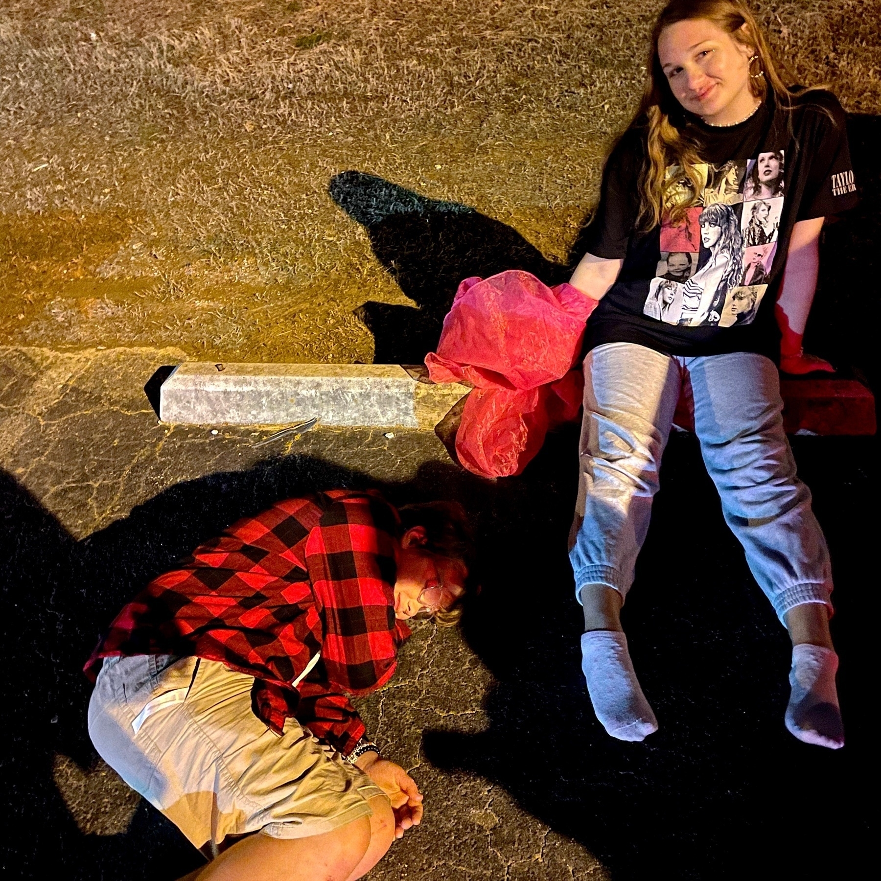
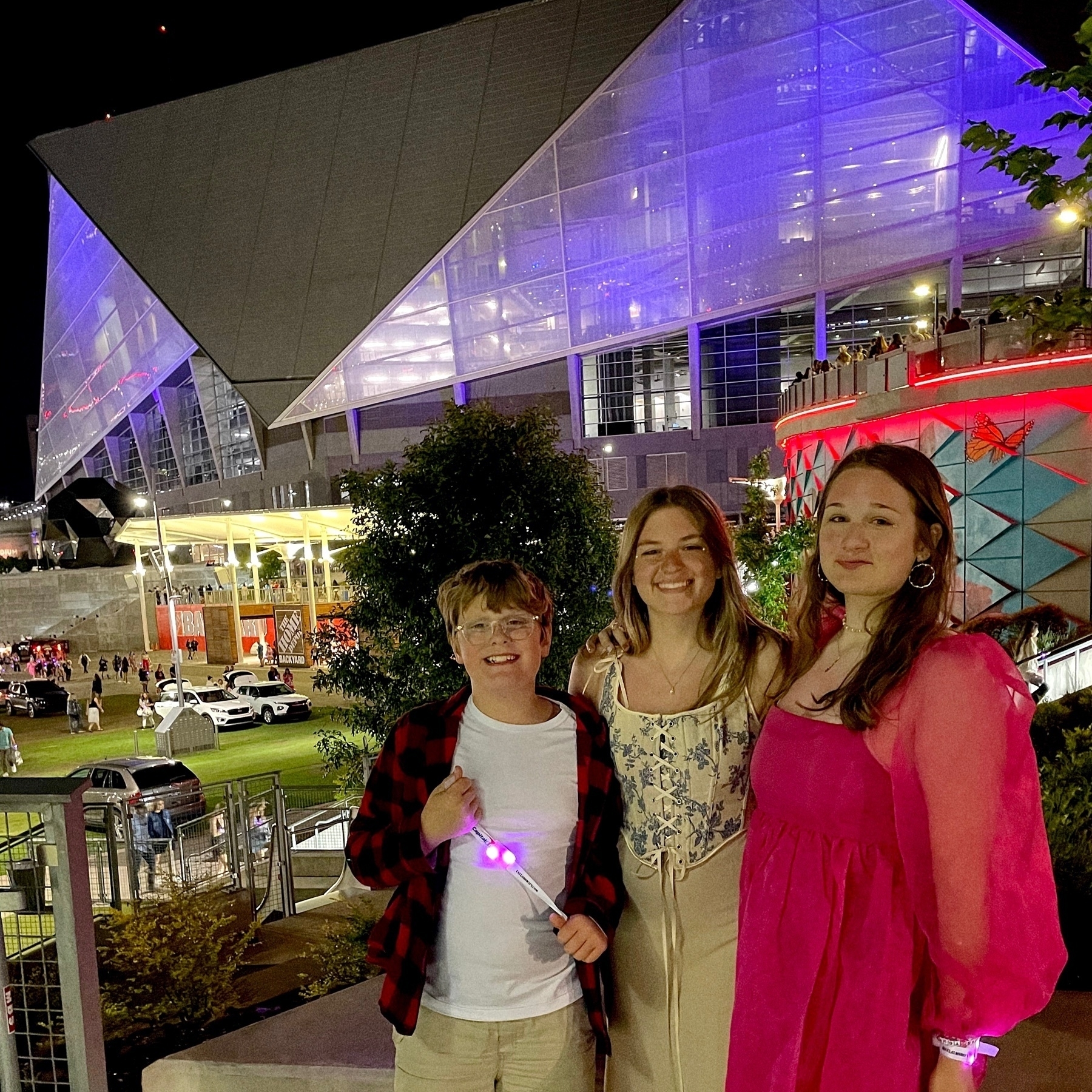
Taylor Swift put on an amazing show last night in Atlanta.
My daughters are making sure the whole family has appropriate attire for tomorrow night’s Taylor Swift concert.
Spending the day at the coffee shop with my daughters who are reviewing for AP exams next week. I’ve been working on finishing up the revisions to my journal article, but I keep going down rabbit holes…
The willingness of my children to wear mismatched socks perplexes me greatly.
My daughter’s high school lacrosse season ended last night. It’s been a tough year for her, missing her senior season with a torn ACL, but she cheered her team on from the sidelines and attended every practice. I’m so proud of her and how hard she fought along the way.
Today starts an amazingly busy couple of weeks for my crew. Playoff lacrosse games, school field trips, five AP exams (for two high schoolers), birthday parties, a 5K, Taylor Swift and a high school prom. All in the next two weeks. I’m tired just thinking about it all.
I use Apple Pay with my watch all the time. And cashiers are always surprised that I can do that and claim they’ve never seen someone pay with their watch. Apple Pay on the watch is the easiest way to use Apple Pay. Why don’t more people use it?
Working on editing a journal article that I got a revise and resubmit on. This is my first time through the academic publishing process, and I have to admit that it’s a challenging process. I’ve lived with this research for years and I’ve rewritten some version of this paper so many times… It started life as a class assignment, then a conference presentation. I completely started from scratch and redid the study to be a MA thesis project. And now, I’m submitting it as a journal article. I love the study and I know I’ll get it published eventually, but the process is long, y’all.
Hey @manton. I was able to upload the archive that I got from Twitter and it started a new blog and installed the plugin, but it’s been over 24 hours and I don’t see any tweets. How can I tell if it’s still in process, or if it’s stalled? Thanks for your help (and this amazing feature.)
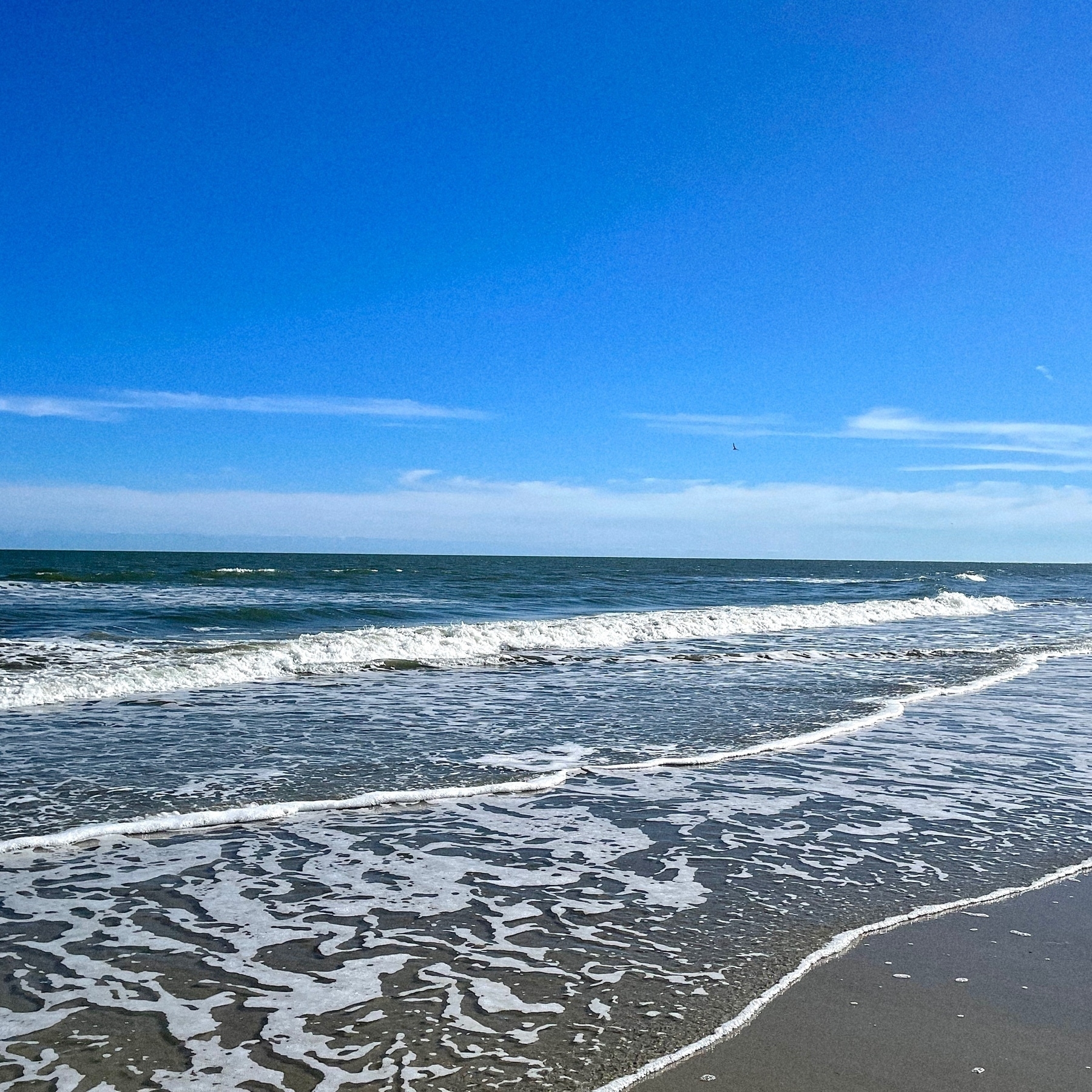
Made it to the ocean today with a day trip to Isle of Palms in South Carolina. Beautiful weather to walk along the beach and gather shells.
Diving into Micro.Blog custom themes. It’s a little out of my comfort zone — I usually stick with messing with the CSS — but I’ve got something specific in mind and I think creating a custom template is my best bet.
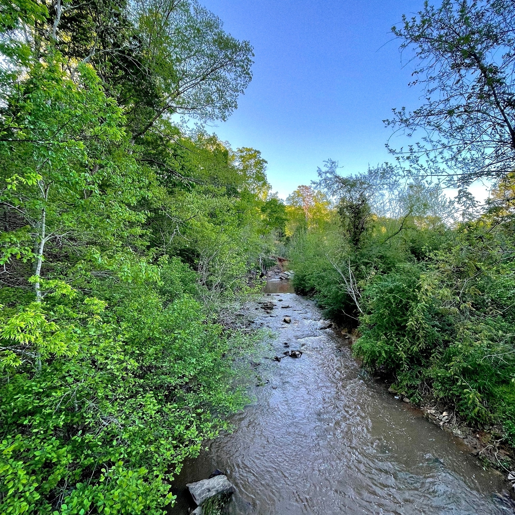
Liz and I took a walk around the trails behind our house after hosting Easter dinner. After a few days of constant rain, it was nice to see the sun.
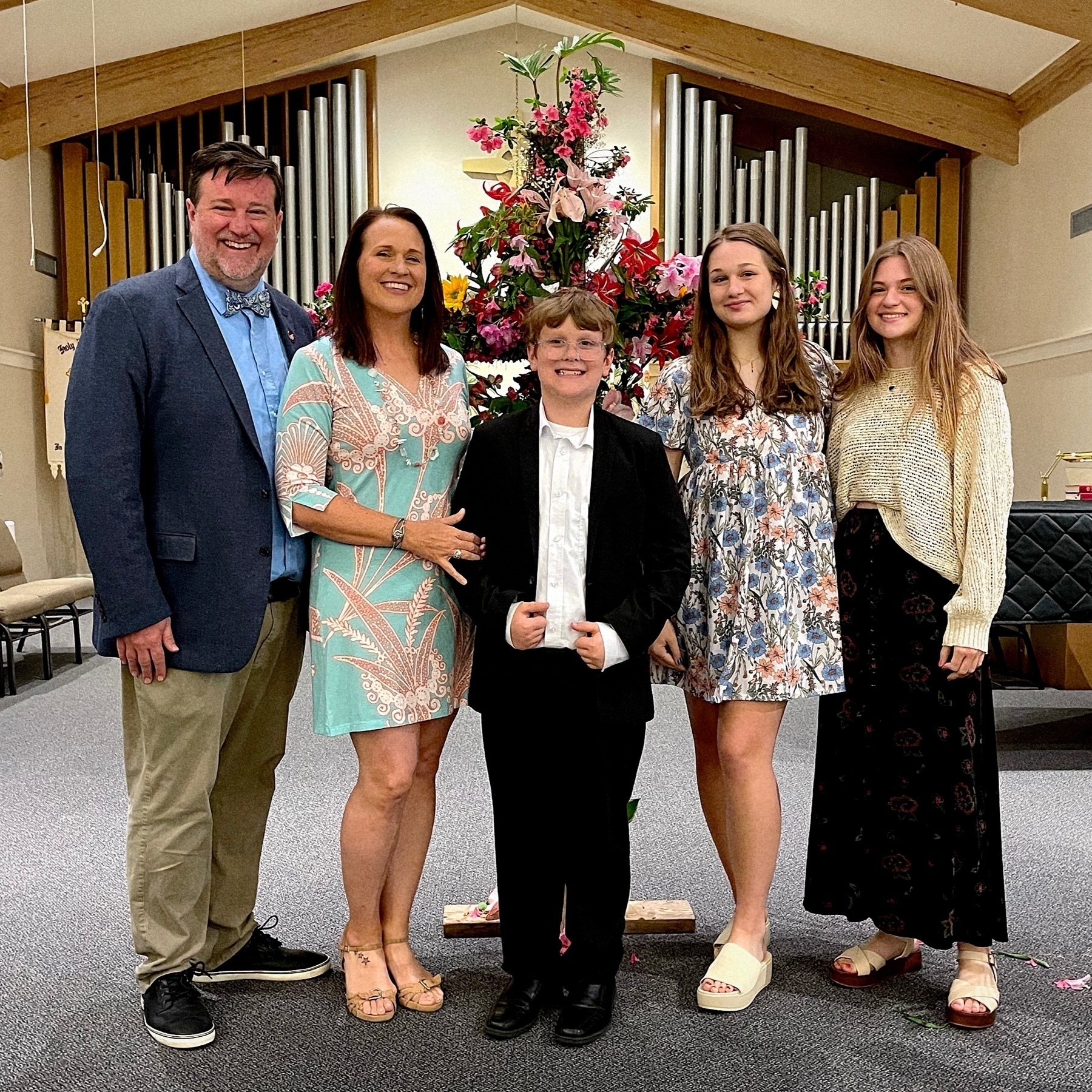
Happy Easter from Team Wertz.
Brought back two pimento cheese sandwiches from the Masters for my daughter. She’s impressed. They were $1.50 each.