This post was originally posted on December 22, 2008 on Sketchbook B. It’s reposted here as part of a project to move some of my favorite writing to my new site.
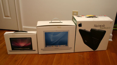
I’ve owned three Apple laptops… a Powerbook G3, a G4 iBook and now a new MacBook. Digging through my attic looking for Christmas wrapping paper, I came across the old laptop boxes. The comparison to the new packaging was pretty amazing and the size difference was especially dramatic.
Apple touts the new, smaller box size as an environmentally-friendly feature. Smaller boxes and packaging use less resources to create and transport. But when comparing the box to the packaging from the last few generations, it really is impressive to see the change.
From left to right: MacBook (2008), iBook (2004) and Powerbook G3 (2000)
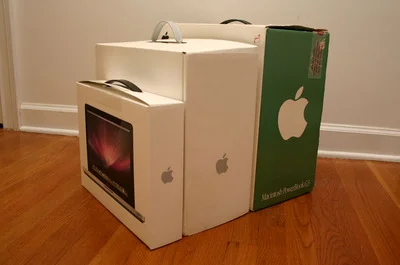
From the side, you can really see the size difference between the boxes.
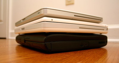
I also pulled out my old Powerbook G3… honestly, it’s still a pretty impressive design, but compared to the new MacBook, the thing is massive. I may post a few more detailed comparison shots later. I think it’s interesting from a design standpoint to look at the progression of elements like latches, ports and trackpads. Here’s a shot with all three laptops stacked…
That Powerbook G3 on the bottom looks massive compared to the newer models.
This post was originally posted on December 8, 2008 on Sketchbook B. It’s reposted here as part of a project to move some of my favorite writing to my new site.
Design competitions are a common grassroots tactic to encourage involvement from readers, volunteers or supporters. Asking for designs from the public involves them in the creation process. With the advent of the Internet, seeking out designs and allowing online voting is easy and further builds a connection to the product or movement. The side benefit is, of course, cost savings.
Professional design organizations like NoSpec and AIGA warn that design competitions are often a form of spec work. An attempt by a client to get design services without compensating fairly for the work provided. Spec work lessens the value of design because it treats it as a commodity instead of recognizing the time and effort that goes into providing design solutions for business.
Personally, I’m not a big fan of design contests and side with NoSpec and AIGA on the matter. But I also understand the PR side of the argument. Design contests are not going away. (In fact, with the growth of social networking, they are more popular than ever.) But professional organizations have a valid point. Contests are asking for designers to work with no guarantee of compensation and the quality that results from these contests is often subpar.
An Acceptable Framework?
I came across a competition the other day that provides a framework for what I think is an appropriate way to build a competition. When I posted my Polaroid/iPhone article last week, I linked to Save Polaroid, a site dedicated to ensuring that someone continues to manufacture film for Polaroid instant cameras. They have a t-shirt design contest that they have clearly thought through and that I think provides a fabulous structure for when a contest is appropriate.
Its goal is to provide issue awareness. Save Polaroid is a volunteer, grassroots organization. They are using the contest to raise awareness about the importance of instant photography and to advocate for companies to continue to support the industry. I think motivation matters here. Yes they are going to print shirts and yes, they hope that they will see some profit. But the main objective is obviously not profit; it’s engagement and promotion.
Contest is for a one-off design. This contest is for a t-shirt design. To me, in this case, a t-shirt design is a fairly simple thing. It does not require a massive understanding of the industry or strategy. And it will have a limited shelf life and a limited run of less than 100 shirts.
It’s not like a logo for a company. Or a license plate for a state. These things need to designed with a clear understanding of strategy and planning and would be inappropriate for a contest. But in the case of a one-off design, like a t-shirt, I think it can be appropriate.
They provide compensation for the winner(s). It’s not cash, but it is a prize. The prizes - a Polaroid camera, film, limited edition posters - all reinforce the contest’s connection to the issue.
All rights remain with the creator. All rights to all designs, including the winning design, remain with the creators. Most competitions do not address this, but this is a key issue.
If an artist is going to design something for no or limited compensation, the artist should retain the rights. Many contests do not clearly spell this out. And some require the artist to turn over all rights as a condition of entering - even if they don’t win. In a contest like this, all rights should always remain with the artist. Anything short of that is unacceptable.
Moving Forward…
I think this provides a functional framework for an acceptable design contest - part of grassroots effort to promote an issue, one-off design, appropriate compensation and responsible treatment of artist rights.
And who knows… I may just submit a design or two.
To learn more about the problems with spec work, visit NoSpec and read the official AIGA statement on spec work.
This post was originally posted on December 1, 2008 on Sketchbook B. It’s reposted here as part of a project to move some of my favorite writing to my new site.
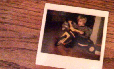
Kodak Instant Print of a future art director on his Big Wheel. (Taken with an iPhone.)
Everyone loves Polaroid prints. The shape and format is iconic. The quality wasn’t that great. You couldn’t really enlarge or frame the prints. And the camera itself didn’t offer anything that even remotely resembled bells and whistles. But the great thing about Polaroids was that the moment you took a picture you were ready to share it.
The iPhone and other camera phones are becoming the modern equivalent of the Polaroid instant camera.
The photographer in me hates my camera phone. The iPhone camera has 2 megapixel image quality, no flash, no zoom, no control over exposure. My digital SLR is far superior as a camera. And yet, I still take pictures with my iPhone all the time. Why?
It’s because I want to share what I’m shooting. Right then. I take a shot of something and I’m able to email it to someone, post it to an online gallery or Facebook. I’m not planning on making prints or enlargements. I’m not expecting great lighting.
I am capturing a moment and sharing that emotion immediately. Just like with the Polaroid.
This post was originally posted on November 29, 2008 on Sketchbook B. It’s reposted here as part of a project to move some of my favorite writing to my new site.
InShow is AIGA South Carolina’s annual design competition. While most design competitions have plaques, statuettes, acrylic blocks and other mass-produced awards, InShow has the “cube.”
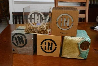
Every year, the cube is manufactured from a different material. It’s been aluminum, concrete, cardboard, acrylic, ceramic and wood and is always roughly 5 inches.
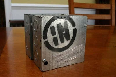
The final prototype for the 2008 InShow Cube.
This year’s cube
The cube for the 14th Annual InShow was manufactured out of electrical boxes and carriage bolts.
I actually built the prototype for this year’s show as a backup for last year. The wood cubes had been shipped, but there was a slight possibility they would not arrive in time for the Gala. So I went to Home Depot and assembled a quick prototype from off the shelf parts. Something we could assemble quickly if the wood awards did not arrive.
However, the wood cubes did arrive in time, so the electrical box prototype was saved for the 2008 show.
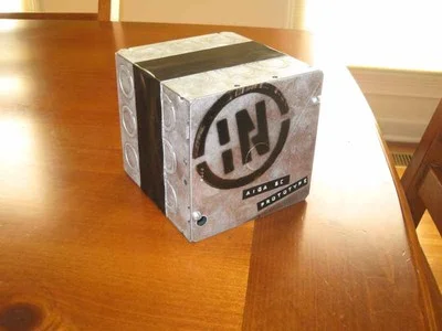
Original prototype with duct tape hiding gap in the center and black labeling.
The challenge of the custom award
I was at least partially involved with the last five cubes: cardboard, acrylic, ceramic, wood and now electrical box cubes. And I’ve learned a lot from the process. There are several specific challenges to building a custom award.
Find a material. For the InShow cube, we use a new material every year. And every year, we go through a bunch of concepts and ideas. The cube needs to have a certain aesthetic value - after all it is an award - so the material needs to look nice when completed. And budget is an issue, too. An expensive material or process can completely throw the budget off.
The parts for the electrical box cubes came off the shelf from local hardware stores. We debated a few finishing options - like using duct tape to hide the gap between the boxes or some different combinations of parts. But in the end, we went with the cleanest execution of the concept.
The last five InShow cube prototypes.
Now make 60. It’s one thing to make a prototype. It’s another thing entirely to make 60 awards. Whatever concept you settle on has to scale. Building 60 cubes can be a massive undertaking, especially if you don’t think it through completely. Part of the design process is figuring out the most efficient way to build a larger quantity.
However, 60 is also too small of a number to be efficiently produced using a large-scale manufacturing process. So much of the work is done by hand.
The only scale related issue with the electrical box cube was finding enough electrical boxes. This is not a commonly used box size and is not stocked in large quantities. And with 2 boxes per cube, we were looking for 120 boxes. I had to buy all the stock at three different hardware stores to find enough boxes.
Whose award is it? The hardest and most time consuming part of building a custom award is personalization. The award has the name of the winning firm and title of entry. We also have a handful of judge’s awards that need to look a little different than the regular award.
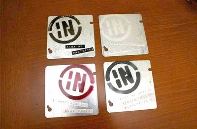
I used a Dymo 3-D label maker to put the names on the awards. On the prototype, I used black labels and spray painted a black InShow logo. I wanted the label to look more intentional and so I experimented with different combinations. I finally settled on silver labels - which meant I had to spray paint the completed labels. I was a little more time consuming, but I felt the more subtle effect from silver labels on the silver box was worth the extra effort.
I changed the color of the InShow logo from black to dark gray (although most people still thinks it looks black). The special judges awards sported magenta logos - an accent color we picked up from the Call for Entries mailer.
Four prototype faceplates for the awards.
So what’s next?
I have no idea.1 Lots of concepts have been thrown around, and every year, it becomes that much harder to find another concept. But inevitably, someone will come up with a material and an execution that will work.
Okay, I have a few ideas. And even a few more prototypes… ↩︎
AIGA Gain Conference.
Shot of the stage from back center.
Originally published on Flickr.
Sagmeister with Egg. Sagmeister with one of Marius Valdes’ Egg Shotskis.
Originally published on Flickr.
Espresso on a rainy day. Shot of a neon sign from inside a car.
 From left to right: MacBook (2008), iBook (2004) and Powerbook G3 (2000)
 From the side, you can really see the size difference between the boxes.
 That Powerbook G3 on the bottom looks massive compared to the newer models.
 Kodak Instant Print of a future art director on his Big Wheel. (Taken with an iPhone.)