This post was originally posted on February 5, 2010 on Sketchbook B. It’s reposted here as part of a project to move some of my favorite writing to my new site.
NOTE: While this page may have useful insights, be aware that it was published more than 10 years ago and may not be relevant for current software versions.
I’m primarily a print designer. So when it comes to linked files in InDesign, I need to know two main things – what is the color space of the linked file and what is the resolution of the file. InDesign CS4 makes it easy to find this info. If you click the arrow in the lower left hand corner of the Links Panel, you’ll see a link information box that gives you all sorts of data about the selected link including color space, actual PPI and effective PPI. (Actual PPI measures what the resolution of the file in its native form. Effective PPI calculates the output resolution based on how it is scaled within InDesign.)
It’s great and very handy, but you can only see one link at a time. And if you are trying to scan a document quickly to find low-res or RGB files, you still have to click on each link. Thankfully, Adobe offers another option. On the Links Panel, go to the flyout menu and select “Panel Options.”
Select “Panel Options” from the flyout menu…
…and you can fully customize the appearance of your Link Panel.
Here you can customize what information is shown in the Link Info Box AND you can add information to show up in the Link Panel itself. Very handy for scanning a document quickly.
Link Panel showing color space and effective resolution.
This post was originally posted on November 12, 2009 on Sketchbook B. It’s reposted here as part of a project to move some of my favorite writing to my new site.
I went to Subway last week. I don’t typically eat at Subway, but there is one by my office and I didn’t have much time for lunch. As I walked in, on the door, there was a window cling encouraging me to order soup with a combo. When I got in line, I looked up and there on the menu was an ad encouraging me to order soup. At the register there was another sign.
So I ordered soup.
I grabbed a seat. And realized I didn’t have a spoon. I looked up by the straws and napkins. There were forks and knives, but no spoons. So I asked the woman behind the counter – the same woman who sold me the soup – if they had any spoons. After asking another employee, she confirmed that they had no spoons in the restaurant.
The big picture
It seems both silly and odd that a franchisee would go to all the trouble of putting up all the signs and ads and then mess up something as simple as having spoons.
But I think this type of thing is very common in business. Often, we see people obsess over seemingly insignificant details, only to completely overlook a major issue. They work on the details and lose sight of the big picture.
As designers, we see this a lot.
Clients spend time and energy critiquing minor elements of a design, but often forget to shore up the logistical issues that support a campaign. Marketing and design are critical, but so is customer service and support. Think about my Subway story for a second. The marketing worked. I entered the store. And I purchased soup. However because of a minor – but critical – oversight, I was a dissatisfied customer.
Social media and a lack of spoons
Right now, social media is all the rage. Everyone seems to be talking about how social media can help their business. Worrying that they’ll be left behind if they aren’t on Twitter or Facebook. Consultants are aggressively selling social media services.
But I fear many of these folks are losing sight of the big picture. Social media is a tactic. And yes, it can be an effective and powerful tactic. But as companies develop their social media plans, they cannot forget that it is just the beginning of the customer relationship. Strategically, you need to think through the entire customer experience. What are you going to do with your customers after you reach out to them through social media? How do you want to engage your customers on a continuing basis?
I’m not saying social media is bad or that it isn’t important. There are absolutely uses for social media in business and marketing. Just remember that the social media tactics are only the beginning. You and your company need to prepare for a long-term customer relationship.
Or in other words, when you decide to sell soup, make sure you are ready to provide spoons.
Bob Wertz is a creative director, type designer, Ph.D. student and researcher living in Columbia, South Carolina. He’s been blogging since 2008.
This post was originally posted on October 6, 2009 on Sketchbook B. It’s reposted here as part of a project to move some of my favorite writing to my new site.
NOTE: While this page may have useful insights, be aware that it was published more than 10 years ago and may not be relevant for current software versions. Sadly, links to other resources might be broken.
I received a file containing 100 pages of information in a table. The table needed to be placed into InDesign. No problem…
Well, of course there was one problem. Randomly, the lines began with spaces. Not every line, but most lines. So the left edge of the table looked ragged. So how do you take out random spaces at the beginning of text? In a table? Without doing it manually? (Because I have much better things to do than going through a 100+ page document line-by-line…)
What is GREP?
In InDesign CS3 and CS4, you can choose to do GREP find and change. GREP is a text search function originally written for UNIX. Basically, it lets you look for patterns and allows you to do find and replace based on those patterns.
So back to the random spaces…
What I had was a pattern. Find all spaces at the beginning of the paragraph and replace with nothing. GREP was the perfect solution.
Next to the find and change fields are flyout menus (marked with “@”) that give you shortcuts to all of the variables. For example, go to “Locations>Beginning of a Paragraph” and InDesign inserts a “^” into the field.
So I typed “^ ” (there is a space after the ^) in the “Find what” field – which tells InDesign to find one space at the beginning of any paragraph. I left the “Change to” field blank, clicked “Change All” and several thousand instances were changed instantly. Without having to go through line-by-line…
EDIT: Above, I set up the search with the ^ (to find the beginning of the paragraph) and a space after it. And while it works, a reader pointed out correctly that a better search would have been “^\s+” which would have found one or more spaces at the beginning of a line.
What else can GREP do?
I’ve used GREP to replace dashes or periods at the beginning of lines. And GREP is perfect for standardizing the formatting of a phone number across an entire document. GREP is amazingly powerful and you can build a GREP search for anything with a pattern. I’ve only scratched the surface…
You can save queries to be reused. (Several sample searches – including a phone number formatting query – are already saved as a sample searches in InDesign. It’s located at the top of the dialog box.)
InDesign also lets you apply GREP-based character styles – for example, telling it to find all prices in a document and apply a particular style.
It’s probably not for everyone.
You aren’t going to need GREP find/change unless you are doing some pretty heavy duty, long document work like magazines, catalogs and directories.
I’m pretty sure most InDesign users aren’t doing that kind of work. But if that type of project comes across your desk, keep in mind that GREP might be a great – and time-saving – solution for your project.
More resources
Want to learn more about what GREP can do for you? If you do a search for GREP, there are lots of resources out there. Two that I have found helpful:
This post was originally posted on July 29, 2009 on Sketchbook B. It’s reposted here as part of a project to move some of my favorite writing to my new site.
NOTE: While this page may have useful insights, be aware that it was published more than 10 years ago and may not be relevant for current software versions.
So let’s say you have a long text to place into InDesign – a magazine article or a training manual. In talking to some friends who are InDesign users, many of them place the text one frame at a time. But it can be so much easier than that…
Enlargements of InDesign’s text placement cursors. The cursors (and functions) change depending on what additional modifier keys are pressed. From left to right: Manual (default), Semi-Autoflow (Option/Alt), Autoflow (Shift) and Fixed-Page Autoflow (Shift + Option/Alt).
Default behavior…
When your cursor is loaded with text in InDesign, you can place the copy by clicking or by drawing a text box. You load your cursor by going to File>Place or by clicking on a text frame’s overset indicator (the red plus in the lower right “out port”).
If you click on the page, a text frame is created to fill either the page margins or a single column. (You set the margins and column settings when you open a new document.) If you draw a text frame, the text fills the new frame.
One more thing to note about the default behavior. When you are done placing the text, the tool reverts back to what it was before you went to File>Place. So if the Rectangle Tool was selected when you loaded your cursor, after you place the text, the tool becomes a rectangle again. Most of the time, that’s exactly the behavior you want.
Hold down the option key…
(Or the Alt key for you Windows users) If you are placing a long piece of text, you may want to draw a few text boxes and have the story flow between them. In this case, the default behavior of reverting back to original tool is irritating because it forces you to keep switching tools.
However, if you hold down the option key, the cursor stays loaded. You can continue to click or draw frames and the copy with automatically flow between them.
Or the shift key…
So let’s say you have a long training document that’s going to be several pages. When you place the copy, you keep having to add pages and link the text frames. If only InDesign would add the pages and frames for you…
Well, it can. Hold down the shift key when your text is loaded and click. InDesign will autoflow the copy, adding pages and text frames for the entire length of the copy.
Note: If you hold down the shift key and try to draw a text box, the default behavior kicks in and the tool reverts to what it was before you placed the text.
Use the shift key and the option/alt key together…
If you hold down the shift and option keys at the same time and click, InDesign autoflows the copy for that spread only, but it leaves the cursor loaded. If you draw a new text frame instead of just clicking, the copy doesn’t autoflow, but the cursor does stay loaded.
This post was originally posted on July 18, 2009 on Sketchbook B. It’s reposted here as part of a project to move some of my favorite writing to my new site.
So I’ve been at TypeCon 2009 in Atlanta for the last day and a half. Here are some of the highlights from preliminary workshops and the first full day of sessions.
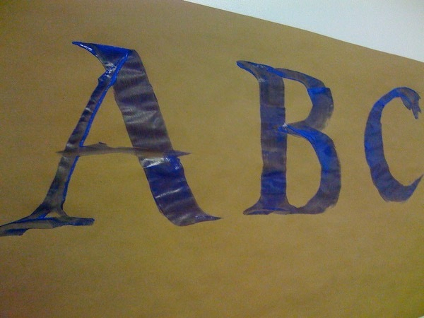
Historical Calligraphy – This workshop focused on the calligraphic roots of modern letter forms. To demonstrate the process, the instructor, Joey Hannaford – covered the walls with paper and we experimented with letterforms on a large scale with foam brushes and tempera paint. A really engaging way to teach the relationship between historical and modern forms.
A great way to teach the calligraphic roots of modern lettering. On a large scale…
Hatch Show Print – I’ve seen Jim Sherraden’s lecture twice before when he visited AIGA South Carolina. He has expanded his normal presentation and it’s more inspirational than ever. He’s a great guy and the presentation is amazing.
Gail Anderson from SpotCo – Gail gave a delightful talk about her love of type and her history. She also gave a preview of her upcoming book with Stephen Heller, New Ornamental Type, and showed some fascinating typographic videos done by her students. Great presentation.
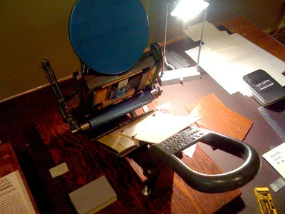
The “Playroom” – Local Atlanta printer Jessica Germaine brought in her gear to allow TypeCon attendees to experiment with letterpress printing. We were able to use three small presses and a selection of metal and wood type.
Printing my notecards on a small letterpress.
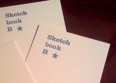
Jessica walked us through all the details and helped with the process. I was able to select and set my type and made some Sketchbook B notecards. I’d never had an opportunity to work with letterpress and the whole experience was amazing.
My completed notecards.
Coming Up – I’m looking forward to the next two days of sessions. Lots of stuff on the schedule, including… Armin Vit from Under Consideration will be talking about the TypeCon identity for this year. REM’s Creative Director Chris Bilheimer (and a former AIGA South Carolina speaker) was added to the agenda. Also on the schedule is a two hour panel discussion on web typography with a various foundries and designers. I’ll post more highlights as the weekend progresses.
Practicing my ABC’s. Experimenting with calligraphic letterforms on a large scale in a pre-TypeCon Workshop.
This post was originally posted on July 6, 2009 on Sketchbook B. It’s reposted here as part of a project to move some of my favorite writing to my new site.
A few months ago, I came across Ponoko, a New Zealand-based online fabrication service and marketplace. People make everything from jewelry to furniture. Ponoko offers a marketplace where people can sell products or plans.
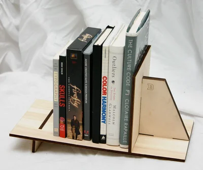
I decided to make a small bookshelf for my office based on a bookshelf I made in Shop Class in the seventh grade. After signing up for a free account, I downloaded the “Making Guide” that explained the whole process.
My bookshelf, assembled, with an assortment of books and DVDs.
Basically, you upload an Illustrator EPS with your cuts and pick your material. They laser cut the material and ship it to you. Using their template, I marked my cuts on an Illustrator file. You use different line colors to mark cuts and burns. Once I was done, I uploaded the file to their server and selected materials. Materials include various types of wood, acrylic, metal, felt, leather and cardboard.
I had one minor problem when ordering. I planned to have the piece made at their San Francisco shop to save on shipping. So I designed the shelf to use 6mm bamboo that was only available from the San Francisco shop, but when I went online, I could only use the New Zealand facility which didn’t have the material I wanted. (The San Fran shop is relatively new and I’m assuming, slammed.) So I had to change to another 6mm material - an Italian Poplar plywood - and pay a little extra for the shipping.
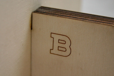
A close-up of the laser burning, The edges are darker from the laser cutting. The “B” is burned in at medium strength.
It was a few days before they started processing the job. But when they started working on it, everything progressed quickly. And once the shipped it, it once took three days to get here from New Zealand. (And I didn’t pay for express shipping.) Total time from order to arrival was about two weeks.
I opened the box and started to assemble it. When assembling, I figured out that I made a couple of very minor measurement errors that made a couple of pieces a tight fit. A little sanding and filing and everything fit.
Based on the prototype, I’m going to make some changes to the design. The slots need to be slightly bigger. And with heavier books, there is some slight bowing, so I’m going to modify the support under the shelf. (Or look at a thicker material).
If you are interested in designing and creating 3-D objects, I highly recommend looking into Ponoko. The online experience and process is very well thought out. Everything is documented so it’s very accessible to designers who maybe aren’t familar with the fabrication process.
Update on 2009-07-08 13:10 by Bob
So, it’s really easy to switch to the San Francisco location… I was just looking in the wrong place. I just published a follow-up post to explain how to switch between fabrication locations.
This post was originally posted on June 1, 2009 on Sketchbook B. It’s reposted here as part of a project to move some of my favorite writing to my new site.
One of the defining design characteristics of a ship in the Star Trek Universe is the forward viewscreen. And in the J.J. Abrams reboot of Star Trek, the entire concept of the viewscreen has also been reimagined.
By looking at how our vision of the future has evolved, we can often learn more about how we as a society have changed. And I think by looking at how the concept of the viewscreen has changed over the last four decades, I think we can draw some conclusions about how we have changed as culture and where we are going.
The new Enterprise viewscreen display various data, including speed. Image via startrekmovie.com. Copyright Paramount/CBS.
The Original Viewscreen
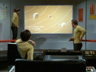
In Gene Roddenberry’s original Star Trek TV Show, the view screen was primarily a giant screen showing the outside. Very rarely, the screen would be used to show scientific data.
A rare instance of the original Enterprise using its viewscreen to display data from the ship’s computer. Image via Memory Alpha. Copyright Paramount/CBS.
At the time, in the late 60’s, that concept was enough to seem futuristic. TV’s were still a relatively young technology. A screen that size providing live pictures with the ability to show content from the ship’s computer… That was the future. Computers were room-sized devices with limited capabilities. The whole concept would have seemed very advanced.
The expectation was that interaction with a large viewscreen would be passive. It was something to watch, more like a TV than a computer interface.
To the big screen and back to the small screen
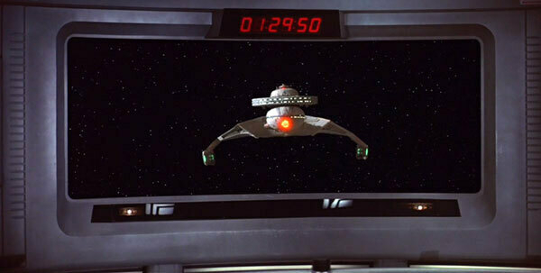
When the Star Trek series moved to the big screen in the late 70’s and into the 80’s, the viewscreen concept was only slightly refined. The expectation was still that the viewscreen provided a passive experience. Some odd touches were added, like a digital clock over the screen.
Nothing says the future like a digital alarm clock. Image via Memory Alpha. Copyright Paramount/CBS.
With the success of the movie franchise, Star Trek: The Next Generation launched into syndicated television. Because the series took place even further in the future, they took the established concepts and “enhanced” the technology. The viewscreen evolved, but only from a technical level. The screen was now “holographic.” (Note: I’m assuming this means the images were more realistic.)
The way the crew actually used and interacted with the screen was still passive and static. And through the three series that followed, the viewscreen never really did much more than provide pretty pictures.
Reimagining the Viewscreen
When Abrams and crew started work on the reboot, they faced a challenge of honoring the style of the past and while projecting a modern, futuristic feel:
We had the weird challenge of having to take a 43 year old vision of the future and make it a current vision of the future. I wanted the movie to feel as tactile and tangible and as real as possible, but given what our computer interfaces are like now, its preposterous to assume that hundreds of years from now there won’t be some version of holographic screens and things that seem almost ubiquitous now in science fiction.
-Abrams in an interview with Memory Alpha
We as a culture have evolved to expect more from our “viewscreens.” Many of our TV channels have crawls and information graphics. Look at what CNN produced during the elections or what ESPN News does on a daily basis. Our computers provide constant updates. Even our cars and phones have interactive interfaces. We expect modern screens to do more than just show us pictures. We expect them to inform us.
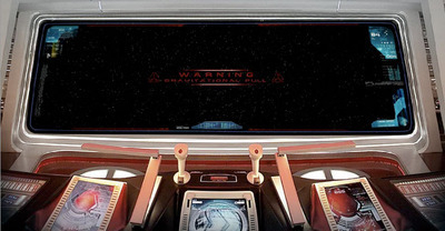
The new Enterprise viewscreen displaying a warning. Image via startrekmovie.com. Copyright Paramount/CBS.
That old concept of a passive viewscreen has been discarded in the new Star Trek movie. The giant viewscreen acts as a heads up display for the ship. Warnings, current speed, the health of the away team, status of the ship and more appear over the top of the screen. And the information that is provided is contextual, only appearing when needed or applicable.
We have become a viewscreen culture
Looking at the new Star Trek viewscreen, it feels futuristic. And what that really means is that it feels like a radically advanced version of where we are now.
I think that we have become a viewscreen culture. We have become comfortable interacting with screens in a way that wasn’t comprehended in the late 60’s and wasn’t fully understood even in the 80’s and 90’s. In fact, we are more than just comfortable. We now expect our screens to provide us information and feedback.
As the web, digital television, phones and computers evolve, our cultural expectations of the screens and surfaces around us with continue to change and evolve. We as designers are already starting to see this. People expect more from their web sites and other digital interfaces. They expect these tools to interact with them. To provide the information they need when they need it.
What designers need to remember is that this is just the beginning. People will continue to become more and more comfortable with screen-based content. And we must continue to push the limits of the medium to provide the interaction and capabilities that our society is beginning to expect.
Bob Wertz is a creative director, type designer, Ph.D. student and researcher living in Columbia, South Carolina. He’s been blogging since 2008.
This post was originally posted on May 5, 2009 on Sketchbook B. It’s reposted here as part of a project to move some of my favorite writing to my new site.
NOTE: While this page may have useful insights, be aware that it was published more than 10 years ago and may not be relevant for current software versions.
I mentioned a few weeks ago that in InDesign CS4, you could use nonbreaking hyphens and spaces to control bad breaks in phone numbers and proper names. And you can, but this week, I discovered an even easier technique.
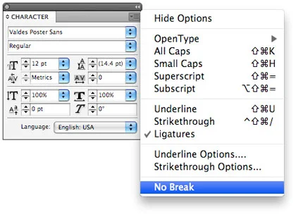
Step one: Highlight the text you want to keep together.
Step two: Go to Character Palette and from the flyout menu, select “No Break.”
And that’s it. I’ve looked back and this feature is in CS3 as well. It’s probably been there all along and I’ve never noticed…
This post was originally posted on May 5, 2009 on Sketchbook B. It’s reposted here as part of a project to move some of my favorite writing to my new site.
I had the privilege of moderating the AIGA South Carolina Web Panel discussion a few weeks ago. The panel featured a number of local web designers and developers - Gene Crawford and Jay Berry from Period Three; Matthew Smith from Squared Eye; Jason Beaird, Greg Lunn and Ken Seals from Cyberwoven; and AIGA SC Vice President and hired gun James Miller.
We had a really fascinating discussion about trends in web design and how web designers work. A few quick reflections:
Continuing education. The web is constantly changing. And for web designers, that means that they need to keep up with the most current techniques and methods. Most use internet resources to keep up with new concepts and the web design industry has essentially created a virtual cooperative to share information online.
Personally, I think this commitment to continued learning and sharing is one of the most fascinating parts of the web development community. I feel like the online print design resources are focused mainly on inspiration. The web community has managed to merge the inspiration element with technical knowledge and information on best practices. There really seems to be a dedication to improving the quality of the industry as a whole.
Side projects. Pretty much everyone on the panel has a side project. Matthew has Pattern Tap. Gene and Jay have Unmatched Style. Jason has Publix for Pennies. As I look around at other established web professionals, they all seem to have developed side projects as well. The goals for these side projects are very rarely profit. These projects are essentially client-less projects that allow for exploration and experimentation. A chance to use the skills that you have learned to contribute back to the community in some way.
(Honestly, we really don’t have an equivalent to these side projects in the print design world. The printing process is so expensive, you really need to have some sort of client to foot the production bill… Our closest parallel is probably working pro bono.)
IE6 sucks. Really, if you are still using Internet Explorer 6, upgrade now. Firefox and Safari are fine options. And free…
Client relationships. In the print world, client relationships are often simple transactional affairs. There is a project beginning and a project end - usually resulting in a deliverable of some sort. In the web world, you have to find a way to deal with the ongoing maintenance of the site and other issues like hosting and email. With web work especially, a good contract is vitally important.
The panelists were going to pool a number of resources and publish them online. I’ll link to them as soon as the list goes live.
Stone details. Stonework outside the Wade Hampton Building at the South Carolina Statehouse.
Originally published on Flickr.
Caffeine Free Diet Mountain Dew. Seriously, what’s the point?
This post was originally posted on March 17, 2009 on Sketchbook B. It’s reposted here as part of a project to move some of my favorite writing to my new site.
NOTE: While this page may have useful insights, be aware that it was published more than 10 years ago and may not be relevant for current software versions.
I tend to use a lot of solid color blocks in my designs. One of my favorite tricks in InDesign CS4 is to create a type of vignette using the “Basic Feather” effect. (You can actually do this in CS3 as well.)
Sample of boxes with and without the vignette highlight.
Create two boxes, one on top of the other. The top box should be slightly lighter than the one underneath it. For easier editing, make the rear box a little bigger than the one in the foreground.
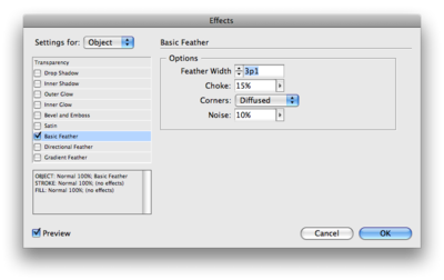
Apply the Basic Feather (Object > Effect > Basic Feather) effect to the top box… and instant vignette. Adjust the size of the feather, noise, choke and corner types to tweak the look.
The options dialog box for the “Basic Feather” effect. (Click the image to see the box at full size.)
I used Photoshop for this effect for years, but every time you changed the size of the file or area, you had to go back to Photoshop and render a new file. The InDesign method is faster and more flexible.
And in case you are wondering, I’ve sent files to press with this effect many times without problems. Adding a little bit of noise will limit any banding you might see on press. I’ve got a few other variations on this using photos and blend modes that I’ll try to post soon as well.
This post was originally posted on March 16, 2009 on Sketchbook B. It’s reposted here as part of a project to move some of my favorite writing to my new site.
Journalism was my first love. Eventually, working with newspapers led me to my love of design and to my current career. The newspaper will always have special significance to me.
But the newspaper as we know it is dying.
I tell my students every semester that newspapers have survived the introduction of radio, television and 24-hour news coverage. They’ve changed and adapted, but newspapers have survived. But with the closing of the Rocky Mountain News and significant cutbacks in the newsrooms around the country, the verdict is out on whether the newspaper industry can survive the growth of the internet.
The only way for the industry to survive is for the journalists to become entrepreneurs.
How did we get here?
In the not so distant past, newspapers were locally owned (and often family owned) businesses. Their primary objective was to serve and educate their community. Newspapers were a primary advertising outlet and were profitable.
Corporations started gobbling up these papers to form massive media conglomerates. They used their size to leverage efficiencies and become more profitable. With size also comes the inability to change easily and respond to competitive threats - like the internet.
As more and more readers got connected to the internet, subscriptions started to drop. And as subscriptions dropped, revenues from ad sales decreased. This forced the papers to cut back on staff and the size of their publications. The perceived decrease in quality causes more people to drop subscriptions… and the death spiral continues.
So what is next?
The continued decline of the newspaper will leave a void. Newspapers are excellent at providing in depth and investigative reporting. And local papers provide news that you can’t get from national or regional outlets.
Where there is a void, there is demand. And where there is demand, there is opportunity.
Many of the journalists getting laid off across this country are brilliant, capable people. And most of them have a love for what they do… It’s not a job, it’s a calling. They’ll want to continue to cover the news.
To continue to cover the news, they will need to become entrepreneur journalists. Starting their own outlets and news services. Figuring out where the demand is and creating a product that readers and advertisers will embrace. Creating products that marry the internet with the printed page. Finding a business model that will be profitable and serve the community they are in.
Unlike their corporate counterparts, these entrepreneur journalists can be agile and quick to adapt. They can experiment. Like all startups, many will fail. But someone will figure out how to adapt the newspaper to today’s competitive environment and be profitable. And eventually, the industry will be reshaped and the newspaper will survive.
It just won’t be the newspaper as we have grown to know it.
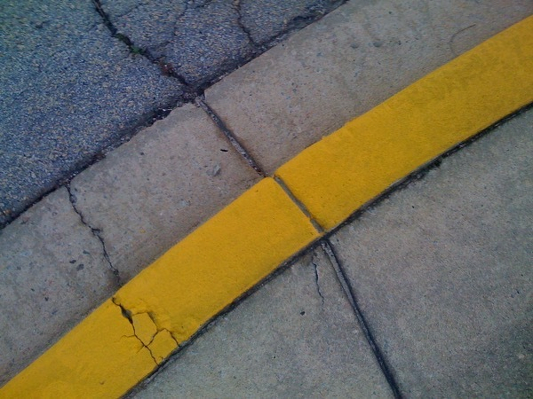
Rough curb. Waiting for my wife, I looked down and found this…
Originally published on Flickr.
Palmetto on Isle of Palms. Beautiful blue sky with some palmettos in the foreground.
Originally published on Flickr.
Tide coming in at Isle of Palms in South Carolina
Originally published on Flickr.
Moon over the beach at Isle of Palms in South Carolina.
This post was originally posted on January 7, 2009 on Sketchbook B. It’s reposted here as part of a project to move some of my favorite writing to my new site.
I finally got around to entering the Save Polaroid t-shirt contest that I mentioned a few weeks ago. Save Polaroid will be selecting finalists and readers will be able to vote for their favorites. I can’t wait to see what other designers came up with…
Design on t-shirt template from Save Polaroid.
As I thought about Polaroids, the main thing that came to mind with the iconic nature of the print itself. So I played off that and created a type treatment with a Polaroid print as the “o.”
Close up of the type treatment.
The letter designs take their proportions directly from the print itself. The stroke is based on the width of the sides and top of the Polaroid print. And the width of the “C” and “N” is equal to the width of the print.
 Select “Panel Options” from the flyout menu…
 …and you can fully customize the appearance of your Link Panel.
 Link Panel showing color space and effective resolution.

 Enlargements of InDesign’s text placement cursors. The cursors (and functions) change depending on what additional modifier keys are pressed. From left to right: Manual (default), Semi-Autoflow (Option/Alt), Autoflow (Shift) and Fixed-Page Autoflow (Shift + Option/Alt).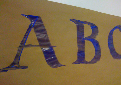
 My bookshelf, assembled, with an assortment of books and DVDs.
 A close-up of the laser burning, The edges are darker from the laser cutting. The “B” is burned in at medium strength.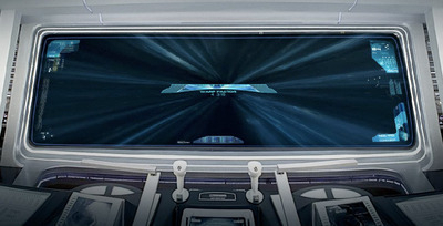







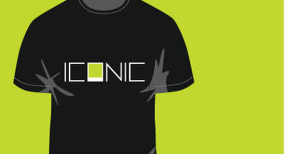 Design on t-shirt template from Save Polaroid.
 Close up of the type treatment.