Posing with mannequins.

Posing with mannequins.
Setting up your Power Macintosh G3 “minitower”
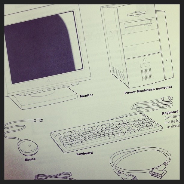
A 1997 Power Mac 6500 Restore CD.

Found in a drawer at the office: a Power Mac G3 setup CD.

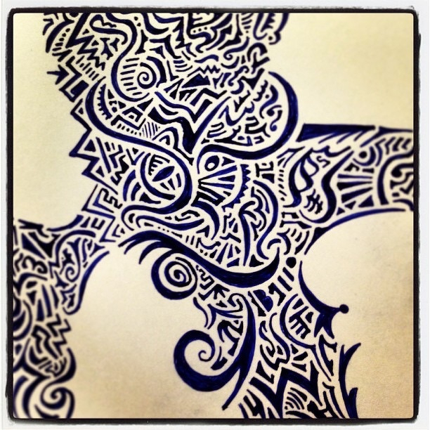
Today’s meeting sketch.
This post was originally posted on January 21, 2013 on Sketchbook B. It’s reposted here as part of a project to move some of my favorite writing to my new site.
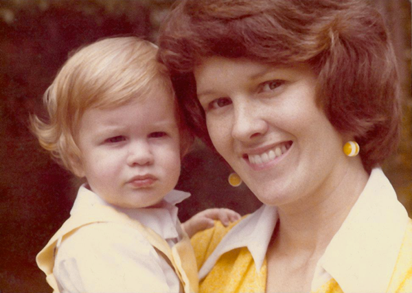
Mom and me in August 1976. Yes, that’s me with the crazy curls.
I was about to graduate from college and was at home telling my Mom about my decision to be a designer. For most of my college career, my major had been journalism or public relations. But near the end of my college career, I fell in love with design and changed my major. Mom was normally the most supportive person in the world, but that day, she was skeptical. “Bob, you don’t exactly handle criticism well.”
I thought about Mom when I read Michael Bierut’s essay Graphic Design Criticism as a Spectator Sport on Design Observer earlier this week. (If you have not read the essay, do yourself a favor and read it now.)
Michael Bierut came to speak at an AIGA South Carolina event several years back. I remember him talking honestly about the challenges of pitching work to clients. It was the first time I could remember a “rock star” designer expressing that sometimes, you are limited by a client.
It resonated with me. As designers, I think we often fall into the trap of thinking that our solution is perfect and flawless and that the client should just trust us. But it doesn’t always happen that way, even for famous designers.
Michael talks in his essay about how Pentagram spent over two years on redesigning UPS. And they never could convince them that their solution was the right one. Several years later, Futurebrand won the redesign, but their solution was widely criticized.
His point in telling the story is that he understood Futurebrand’s challenges with the UPS redesign. But I took something else from it: No matter how large and well-respected you and your firm are, you still have to convince a client that your solution is right for them. Sometimes, you will fail.
I have students and friends that absolutely explode with frustration when their work is criticized. Or when clients ask for significant changes. But this is part of the job and part of the environment that we live in today. This is part of the career we have chosen. We have to deal with the criticism as constructively as possible and move on.
Futurebrand released a redesign of American Airlines last week, replacing the iconic Massimo Vignelli mark. Personally, I love the redesign. (And I love the original.) Commentary from designers seems to be split and there are many who are harshly criticizing it. Even Massimo Vignelli. It doesn’t matter who you are, you can’t please everyone.
My mom was very astute to realize that if I was going to be successful as a designer, I needed to understand that criticism is part of the job. I’ve worked really hard to deal with criticism in a positive way and to encourage others to do the same.
My oldest daughter is very creative and interested in design or art as a career when she grows up. I’ve thought about what advice I’ll give her about criticism if that’s the route she takes. I’ve settled on this:
This post was originally posted on January 13, 2013 on Sketchbook B. It’s reposted here as part of a project to move some of my favorite writing to my new site.
After my dad retired, he got into antiques. Knowing my love for type, design and printing, he’s always on the look out for something unique. Over the years, he’s found a bunch of great wood and metal type, type drawers and other printing materials.
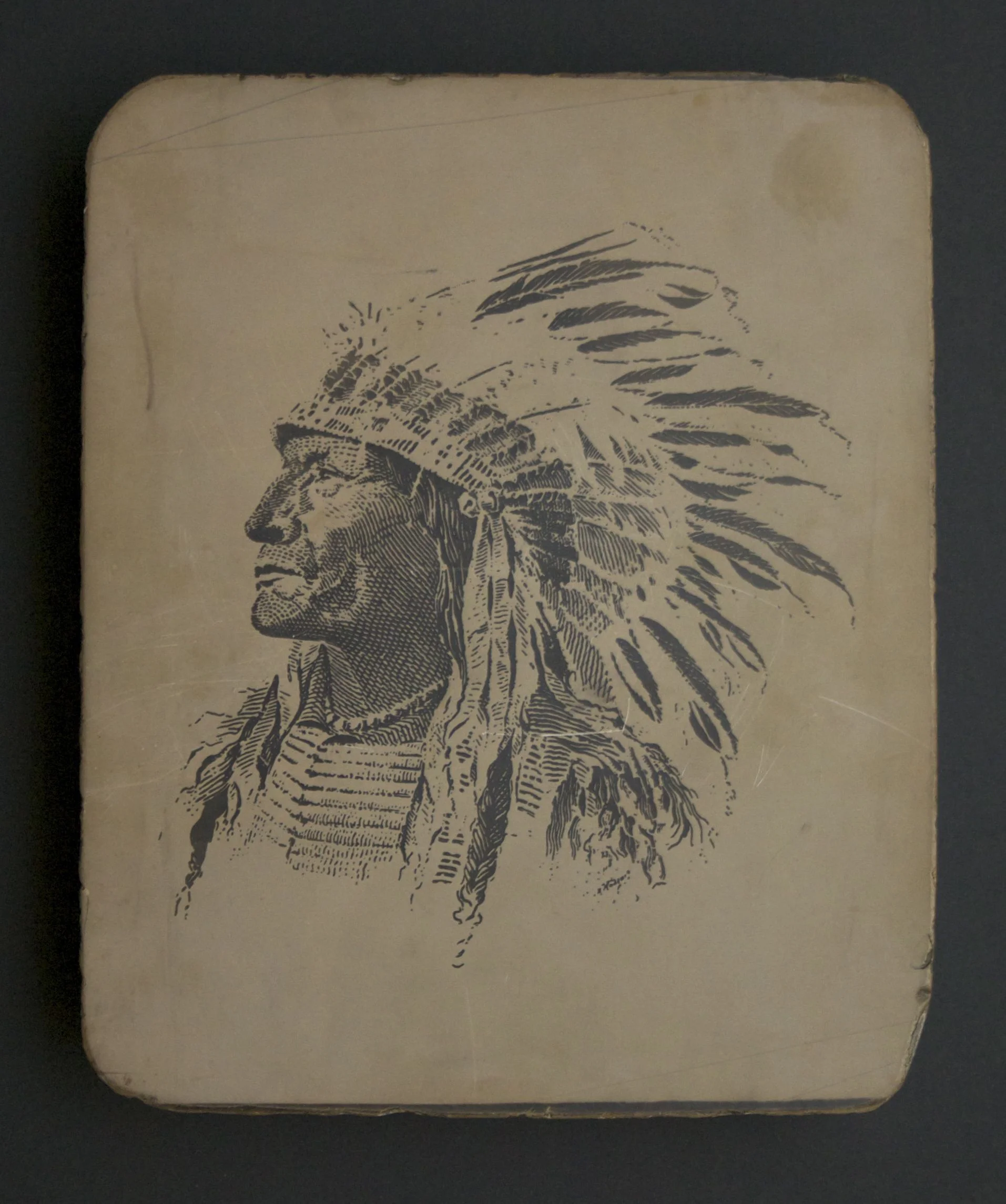
A 100-year-old litho stone. The logo for Carlisle and Co., a San Francisco printer. Note the name of the company in the feathers.
Before Christmas, he sent me an email that he had purchased my Christmas present, but wasn’t sure exactly what it was. The auction listed the lot as “printing stones” and no one really knew anything about them. He had one for me, but to get it, he had to buy the entire lot. 11 stones in all.
I knew immediately that he had litho stones. But I wasn’t prepared for how remarkable they were. (If you don’t know about stone lithography, here’s some background.)
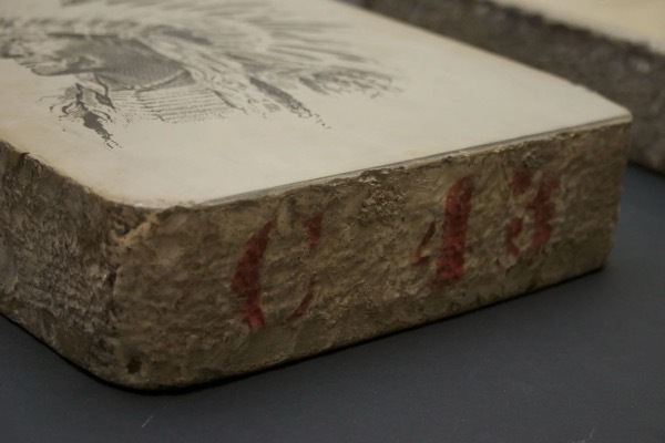
Each block is limestone and about 10 x 12 inches and about 2.5 inches deep. They weigh around 30 lbs. each. They are marked on the side with a red identification number.
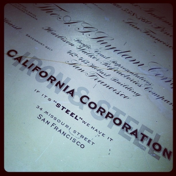
My Christmas present had a large Native American illustration on one side and stock certificates on the other side.
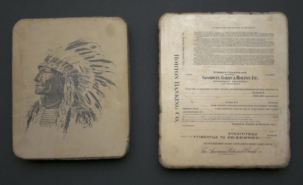
I didn’t see it at first, but the feathers of the head dress spell the name “Carlisle and Co.” A quick Google search and I was able to find A. Carlisle and Co., a printer still in operation and currently located in Reno. Thanks to a corporate history published on their 100th anniversary in 1953, I was able to find out a lot about the company, the Indian and the stones.
The corporate history, A. Carlisle and Company: The First Hundred Years is an amazing look at the history of printing, detailing the process with lots of photos of old equipment. It’s been scanned and made available through the University of California. If you are interested in printing or design, check it out.
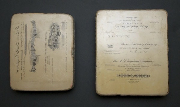
I’m going to try to research the other stones. I’ve actually only seen 2 of the 11 stones. They are an interesting snapshot of the growth of industry in California at the turn of the century. I’ll post pictures and background on them here as soon as I can catalog them all.
Interested spelling.
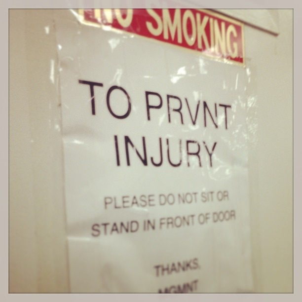
Carpet

More doctor’s office decor.

Wall decorations at the doctor’s office.

Lamp overhead.

Bricks
Floor.
Wood paneling.

Marking on the side of the stone. Well worn, but clearly an E.
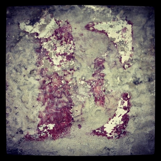
Opposite side of the litho stone.
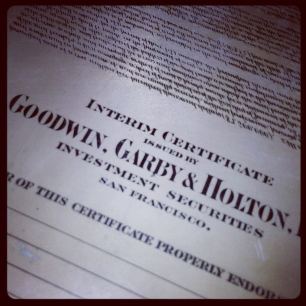
Lithography stone. Circa 1920.
READY FOR TURKEY!!!!!

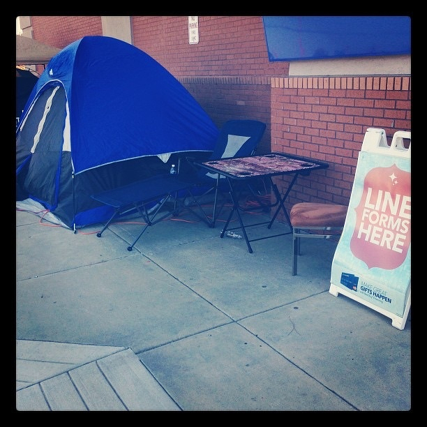
People already camped out at Best Buy. Crazy…