Found a small bag of these Zoo Valdes/AIGA SC “Vote” from 4 years ago. Go vote today!
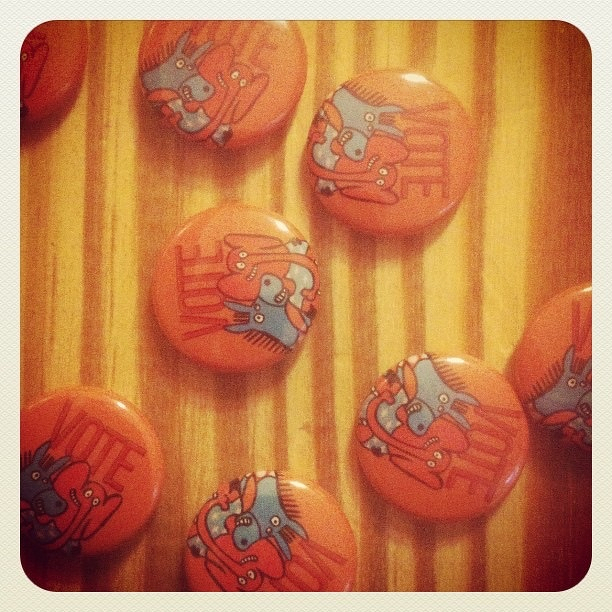
Found a small bag of these Zoo Valdes/AIGA SC “Vote” from 4 years ago. Go vote today!
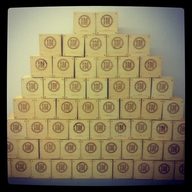
A whole lot of InShow cubes.
This post was originally posted on November 5, 2012 on Sketchbook B. It’s reposted here as part of a project to move some of my favorite writing to my new site.
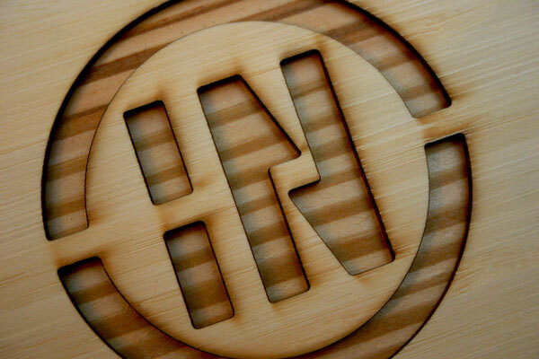 Laser cut InShow logo
AIGA South Carolina’s InShow design awards were held last weekend. The award is always a cube — constructed from a different material every year.
I’ve been involved in the design and assembly of cubes in the past, designing the junction box cube in 2008 and helping with the pillow cubes last year. So I was really excited to design this year’s InShow cubes.
Maria Fabrizo was creating the supporting materials and was taking a rustic approach. Over the years, I’ve created a small collection of rejected cube prototypes. One prototype that I had experimented with previously was a wood block, made from a 6x6 timber cut into cubes. It seemed like a perfect fit for the theme.
I looked at a couple of different ways to add the logo and winner’s information to the blocks and settled on a plan to fabricate face plates and bolt them onto the solid blocks of wood.
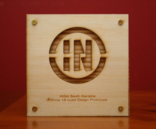 The face plate — laser cut and engraved.
I used Ponoko to laser cut and engrave the face plates, cutting the InShow logo into a sheet of bamboo plywood. And the cutting and engraving were done at one time so personalization was really easy.
Ponoko is a really interesting service — just upload an EPS file and they cut your design into a material of your choice. And they provided great service and support. (I’ve used Ponoko before. See my 2009 blog post about building a book shelf with their service.)
Once we got the face plates, we just had to screw them onto the cubes. Brynley Farr from ByFarr Design was able to get some awesome remnant wood from Southland Log Homes and had it cut into cubes. In all, we assembled almost 70 cubes.
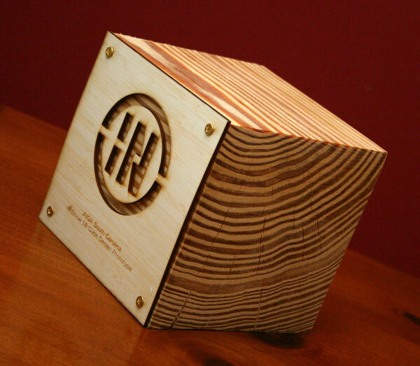 The face plates were screwed onto a solid block of wood. Check out the awesome wood grain on the side.
On the best of show and the special judges awards, the background of the InShow logos were painted — red for best of show and gold for the special judges award. (Check out this blog post from Fuzzco who won 10 cubes including best of show.)
Fence
Carpet.
Long Meeting.
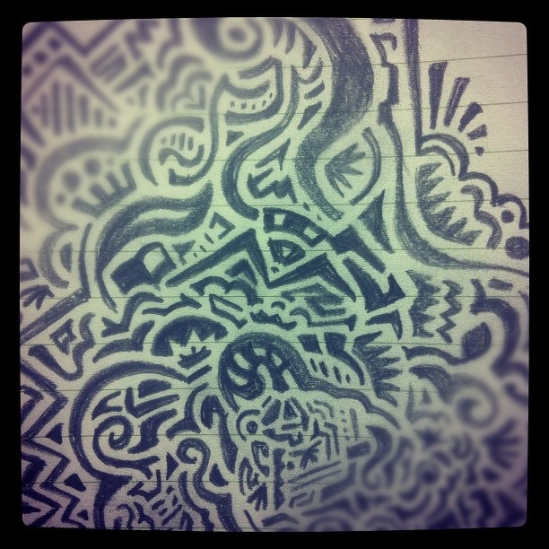
Un-square
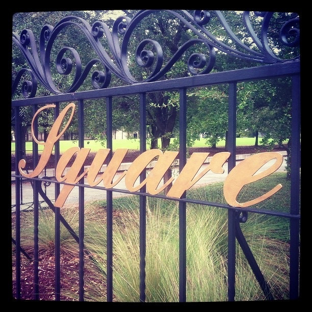
Plaque at Rutledge
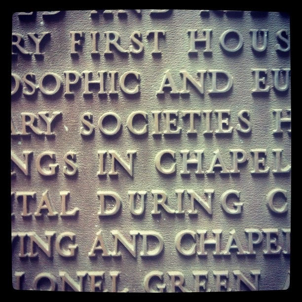
ODK in the bricks.
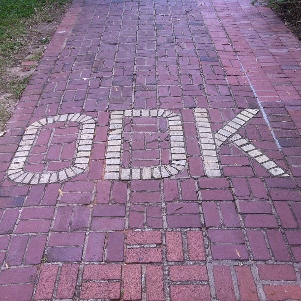
Rose Garden on the Horseshoe.
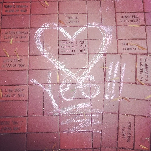
I have no idea who these people are. But I saw this on the Horseshoe at USC today.
Fell asleep in his jumper
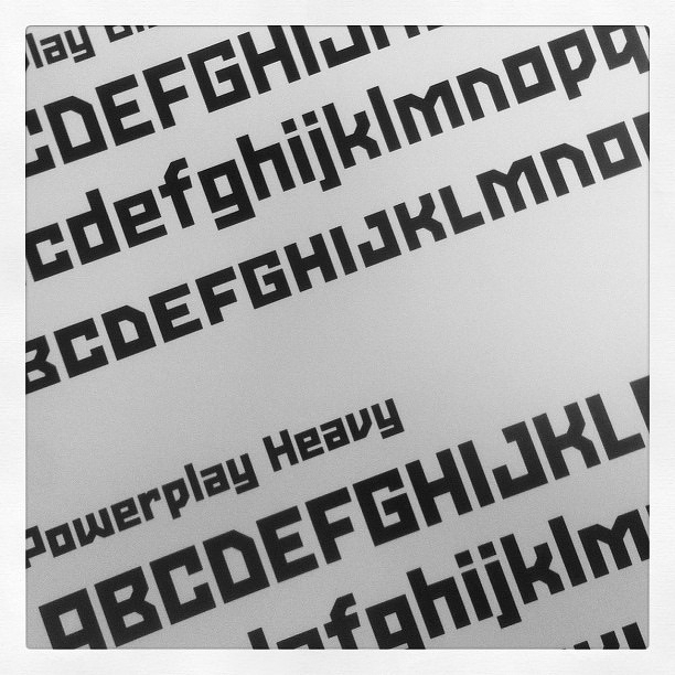
Proofing.
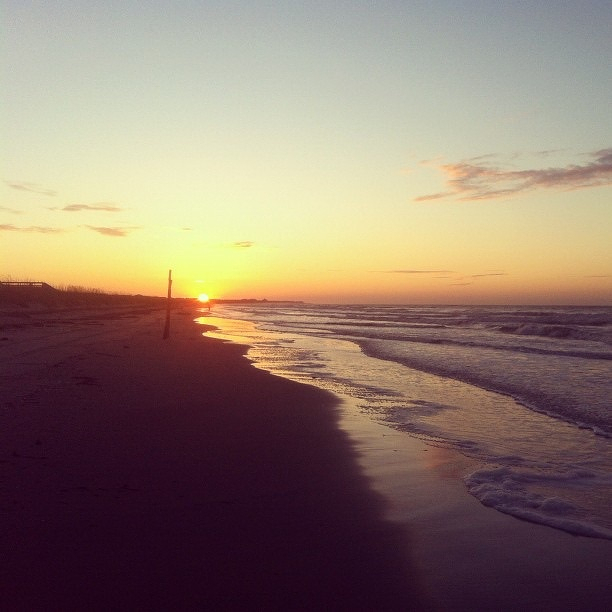
Sunrise
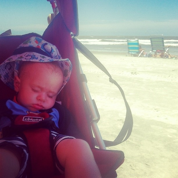
Nap
Isle of Palms
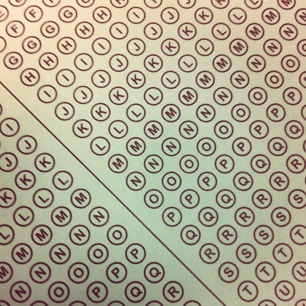
Bubble Sheet
At the pool.
Our cat isnt so sure about this crawling thing.
Just found my original artwork for my InShow 11 poster