Ryan says “HULK SMASH”

Ryan says “HULK SMASH”
This post was originally posted on September 19, 2014 on Sketchbook B. It’s reposted here as part of a project to move some of my favorite writing to my new site.
When the iPhone was released in 2007, I had never paid more than $15 for a phone. Whatever phone was free with contract was what I purchased. I simply didn’t see the point of spending significant money on a phone. But when the iPhone was announced, I wanted an iPhone. And now, 7 years later, every two years or so, I drop significantly more than $15 on the newest model of iPhone.
I’ve never paid more than $150 for a watch. I don’t wear one every day. I really didn’t see the point in investing a significant amount of money on a watch. But now I look at the newly announced Apple Watch.
And I want a watch.
I read John Gruber’s thoughts on the new Apple Watch the other day. And what he’s thinking is what I was thinking. The Apple Watch Sport will be $349 and the prices will increase significantly from there. Luckily, I like the Sport. But I really like a bunch of the other models as well — especially the stainless steel Apple Watch with Milanese Loop.
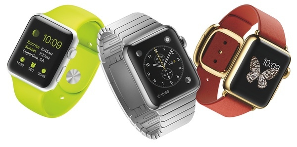
Price increases significantly as you move from left to right.
I have lots of questions about the Apple Watch. But cost really isn’t the major concern. I expect a quality device with a premium price tag. But the more expensive the watch, the more these questions impact my decision.
Will the battery charge last for the entire day? For me to buy an Apple Watch, the charge has to last for at least a full day. And then hopefully, I’ll remember to charge it every night. (I stink at remembering to charge my devices nightly.)
Will the Genius Bar become a jewelry counter? If I’m going to spend this kind of money, I want to try it on. See how it feels on my wrist. Think about the current Apple Stores. How in the world would they accommodate that type of customer interaction? They are already incredibly crowded. Will other retailers sell the Apple Watch? Can you see Best Buy selling solid gold watches? My guess is that Apple will offer the Sport through various retail channels, but the more expensive models will be sold exclusively through the Apple Store.
What will the upgrade cycle be like? Most of us buy an iPhone every two years. But that’s because it’s tied into a contract. I update my iPads and my Mac less frequently. How frequently will I upgrade my Apple Watch? For me to invest in a more expensive version, it’s going to need to last more than two years.
Can I run with my Apple Watch without my iPhone? If I want to use my watch to workout, I don’t also want to have to carry my iPhone. If all the GPS and network connectivity is in the iPhone, won’t you need both with you to take advantage of apps like Nike Plus? And who wants to run with a giant iPhone 6 or an enormous iPhone 6 Plus? If I can leave behind my iPhone and run with just my Watch, then I’m interested. Otherwise, I’ll leave the watch at home and run with my iPhone like I do now.
As we get closer to the release, we’ll discover the answers to some of these questions. I have confidence that Apple will do its best to address these issues.
I intend to buy an Apple Watch. Will I spurge and go with the more expensive option? Probably not initially. I have trouble with the idea of investing in an expensive watch that is obsolete after a few years. But just like how Apple changed my attitude towards buying mobile phones, I think they will radically change my attitude towards buying watches.
This post was originally posted on September 17, 2014 on Sketchbook B. It’s reposted here as part of a project to move some of my favorite writing to my new site.
NOTE: While this page may have useful insights, be aware that it was published more than 10 years ago and may not be relevant for current software versions.
Most people don’t know how to use tabs properly. But tabs can be really powerful, especially if you are building a form or table of contents.
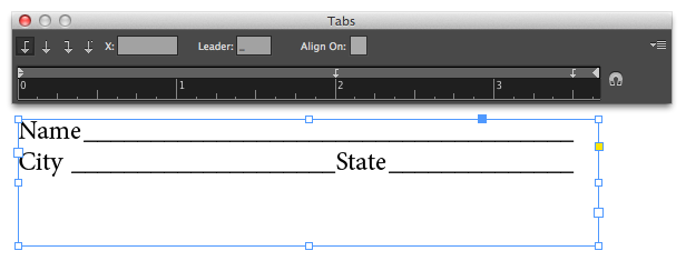
Below you see a simple form with the tab ruler above it. Select each tab and type an underscore in the “Leader” box. Whatever character you type in the “Leader” box will repeat all the way to the tab. The underscore becomes the lines on the form. Much quicker and more accurate than trying to draw the underlines yourself. And much, much easier to edit the form later.
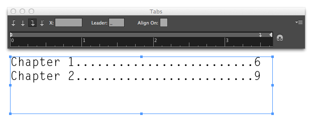
If you are building a table of contents, you may want to have a dotted line from the end of the chapter name to the page number. Don’t type a bunch of periods! Just set the “Leader” to a period. You can also use a right-justified tab to line up all your numbers correctly. Faster to build. Faster to edit.
Glasses all around.

New glasses.

This post was originally posted on September 11, 2014 on Sketchbook B. It’s reposted here as part of a project to move some of my favorite writing to my new site.
Does anyone still use TIFF (TIF/.tif) files? And if so, why? Back when I was a young designer, a TIFF file was the only real choice for exporting a high quality image. But I can’t really imagine why anyone would use one in today’s Adobe/Creative Cloud workflow.
InDesign’s support for directly placing native files – Photoshop, Illustrator, PDF and even other InDesign files – largely eliminates the need to export to another file before placing. (Although I still save logos as EPS files when they are final.) Many people don’t know that InDesign has the capability to place native files or assume that it will cause significant problems in production.
For high quality, high resolution im****ages, you can place a Photoshop file (PSD) directly into InDesign. This way you place the original image and you aren’t exporting a new TIF with each revision. One major benefit is that the PSD maintains all transparency when placed into InDesign. The only drawback I see here is that file size might get unwieldy if it’s a large image with a bunch of layers.
If you are sharing a high resolution image, a JPG will work fine. Many designers turn their nose up at JPGs because they associate them with low resolution, highly compressed web images. But a high quality JPG doesn’t have noticeable artifacts from compression and is much smaller than a TIFF.
Greyscale and bitmap files might be the only remaining use for a TIFF. When placed into InDesign, a greyscale or bitmap TIFF can be colored. So if you are wanted to colorize a grayscale image with a spot color, a TIFF is still your best option. But as 2-color print jobs become less common, I rarely use this technique for anything except screen printing.
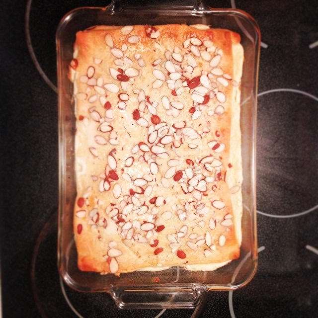
Coffee cake for the office tomorrow.
This post was originally posted on August 27, 2014 on Sketchbook B. It’s reposted here as part of a project to move some of my favorite writing to my new site.
NOTE: While this page may have useful insights, be aware that it was published more than 10 years ago and may not be relevant for current software versions.
InDesign can highlight lines of text that are spaced badly. By default, the highlighting is turned off for justification issues. To turn it on, go to InDesign > Preferences > Composition… The highlighting options are at the top of the window:
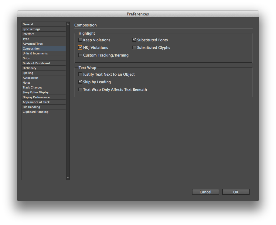
Turning on “H&J Violations” will highlight in yellow any place where InDesign can’t meet your hyphenation and justification settings. Here’s an example of a block of justified text with hyphenation turned off:
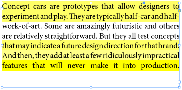
The worse the violation, the darker the yellow highlight is. Here is the same passage with hyphenation turned on:
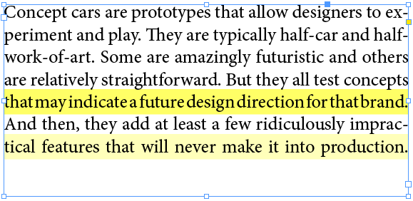
Obviously, allowing InDesign to hyphenate and handle the bad breaks results in much better spacing.
I try to avoid full justification because of the issues that almost always come up with the spacing. But sometimes, you have to justify. And when you do, it’s easier to spot and fix badly spaced lines with the highlighting turned on.
Head Ball Coach. Ready for football season.

Genius
Quick break behind the South Caroliniana Library. #uofsc

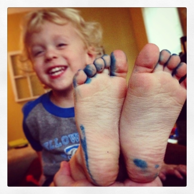
Someone traced his feet with a blue marker.
View from a balcony.

This post was originally posted on July 30, 2014 on Sketchbook B. It’s reposted here as part of a project to move some of my favorite writing to my new site.
NOTE: While this page may have useful insights, be aware that it was published more than 10 years ago and may not be relevant for current software versions.
The Wednesday Quick Tip is back with a simple Photoshop tip. I use a lot of layers in Photoshop. And so I frequently duplicate layers by selecting one or more layers and selecting “Duplicate Layer…” from the flyout menu on the Layers palette.
But Photoshop also lets you duplicate layers to other destinations. By default, the destination for your duplicate layer is set to the current file that you are in:
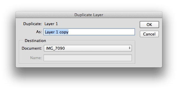
But you can change the destination to any other open file or even create a new document with the layer:
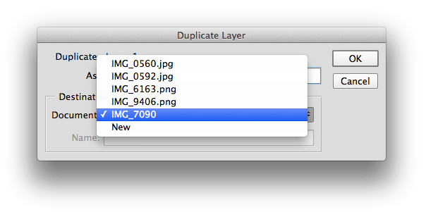
You’re not just duplicating the layer… you’re kind of teleporting it to a different file. It’s especially helpful when you want to copy an adjustment layer to a similar photo or combine a few images into a new document.
It’s a simple feature that many people don’t even notice.
Sunset

Mesa Falls

Snake River

Farm vehicles, large.

Farm vehicles, small.

Moose, Wyoming.