Reading
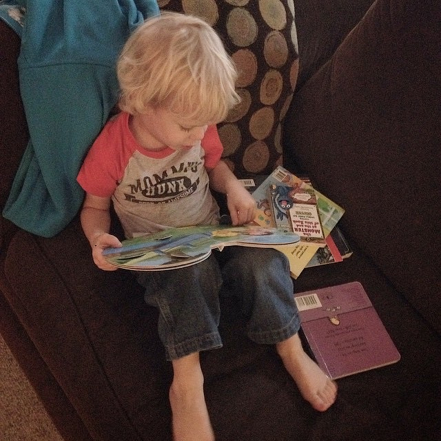
Reading
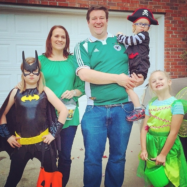
Trick or treat.
Longstreet #uofsc
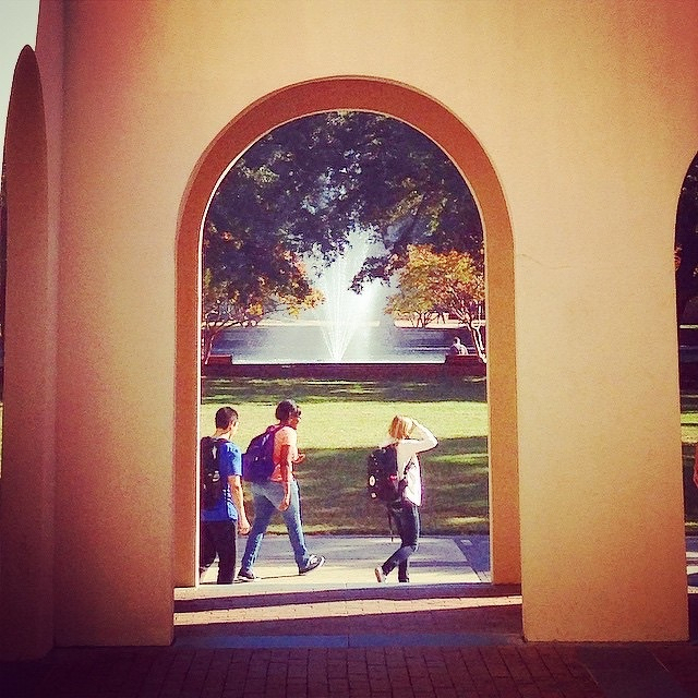
My job is never boring.
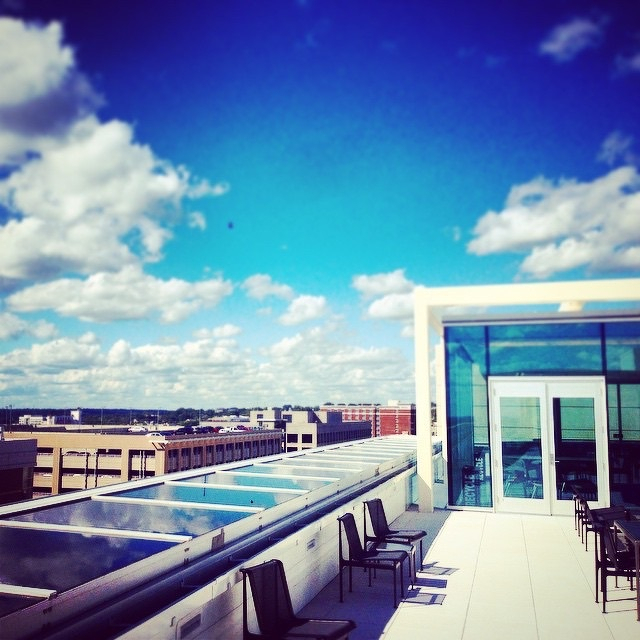
Rooftop at the new Moore School.
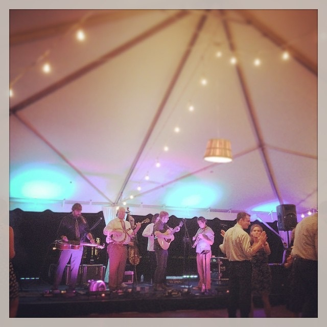
Band still going #happilyeverhickman
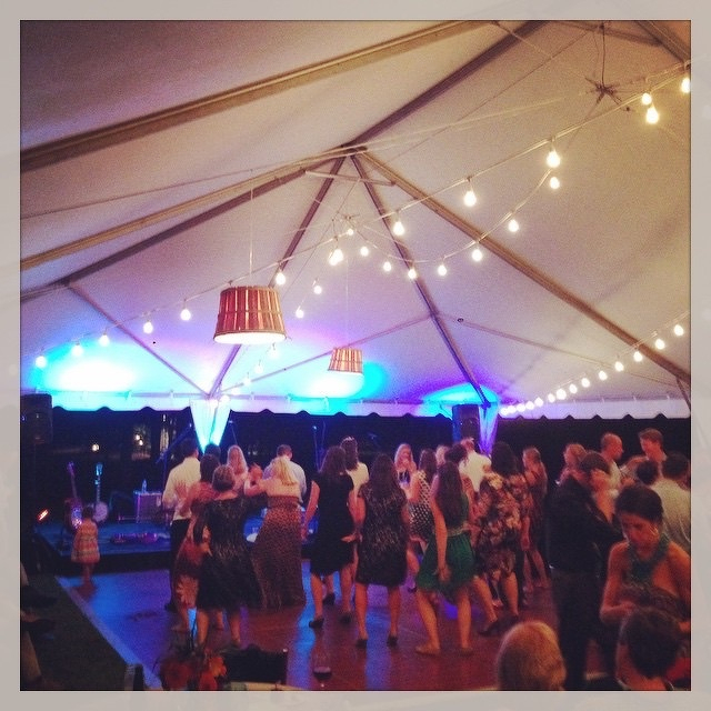
Dance floor #happilyeverhickman
Wedding “cake” #happilyeverhickman
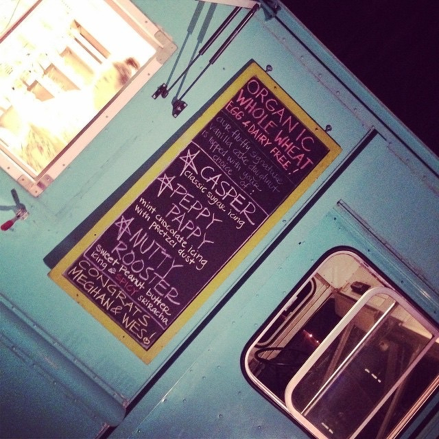
Nicer than the Honeycombs.
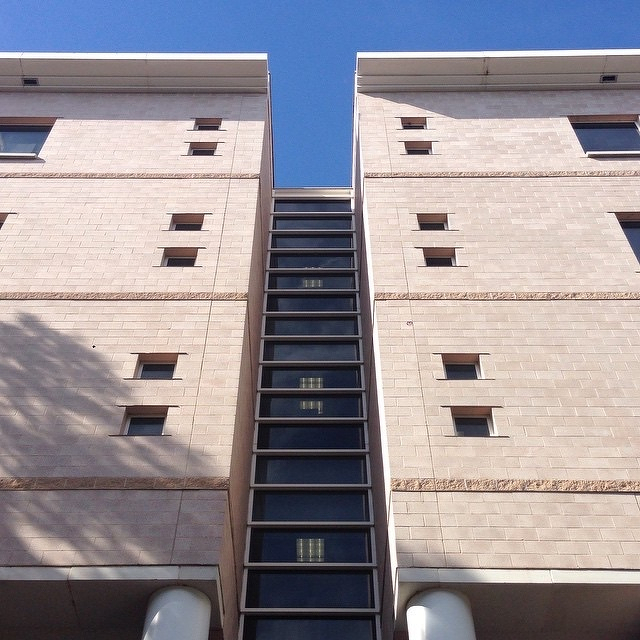
Thomas Cooper
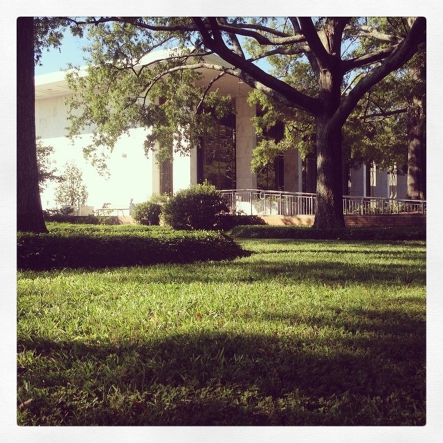
This post was originally posted on October 8, 2014 on Sketchbook B. It’s reposted here as part of a project to move some of my favorite writing to my new site.
NOTE: While this page may have useful insights, be aware that it was published more than 10 years ago and may not be relevant for current software versions.
InDesign will let you create a QR codes without leaving the application. Go to Object > Generate QR code… You’ll have options for hyperlink, text message, email, business card or plain text.
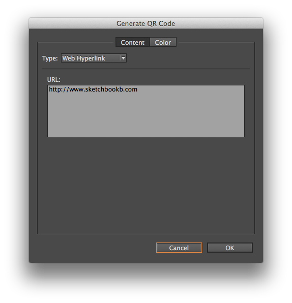
Once you have all the information filled out, you can then place the QR code like you would an image.
I will freely admit that I tend to avoid QR codes like the plague. I’m not convinced of their effectiveness. But sometimes, you need to use one and generating one without leaving InDesign is helpful.
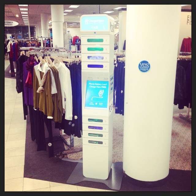
Free, secure charging station at Belk. Nice.
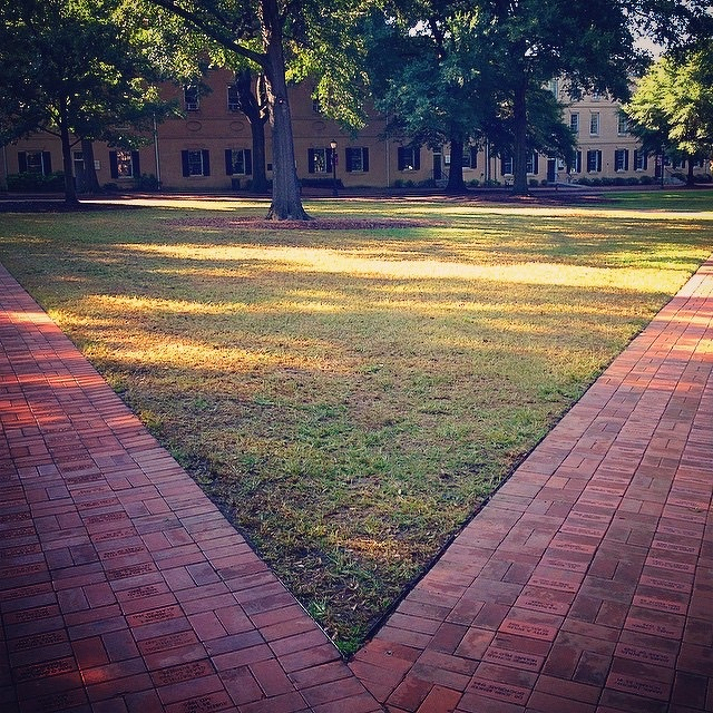
Choice.
This post was originally posted on October 1, 2014 on Sketchbook B. It’s reposted here as part of a project to move some of my favorite writing to my new site.
NOTE: While this page may have useful insights, be aware that it was published more than 10 years ago and may not be relevant for current software versions.
Tucked away in InDesign’s Window menu is a Story palette. This palette has exactly one function – to turn on and off optical margin alignment.
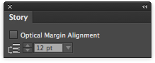
You can find the Story palette at Window > Type & Tables > Story. There are two settings. The first is a checkbox to activate optical margin alignment. And the second alters the intensity of the alignment.
Optical margin alignment automatically adjusts the positioning of characters on the margin. It’s especially noticeable for punctuation and letters like “A” and “W” which look a little odd lined up exactly on the margin. See the example below.
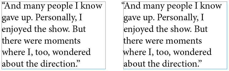
Optical margin alignment. Off (left) and on (right). Notice how the quotation mark and the lower case “w” move in relation to the margin.
I’m not sure why Adobe didn’t just include it on the Paragraphs palette. Seems odd to hide such a powerful feature on a random single-function palette.
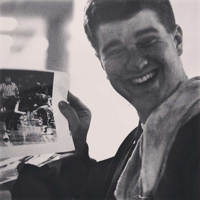
Looking through the attic, found this shot of me as a young Gamecock photographer. Fresh out of the darkroom. Pretty sure it was taken by @kimtruett.
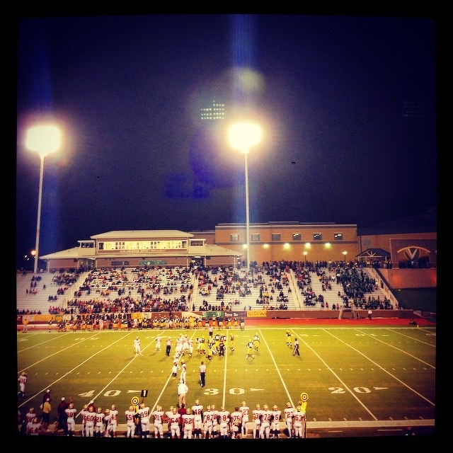
High school football. South Aiken vs Spring Valley.
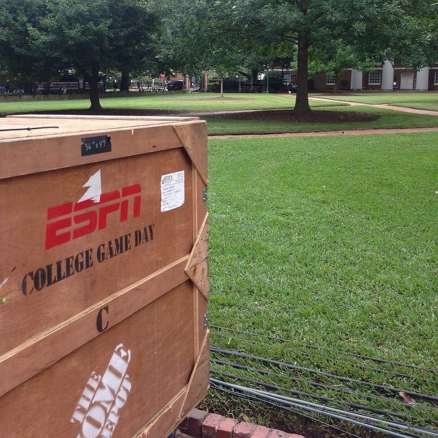
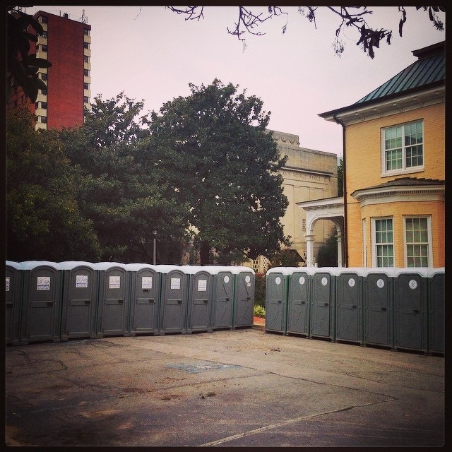
#uofsc is really ready for GameDay.
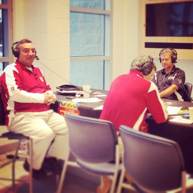
1075thegame Live Remote.
Crate.
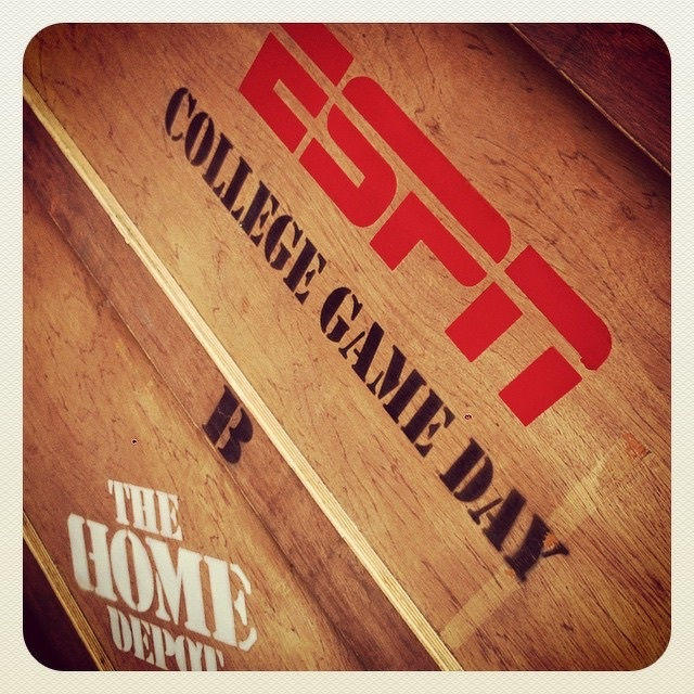
ESPN GameDay is at #uofsc