This post was originally posted on January 20, 2017 on Sketchbook B. It’s reposted here as part of a project to move some of my favorite writing to my new site.
The Kickstarter has two parts: A book and a service.
The book will detail a framework for independent microblogging… basically a standards-based system for posting and sharing Twitter-like posts.
The service is Micro.blog. And it’s a fascinating attempt to make it as easy as possible to host your own micro blog, basically a decentralized version of Twitter.
I think Manton’s got some great ideas. And I think his heart is in the right place. I love the idea of leveraging RSS for the underpinning of the service. I think 280 characters is great. The iPhone app supports Markdown. You can use your own domain for free or pay $5/month for Micro.blog to host your microblog. An API that others can use to hook into the service. And oh yeah, and the name is perfect.
The Kickstarter project was funded on the first day. And he’s now got a stretch goal — $80,000 — to help fund a community manager to shape the service and actively address the bullying and nastiness that is rampant on Twitter. I don’t know if he’ll make the stretch goal, but I love that he’s already thinking about this.
Also, remember in the early days of Twitter, before they cracked down on the API usage, when third party developers were extending and improving the service. I hope those developers throw everything they’ve got at supporting Micro.blog.
Many people are skeptical that Micro.blog will blossom into a sustainable full featured Twitter replacement. And I completely get that. Look at all the failed attempts to replace or replicate the functionality of Twitter of the years. It’s tough to build a large user base for a new social media site and it’s too early to tell if Micro.blog will take off — after all, the service hasn’t even launched yet. But I think the service and the concept are the right idea at the right time. I’m looking forward to using the service and watching it develop in the coming years.
I’m excited about Micro.blog and about the plan to use RSS to power what is essentially an independent version of Twitter. If you are concerned about the future of Twitter and social networks, I really encourage you to head over to Kickstarter and back the Indie Microblogging project.
Bob Wertz is a creative director, type designer, Ph.D. student and researcher living in Columbia, South Carolina. His blogging journey started in 2008 with a Squarespace hosted blog.
This post was originally posted on December 20, 2016 on Sketchbook B. It’s reposted here as part of a project to move some of my favorite writing to my new site.
‘Sticking’ with tradition.
InShow is AIGA South Carolina’s annual awards program that honors the best work in the state of South Carolina. And each year, the award is in the shape of a cube.
It’s the 21st InShow, but the 14th cube. The original cube design and current InShow logo were created by Vince McCall back when InShow was run by The Columbia Communicating Arts Society. AIGA South Carolina took over with InShow 10… We’ve kept the tradition going, and each year, the InShow cube is made from a different material or reflects a theme. So far, we’ve had:
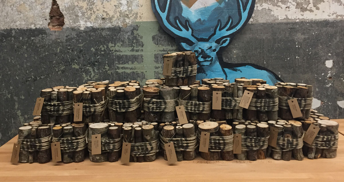
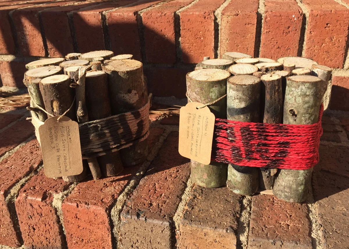
This year’s cube is a bundle of kindling, tied together with twine. The logo is spray painted over the twine and the winners’ names were printed on labels and tied to the sticks. The special judges awards used red twine. I won’t bore you with the details, but building 42 “firewood” cubes was time consuming.
It’s one of my favorite designs, although I really do love them all. I’ve had a hand in a bunch of cubes over the years, but I’m going to hand off responsibility for next year’s cube. It really is a great project and it’s time to let someone else have some fun. Plus, I think I’ve used up almost* all the ideas floating around my garage.
Almost final prototypes… I decided not to hand letter the tags on the final cubes.
* I can’t tell you how many times I’ve tried — and failed — to make an affordable candle cube. It’s the one that got away…
Bob Wertz writes about design, technology and pop culture at Sketchbook B. Bob is a Columbia, South Carolina-based designer, creative director, college instructor, husband and dad. He’s particularly obsessed with typography, the creative process and the tools we use to create. In his spare time, he thinks about new cube concepts.
This post was originally posted on November 19, 2016 on Sketchbook B. It’s reposted here as part of a project to move some of my favorite writing to my new site.
This man loves to create.
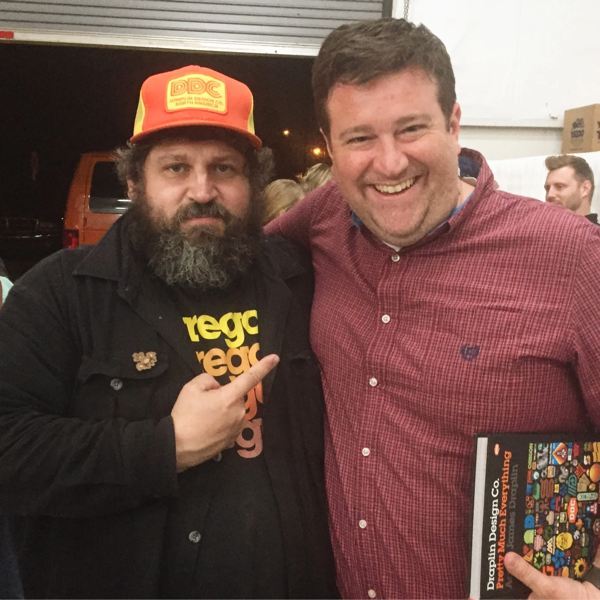
I saw Aaron Draplin for the fourth time on Thursday night when he came to the Half and Half in Columbia. Over the last years 15 years or so, between CCAS, AIGA South Carolina and Converge SE, we’ve had a bunch of awesome designers come through Columbia… DJ Stout, David Carson, Chip Kidd, James Victore, Seymour Chwast, Michael Beirut, Sean Adams, Sagmeister… and that’s a really incomplete, partial list.
But Draplin is one of my favorites.
What I love about Draplin is how much he loves to make things. Other designers are passionate about solving business problems. Or challenging convention. Or tackling large international clients. But Draplin loves to create things. Sure, he solves problems for clients, he challenges conventional thinking, he has some large international clients. But the thing that really seems to drive Draplin is putting things out into the world, which I really do feel makes him unique among the big names in design.
(It’s also the reason why Draplin’s work is known beyond the design world. Field Notes is loved by people all over the world and they love Draplin, too.)
If he comes to a town near you, see him. You won’t be disappointed.
Bob Wertz is a creative director, type designer, Ph.D. student and researcher living in Columbia, South Carolina. His blogging journey started in 2008 with a Squarespace hosted blog.
This post was originally posted on November 15, 2016 on Sketchbook B. It’s reposted here as part of a project to move some of my favorite writing to my new site.
4 steps to simplifying URLs
I was behind a truck in traffic yesterday with an URL boldly printed across the back. And since traffic was moving slowly, I got a nice long look at it:
Okay. I may have changed the address to protect the innocent. But it was a really long address. And it looked really awkward.
I see addresses like this all the time and I’m not sure why designers don’t instinctively take steps to make these addresses more readable and easier to remember. I’m guessing that designers are simply using the addresses that are provided to them by copywriters and clients, but it really is easy to clean up.
Step one, get rid of the protocol.
You really don’t need to put ““ at the beginning of a URL. It’s called the protocol identifier and if you type the address into a web browser without it, the browser will add it for you. So all it adds is clutter.
Most websites don’t need the “www” to take you to the proper address. Again, unnecessary clutter. If your web site does require the www for the URL to resolve properly, you have two options: leave the www. in the address; or contact the person who set it up and have them fix it.
reallylongwebaddress.com/home
Definitely better. But can we make it easier to read?
Step three, do you really need that specific page?
Sometimes, you need to direct someone to a specific page on a site — a landing page or specific bit of content. But if it’s just “/home” or “/index” you can usually drop it:
reallylongwebaddress.com
Just make sure the shortened address takes you to the desired location.
And finally, can you improve it with intercapping or some other design treatment?
Web addresses sometimes have hidden words. And that’s not always good. For example, a reader may not see “Really Long Web Address,” but may instead see “ Really Long We Bad Dress.” Same letters, but completely different. Sometimes, you can insert capital letters into the middle of the URL to help the viewer read the address as intended. Or use color and type weight to make the address read correctly. For example:
ReallyLongWebAddress.com
URLs are not typically case sensitive so the capitalization doesn’t alter the address in any way. It’s just easier to read.
The bottom line: Use the shortest URL possible that takes the viewer where you want them to go.
Bob Wertz is a creative director, type designer, Ph.D. student and researcher living in Columbia, South Carolina. His blogging journey started in 2008 with a Squarespace hosted blog.
What would happen if Twitter disappeared tomorrow?
This post was originally posted on November 9, 2016 on Sketchbook B. It’s reposted here as part of a project to move some of my favorite writing to my new site.
I’ve been on Twitter since 2007. It’s part of my daily routine and probably my most vital social media channel for finding and sharing news. But Twitter has had some lingering financial issues and when they recently tried to sell the company, no one stepped up to make an appropriate offer.1
Also, a couple of social media experiments have crashed and burned lately. Twitter announced that they were closing Vine.2 Talkshow had a bunch of potential but didn’t make it six months. And while Twitter is much larger, it’s not immune from financial reality.
Which got me thinking, what if we woke up one morning and Twitter was gone. Or more likely, what if Twitter changed so radically, that it was unusable? How would that change the way I get things done?
I’d lose a bunch of contacts. I follow a large number of designers, brands and local experts on Twitter — and no where else. If Twitter disappeared, I’d lose all those contacts and have to try and reconstruct the network on another channel. Not an easy task.
I’d change how I watch live events. During the World Series, I kept an eye on Twitter. During the presidential debates, I followed along on Twitter. During the University of South Carolina’s football game last weekend, I kept up with the score on Twitter. During election night coverage, sigh. Twitter is the perfect companion to a live event and I’d miss seeing what my friends and family think in real time.
I’d have to rethink how I find articles and stories. I find lots of inspirational links and content on Twitter. If Twitter goes away, I’m using RSS and Feedly much more aggressively.
I’d have to rethink how I share content. I share most of my blog posts through Twitter. If Twitter were gone, I’d have to share them somewhere else like Facebook or Medium.
I’d change the way I use Facebook. I use Facebook for family pictures and connecting with people I know and have met. If Twitter disappeared, I’d probably use Facebook more to connect with a wider audience. Maybe I’d invest more time into building the Sketchbook B page on Facebook. Post more links to articles on my Facebook feed. If Twitter goes away, my Facebook experience changes radically.
I’d spend more time on Instagram. Because I love Instagram, almost as much as I love Twitter. And I’m going to have some free time if there is no Twitter.
I’d try to find a replacement. If Twitter disappeared, I imagine several companies would rush to unveil a replacement. Or modify their social product to attract Twitter refugees. You know Google would retool and rebrand Google Plus, Linked In might try to be less of a train wreck. Even Snapchat might try to appeal to former Twitter users. Startups would start, and fail. Someone would try to resurrect App.net. I’d try them all, but I’m not sure there can truly be a replacement for Twitter.
But… reality.
So I don’t think Twitter will just shut down. At some point, the price to purchase the company gets so low, that someone will take a chance on them. I’m more concerned that Twitter, or a company that buys Twitter, will change it so completely, that it becomes useless.
This exercise had forced me, though, to start evaluating areas where I am too reliant on Twitter. I’m going to start connecting to designers and thought leaders on other channels. I’m looking for new avenues to find and share content. I’ll evaluate how I use channels like Facebook, Instagram, Dribbble, YouTube and Medium.
Twitter might not disappear, but it’s still best not to keep your eggs in one basket.
Bob Wertz is a creative director, type designer, Ph.D. student and researcher living in Columbia, South Carolina. He’s been blogging since 2008.
This was compounded by the fact that few established companies — like Disney — wanted to take on Twitter while abusive rhetoric is rampant. Let’s face it, Twitter has been a dumpster fire during this election season. ↩︎
This post was originally posted on October 31, 2016 on Sketchbook B. It’s reposted here as part of a project to move some of my favorite writing to my new site.
95 reasons to reform the church! (#15 changes everything!)
Almost 500 years ago today, Martin Luther nailed his 95 Theses to the door of a church in Wittenburg in Germany. This act, intended to provoke discussion and debate, sparked the Reformation and fragmented the Christian church.
Over the next few decades, Luther spread his message through a variety of methods, taking advantage of the latest technology, the printing press. He wrote letters, books and sermons. He translated the bible into German to better reach his target audience. He created devotional materials for families. He composed hymns to reach the masses. He gathered his followers together to have discussions which they then shared with other Protestant reformers. His message of reform spread through Europe, inspired followers and provoked discussion.
Martin Luther was the first content strategist.
It’s not hard to imagine Luther using today’s technology to spread his carefully crafted content. Tweeting to his followers.* Retweeting fellow reformers. People live tweeting his sermons. Blogging on the latest topics. Sharing posts on Facebook — “95 reasons to reform the church! #15 changes everything!” Putting music and videos on YouTube. Authoring free ebooks. Sending email newsletters. Podcasting.
Martin Luther used content to change the world — almost five centuries before the creation of the internet. And his lasting impact, 499 years later, is a testament to the power and longevity of powerful and effective messaging.
* I can imagine Martin Luther complaining about how hard it is to get verified on Twitter.
Bob Wertz writes about design, technology and pop culture. Bob is a Columbia, South Carolina-based designer, creative director, college instructor, husband and dad. He’s particularly obsessed with typography, the creative process and the tools we use to create. In his spare time, he geeks out about all things historical.
This post was originally posted on October 17, 2016 on Sketchbook B. It’s reposted here as part of a project to move some of my favorite writing to my new site.
Some classes just stick with you.
I was talking with a friend a couple of weeks ago about influential classes that I took in college – classes that helped shape my world view and approach to life. I noted that it was interesting to look back and see what has stuck with me after two decades.
The more I started to think about it, I realized the same was true for high school and even middle school classes. Some classes just stick with you long after you take them. And decades later, it’s sometimes surprising which classes and teachers shape how you look at the world decades later.
I’m lucky to have had a whole range of amazing teachers at all levels. But a handful stick out in my mind today:
Speech Arts, 8th Grade, Batavia Junior High. I took a speech arts class in eighth grade and was forced to get comfortable with prepared and impromptu speeches in front of crowds. To this day, I think of Mr. McCloud’s class before I make a big presentation.
German, 9th-12th Grade, Aiken High School. I don’t use German as part of my job. I can read German without too much difficulty, but my spoken German is embarrassing because I haven’t really spoken German conversationally in a couple of decades. So if I don’t use German in my career, why was German so influential? Because Herr Lader and Frau Lader1 taught me about another culture and helped me understand things from a more global perspective. And as a bonus, it provided me with an opportunity to spend six weeks in Germany one summer and experience life from a different point of view. Randomly, German class is also where I learned about Bauhaus and Walter Gropius, a couple of my favorite influences from art history. I enjoyed it so much, that I went on to take three more years of German in college and my cognate2 is German.
Media Law, Freshman, University of South Carolina. After spending a semester with Dr. Collins, you look at the Constitution, the Bill of Rights and our legal system in a different way — understanding the balancing act of personal freedoms and necessary governance. A tough class, especially for a freshman.3
Political Psychology, Junior, University of South Carolina. This was an odd little Honors College seminar. A small class with lots of readings and lots of discussions. I learned about why we make the decisions we make and the factors that influence our government and our leaders. I come back to those discussions frequently, especially in today’s political climate.
There are many others, too. A middle school shop class introduced me to woodworking and drafting. High school and college history classes fostered a love of the past. An intro to art class equipped me with many of the tools that I still use today. A class on mysticism in Eastern Orthodox Christianity whose lessons seem to come up at the most random times.
Looking back, many of the classes that I loved and enjoyed were outside my major and outside my career needs. But they are undoubtedly a significant part of who I am.
We force kids to decide on career paths earlier and earlier. I see many students today rushing through school, laser-focused on taking classes that will advanced their specific career needs. And while we want them to be focused, I worry that many of them are missing out on those random classes that might not help them in their chosen career, but might help them become a more well-rounded person.
Bob Wertz is a creative director, type designer, Ph.D. student and researcher living in Columbia, South Carolina. His blogging journey started in 2008 with a Squarespace hosted blog.
Yes. I know I should call you Art and Lisa. It’s just so hard. ↩︎
This post was originally posted on October 7, 2016 on Sketchbook B. It’s reposted here as part of a project to move some of my favorite writing to my new site.
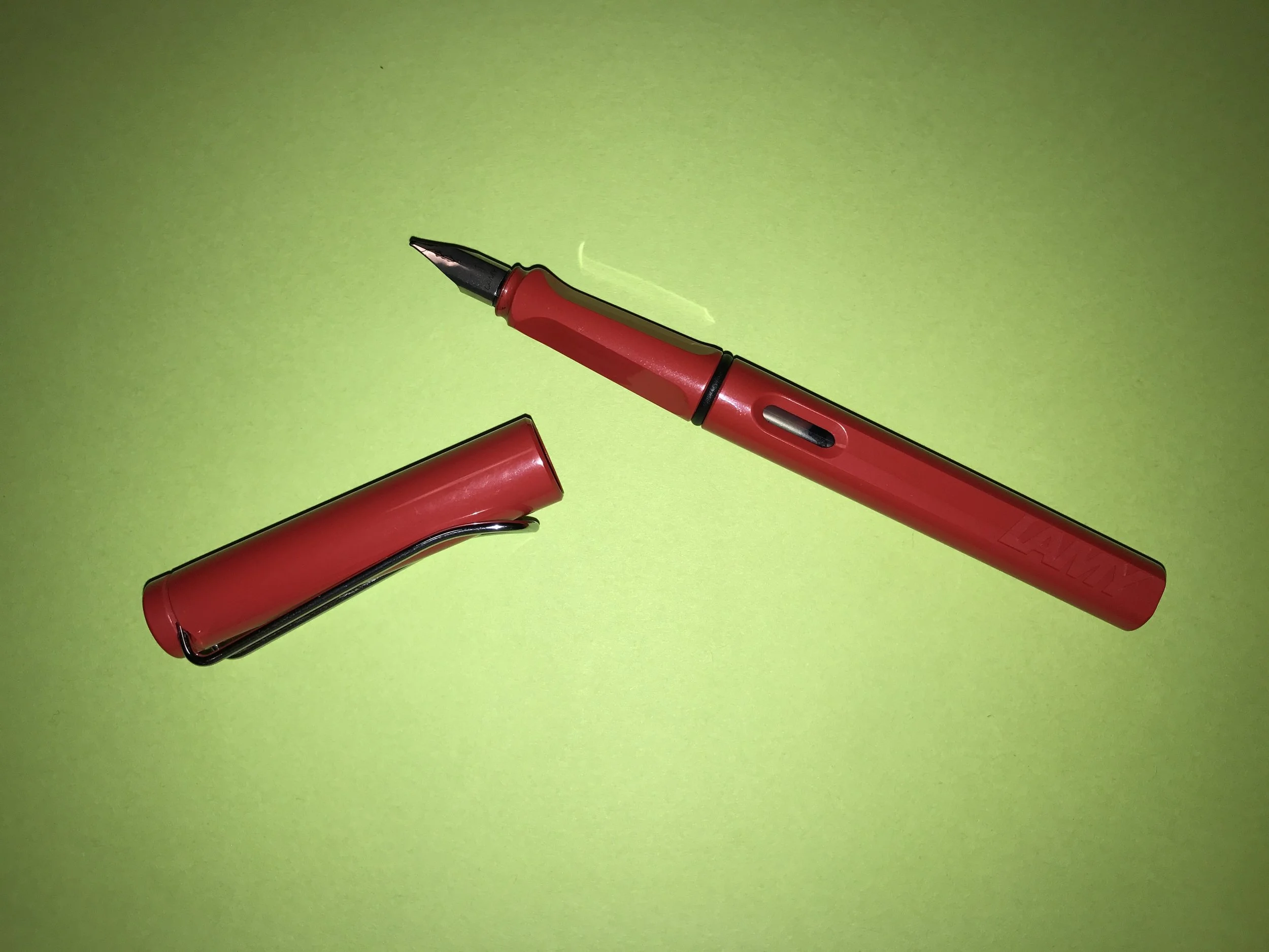
A perfect modern, beginner fountain pen
Designer Toolkit is a new weekly series on Sketchbook B that will highlight an analog tool that designers should be using.
Why designers will love the Safari:
Colorful inks. The Lamy Safari is a fountain pen that uses ink cartridges or bottled ink. This means that you can write in an absurdly wide range of ink colors. Find a color that’s close to your favorite Pantone color.
Choose your thickness. The nibs on a Lamy Safari are interchangeable. This means that you can select a thickness that works for you. Like really thin pen strokes? Get an extra fine nib. Want to have some variation in stroke thickness? Buy a 1.1 mm caligraphy nib. Customize the writing experience to be exactly what you want.
Modern look. It’s not a “traditional” looking fountain pen. Most people think of fountain pens as archaic devices with a century old design aestitic. A Lamy Safari has a clean, modern look and comes in a range of colors. It’s definitely not an antique.
Things to know:
Converter. If you want to use bottled inks — and trust me, you do — you’ll need to by a converter. It’s a little plastic cartridge that lets you draw the ink from the bottle and costs about $5.
Taking care of your Lamy. You’ll need to spend some time cleaning your pen when you change the ink. Thankfully, there are many online resources that talk you through the process.
Cartridges and bottles. The pen comes with a blue ink cartridge, but if you want to start with a different color, you’ll need to buy some other ink cartridges or bottles of ink. If the idea of buying bottles of ink is intimidating, I recommend starting with some of the Lamy ink cartridges.
How much?
A Lamy Safari costs about $30, depending on where you buy it. I recommend Pen Chalet or Goulet Pens.
Bob Wertz writes about design, technology and pop culture at Sketchbook B. Bob is a Columbia, South Carolina-based designer, creative director, college instructor, husband and dad. He’s particularly obsessed with typography, the creative process and the tools we use to create. In his spare time, he endlessly searches for a perfect “Sketchbook B” green ink.
This post was originally posted on September 27, 2016 on Sketchbook B. It’s reposted here as part of a project to move some of my favorite writing to my new site.
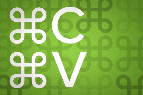
Just copy, paste and send.
I constantly struggle with getting high quality images from clients to use in printed materials. Typically, my struggles fall into one of two issues:
Poor image quality. Images that are too small, edited or color corrected poorly.
Vector files. Clients don’t understand what a vector file is and why you need it.
I was tired of explaining it repeatedly so I started writing some standard text that I can copy and paste when I need to explain these concepts to clients and partners. As I worked on them, I realized that other designers could benefit to having a copy of these explanations.
Request high quality Images
Most designers try to explain image size with resolution, file type or file size. This goes completely over the head of most users. Now that most digital cameras — including phone cameras — generate appropriately large images, we can just ask for the original, unedited image. We also need to make sure they understand that they can’t just grab the files off of Facebook or Instagram.
Next time you need an image from someone, try this explanation:
In order to make sure your image looks its best, please provide us with the highest quality image you have. This should be the file that comes directly off your camera or phone. Do not edit or crop the image. Images downloaded from Facebook or Instagram will not reproduce well. The file will likely be a JPG or PNG file.
Getting Vector files
Vector files are tougher. The concept is foreign to most users who don’t understand the difference between vector and bitmap. Here, I think the best bet is to educate them that a vector file is a special file format and try to steer them to the designer or communications department.
Most of the time, when I need a vector file, it’s a logo. So I wrote several versions of my vector explanation. The first version is specifically for logos:
In order to ensure your logo will look great, we require a vector version of your logo. A vector file is a special type of image file typically created with Adobe Illustrator that can scale to various sizes while maintaining quality. A vector logo is typically saved as an EPS file. Note that JPG or PNG files are bitmap files and cannot be vector files. Vector files are typically provided by the designer or company that created your logo.
A second version of this copy can be used when you are working with a non-designer in a larger company that has a dedicated communications team:
In order to ensure your logo will look great, we require a vector version of your logo. A vector file is a special type of image file typically created with Adobe Illustrator that can scale to various sizes while maintaining quality. A vector logo is typically saved as an EPS file. Note that JPG or PNG files are bitmap files and cannot be vector files. You can typically get a vector version of your logo from your communications department.
Sometimes, I need vector artwork for other projects. So I wrote a third version that is a little more generic.
In order to ensure your artwork will look great, we require a vector version of your design. A vector file is a special type of image file that can scale to various sizes while maintaining quality. Vector artwork is typically saved as an EPS file or a PDF. Note that JPG or PNG files cannot be vector files.
Copy and paste!
Feel free to use these descriptions next time you are requesting artwork. Hopefully they will help you get the files you need and save you time. Please let me know how they work for you. Based on feedback, I may refine and update them.
*Bob Wertz writes about design, technology and pop culture at Sketchbook B. Bob is a Columbia, South Carolina-based designer, creative director, college instructor, husband and dad. He’s particularly obsessed with typography, the creative process and the tools we use to create. In his spare time, he looks for ways to be more efficient.
This post was originally posted on September 24, 2016 on Sketchbook B. It’s reposted here as part of a project to move some of my favorite writing to my new site.
Maybe the most effective way to get work done at night is to go to bed early.
The other night, I had a bunch of projects I needed to work on after I got home. This is always challenging for me, because I need — and want — to spend quality time with the kids and my wife.
The college version of me would just stay up all night.* The 40+ year old version of me isn’t as good at that anymore.
So when I have a bunch of work to do, I go to sleep early.
The sun isn’t up yet.
When our first child, Norah, was born over a decade ago, I would often wake up when my wife woke up to feed her. Our oldest did not sleep very well. It was helpful for me to be awake to get my wife a glass of water or, honestly, just provide emotional support. It was seriously a rough couple of months.**
For several months, in the wee hours of the morning, I would work in my office, next door to the nursery while my wife fed our infant daughter. Surprisingly, I got a lot of work done in the middle of the night and early morning.
Thankfully, after six months or so, Norah started to sleep through the night and we went back to our normal sleeping habits. But I never forgot that I could be really productive in the early morning.
So I developed a new procedure for working on significant projects at home. When I really need to dedicate a couple of hours to a project, I go to sleep right after the kids do. I’m in bed by 9 p.m.
Then, I wake up at 3 a.m.*** After 6 hours of sleep, I’m not mentally exhausted from the day I just had. And I find that the two and a half hours before the family wakes up is some of the most creative time I have during a day.
I’m more productive, too. If I stay up late, I often stay up until 1 a.m. working, but then often can’t go to sleep right away. My brain is in overdrive and I stare at the ceiling for a couple of hours. I end up getting less done and only get 3-4 hours of sleep.
I blame the industrial revolution
As a quick aside, research suggests that this early morning creative period is something that humans developed with the advent of electric powered lights and that the continuous 8-hour night of sleep is a modern invention. So maybe there is a scientific reason for my insanely early morning productivity. Or maybe not…
Set your alarm
I don’t do this every night. But when I’ve got personal projects that I really want to work on, it’s better for me than staying up all night.
There are drawbacks to my early morning approach. Sometimes, the alarm doesn’t go off. Or you need a larger chunk of time than you planned for. Sometimes you finish quickly and try to go back to sleep, which doesn’t always work so well. And trust me, if you send a bunch of emails at 3 a.m., people will think you are crazy.
But next time you’ve got a chunk of design work to do and you need uninterrupted time, go to bed and give waking up early a shot.
* In college, I didn’t sleep that much.
** Thankfully, our other two were much more consistent in their sleep patterns. *** And as an FYI, television at 3 am is really bad. Procrastination is that much harder…
Bob Wertz writes about design, technology and pop culture. Bob is a Columbia, South Carolina-based designer, creative director, college instructor, husband and dad. He’s particularly obsessed with typography, the creative process and the tools we use to create. In his spare time, he writes wakes up at weird hours of the morning and works on personal projects.
This post was originally posted on September 12, 2016 on Sketchbook B. It’s reposted here as part of a project to move some of my favorite writing to my new site.
Real jobs have deadlines.
As a designer, I hear “As Soon As Possible” an awful lot. Most people are shocked to learn that ASAP is actually my lowest priority. Jobs with concrete deadlines are always in line ahead of jobs with no real deadline.
Understanding why the client needs something ASAP is the first step in understanding whether you are dealing with a crisis or a “crisis.” There are a couple of reasons why clients avoid giving you a real deadline:
When can you get it to me? If the client is asking you to set a deadline, the project probably doesn’t have a firm due date. It likely needs to be done quickly, but they don’t want to look stupid and throw out a date that is impossible. Or they are hesitant to suggest a date that is too far out in the future. So they throw it back to you. In that case, sit down and start developing a schedule that works for everyone. If they need it faster, they’ll let you know in the process of setting the timeline.
Everything is a rush! For some clients, everything is a rush. Every email is marked high priority. So don’t overreact and rush into the project. Ask for a specific timeline. This is client’s normal operating procedure so stick to yours. If it’s a real rush, they will tell you.
It’s going to take forever! Some clients have no idea how long a project is going to take. So they are anxious to get started. Asking for a deadline will diagnose that immediately. I once had a client call in a panic and rushed over to meet them only to find out that we had four months to complete a simple poster series. Crisis averted.
My boss wants it now! Sometimes, the client is panicked because their boss is on their back. They may not even know when the project is really needed. Work with them to set a schedule to share with their manager. Have them confirm the schedule will meet the manager’s needs and get back to you. 99% of the time, the manager will be fine with the schedule.
I need it yesterday! Some clients ask for the world. And the ability to travel back in time. Setting a timeline is important here, but so are problem solving skills. I’ve seen clients ask for 50,000 brochures on a very short turn, only to find out it was because they needed 1,000 for a trade show. (We ran the 1,000. Then ran the larger print run later.) The clients are typically panicked and aren’t thinking straight. By focusing on the timeline, you can help them figure out what they really need and give them the best solution for their problem.
Sometimes, the client really is asking for the impossible. Tell them. But here’s the key, after you tell them that you can’t meet their deadline, tell them what you can do for them.
Oops! Sometimes the client makes a mistake and forgets to make a request or communicate a deadline. And this is where you can play the hero. Set a timeline for how to get them what they need and do your best to help them out.
Designers drop the ball sometimes, too. If it’s your fault, apologize and own the mistake. Then, move heaven and earth to make it right.
In every single one of these scenarios, communication is key. Be up front about the schedule, challenges and costs. Remember that the client is often under a lot of pressure and may not be thinking straight. Most importantly, don’t take the ASAP request personally. Just view it as what it is… an opportunity to save the day and build a better relationship with your client.
Bob Wertz is a creative director, type designer, Ph.D. student and researcher living in Columbia, South Carolina. He’s been blogging since 2008.
This post was originally posted on August 30, 2016 on Sketchbook B. It’s reposted here as part of a project to move some of my favorite writing to my new site.
An extra period in an email address apparently doesn’t matter to Google.
A number of years ago I randomly started getting emails from a Republican Women’s Group in Virginia. I unsubscribed, but the emails kept coming. I unsubscribed again. Nothing changed. I finally responded with a nasty email explaining that I had repeatedly tried to unsubscribe, unsuccessfully.
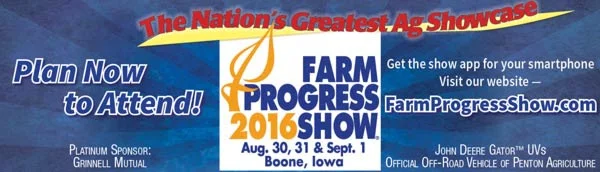
All of the images in this post are from emails I have ACCIDENTALLY RECEIVED. I don’t think I’ll be headed to Boone, Iowa for the Farm Progress Show.
An employee with a political consulting group reached out to explain that they could not find my email address — bobwertz@gmail.com — in their records and they had no idea why I was getting their email. They finally figured out that the address in their database was actually bob.wertz@gmail.com. Somehow the mailing system was dropping out the period and sending the email to the wrong person. They removed bob.wertz@gmail.com from the mailing list and the emails stopped.
But new ones appeared.
Over the years, I received emails from a number of mostly conservative organizations. I would unsubscribe and move on. Then, my dot-pleganger — as I began to call him — became a member of the NRA and I was inundated with email. Lots of it, all addressed to bob.wertz@gmail.com, but delivered to my address. At one point, I started getting emails from Match.com. I got sick of unsubscribing to the emails and pretty much abandoned my Gmail account.
I’m sure that National Hog Farmer is a lovely publicatioN, but I didn’t sign up for your email.
But I still needed my Google account for other reasons so I checked in occasionally. I had a few new subscriptions — Corn & Soybean Digest, Penton Agriculture, Sam’s Club, Farm Progress Show and National Hog Farmer. I had an email from Indiana Representative Todd Rokita from Indiana’s 4th District inviting me to his Women’s Summit on Safety. All addressed to my dot-pleganger.
I’ve avoided writing about this for a couple reasons:
I didn’t really want to put my email out there. I can’t even imagine the spam I’m going to get now.
It was annoying, but harmless. Basically, a bunch of annoying subscriptions and I could easily move on to a different, non-Gmail email account.
This week, I noticed that I missed an email from a friend to my Gmail account. I decided it was finally time to figure out what was going on and post about it in case others were experiencing the same issue.
I don’t live in your district, Todd. I don’t even Live in your state.
I started by trying to figure out if they were all using the same mailing service. They weren’t.
GOOGLE DISREGARDS THE PERIODS IN THE ACCOUNT NAME FOR GMAIL ACCOUNTS!
So now, I’m really confused. This means that there is no way that there can even be a bob.wertz@gmail.com account. My dot-pleganger doesn’t exist. But even though the email address doesn’t exist, emails addressed to my dot-pleganger are still sent to my address because it’s… close? What kind of twisted logic is this? Why it the world would anyone set up an email system this way?
As for why I am repeatedly getting email that I don’t want, this leaves only two scenarios:
Someone out there is mistyping their own email address repeatedly over a period of years.
Someone mistyped my address once and then it was sold to a variety of entities that now spam me.
Either way, I’m irritated. I’m betting on the “my name is on a master list that keeps getting sold and recycled” scenario. (The fact that my dot-pleganger’s address seems to circulate among mostly conservative causes seems to reinforce this theory.) I can unsubscribe from the emails I get, but I can never get that address off the master list.
“Navigate the complexities” of unsubscribing from email.
I’m also completely perplexed. Why would Google set up an email system that delivers emails to the wrong address on purpose? And who is the random person that apparently doesn’t know their own email address?
I had hoped that I would be able to reclaim my Gmail account. Alas, it doesn’t seem possible.
Bob Wertz is a Columbia, South Carolina-based designer, creative director, college instructor, husband and dad. He’s particularly obsessed with typography, the creative process and the tools we use to create. In his spare time, he tries to unsubscribe from emails.
This post was originally posted on August 22, 2016 on Sketchbook B. It’s reposted here as part of a project to move some of my favorite writing to my new site.
How do we make the printed newspaper relevant again?
As a kid, I loved the newspaper. Growing up in suburban Chicago, we had the Chicago Tribune and the Aurora Beacon News delivered to my house daily. And there was a local weekly called the Windmill News. I was a paper boy for the Aurora Beacon News and one of my original majors in college was journalism. Newspapers were a major part of my life growing up.
I’m still a news junkie, but it’s been years since I subscribed to the newspaper. As much as I love the daily newspaper, that’s not how I get the news anymore. I don’t have time to sit and read it every morning and all the breaking news I want is delivered through Twitter or the web.
I’ve been thinking lately about what I want from a modern local paper. What would make me subscribe again? In my perfect scenario, this is what I would love to see:
Fiercely local.
I get my breaking national news from the internet. My newspaper will give me news I don’t get from Twitter. Newspapers now are half filled with wire stories and in today’s world, that doesn’t make sense. I get that news online the instant it breaks — not the next morning.
I want a newspaper filled with local stories and local perspective on national stories.
National newspaper conglomerates are mostly interested in efficiency and streamlining operations. The emphasis on local would mean investing in local reporting and probably impact their balance sheets. And so for my modern newspaper to be fiercely local, I assume that it also needs to be fiercely locally-owned.
Once a week.
My local paper — The State — often sets up a booth in the local grocery store trying to sell subscriptions. Their sales pitch is that you can get the entire week of papers for the same price as just the Sunday paper. People perceive value in the Sunday paper.
I never have time to sit and read the paper. But for me, Sunday is the best option for spending a significant amount of time reading and I think that most papers will be better off with just one paper a week, delivered to your doorstep.
There are all sorts of problems with the economics of producing and delivering the paper just once a week. What are the presses doing the rest of the week? How do you hire a delivery team that only works one day a week? Sunday delivery keeps the lucrative retail insert profit alive, but will your subscriber base be large enough to entice advertisers to continue to print and place inserts.
So my modern newspaper — assuming you can work out the financial model — would be delivered to your doorstep once a week on Sunday.
Smart mix of online and print
Just because you only print a paper once a week doesn’t mean you do nothing the rest of the week. My perfect paper would have a smart mix of online content to supplement the printed version. Blogs, podcasts and exclusive online content would keep you connected to the writers and editors. Relevant social media engages readers. Your reporters become trusted sources and well-known voices. With today’s consumer, I think the success of a modern newspaper depends on this deep connection with the readership.
The Perfect Size.
I miss the old broadsheet papers, but the logistics of printing a newspaper in smaller quantities and reduced runs means that the size of the newspaper needs to be a strictly business decision. I guess a tabloid size is the most logical, but I’m open to whatever size makes sense.
Comics
On Sundays after church, I used to sit with my dad and read the comics. I looked forward to that every week. How can we bring back that magic? The daily grind of comics burned out countless cartoonists. Would we still have Calvin and Hobbes if the schedule wasn’t as relentless? A modern newspaper should work with cartoonists to recapture the magic. Partner with them to develop new models and formats.
Respectful online experience
Ads are part of the financial model that makes content possible. I understand that, but for online ads, be respectful. Today’s ads are obnoxious. Terrible. They slide in and pop up and create an awful experience. I am not opposed to advertising at all, but a modern newspaper needs to respect its readers and provide a first rate experience.
Well designed and high quality
Newspapers typically aren’t held up as examples of great design. The breakneck daily schedule doesn’t leave much time for refinement and reimagining. A modern newspaper has to take a step toward better design quality. Most newspaper websites aren’t much better than their printed counterparts. Make content easy to find and search.
Modern consumers value design quality and high quality photography. A modern newspaper must meet those expectations.
Can this happen?
I’m not sure if anyone could pull this off. Current newspaper conglomerates have shown they don’t have the foresight to pull off a massive shift like this. An entrepreneur would have to find funding, but good luck finding an investor that thinks starting a newspaper in 2016 is a good idea.
But I still think there is value in a printed news vehicle, and not just because of the ads that are in the Sunday paper. I hope someone figures out a model before all of the local papers are gone.
This post was originally posted on July 28, 2016 on Sketchbook B. It’s reposted here as part of a project to move some of my favorite writing to my new site.
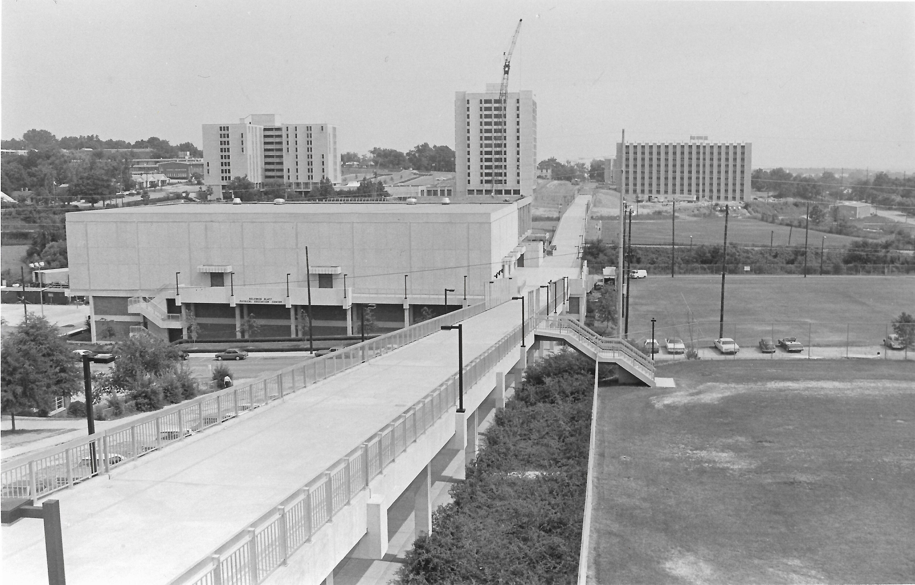
The south side of the University of South Carolina’s campus under construction in the early 1970s.
I spent the spring semester taking a class on modern American architecture, specifically looking at the buildings on the south side of the University of South Carolina’s campus. That section of campus is going to be redeveloped soon and this was our chance to document what’s there before it changes completely.
Taking a class again was a fun experience. I thoroughly enjoyed it, even if I was the old guy in the class. Thanks to Dr. Brandt for the thought provoking discussion. I don’t think I’ll look at modern buildings in the same way again.
The class produced a book that includes the histories and architectural surveys we researched over the course of the semester. I designed the final book and am hosting a PDF copy of it here. My project involved the pedestrian bridge that connects the south side of campus with main campus. Despite having spent have my life around campus, I realized just how little I knew about that side of campus.
I’m looking forward to taking some more classes. I’m teaching in the fall semester, but look to take another class in the spring.
This post was originally posted on June 2, 2016 on Sketchbook B. It’s reposted here as part of a project to move some of my favorite writing to my new site.
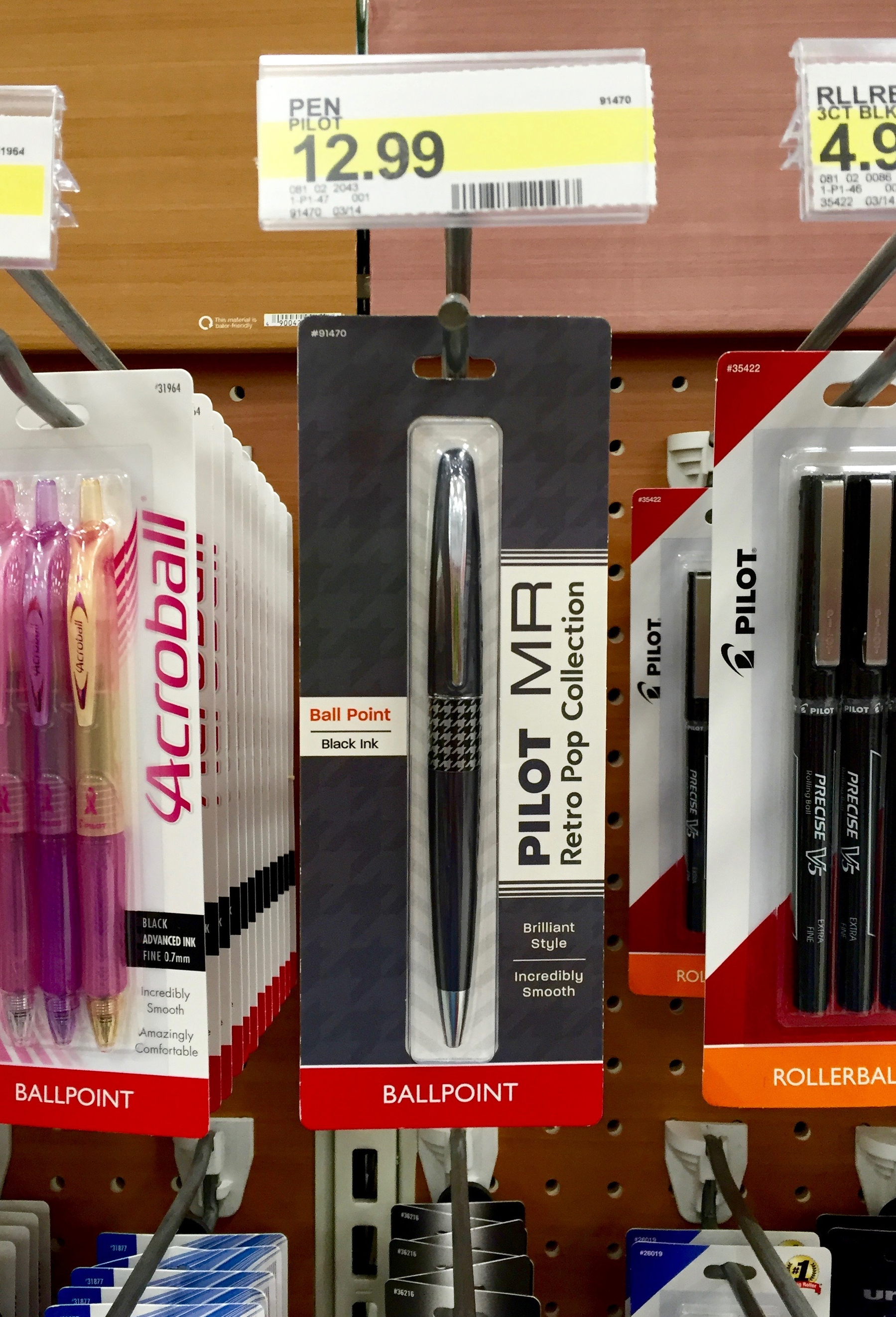
Walking through Target a few weeks ago, I noticed they were selling a Pilot MR Metropolitan Retro Pop ballpoint pen.
I’m familiar with the Pilot Metropolitan Retro Pop fountain pen and rollerball. The Metropolitan fountain pen is well regarded as a great pen for beginners. I own a green Pilot Metropolitan fine nib fountain pen and I’ve really enjoyed it. But I had no idea how there was a ballpoint version available through typical retail channels and I wanted to try it out.
The Metropolitan Retro Pop that I purchased from Target is sharp looking, with a dark gray metal body. The center band is a black and silver houndstooth pattern. The rest of the trim is silver. The point extends with a slight twist on the top of the pen body. If you are used to cheap plastic pens, the Metropolitan feels substantial.
The pen is a 1.0 mm black ballpoint and writes smoothly on a wide variety of papers. I typically use a 0.5 mm or 0.7 mm point so the line is a little thicker than I’m used to. The pen insert is replaceable but uses a shorter Pilot Dr. Grip Center of Gravity refill that is only offered in black or blue and only in 1.0 mm. I’m not sure if other refills will fit it as well. (None of the refills I had around the house fit the pen.)
For such a cool looking pen, the packaging isn’t impressive at all. It’s clearly designed to blend in with the other Pilot packaging, but it doesn’t really do a great job showing off the pen. I’m also a little surprised that the word “Metropolitan” doesn’t appear anywhere on the retail packaging, since that’s the branding that is more prominent in the fountain pen offerings.
The Metropolitan fountain pen and rollerball models come in a range of colors and patterns. According to the Pilot website, the ballpoint comes in five colors combos, but I’ve only seen the dark gray and houndstooth on the shelf.
The pen is a solid and versatile addition to my collection. I enjoy writing with it and it’s nice to have a quality ballpoint to supplement my fountain pens. While I like the gray and houndstooth design, I hope Pilot makes the bright colors widely available for people to discover.
If you don’t think you are ready for a fountain pen, the Metropolitan ballpoint might be a great option for you. For $13, it’s a solid gateway to the world of nicer pens.
This post was originally posted on April 27, 2016 on Sketchbook B. It’s reposted here as part of a project to move some of my favorite writing to my new site.
I struggle to explain why, but I want an electric car. My trusty VW Rabbit is getting up there in age and I’m thinking about a replacement. The next generation of electric cars are increasing in range and decreasing in price. With the Tesla Model 3*, Chevy Bolt, BMW i3, an updated Nissan Leaf and the rumored Apple Car, I’m thinking seriously that my next car might not have an internal combustion engine.
But why? When I talk to people about electric cars, most of them don’t get it. At all. And I’ll be honest — I struggle to explain it. I’ve been seriously thinking about it over the last week and I’m trying to understand why I’m so intrigued by an electric transmission.
Going the distance. An electric car fits my driving habits. Newer electric cars boast a 200 mile range. Most days, I drive about 40 miles. But some days, it’s almost 100 miles. Having a 200 mile range gives me more that enough juice to go anywhere I need to go without dealing with range anxiety. My wife’s SUV will work for long trips and I can use the electric car around town. I’m also close to charging stations on campus so if I need an additional charge, I can easily do that.
Less maintenance. I hate scheduling maintenance for my car. Electric cars have no oil changes and really only need tire rotation regularly. Less ongoing maintenance is appealing, but replacing a giant battery someday will be expensive.
It’s not about the environment. Most people want an electric car because it’s more environmentally friendly. But in reality, that depends on how your electricity is generated. Here in South Carolina, much of our power grid is nuclear power, but a significant percentage is still coal. While I’m sure an electric car is better for the environment than its gas powered alternative, it’s not a driving factor in my purchase decision. (I do think that getting America off its oil addiction is good foreign policy.)
It’s not about the high cost of gas. When gas was $4/gallon, electric cars were a hot idea because they were potentially cheaper. Gas prices are relatively low and if you calculate cost of ownership today, the electric car isn’t going to be the most cost effective. So switching to an electric car isn’t about money.
I’m not interested in a hybrid. I think hybrids are cool, but they are still cars with internal combustion engines. They have all the complexity of a normal car with the added complexity of an electric car. I have lots of friends with Prius (or Priuses?), and they all love them. But my interest in an electric car isn’t because I want to use less gas. I don’t want to use any gas at all.
I’m in love with the technology. I’m completely and totally in love with technology. And an electric car is the cutting edge of technology. From the drivetrain to the internal controls, an electric car is the most advanced piece of technology on the road.**
So will my next car be electric? It’s definitely possible and I think it all depends on timing. If I had to buy a new car today, it wouldn’t be an electric. Too many interesting cars on the market that are a better fit for me. But if I can hold out a couple of years, I’d be surprised if I don’t go electric.
* Since I haven’t already put money down on a Tesla Model 3, I won’t be getting one this decade.
This post was originally posted on April 19, 2016 on Sketchbook B. It’s reposted here as part of a project to move some of my favorite writing to my new site.
A little over a year ago, I started listening to the Upgrade podcast with Jason Snell and Myke Hurley on the Relay FM network. I knew all about Jason from listening to the Incomparable and reading his work on Macworld. I loved the show and the banter between Myke and Jason. But best of all, it introduced me to selection of other podcasts on Relay FM and the Incomparable.
One of these shows was the Pen Addict, hosted by Myke and Brad Dowdy. I tuned in for episode #152, just after the 2015 Atlanta Pen Show. Ironically, the topic was mechanical pencils. I was hooked and I’ve been listening weekly ever since. (I’ve also been buying pens and pencils ever since…)
When the 2016 Atlanta Pen Show rolled around, I knew I had to go. Brad lives near Atlanta and Myke flies in from London for the show. This year, they recorded the 200th episode of the Pen Addict live in front of an audience.
My wife joined me on the (reasonably easy) trek down I-20 from Columbia. I always make Liz listen to podcasts on long trips and she wanted to put faces with the voices she’d heard.*
We spent Saturday at the show and attended the episode recording that evening. It was a wonderful experience and we may have to make the Atlanta Pen Show an annual tradition. I figured I share some thoughts on the experience of attending the Atlanta Pen Show and Pen Addict live broadcast:
The Atlanta Pen Show
It’s a little bit overwhelming for a first time visitor. All the vendors were exceptionally nice and willing to answer questions.** But there are just so many pens. Three large rooms with tables and vendors everywhere. New and vintage. Inexpensive and very, very expensive. Stock and custom. Inks, nib grinders, cases, paper and more. (Several vendors noted that the D.C. Pen Show is much bigger and crazier.) I enjoyed it, but it was a lot to take in and absorb. I’ve only been buying pens for about a year and I’ve got a lot to learn.
I got to check out pens I’ve never seen. There isn’t a pen store in Columbia so I rarely have a chance to check out nice fountain pens in person. But there is a great selection at the Atlanta Pen Show. I fell in love with the Pilot Vanishing Point. I got to check out some Lamys that I haven’t had a chance to hold… a Lamy 2000, a Studio and even an Imporium. The Karas Kustoms clipless Ink is also a beauty. I definitely prefer the cleaner, more minimalist designs.
I didn’t buy a pen. I almost bought a Pilot Vanishing Point — green, of course — but decided to wait. And I was tempted by a Lamy Studio. I must have circled the Anderson Pens table a dozen times. I’m looking at more expensive pens and these pens aren’t an impulse buy. Instead I bought some ink from Vanness Pens, a Nock Fodderstack XL and some notepads to try.
I’m terrified of vintage pens. I love the idea of vintage pens, but I was overwhelmed by the selection. I had no idea what I was looking at. I’ll need to do a fair amount of research before I feel comfortable investing in a classic design.
The Pen Addict’s 200th Episode
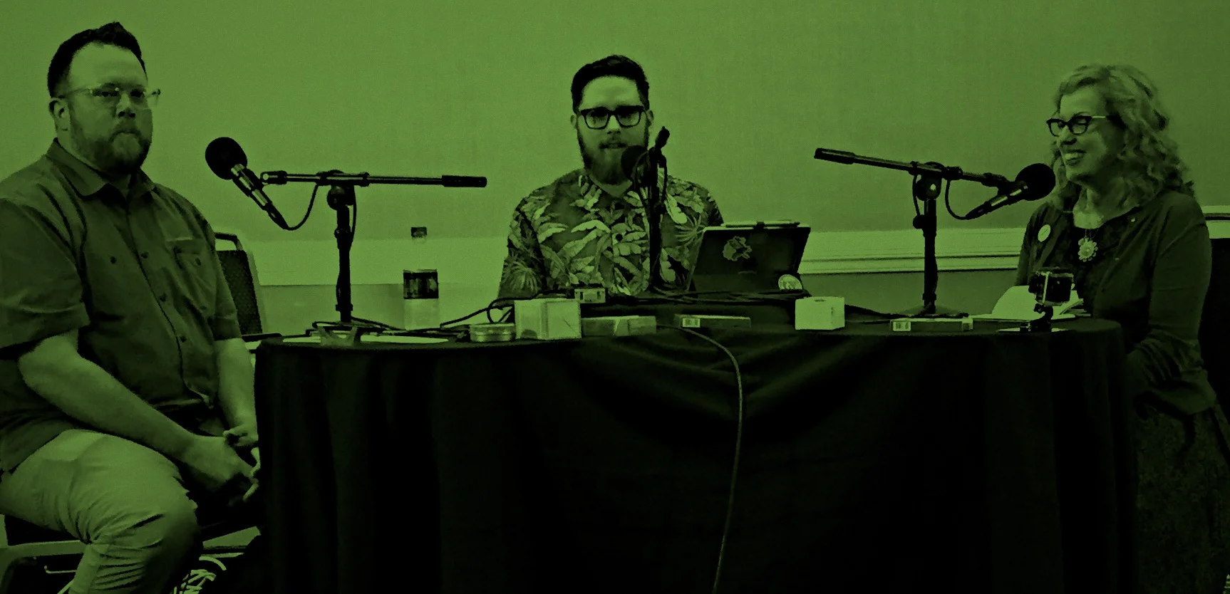
Friendly folks. Myke and Brad were joined on the episode by Ana Reinert from the Well-Appointed Desk. Stephen Hackett from Liftoff and Connected came down to run the technical side of the broadcast. They were all very approachable and made an effort to talk to everyone. (I even got an impromptu review of Myke’s new nylon Apple Watch band.) It’s nice to find out that the people that you listen to every week are really as awesome as they seem on the podcast.
Watching the Pen Addict live was amazing. Being able to see how Myke, Brad and Ana interact on the show was wonderful. It was like a couple of friends just talking about pens… with a bunch of spectators and a whole lot of technology.
Thanks for all the hard work. It’s got to be hard to record a podcast every week and not really know what people think. This show ended with a standing ovation and tears from Brad and Ana. I didn’t really think about it until that moment, but I’m glad we as an audience got to let Brad and Myke know — in person — how much we appreciate the show. I really do look forward to it each week.
Liz and I had a great time. If our schedule permits, we’ll absolutely head down to Atlanta for the 2017 edition. (April is always a busy time of year for us, though.) If you are interested in pens and writing utensils, attending a pen show is a great way to check out your options if you don’t have a pen store near you.
* She was disappointed that Jason Snell and Serenity Caldwell weren’t there. I told her Jason would never attend a pen show.
** There was one pushy dude who was kind of obnoxious.
*** I win a lot of door prizes. It all started when I won a jet ski in 7th grade…
**** My wife was disappointed that she can’t take it to her work, but a notepad with the “s-word” on it won’t fly in kindergarten. I, however, love it.
This post was originally posted on April 6, 2016 on Sketchbook B. It’s reposted here as part of a project to move some of my favorite writing to my new site.
I’m a big fan of concept cars and I’ve written about them in the past. They are often horribly impractical and will never come to market, but they often present a unique presentation of a particular concept or feature that can point a way for the future of the car.
Toyota introduced the Setsuna, a wooden car intended to be a family heirloom. Hand crafted out of wood using “traditional Japanese joinery technique called okuriari which does not use any nails or screws.”
I think it’s kind of cute, even if it looks like a life size pinewood derby car.* And while I don’t expect to see Toyota Setsuna make it to a dealership, it does pose an interesting question about how we will view internal combustion cars in an electric, self-driving car world. Will they be heirlooms as Toyota seems to imply with the Setsuna? Or junk?
This post was originally posted on March 31, 2016 on Sketchbook B. It’s reposted here as part of a project to move some of my favorite writing to my new site.
Last week, I talked to an advertising class at the University of South Carolina. One of the things I mentioned was the need to stay up-to-date on the changes in the communications industry.
In preparing for my talk, I started a list of the things that have changed during my career — roughly 20 years of being a creative professional.*
The list was really, really long. I’ve included a couple of links for all the really obscure stuff:
Web 2.0 (Which if we are honest, isn’t really different than Web 1.0.)
Standards-based web design. Javascript. CSS.
The search engine.
Social media. All of it. MySpace. Facebook. Twitter. LinkedIn. Flickr. Instagram. Vine. Google+. Snapchat. Periscope. Meerkat. And lord knows how many more failures I’ve forgotten about.
All of this change and disruption occurred in such a short period of time. And this is just in one industry. My interest in design started when I was in college in the mid-1990s at the beginning of all this change. The designers and communicators that are thriving today are the ones that are able to change and adapt constantly.
Looking ahead at the next 20 years, the only thing I’m 100% sure of is that the world isn’t going to get less complex. For designers and communicators, the ability to evolve and adapt is going to be more critical to success than ever.
This post was originally posted on March 23, 2016 on Sketchbook B. It’s reposted here as part of a project to move some of my favorite writing to my new site.
All professionals need a personalized email address and a home on the web. And Gmail accounts and Facebook pages don’t count.
I saw a branding consultant recently without a branded email address. Who hires a brand consultant who doesn’t invest in their own brand?
I saw a company trying to recruit managers… just email an AOL account. (In case you are wondering, the company wasn’t recruiting for AOL.)
I was trying to find out information on a store in town and all they had was a Facebook page that hadn’t been updated in a couple of months.
I don’t really care what your business is — from a home-based business to a large corporation — if you don’t have a real email address with your own domain name, I’m less likely to take you seriously. And if your only web presence is a Facebook page, you don’t have a real business.
Look. I get it. It’s easy to get by with the free accounts. A penny saved is a penny earned. Absolutely. But investing in a domain name and a Google apps account? It’s not that expensive. Without your own domain, you send a message to all your clients and potential clients that you can’t or won’t invest in your own company.
It used to take some effort to get on the Web a decade ago, but now, services like Squarespace provide great solutions for small businesses and take care of hosting, e-commerce and more. Like Gmail? That’s fine. You can customize your address with Google Apps. Other services like Hover can help you get your domain and email set up. There are seriously hundreds of services to help you look professional. It’s not that hard and not that expensive.
Having a professional online appearance is every bit as important as dressing appropriately or speaking intelligently. It’s a necessary investment that lets people know that you are serious about your business.
Unless you aren’t serious about your business. And then, I guess, any email address or website will do.
Bob Wertz is a creative director, type designer, Ph.D. student and researcher living in Columbia, South Carolina. He’s been blogging since 2008.
This post was originally posted on March 16, 2016 on Sketchbook B. It’s reposted here as part of a project to move some of my favorite writing to my new site.
NOTE: While this page may have useful insights, be aware that it was published more than 10 years ago and may not be relevant for current software versions.
I wanted to create a PDF of some pages in an InDesign document, but I needed them in a different order in the exported PDF — page three followed by page two. I know, weird. So I was going to make the PDF and then rearrange the pages in Acrobat.
But as I was exporting the PDF, I wondered what would happen if I typed exactly what I wanted in the page range field. I typed “3,2” and hit the export button expecting an error message…
Magically, my PDF outputted correctly with page three first, followed by page two. Mind. Blown.
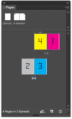
To export these in order, type “2-4, 1” in the page range field and the exported PDF will be in the correct reading order.
Turns out the range field has other tricks, too. I tried “3,2,4,3,2” expecting it to give me an error message. Nope. The resulting PDF had all five pages, in that order… including the multiple pages.
The most practical use for this little trick is when you’ve set up a brochure with the back cover and front cover on the same spread and want to export the pages in the order a viewer will see them. Typically page 4 is first, followed by 1-3. So type “2-4, 1” in the page range field and the PDF will export in the correct reading order.
It’s a nice touch. And I had no idea the feature was there.
This post was originally posted on March 8, 2016 on Sketchbook B. It’s reposted here as part of a project to move some of my favorite writing to my new site.
My garbage disposal started leaking last week. And considering how old it is, I needed to replace it. Badly.
So I went to the store to pick up a new garbage disposal… and decided that if I was going to take out the disposal, now would be a perfect time to replace a leaky faucet, too. And while I was at it, maybe I should replace the kitchen sink. All of these things needed doing and if I was going to do one of them, it made sense to tackle them all. (Keeping in mind, of course, that I’ve never replaced a faucet or a sink before…)
After many hours and several trips to the store, the kitchen is back together and everything works.
The process was challenging. I wanted to quit repeatedly. More than a few choice words were spoken. My hands are torn up. My shoulder hurts.
But now it’s done. I’m proud of the work. I’m glad I did it. It looks much better than the old sink. The disposal and faucet don’t leak. Even though it took longer than I expected, it was worth the investment of time and energy.
I chose a harder, but more ambitious path. And as I struggled, I questioned my decision. I was frustrated and bruised. My confidence wavered. I wondered if I could turn back the clock and undo the initial decision to tackle a massively challenging project.* And it was only in the end that you see if the effort was truly worth it.
This is true in home improvement. But it’s also completely true with relationships, design, parenting and just about everything. We take on big responsibilities. We struggle. We lose confidence. We want to quit. We question our decisions and assumptions. We lose sight of the big goal. And unlike my kitchen sink, sometimes these big picture challenges take more than just a Sunday afternoon. They require investments of months and years.
I’m often guilty of losing sight of the big goal. It’s easy to get caught up with the challenges and frustrations. To convince myself that I’ll never overcome the barriers in front of me. I personally need to be better about keeping the battle in perspective. And most of all, I need to stay focused on why I started the journey in the first place.
* Seriously, at that point, time travel seemed a more rational path forward. It wasn’t going well.
This post was originally posted on March 5, 2016 on Sketchbook B. It’s reposted here as part of a project to move some of my favorite writing to my new site.
I’ve attended a lot of graduations over the years and heard many bad commencement speeches. Most are forgettable. Some were memorably bad.* But few are great.
I was lucky enough to have Pat Conroy as my commencement speaker when I graduated from the University of South Carolina in 1997. It was a perfect graduation speech. Powerful. Insightful. Heartfelt. Short.
I send you out into the world now, Class of 1997, with this admonition. You have graduated from a great university. Now make this university, this state, yourself and your family proud, and if you have a little luck — if you have any luck at all — if you do it right, there is a great possibility you can teach the whole world how to dance.
* George Will was my wife’s graduation speaker.
** Looks like the University of South Carolina may have a transcript in Pat Conroy’s papers. It just doesn’t appear to be online, yet.
This post was originally posted on January 12, 2016 on Sketchbook B. It’s reposted here as part of a project to move some of my favorite writing to my new site.
2015 was a long year for me. Literally. My 2015 was three hours longer than 2014 because I rang in the new year on the West Coast. For me, 2015 was 365 days and 3 hours long.
But here’s the thing with stealing time. You don’t get extra time, you have to steal it from somewhere. My 2016 will be three hours shorter1 — unless I celebrate the new year in a different time zone again.
I have lots of projects on my plate at any given time. Add to that my family, my job, organizations, teaching and more. (And oh yeah, I start grad school this week.) I’m always stealing time from somewhere.
I’ve been bad about stealing time from sleep. I tend to stay up late and get a lot done after the kids go to bed. But I need to dial that back and get to bed a little earlier each night. I’m aiming for an extra hour of sleep a night, which doesn’t sound like much until you realize that’s 7 hours a week… roughly 15 days over the course of a year. So I’ve got to make some adjustments.
Right now, my plan is to be more efficient and make the most of the time I have. Maybe I’ll be more effective working with more sleep. But efficiency will only get me part of the way.
After that, it’s about prioritizing my projects and commitments. We’ll see what projects make the cut and which ones go on the back burner.
Bob Wertz is a creative director, type designer, Ph.D. student and researcher living in Columbia, South Carolina. His blogging journey started in 2008 with a Squarespace hosted blog.
Actually, 2016 will be longer than 2015 because it’s a leap year. ↩︎
This post was originally posted on December 21, 2015 on Sketchbook B. It’s reposted here as part of a project to move some of my favorite writing to my new site.
Four.
As Advent comes to a close, I’m still working on my Advent Resolution of preparing for 2016. In fact, last Friday, in the post-Star Wars euphoria, I took a day off and sat down to put in writing all the ideas and plans that I’d been working on.
I quickly became completely overwhelmed.
I started by grouping my goals into four categories… fitness, family, professional and household. And then started trying to figure out how to make all these things happen. But the list of things I want to change are long and two things happened:
I got discouraged: How am I ever going to do all these things next year?
I got depressed: I have to change all these things to feel like I’ve accomplished anything.
And planning and preparation came to an abrupt halt. Friday night though, I came to a conclusion: I really love my life and I don’t have to change anything. But I want to be healthier, more organized and more connected to my family. I can’t make all these things happen at one time. They have to happen gradually as part of a lifestyle change.
I tackled my list with renewed energy. I tried to prioritize items as I grouped and I noticed a pattern: Every category had a foundation.
For the fitness and health, the foundation goal is walking at lunch. When I walk at lunch, I eat better and feel better, and I’m more likely to work out more and log my food in Lose It. All my other goals start to fall in line if I make time to walk around downtown Columbia at lunch.
For my family, it’s eating dinner at home as a family around the dinner table. With our busy schedules, it’s too easy to eat out. Things just run better when we eat at home and get all five of us around the dinner table.
For professional improvement, it’s the blog. When I’m posting regularly, I’m more creative and energetic. Writing about design and creativity typically sparks ideas and projects.
And for household, it’s sitting down with my wife to plan the week, figuring out meals and schedules for the week ahead. Life’s a lot easier when we are on the same page.
As I started to structure my goals, it became clear that if I do those four things, lots of good things tend to follow. I’m going to add a few more things like using my phone less and some specific long term fitness goals. But I’m starting with my four foundation goals.
This post was originally posted on December 18, 2015 on Sketchbook B. It’s reposted here as part of a project to move some of my favorite writing to my new site.
I saw Star Wars: The Force Awakens on opening night and completely loved it. J.J. Abrams did an amazing job capturing the spirit of the original and building an awesome new environment for the future of the franchise.
It’s not a perfect movie, but it is amazingly fun and I enjoyed every minute of it. If you haven’t seen it and are even remotely a Star Wars fan, go and see it.*
You can find spoiler-free reviews all over the internet. I’m not going to do a review or spoil any plot points, but I want to talk about the things I really loved in the new movie.
Rey. I have daughters. And I couldn’t be happier that Rey is a strong, independent and awesome character in the Star Wars universe. The original trilogy didn’t have any strong women outside of Leia. I can’t wait to see what my daughters think of Rey.
Droids. BB-8 steals the show. Seriously great. And great moments from C-3PO and R2-D2, too. Funny and comical in the same way that they were in the original trilogy. Not obnoxious and slap-stick like the prequels.
Spoiler Free. I went into the movie completely spoiler free. I hadn’t read reviews or online spoilers. I watched the trailers, but that was it. I didn’t have any idea what was coming next. And it was perfect.
Mystery. Lots of mysteries are revealed, but even more are teased and not answered. Plenty to reveal in the next two movies.
Production Design. The movie looks incredible. It’s a perfect visual extension of the original trilogy. The ships are great. The planets look amazing. And the whole thing looks like Star Wars.
I’m going to see it again tonight with my wife and will probably have more thoughts. But as a Star Wars fan, I’m happy. Thanks, J.J.
* And see it now, before the movie is spoiled for you.
This post was originally posted on December 14, 2015 on Sketchbook B. It’s reposted here as part of a project to move some of my favorite writing to my new site.
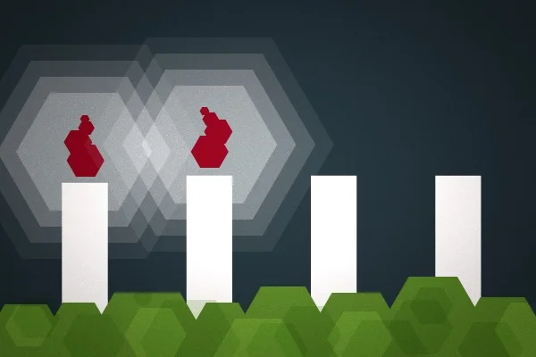
Three candles.
Advent is speeding by and my preparations for the new year are moving forward. But I feel like I’m running out of time to prepare for 2016.
I tried this week to limit my phone use and honestly really struggled. I made a couple of simple changes that I hope will help. I turned off virtually all notifications to limit the “pull” of the phone. And I reordered my apps so that only the necessary apps — like banking, calendar and to-do list — are on the home page. Social media apps like Twitter and Facebook are now on page two so hopefully I won’t get sucked into other apps on my phone when I just need to check and appointment time.
This week, I’m going to think about health and fitness. My biggest challenge is our crazy family schedule. We eat out too much and don’t always make time to work out. I’ve got some ideas for how to plan a little better and work out more consistently. I’m hoping to hammer out details this week.
I bought a Fitbit Charge recently and I’m tracking my activity. I’m going to start using Lose It for food tracking again. Personally, I find that having those data points help me be healthier.
This post was originally posted on December 11, 2015 on Sketchbook B. It’s reposted here as part of a project to move some of my favorite writing to my new site.
Today at work, I mentioned that I had participated in a Future Problem Solving competition and, much to my shock, someone else on my team not only knew what it was, but had also participated in one as well.
When I was in junior high, we lived in Illinois and the Future Problem Solvers Bowl was an after school program where we worked with teams to examine scenarios and work through a problem solving process. We went to regional and statewide competitions where we were presented with a scenario and had to work through the process to develop a solution and then present our conclusion.
When we moved to South Carolina, there wasn’t a Future Problem Solvers Bowl in the state. But in retrospect, I still use many of the tactics that I learned every day.
The Future Problem Solving Process is:
Identify challenges
Select an underlying problem
Produce solution ideas
Generate criteria to judge solutions
Evaluate solutions with criteria
Develop an action plan
It’s basically the foundation of a good design process. And in competition, you learn to apply the process quickly, under pressure, with a team and then present your findings.
I hadn’t thought about Future Problem Solving in years, but in retrospect, I can’t imagine a better foundation for my design career.
Bob Wertz is a creative director, type designer, Ph.D. student and researcher living in Columbia, South Carolina. His blogging journey started in 2008 with a Squarespace hosted blog.
This post was originally posted on December 6, 2015 on Sketchbook B. It’s reposted here as part of a project to move some of my favorite writing to my new site.
Two candles.
My wife and I took a trip to Hilton Head a few weeks ago. We got to the resort late, but decided to take a stroll around and check it out anyway. We walked out to the beach.
It was pitch black.
A clear and moonless night. We could barely find our way down the path. (Hilton Head significantly restricts night lighting to protect sea turtles.) We stumbled down the path with our pitifully inadequate iPhone “flashlights.”
We reached the beach and turned our flashlights off. Looking out over the Atlantic Ocean, the stars were brighter than I’ve ever seen in my life. Stunningly beautiful. It was remarkable how much more vibrant the stars were without the distraction of the light from the ground or moonlight.
But as beautiful as the stars were, you couldn’t do anything else but enjoy the night sky. You could hear the waves, but couldn’t see the water. It would have been very challenging to find our way back to the resort without our iPhone flashlights. We almost fell a couple of times looking for the path back.
Focus.
As I reflect on my Advent Resolution, “focus” keeps coming up. How do I focus on the important things and cut back on the distractions? But it’s not as easy as that.
Just like on the beach. When you hit that moment of maximum focus… When you are completely locked in on the stars in front of you… You can’t easily do the other things in life that you need to do.
So while I have goals and objectives for 2016, I’ve got to figure out how to focus without losing sight of the other important things in my life.
I need to figure out how to focus, while still maintaining balance. I think one of the easiest ways to find focus is to minimize the main cause of distraction in my life: My iPhone.
I’m going to experiment with a couple of different things this week:
Changing how and when I use my phone. I’m going to try to minimize my phone use during the day in attempt to focus on the task at hand. That means that I’ll be on social media a lot less, which I also think is a good thing.
Set time to handle emails and administrative tasks. I’m going to try and block some time in the morning, after lunch and at the end of the day for email. And ignore it for the rest of the day. My hope is that I’ll be more focused and effective at the task at hand. We’ll see how it goes. All notifications are off.
No phone use when the kids are around. I want to have time to focus on spending time with them. No Twitter, no Facebook, no random games, no surfing. The only exceptions I’ll make is for things like entering food items into Lose It, taking a picture or adding something to the shopping list. I tried this the other night and it worked well, but I can’t tell you how many times I reached for the phone.
My hope is that these things will allow me to focus on the task in front of me and enjoy the moment of focus. I’ll try it this week and see if it’s something I want to adopt for 2016.
I’m writing about my Advent Resolution. Read the background here.
This post was originally posted on December 5, 2015 on Sketchbook B. It’s reposted here as part of a project to move some of my favorite writing to my new site.
This summer, I got an electric kettle for my birthday and I’m really getting into making tea and french press coffee. I started grinding beans and making coffee in the morning. I love the smell and process of making french press coffee and can’t believe it took me this long to discover it.
My newfound love of coffee at home had a limitation, though. I could never find a travel mug that I like. I always preferred the old school ceramic coffee mug and no travel mug felt like that.
I had a couple of stainless steel mugs, but I didn’t love them. I tried the Tervis tumbler style mugs, but I didn’t like them either. I was looking for a mug that was a little more substantial and didn’t have a plastic lid.
A few weeks ago, I was in Starbucks and noticed a ceramic travel mug. I hadn’t seen a mug quite like it and bought one. It didn’t take me long to figure out that it was exactly what I was looking for so I bought a second one, too.
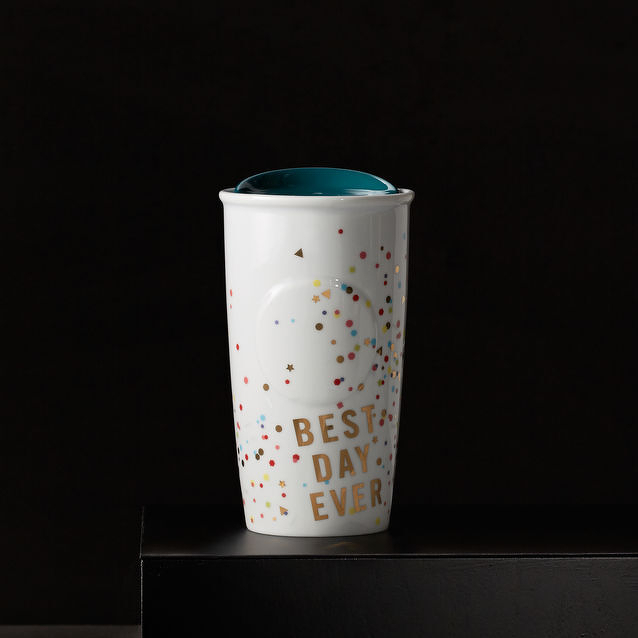
The Starbucks Double Wall Traveler is a fully ceramic travel mug. Even the lid is ceramic. The lid has a silicone seal to keep the coffee from spilling. It’s heavier than most travel mugs and fits perfectly in my car cup holders. There’s a little rubber circle on the bottom to keep it from sliding around.
There are tradeoffs. It only holds 12 oz. of coffee (but it looks bigger than that). You can’t microwave it and they recommend washing by hand. But none of those issues are a problem for me.
The designs that I bought aren’t available online right now, although the Navy one is similar to the first one I purchased. Starbucks seems to continuously add and retire designs. There are a couple of nice designs in the store right now that weren’t available a couple of months ago.
If you are looking to give a gift this holiday season for a coffee-loving loved one, these mugs might be a cool gift.