This post was originally posted on October 9, 2017 on Sketchbook B. It’s reposted here as part of a project to move some of my favorite writing to my new site.
In college, my first major was newspaper journalism. And even though I decided I didn’t want to be a reporter, I still have a respect for journalism and believe it’s a vital part of a functioning society. Fake news undermines one of the cornerstones of a healthy democracy.
If you want to combat fake news, here are some things to think about when you are cruising your timeline…
This story looks completely legit! Really? How do you know? Who wrote it? Is this a publication you are familiar with? Or a blog you’ve never heard of? Look at the sources. Do they even offer sources to support their “facts?”
But this headline is catchy! Did you actually read the article before liking it? Or worse, sharing it? The devil is often in the details. Maybe you should read those…
But I completely agree with it! Most fake news is written in a way that confirms your own bias. So especially if you agree with it, take a few minutes and double check that the story is accurate. If you feel so strongly about the topic, it shouldn’t take you any time at all to confirm it.
But I only need one source. I’m sure you think they are trustworthy, but if you only get news from one source, then you are a fool. And if only one unknown blog is reporting a major story, it’s a hoax. If there’s really a story there, trust me, more than one publication is going to be covering it.
When was this published? Where did this happen? Look at the date. Is this post years old and someone has just now rediscovered it? Does it even have a date? And where did it happen? Fake posts are often light on the details, because once you know where it happened, you can fact check it easier.
But look at the awesome picture! Are you sure that picture accurately reflects the article? It’s probably a stock photo unrelated to the article to get you to click on it. Fake news always uses fake photos… because the “news” didn’t actually happen.
People I know liked and shared this! It must be true. Or they got tricked, too.
**This is exhausting. I read so much news on social media. How can I check it all?**That’s what the scammers are counting on. That you are too busy or lazy to spend a few seconds thinking critically.
The only way to defeat fake news is to think critically. Social media sites want you to react quickly — like, share, retweet — and then move on to consume more content. But to combat fake news, you need to slow down and don’t just react.
When you read something on the internet that dovetails perfectly with what you want to believe, question it. Before you get worked up and repost or share that content, ask yourself if you took the time to actually think about it and process it.
Because everything you share is your responsibility, and if you share fake news, you are the problem.
Bob Wertz writes about design, technology and pop culture at Sketchbook B. Bob is a Columbia, South Carolina-based designer, creative director, college instructor, husband and dad. He’s particularly obsessed with typography, the creative process and the tools we use to create. He’s currently in the middle of a project to design a new shirt a week for an entire year.
This post was originally posted on October 8, 2017 on Sketchbook B. It’s reposted here as part of a project to move some of my favorite writing to my new site.
The Reformation started 500 years ago this month with the posting of the 95 Theses.
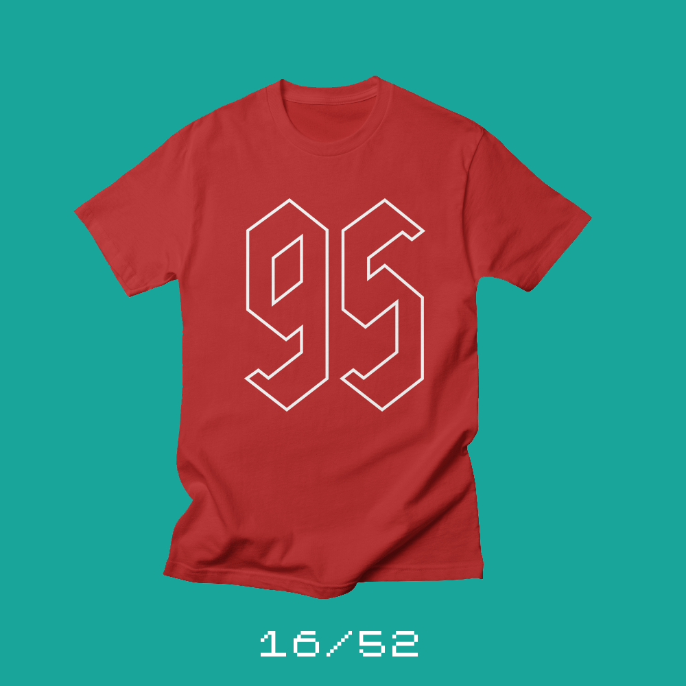
Each week for a year, I’m going to be designing a shirt and releasing it on my Threadless store. This is the design for week 16.
I’m a big fan of Luther, and not just because I’m Lutheran.
Luther was a passionate communicator and he used the latest technology to share his message. The newly-invented printing press made it possible for his ideas to spread across Europe.
“Luther was a passionate communicator and he used the latest technology to share his message.”
Luther focused on grace. The idea that we are all sinful and imperfect people and that we can do nothing to earn salvation. Salvation, instead, was given to us when Christ died on the cross for our sins. Today I look at the state of Christianity and I can’t help but think it’s time for another Reformation. One that focuses on love and reflects on what it means to be Christian — and to act like a Christian — in today’s world.
This week’s shirt is Team Luther and features a “95” in blackletter-inspired* lettering. This is the perfect shirt for Lutherans who want to celebrate the Reformation in a really subtle way. Lutherans never want to talk about their faith, so with this shirt, if someone asks you what it means, you can then tell them about the Reformation and about being Lutheran. After all, they asked.
* Blackletter is a type style commonly associated with medieval Germany. When I had this shirt idea, I thought I knew what blackletter numerals looked like. When I did my research, I discovered that I was completely wrong. So I drew what was in my head, and didn’t base it on a historical model like I had planned. Hence, “blackletter-inspired.”
** Red is the color of the Reformation, and the traditional color of doors in aLutheran church.
Bob Wertz writes about design, technology and pop culture at Sketchbook B. Bob is a Columbia, South Carolina-based designer, creative director, college instructor, husband and dad. He’s particularly obsessed with typography, the creative process and the tools we use to create. He’s currently in the middle of a project to design a new shirt a week for an entire year.
This post was originally posted on October 1, 2017 on Sketchbook B. It’s reposted here as part of a project to move some of my favorite writing to my new site.
I’m not a big fan of Halloween, but I do like candy.
Each week for a year, I’m going to be designing a shirt and releasing it on my Threadless store. This is the design for week 15.
I’ll let you in on a little secret… I don’t really like Halloween. I’m sure I liked it when I was little, but as I got older, it never really meant anything to me. I don’t necessarily hate Halloween, but I am completely ambivalent about it.
My kids and my wife, on the other hand, love Halloween. They dress up and go trick-or-treating, and I follow along, wearing some sports jersey or something, and pretending like it was a costume of some sort.
I wanted to design a shirt as part of the project to wear around with the kids while they trick-or-treat. But my initial sketches were terrible.
Finally, I asked myself what I liked about Halloween? The answer, embarrassingly, is candy. The stores are full of candy that you can’t get the rest of the year. And my favorite of the Halloween candy is candy corn.
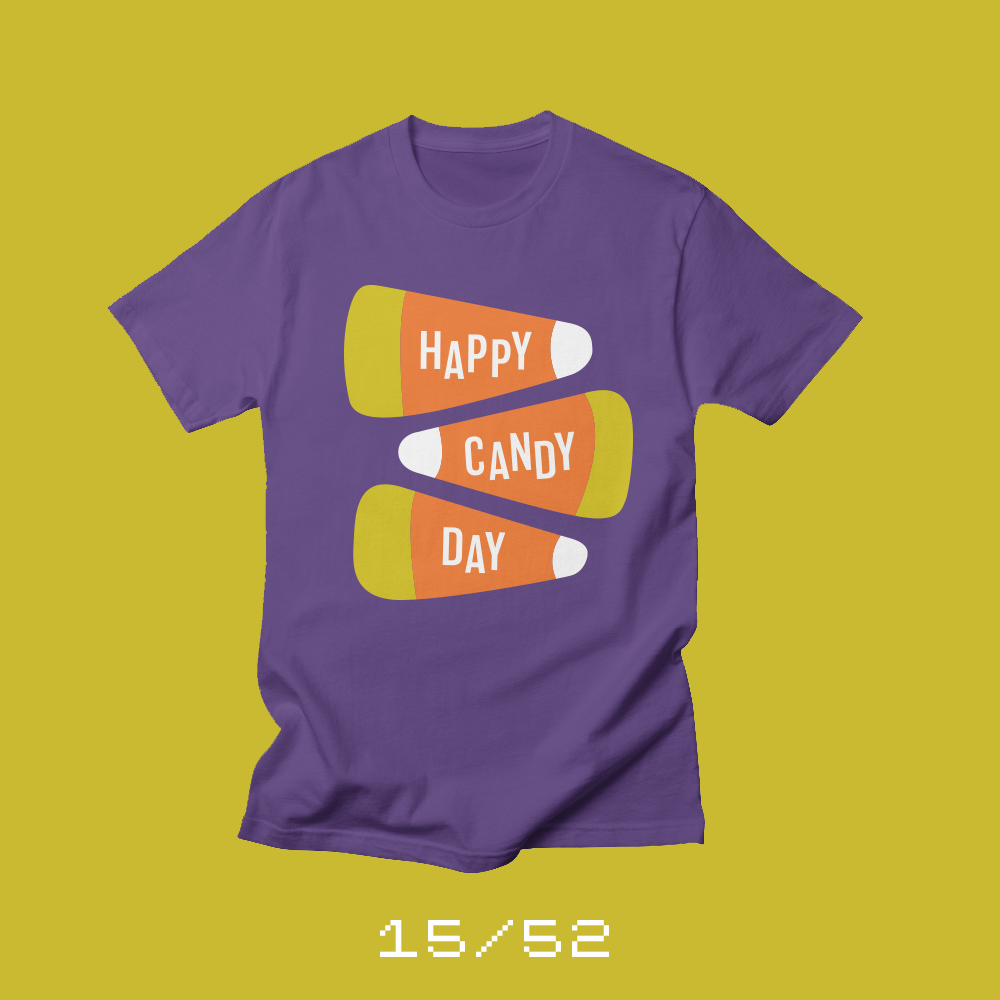
So celebrate candy — and candy corn — with my 15th shirt, Happy Candy Day. You can buy it on my Threadless store, and since it’s Fall, I’ve even made it available as a sweatshirt.
Bob Wertz writes about design, technology and pop culture at Sketchbook B. Bob is a Columbia, South Carolina-based designer, creative director, college instructor, husband and dad. He’s particularly obsessed with typography, the creative process and the tools we use to create. He’s currently in the middle of a project to design a new shirt a week for an entire year.
This post was originally posted on September 24, 2017 on Sketchbook B. It’s reposted here as part of a project to move some of my favorite writing to my new site.
I struggle with the relationship between design and art.
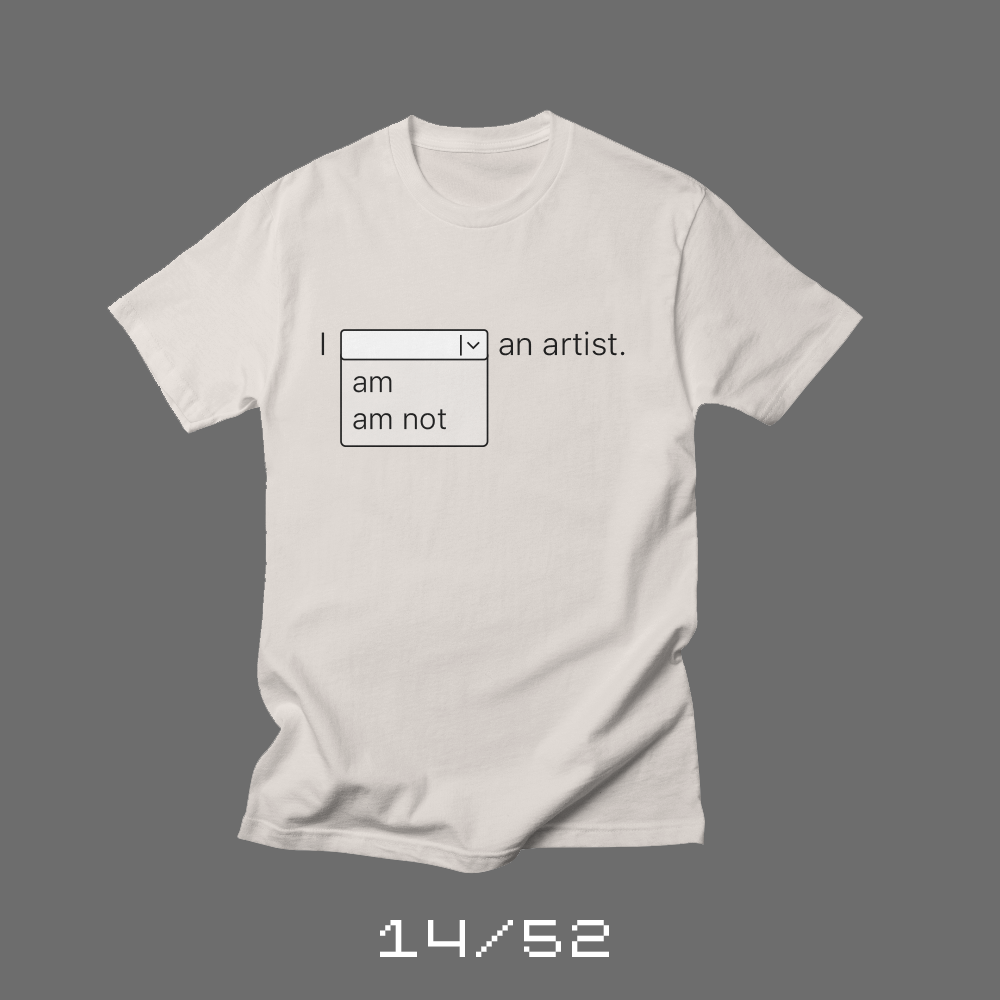
Each week for a year, I’m going to be designing a shirt and releasing it on my Threadless store. This is the design for week 14.
My kids think that I’m a great artist. But most days, I wouldn’t call myself an artist. Designer, yes. Artist…. I’m not sure.
It’s probably a hangup from my youth, but to me, artists use natural media. Paint and canvas. Ink and paper. I feel completely lost with a paintbrush in my hand. While I work out ideas in a sketchbook, my tool of choice is a computer. And to be honest, I’ve always felt that makes me less of an artist.
I’ve talked to many designers my age who feel the same way. But younger designers often have no issue with the distinction between natural media and computer-based creations. They’ve grown up with computers as just another tool that artists use. It’s all art to them.
To complicate things further, as a designer in the business world, I’ve always been taught to base every aesthetic decision on a strategic need. Organizations struggle with subjective artistic decisions, but they love a problem solver. And so designers — like me — often downplay the “art” side of what we do in an effort to show the strategic value of design.
This shirt project is the first thing that I’ve done in a while that feels like an art project. The tools I’m using are the same ones I use when I’m working with clients. The process I’m undergoing is no different than my normal design process. But it feels different.
Maybe it’s that I’m creating for myself, or how I’m presenting the shirt project. Perhaps it’s because I’m not trying to justify my art with a strategic foundation. Whatever the reason, I’m now sure that the difference between artist and designer has nothing to do with the tools, and everything to do with perception.
* My wife thinks I’m an artist, too. And she reallydidn’t like this shirt idea.
Bob Wertz writes about design, technology and pop culture at Sketchbook B. Bob is a Columbia, South Carolina-based designer, creative director, college instructor, husband and dad. He’s particularly obsessed with typography, the creative process and the tools we use to create. He’s currently in the middle of a project to design a new shirt a week for an entire year.
This post was originally posted on September 20, 2017 on Sketchbook B. It’s reposted here as part of a project to move some of my favorite writing to my new site.
Honda’s onto something with their new Urban EV Concept Car
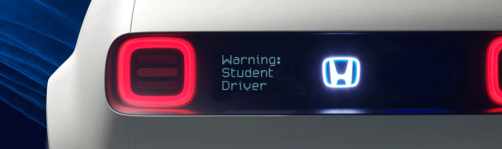
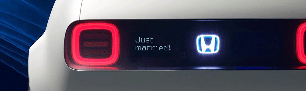
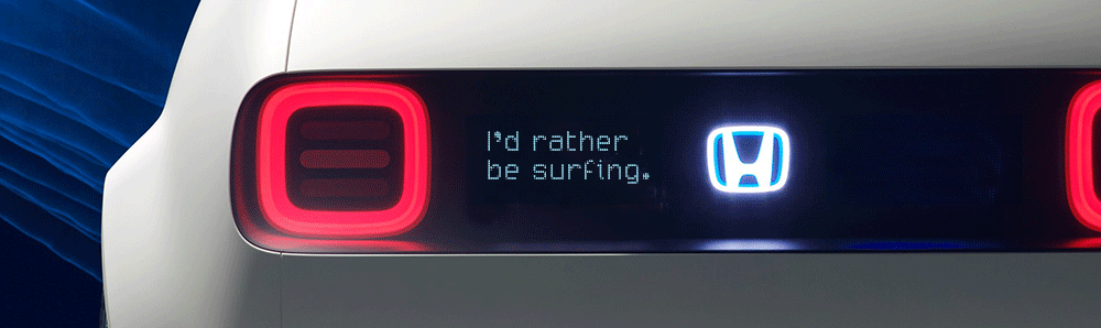
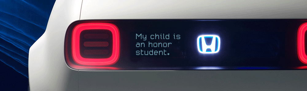
I posted yesterday about Honda’s new Urban EV concept car. And the more I thought about it, the more I realized every new car should come with a programable LED display. The car at the Frankfurt auto show had “#UrbanEV” on the screen, but that only scratches the surface. Imagine all of the potential uses…
Practical messages…
Sweet sentiments…
Wishful thinking…
Of course you are proud of your kid…
Maybe a little mild humor…
A gentle reminder not to tailgate…
I can see a future when every car has an electronic bumper “sticker” that can be changed with an iPhone app. So when your candidate loses unexpectedly, you can change it to “Don’t blame me, I voted for the other guy!” Maybe the anti-tailgating reminder can be triggered by a proximity sensor. Want to build a social media following? Maybe you can go with “You’re already following me in traffic, why not follow me on Twitter?”
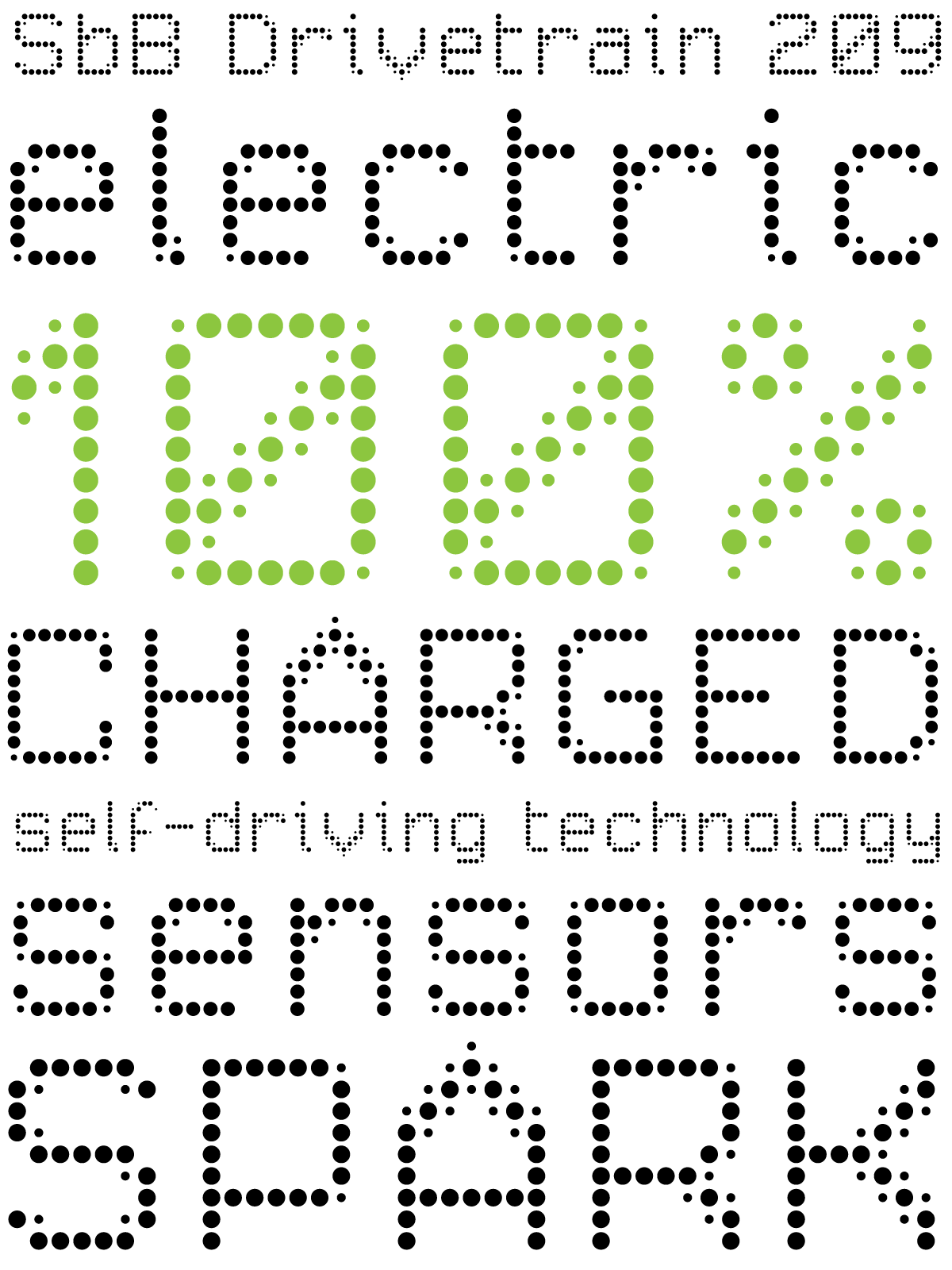
And by the way, I built these quick Photoshop mockups with my new typeface, SbB Drivetrain 209. You can get it for free from Fontstruct if you are interested.
Bob Wertz writes about design, technology and pop culture at Sketchbook B. Bob is a Columbia, South Carolina-based designer, creative director, college instructor, husband and dad. He’s particularly obsessed with typography, the creative process and the tools we use to create. He’s currently in the middle of a project to design a new shirt a week for an entire year.
This post was originally posted on September 17, 2017 on Sketchbook B. It’s reposted here as part of a project to move some of my favorite writing to my new site.
I love concepts cars and modular type, so Honda’s Urban EV is right up my alley.
I grew up going to the Chicago Auto Show and love to see a fun concept car. And the Urban EV is definitely fun. I think it’s interesting to see how car companies are designing electric vehicles, when most of the design constraints from traditional cars — engines, transmissions, gas tanks, etc. — are completely eliminated.
But the thing that really grabbed my attention was the screen and typeface that Honda used on the outside of the car. It includes the name of the car and other details like the charging status. The typeface Honda created for the Urban EV reminds me of an experimental design I created in 2009, Micro 205, but with dots instead of squares.
I took Micro 205 and the Urban EV as a starting point and created an all new typeface on Fontstruct. SbB Drivetrain 209 uses two dots of different sizes to create the alphabet. I’m pretty happy with how it turned out.
A note about the “209” in the name of SbB Drivetrain 209. When I created Micro 205, I had this idea that I would add numbers to all my Fontstruct designs. Each number would combine the number of block styles used with the cap height in blocks, separated by a zero. Micro used 2 blocks and was 5 blocks high, so it became Micro 205. Another example… SbB Codebreaker with 1 block style and a cap height of 43 blocks would be SbB Codebreaker 1043. I never used the numbering convention after Micro 205, but figured it would be fun to dust off for Drivetrain since Micro 205 was part of the inspiration.
Bob Wertz writes about design, technology and pop culture at Sketchbook B. Bob is a Columbia, South Carolina-based designer, creative director, college instructor, husband and dad. He’s particularly obsessed with typography, the creative process and the tools we use to create. He’s currently in the middle of a project to design a new shirt a week for an entire year.
This post was originally posted on September 17, 2017 on Sketchbook B. It’s reposted here as part of a project to move some of my favorite writing to my new site.
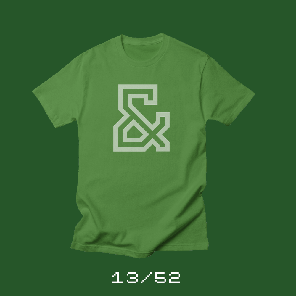
5 years ago this week, I released my first commercial typeface.
Each week for a year, I’m going to be designing a shirt and releasing it on my Threadless store. This is the design for week 13.
I released a couple of free typefaces in the early days of Sketchbook B. But five years ago, I took a big step and released my first commercial typeface, Powerlane.
Powerlane is a massive typeface family. 20 different fonts. And when you count all of the letters and numbers, foreign characters and special OpenType alternates, the family has more than 8,000 glyphs.
I’m proud of Powerlane. I spent years designing Powerlane and learning all about the process of finalizing a commercial typeface. And even though I haven’t sold a ton of copies, I have sold copies on five continents — North America, South America, Europe, Asia and Australia — which I think is pretty amazing.
I’ve released four other commercial fonts since Powerlane: Valdes Clarendon, Power Grid 2.0, Intermodal and Saluda. You can buy all of them on Creative Market. Powerlane and Valdes Clarendon are available on MyFonts, too. You can check out all of my type designs on my Fonts page.
Also, a quick side note… With the release of the 13th shirt, I’m a quarter of the way through my 52 Shirts project. 39 to go.
Bob Wertz writes about design, technology and pop culture at Sketchbook B. Bob is a Columbia, South Carolina-based designer, creative director, college instructor, husband and dad. He’s particularly obsessed with typography, the creative process and the tools we use to create. He’s currently in the middle of a project to design a new shirt a week for an entire year.
This post was originally posted on September 10, 2017 on Sketchbook B. It’s reposted here as part of a project to move some of my favorite writing to my new site.
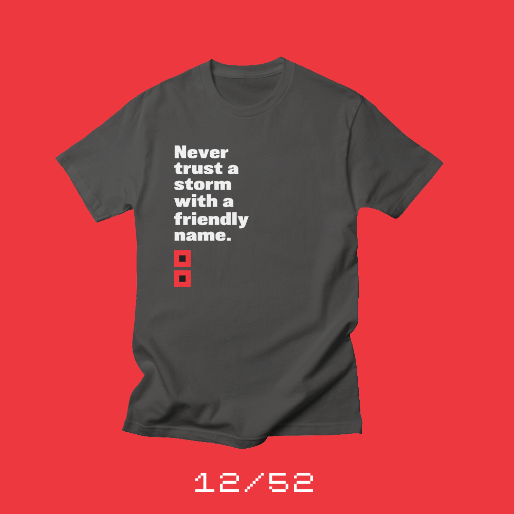
We personify the things we cannot control.
Each week for a year, I’m going to be designing a shirt and releasing it on my Threadless store. This is the design for week 12.
As I write this, Hurricane Irma is about to tear through Florida after devastating the Caribbean. I live in South Carolina, and earlier this week, we were in the path of this beast of a hurricane. Gas stations ran out of fuel. Grocery stores rushed to stock enough bread and bottled water. Irma turned west and now, we’ll likely avoid a direct hit.
But I also think that we personify these storms because it’s somewhat comforting to give a friendly, familiar name to something so incredibly terrifying. Irma, Harvey, Katrina, Andrew, Hugo… These were monstrous, deadly destructive storms, but each of them with a friendly, approachable name. We talk about them as though they are our next door neighbor. And it seems to me that the friendlier the name, the more dangerous and unpredictable the storm is.
“But I also think that we personify these storms because it’s somewhat comforting to give a friendly, familiar name to something so incredibly terrifying.”
So this week’s shirt is a reminder that no matter how friendly a storm name sounds, it’s still a dangerous force of nature. You can order “Never trust a storm with a friendly name” from my Threadless store. And stay safe out there.
* Bob was retired after the 1991 storm wrecked havoc in New England.
Bob Wertz writes about design, technology and pop culture at Sketchbook B. Bob is a Columbia, South Carolina-based designer, creative director, college instructor, husband and dad. He’s particularly obsessed with typography, the creative process and the tools we use to create. He’s currently in the middle of a project to design a new shirt a week for an entire year.
This post was originally posted on September 3, 2017 on Sketchbook B. It’s reposted here as part of a project to move some of my favorite writing to my new site.
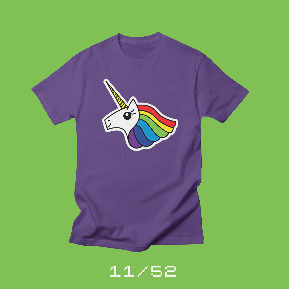
I designed this week’s shirt with my daughter.
Each week for a year, I’m going to be designing a shirt and releasing it on my Threadless store. This is the design for week 11.
My middle child, Jill, turns 10 this week. As part of my 52 Shirts project, I decided I would design a shirt for each child on their birthday.
It was easy to choose what to design for Jill. The girl is obsessed with unicorns. So I designed a unicorn the way I would design a unicorn. Angular and modern.
To be honest, it completely sucked.
And that’s when I had an epiphany. Instead of designing a shirt for Jill, I needed to design a shirt with Jill. I threw out my crappy unicorn design and started to talk to Jill about what she really wanted in a unicorn shirt. We sketched together at the dining room table. We talked about colors and style. She taught me all about “kawaii” style (which apparently is Japanese for cute). We drew different versions of kawaii unicorn eyes. And the end result — our “Team Rainbow Unicorn” shirt — is one of my favorite creations ever.
(One fun note, the horn has ten segments because she’s turning 10. That was my wife’s idea. This shirt is a complete team effort.)
I’ve always said that I don’t — that I can’t — design cute things. And yet, this unicorn is completely adorable. I could never design something like this on my own. I needed Jill’s help to break out of my rigid style. It’s just another reminder to me that I’m a better designer when I partner with other creative people.
Bob Wertz writes about design, technology and pop culture at Sketchbook B. Bob is a Columbia, South Carolina-based designer, creative director, college instructor, husband and dad. He’s particularly obsessed with typography, the creative process and the tools we use to create. He’s currently in the middle of a project to design a new shirt a week for an entire year.
This post was originally posted on August 26, 2017 on Sketchbook B. It’s reposted here as part of a project to move some of my favorite writing to my new site.
I hate my handwriting.
Each week for a year, I’m going to be designing a shirt and releasing it on my Threadless store. This is the design for week 10.
After I finished 2nd grade, we moved from North Carolina to Illinois. The move went smoothly, with one notable exception. In North Carolina, they taught cursive in 3rd grade. In Illinois, they taught cursive in 2nd grade. I didn’t know how to write in cursive, yet I was required to write everything in cursive in my new school.
Mrs. Schmidt was nice and had a solution for this problem… I would learn cursive over the first two weeks of school. A couple times a day, I’d go over to a desk off to the side and do cursive worksheets. And it worked, kind of. I learned the basics of how to make the letterforms, but I never became comfortable. My cursive handwriting never became fluid or natural. It always looked like the writing of a 3rd grader.
Eventually, I moved on from elementary school and my teachers no longer cared if I wrote in cursive. I settled on my current style — mostly block printing with some cursive connectors thrown in for speed. I became more comfortable, but I hated my handwriting.
When I was young, having to write handwritten notes to people always stressed me out because I thought people would judge my juvenile writing. I still don’t write long notes in greeting cards because it makes me anxious. In high school and college, I actively destroyed my signature and made it messier because I thought it looked “older.”
“I still don’t write long notes in greeting cards because it makes me anxious.”
A few years ago, I discovered fountain pens — and better writing utensils. Writing with nice pens and pencils changed my writing. When I wrote with an extra fine nib, my handwriting became small and neat. And with a 1.1 mm stub nib, my handwriting was looser and more fluid. I still don’t love my handwriting, but I’m less embarrassed about writing notes to people.
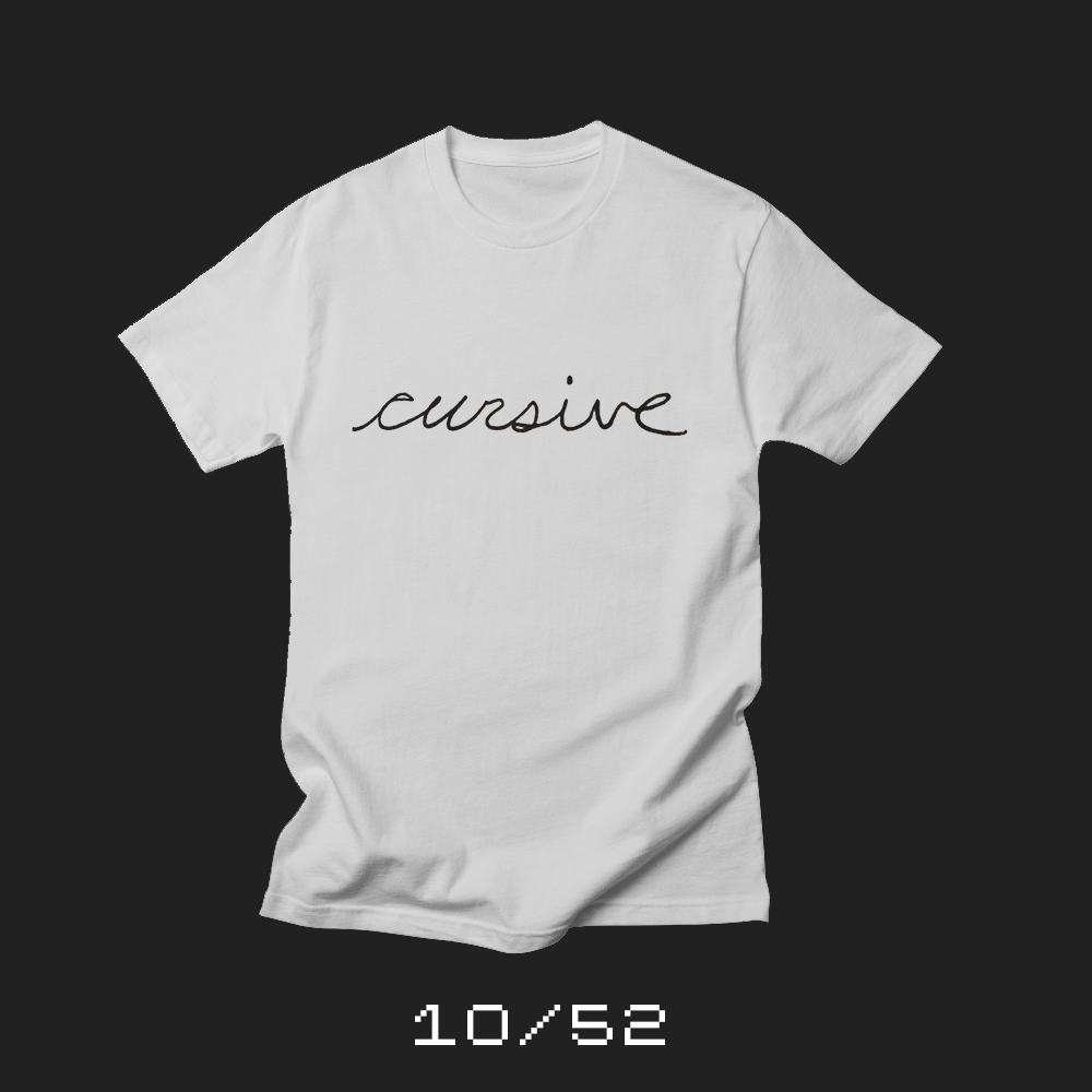
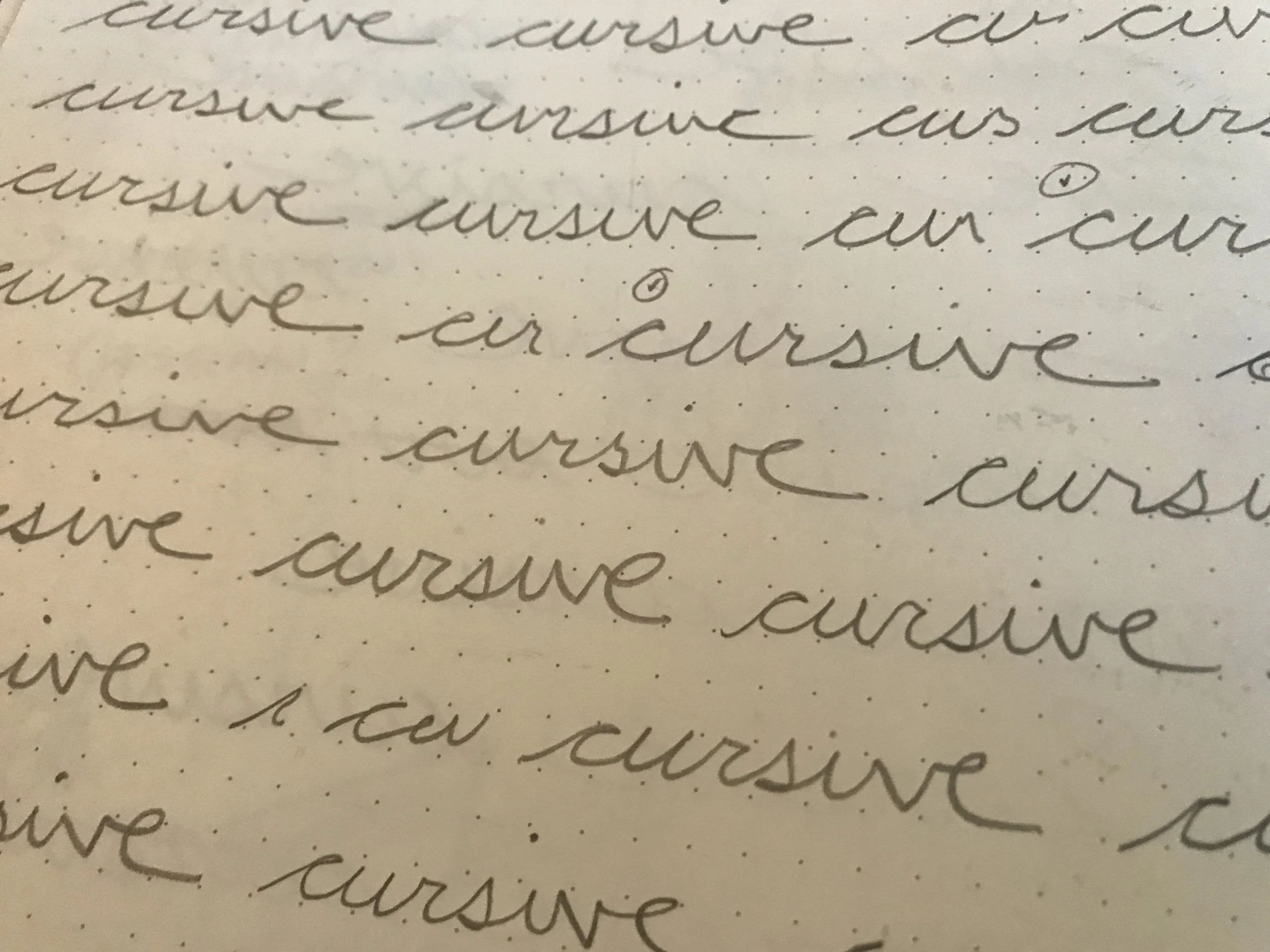
This week’s shirt is Cursive. And it’s my handwriting. I used a limited edition Blackwing Volume 73 pencil — one with a really soft lead. And I wrote the word cursive in my sketchbook several hundred times.* I eventually found one I liked to scan and convert.
Bob Wertz writes about design, technology and pop culture at Sketchbook B. Bob is a Columbia, South Carolina-based designer, creative director, college instructor, husband and dad. He’s particularly obsessed with typography, the creative process and the tools we use to create. He’s currently in the middle of a project to design a new shirt a week for an entire year.
This post was originally posted on August 20, 2017 on Sketchbook B. It’s reposted here as part of a project to move some of my favorite writing to my new site.
The internet is shaping who we are.
Each week for a year, I’m going to be designing a shirt and releasing it on my Threadless store. This is the ninth design of fifty-two.
The first reference to “You are what you eat” was in the 1860s. But today, I think it’s more accurate to say that in the age of the internet, we become what we consume. Our attitudes, our temperament and even our well-being is significantly influenced by what media we consume online.
I watched last weekend as the events in Charlottesville unfolded. And there were Nazis — Nazis! — marching with torches on a college campus. And then followed by more violence the next day and the death of a counter protester.
Look, I’m not going to blame the internet for Nazis. They existed long before the internet. But I think many of the young adults that showed up in Charlottesville were fueled and amplified by what they saw online. Or more precisely, what they chose to seek out online.
The Nazis are an extreme example of this though. Today, I feel like all of us are shaped by the media we consume. If you only watch Fox News… CNN… conspiracy websites… Twitter… cat videos… hate-filled rhetoric… you slowly become what you consume.
“…having a well-rounded media diet makes us all better, happier and healthier people.”
The internet is full of content. Funny and serious. Factual and false. Some articles and videos are thoughtful and well reasoned. Some content is shallow and inflammatory. I’m not saying you need to only watch serious, long form content from reputable sources. But I am saying that having a well-rounded media diet makes us all better, happier and healthier people.
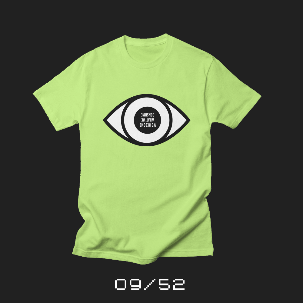
This week’s shirt is “We become what we consume.” And yes, the lettering is reversed and upside down on purpose. Our eye flips everything it sees.The brain then corrects it for us.
Bob Wertz writes about design, technology and pop culture at Sketchbook B. Bob is a Columbia, South Carolina-based designer, creative director, college instructor, husband and dad. He’s particularly obsessed with typography, the creative process and the tools we use to create. He’s currently in the middle of a project to design a new shirt a week for an entire year.
This post was originally posted on August 13, 2017 on Sketchbook B. It’s reposted here as part of a project to move some of my favorite writing to my new site.
Every great teacher is a bit of a renegade.
Each week for a year, I’m going to be designing a shirt and releasing it on my Threadless store. This is the eighth design of fifty-two.
School is starting back.
I’ve been lucky to have some amazing teachers through the years in a wide range of subjects and at pretty much every level from elementary school through college. Without exception, every impactful teacher I’ve had was a little unconventional in their teaching methods. They looked for the most powerful way to reach their students, even it meant pouring an absurd amount of time and energy into kids who — let’s be honest — probably didn’t appreciate it at that time.
That was a simpler time. Before constant testing and obsessive parents.* It occurs to me that those great teachers — the ones who were just a little unconventional when I was in school — would be downright renegades in today’s education world.
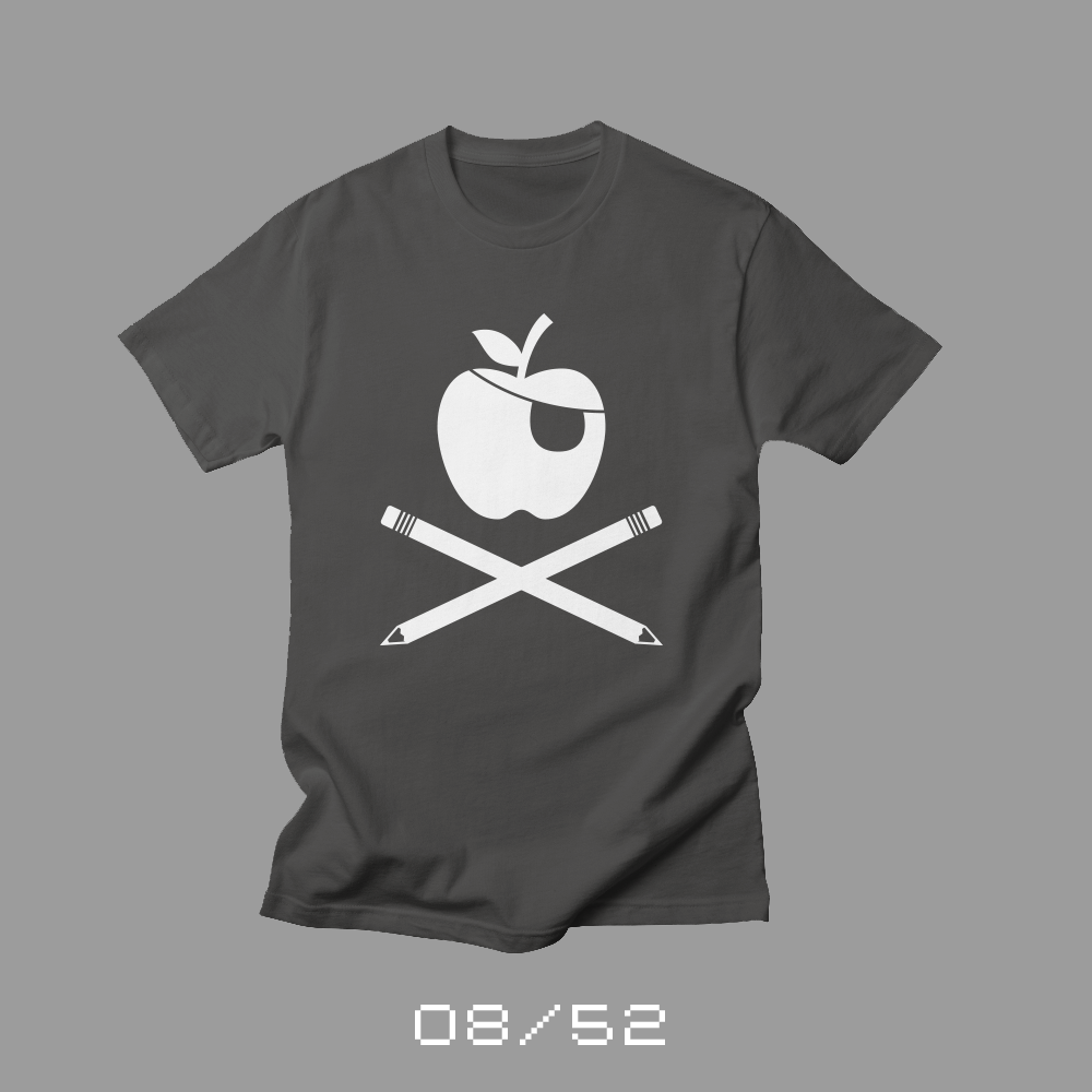
So to salute those great teachers, this week’s shirt is all about being a renegade in the classroom. A pirate flag for teachers that aren’t afraid to do whatever it takes to teach their students.
* Yes, I know parents have always been obsessive, but today’s parents seem worse by historic standards.
Bob Wertz writes about design, technology and pop culture at Sketchbook B. Bob is a Columbia, South Carolina-based designer, creative director, college instructor, husband and dad. He’s particularly obsessed with typography, the creative process and the tools we use to create. He’s currently in the middle of a project to design a new shirt a week for an entire year.
This post was originally posted on August 6, 2017 on Sketchbook B. It’s reposted here as part of a project to move some of my favorite writing to my new site.
Getting the most out of a sheet of paper
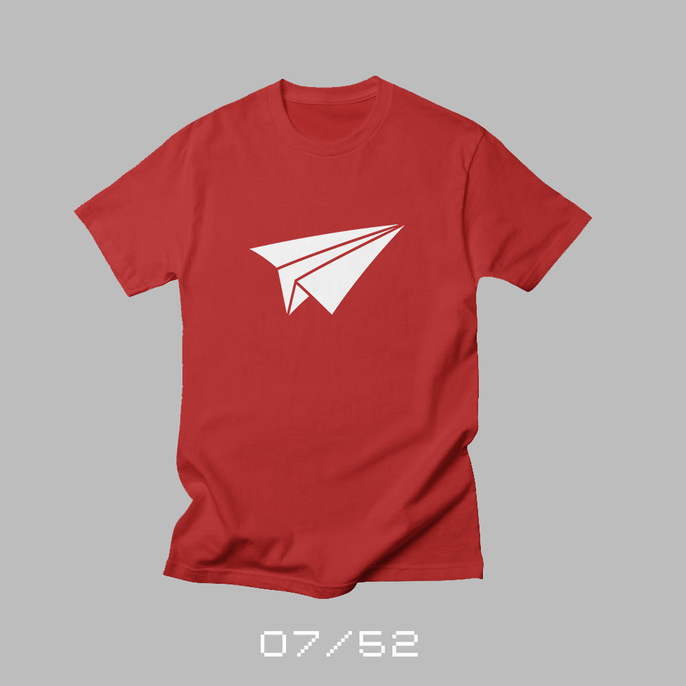
Each week for a year, I’m going to be designing a shirt and releasing it on my Threadless store. This is the seventh design of fifty-two.
Sometime in late elementary school, browsing through a Waldenbooks* at the Fox Valley Mall, I stumbled upon a book about paper airplane design. 30 Designs for the Paper Pilot taught you how to build some (absurdly) complex paper airplanes.
The author, Peter Vollheim, was a pilot and created airplanes using regular paper, card stock, index cards, business cards, straws and other common materials. He tested his designs with wind tunnels and then provided detailed instructions for how to build them at home. He got the most out of his materials and the paper airplanes he designed flew far and straight. I eventually purchased Vollheim’s two other books, 30 More Planes for the Paper Pilot and The Paper Ace.
And while these books helped me build some wicked paper airplanes, I think they heavily influenced my design style, too. Most people who are interested in paper folding start with origami — the art of paper folding. But while I played around with some simple origami, I was much more intrigued by the functionally of paper airplanes.
Early in my design career, many of my creations contained interesting paper folding. Looking back, I can see the influence that Vollheim’s books had on my thought process. Even though they didn’t fly, my folded paper designs were absolutely intended to get the most possible out of a sheet of paper, just like Vollheim’s airplanes. ( I don’t fold paper as much as I used to… maybe it’s time to get back to my roots.)
I was disappointed — but not surprised — to find that Vollheim’s three books were out of print. And while you can still get used copies of the books on Amazon, I was delighted to discover Vollheim has a web site were you can still purchase all three books as a PDF. If you are interested in the aerodynamics of paper airplanes, you’ll love these books.
* Or maybe it was a B. Daltons. I miss mall book stores.
** Pretty much every color but white and orange.
Bob Wertz writes about design, technology and pop culture at Sketchbook B. Bob is a Columbia, South Carolina-based designer, creative director, college instructor, husband and dad. He’s particularly obsessed with typography, the creative process and the tools we use to create. He’s currently in the middle of a project to design a new shirt a week for an entire year.
This post was originally posted on July 30, 2017 on Sketchbook B. It’s reposted here as part of a project to move some of my favorite writing to my new site.
Another year older
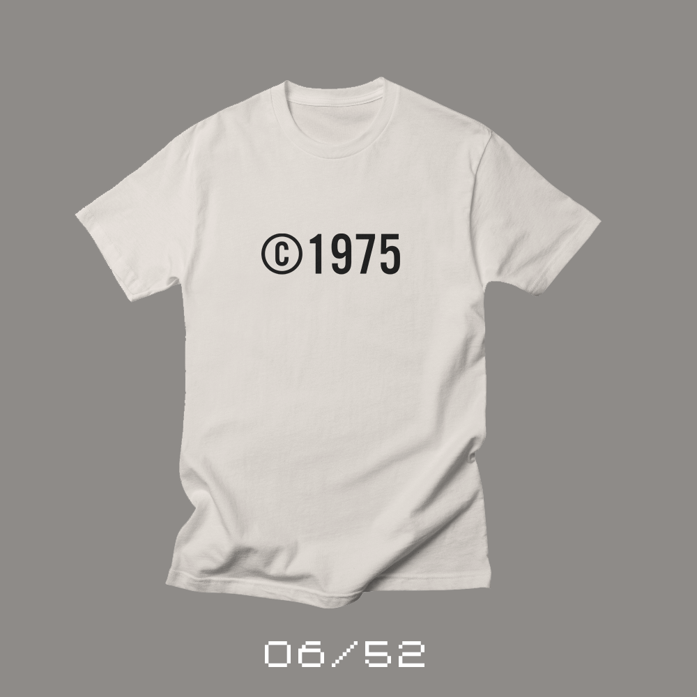
Each week for a year, I’m going to be designing a shirt and releasing it on my Threadless store. This is the sixth design of fifty-two.
This week, in 1975, I was born. My birthday isn’t a momentous one this year. I’m just another year older and a little more gray.
I love when I was born — I got to see the advent of the personal computer, the growth of the internet, comic book movies that don’t suck, iPhones and digital cameras. But I also remember typewriters, card catalogs, Superfriends, rotary phones and working in a darkroom.
When I was younger, it was significant work and investment to share a creation. And copyright was one way that an artist protected that investment. Today, it’s simple for a creator to publish their own writing online, share thoughts on social media, sell music and even offer t-shirts that are printed on demand. And it’s easier than ever for others to steal your creations and profit off of them.
Copyright was relatively straightforward when I was born, but the changes in technology are forcing an evolution in how we look at intellectual property rights. Maybe copyright is like the technology of my youth — obsolete like a rotary phone? Or maybe it just needs to evolve to better protect artists in a digital age while preserving the freedom to create. Forty years from now, I imagine copyright law with be radically different.
This week’s shirt is Copyright 1975 and you can buy one from Threadless. Of course, it only makes sense to purchase one if you were born in 1975.
Bob Wertz writes about design, technology and pop culture at Sketchbook B. Bob is a Columbia, South Carolina-based designer, creative director, college instructor, husband and dad. He’s particularly obsessed with typography, the creative process and the tools we use to create. He’s currently in the middle of a project to design a new shirt a week for an entire year.
This post was originally posted on July 23, 2017 on Sketchbook B. It’s reposted here as part of a project to move some of my favorite writing to my new site.
There’s something special about gathering around a campfire.
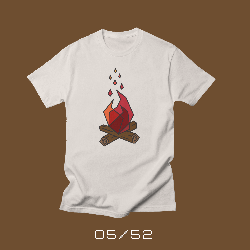
Each week for a year, I’m going to be designing a shirt and releasing it on my Threadless store. This is the fifth design of fifty-two.
Some of my happiest memories are at one, very specific place: Lutheridge, a camp in Arden, North Carolina.
As a young child, I attended as a camper. I made lifelong friendships as a high school camper. And then, after my freshman year of college, I was beyond excited to be a counselor.
And promptly blew my knee out.*
My summer ended very quickly. One week to be exact. I had to have reconstructive surgery on my right knee. I was devastated and heartbroken.
I returned the next summer and this time, made it through the summer unscathed. I had a great summer — a challenging summer — but an amazing time working with kids. But that was my last summer at Lutheridge. The following year, I worked as an orientation leader at the University of South Carolina and then, I graduated and entered the work world.
A couple of years ago, my girls started to attend Lutheridge as campers. And they fell in love with camp, just like I did when I was young. It was fun to see the camp experience through their eyes. To hear them talk and share their experiences.
This summer, our entire family is headed to camp. My wife had never spent time at any summer camp and our youngest is too young for regular camp, so the three of us are heading to a program for families. The girls are doing their usual camp activities, but we’ll all be there at camp for an entire week. The whole crew is excited and I’m really looking forward to being a “camper” again.
I wanted to design a shirt for camp. Something that captured my love of Lutheridge and my history with the place. When I was young, I remember Lutheridge’s logo was a campfire.** It was emblazoned on more than one shirt I had growing up. So this week’s shirt is a stylized campfire, in honor of the camp that I love.
* It’s a little more complicated than that. I injured my knee during orientation during a game of elbow tag. Then finished off my ACL during the first week of camp with a musical, noncompetitive version of duck-duck-goose… on wet grass.
** The logo is actually still a campfire, but different than the one I remember…
Bob Wertz writes about design, technology and pop culture at Sketchbook B. Bob is a Columbia, South Carolina-based designer, creative director, college instructor, husband and dad. He’s particularly obsessed with typography, the creative process and the tools we use to create. He’s currently in the middle of a project to design a new shirt a week for an entire year.
This post was originally posted on July 22, 2017 on Sketchbook B. It’s reposted here as part of a project to move some of my favorite writing to my new site.
SbB Codebreaker selected as an honorable mention for the Fontstruct Reverse Competition and a Top Pick.
SbB Codebreaker was selected as an honorable mention for the Fontstruct Reverse Competition and also awarded a Top Pick. I really enjoy working in Fontstruct, but what I love about these competitions is that the theme pushes you in new creative directions. Over the years, my competition entries have been different from my normal approach. I’ve had fun, but I’ve only been mentioned in the wrap up blog post one other time — for Dingbots and Monsters XL for the Illustrative Competition. SbB Commodora is one of my favorite Fontstructions and was my entry for the Connected Script Competition. And Infield was my Sports Competition entry.
Thanks to the whole Fontstruct crew and the amazing community. Can’t wait for the next competition.
Bob Wertz writes about design, technology and pop culture at Sketchbook B. Bob is a Columbia, South Carolina-based designer, creative director, college instructor, husband and dad. He’s particularly obsessed with typography, the creative process and the tools we use to create. He’s currently in the middle of a project to design a new shirt a week for an entire year.
This post was originally posted on July 16, 2017 on Sketchbook B. It’s reposted here as part of a project to move some of my favorite writing to my new site.
The power of a tangible object
Each week for a year, I’m going to be designing a shirt and releasing it on my Threadless store. This is the fourth design of fifty-two.
My daughters got Fuji Instax cameras for Christmas. The idea of an instant print was a novelty to them.* We’ve documented their lives with digital cameras. We bought our first DSLR the month our oldest child was born so our kids have always been able to see pictures immediately after they are taken. But an instant print is different and they fell in love with taking pictures, trading shots and labeling them.** Photos have largely become digital things for this younger generation of kids. They didn’t grow up with shoeboxes full of prints and negatives. It was fun to see them interact with photos as physical objects.***
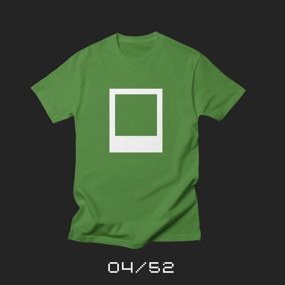
As I looked at the stack of pictures they took, I noticed the familiar white frame of an instant print. There are a wide range of sizes and proportions of instant prints, but almost all of them share a similar, logical structure. A white frame around the top, outside edges and a wide bottom containing a packet of chemicals that develop the image. (The wide bottom also doubles as a place to caption your image.)
I guarantee you that the engineer that created the shape of the print had no idea that he was creating such an iconic shape. He was simply solving a problem. Yet, the iconic shape became so valuable, that when Polaroid declared bankruptcy, the shape, proportions and size of the most famous instant film print size — the Polaroid 600 — was part of the intellectual property that was sold to a holding company for licensing agreements.**** The design of the frame had more perceived value than the business they were in.
This week’s shirt is an instant print frame. Just the frame and nothing in it. For me, the instant print frame serves as a reminder that in today’s digital world, tangible things still have magic.
* I pondered the future of the instant print in a smartphone world in a post in 2008. Funny to see me describe how awful the first iPhone camera was. My iPhone 7+ camera is completely amazing.
** They were less enamored with having a limited number of shots and the cost of the film.
*** Now I desperately want an instant camera. Either the new Fujiflim Instax SQ10 or the Leica Sofort, which is a glorified Instax Mini 90, but with Leica style. And I’ve always wanted a Leica.
**** Which is why everyone who uses the instant print shape — including me — avoids using the exact proportions and size of an actual Polaroid print.
Bob Wertz writes about design, technology and pop culture at Sketchbook B. Bob is a Columbia, South Carolina-based designer, creative director, college instructor, husband and dad. He’s particularly obsessed with typography, the creative process and the tools we use to create. He’s currently in the middle of a project to design a new shirt a week for an entire year.
This post was originally posted on July 9, 2017 on Sketchbook B. It’s reposted here as part of a project to move some of my favorite writing to my new site.
Celebrating a total solar eclipse this August
Each week for a year, I’m going to be designing a shirt and releasing it on my Threadless store. This is the third design of fifty-two.
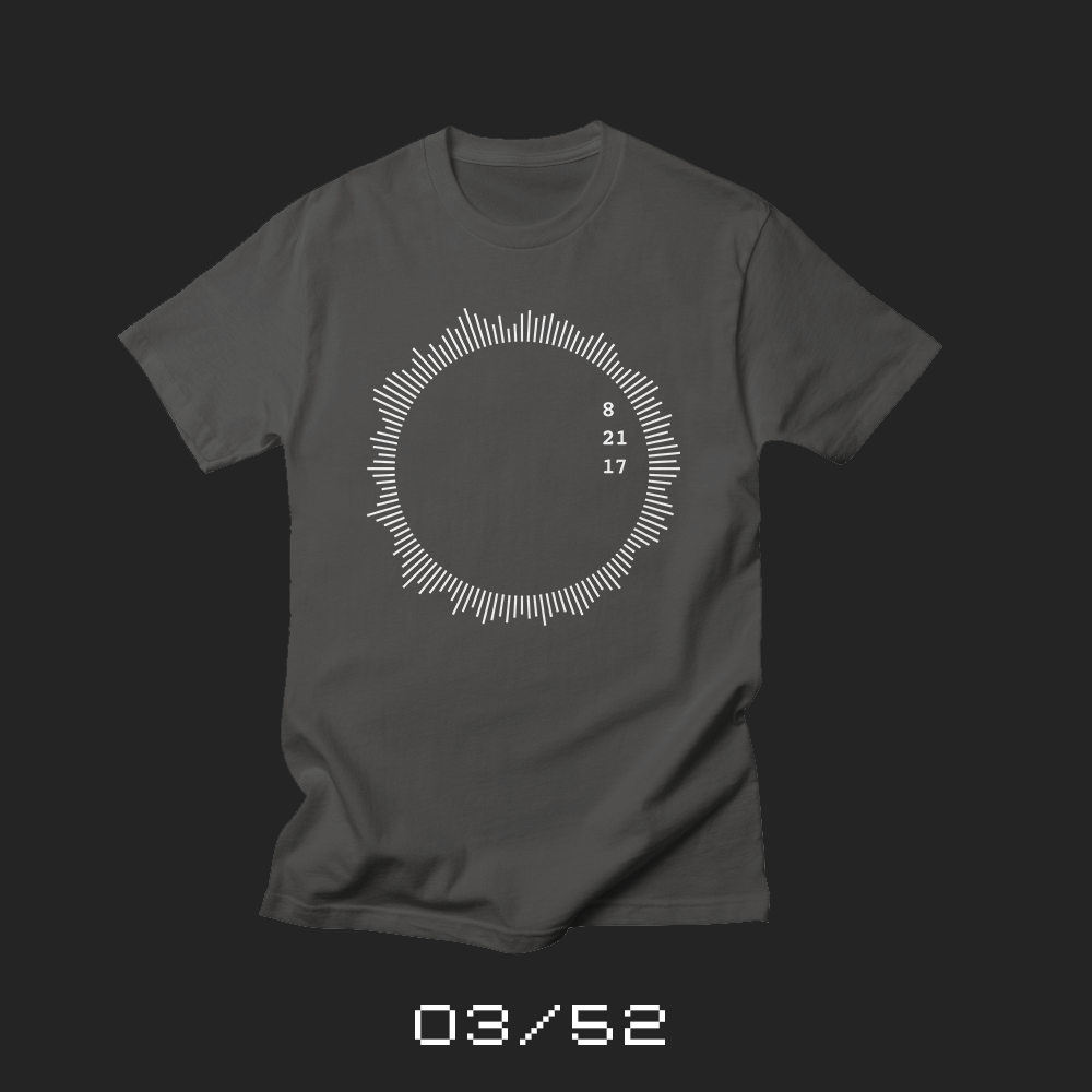
I wanted to design a shirt to commemorate the occasion. I looked at a couple of different approaches, but settled pretty quickly on an abstract visual representation of the sun’s corona. During a total solar eclipse, you can directly observe the corona around the moon’s shadow. As an added bonus, the 21st is also our wedding anniversary, and I felt like the shape of the corona was slightly evocative of a wedding ring.
My sketches and my first draft had more text in and around the corona, but I fell in love with just having the date positioned off to the side.
I originally planned to release this design the week of the eclipse, but I wanted to give people plenty of time to purchase it and have it in time for August 21. It’s available in a range of dark colors, including a really sweet looking black and gray baseball shirt.
Bob Wertz writes about design, technology and pop culture at Sketchbook B. Bob is a Columbia, South Carolina-based designer, creative director, college instructor, husband and dad. He’s particularly obsessed with typography, the creative process and the tools we use to create. He’s currently in the middle of a project to design a new shirt a week for an entire year.
This post was originally posted on July 8, 2017 on Sketchbook B. It’s reposted here as part of a project to move some of my favorite writing to my new site.
My odd entry for the Fontstruct Reverse Competition
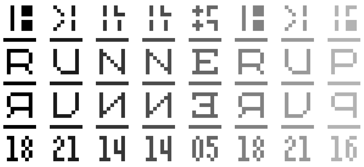
I don’t have time to play around on Fontstruct much these days, but I noticed that they were having a competition centered around the theme, “Reverse.” I sketched out a couple of ideas and was able to pull together SbB Codebreaker before the deadline tonight.
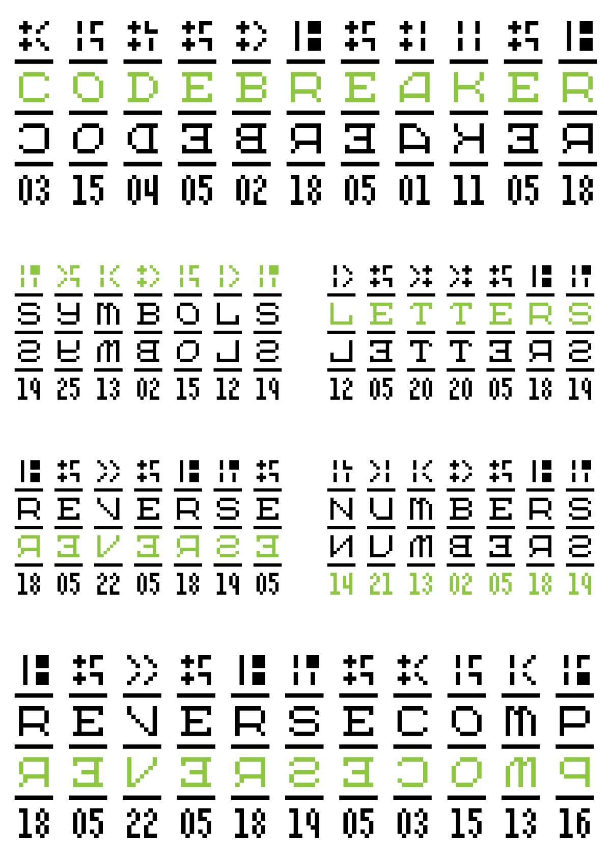
So Codebreaker has four tiers: symbols, letters, reversed letters and alphanumeric. The idea is that you can use Codebreaker to translate to other letters, numbers or symbols, kind of like the Rosetta Stone. It’s completely impractical, but really distinctive looking.
Because I’m a bit of a Fontstruct purist, I usually try to execute my ideas with the fewest number of bricks. And this one is no exception. I used only one brick to build Codebreaker.
I miss playing around on Fontstruct and need to remember to get back there more frequently.
Check out SbB Codebreaker on Fontstruct. And remember that you can download my free fonts and Fontstruct fonts from my Fonts page. (And learn about my pro fonts that are available on My Fonts and Creative Market.)
Bob Wertz writes about design, technology and pop culture at Sketchbook B. Bob is a Columbia, South Carolina-based designer, creative director, college instructor, husband and dad. He’s particularly obsessed with typography, the creative process and the tools we use to create. He’s currently in the middle of a project to design a new shirt a week for an entire year.
This post was originally posted on July 2, 2017 on Sketchbook B. It’s reposted here as part of a project to move some of my favorite writing to my new site.
A simple twist on the stars and stripes
Each week for a year, I’m going to be designing a shirt and releasing it on my Threadless store. This is the second design of fifty-two.
In honor of the Fourth of July, I wanted to design a shirt that’s a little patriotic… with a twist. I wondered what the stars and stripes would look like if it had designed with modern design sensibilities and restrictions. Is it refined and simple? Can it be easily reproduced in small sizes? Will it work as a social media icon?
How minimalist can you make the American flag and still evoke the feeling of the stars and stripes?
And so my second design is America the Minimal, a simple take on the stars and stripes. But what started as a funny little speculative redesign triggered some thoughts about redesigns, minimalism and more.
First some history about the American flag. I knew that the Betsy Ross origin story was widely considered a myth, but I didn’t know much about who was credited with designing the original U.S. flag. Turns out a guy named Francis Hopkinson is credited with the design of the flag and many other American symbols. He actually requested payment from the Congress in the form of a “quarter cask of wine” in exchange for designing the American flag, the Great Seal of the United States and other symbols. Long story short, he never got paid.*
The current flag has been in use since 1960 and is actually the 27th version. The number of stars have changed as states have been added. In early years, there was no prescribed structure for the stars so it varied based on who was sewing the flag. Only the number of stars was mandated. (The original stars had six points, but it turns out five-pointed stars are easier to produce.)
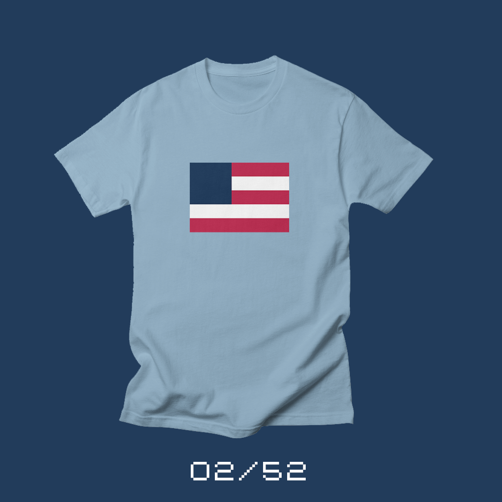
As I sought to create a minimalist version of the U.S. Flag, I started with the stripes. My first drafts had four stripes, but that didn’t look quite right. The regular American flag has an odd number of stripes and the top and bottom stripes are both red. Three stripes were too few. And while both five and seven stripes worked nicely, I eventually settled on five stripes for my design.
The stars were a challenge because they don’t work well at small sizes. My first thought was to use one big star in the blue field, but a single star was too prominent. (Plus, it looks like the Liberian flag.) As I was driving home one afternoon, I noticed that when you look at a flag flying at a distance, the stars almost disappear into the blue field. And after experimenting for a little bit, I came to the conclusion that maybe the best solution to keep things minimal was to eliminate the stars and go with a plain blue field.
And what I ended up with is a minimalist version of the American flag with five stripes and a plain blue field. I think it successfully feels like a more simple version of the American flag and not the flag for another country.
As I wrapped up the shirt design, a couple of lessons resonated with me.
First, it would be impossible to redesign the American flag in today’s environment. As I focused on designing a “new” flag, it occurred to me how frustrating this process would be. Every single item I removed or changed had meaning. And as I changed those things, every alternation would be scrutinized. I can hear the comments now…
Why aren’t there 13 stripes? You know, the ones that stood for the 13 original colonies. Do you no longer care about history? And where are the stars? Removing the stars is a sign that you care more about the federal government than the states. This is clearly the work of socialism! This is clearly the work of facism!
No one would be happy. And as I thought about it, redesigning the American flag, or any U.S. political symbol, has to rank as one of the worst, most impossible jobs in the design world. Which is why the flag won’t ever change. (I might argue that one reason Puerto Rico won’t become a state is that there are people who would be uncomfortable adding a 51st star.)
But here’s the bigger takeaway for me… Sometimes, minimalist solutions are unnecessarily limiting. In this case, it was a fun exercise, but every revision took away meaning. The 13 stripes do stand for the 13 original colonies. The 50 stars stand for each of the states in the union. Slavishly removing those things in an effort to make it more simple destroys the meaning of the symbol. And the quest to be minimal adds an additional challenge: with every detail you remove, the design becomes less unique. The “new” flag looks more like other country and state flags. One benefit of more complex designs is that they often seem more original than simpler ones.
Get your America the Minimal shirt over at my Threadless store. I’ve included kids shirts for this week and a long sleeve “baseball” tee. Remember that for the first week a new design is on sale, the price is discounted, so get your shirt this week and save some money.
One additional note. I realize that it’s too late to order shirts for the 4th of July this year. For future seasonal shirts, I’ll release them earlier so you’ll be able to get them in time.
* That’s what you get for doing spec work, I guess… even in the 1790s.
Bob Wertz writes about design, technology and pop culture at Sketchbook B. Bob is a Columbia, South Carolina-based designer, creative director, college instructor, husband and dad. He’s particularly obsessed with typography, the creative process and the tools we use to create. He’s currently in the middle of a project to design a new shirt a week for an entire year.
This post was originally posted on June 25, 2017 on Sketchbook B. It’s reposted here as part of a project to move some of my favorite writing to my new site.
One shirt a week for an entire year
I was sitting in a coffee shop, hyped up on way too much caffeine. I’d taken the day off to spend some time thinking about what I wanted to do with Sketchbook B for the next year. What side projects did I want to tackle?
I pulled out my new sketchbook, a massive Leuchtturm 1917 Master Slim that I purchased at the Atlanta Pen Show. I’ve been working on a new typeface for the last year or so and I intended to make some progress. But as started to sketch, I realized that most of my recent sketchbooks are filled with notes and smaller, less ambitious doodles. I struggled to fill the (admittedly massive) pages and this bothered me. As I sat there sketching, trying to clear the cobwebs off my creativity, I drew a simple little doodle of a coffee cup and thought, that’d look good on a shirt. And for whatever reason, that opened the floodgates.
So there, in the middle of the Wired Goat in Chapin, I decided on my next project. I quickly started working out the details. Researching production options. Sketching ideas. I continued to work on the concept for the next couple months. And now, I’m finally ready to launch my new side project…
I’m going to design a new shirt every week for a year.
I’ll post a new shirt for purchase on Sundays with different design styles and content each week. One week, it might be something silly. Another week, it could be an invented restaurant or coffee shop. A fake band. Something seasonal. Each week will be different, but every Sunday, there will be a new shirt inspired by the world around me.
Every design will be accompanied by a blog post explaining the story behind the design. The post is a major part of the project. I’m looking forward to writing about my creations as much as I am designing them. My hope is that these will be more personal than my usual posts. I want to focus on the thoughts behind the design, my creative process and reflect about my experiences as a designer.
So why shirts?
The shirt sketch that sparked this project was completely random, but the more I thought about it, designing shirts was the perfect challenge. I wanted to create something tangible. I didn’t want to just build an image for sharing on social media. I needed a challenge that would give me a defined canvas and a set of restrictions.
I briefly considered designing coffee mugs instead of shirts. I love coffee and hot tea. And the idea came to me in a coffee shop. But what would I do with 52 mugs? My kitchen cabinets aren’t big enough. And while 52 shirts are a lot, too, I don’t have to order all the shirts for me. I can order shirts for my wife and my kids. Everyone loves shirts.
I decided to use an on-demand service for printing my shirts. All the shirts will be available on my new Sketchbook B Threadless store. There are numerous on-demand shirt printing services and they are all very similar. After (way too much) research, Threadless seemed like the best storefront for the project I wanted to create.
One of the benefits of on-demand, direct-to-garmet printing is that each shirt design can be available in a range of colors and shirt types. Every design will come in three styles: a lower cost classic t-shirt, a super soft men’s tri-blend shirt, and a women’s tri-blend shirt. I’ll also offer other versions when they make sense… long sleeves, kids shirts, sweatshirts and more.
I’ll be honest, I don’t expect to sell a lot of shirts. Some of my designs may have broad appeal, but a couple will probably just appeal to me. And that’s okay. I’m not doing this to make a ton of money. It’s more about the creative process.
I’m excited about the project. I’m sketching more than I have in years. I’ve already got a rough schedule for the next couple months and literally hundreds of concepts in my sketchbook waiting to be refined. And in addition to the shirts themselves, I’ve got some ideas with what to do at the end of the project with my collection of 52 shirts. I’m looking forward to where the project takes me.
If you are interested in the project and like the shirts, please follow along and share on social media. Let me know what you think. You can reach out on Twitter or Micro.Blog.
Bob Wertz writes about design, technology and pop culture at Sketchbook B. Bob is a Columbia, South Carolina-based designer, creative director, college instructor, husband and dad. He’s particularly obsessed with typography, the creative process and the tools we use to create. He’s currently in the middle of a project to design a new shirt a week for an entire year.
This post was originally posted on June 25, 2017 on Sketchbook B. It’s reposted here as part of a project to move some of my favorite writing to my new site.
A new side project to postpone creative extinction.
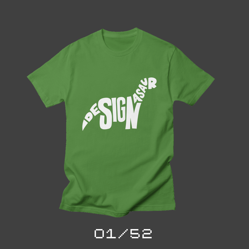
01/52: Designasaur
Each week for a year, I’m going to be designing a shirt and releasing it on my Threadless store. This is the first design of fifty-two.
Almost 20 years ago, I attended a lecture at the University of South Carolina School of Art hosted by the Columbia Communicating Arts Society. I was a young designer and trying hard to network with other designers and CCAS was the hub of the Columbia creative community at the time. The speaker was a designer from Atlanta, Bob Wages from Wages Design. Like most designers who came to speak at events like this, Bob showed his work and talked about his creative process. I distinctly remember him mixing in a fair amount of career and business advice, giving tips about how small the design world was and how important it was to be fair to everyone you worked with. But one offhand comment has stuck with me since that lecture…
Bob Wages introduced me to the concept of the “designasaur.”
A designasaur is a designer that never evolved. Someone who wouldn’t or couldn’t adopt new technologies or new styles. A creative who hasn’t embraced the changing world and risks “extinction.”
Since the advent of desktop publishing and the creation of the internet, the design industry has grown and changed in amazing and unbelievable ways. Technology continues to evolve at an absurdly rapid pace. It’s hard — maybe impossible — to keep up with it all. The struggle to figure out and incorporate new tools and trends is constant. And it feels sometimes like extinction is just around the corner.
Almost two decades later, I realize that all my side projects have been about continuing to grow as a designer and to avoid becoming a designasaur. Trying out new challenges and delaying creative extinction as long as I can. I figured the perfect shirt to kick off my new project was a designasaur shirt.
I sketched out my designsaur* over the course of a couple of days in pencil. Once I’d refined the sketch, I took a photograph of it with my iPhone and then reconstructed it in Illustrator on my Mac. This is a pretty normal workflow for me and that familiarity actually bothered me a little. For this new side project, should I put more restrictions on the production process? Should I only use non-Adobe apps like Affinity Designer? Should I actually use the sketch instead of rebuilding it in a vector format? In the end, I decided that the challenges of production mattered less to me than the process of creation. I’m okay relying on more comfortable production processes, especially at the beginning of this project. I hope to extend a little more out of my comfort level on the production process as the project continues.
If you are interested in the project and like the shirts, please follow along and share on social media. Let me know what you think. You can reach out on Twitter and Micro.Blog.
* My 9-year-old says I should name him Bob. Or Inky.
** It’s my wife’s favorite kind of t-shirt.
Bob Wertz writes about design, technology and pop culture at Sketchbook B. Bob is a Columbia, South Carolina-based designer, creative director, college instructor, husband and dad. He’s particularly obsessed with typography, the creative process and the tools we use to create. He’s currently in the middle of a project to design a new shirt a week for an entire year.
This post was originally posted on May 15, 2017 on Sketchbook B. It’s reposted here as part of a project to move some of my favorite writing to my new site.
Of course you don’t. What we can learn from design and product failures…
In 2000, the potential of digital music was uncertain. There were a handful of limited MP3 music players. And Napster was the main way that people shared digital music (illegally). iTunes and the iPod hadn’t been launched yet. Everyone knew that the Internet could revolutionize the music industry. No one really knew how…
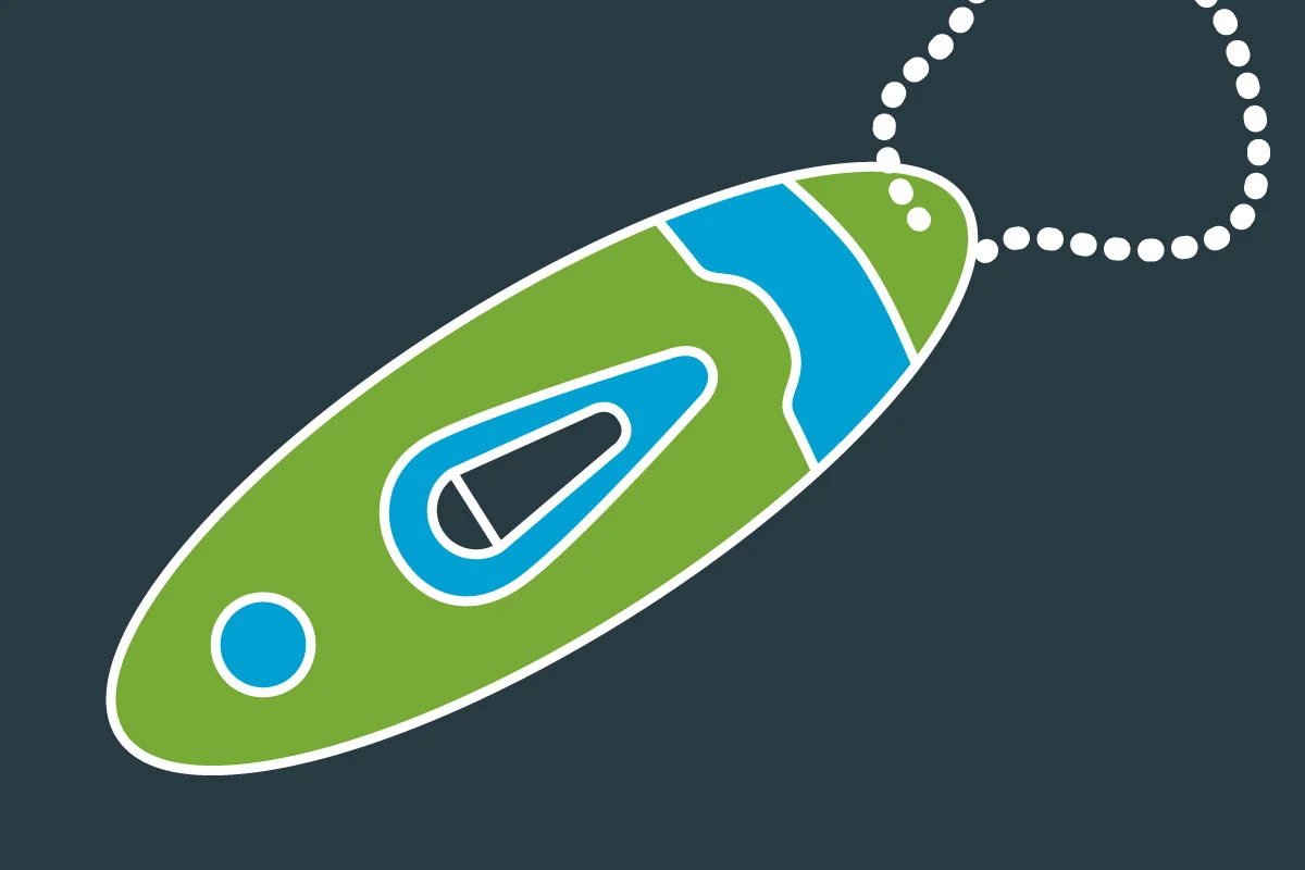
Sony released a product in 2000 that tried to bridge the gap between the old music world and the new digital one. The Sony eMarker solved a legitimate problem. It would let you mark songs that you heard on the radio so you could buy them later. This $20 keychain had a button and a small LCD display. When you heard a song on the radio you wanted to remember, you pushed the button. You could save up to 10 “eMarks.”
When you got home, you plugged your eMarker into your computer and fired up a Flash app that cross referenced your time stamp with the radio stations that you said you liked in your area and told you what was playing at that time. It then offered you a link to purchase a CD from Amazon or CDNow.
The eMarker worked surprisingly well. I know because I was one of a small number of people that actually owned one. It’s mostly a forgotten experiment, though. The service was discontinued in 2001. It’s even hard to find a good picture of the eMarker online.*
Here’s the thing about the eMarker. It was a relatively well-designed and reasonably effective solution to a real problem — music discovery. But the product was a failure because it wasn’t where the market was headed. The eMarker was based on the assumption that radio would still be the main way people discovered new music. And then users would pay to buy CDs from Amazon. iTunes and the iPod destroyed that world. (The problem of figuring out how to purchase music that you heard around you was eventually solved by Shazam, the iPhone and iTunes.)
Often, we see projects fail because they are based on a flawed strategy or approach. Look at Apple’s recent admission that the design of the new Mac Pro was a misstep. Apple “backed themselves in a thermal corner” because they bet that the future of professional machines was multiple, lower-powered GPUs. They designed and built their concept of a professional machine, but the rest of the industry charged ahead with large, power-hungry GPUs. Apple’s design couldn’t accommodate where the market needed them to be. No one doubts the skills or abilities of Apple’s designers, but the new Mac Pro wasn’t able to serve the pro audience because it was based on a flawed concept.
Even the best designs are only as good as the assumptions they are built on.
* It occurs to me that it’s impossible to find a high quality images of the eMarker because there weren’t any high quality digital cameras in 2000.
Bob Wertz writes about design, technology and pop culture at Sketchbook B. Bob is a Columbia, South Carolina-based designer, creative director, college instructor, husband and dad. He’s particularly obsessed with typography, the creative process and the tools we use to create. In his spare time, he is trying to figure out how to use all the ink he has purchased.
I’ve used this phrase for years to describe changing jobs. Maybe I was wrong…
This post was originally posted on May 8, 2017 on Sketchbook B. It’s reposted here as part of a project to move some of my favorite writing to my new site.
Every place we work has its own dysfunctional elements. And when you change jobs, you move from one group of challenges to another. Every job has challenges. You choose which challenges you’ll face.
I had coffee a couple of months ago with some friends and one of them was in the midst of a job search. I relayed my standard “choose your dysfunction” advice. One of our friends piped up:
“I don’t know. I think that sometimes, we bring our dysfunction with us."
I still haven’t been able to get that thought out of my head.
Yes, it’s true that each job brings unique challenges. But it’s equally true the we cause many of our own issues. Too often, we blame the environment around us for something that we, ourselves, are causing.
The key to addressing those issues – to finding happiness or fulfillment or whatever you are looking for – is being able to tell the difference between the dysfunction you find and dysfunction you carry with you.
Bob Wertz is a creative director, type designer, Ph.D. student and researcher living in Columbia, South Carolina. He’s been blogging since 2008.
This post was originally posted on April 30, 2017 on Sketchbook B. It’s reposted here as part of a project to move some of my favorite writing to my new site.
Reflections on the Atlanta Pen Show
My wife and I made the trek from Columbia to Atlanta last weekend to catch the Atlanta Pen Show and the live recording of the Pen Addict Podcast. We went last year and thoroughly enjoyed it. (I wrote a post about last year’s experience, too.) Some quick thoughts on our new annual tradition:
A post shared by Bob Wertz (@sketchbookb) on Apr 22, 2017 at 4:13pm PDT
The Pen Addict Live. We wanted to go to the Atlanta Pen Show, but the live recording was the main reason we made the trip. The Pen Addict is a great show and I listen to it every week.*
The episode they recorded was excellent, as usual. Once again this year, Myke and Brad were joined by the equally awesome Ana Reinert. But they also had a couple of interviews on the show, too. Vito from Story Supply and Brooks from Carolina Pen Company both talked about their businesses. It’s always great to see and hear from people who are so incredibly passionate about their craft.
Seeing Vito and Brooks on the live show crystalized something that I’d been thinking about for a while. Yes, the Pen Addict is about pens (and ancillary stationery products), but it’s also a celebration of entrepreneurship. Myke and Stephen took their mutual love of podcasts and started their own podcast network. Brad and Jeff started NockCo and are building an amazing case business. Ana has a new product for sale, the Col-o-ring. Vito talked about what drove him to start the Story Supply Co. And I honestly have no idea how Brooks combines polymers and makeup to make the beautiful pens that he sells through Carolina Pen Company.
Myke and Brad routinely bring in creators to talk about their products and creations. They support, encourage and build up the creative community.** I really do think that support is a big part of what makes the Pen Addict — and the larger pen community — amazing.
NockCo Sinclair. I enjoyed the show, but I didn’t buy much. (I’m still working my way through all the ink I bought at last year’s show.) I checked out some vintage pens, but didn’t see anything I had to have.
One of my favorite purchases was the NockCo Sinclair. I was in the market for a smaller case… I love my NockCo Brasstown, but I wanted a smaller case for carrying with me to meetings. NockCo had some exclusive colors for the pen show circuit. I was eyeing the olive/lime Lookout. I seriously love the olive/lime colorway and you know how I love my bright greens… But once I saw the Sinclair with a black waxed canvas exterior and a garnet*** interior, I was sold. I’m a lifelong Gamecock fan and the creative director at the University of South Carolina. For a case to carry around campus, the garnet and black case is perfect. I’ve really enjoyed using it this week and I’m thrilled with my purchase. Hopefully, they’ll make some more pieces in this colorway, because I will buy them all.
A post shared by Bob Wertz (@sketchbookb) on Apr 23, 2017 at 6:58am PDT
Waffle House. There is a Waffle House in the parking lot of the hotel and we decided to grab a bite Saturday morning before we left Atlanta. (Myke and Brad have mentioned on past shows that they tend to frequent this Waffle House during the pen show.) It was packed. We found our way to a couple of open stools at the counter. The waitress told me that the weekend had been one of their busiest ones of the year. I guess we can blame the Atlanta Pen Show for the crowd. Next year, they should completely hook Myke and Brad up with some free coffee or something.
* I listen to a bunch of other Relay FM podcasts, too. I’m a Pen Addict, but I’m also a fan of the whole network.
** Unless your product is a bogus Kickstarter rip off. Then Brad will tear you limb-from-limb.
*** Officially, the color isburgundy, but I’m sticking with garnet.
Bob Wertz writes about design, technology and pop culture at Sketchbook B. Bob is a Columbia, South Carolina-based designer, creative director, college instructor, husband and dad. He’s particularly obsessed with typography, the creative process and the tools we use to create. In his spare time, he is trying to figure out how to use all the ink he has purchased. Follow Bob on Twitter, Instagram and Micro.Blog.
This post was originally posted on April 5, 2017 on Sketchbook B. It’s reposted here as part of a project to move some of my favorite writing to my new site.
As a rule, I don’t normally critique work by other firms. I don’t know what they discovered in their research. And I didn’t work with their clients and deal with their constraints. I will say that like most designs, there are things I like and things I don’t like. But this blog post isn’t about the new Columbia logo.
Instead, it’s about how we rollout new identities.
It occurs to me that more than ever, the rollout of a logo is a critical part of it’s reception. New designs spread quickly across social media. Opinions form. Criticism starts immediately. And people start asking questions.
I first saw the logo on the article from the Free Times. And the main image was an ad, that used the new Brick C* as an element in the word “crafted.” Of course, it read “rafted.” Much of the early criticism I saw was centered around this ad… not the logo. There was confusion about how much was spent on the logo and research. Questions about why the work wasn’t done in Columbia. Every question about inspiration, cost, how the vendor was chosen could have been easily predicted and shared proactively on a web site at launch.
Would it have eliminated criticism? Absolutely not. There are people in any community who are going to hate anything you do and complain about any money you spend on design.** But being more strategic about the rollout might have helped rally some support, especially from designers and communications professionals.***
In today’s world, design firms need to start building extensive rollout planning into their budgets and plans. It’s not good enough to do the work for the client anymore — you have to help sell the final solution to stakeholders.
And clients need to accept that their audiences may be resistant to new identities and be prepared for strong — and likely critical — opinions. An extensive rollout plan is going to add to the time and cost, but is a critical part of your overall investment.
I don’t know when I’ll rollout a brand new identity again. But when I do, I will spend as much time planning the rollout as I do the fine tuning the design.
* USC’s athletic logo is the real block C. So I’m calling the new Columbia logo the brick C, since bricks are the inspiration for the mark. A local firm would have known that a prominent mark in town was already referred to as the block C.
** I saw some comments on social media asking why we couldn’t have a design contest like we did for the new flag. Sigh… it’s a slippery slope, y’all.
*** This week, the IABC chapter in town had a presentation on the new identity. I didn’t get to go, but from the reaction on Twitter, it seemed filled with insights and explanations for the approach. Imagine if the IABC presentation had been given the same day as the rollout. Or even the day before as a sneak preview…
Bob Wertz writes about design, technology and pop culture at Sketchbook B. Bob is a Columbia, South Carolina-based designer, creative director, college instructor, husband and dad. He’s particularly obsessed with typography, the creative process and the tools we use to create. In his spare time, he attempts to be diplomatic.
This post was originally posted on March 12, 2017 on Sketchbook B. It’s reposted here as part of a project to move some of my favorite writing to my new site.
Why does everyone wants to be first?
The fifth post in my ongoing series on conventional wisdom.
In 1670, John Ray published the proverb ”The early bird catcheth the worm." More than three centuries later, we’re still obsessed with being first.
First to post something on social media.
First to buy the newest gadget.
First to meet with a client.
But let’s take the proverb to its unstated, but logical conclusion: “The early bird gets the worm; the lazy, slacker second bird gets nothing.” And I’m not sure that’s good advice.
There are absolutely advantages to getting there first. If you are the first company to bring a new product to market, you have a distinct advantage against your competitors. In news, being the first to report “breaking” news draws viewers.
But our obsession with being first doesn’t always make a whole lot of sense. You don’t have to be first to be successful. I might argue that:
The early bird gets the early worms.
Your business strategy might be build around getting the “early worms.” The tech company with a cutting edge product gets the early adopter consumer who will pay a premium. Many companies have successful business strategies centered around being first.
But there are also advantages to being second. You can see what your competitor is doing. Learn from their mistakes. You might miss out on the “early worms,” but in today’s international marketplace, there are plenty of “worms” all over the world to sell to.
Apple is one of the world’s most valuable companies. They weren’t the first to develop the computer. Or the portable music player. Or the smartphone. They don’t try to always be first. They strive to be the best. And they’ve been successful with that strategy.
So there is a reason to be first. And a reason to be second.
Bob Wertz writes about design, technology and pop culture at Sketchbook B. Bob is a Columbia, South Carolina-based designer, creative director, college instructor, husband and dad. He’s particularly obsessed with typography, the creative process and the tools we use to create. In his spare time, he is trying to get more sleep and wake up earlier… Follow Bob on Twitter and Instagram.
This post was originally posted on February 26, 2017 on Sketchbook B. It’s reposted here as part of a project to move some of my favorite writing to my new site.
Does speed always lose?
The fourth post in my ongoing series on conventional wisdom.
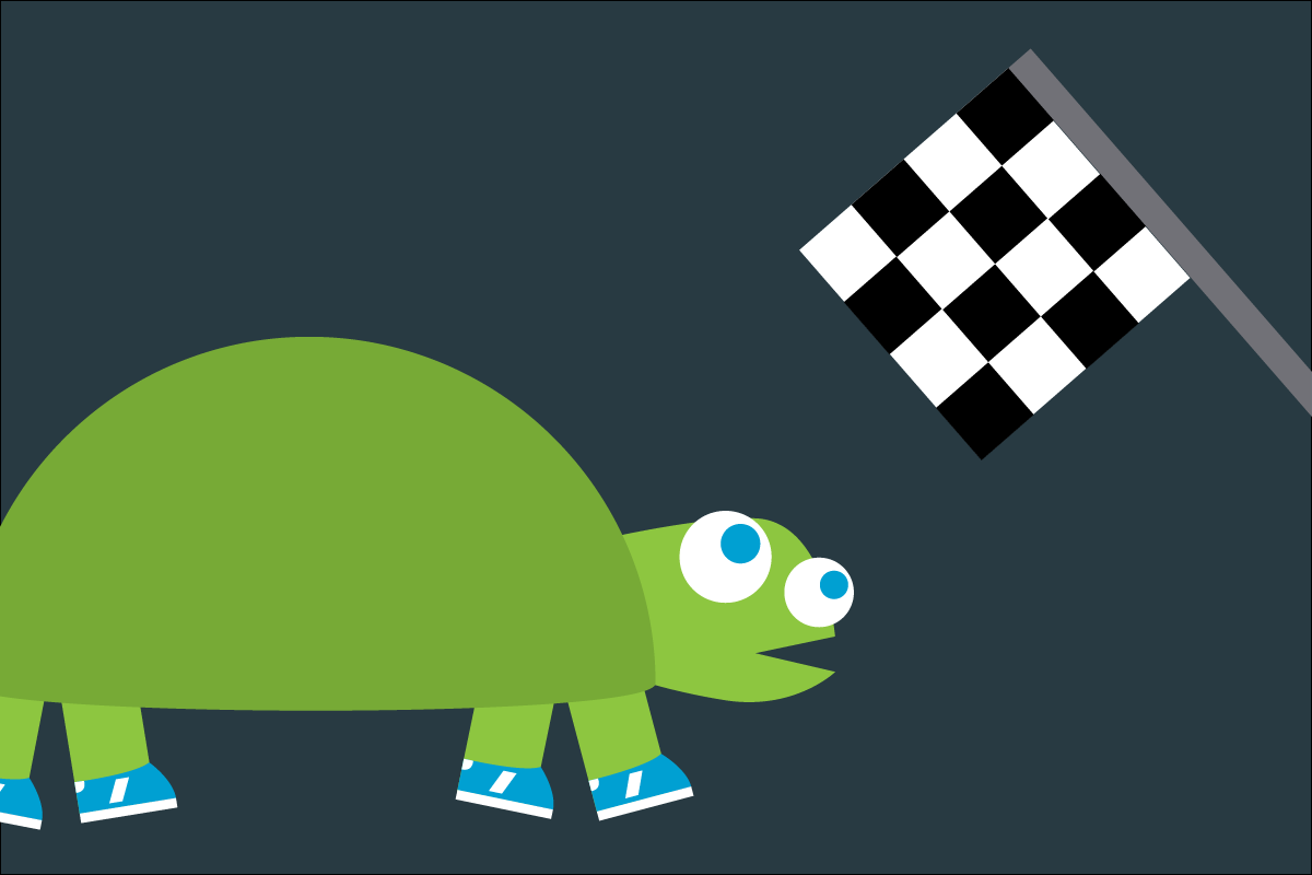
We all know the story of the tortoise and the hare. It’s one of Aesops fables and has been a staple of conventional wisdom since around 600 BCE.
The hare challenges the tortoise to a race. Gets cocky. Takes a nap in the middle of a race. The tortoise passes him and wins. And the moral of the story is: Slow and steady wins the race.
Wait! Except that’s not the moral at all. The moral is “Don’t get cocky and lose focus.” The tortoise was slow and steady, and yes, he wins. But if the hare doesn’t goof off, the tortoise loses in a landslide.
So why do we all remember “slow and steady wins the race?” Because I think it’s a comforting thought. If you work slowly and methodically, you will succeed no matter how quick your competition is. I fear that’s bad advice in today’s fast moving world.
I hear echoes of “slow and steady” all the time, with the distinct impression that slow somehow equals strategic and fast equals reckless. I don’t buy into that. I think it’s a oversimplification of reality.
First of all, everything depends on the “race.” I could believe that slow and steady wins the really long endurance race. But fast always wins in a shorter race.
I’m still not sure that’s right, though. There are people and companies that can move quickly without losing focus. And those people are going to win the short races and the long races, too.
Perhaps the true moral of the story has nothing at all to do with speed and everything to do with consistency:
It doesn’t matter if you are fast or slow, steady wins the race.
Let’s just take speed out of the equation. Being consistent is key. Don’t slack off if you have a lead. Don’t quit if you fall behind.
The hare wasn’t true to his talent, slacked off and lost focus. The tortoise moved as fast as he could. In the end, the tortoise’s consistency was the key to success — not his slow pace.
Bob Wertz writes about design, technology and pop culture at Sketchbook B. Bob is a Columbia, South Carolina-based designer, creative director, college instructor, husband and dad. He’s particularly obsessed with typography, the creative process and the tools we use to create. In his spare time, he is trying to get back into running… slowly.
This post was originally posted on February 21, 2017 on Sketchbook B. It’s reposted here as part of a project to move some of my favorite writing to my new site.
Does effort solve all problems?
The third post in my ongoing series on conventional wisdom.
We’ve all heard the classic saying “If at first you don’t succeed, try, try again.” Don’t give up! Determination will win the day! Increased effort is the solution to all problems.
The saying was popularized by William Hickson, a British education writer in the mid-1800s. The full phase is:
‘Tis a lesson you should heed:
Try, try, try again.
If at first you don’t succeed,
Try, try, try again.
The rhyme was obviously intended for to encourage school children to keep up their studies until they mastered a concept. But this simple message has grown into so much more than that.
The message that “effort solves everything” is ingrained in the American psyche. I’ve seen this phrase used by parents, managers, teachers, pastors and coaches. I’ve even used this phrase with my kids and my students. It’s intended to be inspirational, right? Just try harder and you, too, can succeed.
Often, it’s shortened to just be “Well, if at first you don’t succeed…” and endless and continuous effort is simply implied as an obvious next step.
Is this good advice for kindergarteners learning to ride a bike? Sure. Is this good advice for business? Not really.
“If at first you don’t succeed, try, try again” implies that no matter what, you need to stay the course. If you try harder, you’ll eventually get it. And if you fail, it’s your fault for not trying harder.
You’ll pass the test.
You’ll make the sale.
You’ll solve the problem.
But all this focus on effort ignores one significant fact: Sometimes, no matter how hard you try, you fail.
Repeating the same approach over and over might not get you closer to a solution. It only wastes time and resources. Effort is only part of the solution.
So how about an adjustment to the classic saying:
If at first you don’t succeed, ask why.
Once you understand why you failed, it’s easier to figure out a path forward. If you are headed the wrong way, continuing ahead blindly only gets you further from your goal.
Effort alone can’t always solve the problem. If you don’t know how to study for a test, studying more won’t help. Working harder won’t help your sales staff sell a flawed product. When you evaluate what went wrong, you’ll often find an better solution.
Every so often, you’ll find the goals that you’ve set are unachievable. I’m not advocating quitting, but there are times and situations where no amount of effort is going to help you reach an impossible goal. That’s okay. Reevaluate your priorities and figure out the next step.
Bob Wertz writes about design, technology and pop culture at Sketchbook B. Bob is a Columbia, South Carolina-based designer, creative director, college instructor, husband and dad. He’s particularly obsessed with typography, the creative process and the tools we use to create. In his spare time, he is annoying his kindergarten-teacher wife with this post.
This post was originally posted on February 12, 2017 on Sketchbook B. It’s reposted here as part of a project to move some of my favorite writing to my new site.
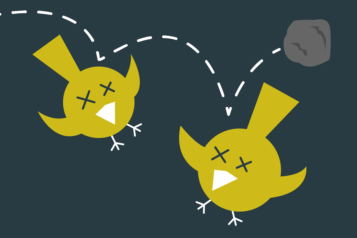
When was the last time you killed a bird with a stone? Yeah, me neither. The idea of “killing two birds with one stone” is old, dating back to the 1600s. So what’s the story with this 400 year old piece of wisdom?
It seems pretty straightforward: accomplish two goals with one effort. People use the phrase at home and in business all the time. But if you dig down into the metaphor, it’s anything but simple.
Accidentally killing two birds with one stone is a lucky bit of good fortune, but trying to kill two birds with one stone is a trick shot. The degree of difficulty is high. The birds need to be aligned perfectly. You’ve got to pick the right angle. You need to be a little lucky. You might only get one bird and you might miss both all together.
Planning to kill two birds with one stone only makes sense if you must kill two birds and you have only one stone. If you only need one bird, target that bird and make sure you don’t miss. And if you have more than one stone, use them.
Let me translate that into modern terms.
If you happen to accidentally solve two problems with one solution, that’s awesome.
If you plan to solve two problems with one solution, be prepared that you might not solve either problem. If you really care about solving a problem, develop a solution for that issue specifically. In other words:
Kill one bird with one stone.
And if the “bird” is big enough, you may need to develop multiple tactics to address the issue:
Kill one bird with two stones.
Most people try to kill “two birds with one stone” because they lack the resources, time or energy to fully attack both issues. But it’s a strategic flaw. A lack of focus. More often than not, this approach results in bad solutions.
I can’t tell you how many times I’ve seen organizations shortcut good strategic thinking and try to quickly solve multiple problems with one solution. It almost always ends up as a mess, takes longer and costs more. In the end, no issues are adequately solved.
If you are serious about solving problems, take aim and focus directly on the issues at hand. You’ll be much more successful in the long run.
Bob Wertz writes about design, technology and pop culture at Sketchbook B. Bob is a Columbia, South Carolina-based designer, creative director, college instructor, husband and dad. He’s particularly obsessed with typography, the creative process and the tools we use to create. In his spare time, he is thinking about taking up bird watching.