This post was originally posted on July 4, 2019 on Sketchbook B. It’s reposted here as part of a project to move some of my favorite writing to my new site.
I grew up loving magazines. Any time I’d be interested in something, I’d head to the magazine aisle in the bookstore or grocery store and look for magazines on the topic. Computers, cars, boats, science, model railroads, photography, sports, baseball cards, comics, design and more. It didn’t matter what I was interested in, there was at least one magazine on the topic.
Growing up in the pre-internet days, these magazines provided the info I was looking for. Detailed, up-to-date, authoritative info about whatever geeky habits I was interested in. Even the ads were informative and useful. I subscribed to some of them. Others, I’d buy if the main topics that month interested me.
The internet destroyed these publications. The first blow came from blogs. Authoritative people writing about the things they loved that people could read for free. The second blow was Google, which could route you to exactly what you were looking for. For various reasons — mostly related to monetization — the blog revolution failed to really take hold. Google’s search engine algorithm seemed to reward people with better SEO tactics over more authoritative sources. When I search Google for resources today, it’s hard to tell if what I’ve found is up-to-date or reputable. More often than not, I’m led to dated post of questionable origin that barely answers my question.1
I was excited about the introduction of Apple News+. Access to hundreds of magazines for $10 a month. The service is nothing world-changing. I’ve absolutely gotten my money’s worth and will continue to subscribe. Surprisingly, though, I discovered I’d already filled the need for a detailed, up-to-date, authoritative source for my geeky habits: podcasting.
I use podcasts the same way I used special interest magazines as a kid.
If I’m interested in a topic, I find a podcast. Computers, design, photography, business, pens, science fiction, pop culture, sports, meditation and more. I subscribe to many of these podcasts in Overcast2, while others I only listen to a few episodes. Even the ads are informative and relevant. Podcasts are how I learn about and explore new topics.
Some people think of podcasting as an evolution of talk radio. Others feel it’s more an audio form of blogging. I suppose I don’t have an issue with either of those opinions, but for me, podcasts serve a vital role as a replacement for the special interest magazine.
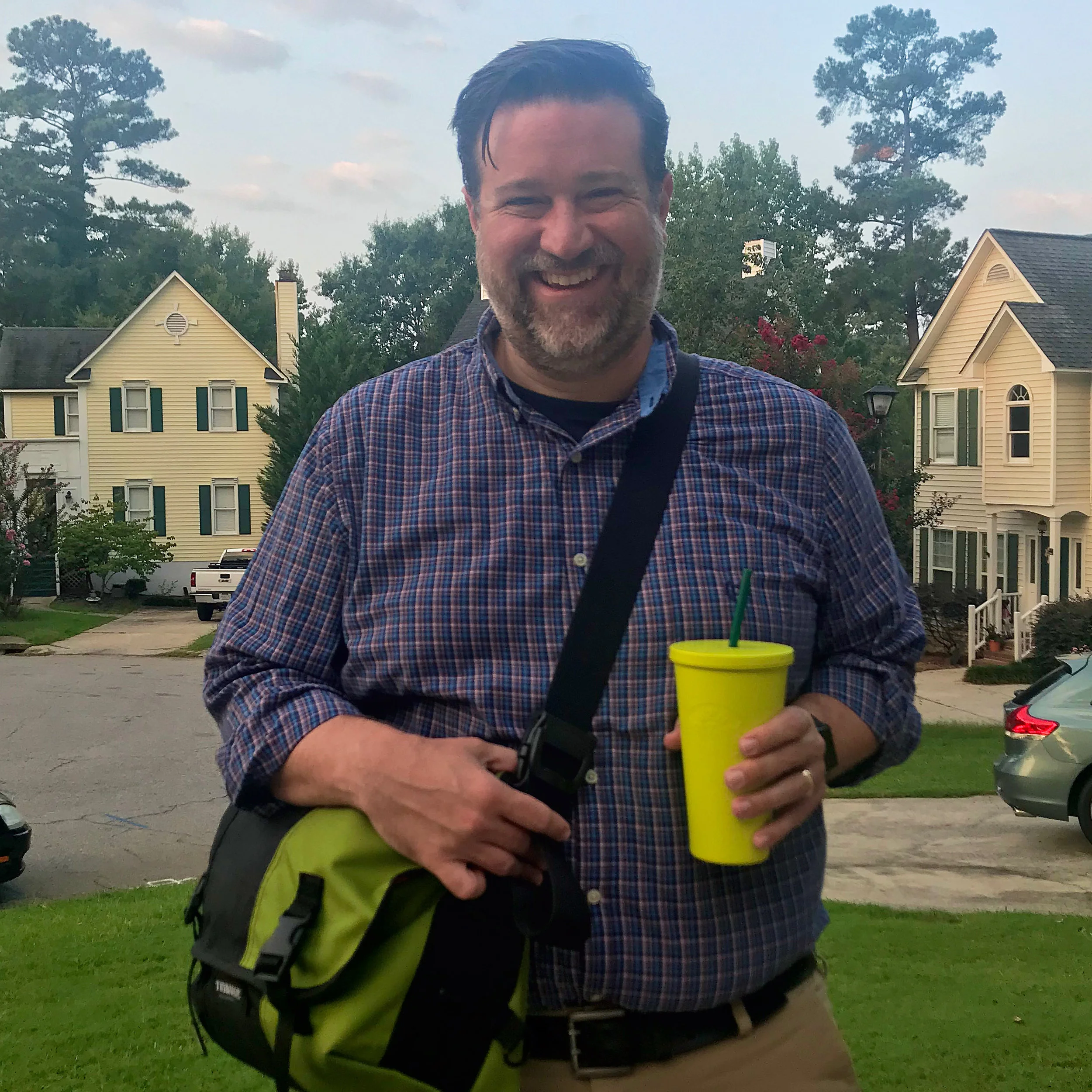
Bob Wertz is a creative director, type designer, Ph.D. student and researcher living in Columbia, South Carolina. He’s been blogging since 2008.
And let’s face it, these sites are covered with annoying ads that make reading the content difficult. ↩︎
Overcast is my preferred podcast app. It’s significantly better than the default app and if you haven’t tried it, you really should. ↩︎
This post was originally posted on July 4, 2019 on Sketchbook B. It’s reposted here as part of a project to move some of my favorite writing to my new site.
Getting old has some positive effects
I’ve worn glasses since 7th grade and contacts since 10th grade. I wasn’t happy with my old optometrist — one of those big national chains. So when it came time to renew my contacts prescription, I changed to a new locally-owned optometry practice that opened near my house.
I told my new doctor about how much I was reading with graduate school and he asked if I had ever used reading glasses. I assured him that I didn’t have any issues with reading, but we might as well see if I needed them.
I now have reading glasses.
It’s a light prescription, but it makes a significant difference.
Since I’ve gotten the glasses, I’ve noticed another interesting difference: I’m reading more. At first, I thought that maybe it was because the glasses reduce my eye strain and make it easier to read comfortably. But I think it’s more than that. I recently read Atomic Habits by James Clear which is all about ways to develop positive habits. One of tips he gives you is to pay attention to the cues that lead you into certain actions. So if junk food is visible, but the fruit is hidden in the refrigerator crisper drawer, you’ll likely eat more junk food. But if you put the fruit in a bowl on the counter and hide the junk food, your eating habits will change.
For me, the glasses seem to be acting as a physical cue to focus on reading. With my glasses on, I’m less likely to switch modes and try to multitask. The end result is that once I start reading, I read longer.
Another fun side effect of getting old.
Bob Wertz writes about design, technology and pop culture at Sketchbook B. Bob is a Columbia, South Carolina-based designer, researcher, college instructor, husband and dad. He’s particularly obsessed with typography, the creative process and the tools we use to create.
This post was originally posted on June 22, 2019 on Sketchbook B. It’s reposted here as part of a project to move some of my favorite writing to my new site.
I haven’t written this much since my senior thesis.
I just wrapped up another semester of graduate school working part time towards a masters degree in mass communications. I intended to recap the semester right after classes were over, but I’ll be honest… the volume of reading, research and writing this semester (while working full time) completely exhausted me. A month-and-a-half later, I’m mostly recovered. It was a great semester and I’ve got a much better idea of where I’m heading with my thesis and plenty of ideas for future research.
This spring, I took two classes — one on the history of mass media and an introduction to content analysis.
For the mass media history class, I researched the introduction of the Linotype into weekly newspapers across South Carolina in the early 1900s. My project involved digging through newspaper archives and discovering fascinating stories about community papers at the turn of the century. I’m happy with the final paper and want to rework it a little bit before submitting it for conference consideration.
Content analysis is the process of systematically researching the patterns and content of documents and other communications materials. I performed a quantitative content analysis project looking at logo reviews on Brand New and how the content of the review affected reader reaction. The final paper was accepted by AEJMC’s Visual Communication division for presentation at the annual conference in Toronto this August. I’m really excited — and more than a little bit nervous — for my first academic conference presentation.
I enjoyed both classes, but the semester was exceptionally intense. I spent many evenings studying, reading and writing at the new Starbucks not too far from my house. I’m proud of both of my major papers and have many ideas of how to extend them into future research. A few other observations from the semester:
Last fall, I realized that I needed software to track all the journal articles I was reading. I was surprised that most of the faculty members I talked to were using any kind of reference management software. I eventually settled on Zotero. Don’t let the brutalist interface fool you… The service is exceptionally powerful, and I’ve barely scratched the surface of what it can do. The free level had just enough cloud storage for this semester, but I’ll be upgrading to the paid tier for more storage next semester.
I’m using Ulysses to write everything, but I may switch to using Scrivener for longer research papers. I’m also intrigued at the integration between Zotero and Google Docs, but I really don’t want to write everything in Google Docs.
The solution to all problems in grad school is “read more.” I’ve read more in the last six months than I have in my life — mostly academic journal articles. And every time I had a question or a problem, the answer always started with “Have you read…?”
Next semester, I’m taking a single class — Literature of Mass Communication — and I’m teaching a class. I’m looking forward to another semester of research and what I assume will be a significant reading load.
Bob Wertz writes about design, technology and pop culture at Sketchbook B. Bob is a Columbia, South Carolina-based designer, researcher, college instructor, husband and dad. He’s particularly obsessed with typography, the creative process and the tools we use to create.
This post was originally posted on June 22, 2019 on Sketchbook B. It’s reposted here as part of a project to move some of my favorite writing to my new site.
The benefits of posting less.
I pretty much abandoned Facebook late last year. Quitting Facebook has become trendy as it’s become apparent that the service is creepy and maybe a little evil. And while there are no shortage of “Why I quit Facebook” blog posts, I felt like I wanted to add my thoughts.
I didn’t leave Facebook because of some sort of protest against their obvious ethical shortcomings and lack of respect for user privacy.
I noted at the start of the year that I felt like I needed to change my relationship with social media. My Facebook departure started as a “think before posting” exercise, reflecting on why I was posting, commenting or liking things before I actually did. And the result was that I started posting less. Posting less meant that I wasn’t popping in to check on responses to my posts. And the fact that I wasn’t in Facebook as much meant that I wasn’t reading as many posts. And then something else happened…
I was happier.
I stopped posting in Facebook all together around the start of the year. Any post you saw from me originated in Instagram. I would occasionally still like or comment on other’s posts if I saw them, but as I transitioned away from posting on Facebook, I saw far fewer posts. I’m pretty sure no one noticed. No one has said anything. My wife is still posting so close friends are still seeing pictures of my family and hearing funny stories.
So why am I happier? I honestly don’t know.
I listened to a podcast this week where Cal Newport discussed his book Digital Minimalism. I haven’t read the book yet, but his argument seems to be that social media is engineered to suck you in, and by opting out of the social media hamster wheel, you’ll be more productive and happier. I think that’s definitely part of it.
I also think part of it is that I don’t have to see the worst of people. People I know routinely post obviously fake things to Facebook. I see ignorance and hate from people that I assumed were good people. But on Facebook, they allow themselves to be different. It’s frustrating to see that hypocrisy and it makes the whole Facebook experience completely miserable.
Even though I’ve deleted the app off my phone, I still visit Facebook every so often to look at my memories from the last 11 years. There are so many great nuggets from my wife and kiddos — comments and pictures that make me happy. I’m currently working on a way to preserve those in a more tangible format.* I also need an account to connect with some groups that only communicate through Facebook. So I can’t completely delete my account yet.
My goal is to stay under 30 minutes of total social media use a day and I’m using Apple’s ScreenTime settings to keep me honest. I still enjoy posting on Instagram occasionally, even if it is owned by Facebook. I use Twitter, but I’m actually starting to limit my Twitter usage, too.** My hope is that I’ll be able to reclaim some of the time that I was spending on social media and channel that energy into other endeavors.
* I will blog about that process here.
** My Twitter posts are actually microblog posts that originate on my own blog and are shared throughMicro.Blogand then Twitter.
Bob Wertz writes about design, technology and pop culture at Sketchbook B. Bob is a Columbia, South Carolina-based designer, researcher, college instructor, husband and dad. He’s particularly obsessed with typography, the creative process and the tools we use to create.
This post was originally posted on April 8, 2019 on Sketchbook B. It’s reposted here as part of a project to move some of my favorite writing to my new site.
Minor league baseball having fun with logos.
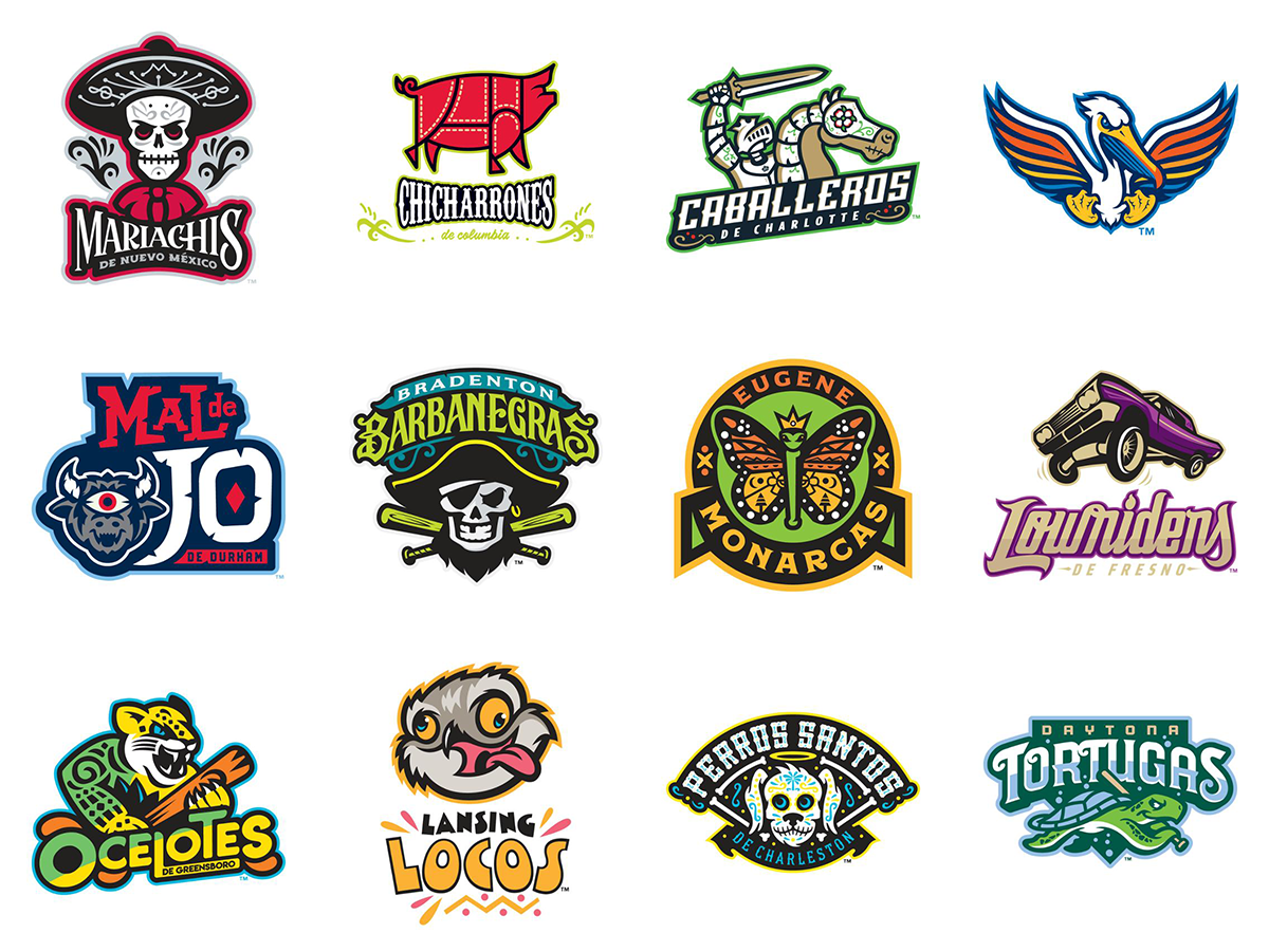
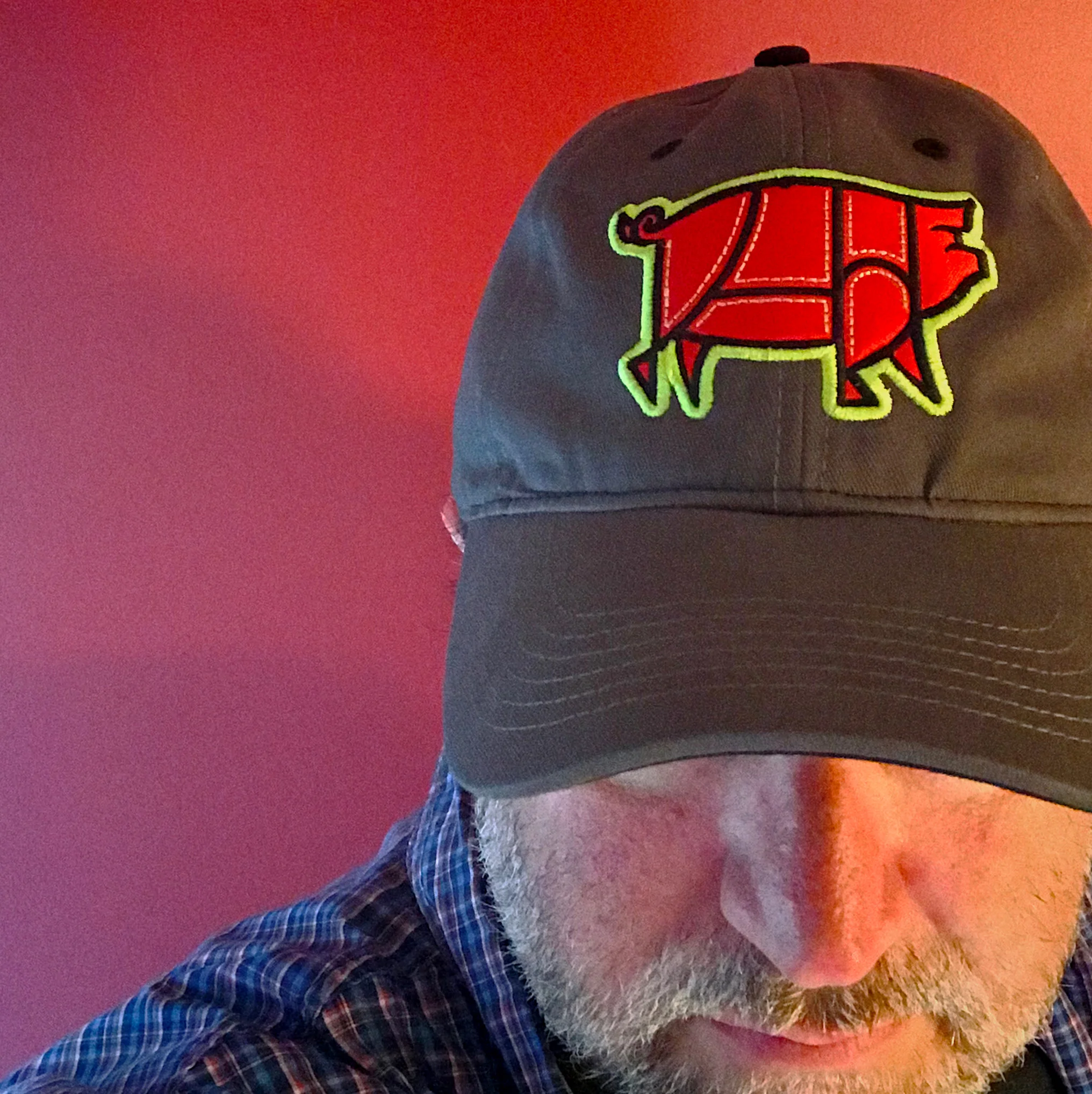
I’m a big fan of minor league baseball. Our home team, the Columbia Fireflies, play in a great park and we typically go to a few games each season. We took the whole family to a game this past weekend and had a blast. I stopped by the team store to see the new Chicharrones de Columbia branding for the Copa de la Diversión, a program where 72 minor league baseball teams rebrand themselves for a few games as a visual reflection of the hispanic culture that’s an important part of baseball today. You can take a look at all the rebrandings, but here are a few of my favorites:
Obviously, this is minor league baseball’s attempt to sell more merchandise. (They are always trying to sell more merchandise.) Minor league designers often have fun with logos and I love how playful these redesigns are. Some are better than others, but they look really great on hats and shirts and if you see a logo you like, you can order some merch online.
Bob Wertz writes about design, technology and pop culture at Sketchbook B. Bob is a Columbia, South Carolina-based designer, creative director, grad student, college instructor, husband and dad. He’s particularly obsessed with typography, the creative process and the tools we use to create. He recently finished a project to design a new shirt a week for an entire year.
This post was originally posted on January 13, 2019 on Sketchbook B. It’s reposted here as part of a project to move some of my favorite writing to my new site.
I’ve been thinking a lot lately about the language we use to talk about social media and content creation on the web. And as I’m writing about social media — especially microblogging and the indie web movement — I feel like we need a phrase to refer to platforms like Facebook, Twitter, LinkedIn and others that try to lock in users and leverage their private data to sell more ads, compared to the other newer services with revenue models that are less interested in ad sales or lock in.
I know that we already use “indie” and “indie web” as a way to differentiate between the two approaches, but I’m not sure that meaning is clear to a broader audience.
I’m going to go with “captive social” and “open social.”
Captive Social. Social media networks and services that make money through advertising, leveraging their user’s private data. Captive social networks benefit from gathering as much data on their users as possible and using that data to sell more relevant ads to users. To be profitable, that also means that they benefit from having users spend as much time as possible engaged with their platform. Examples of captive social networks: Facebook, Instagram, Twitter, Linked In, Snapchat.
I think my time in the insurance industry has partially inspired this terminology. Captive insurance agents are contractually obligated to only sell products from a single vendor. But I think the term is appropriate for the relationships we have with social media platforms. We are locked into each service silo with very little interoperability between competing platforms.
Open Social. Newer social media networks that are aren’t interested in trapping your data. They benefit from interoperability and the sharing of data between services. Their profitability isn’t based on leveraging personal user data, but on the value you derive from the service.
The inspiration for the terminology isn’t open source, it’s open web standards. I was a Mac user during the years of Internet Explorer dominance — when you sometimes couldn’t access a web site if you didn’t have the right browser. The open web standards push in the early 2000’s freed us from that nightmare and led to expanded browser choice. I hope that open social can have a similar effect on social media that open web standards had on the web.
Open social does have a distinct meaning from indie web. Indie web aims to separate itself from the corporate web, but open social is not necessarily limited to only small companies and decentralized platforms. A large corporation could build an open social platform, as long as they weren’t profiting from trapping your data and locking you into their service.1 The difference isn’t the size of the provider, but instead, their goals, objectives and business models.
So here are a couple of examples of captive social and open social in context:
I don’t know why you spend so much time on those captive social sites.
I’m going to focus on open social platforms like Micro.Blog and limit the time I spend on captive social sites like Facebook and Twitter.
Hopefully, open social platforms will have the same impact on the web that the open web standards movement did.
It’s a subtle change — a language shift that I think will help when we are having discussions with people who are concerned about privacy and the power of social media, but who aren’t comfortable hosting their sites or maintaining a server.
Bob Wertz is a creative director, type designer, Ph.D. student and researcher living in Columbia, South Carolina. He’s been blogging since 2008.
I recognize that the concept of an open social network from a large corporation might seem absurd in today’s environment, but you never know. ↩︎
Designers don’t want to admit it, but math is important to the profession.
This post was originally posted on September 29, 2015 on Sketchbook B. It’s reposted here as part of a project to move some of my favorite writing to my new site.
My first class in graduate school was a quantitive research class and I really enjoyed the statistics side of things. As I’ve told my designer friends this, they typically respond with something along the lines of “Ugh. I became a designer so I wouldn’t have to do math.” I’m not surprised. I’ve heard the same from designers and students over the years, but I’m increasingly irritated by it for a few reasons:
Designers use math every day. I’m not sure where the myth that designers don’t need to understand math comes from, but it’s not true. I use math pretty much every day in my work. Especially geometry and algebra. Understanding foundational mathematical concepts makes you a better designer.
It steers talent away from the field. Let’s say you’ve got a talented high school kid, who also happens to be good at — or maybe even like — math. Tell them enough times that math isn’t important for designers and they’ll find a different career path. As an honors student, I was told repeatedly through school by well-meaning adults that I didn’t want to take art classes because they weren’t rigorous enough. As a result, I initially looked at options like architecture and engineering. It took me a while to circle around to design.
It undermines the profession. The reality is that designers struggle to be taken seriously by big business. We’ve fought to get a “seat at the table” and prove our value beyond just crafting the look and feel of something. As much as we don’t like it, the “language” of business is often based in math. Ignoring the importance of math simply makes it harder to communicate with business decision makers.
I think the challenge is separating our feelings about “math class” from our feelings about “math.” I didn’t enjoy most of my high school math classes. My algebra and geometry teachers weren’t my favorites. Because I scored a high enough score on my AP Calculus test, I was able to exempt all of my college math requirements, so I haven’t taken a math class in almost 25 years. What I’ve come to realize is that while I disliked the way I was taught math, math itself is pretty amazing. And useful.
Don’t misunderstand me… I’m not expecting designers to line up and take refresher math classes. AIGA chapters aren’t going to start holding day-long math workshops. All I’m saying is that embracing the idea that math is an integral part of design only helps the profession as a whole.
Bob Wertz is a creative director, type designer, Ph.D. student and researcher living in Columbia, South Carolina. He’s been blogging since 2008.
This post was originally posted on January 6, 2019 on Sketchbook B. It’s reposted here as part of a project to move some of my favorite writing to my new site.
Taking a look in the Facebook mirror.
I often look at people’s Facebook posts and ask “why?” Why did you post that status? Why did you share that meme? Why did you feel you should comment on that post that you disagreed with?
Does it make you feel better? Do you enjoy sharing something controversial and have some of your friends agree with you? Does that provide you validation of some sort?
Are you trying to anger those that disagree with you? Do you get some satisfaction from pissing off your “friends?”
Was this story critically important to share? Did you honestly read past the headline? Are you sure the story is even true?
Are you outraged? Why are you outraged? Because the news told you to be? Because the Russians told you to be? Do you know why you are outraged?
Seriously, where does it end?
Every interaction on Facebook — posts, comments and likes — is in your activity log. It’s easy to find. Just go to your profile and click on the “Activity Log” button in the top right of your profile page.
Just look at the last week. For each interaction, ask yourself “why?” Why did I share that comment? Why did I like that meme? Why did I share that link?
What value am I adding to discussion?
How am I making the world a better place?
Are my interactions with people positive and encouraging?
Am I sharing joy?
When you look in the mirror, what do you see? Do you see hate and angst? Because if so, you aren’t helping your cause. You aren’t helping society. And you aren’t helping yourself.
Now the hard part: Start asking “why” before you post? Understand the impact of your words before you comment. Or like. Or share. In all likelihood, this exercise will cause you will post less. Comment less. Like less. That’s okay. The only person who will get upset that you are using Facebook less is Mark Zuckerberg. (And honestly, he’s too busy trying to collect all your personal data to notice.)
Don’t get sucked into the negativity. Don’t get caught up in the outrage machine. Don’t let the trolls get to you. And I promise, your Facebook experience will get better and your personal outlook will get better, too.
Bob Wertz writes about design, technology and pop culture at Sketchbook B. Bob is a Columbia, South Carolina-based designer, creative director, grad student, college instructor, husband and dad. He’s particularly obsessed with typography, the creative process and the tools we use to create. He recently finished a project to design a new shirt a week for an entire year.
This post was originally posted on January 6, 2019 on Sketchbook B. It’s reposted here as part of a project to move some of my favorite writing to my new site.
Getting through the gatekeeper.
When we create content for anything, a communicator considers the audience. Who is going to read this piece or watch this video? What are they hoping to get out of it? What do we want them to do?
When we create for online and social, we consider our target audiences. But there’s another audience we often overlook: the algorithm.
The algorithm isn’t a person, but it is an audience. The algorithm determines what our primary audience sees online and on social media. The role the algorithm plays is no different than an administrative assistant who’s sorting the mail — a gatekeeper — and we need to treat it the same way. Think about what the algorithm needs to see to get the message through to our intended target. List it as a secondary audience on our creative briefs. We need to understand how the algorithm “thinks” as much as we need to understand our primary target audience.
Because a message that is well-crafted for your primary target audience is wasted if they never see it.
Bob Wertz writes about design, technology and pop culture at Sketchbook B. Bob is a Columbia, South Carolina-based designer, creative director, grad student, college instructor, husband and dad. He’s particularly obsessed with typography, the creative process and the tools we use to create. He recently finished a project to design a new shirt a week for an entire year.
This post was originally posted on December 29, 2018 on Sketchbook B. It’s reposted here as part of a project to move some of my favorite writing to my new site.
Don’t call them goals or resolutions.
Looking back, 2018 was great. Lots of challenging moments and disappointments, but so many great things happened. This year marked a change in emphasis for me. I made the decision to apply for graduate school in early January 2018 and started in August. And so for the last half of the year I was working full time and taking classes part time and teaching and parenting and… I’ve had to take a hard look at how I spend my time and prioritize.
I usually do some kind of annual planning and pull together a handful of specific things I want to achieve in the upcoming year, but for 2019, I’m going to try to do something different. I’m going to pick a couple of broad themes that I want to focus on for the year ahead.
These aren’t goals. There is nothing S.M.A.R.T. about them. And they aren’t New Year’s Resolutions, either. They are just topics to give me some focus of where I want to spend my time and creative energy this year.
Graduate School. I started working on my Masters last year, but 2019 will be much more intense. Being a graduate student is my primary focus in the upcoming year as I develop a research plan for my thesis.
Type Design. I love type design, but over the last few years, I haven’t focused on it much. In 2018, I did some contract type design work and really enjoyed it. I want to design more typefaces in 2019.
Python, Javascript or both. I’ve tinkered around with learning to program for years. For 2019, I want to expand my knowledge of Python and/or Javascript. Both languages are used with data visualization packages and I could see that being useful with my graduate program. As a bonus, Python is also used heavily in type design and would be helpful if I’m working with type more.
Writing. I want to write more. How much more? I don’t know. What do I want to write? I don’t know. But I do know that I enjoy writing and need to do it more often.
Social media. Last year, I started to change my relationship with social media. I’m learning that less is definitely more. This year, that will continue. Expect me to post significantly less on Facebook and Twitter and focus almost exclusively on Instagram and Micro.Blog.
So these are my professional themes. My creative priorities for the upcoming year. It doesn’t mean that I won’t do other things during the year — for example, I have some other t-shirt related ideas — but they’ll be one-off projects.
I’ve also got a couple of personal themes about family and health, too. These are mostly about balance. Maintaining enough quality time with the family and taking care of myself.
I’m looking forward to a fabulous 2019.
Bob Wertz writes about design, technology and pop culture at Sketchbook B. Bob is a Columbia, South Carolina-based designer, creative director, grad student, college instructor, husband and dad. He’s particularly obsessed with typography, the creative process and the tools we use to create. He recently finished a project to design a new shirt a week for an entire year.
This post was originally posted on December 27, 2018 on Sketchbook B. It’s reposted here as part of a project to move some of my favorite writing to my new site.
Better than my “Best Nine.”
A couple of weeks ago, I generated my Instagram “Best Nine” as I’ve done the last few years. If you aren’t familiar with it, you go to a web site, put in your Instagram profile name and it generates a single image containing the nine images you took over the last year with the most likes. And you post it on Instagram as a retrospective from the year.
When I looked at my best nine image for this year, I noticed that while these may have been the images that got the most likes, they weren’t my favorites.
I had another idea. What if I went through my Instagram feed and just picked my favorites?
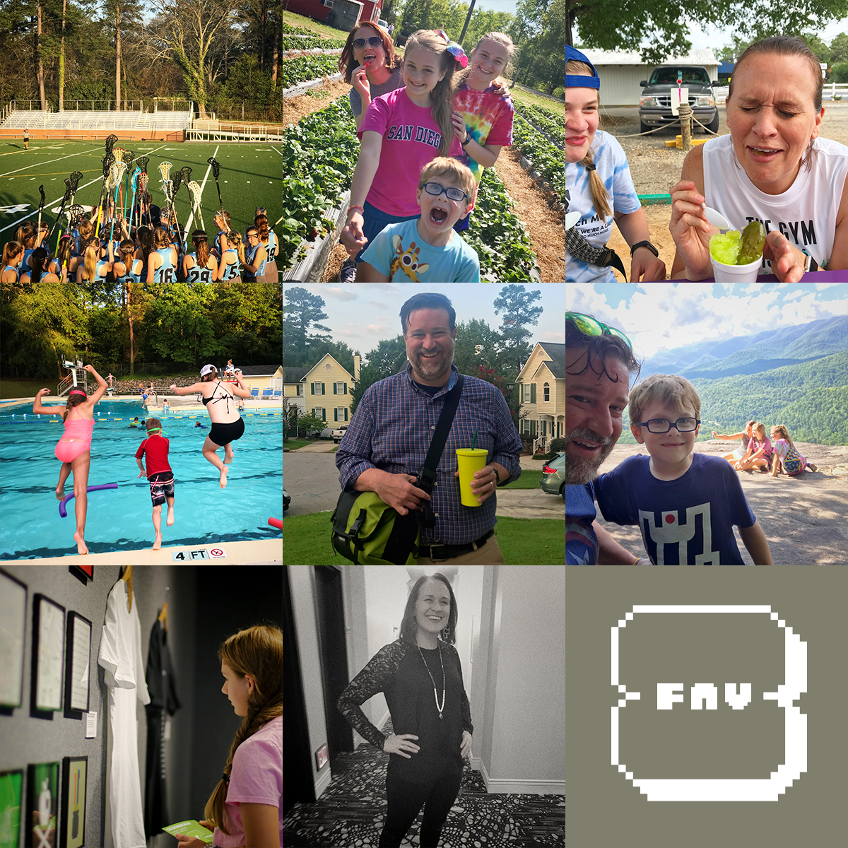
I started to go through Instagram to pick my favorite eight images from the past year. With “Best Nine,” you don’t have to put any thought into it. The algorithm selects the ones with the most likes. But with “Fav8,” this process takes some time. I posted 120 times over the last year and many of the posts had multiple images. I used Instagram’s bookmarks filter to keep track of my favorite shots. A first pass quickly got me to about 14 images, but getting down to 8 was really hard. I cut many of the artistic shots for the ones that meant more to me personally.
A quick summary of my Fav 8:
Our oldest had a fun first season playing JV Lacrosse this year.
We picked strawberries. The whole crew loves strawberries.
My wife tried pickle-flavored Pelican’s SnoBall. She did not like it.
We joined a pool and had a blast.
I went back to grad school.
We discovered that the whole crew loves hiking.
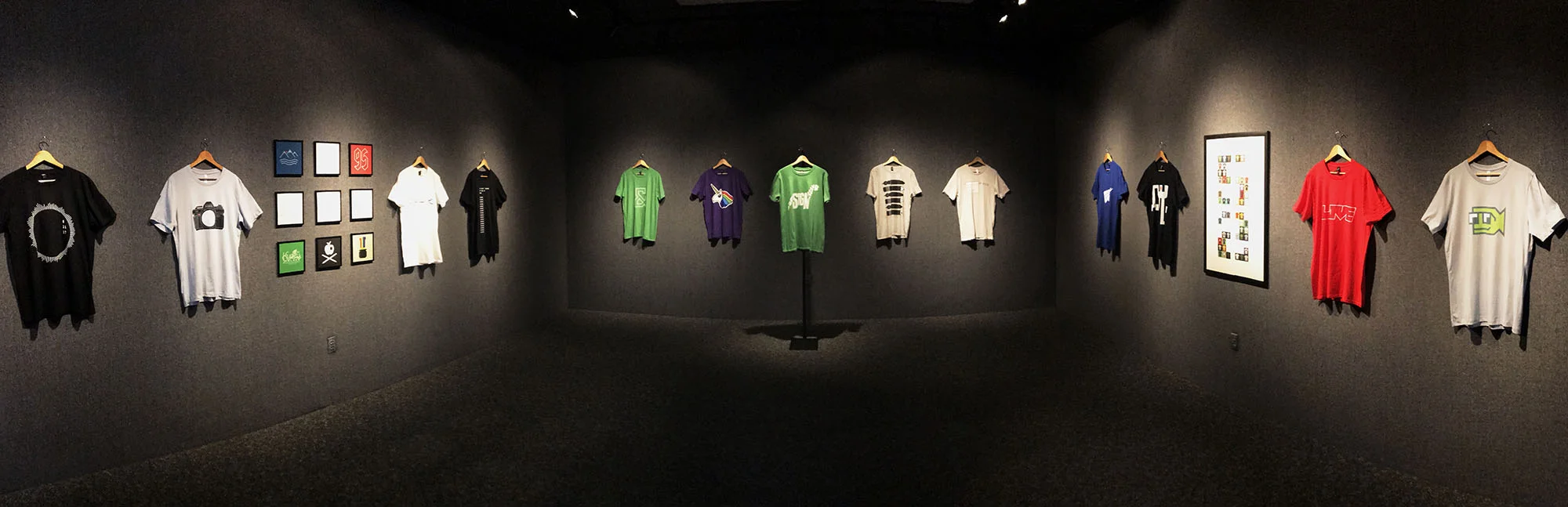
I finished my shirt project and had an art show at USC Upstate.
I’m a designer, so naturally, I fired up Photoshop. I’m sure that there is an easier way to do this, probably with some app on iOS, but I’m much faster on my Mac. I created a 1200 px x 1200 px Photoshop file and then scaled each of my favorite images to 400 px x 400 px and arranged them in a grid.
That left one block in the lower right. I was just going to put the year there, but I decided to build a quick little “Fav8” logo. It’s SbB Epyx, a Fontstruct design I created last year.
For a little bit of whimsy, the background color of that last square is the average color of my favorite eight images. Which leads us to a quick Photoshop tip. (Feel free to skip this next section if you aren’t a Photoshop user…) Getting the average color from your images is easy:
Edit > Select All
Edit > Copy Merged (If you are like me, your images are all on different layers.)
File > New… (It will automatically set the size to what’s on your clipboard)
Edit > Paste
Filter > Blur > Average (This will generate a solid color that is the average of all the color in your image. It will likely be some shade of gray.)
The take that color and make it the background of your final square.
Back from the random Photoshop tip and moving on to some social (media) commentary.
Instagram lets us share our images with friends (and strangers) across the world. That’s mostly awesome, but it also means that we know what those people think about our images. And I think we start crafting images to generate that positive feedback.
Something like “Best Nine” is fun. Take a look at the images that other people liked most. But I’d rather look pull together the images I liked most and relive those memories and moments. Sorting through my images to select my favorites was fun. It reminded me of some awesome moments during 2018 — some that I honestly had forgotten about.
My favorite eight were my favorites not because other people liked them, but because I loved the moment and the story behind the image. And that’s something an algorithm can’t know.
Bob Wertz writes about design, technology and pop culture at Sketchbook B. Bob is a Columbia, South Carolina-based designer, creative director, grad student, college instructor, husband and dad. He’s particularly obsessed with typography, the creative process and the tools we use to create. He recently finished a project to design a new shirt a week for an entire year.
This post was originally posted on September 30, 2018 on Sketchbook B. It’s reposted here as part of a project to move some of my favorite writing to my new site.
Designasaur: Open through October 26
Designasaur: On display at USC Upstate through October 26.
A few weeks after I started my 52 Shirts project, I decided that at the end of the project, I wanted to have a show featuring my creations. I started sketching some ideas out, but honestly, I wasn’t sure where to even start. I’ve never held an art show before. I started looking into how to get gallery space, paying attention to other shows and asking questions.
After I wrapped up the project this summer, I wanted to take a couple of months off and then start working to make my art show a reality.
While I was on vacation in the mountains of North Carolina, I got an email from Jane Nodine at USC Upstate asking if I’d be interested in bringing a show to the Curtis R. Harley Gallery at USC Upstate in Spartanburg, South Carolina. I responded immediately that I was absolutely interested and started working on how to build a show.
I edited my 52 Shirts project down to a selection of shirts that discuss my creative process and evolution as a designer. Designasaur is my look at creative process and the quest to avoid creative extinction.
The show was installed last week and I get to do an artist’s talk on campus this Thursday, October 4 at 4:30 pm. I’m so happy with how it turned out and excited about the talk this week. If you are in the Spartanburg area between now and October 26, stop by to see the show in the Curtis R. Harley Gallery on the first floor of the Humanities and Performing Arts Center.
I can’t begin to tell you how nervous I’ve been for the last three months planning the show. This isn’t something I’ve ever done before and I had so many questions. I need to thank a lot of people: my wife and kiddos, my friend Marius Valdes, Jane and Mark at USC Upstate and all the people that bought shirts and encouraged me along the way. I really couldn’t have done it without you all.
Also, I’ve designed a poster for the event. In keeping with the on demand nature of the project, you can order it from Threadless, too.
Bob Wertz writes about design, technology and pop culture at Sketchbook B. Bob is a Columbia, South Carolina-based designer, creative director, grad student, college instructor, husband and dad. He’s particularly obsessed with typography, the creative process and the tools we use to create. He recently finished a project to design a new shirt a week for an entire year.
This post was originally posted on August 23, 2018 on Sketchbook B. It’s reposted here as part of a project to move some of my favorite writing to my new site.
Back in the classroom
Yesterday, my children went back to school. But today was my turn: I officially started graduate school.
I am now an M.A. student at the University of South Carolina studying communications. I’m going to work on my degree part-time over the next few years with an eye towards eventually pursuing a Ph.D.
In some ways, this has been in the works for almost 15 years. I decided then that I wanted to start working on a terminal degree, even going as far as touring several schools. But for various reasons, I was never ready to make the jump.
This January, I revisited the idea of returning to graduate school. I scheduled an appointment with the graduate coordinator at the South Carolina School of Journalism and Mass Communication to talk over my options. I left energized and excited. I talked about my plans with my wife, my friends and some faculty members that I know well. And every time I explained why I wanted to head back to school, I became even more convinced that the time was right.
I assembled everything that I needed for my application and prepared for the GRE. I actually did pretty well on the GRE — even the analytical section — a significant accomplishment considering the last math class I took was AP Calculus in high school. Honestly, I was just as excited to get my graduate school acceptance letter as I was to get my undergraduate acceptance letter 25 years ago.
I’m thrilled for this new chapter. To make time for my new classwork load, I’m scaling back some of my side projects and commitments, so you won’t see me around Columbia and social media as much. I look forward to learning more about formal academic research and getting to know my fellow graduate students and faculty.
My first day of graduate school picture. Photo by my daughter, Norah.
Bob Wertz writes about design, technology and pop culture at Sketchbook B. Bob is a Columbia, South Carolina-based designer, creative director, grad student, college instructor, husband and dad. He’s particularly obsessed with typography, the creative process and the tools we use to create. He recently finished a project to design a new shirt a week for an entire year.
This post was originally posted on August 9, 2018 on Sketchbook B. It’s reposted here as part of a project to move some of my favorite writing to my new site.
The bathroom at my office has four sinks and three soap dispensers. Each soap dispenser has a clear plastic front so the cleaning crew can see how much liquid pink soap is left and refill it if necessary.
Sometimes, the first two soap dispensers are low on soap, but the last one, furthest from the door never seems to be low on soap.
You could draw conclusions from this single data point that no one uses the dispenser. And you would be right.
But why? Maybe people prefer the sinks closer to the door? Maybe it’s not in the most convenient location? Maybe there are too many soap dispensers?
The soap dispenser is broken. It hasn’t worked in at least 8 months.
But I imagine the cleaning crew has no idea. They are only looking at that one indicator: Is there soap in the dispenser?
Just a reminder that often, our data tells us what’s happening, but not necessarily why.
Bob Wertz is a creative director, type designer, Ph.D. student and researcher living in Columbia, South Carolina. He’s been blogging since 2008.
This post was originally posted on June 17, 2018 on Sketchbook B. It’s reposted here as part of a project to move some of my favorite writing to my new site.
Finishing one project, starting the next.
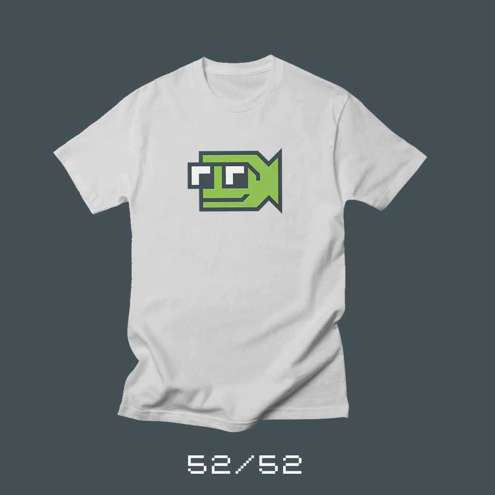
Each week for a year, I’m designed a shirt and released it on my Threadless store. This is the final design of the year.
This is it. The final shirt of my 52 Shirts project. This project has been everything I hoped, letting me explore a bunch of new ideas, techniques and inspiration. I’m almost sad to see it end. My sketchbooks are full of unused ideas. I could probably keep rolling for another few months without any problem.
I’m ready to move on to my next project, though. I’m starting a new blog and podcast: Bold Fish, Big Ocean. I’m excited to look at the people, things and ideas that inspire and shape me.
Bold Fish, Big Ocean is not quite ready yet — I’m still finishing up some things on the shirt project and need to work out some of the specifics for how I want to set up my new blog. But the logo is ready. This bold little fish has been hanging around for a few months waiting for the shirt project to wrap up.
The rest of this week, I’ll be posting some more reflections on 52 Shirts project. And look for my bold little fish to launch in early August.
Bob Wertz writes about design, technology and pop culture at Sketchbook B. Bob is a Columbia, South Carolina-based designer, creative director, college instructor, husband and dad. He’s particularly obsessed with typography, the creative process and the tools we use to create. He just finished a project to design a new shirt a week for an entire year.
This post was originally posted on June 10, 2018 on Sketchbook B. It’s reposted here as part of a project to move some of my favorite writing to my new site.
It’s been a rough year.
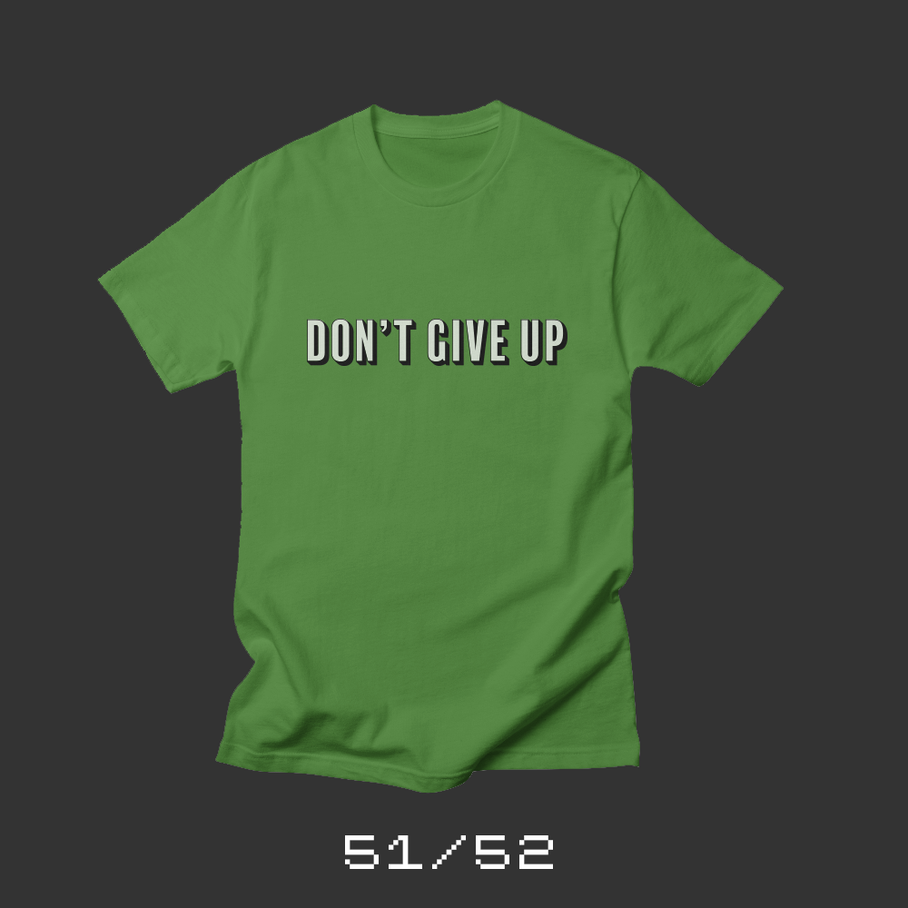
Each week for a year, I’m designing a shirt and releasing it on my Threadless store. This is the design for week 51.
It’s been a rough year. I don’t talk about it much, but 2017 was challenging. A few months ago, I had a rough day. I was frustrated. Aimless. Struggling. And then, out of the blue, I got an invitation from a friend to grab coffee. It was precisely what I needed at that moment.
While I was leaving, I heard Peter Gabriel’s Don’t Give Up at the coffee shop. I hadn’t heard the song in years, and thanks to the magic of Apple Music, when I got back into the car, I was listening to the original Gabriel/Kate Bush duet.
In this proud land we grew up strong
We were wanted all along
I was taught to fight, taught to win
I never thought I could fail
The whole song is beautiful. If you haven’t heard it, listen to it. Basically, it’s a duet between someone who’s lost their way and someone who cares about them.
I wrote a version of this blog post that day and designed the shirt to accompany it. But as I edited the post, I worried what people would think. I wanted to be honest about how I was feeling, but was I being too honest? I shelved the post — and the shirt design — and released something else.
After this week’s suicides by Kate Spade and Anthony Bourdain, I’ve been thinking about mental health and how scared we are to talk about how it impacts all our lives. Especially within the creative community. I thought back to this shirt and blog post.
Rest your head
You worry too much
It’s going to be alright
When times get rough
You can fall back on us
Don’t give up
Please don’t give up
I’m really lucky to have a bunch of wonderful people around me. Encouraging me. Supporting me. Loving me. Reminding me that there’s a place where I belong. I can’t imagine life without my support system. And if it weren’t for my wife, kids, family and friends, I don’t know how I’d be able to handle everything. Especially my wife, Liz, who manages to always be there for me when I need to talk or vent.
I don’t post much here that’s deeply personal. I don’t talk about my challenges. I don’t discuss my failings and flaws. Part of this shirt project is trying to open up. To write things I wouldn’t normally write. This post is not something I would normally write. But I look around me and I see friends struggling. People dealing with much more than I am. Even in the face of my own struggles, I hope that I can be someone that encourages others, as so many have been there for me.
This week’s shirt is “Don’t Give Up.” I’m biased, but I love it. I’m thinking about ordering a bunch and wearing them underneath my typical business casual attire. Just as a reminder that I’m never alone.
Don’t give up
‘Cause you have friends
Don’t give up
You’re not the only one
Don’t give up
No reason to be ashamed
Don’t give up
You still have us
Don’t give up now
We’re proud of who you are
Don’t give up
You know it’s never been easy
Don’t give up
‘Cause I believe there’s the a place
There’s a place where we belong
Bob Wertz writes about design, technology and pop culture at Sketchbook B. Bob is a Columbia, South Carolina-based designer, creative director, college instructor, husband and dad. He’s particularly obsessed with typography, the creative process and the tools we use to create. He’s currently nearing the end of a project to design a new shirt a week for an entire year.
This post was originally posted on June 3, 2018 on Sketchbook B. It’s reposted here as part of a project to move some of my favorite writing to my new site.
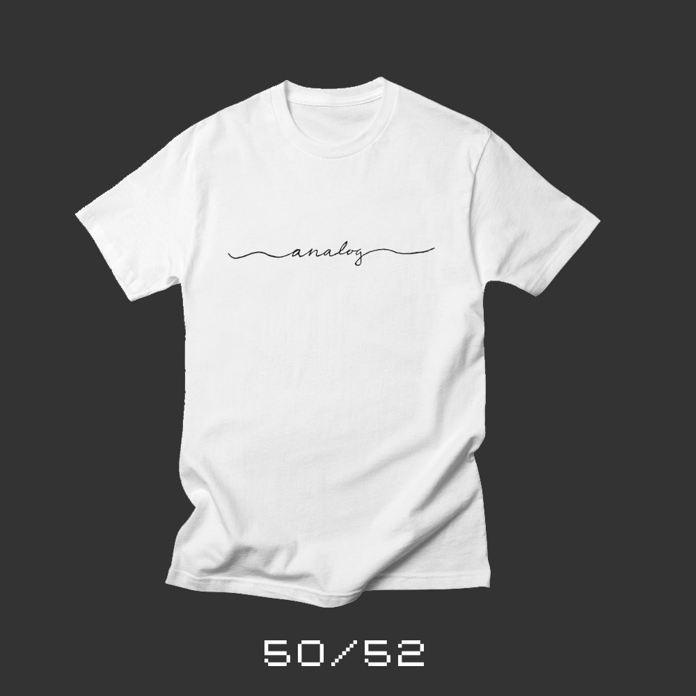
I loved my analog childhood
Each week for a year, I’m designing a shirt and releasing it on my Threadless store. This is the design for week 50.
My entire childhood was essentially analog. I grew up with records, cassette tapes, VCRs and rabbit ear antennas. I took pictures on film and developed them in a darkroom. When I did research for papers in high school, I used the card catalog in the library to find resources. I sent people letters. And they wrote back. I didn’t have a mobile phone. And smart phones didn’t exist outside of science fiction. We had computers, but they were very simple and barely networked. I didn’t have to worry about social media or texting.
When I got to college, the internet was just taking off. I got email my freshman year and by the time I entered the workforce, everything was different.
I’ll be honest, I wouldn’t go back if I could. I love technology and I love all the things that are possible because of the advancements we’ve made over the last three decades.
But I loved my analog childhood. I feel like I’ve had the best of both worlds. I was able to grow up in a world with a lot less pressure and stress than kids have today. And then, I was able to fully benefit from the internet in college, when research and connectivity were more important. I appreciate how “easy” we have it today because I remember what it was like before. I think it makes me more thankful for the technology and capabilities that we have today.
Bob Wertz writes about design, technology and pop culture at Sketchbook B. Bob is a Columbia, South Carolina-based designer, creative director, college instructor, husband and dad. He’s particularly obsessed with typography, the creative process and the tools we use to create. He’s currently nearing the end of a project to design a new shirt a week for an entire year.
This post was originally posted on May 27, 2018 on Sketchbook B. It’s reposted here as part of a project to move some of my favorite writing to my new site.
Ancient stories in the sky
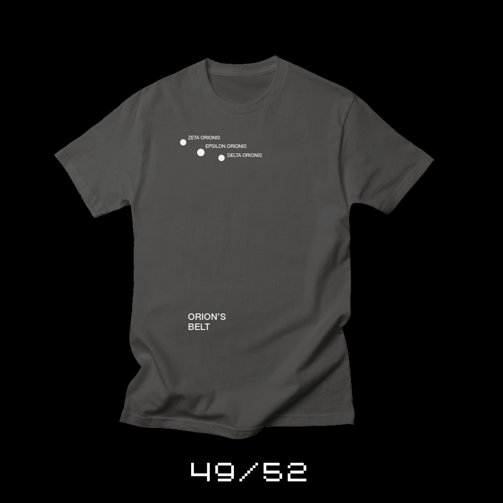
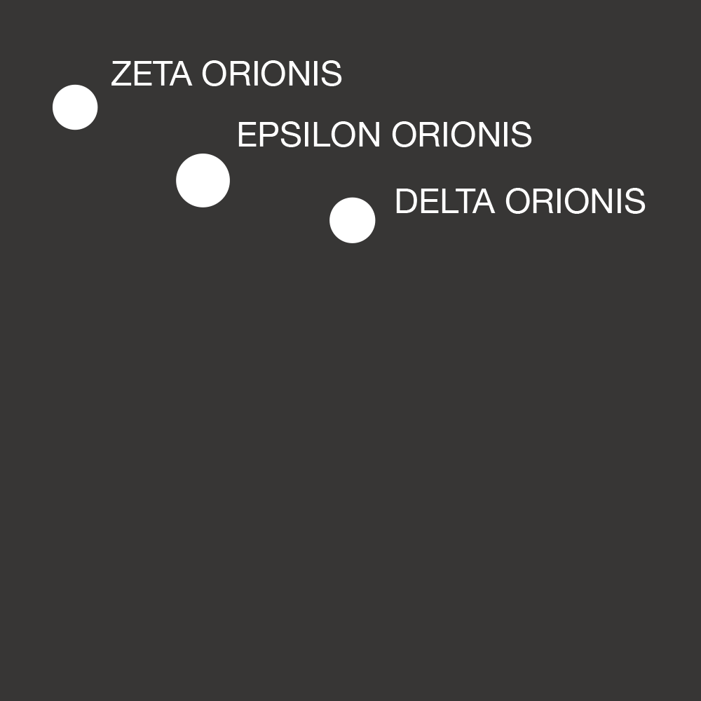
Each week for a year, I’m designing a shirt and releasing it on my Threadless store. This is the design for week 49.
At certain times of the year, when I walk out my front door, the constellation Orion is directly in front of me. Orion’s Belt is easy to spot — three bright stars aligned in a row. I learned all these constellations in Cub Scouts in elementary school, and I had a star field guide at some point. I’ve forgotten most of them, but I remember Orion. I tend to look for it whenever I’m somewhere I can see the stars clearly. Now, my kids and my wife look for it, too. My son, Ryan, is still convinced it’s called “Ryan’s Belt.”
I’ve been thinking about constellations lately. How ancient people found shapes in the night sky to tell their stories… and how we don’t really do that anymore. Our ancestors shared their ideas widely as they traveled and traded. Other cultures took and shaped the stories to fit their traditions. And now, we know stories that pre-date written history. It’s impressive that their narrative is alive today.
What constellations could we find today in the night sky to pass onto our future generations? What grand stories do we even want to pass along?
Bob Wertz writes about design, technology and pop culture at Sketchbook B. Bob is a Columbia, South Carolina-based designer, creative director, college instructor, husband and dad. He’s particularly obsessed with typography, the creative process and the tools we use to create. He’s currently nearing the end of a project to design a new shirt a week for an entire year.
This post was originally posted on May 20, 2018 on Sketchbook B. It’s reposted here as part of a project to move some of my favorite writing to my new site.
The perfect beach souvenir
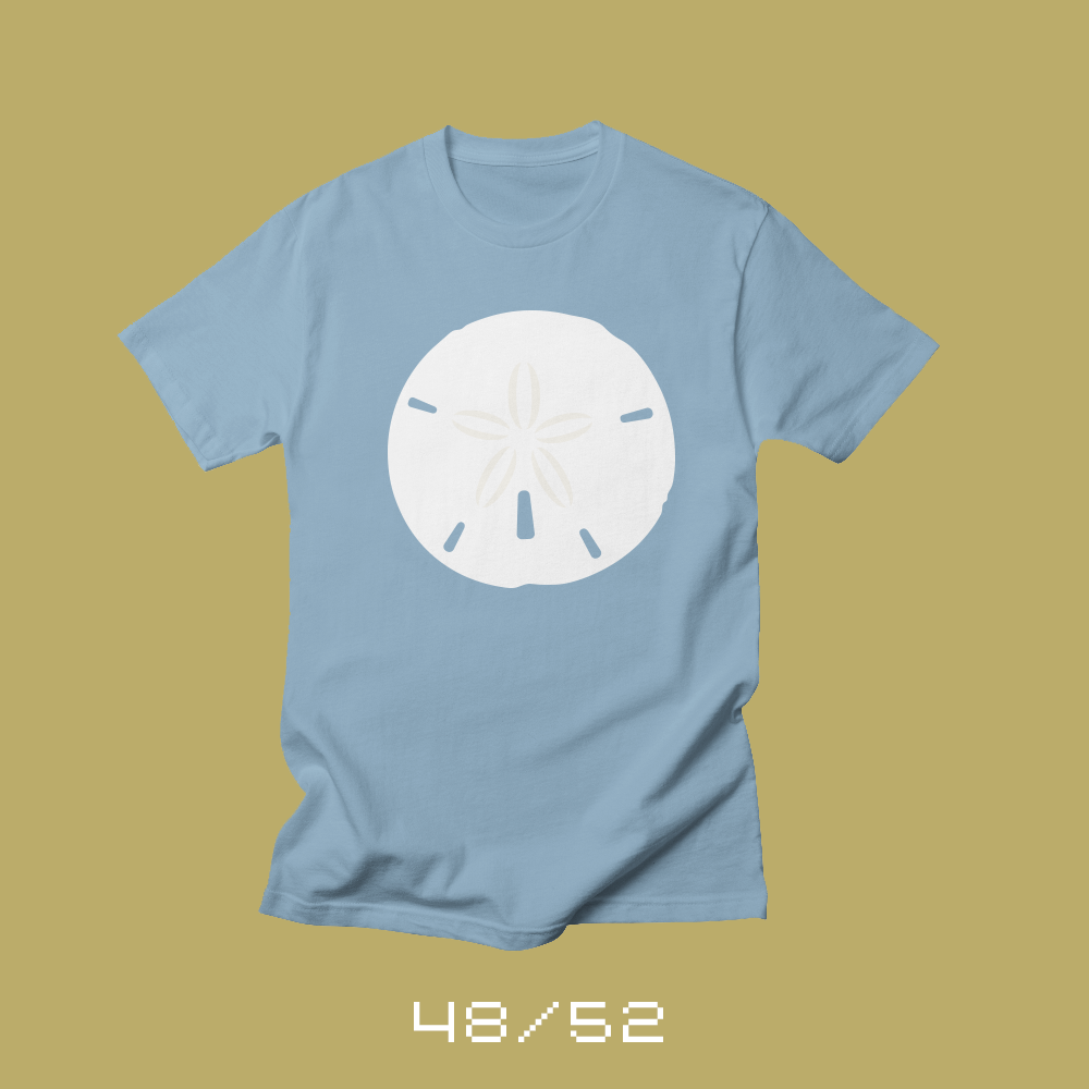
Each week for a year, I’m designing a shirt and releasing it on my Threadless store. This is the design for week 48.
Living in Columbia, South Carolina, we can easily make a day trip to Isle of Palms to spend the day on the beach. It’s a relatively easy drive when I-526 isn’t under construction. Other times during the year, we’ll head to Hilton Head. And whenever we head to the beach, our kiddos are somewhat obsessed with finding sand dollars.
Finding a sand dollar isn’t always easy. If the beach is crowded, it’s going to be tough to find one. You want to find a sand dollar that’s in one piece — the beach is littered with fragments of sand dollars. And it can’t be alive. Sure you can take a living sand dollar off the beach and bleach it, but that’s cruel.
We’ve got more than a couple that we’ve collected over the years. And they always remind me of the family beach trips we’ve taken in the past. We’ll take another day trip soon, and hopefully we’ll come home with a perfect sand dollar souvenir.
Bob Wertz writes about design, technology and pop culture at Sketchbook B. Bob is a Columbia, South Carolina-based designer, creative director, college instructor, husband and dad. He’s particularly obsessed with typography, the creative process and the tools we use to create. He’s currently nearing the end of a project to design a new shirt a week for an entire year.
This post was originally posted on May 13, 2018 on Sketchbook B. It’s reposted here as part of a project to move some of my favorite writing to my new site.
Things always loop back around
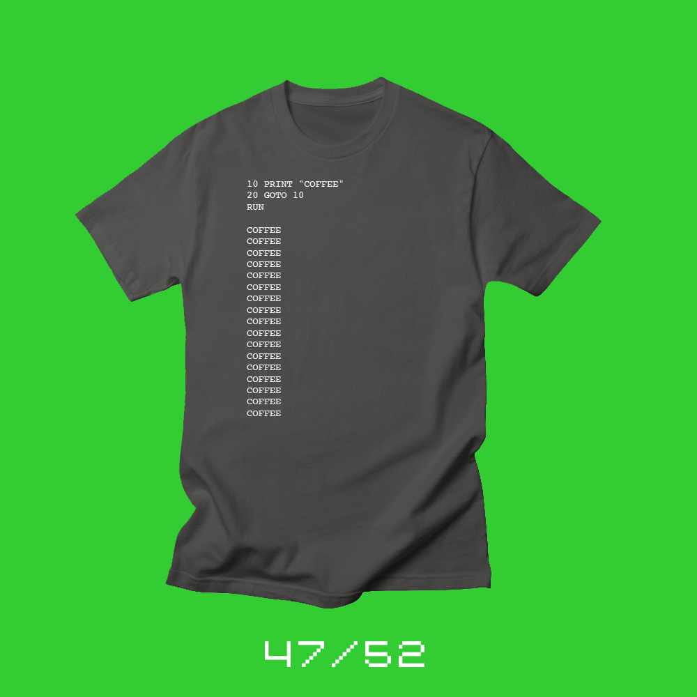
Each week for a year, I’m designing a shirt and releasing it on my Threadless store. This is the design for week 47.
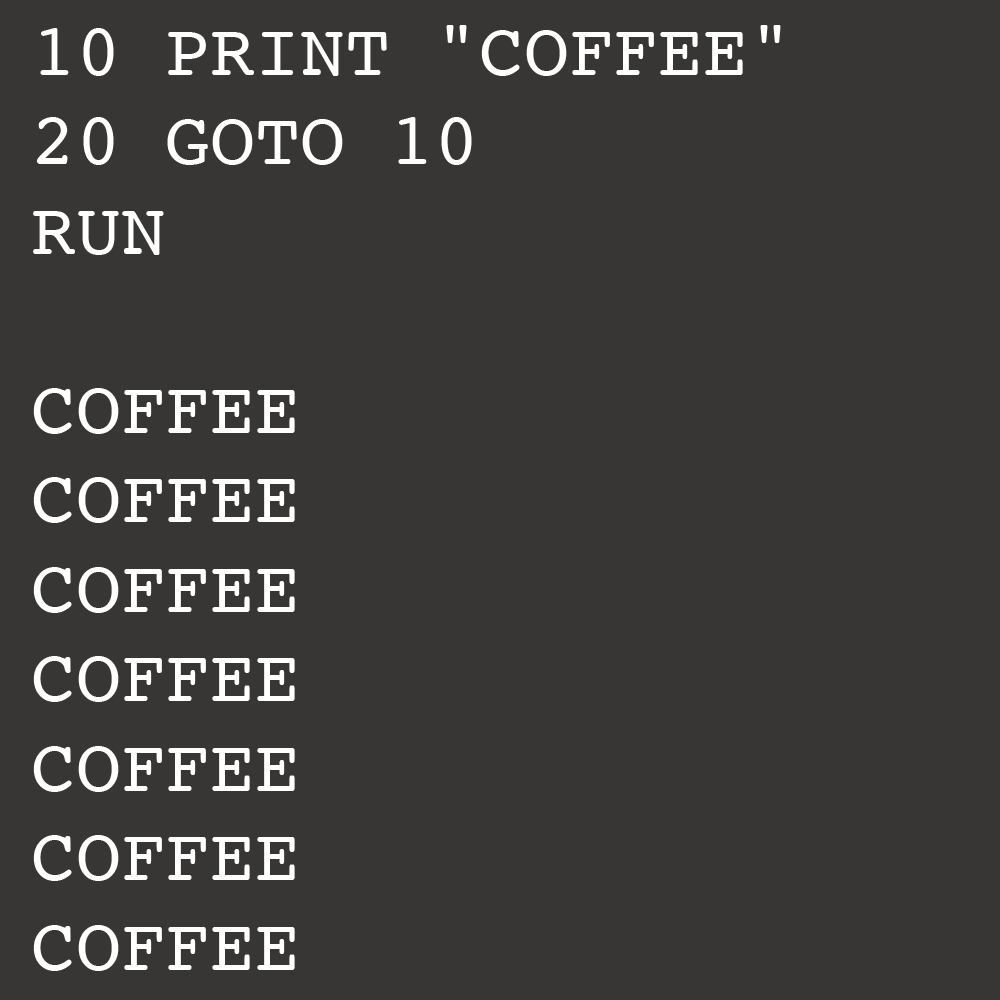
I was a young kid when my parents got us a Commodore VIC-20. Around the same time, I was exposed to TRS-80 computers at school. With either system, you could load and play very simple games, but you could also write some simple programs. One of the easiest things to do was to write a simple loop, and then the string in the first line would repeat infinitely.
I’d go into Sears, Montgomery Ward or Service Merchandise and they had computers out in the electronics department. No one really knew how to display computers, and it was pretty clear the sales people had no idea what to do with a computer. The machines would just sit there. So I’d always write a loop, with “hello” or my name repeating infinitely. Just because I could.
It was also in that Chicago suburb that I learned about coffee. My father was the pastor at a Lutheran church with a strong Swedish heritage. And those church members loved their coffee. Strong, black coffee. No cream. No sugar. I didn’t drink coffee then… I was too young. But many years later, when I acquired a taste for coffee, I always tried to drink it black because I believed that had to be the best way to enjoy coffee. It’s funny how experiences from childhood always manage to loop back around.
Bob Wertz writes about design, technology and pop culture at Sketchbook B. Bob is a Columbia, South Carolina-based designer, creative director, college instructor, husband and dad. He’s particularly obsessed with typography, the creative process and the tools we use to create. He’s currently nearing the end of a project to design a new shirt a week for an entire year. Follow Bob on Twitter, Instagram and Micro.Blog.
This post was originally posted on May 6, 2018 on Sketchbook B. It’s reposted here as part of a project to move some of my favorite writing to my new site.
Facts at my fingertips
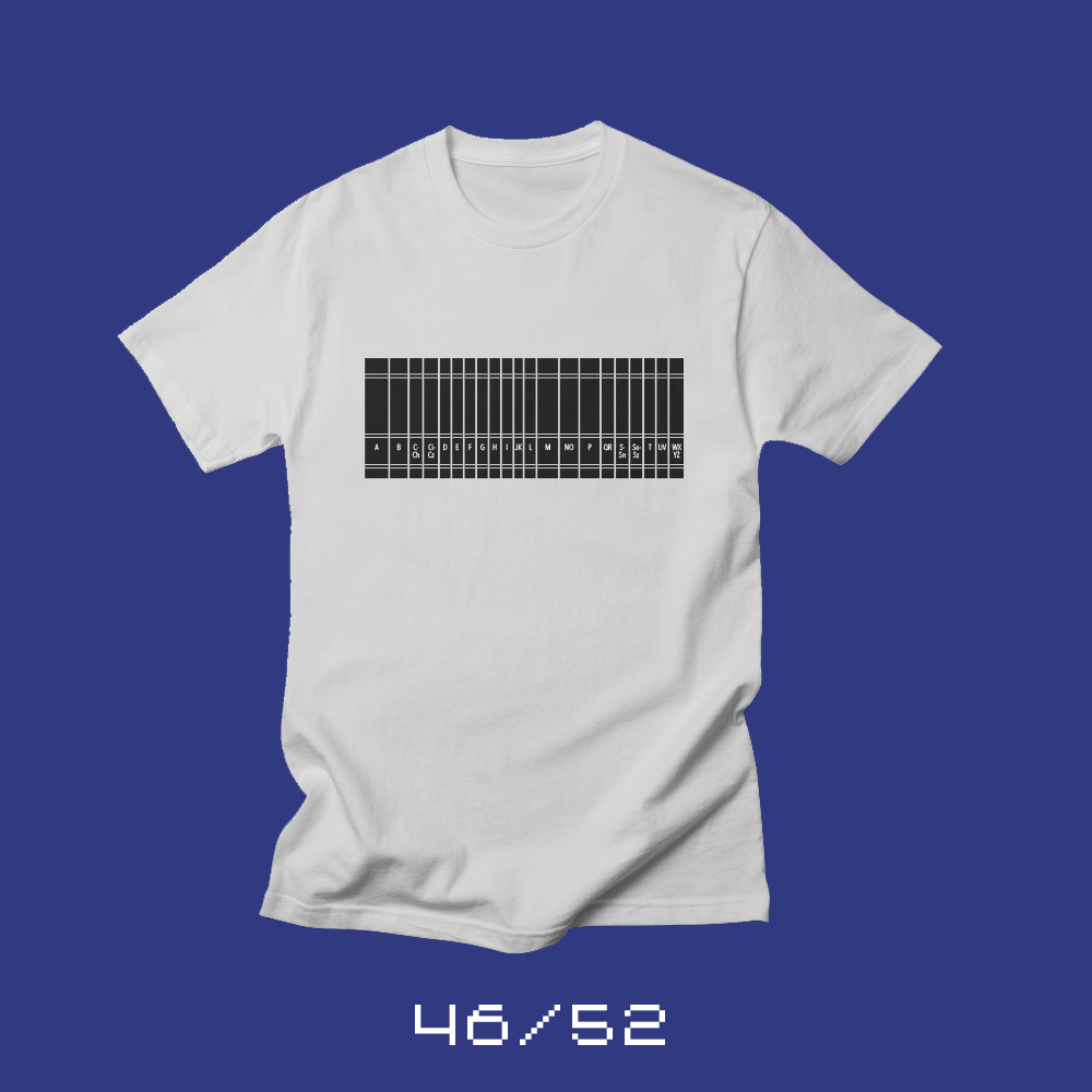
Each week for a year, I’m designing a shirt and releasing it on my Threadless store. This is the design for week 46.
My daughter, Jill, was asking me what I read for fun when I was her age. The answer probably isn’t surprising for anyone that really knows me: I read the encyclopedia for fun.*
My family had a set of World Book encyclopedias. I’d grab a volume, crack it open and look for something that interested me. I liked to read about space travel, other countries and creatures of all sorts.
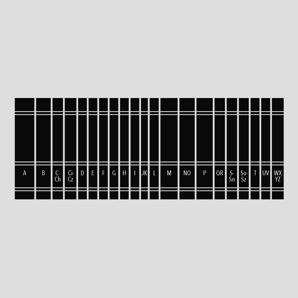
Jill, of course, has no idea what an encyclopedia is. She eventually concluded that it was “like the internet, but printed out and never updated.” And yes, that’s reasonably accurate and more than a little snarky. But when I was a kid, the world’s knowledge, as I understood it, was completely contained within the 20 or so volumes that sat on the shelf in the family room. I still love finding a topic on Wikipedia and learning everything I can about it.
* I read more than just the encyclopedia. I also loved the atlas and anything by David Macaulay.
Bob Wertz writes about design, technology and pop culture at Sketchbook B. Bob is a Columbia, South Carolina-based designer, creative director, college instructor, husband and dad. He’s particularly obsessed with typography, the creative process and the tools we use to create. He’s currently in the middle of a project to design a new shirt a week for an entire year.
This post was originally posted on April 29, 2018 on Sketchbook B. It’s reposted here as part of a project to move some of my favorite writing to my new site.
Tangible validation
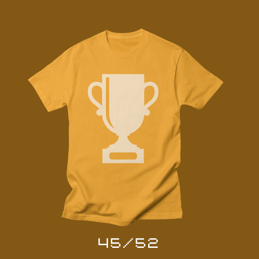
Each week for a year, I’m designing a shirt and releasing it on my Threadless store. This is the design for week 45.
My daughter’s orchestra performed at a competition at Universal Studios this week and won the highest honor. She volunteered to help carry the trophy back to their bus. While walking through the middle of a crowded park, people along the way — even though they had no idea why she was carrying a trophy — congratulated her. Everyone wanted to know what the trophy was for.
As a society, we love trophies (and plaques and certificates). They are a tangible representation of success. For some things like sports or races, the trophies are awarded to the last team or competitor standing. Other things are less black and white — like musical competitions, the Academy Awards and yes, design awards.
We love the validation that a trophy provides. We love to celebrate the moment. But too often, we’re quick to move on, seeking the next trophy. Wondering what else we can win. Never settling. And while that drive is wonderful, it’s also exhausting. It’s always important to keep things in perspective.
Bob Wertz writes about design, technology and pop culture at Sketchbook B. Bob is a Columbia, South Carolina-based designer, creative director, college instructor, husband and dad. He’s particularly obsessed with typography, the creative process and the tools we use to create. He’s currently in the middle of a project to design a new shirt a week for an entire year.
This post was originally posted on April 26, 2018 on Sketchbook B. It’s reposted here as part of a project to move some of my favorite writing to my new site.
A larger sketchbook sparked my creativity.
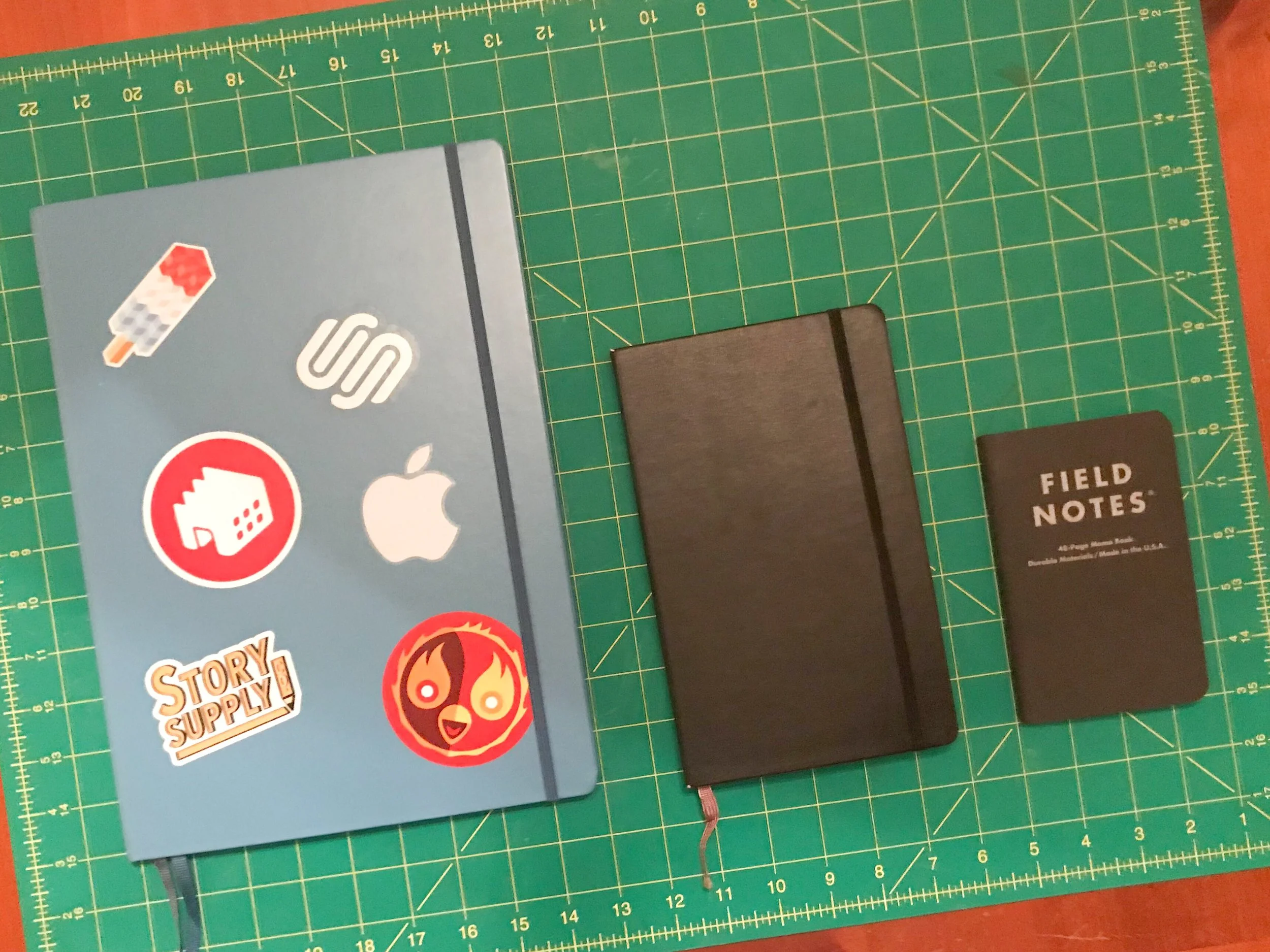
Lauchttrum 1917 Master Slim, Moleskine, Field Notes
I’ve used Moleskine-sized sketchbooks for the last 10 years or so. The size was portable and useful. Not too small, not too big. Functional. I used one notebook for both sketches and meeting notes.
About a year ago, I purchased a Leuchttrum 1917 Master Slim sketchbook at the Atlanta Pen Show. The Master Slim is an oversized hardcover notebook. The official size is A4+, meaning it’s larger than a European letter size sheet of paper. I got the dot grid, which is my favorite paper type for any notebook. I didn’t have a purpose in mind when I purchased the Leuchttrum Master Slim. I wasn’t really sure what I was going to use it for. It sat on my desk unused for about a month waiting for the perfect project. I finally broke it out to start working on some lettering ideas for a new typeface.
It took some significant adjustment. The pages were so large, I had to get used to working with a larger surface area. I was working at a coffee shop and the open book took up most of the tiny table I was at.
But now, it’s my favorite sketchbook and I can’t imagine going back to the old size. I’m already on my second one.
I love having the big pages to work with. The Master Slim gives me room to do a whole series of small thumbnails, or work on a single, really intricate illustration. I can see the evolution of an idea across a spread instead of flipping through multiple pages. Every sketch for my 52 Shirts project is in a Master Slim notebook. It never occurred to me that my creative process might be altered by changing the size and type of sketchbook I’m using.
Having a large sketchbook has forced me to reevaluate how I use my notebooks. The Leuchtrum isn’t really practical for taking to meetings and it’s definitely not pocketable. So I now have two notebooks: The Leuchtrum is my sketchbook, and I use Story Supply or Field Notes pocket notebooks for any meeting notes and my new task tracking system. Using two notebooks works better for me and each notebook is better suited for their designated role.
Bob Wertz writes about design, technology and pop culture at Sketchbook B. Bob is a Columbia, South Carolina-based designer, creative director, college instructor, husband and dad. He’s particularly obsessed with typography, the creative process and the tools we use to create. He’s currently in the middle of a project to design a new shirt a week for an entire year.
This post was originally posted on April 26, 2018 on Sketchbook B. It’s reposted here as part of a project to move some of my favorite writing to my new site.
Join the cutest club around.
I’m excited that Threadless has chosen to include in their collection the shirt I designed with my daughter Jill as part of my 52 Shirts project. Team Rainbow Unicorn is one of the cutest things I’ve ever designed, and if I’m honest, it’s all because of my 10-year-old Jilly. She loves unicorns and when we gathered around the dining room table to create this shirt, she had some very strong opinions about what the unicorn should look like — especially the eyes. We sketched eyes in “kawaii” style, working on the perfect placement of the highlights and the eyelashes. The eyes make the design, and that was all from Jill.
Bob Wertz writes about design, technology and pop culture at Sketchbook B. Bob is a Columbia, South Carolina-based designer, creative director, college instructor, husband and dad. He’s particularly obsessed with typography, the creative process and the tools we use to create. He’s currently in the middle of a project to design a new shirt a week for an entire year.
This post was originally posted on April 22, 2018 on Sketchbook B. It’s reposted here as part of a project to move some of my favorite writing to my new site.
My six-year-old has some Siri-ous concerns.
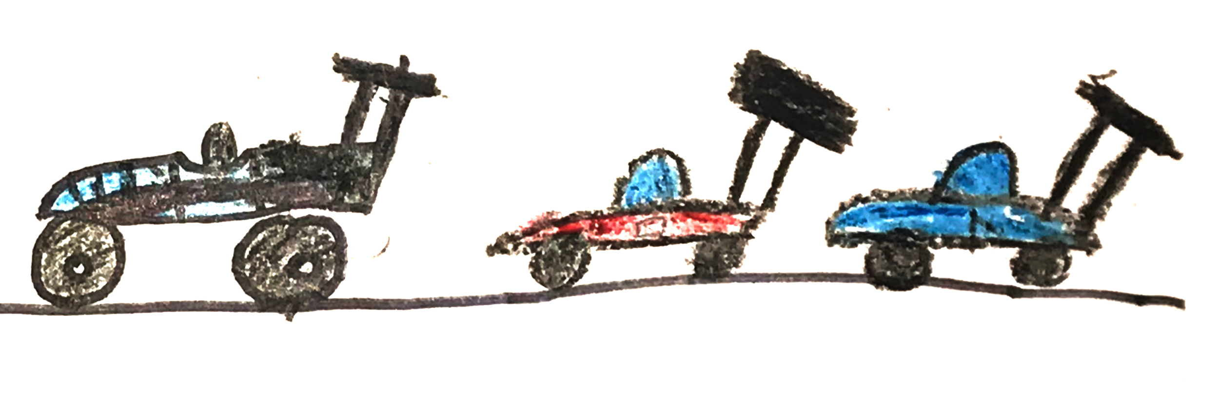
Race Cars by Ryan, 6.
We were driving down I-20 towards Atlanta heading to the Atlanta Pen Show to see Myke and Brad at the live recording of The Pen Addict. The whole crew was in the car because we were dropping the kiddos off at Grandma’s house on the way.
It had been a long week so just outside of Columbia, everyone was asleep… except Ryan. Our six-year-old was wide awake and ready to talk. He eventually started telling me about all the things he wanted to invent someday. Rockets and spaceships, mostly. But then, he brought up cars that can drive themselves…
Ryan: I’m going to invent a car that can drive itself.
Me: That’s cool, bud.
Ryan: And you’ll control it with a video game controller.
Me: That’s not exactly a self-driving car. Engineers and scientists are already working on making a car that will drive itself.
Ryan: But how will it know where to go?
Me: You’ll hop in and say “Take me to Grandma’s house” and you’ll be on the way. There won’t even be a steering wheel.
Ryan: THAT WILL NEVER WORK!
(Keep in mind that 5 minutes ago, we were talking about building invisible rockets that could fly to the sun…)
Me: Why not? People are already working on it.
Ryan: Dad! Have you ever tried to ask Siri anything? That’s never going to work.
I don’t use Siri much. I use it for voice dialing when I’m driving. I’ve switched my AirPod controls so they don’t use the Siri functionality. I’d rather just tap to pause or play.
Ryan, though, loves talking to voice interfaces. He loves asking Siri questions. He uses the Siri remote on our Apple TV. We have an Echo Dot at home that he loves to ask Alexa about the weather, add things to our shopping list and ask it to play music and tell jokes. Ryan isn’t good at structuring his sentences in the perfect way to get the best response — he’s six — so even with the Alexa, it’s hit or miss.
We all know that voice assistants have to get better before they become the primary interface for our cars and devices, but I think it’s telling that a six-year-old who believes he could grow up and invent invisible rockets that will take us to the outer reaches of the solar system has zero confidence that Siri could ever get him to his Grandma’s house.
Bob Wertz writes about design, technology and pop culture at Sketchbook B. Bob is a Columbia, South Carolina-based designer, creative director, college instructor, husband and dad. He’s particularly obsessed with typography, the creative process and the tools we use to create. He’s currently in the middle of a project to design a new shirt a week for an entire year.
This post was originally posted on April 22, 2018 on Sketchbook B. It’s reposted here as part of a project to move some of my favorite writing to my new site.
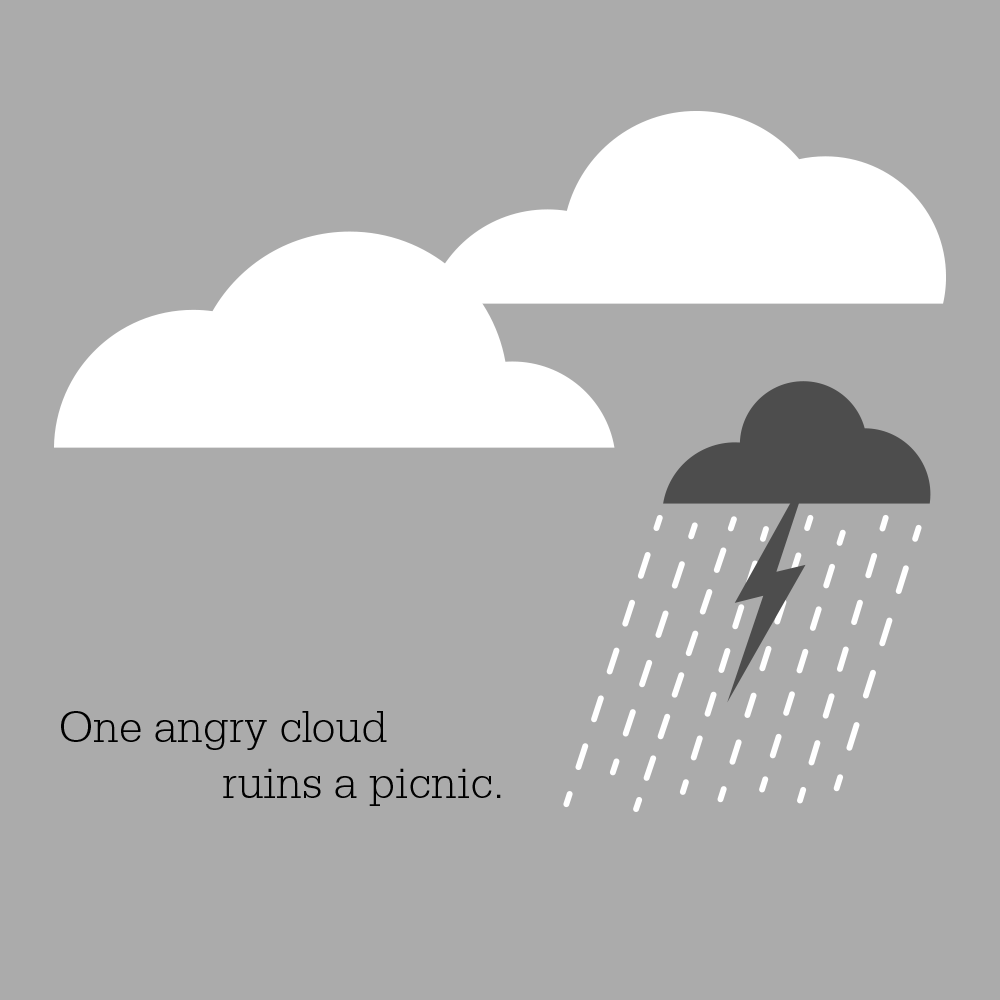
But maybe a picnic isn’t your only option.
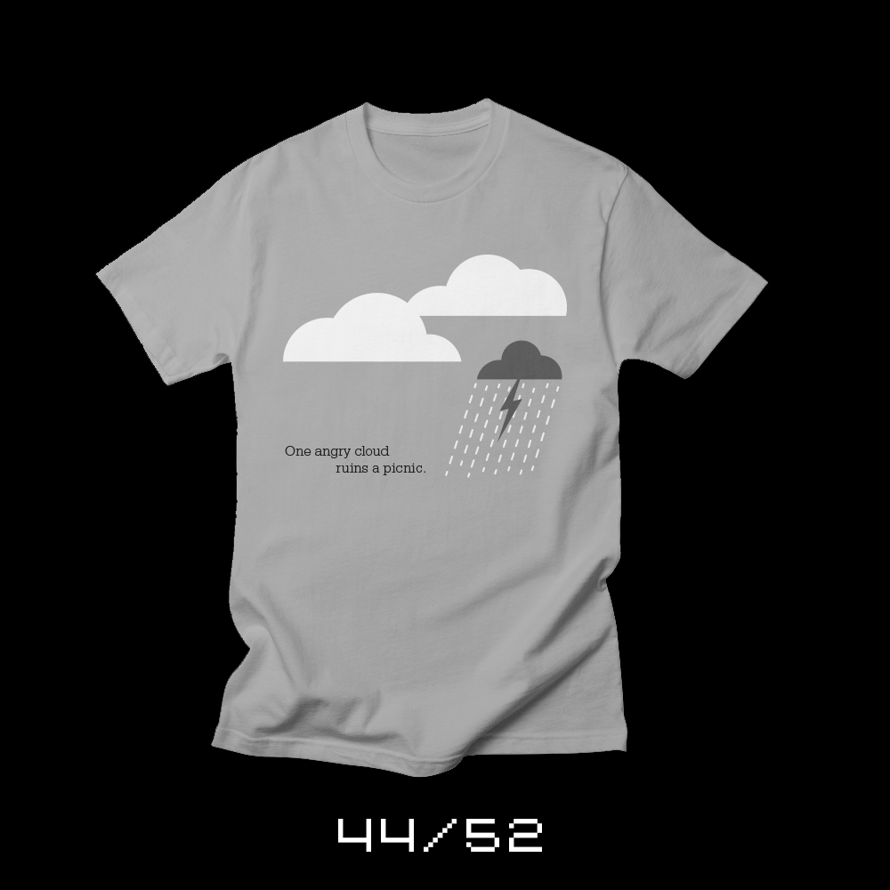
Each week for a year, I’m designing a shirt and releasing it on my Threadless store. This is the design for week 44.
It only takes one person to destroy what should be a fun time. One angry cloud. One person without perspective. One person committed to making people miserable. One unexpected storm. One person convinced that they are more important than everyone around them. And when that storm hits, it’s pretty much impossible to enjoy the picnic.
When the rain is coming down, no one will blame you if you pack up and go home. But it isn’t your only option. You can tough it out (and dance in the rain). You can change your plans and get away from the rain. The choice is up to you.
Bob Wertz writes about design, technology and pop culture at Sketchbook B. Bob is a Columbia, South Carolina-based designer, creative director, college instructor, husband and dad. He’s particularly obsessed with typography, the creative process and the tools we use to create. He’s currently in the middle of a project to design a new shirt a week for an entire year.
This post was originally posted on April 15, 2018 on Sketchbook B. It’s reposted here as part of a project to move some of my favorite writing to my new site.
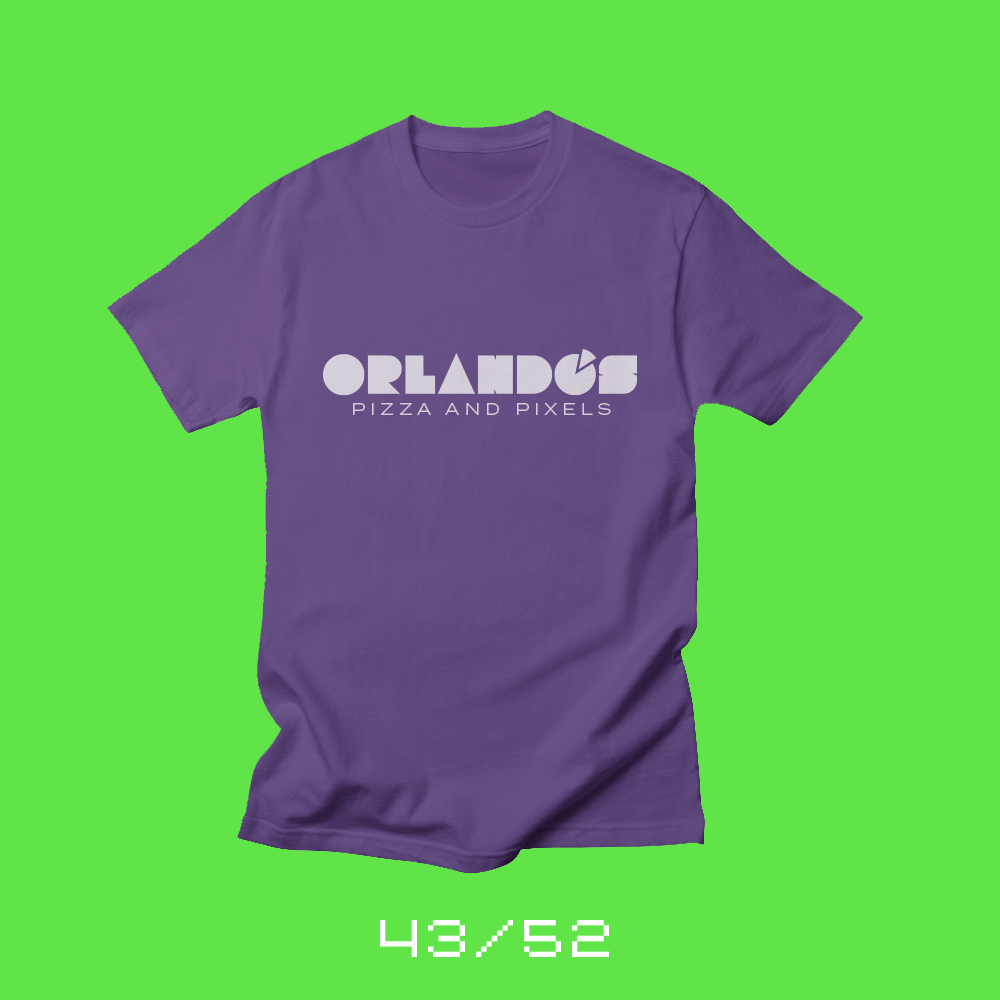
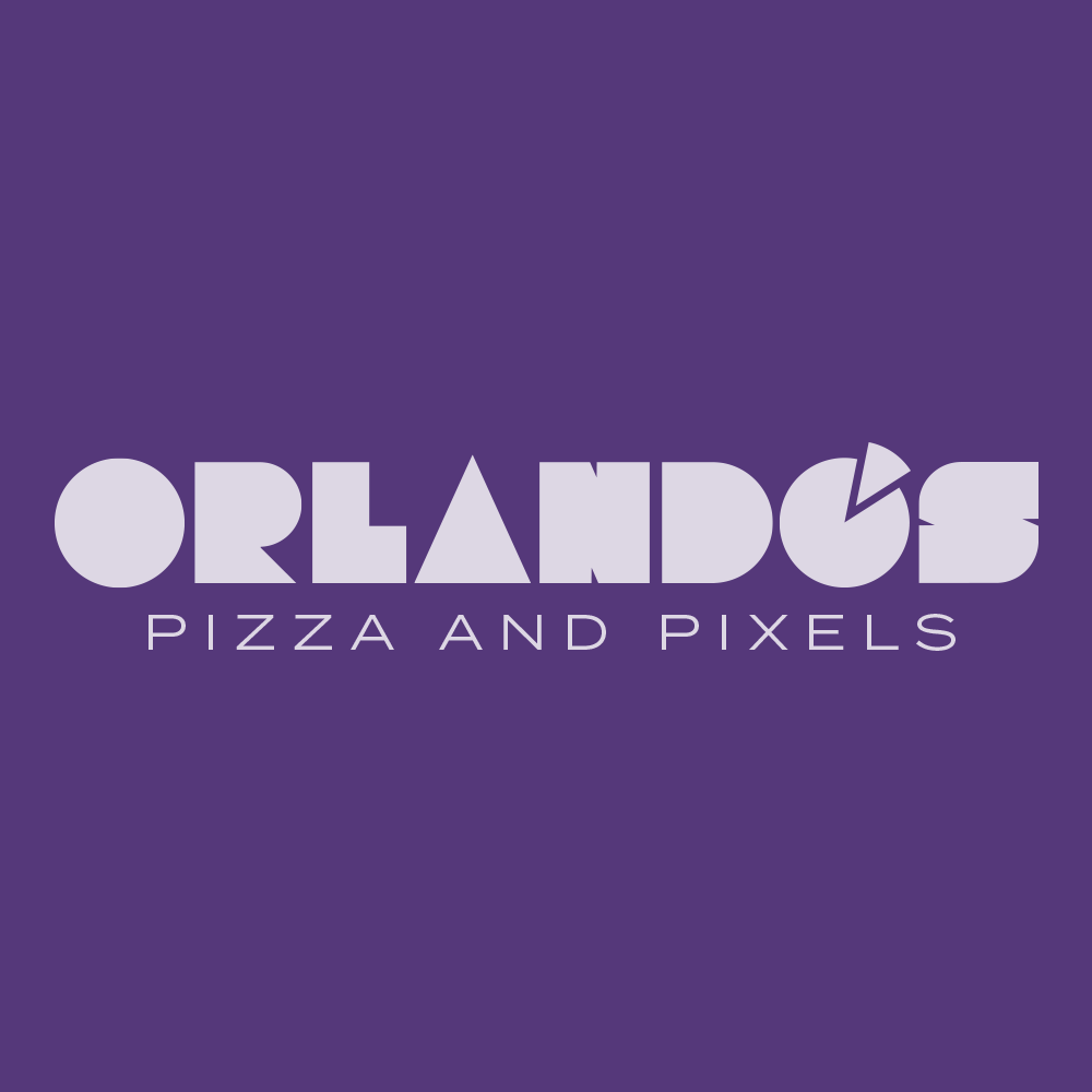
Pizza and Pixels
Each week for a year, I’m designing a shirt and releasing it on my Threadless store. This is the design for week 43.
When I was a kid in the 1980s, we frequently ate at a neighborhood pizza place called Orlando’s Pizza. I don’t really remember that much about the pizza, but we always wanted to go there so the food must have been good.
In the back of the restaurant was a small arcade. “Arcade” is a little generous. It was at most four or five machines. After I finished my pizza I’d head to the back of the restaurant. If I had a quarter, I’d play. Or just watch the machines cycle through their demo screens. I played Pac-Man, Donkey Kong and Galaga for the first time at the pizza joint.
It’s hard to imagine now, when the phone that we carry in our pockets play an endless selection of infinitely more complex games, but those arcade games were my first real exposure to computers. Our family eventually bought several Commodore computers, but my love of video games and technology can probably be tracked back to Orlando’s.
The restaurant is long gone, but I wanted to commemorate it with a redesign, renaming Orlando’s Pizza to Orlando’s Pizza and Pixels. And it was an excuse to turn a slice of pizza into an apostrophe.
Bob Wertz writes about design, technology and pop culture at Sketchbook B. Bob is a Columbia, South Carolina-based designer, creative director, college instructor, husband and dad. He’s particularly obsessed with typography, the creative process and the tools we use to create. He’s currently in the middle of a project to design a new shirt a week for an entire year.
This post was originally posted on April 8, 2018 on Sketchbook B. It’s reposted here as part of a project to move some of my favorite writing to my new site.
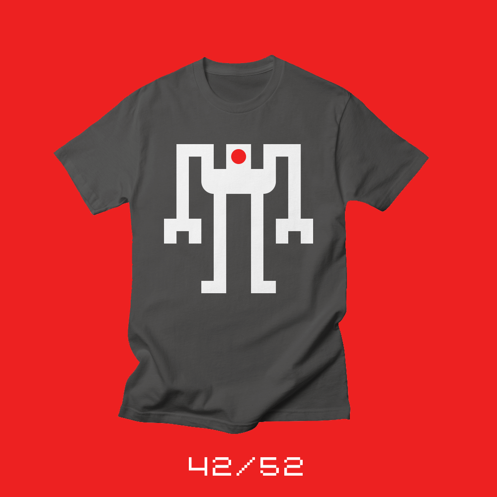
Ten years of Fontstruct
Each week for a year, I’m designing a shirt and releasing it on my Threadless store. This is the design for week 42.
Ten years ago, I came across a web app called Fontstruct that allowed me to build modular type. I signed up and produced my first typeface, Pixa, which must have been terrible because I deleted it. But I blogged about Fontstruct and Pixa on April 6, so considering the site launched on April 1, I must have been one of the first wave of users.
Since then, I’ve released dozens of typefaces through Fontstruct. Some of these designs have been selected as Top Picks and some are pretty bad. Fontstruct designs have served as prototypes for several of my commercial designs. I don’t create much on Fontstruct anymore, but every so often, I’ll show up and enter one of their contests or knock out a quick idea that’s rolling around in my head. I love creating type, and Fontstruct is absolutely fun to create in. I really do need to find time to build more on Fontstruct.
It’s really amazing how the tool and the community has evolved over the last ten years. Users are building increasingly complex typefaces and now with the Google Fonts integration, the better designs might get a wider audience.
To commemorate joining the Fontstruct community ten years ago, I wanted to make a shirt featuring one of my glyphs… but which one? One of my pixel art designs seemed like a good idea, so I settled on my favorite robot from the original “Dingbots and Monsters.”
Bob Wertz writes about design, technology and pop culture at Sketchbook B. Bob is a Columbia, South Carolina-based designer, creative director, college instructor, husband and dad. He’s particularly obsessed with typography, the creative process and the tools we use to create. He’s currently in the middle of a project to design a new shirt a week for an entire year.
This post was originally posted on April 1, 2018 on Sketchbook B. It’s reposted here as part of a project to move some of my favorite writing to my new site.
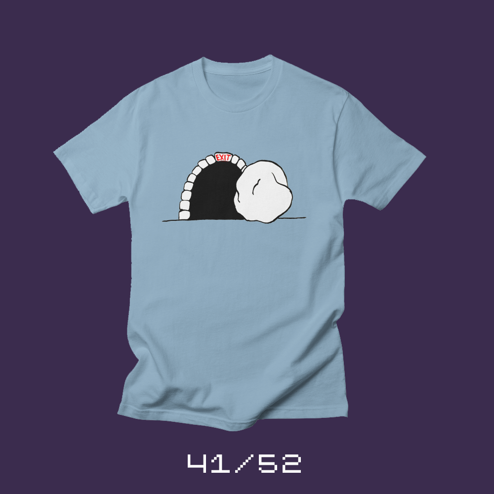
Exit only
Each week for a year, I’m designing a shirt and releasing it on my Threadless store. This is the design for week 41.
I love Easter Sunday. The sunrise service. The hymns. The special music. The flowers. But most of all, I love the joy and the excitement. After the reflection of the Lenten season and Holy Week, we celebrate — we rejoice — that Jesus Christ has risen from the dead.
The release date for this week’s shirt falls on Easter. The stone is rolled back and our savior exits the tomb.
Bob Wertz writes about design, technology and pop culture at Sketchbook B. Bob is a Columbia, South Carolina-based designer, creative director, college instructor, husband and dad. He’s particularly obsessed with typography, the creative process and the tools we use to create. He’s currently in the middle of a project to design a new shirt a week for an entire year.
This post was originally posted on March 24, 2018 on Sketchbook B. It’s reposted here as part of a project to move some of my favorite writing to my new site.
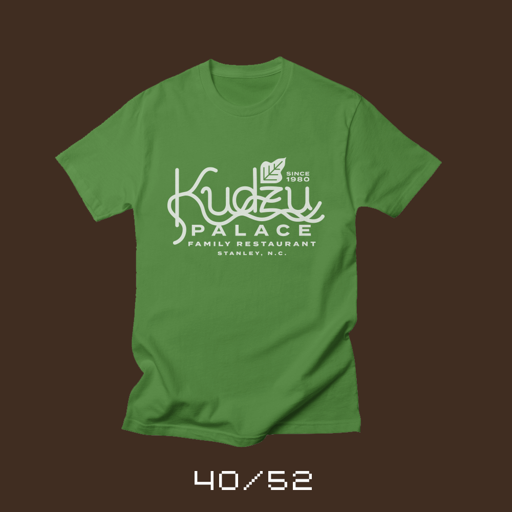
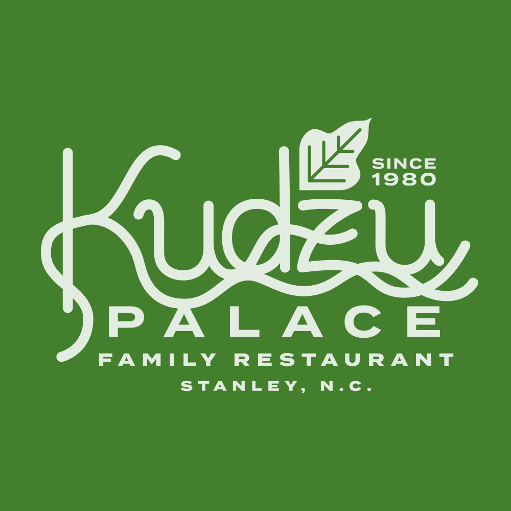
No one ever wants to eat there…
Each week for a year, I’m designing a shirt and releasing it on my Threadless store. This is the design for week 40.
When I was little, we lived in Stanley, North Carolina. Every so often on the weekend, we’d make the trek over to Gastonia to have dinner, go shopping or catch a movie. We’d drive along a road where every tree seemed to be covered in kudzu. If you aren’t familiar with kudzu, it’s a vine that grows relatively uncontrolled across the southeastern United States. It’s legendarily impossible to kill.
At some point on the trip, my dad would ask us where we wanted to eat. He’d give us three options, but the third option was always “Kudzu Palace.” Kudzu Palace didn’t exist, of course, but every time, my siblings and I would yell “Not Kudzu Palace!”
Now that I have kids, I often offer up Kudzu Palace as a dining option. Surprisingly, they never pick it either.
When I started this project, I actually planned to do a bunch of fake restaurants and brands. Kudzu Palace was one of the original ideas from my first set of sketches. The project has taken a different direction and the designs have been more conceptual, but I’m glad I finally got around to creating a shirt for my favorite fictional restaurant. Now, I’m wondering what’s on the menu.
Bob Wertz writes about design, technology and pop culture at Sketchbook B. Bob is a Columbia, South Carolina-based designer, creative director, college instructor, husband and dad. He’s particularly obsessed with typography, the creative process and the tools we use to create. He’s currently in the middle of a project to design a new shirt a week for an entire year.