This post was originally posted on December 28, 2021 on Sketchbook B. It’s reposted here as part of a project to move some of my favorite writing to my new site.
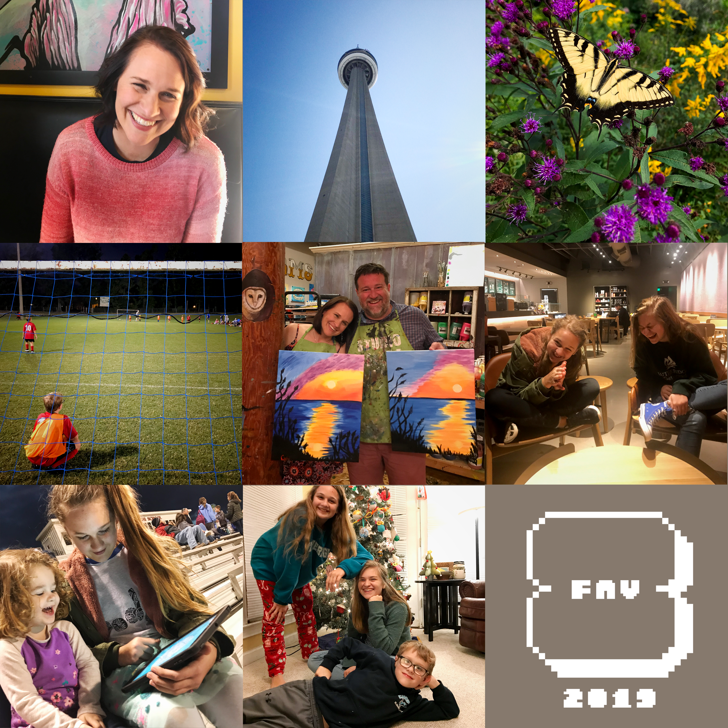
My favorite shots from the last year.
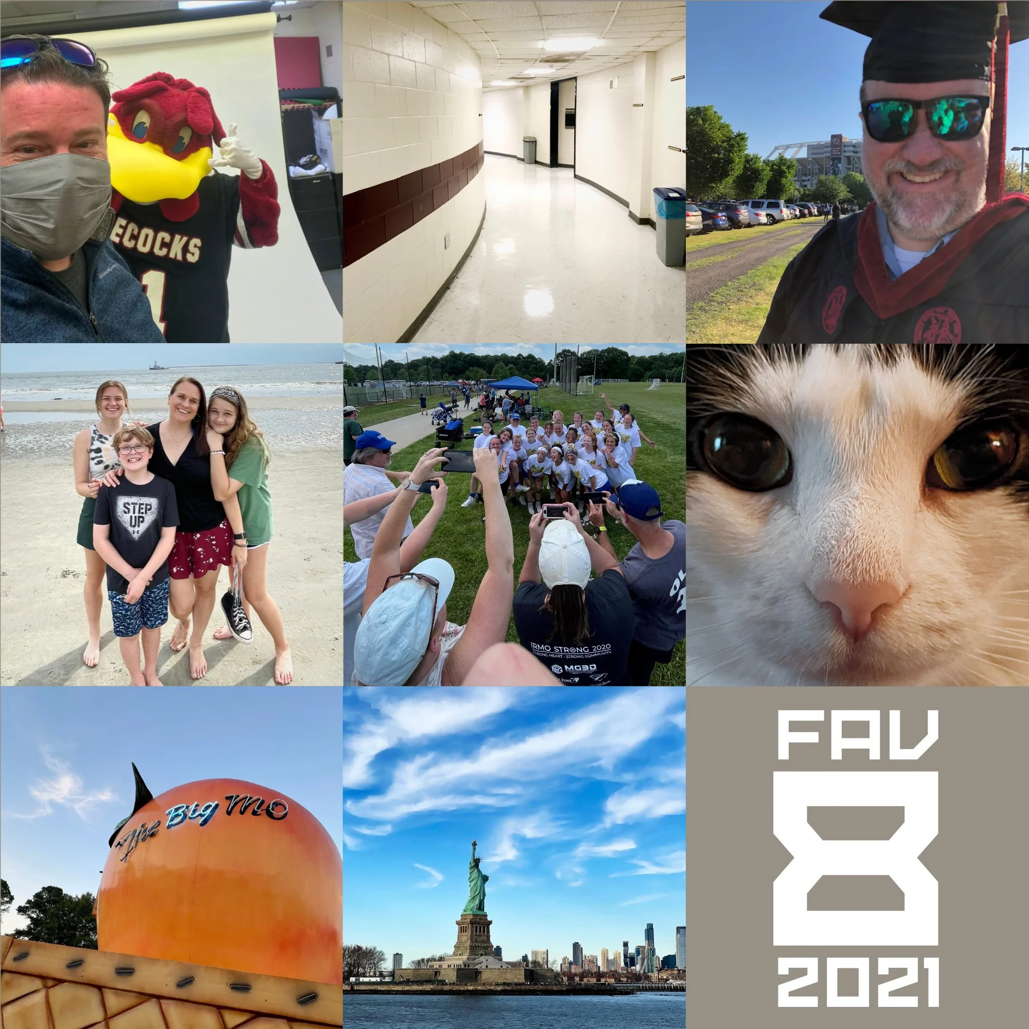
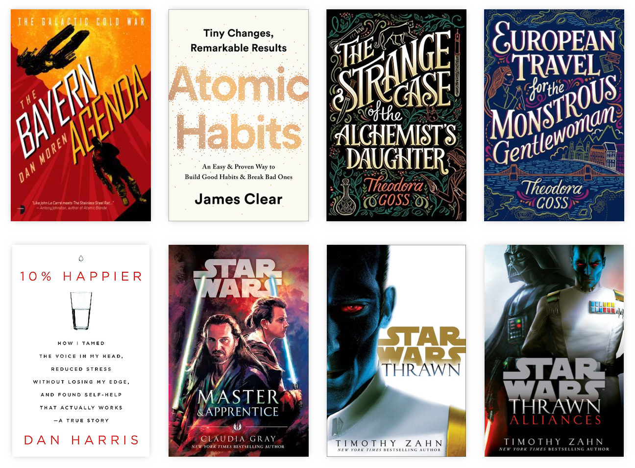
A few years ago, I started picking my eight favorite shots from the last year instead of the automated top 9 that had become popular on Instagram. I’ve written about the process* before so I’m not going to recount that here, but here are my favorite eight shots from the year. (I took lots of shots I liked this year and it was actually really tough to narrow it down to eight shots. I could have picked eight shots just from just our New York trip.)
Cocky. The year started with a photoshoot with Cocky and we used FaceTime to call my Cocky-obsessed niece.
Carolina Coliseum. On the same day as the photo shoot, I grabbed this shot of the empty hallways of the Carolina Coliseum. That’s where the journalism school was when I was an undergraduate student.
Masters. This spring, I graduated from my MA program. The commencement ceremony was held at Williams-Brice Stadium because of COVID.
Beach. The family at the beach in Charleston. Love this shot of everybody.
Lacrosse. Norah’s club team won their bracket at a tournament in Lake Norman, North Carolina. They rallied to win four straight and she played really well. The team posed with their championship shirts after the final.
Ruby. Our cat. Love the detail in this super close up shot.
The Big Mo. We weren’t ready to return to the theatre, but we wanted to see Shang Chi. So we headed to the Big Mo, a drive-in theatre in Monetta, South Carolina.
Lady Liberty. We made a trek to New York with the family right before Christmas and visited Liberty Island.
* One change from my previous process: I made this years collage in Affinity Photo instead of Photoshop.
Bob Wertz writes about design, technology and pop culture at Sketchbook B. Bob is a Columbia, South Carolina-based designer, University of South Carolina Ph.D. student, mass comm researcher, husband and dad. He’s particularly obsessed with typography, the creative process and the tools we use to create. He got vaccinated and boosted to protect his community. #TeamModerna
This post was originally posted on December 12, 2021 on Sketchbook B. It’s reposted here as part of a project to move some of my favorite writing to my new site.
Remembering that time I had coffee with a design legend at the now-closed Vista Starbucks.
Chris Trainor at The State broke the news last week that the Vista Starbucks in Columbia is permanently closed. I used to meet people there from time-to-time when I needed a place downtown to work for a couple of hours.* I haven’t been to that store in years — lately, I’ve been more likely to stop by their new Bull Street location — but one of my favorite professional stories took place at that now-vacant storefront.
Back in April 2008, AIGA South Carolina hosted a lecture by Stefan Sagmeister. At the time, he was probably considered one of the most famous designers in the world and was doing a book tour. Sagmeister’s staff had arranged all of his travel so his stay in Columbia wasn’t our typical speaker visit. He was flying into Columbia on the morning of the lecture and then, after the event, was taking a car to Charlotte for another lecture the next day. I picked him up at the airport and we took him to lunch at Motor Supply with some board members and students from the design program at USC.
Our normal routine at the time was to take the speaker to the hotel after lunch so they could relax and get some work done, but Sagmeister wasn’t spending the night in Columbia so we didn’t have place for him to hang out. We offered him Marius’s office at the School of Art, but Stefan simply wanted a place where he could grab some coffee and check his email. Starbucks in the Vista was the location we settled on.
For three hours, we sat at the outside tables at the corner of Gervais and Lincoln. It was misting rain so we stayed at the tables with the green Starbucks umbrellas. He checked email, drank coffee and smoked, but mostly, we talked about design and the creative process.** We also talked about his “fame” and he noted that if he were truly famous, he wouldn’t be able to sit at an outside table at a busy intersection without being noticed.
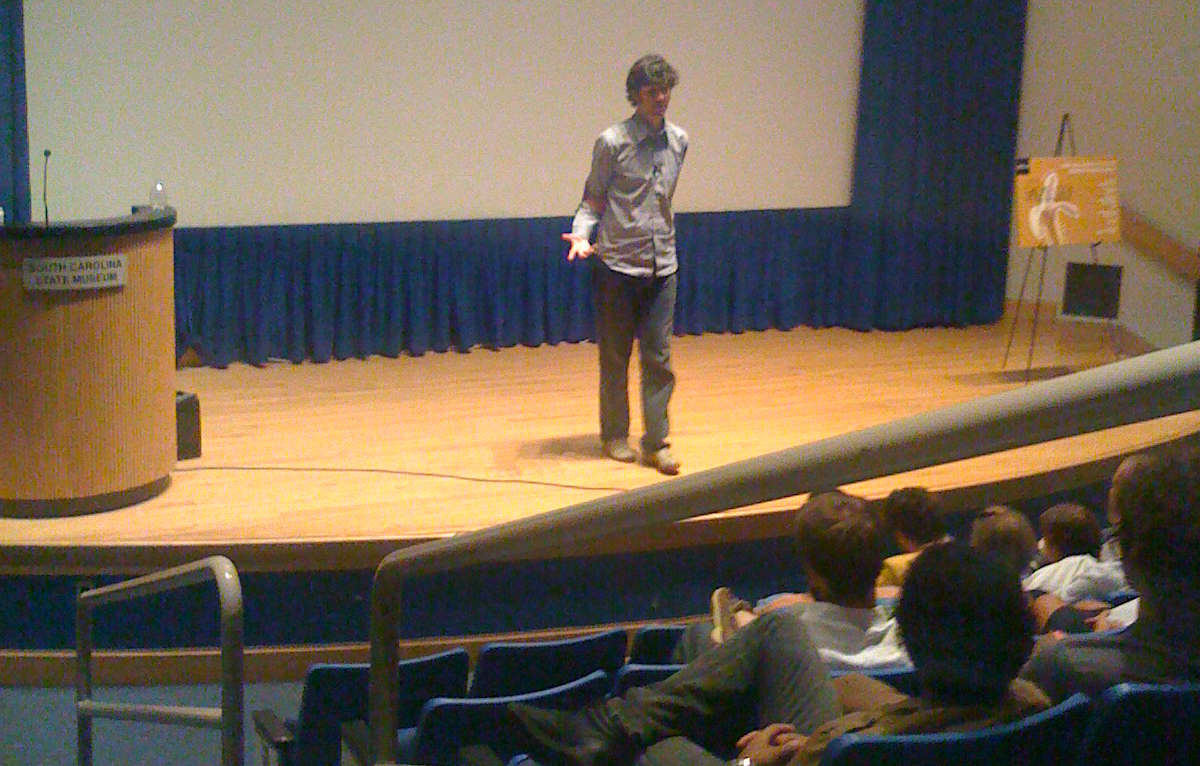
This is the only picture I took of the Sagmeister lecture.
The lecture that night went exceptionally well. About 160 people from all over South Carolina gathered to hear his talk at the State Museum auditorium. But my strongest memory from his visit was sitting at the Starbucks in the Vista with Sagmeister and talking shop for a few hours. He was kind and thoughtful and I appreciated getting to chat with him.
Hopefully, soon, another store or restaurant will fill the vacant storefront, but every time I pass that intersection, I’ll think of the old Vista Starbucks and Stefan Sagmeister.
* Keep in mind that there were very few independent coffee shops in Columbia at the time. And reliable wifi wasn’t a given in 2008 like it is today.
Bob Wertz writes about design, technology and pop culture at Sketchbook B. Bob is a Columbia, South Carolina-based designer, University of South Carolina Ph.D. student, mass comm researcher, husband and dad. He’s particularly obsessed with typography, the creative process and the tools we use to create. He got vaccinated and boosted to protect his community. #TeamModerna
This post was originally posted on November 17, 2021 on Sketchbook B. It’s reposted here as part of a project to move some of my favorite writing to my new site.
A couple of old typefaces get new versions.
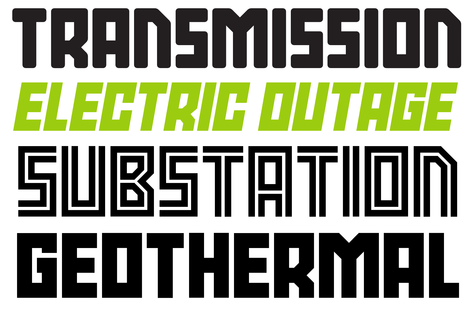
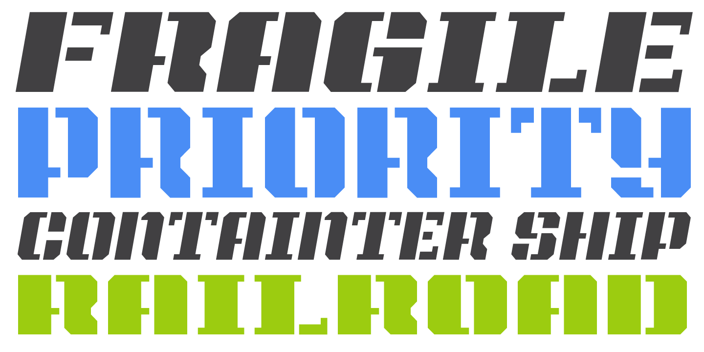
This week I released a couple of new display typefaces based on some of my older designs: SbB Power Grid and SbB Intermodal Stencil. These designs have been available before in different forms, but these new versions are significantly refined and expanded. Both SbB Power Grid and SbB Intermodal Stencil are available for purchase at MyFonts.
SbB Power Grid
SbB Power Grid is a bold display typeface with an industrial feel. The family has four styles — Regular, Inline, Stencil and Rounded and corresponding italics. This is actually the third version of Power Grid. I spent time refining the look and feel of the design and I’m really happy with where it landed. The Stencil and Inline versions in particular would work well in athletic or industrial branding.
SbB Power Grid is available as a family for $19 at MyFonts. Individual fonts are $9 each.
SbB Intermodal Stencil
SbB Intermodal Stencil is my futuristic, sci-fi stencil system. I’ve written about Intermodal Stencil and my experiments with variable type. I’m happy to finally release a new version. I’ve refined the letterforms, added a couple of alternates and two italic angles. The variable version includes three axes — width, slant and stencil opening. The stencil opening serves as a type of optical correction. At smaller sizes, the larger stencil cuts work better.
What’s the deal with multiple italic* angles? When you are designing a typeface that intended to be used in large blocks of text, the designer needs to pick one consistent italic angle. But when you are talking about a display typeface, an italic angle is just an aesthetic choice. So I’ve decided to provide multiple angles for Intermodal. Intermodal features 5 degree and 10 degree obliques. If you use the variable font, you can pick any italic slant between 0 and 15 degrees.
SbB Intermodal Stencil is available as a family for $19 at MyFonts. Individual fonts are $9 each.
* Also, these are really obliques, not italics. An italic is typically drawn in a different style, while an oblique is a slanted version of the upright Roman. But most people and designers just call all slanted text “italics” so I decided it was time to abandon that particular linguistic fight.
Bob Wertz writes about design, technology and pop culture at Sketchbook B. Bob is a Columbia, South Carolina-based designer, University of South Carolina Ph.D. student, mass comm researcher, college instructor, husband and dad. He’s particularly obsessed with typography, the creative process and the tools we use to create. Bob occasionally and begrudgingly posts toTwitterandInstagram. He wears a mask and got vaccinated to protect his community. #TeamModerna
This post was originally posted on November 6, 2021 on Sketchbook B. It’s reposted here as part of a project to move some of my favorite writing to my new site.
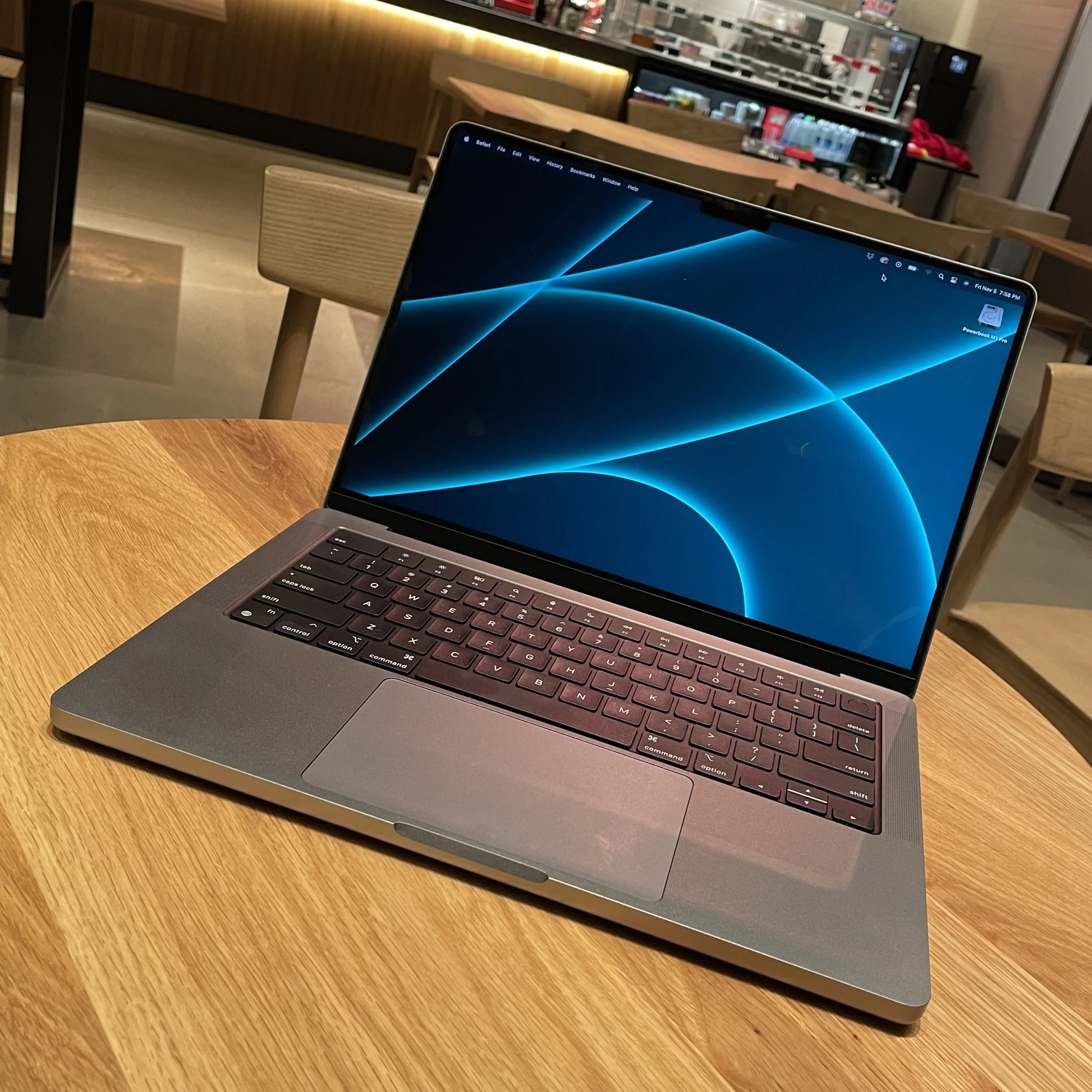
My new MacBook Pro
Y’all. I’ve only had it for less than two weeks, but I love this computer so much. I don’t really need to write a review. Every reviewthat’s been writtenabout the new MacBook Pro*essentially says the same thing. The computer is unbelievably fast. The battery life seems endless. The screen is insanely sharp. The ports are back. The keyboard is solid. The notch is strange at first, but then pretty much disappears.
I went with the 14-inch version in Space Gray. It’s the perfect size for what I need for writing and type design. Some of my designer friends have expressed surprise that I didn’t go with the 16-inch screen, but I don’t really want to carry around that computer (or the accompanying charger brick) in my bag.
If I need more screen real estate, I can easily plug it into an external display. I probably won’t do that often, though, because the MacBook Pro’s screen is beautiful and my external display is woefully inadequate in comparison. You have to see the MacBook Pro in person to understand just how sharp and bright this screen is. It’s an amazing piece of technology and it will be a while before an external screen of this quality is affordable.**
Could I have gotten by with the M1 MacBook Air and saved myself some money? Yes, absolutely. I’m not editing video or doing massively intensive computational tasks. But stepping up to the MacBook Pro gets you the gorgeous screen, the updated industrial design, MagSafe, some additional ports (that I probably won’t use) and some extra speed. Well worth the added investment to me.
So far, I’m happy with my purchase. The whole package feels premium — solid and durable. I look forward to using it in coffee shops, conference rooms and classrooms for many years to come.
* I understand why Apple switched the name to MacBook years ago, but this computer looks like more like a Powerbook to me. 😎
** Apple’s Pro Display XDR is not affordable.
Bob Wertz writes about design, technology and pop culture at Sketchbook B. Bob is a Columbia, South Carolina-based designer, University of South Carolina Ph.D. student, mass comm researcher, college instructor, husband and dad. He’s particularly obsessed with typography, the creative process and the tools we use to create. He wears a mask and got vaccinated to protect his community. #TeamModerna
This post was originally posted on November 6, 2021 on Sketchbook B. It’s reposted here as part of a project to move some of my favorite writing to my new site.
My thesis is finally available on Google Scholar
My master’s thesis, Brand New: How Visual Context Shapes Initial Response to Logos and Corporate Visual Identity Systems, has finally made it to ProQuest and appears in Google Scholar* searches. If you have access to the ProQuest database through a university or public library, you can download the full PDF. I’m proud of how it turned out, and look forward to continuing my research into visual context during my Ph.D. studies. Here’s the abstract:
When a new logo is released, it does not have an established meaning in the mind of the viewer. As logos have become more highly scrutinized by consumers and critics, it has become more important to understand consumers’ initial response to logos. While other studies have researched the impact of aesthetic choices on viewer reaction to logos, few researchers have attempted to understand the effect of the surrounding visual identity system when a new logo is introduced. This study combines a content analysis of the logo review website Brand New with the voting data from their polls to understand how visual context correlates with a viewer’s initial response. The study also takes into account the different types of context that can be presented – from logo variations and environmental examples to videos and animation – and their varied effects. Results show that most types of visual context correlate to improved viewer response.
Anyway, feel free to check it out. If you don’t have access and want a copy, reach out and I’ll send you a PDF. Now comes the difficult part — editing my 84-page, 17,000 word thesis into a 5,000 to 7,000 word journal article.
Bob Wertz writes about design, technology and pop culture at Sketchbook B. Bob is a Columbia, South Carolina-based designer, University of South Carolina Ph.D. student, mass comm researcher, college instructor, husband and dad. He’s particularly obsessed with typography, the creative process and the tools we use to create. He wears a mask and got vaccinated to protect his community. #TeamModerna
This post was originally posted on October 30, 2021 on Sketchbook B. It’s reposted here as part of a project to move some of my favorite writing to my new site.
Discovering the story behind a 50-year-old mistake
Like all great quests, this one starts with a story from my childhood. I was probably only 12 years old when my dad told me a story about how a postcard company had mistakenly claimed that the Capstone building on the campus of the University of South Carolina was named after a Confederate general. The postcards were sold around South Carolina, but then pulled some time later after the mistake was discovered.
I was fascinated by how this could happen. Was it a mistake? Some placeholder text left by accident? A prank? My dad didn’t know and guessed it was some kind of joke that accidentally got left in. How long was the postcard for sale? Did people notice the mistake right away? And did people really believe that Capstone was anything but a descriptive name?
As a kid, I collected baseball cards. And one of the things I always loved was the rare “error” card. Baseball card companies would make mistakes, then reissue corrected cards. (See: Billy Ripkin’s 1989 Fleer card.) The error cards would be worth more because they were less common and the Capstone postcard seemed like an error card to me. I set out to find a copy of the infamous postcard.
After I went to college in Columbia, whenever I happened to stop in an antique store or a used book store, I’d look for the postcard. I’d randomly search eBay or Google to see if I could find the postcard. I found plenty of vintage Capstone postcards, all with the same image, but none included a claim that the building was named after a Confederate general. I knew the story was true. When I started to work at the university, there were people around who had heard the same story that my dad had told me. But there were very few details, and no evidence. The search continued off and on for over 20 years, with no luck.
Let’s take a detour and talk about Capstone for a second. There are plenty of buildings around the South named for notable Confederates, but Capstone is clearly not one of them. Capstone is a 18-story tower that was built in a residential neighborhood next to the University of South Carolina campus. It’s a residence hall that features a rotating restaurant at the top and was intended to be the anchor of campus expansion. Today, it essentially marks the eastern edge of campus and the tower has been equipped with a garnet cap that lights up to celebrate campus achievements.
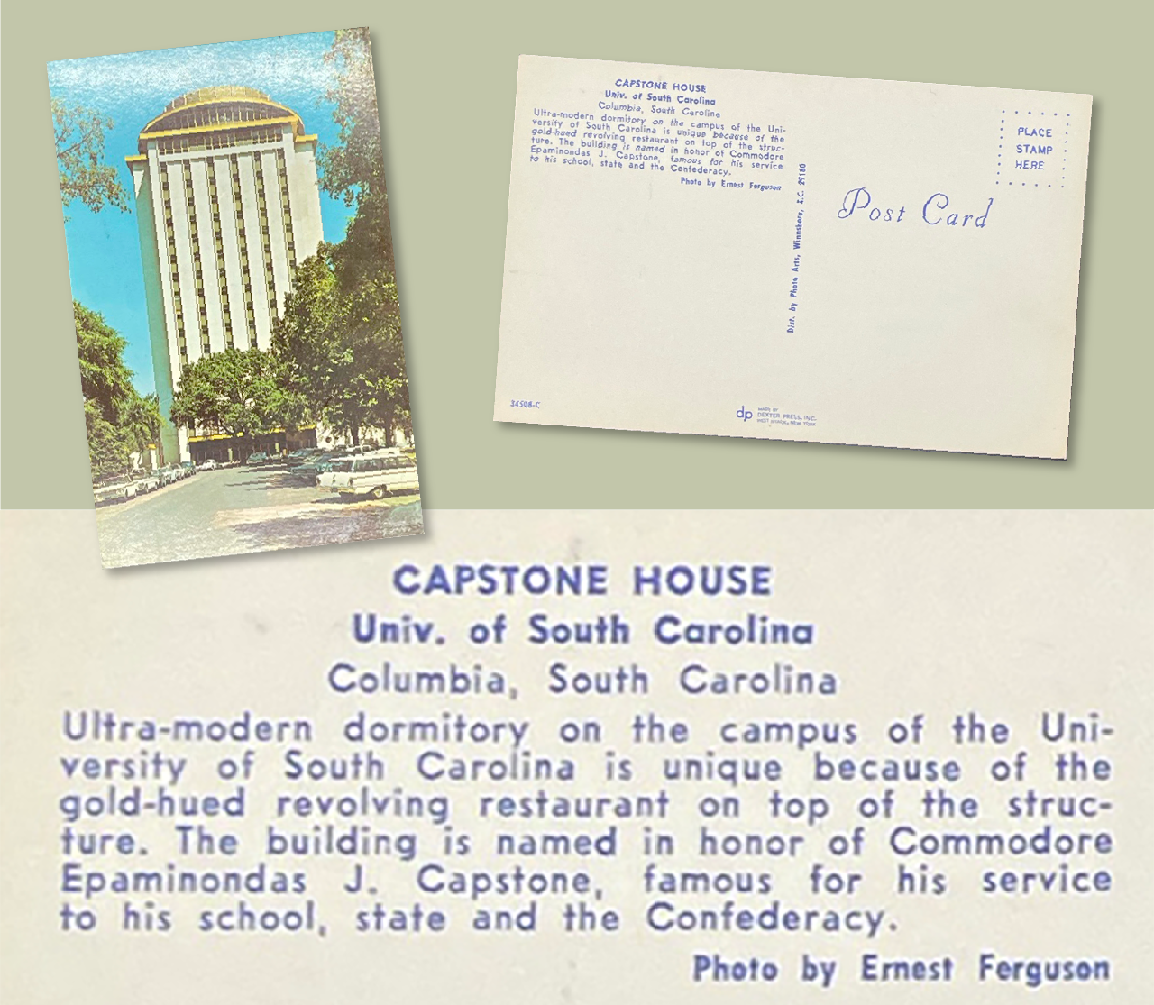
A couple of months ago, I was relaying the story of the postcard to a colleague as we discussed the final History Commission report on the naming of University of South Carolina buildings. I did a quick Google search for “Capstone postcard” and the first result was the image of the same Capstone postcard I’ve seen many times before. I followed it to the California-based Etsy seller and clicked to see the back:
Ultra-modern dormitory on the campus of the University of South Carolina is unique because of the gold-hued revolving restaurant on top of the structure. The building is name in honor of Commodore Epaminondas J. Capstone, famous for his service to his school, state and the Confederacy.
That was it! Every other vintage Capstone postcard I’d seen was exactly the same, but didn’t have that final sentence. I took screenshots and clicked purchase as quickly as I could.
So our fictitious “General Capstone” wasn’t a general… he was a “Commodore” in the Confederate Navy. Thankfully, Epaminondas J. Capstone is quite the unique name, which makes it simple to track down the rest of the story.
A Google search turned up an entry in “Correct Mispronunciations of South Carolina Names” for Capstone, mentioning that the postcard was “an unintentional hoax because the photographer (who wrote the description for the postcard) accepted as fact a facetious editorial in Columbia’s State newspaper.”
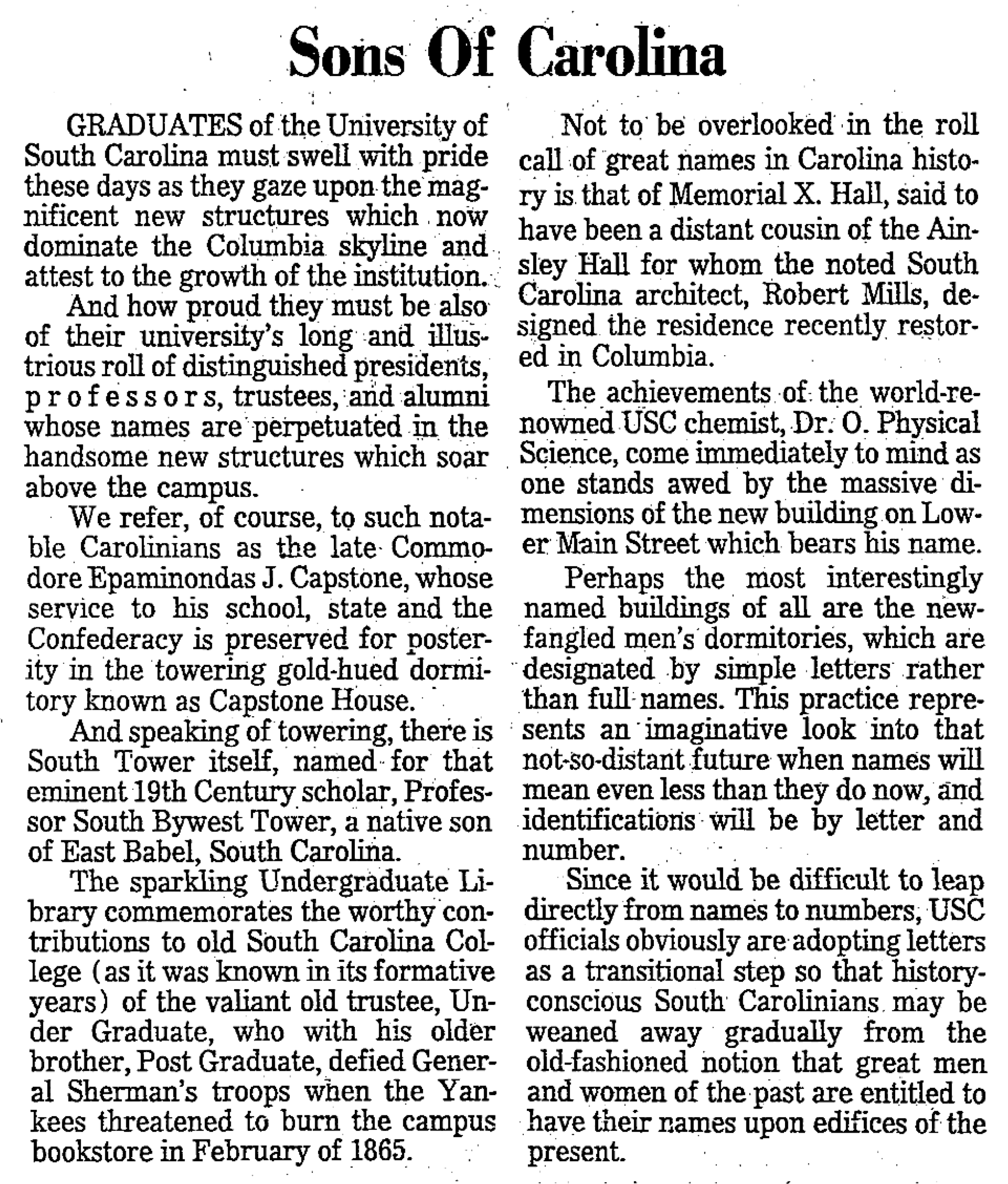
Jump over to Newsbank’s South Carolina Historical Newspapers database — thanks Richland Library for the access — and finding the State’s editorial was easy. Published on January 3, 1968 and titled “Sons of Carolina,” it takes the the university to task for giving buildings descriptive names instead of naming buildings after accomplished South Carolinians. The editorial even includes the exact language from the postcard. But reading the editorial, it’s hard to imagine that anyone would read this obvious parody and accept it as fact.
Another aside… I suppose I shouldn’t be surprised that in 1968 — in the middle of the Civil Rights Movement — that a Southern newspaper was demanding that state universities embrace their Southern heritage and name buildings after accomplished South Carolinians. In October of that year, the board of trustees at the University of South Carolina gave in to pressure and renamed many of their buildings after “honored” South Carolinians — several of which have now been recommended for renaming. The State*’s editorial board cheered this decision and took* a victory lap with a follow-up editorial in October 1968.
Capstone, however, was not renamed.
Further searching on other newspaper databases turned up a number of partial reprints of the editorial in the Greenwood Index-Journal and USC’s student newspaper, The Gamecock. This was common practice at the time. Newspapers would reprint a snippet of another publication’s editorials and sometimes provide their own commentary. These reprints were shortened and stripped of much of the humorous context of the editorial. The Index-Journal ran an editorial on January 5, 1968 titled “E.J. Capstone,” stripping most of the State’s more absurd examples and adding their own commentary, arguing that buildings should not be named for living people like legislators and board members. I imagine shortened editorials like these triggered the misunderstanding by the photographer, who probably never even saw the original State editorial.
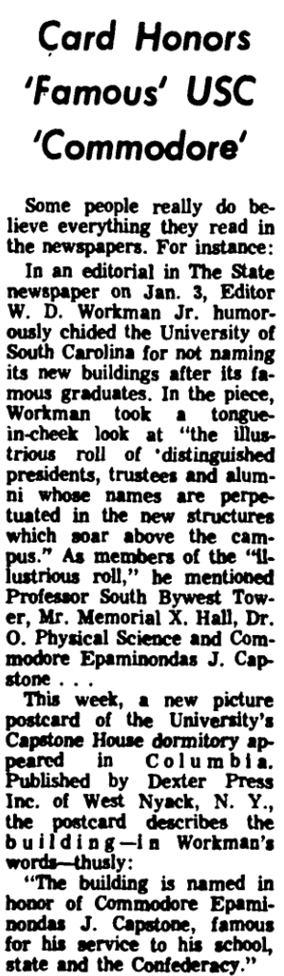
The Record, Columbia’s afternoon paper, ran an article about the postcard on March 2, 1968, noting that “some people really do believe everything they read in the newspapers.” The Record noted that the postcard went into circulation around Columbia that week. Because of the immediate attention to the embarrassing error, I imagine most of the postcards were recalled and destroyed immediately, which is likely why very few of them still exist.
My postcard arrived from California a few days after I ordered it. It included a nice note from the seller commenting that my postcard was “a nice find.” Yes, it was. Quest completed. Now I just have to figure out how to display my “error card.”
Bob Wertz is a Columbia, South Carolina-based designer, University of South Carolina Ph.D. student, researcher, college instructor, husband and dad. He’s particularly obsessed with typography, the creative process and the tools we use to create. He wears a mask and got vaccinated to protect his community. #TeamModerna
This post was originally posted on May 30, 2021 on Sketchbook B. It’s reposted here as part of a project to move some of my favorite writing to my new site.
Time to start using Micro.Blog more
Every so often, I realize that I’m not happy with my social media setup. I had been using Micro.Blog paired with Squarespace since the service launched and I was happy with how my regular blog could connect via RSS with my social media feeds. I’ve written about it in the past, but basically, with my original Squarespace/Micro.Blog setup:
I posted to my microblog here on Sketchbook B and it showed up on Micro.Blog and Twitter.
Any main blog post with the category “micro” posts to Micro.Blog and Twitter.
When I redesigned Sketchbook B, the new Squarespace template didn’t play well with my self-hosted micro blog set up. The template couldn’t figure out how to deal with titleless posts. I spent some time trying to figure out how to fix it, but after a while, decided that maybe it was best if I started using Micro.Blog for posting and hosting.
I never got around to really setting things up again. A pandemic. The election. Working from home. And I had a thesis to write. But now that I’m finished with my Master’s degree, I’ve got time to think through how I want this to work. (At least until August when I start working on my Ph.D.)
So here’s the new plan:
Short posts start on Micro.Blog using either the Micro.Blog app or my favorite writing app, Ulysses. They are then crossposted to Twitter.
Main blog posts — like this one — on Squarespace with the category set to “micro” will still show up on Micro.Blog and Twitter.
Limit my time and interactions on Twitter. Continue to avoid Facebook.
A couple of notes about the new setup:
One benefit of using the Micro.Blog app is that I can decide to pause crossposting to Twitter. This was tougher when I just posted everything through Squarespace. Sometimes, I just want to post something that’s relevant to the Micro.Blog community.
I still really like the ability to connect my main blog with my microblog via RSS. To me, this has always been one of the strengths of Micro.Blog.
I’m not sure how to best share images. I could use Sunlit, the Micro.Blog photo sharing app, but honestly, I don’t mind Instagram, even if their parent company is straight up evil.
I turned on LinkedIn sharing. Then I disabled it. It’s a cool feature, but I remembered that I strongly dislike LinkedIn.
I’m sure things will continue to change and evolve over the summer. I’m happier when I spend less time on social media, but I also know that having an active presence is important for my career and my research. Using Micro.Blog as my intermediary tends to lead me to a better balance and I’m looking forward to hitting the big reset button.
Bob Wertz writes about design, technology and pop culture at Sketchbook B. Bob is a Columbia, South Carolina-based designer, soon-to-be Ph.D. student, researcher, college instructor, husband and dad. He’s particularly obsessed with typography, the creative process and the tools we use to create. He wears a mask and got vaccinated to protect his community. #TeamModerna
This post was originally posted on April 22, 2021 on Sketchbook B. It’s reposted here as part of a project to move some of my favorite writing to my new site.
Apple has one of the most recognizable logos in the world. Which isn’t surprising because they are the largest company in the world. I’ve been watching a couple of trends over the last few months about how Apple uses their logos and this week, those trends have become even more apparent. For brand managers and designers, I think there is something interesting going on and it’s worth digging into the mystery.
The logo is “missing.”
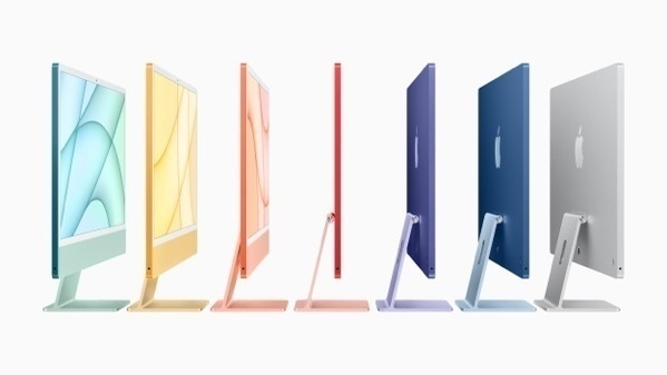
Apple isn’t afraid to use their logos. All of their computers have prominent logos. They include logo stickers in all of their boxes. Apple’s logo is everywhere. But on their new iMac, which was released this week, Apple’s logo is on the back, but not on the front. The last few generations of iMac’s have featured a prominent logo on the back and a second logo on the “chin,” facing the user. The new iMac has no user facing logo.1
The new iMac doesn’t have a logo on the front, but still sports a prominent mark on the back.
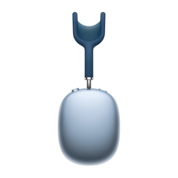
But the iMac isn’t the only recent Apple product with an interesting logo story. I first noticed Apple’s changing logo use with the introduction of the AirPod Max, which has no Apple logos at all on the product. There is plenty of room for a logo on the side of the headphones, but there is none to be found.
A large space for a logo… but there isn’t one.
I guessed the AirPods Max was the only Apple product without a logo, but I was wrong. For some reason I assumed that my AirPods case had the Apple logo on it, but guess what? It doesn’t. I checked Apple’s website and the AirPods Pro don’t have a logo either. (Although according to Apple’s website and an iFixit teardown, the chip inside the AirPods Pro has a tiny logo printed on it.) My Apple Watch has a tiny Apple logo on the bottom on it, but it’s not visible when it’s being worn. Apple doesn’t include logos on any of their wearable products.2
A promotional image from Apple of Apple Fitness+ trainers. I count five Nike logos.
But that’s not all. I’ve been trying out Apple Fitness+ and there are tons of visible logos. Nike logos. All of the instructors seem to be wearing Nike gear. There are no Apple logos. No special Apple Fitness+ shirts. No little Apple “watermark” in the corner of the screen. An Apple logo isn’t hidden somewhere on the set.
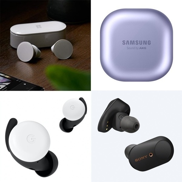
AirPod competitors, with prominent logos on the case or the earbud itself.
I checked Apple’s competitors. Amazon, Samsung and Microsoft all include their logo on the charging case for their AirPod competitors. Sony and Google even managed to get their logo on the earbud itself. None of the competing smartwatches that I looked at had logos, although Samsung etched “Galaxy Watch” into the crown for some reason.
In the fitness space, Peloton employees sport logo apparel while they lead classes. And the instructors on Nike’s fitness apps obviously sport Nike gear.
So what’s going on? I’m not sure.
My first reaction is it’s just an issue of taste. Placing logos all over a product is tacky — especially for wearables. And Apple is showing their superior taste by acknowledging that consumers don’t always want to be sporting company logos. Maybe? But lots of premium and luxury brands include logos on their products. And Apple isn’t exactly shy about using their logo.
It’s not about the logo size. Even the Apple Pencil has a logo. And as I mentioned, the chips inside the AirPods have logos printed on them. (The chips… inside the case… that the consumer never sees…)
The absence of a logo is even stranger when you realize the original intent of a trademarked logo: to clearly identify the manufacturer. With a company like Apple, whose designs are ripped off more than about any other tech company, their logo is the part of the design that absolutely can’t be legally copied.
My best guess is that Apple thinks that their product designs are unique enough, that they don’t even need a logo. People will know AirPods are an Apple product when they see them. The Apple Fitness+ workouts feel like Apple even if their logo isn’t present. I don’t think any other company can make a desktop computer that looks like the new iMac. Apple’s presence is understood because of the overall production quality and design. A logo isn’t necessary.
The logo is “incognito.”
Typical corporate logo standards are incredibly strict. Apple doesn’t publish their internal brand guidelines, but it’s clear they do allow some more playful uses of their mark. For example, they often use illustrated versions of their logo to promote their media events, like they did for this week’s Spring Forward event. Allowing logo variations in large corporate identity systems isn’t uncommon, but those variations are typically used for structural identifications between organizational divisions or product lines.
But Apple is using logo variants that align with their values.
Apple’s environmental logo version, on Earth Day.
In 2014, Apple started using a logo with a green leaf in their retail stores on Earth Day. This logo seems to be used mostly in Apple retail, but showed up this week on the Apple home page for Earth Day 2021 and their updated environmental statement.
Apple’s Privacy logo version is probably the most used of their variations.
And in this week’s presentation, they showed their privacy Apple variation, which is often animated and turns the leaf at the top of their logo into a lock. It’s used in ads, videos and sites when Apple is talking about their commitment to privacy. What’s smart about this approach is that Apple is using their logo to not just communicate their identity, but also their corporate values.
(It’s worth noting that there are a couple of other logo variants as well: a gift that is used during the holidays and a version for their Marina Bay Sands retail store in Singapore. And I’m sure there are others as well.)
What lessons can we take from Apple’s approach to logo management?
Apple’s visual branding is clearly effective. Repetition and consistency are the foundation of contemporary brand management, but Apple has decided to not use their logo in some places and change it in others. This ongoing shift in logo usage isn’t accidental or ill-considered. A couple of lessons to think about:
Everything doesn’t need a logo. In the 1990s, branding meant putting the logo on everything, but is it really necessary? (It isn’t.) Logos are important, but they aren’t the only way you communicate your identity. Apple’s using their logos smartly, and not over using their marks.
Differentiation happens with the design around the logo. Apple’s products are identified by their look and feel. Yes, the logo is part of that, but Apple’s visual branding extends far beyond just their logo. Their brand is expressed as much through the surrounding elements — type, color, materials — as it is through their logo. Their visual differentiation extends far beyond just their logo and their identity is stronger for it.
Think about how a visual identity can reflect a company’s values. Most of the time, visual identity reflects an organization’s structure, but connecting your visual brand to your corporate values is potentially more powerful. Apple uses logo variations that support their beliefs, not their hierarchy.
We’ll never hear from their branding team and Apple doesn’t publicly share their logo and branding guidelines. We’ll just have to watch as they rollout ads, events and products. But it’s clear that Apple is diverging from the standard brand playbook here and I think we should pay attention to where they go next.
Bob Wertz is a creative director, type designer, Ph.D. student and researcher living in Columbia, South Carolina. He’s been blogging since 2008.
This post was originally posted on April 17, 2021 on Sketchbook B. It’s reposted here as part of a project to move some of my favorite writing to my new site.
With my thesis finished, it’s time to rebuild my schedule.
I defended my thesis last week. It was the last hurdle — other than some remaining paperwork — for my Master’s degree in Mass Communications at the University of South Carolina.
My thesis looked at how the visual context surrounding a logo can shape consumer reaction and I’m very happy with how it turned out. (Spoiler: Context matters.) At some point down the line, I’ll revise it and start submitting it to journals, but for now, I’m just thrilled to have completed this major milestone.
I officially graduate in a month and I’m actually going to participate in an in-person commencement. After that, it’s back to the classroom. I was accepted to the Ph.D. program in Mass Communications at the University of South Carolina and will be continuing my research and studies. I’ll start that new adventure after the summer.
I was surprised at how all-consuming the thesis process was. I’ve been working on the framework of this study for over a year. Finding and reading related research. Collecting data and doing analysis. Writing and rewriting my draft. Even when I wasn’t working on it, I was thinking about it.
My goal for this year was to be intentional about scheduling. For the first third of the year, that schedule has been dominated by being a student — writing my thesis and preparing for comps. Now that thesis is done, it’s time to reset my schedule and figure out how to reincorporate my health and creative projects into my daily routine. I’m going to try and find time to work Apple Fitness+ into my day and write blog posts more regularly. I’ve got typefaces to finish and a couple of ideas for shirts and stickers.
I believe that we are rounding the corner with the pandemic. I’ve returned to my office after working from home for over a year. I’ve received my second vaccination last week. Maybe soon, I’ll feel comfortable returning to coffee shops to work on projects, study and write.
My hope is that I can establish some good habits and structures that will continue after I start my Ph.D. program. I’ll be working on my doctorate part-time so it’s going to take a long while. I’m going to need a solid time-management foundation to handle everything.
Bob Wertz writes about design, technology and pop culture at Sketchbook B. Bob is a Columbia, South Carolina-based designer, soon-to-be Ph.D. student, researcher, college instructor, husband and dad. He’s particularly obsessed with typography, the creative process and the tools we use to create. He wears a mask and got vaccinated — Team Moderna — to protect his community.
This post was originally posted on January 1, 2021 on Sketchbook B. It’s reposted here as part of a project to move some of my favorite writing to my new site.
The year after the year that lasted forever.
I don’t know if I’ve ever been so excited for a calendar year to end. We’ll never forget 2020 as long as we live, but I’ll be glad to have it in the rearview mirror. Now that January is here, it’s time to talk about plans for 2021.
Normally, I would have taken a day or two off of work in early December and headed to a coffee shop to plan my next year. I’ve taken these “retreats” for the last four years and I find they really help me focus on what I want to get done. This year, because of the pandemic, there was no all-day coffee shop retreat and I just planned from home. And while I missed the structure of my retreat days, my process was basically the same as the last few years. I take a stack of index cards and write everything I want to do — one topic per card. Then I look for patterns and sort by priorities. Normally a plan emerges from the stacks of cards and I find 3-4 goals to focus on for the next year.
Looking through my cards, there were three major contexts that were obvious:
School. I’ll finish my Master’s degree in the Spring when I finish my thesis and comps. I’ve got a couple of academic papers I need to revise and submit for publication. And I need to decide if I’m going to proceed with the Ph.D. program.
Health. I’m committing to being healthier and 2021 is the year I’m going be more active and focus on taking care of myself — from fitness to meditation.
Creativity. I’ve got a bunch of creative projects I want to tackle. From big projects like typefaces and novels to small projects like stickers and short stories. I need to make sure I find time to be creative and have fun with some new projects.
But there was a single, overarching theme that became apparent as I flipped through my cards. A topic that connected all of the other themes together: I need to focus on building an intentional schedule.
For me, everything I want to do starts with structure. I need to carve time out for writing my thesis. Set aside time to read for fun. Find time to work out. Make sure I have time to do meal planning and grocery shopping. Cook dinner in instead of getting takeout. I simply do better when I have a structure to my day. And during coronavirus, but schedule and daily rhythm has been destroyed.
Building a consistent intentional schedule in 2021 will be a challenge. I’m working from home for the Spring semester. My kids are on a hybrid schedule meaning that they attend school online some days, and I take them to school on others. And their schedules can change from week-to-week depending on the pandemic. Pretty much every day is different. When summer arrives, I assume I’ll be heading back to work five-days-a-week so I will have to get adjusted to commuting again. I have to plan for my schedule will need to adapt to my changing life.
So for 2021, in order to focus on school, health and creativity, my goal is build an intentional schedule that carves out a daily, weekly and monthly structures for the year. I’ve got some ideas about how I want to tackle this structure, but I know it will change and evolve during the year. I’ll share what works (and what doesn’t) here on Sketchbook B over the year.
Bob Wertz writes about design, technology and pop culture at Sketchbook B. Bob is a Columbia, South Carolina-based designer, researcher, college instructor, husband and dad. He’s particularly obsessed with typography, the creative process and the tools we use to create. And he wears a mask to protect his community.
This post was originally posted on December 31, 2020 on Sketchbook B. It’s reposted here as part of a project to move some of my favorite writing to my new site.
Surprisingly not a disaster.
It’s time to look back at how I did with my 2020 themes. In general, with the pandemic, the election craziness and everything else that’s happened this year, I feel like I need to give myself a pass. But honestly, I’ve done okay with my themes. And looking to 2021, I see some specific things I need to work on.
My four identity statements/themes for 2020 were:
I am a graduate student.
I am a healthy person.
I am a typeface designer.
I am a reader.
I had planned to finish my Master’s degree in 2020, but because of the pandemic, I decided to extend my program by a semester. My classwork is done and all I have to do is finish my thesis.
The pandemic completely sidetracked my efforts to be healthier. I was making good progress in March when everything shut down. And then the combination of stress and an inconsistent schedule pretty much obliterated any hope of being healthier in 2020.
I did actually make a significant progress with typeface designs. I massively overhauled one of my older typefaces to release SbB Powertrain. And I’ve completed three other typefaces that I will be releasing at some point soon. One unanticipated side effect of focusing on type design is that it caused me to also rework my website and rethink some marketing and distribution strategies.
I read a bunch this year for grad school, but not as much for fun. The library closed due to the pandemic, which limited my supply of books. But honestly, I found it really hard to settle into a book this year. I’m not sure if it was the pandemic or just stress, but at the end of the day, I just didn’t have the energy to read. And the stuff I did try and read, I just didn’t stick with.
I’m actually proud of my 2020. I made progress towards my degree and I released some typefaces. I read some, but not as much as I wanted to. But I failed completely at being healthier.
Looking forward at 2021, I recognize a couple of things I have to work on. I felt like the year started strong — even during the early days of the pandemic — but when September hit, the wheels fell off. I was working, taking a class and teaching a class all from the same desk in our bedroom. My wife was trying to figure out how to be a virtual kindergarten teacher and my kids were adapting to the new school year with a hybrid schedule. Any semblance of a schedule disappeared. The result was simply overwhelming. For 2021, I need to figure out how to maintain a schedule and structure to find time for the things I need to do.
Around the same time as we returned to school, the election coverage ramped up. I’m a news junkie, but I’d done a really good job of avoiding social media. That fell apart in October, when I started to pay more attention to Twitter and even look at Facebook on occasion. I thought for sure that things would calm down after Biden was elected, but the Trump chaos train continues. I’ve written on this blog about finding a balance with social media. As 2020 ends, it’s time for me to reevaluate that relationship.
I’ve never been happier to flip over to a new calendar year. I’ve been working on my planning process for 2021 since early December and will post about that tomorrow. But considering all that’s happened over the last year, I’m calling my 2020 a success.
Bob Wertz writes about design, technology and pop culture at Sketchbook B. Bob is a Columbia, South Carolina-based designer, researcher, college instructor, husband and dad. He’s particularly obsessed with typography, the creative process and the tools we use to create. And he wears a mask to protect his community.
This post was originally posted on December 31, 2020 on Sketchbook B. It’s reposted here as part of a project to move some of my favorite writing to my new site.
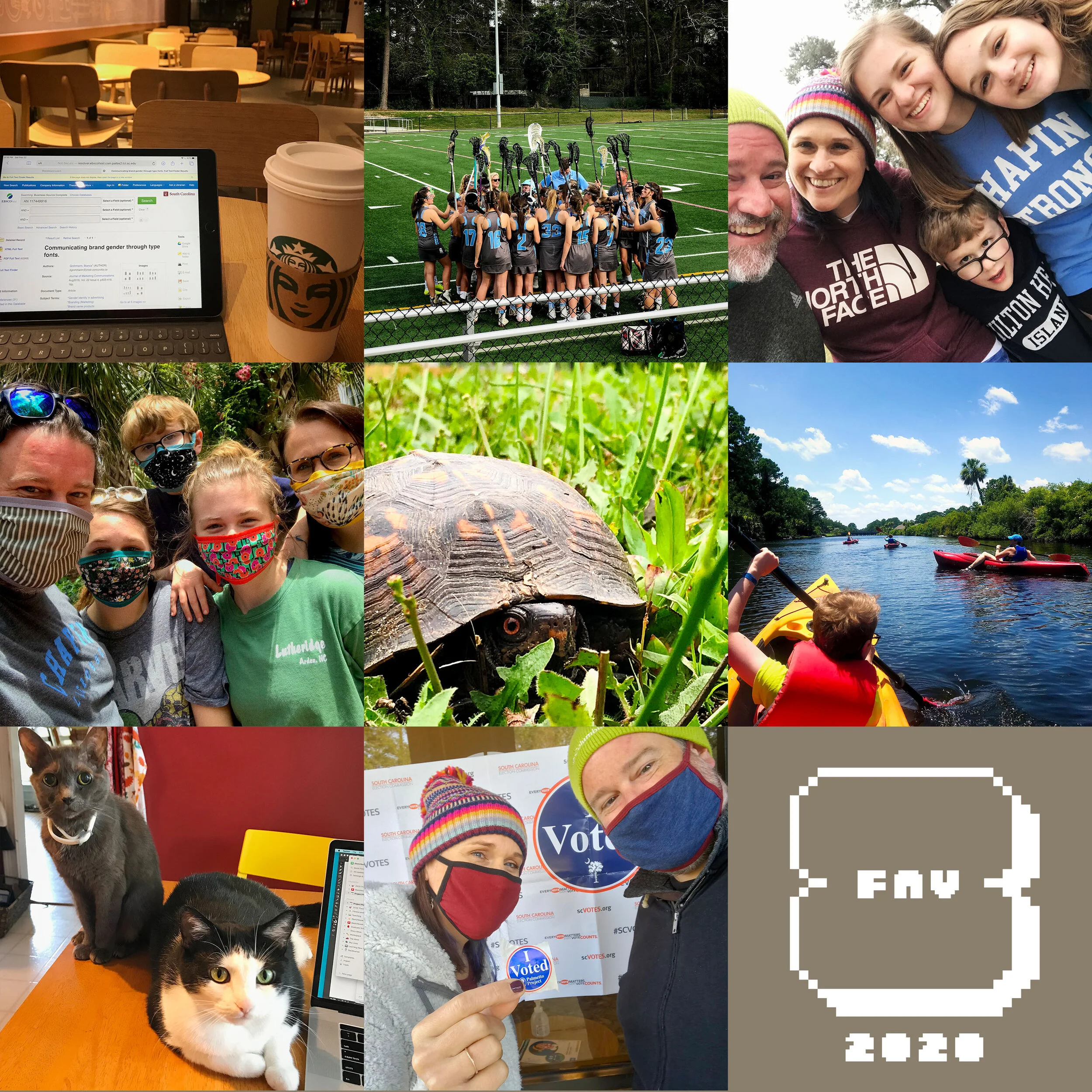
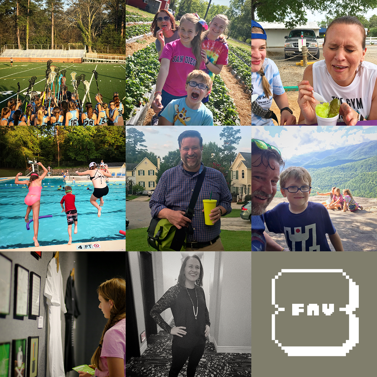
My best shots from an historically bad year.
Each year, I post my eight favorite shots from the previous year. And even in a year as strange as 2020, I still have some great shots. I started the year studying in coffee shops and ended it working from home and wearing a mask everywhere I go.
Late evening studying in a Starbucks before the pandemic. I miss studying in coffee shops.
Norah’s last Chapin JV Lacrosse game before the season was shut down. They won 19-0.
Family selfie on a walk in the park behind our house. Back when we foolishly thought we’d be home for two or three weeks, max.
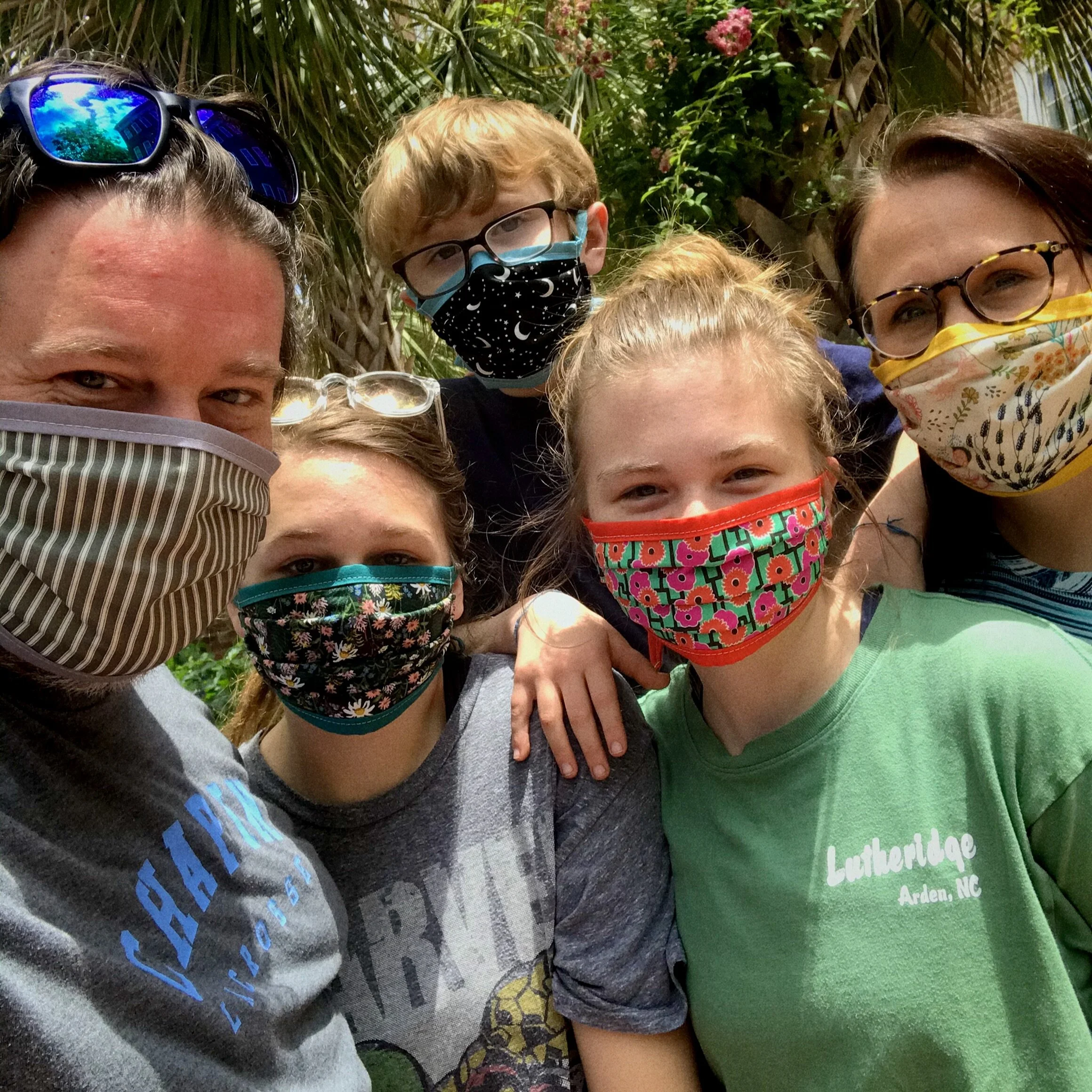
We ordered masks for the whole family from our friend Sally.
Met this little guy on walk.
Kayaking at Hilton Head.
The cats enjoyed having me work from home most of the year.
We voted in the most important election of my life.
I’ve written in the past about my Fav8 process and you can check out my Fav8’s from 2018 and 2019.
Bob Wertz writes about design, technology and pop culture at Sketchbook B. Bob is a Columbia, South Carolina-based designer, researcher, college instructor, husband and dad. He’s particularly obsessed with typography, the creative process and the tools we use to create. And he wears a mask to protect his community.
This post was originally posted on October 18, 2020 on Sketchbook B. It’s reposted here as part of a project to move some of my favorite writing to my new site.
Bold, angular and flexible
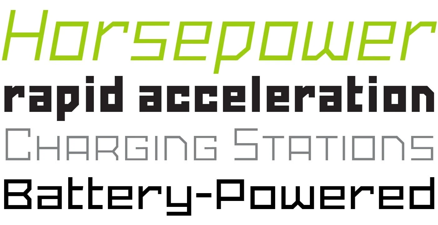
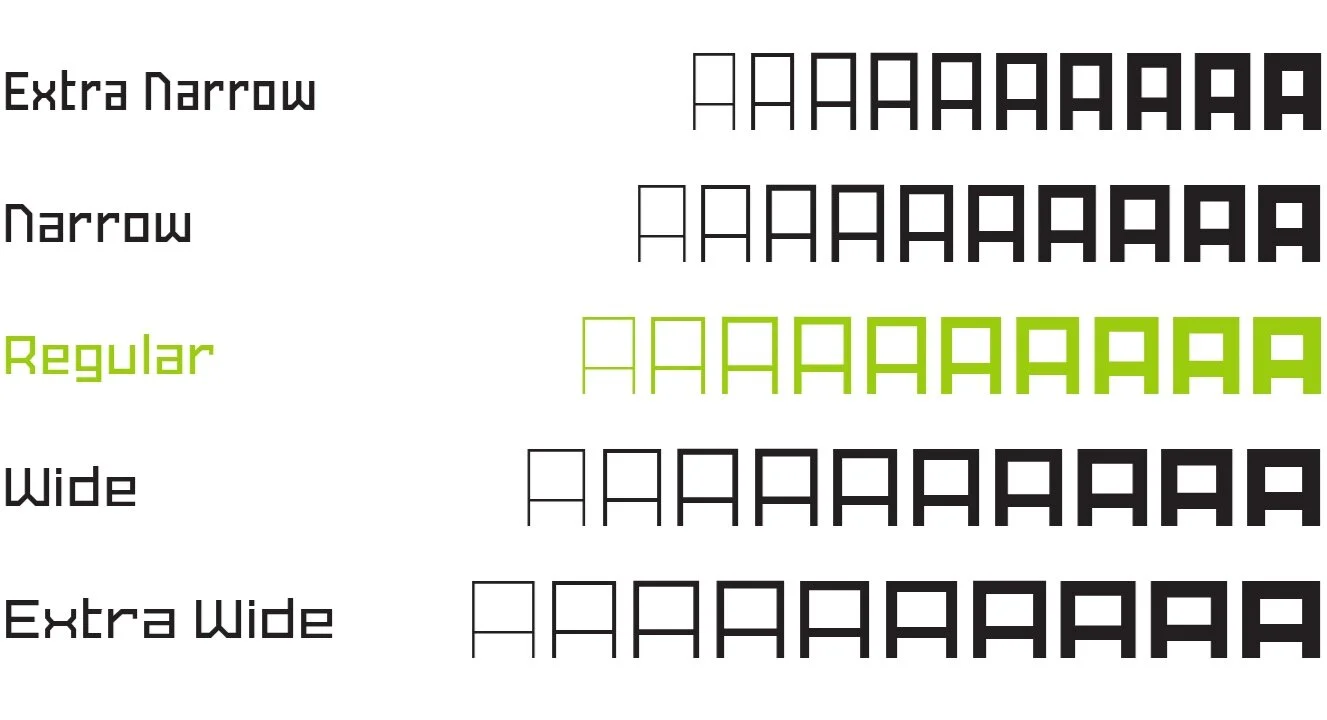
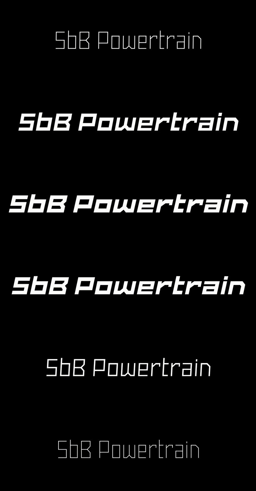
Last spring, in the midst of the pandemic, I decided to revisit, revise and expand some of my existing typefaces, and I pretty much spent every spare minute of the summer working on them. The first release from these updated designs is also the most ambitious of them – SbB Powertrain, a massive family of 100 fonts. Five widths and 10 weights. And it’s available today at MyFonts.
Powertrain is inspired by a bunch of random things I like: 1920s constructivist posters, comic book lettering and early pixel fonts. I’ve been sketching letters on graph paper since I was a kid and a bunch of that DNA is here, too. Obviously, my experimentation with modular type at Fontstruct has been an influence as well.
Powertrain meets a specific need that I had as a designer. I like creating logos and illustrations that are sharp and angular, but I never had the type to complete the look. I needed a wide range of weights and widths to work with a variety of concepts, but I struggled to find options that I liked and that I had the flexibility I wanted. Something that could work for everything from headlines and logotypes to paragraphs and web addresses. Powertrain serves that need for me, and hopefully, it will work for you, too. I think that SbB Powertrain will work well in corporate, industrial and athletic branding projects.
I’ll be honest. Five widths and ten weights is probably overkill. But the more I played around with Powertrain, the more I enjoyed having maximum flexibility in picking exactly the weight I wanted to use.
Five Widths: Extra Narrow, Narrow, Regular, Wide and Extra Wide
Ten Weights: Thin, Extra Light, Light, Regular, Medium, Semibold, Bold, ExtraBold, Black and Heavy.
I’ve included support for many languages, but I plan to expand that further in the near future.
Powertrain vs. Powerlane
Powertrain is a massive extension and revision of my first commercial typeface, Powerlane. Powerlane was very narrow — and actually forms the basis of the SbB Powertrain Extra Condensed. I’ve spent a significant amount of time refining the letterforms, spacing and features. SbB Powertrain will replace Powerlane.
So why change the name? Powertrain is a significantly different typeface and I felt it needed a new name. Plus, I never really loved the name Powerlane. I know why I picked it, but when I started working on this version, I knew it was time to make the change.
Opentype Features
As a designer, I like (and use) Opentype features. So SbB Powertrain features a range of features and alternate characters.
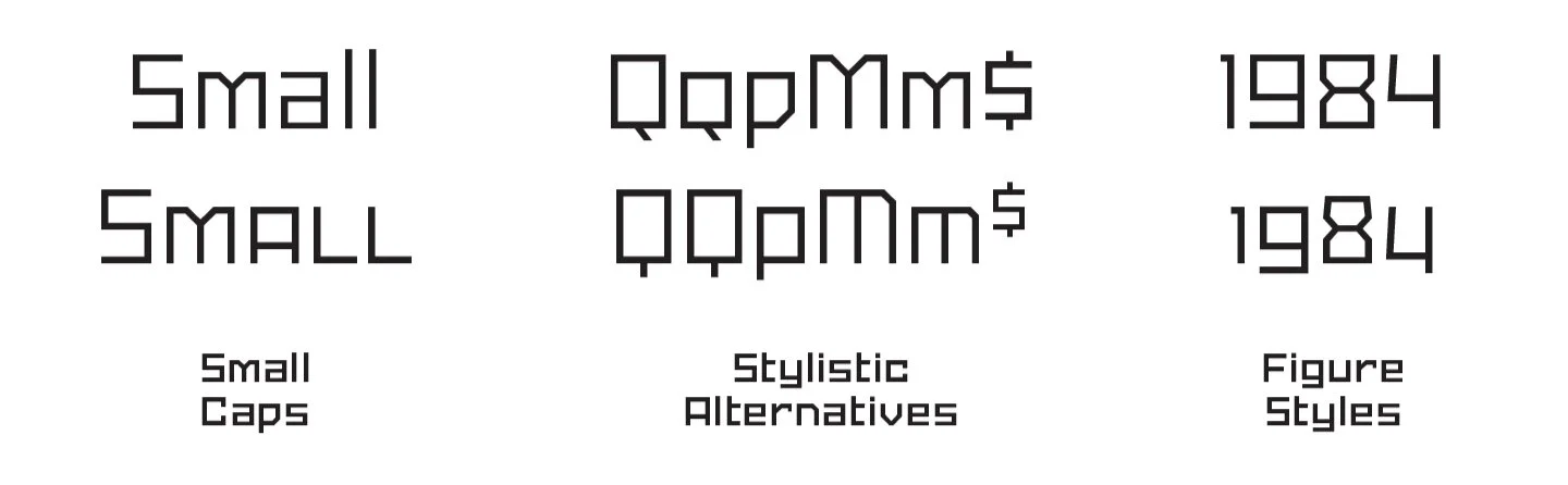
Small Caps. I hate fake small caps where the uppercase letters are just crudely scaled down. So Powertrain includes a full set of small caps.
Alternates. I’ve included a handful of alternate letters. I especially like the alternate M and $.
Figure Sets. Powertrain includes proportional lining numbers, tabular lining numbers and even a version of “old style” numerals. (I really like how the old style numbers look in a block of text.)
Software support for Opentype features varies widely, but Adobe Creative Cloud apps have solid — if inconsistent — support for features.
Sans Serif? Or something else?
Traditionally, typefaces fall into some specific categories. Clearly Powertrain isn’t a serif typeface. It’s not a script. I wouldn’t classify it as a decorative or display typeface because it’s more useful than that. I guess that means it’s a geometric sans serif of some sort? That’s what I’m going with.
Geometric sans are normally curvy, though, so I don’t love grouping Powertrain into that category. (Powertrain has virtually no curves.) I think I actually prefer the term “constructed” to describe Powertrain. It’s not designed to follow a historical, written model, but it is intended to be used beyond just decorative use. Maybe I should call it a “Constructed Sans Serif.”
Variable Font
Variable fonts allow you to customize aspects of the typeface. SbB Powertrain Variable has three axes — width, weight and slant. One font file takes the place of 100. If you want to pick a size in between the defined sizes, you can. If you need a different slant angle, pick any angle up to 15 degrees.
I knew when variable fonts were announced, that I wanted to play around with them. It’s pretty impressive technology, but… it’s early. Support from software is iffy. It works reasonable well in Adobe’s Creative Cloud apps — they just fixed an issue in Indesign. Browser support is coming along slowly.
Since the variable font file can generate any font in the entire family, SbB Powertrain Variable is included when you buy the complete family on MyFonts or Creative Market. I still feel like the variable font is a beta and I plan on updating it as the technology continues to mature.
Price
The type industry is changing. Type is being offered for free through Google Fonts and as part of an Adobe Type subscription. It’s always been tough to get people to pay for type. It’s just getting harder.
I’ve decided to experiment with a different pricing structure. You can buy the whole family — SbB Powertrain, SbB Powertrain Extra Narrow, SbB Powertrain Narrow, SbB Powertrain Wide and SbB Powertrain Extra Wide plus the variable font — for $39. If you need just one width, it’s just $19. (Although I’m offering introductory pricing… Until the end of November, you can purchase the complete SbB Powertrain family — or any of the widths — for 25% off at MyFonts.)
Is it priced too low? Probably, but it’s hard to compete with free. I feel like given the current market, these are reasonable prices.
Wrap up
I designed SbB Powertrain to fill some needs that I had as a designer and I’m thrilled with how it turned out. Powertrain is angular and flexible and will work well for branding projects — especially for industrial, athletic or corporate clients. I designed it for me, but I hope you find it useful as well.
Bob Wertz writes about design, technology and pop culture at Sketchbook B. Bob is a Columbia, South Carolina-based designer, researcher, college instructor, husband and dad. He’s particularly obsessed with typography, the creative process and the tools we use to create. And he wears a mask to protect his community.
This post was originally posted on July 21, 2020 on Sketchbook B. It’s reposted here as part of a project to move some of my favorite writing to my new site.
An “all-in-one workspace” with maximum flexibility
I’m a designer and a graduate student. I have a full-time job and family. One of my biggest challenges is keeping track of things — projects, tasks and ideas — as I bounce between all of my various roles.
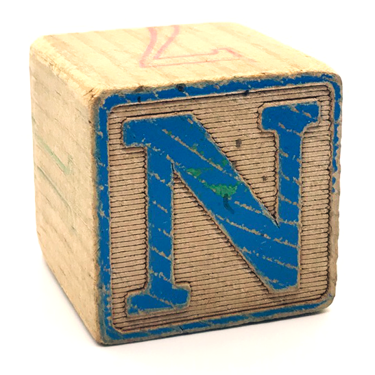
Notion’s logo is a toy block… I just happened to have one at my desk.
I’ve used a variety of apps, but I always felt I was having to adapt my process to the way the software wanted me to work. Recently I discovered a service, Notion, that really works that way I want it to and it’s changed the way I organize myself as a writer, designer and a researcher.
Background
Years ago, I used Backpack, an app from 37 Signals (who changed their company name to just Basecamp). The app allowed you to collect information, links, to-do lists and research into pages in an intuitive, freeform way. I loved Backpack and was disappointed when they announced in 2012 they were discontinuing development of the product.*
Since I moved on from Backpack, I’ve tried lots of different apps and systems for tracking tasks, collecting research and organizing projects. Apps and services like Flow, Wunderlist, Todoist, Basecamp, Trello, Evernote and Apple Notes. (I’ve tried paper-based systems to keep track of tasks, too.) Many of the apps were powerful or full-featured, but none of them worked the way I wanted them to work.
Notion has been around since 2016, but I discovered the app recently when Scott McNulty (Random Trek, Vulcan Hello, The Incomparable) mentioned it on Twitter. Notion bills itself as an “all-in-one workspace,” able to handle tasks, notes and more. That’s a big claim, but after using it for a couple of months, I’m really impressed.
Using Notion
In Notion, you can design a structure that works for you. Pages consist of “blocks” which can contain a range of features — from simple items like text, images, bulleted lists and to-do lists to more complicated databases. You can arrange the blocks in any way you want. Just drag and drop them. Many aspects of the layouts can be customized, allowing the user to change text colors, header images and page layouts.
My 2020 theme page has my goals for the year.
Pages are arranged in the sidebar. You can group pages and link between them. The whole process is actually very similar to building pages in a drag-and-drop content management system like Squarespace. I’ve set up pages for my annual themes, my typeface projects, trip ideas, my thesis, things to purchase for my home office setup and more.
Research. My primary function for Notion is research. Inspiration for projects. Articles that may be relevant for my thesis. Tutorials about a new technique for doing something in Glyphs. I can easily add a website link to a page and then write a note to myself about what it’s for. I have lots of ways to capture links like this, but Notion lets me easily capture links and organize them.
Story ideas. Before Notion, my process for capturing story ideas for Sketchbook B involved starting a sheet in Ulysses, my writing app, with a couple of sentences about the topic. That worked okay, but I tended to lose track of ideas. Now, when I come up with a story idea, I add it to a database in Notion. I can set a target date, link to references, add tags. And when it’s done, I just check it off.
Lightweight task management. I’ve often tried to use one task management app for all of my tasks. One central system for work, grad school, my blog, my type and family tasks. Recently I started using Microsoft To Do** for my office tasks, but wanted something else for tracking the other stuff. Notion fills that gap for me. I’m sure you could use Notion as part of a full GTD workflow, but that’s not how I’m using it. I’m just keeping simple to-do database and checking the items off as I complete them. It’s also nice to be able to attach a short to-do list to a PDF or a web link.
Planning. I’m currently working on plans to rework and rerelease some of my type designs and I’m using Notion to organize my planning. I’ve captured marketing plans, website updates, rough timelines and a planning calendar. And I can pair those plans with their own set of task lists. It’s nice to have everything together in one place.
Mobile. I access Notion from my Mac, iPad and iPhone. I expect this from all services now and only want to use services that I can access across all of my devices. The Notion apps on my mobile devices are pretty much just as powerful as the desktop access. The share sheets on iOS and iPadOS allow me to add links to any page or database.
My design and research projects now start in Notion. I’m still using Ulysses as my primary writing app and prefer its distraction-free writing environment. Zotero is the app I use to track the journal articles and references that will end up in my research papers. But all of my other note taking, research and personal task management is gathered in Notion.
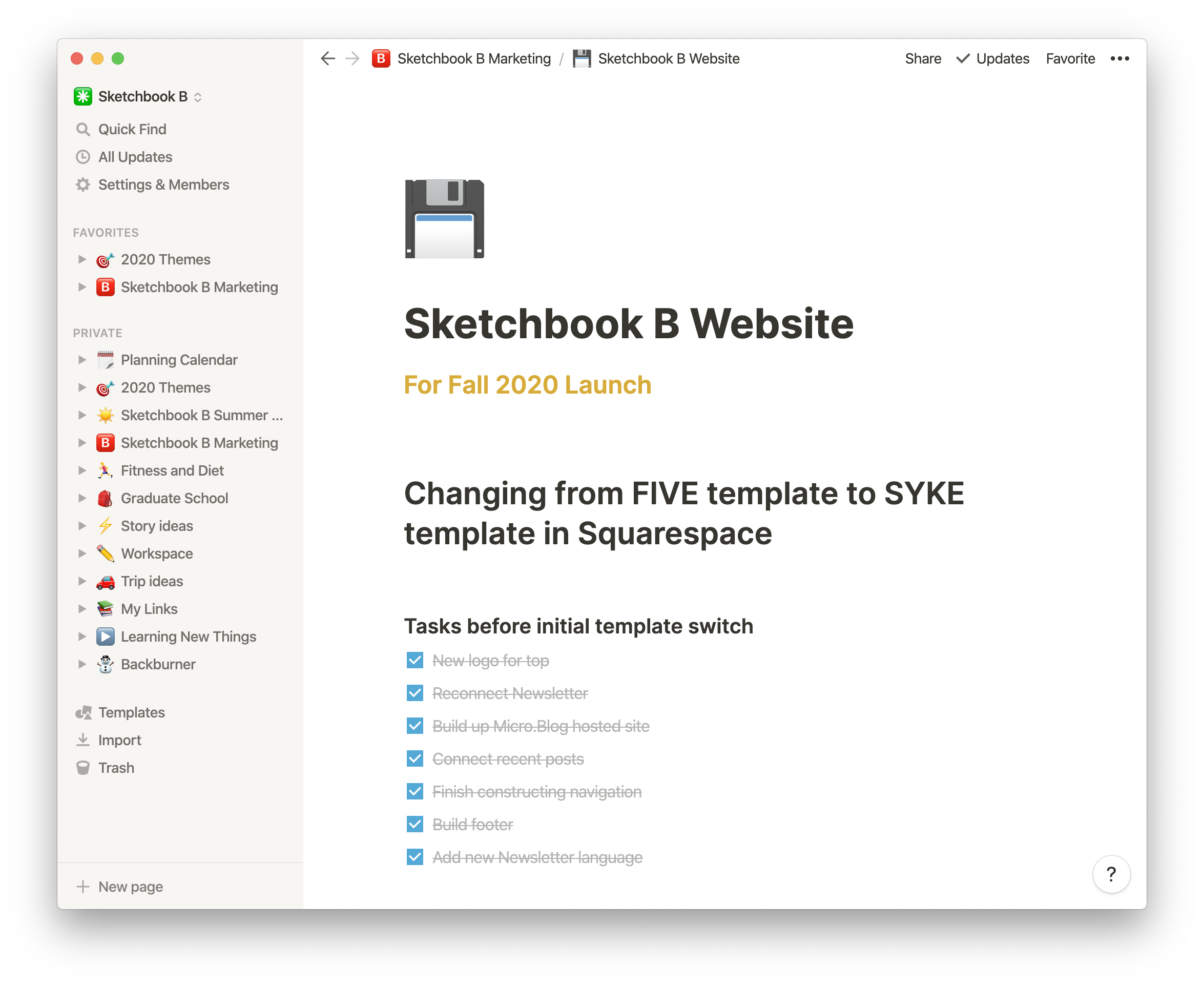
I used Notion to plan the recent upgrade to a new Squarespace template.
Tips to getting started
Normally, I’m the type of person who skips all the onboarding steps and just starts using an app. I tried to do that with Notion, but I struggled to figure things out. I recommend watching the tutorial videos. They aren’t long and help you understand how to get the most out of Notion.
Once you have a good idea of how Notion works, start experimenting. See which features work for you. Notion offers a range of prebuilt templates, and exploring them helped me to understand how to build better pages.
Because Notion has so much flexibility, you can easily fall down the rabbit hole and spend too much time tweaking and adjusting your pages. My advice is to keep it simple at first, and work your way up to more complex layouts and databases.
Finally, don’t feel like you have to use everything. Notion has a ton of functionality that I’m not using including collaboration tools, third-party app integrations, guest users or even create public pages that anyone can visit.***
Pricing
Notion offers a free Personal plan that should work for most people. I just updated to the $4 a month Personal Pro that adds version history and unlimited guests. (Honestly, I could have stayed at the free level, but I wanted the version history AND I wanted to support a great product.)
If you are interested in using Notion with a design or project team, those plans start at $8 per user per month. I could see using Notion with not-for-profit boards, creative teams or with any team working remotely.
Improvements
Notion is updating their app regularly, adding features and improving the product. There are a couple of improvements I’d like to see. Their iOS apps are great, but sometimes, selecting and editing text can be challenging. I wish they had a web clipper for Safari on the Mac to make it as easy to add links on the Mac as it is on iOS.**** And I’d really like the option to archive old pages to get them off the sidebar without deleting them. But these are minor issues in an otherwise stellar app and I feel confident that the team is constantly working to improve them.
Final Thoughts
It’s amazing how quickly Notion has filled the spaces in my workflow. Because of Notion’s flexibility, I’m able to tailor it fit to my needs as a designer and as a grad student. It’s become my primary workspace for developing ideas, structuring research and organizing my life.
I’m happy with Notion and look forward to using it for years to come. If you need an app to help pull together the projects, tasks and ideas floating around in your head, give Notion a try.
* While Basecamp stopped developing Backpack, paying users can still access the app. Unfortunately, I gave up my subscription long ago.
** I used Wunderlist, which was purchased by Microsoft and turned into Microsoft To Do, which honestly, is a solid task manager, especially when it’s integrated with Outlook.
*** I’m thinking about using one of these public pages forColaContent. And I could easily see using this product with a design team or for a research project.
Bob Wertz writes about design, technology and pop culture at Sketchbook B. Bob is a Columbia, South Carolina-based designer, researcher, college instructor, husband and dad. He’s particularly obsessed with typography, the creative process and the tools we use to create.
This post was originally posted on June 21, 2020 on Sketchbook B. It’s reposted here as part of a project to move some of my favorite writing to my new site.
Wearing a mask is a simple way to prevent the spread of COVID-19
I’ve been working from home since March 13 because of the COVID-19 pandemic. And since March, I’ve been wearing a mask every time I go to the store, or pick up food from a restaurant. Four months of mask wearing. Here in South Carolina, unfortunately, our COVID-19 infection rate is rising. Despite that alarming increase, people still aren’t wearing masks.
Admittedly, initial guidance on whether we need to wear masks was muddled and confusing, but over the last few months, the consensus among health experts is clear: Wearing a mask helps prevent the spread of COVID-19.
If you are wearing masks when you go out, thank you. If not, here are a couple of tips for comfortably wearing a mask.
Masks for the whole family.
Find a style that works for you. The first masks I wore were ones that I had in the garage for working in the yard. And yes, they were uncomfortable. I ordered reversible cloth masks for our whole family from our friend, Sally, and that’s been a much more comfortable solution for me. Find something that works for you. There are other face covering styles that may work better for your face, hairstyle or preference. We’ve purchased a few different styles of masks from Target. Finding something comfortable is the first step to wearing them regularly.
Socially awkward. Accept that wearing a mask in public is awkward. You can’t communicate with facial expressions. You might feel a little silly, especially surrounded by people who aren’t wearing masks. It’s okay that it feels awkward, but it’s the right thing to do. I imagine that seatbelts once felt awkward. Now I don’t even back out of the driveway without my seatbelt on.
Keep a couple of spare masks in your car. It’s easy to forget your mask when you leave the house. I keep a few one-time use masks in my car to use if I leave my mask at home. Having a backup means that you don’t have to worry when you run into a store.
Only support businesses that require their staff to wear masks. When restaurants first started to close because of Coronavirus restrictions, I went out of my way to support local businesses. I didn’t want our favorite restaurants to close because of the pandemic and I felt like it was important to take care of our community. Now, I’m disappointed to see some of the restaurants I supported aren’t requiring their staff to wear masks. If I visit a restaurant or a store that isn’t taking my safety seriously, I’m going somewhere else. (To be honest, I’d rather store owners require everyone in the store to wear masks.)
Why can’t things just go back to normal? I get it. We all want things to go back to normal. But COVID-19 is still a problem and things won’t be “normal” until we slow the spread of the disease.
The reality is that we’ll be wearing masks for the foreseeable future. When I return to the office in August, I’ll be wearing a mask. I’m taking a grad school class in the fall and I’ll be wearing a mask in class. In the midst of a pandemic, remember that wearing a mask is one way to protect the people we love and respect.
Bob Wertz writes about design, technology and pop culture at Sketchbook B. Bob is a Columbia, South Carolina-based designer, researcher, college instructor, husband and dad. He’s particularly obsessed with typography, the creative process and the tools we use to create. And he wears a mask to protect his community.
This post was originally posted on April 4, 2020 on Sketchbook B. It’s reposted here as part of a project to move some of my favorite writing to my new site.
The Lamy Pico is a fun, pocket-sized pen
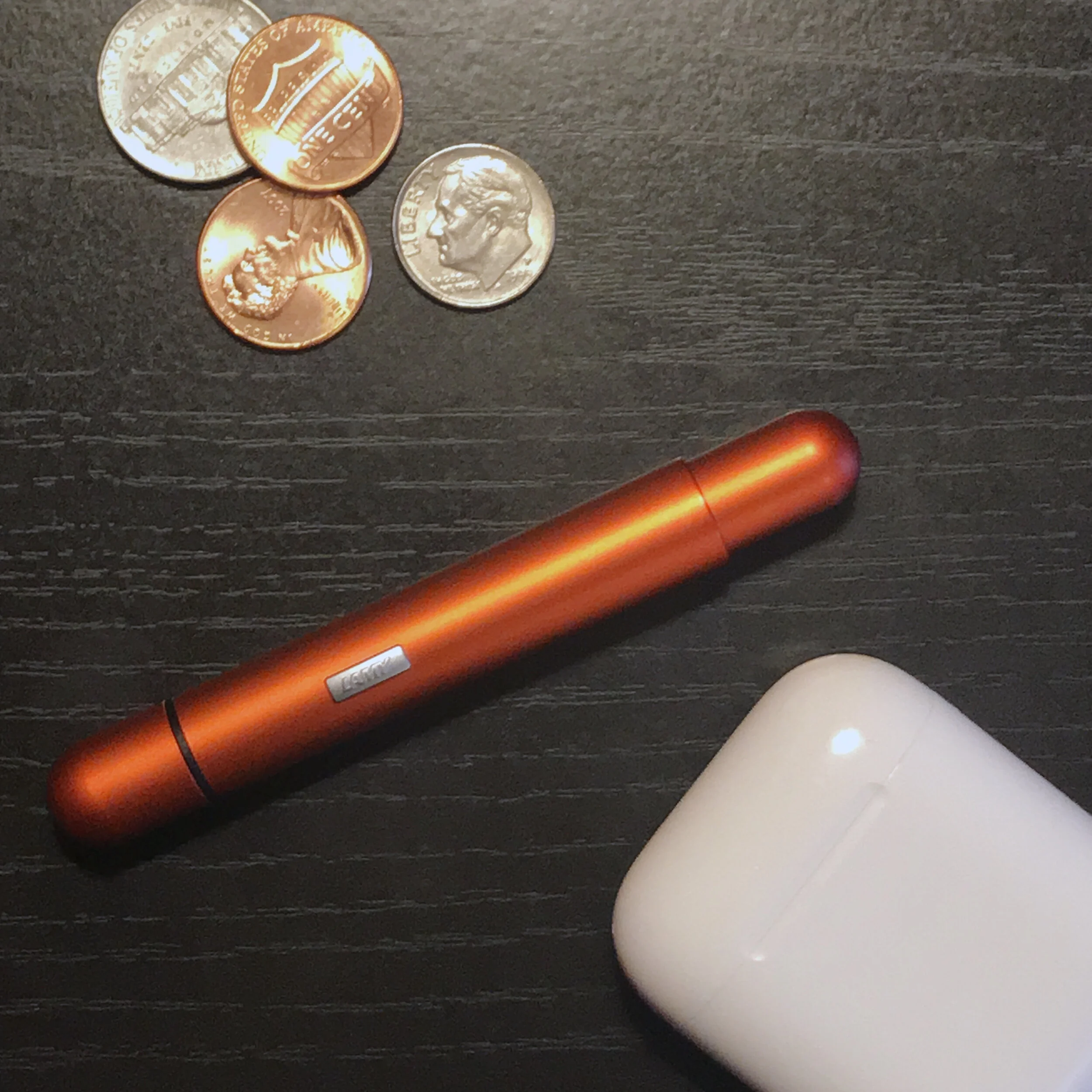
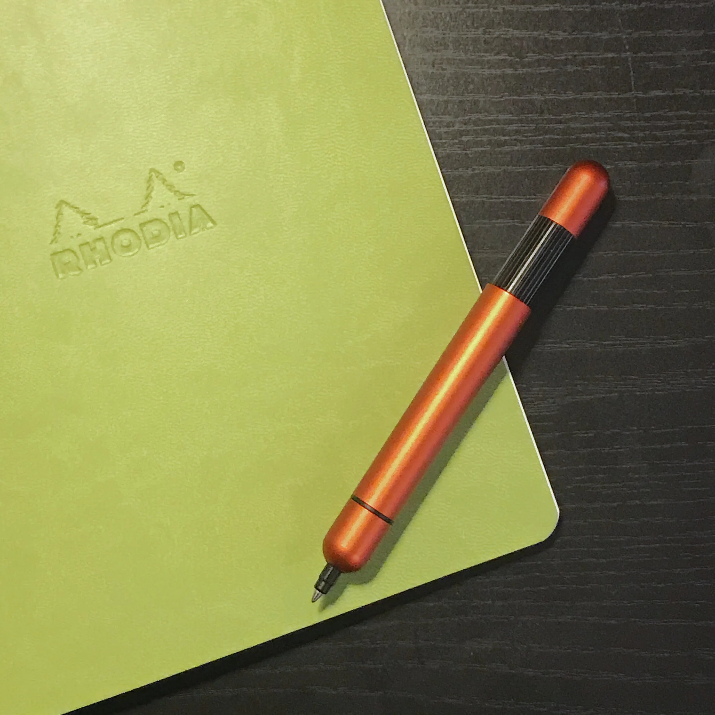
For reference: The Lamy Pico with some random change and my AirPods.
I enjoy using quality pens, but I usually carry them in a case of some sort. That’s not always practical, though, so I picked up a Lamy Pico pocket pen a while ago. Now that I’ve had a chance to use it extensively, I wanted to review it.
I adore the clever design of the Lamy Pico. The pen is a small cylinder that fits easily in your pocket. When you need to use it, you click the end and it telescopes out to a full-sized pen. The aluminum is light and durable. The mechanism to extend the pen feels solid. The little Lamy logo on the side acts as a roll stop, so it doesn’t fall off the table. The pen at full length is a perfect size to write with comfortably.
Back before the Coronavirus forced us all to work from home, I kept the Pico in the front of my bag so I can grab it when I need to jot something down. Sometimes, I’d throw it in my pocket with a Field Notes notebook. But now that I’m home, I’ve got it at my desk in case I need to take some notes on a conference call.*
The Lamy Pico, extended to full length.
My Pico is a red aluminum version which doesn’t seem to be readily available anymore. Lamy offers the Pico in black, white, chrome and a range of other colors. The color lineup changes periodically and currently includes Imperial Blue, Laser Orange, Neon Pink and a new limited edition — and more expensive — Rose Gold.
The Pico uses a proprietary Lamy refill so you are stuck with either blue or black ink. Thankfully, Lamy offers the refill in three thicknesses: fine (0.5), medium (0.7) or broad (1.0). Mine came with the medium black cartridge and it’s nice for jotting notes down. I recently purchased the fine blue refill and prefer the thinner line.
The Lamy Pico is not an inexpensive pen. On Jet Pens and Pen Chalet, the Pico is right around $39. If you have only used disposable pens, that probably seems outrageous, but for the level of quality and engineering, I feel like it’s reasonable.
I’ve been using my Pico for almost two years and it’s great to write with. If you need a pocket pen and want a high quality writing utensil, the Pico is a great choice.
* Bonus: It’s also a great fidget toy during meetings.
Bob Wertz writes about design, technology and pop culture at Sketchbook B. Bob is a Columbia, South Carolina-based designer, researcher, college instructor, husband and dad. He’s particularly obsessed with typography, the creative process and the tools we use to create.
This post was originally posted on March 29, 2020 on Sketchbook B. It’s reposted here as part of a project to move some of my favorite writing to my new site.
Defining boundaries for the new normal
Corner office. On/Off
Before we had our second child, we had a home office. Our smallest bedroom in the house had a desk, bookshelves and a big, comfy chair — with plenty of room for Liz and I to work on projects or just read. But when our second child was born, the home office was converted into a nursery. We tried to carve out space for me to have an office somewhere else in the house – in our bedroom, dining room, kitchen, living room… We moved the desk around, but I didn’t use it consistently and we needed the space for the family. When I went back to grad school, I carried my “office” in my Timbuk2 bag and set up wherever I needed, most often in a coffee shop.*
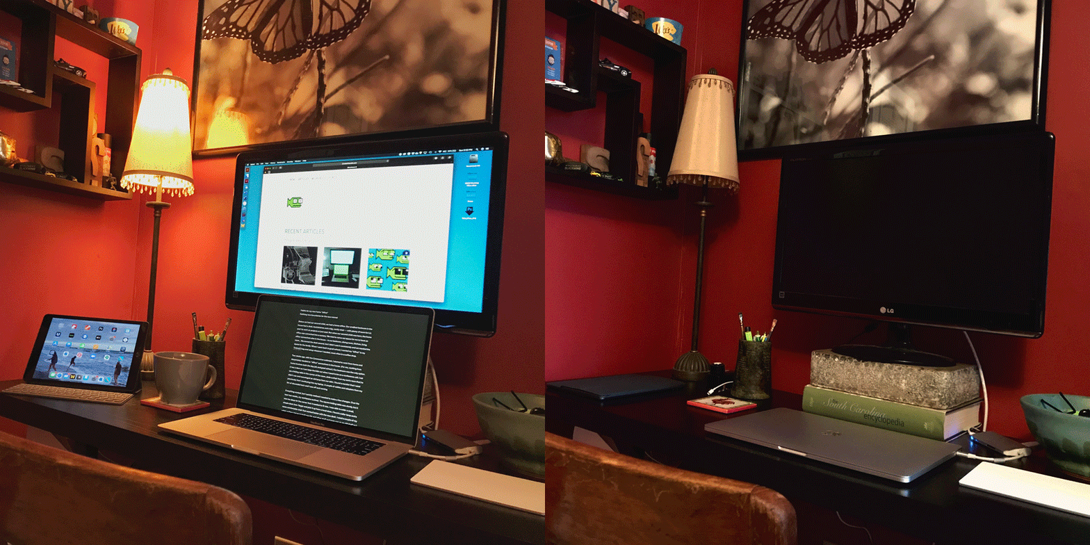
Two weeks ago, with the Coronavirus outbreak, I started to work from home and desperately needed an “office” somewhere in the house. (For me, working from home involves both the day job and grad school.) Our bedroom was the only option. It has a door so I can keep the kids out when I need to be on a conference call.** I set up a folding table in the corner, stole a chair from my son’s room that he didn’t use and scavenged an old lamp from our attic. I found a monitor that I used previously that I could plug into my laptop. A couple of cables and adapters from my bin of discarded tech and I was off and running.
Everything worked, but I quickly realized I needed to make a few changes. Over the next two weeks, my workspace evolved. The square folding table was sturdy, but it was too deep for the corner that it needed to fit into. I was able to order a small, simple desk from Target and pick it up from a local store. I found a taller lamp and a more comfortable chair that worked better with the new desk.*** I used a couple of my wife’s pottery pieces to hold pencils and other stuff and even put up an old shelf so I could display some of my knick-knacks and old toys.
Now I have an office again, even if it’s just a corner of my bedroom. I’m enjoying having one spot with all my stuff and it makes going to “work” easier. But I’m also concerned about the impact of working from home on my work-school-life balance. I’ve been reading a bunch about intentionality and mindfulness over the last couple of years and I’ve been trying to balance my job, my classwork and my family. Having a full technology set up a couple of feet from my bed isn’t ideal. Given the new situation — and assuming that I’ll be working from home for a little while — I’m trying to create some helpful boundaries and form some good habits:
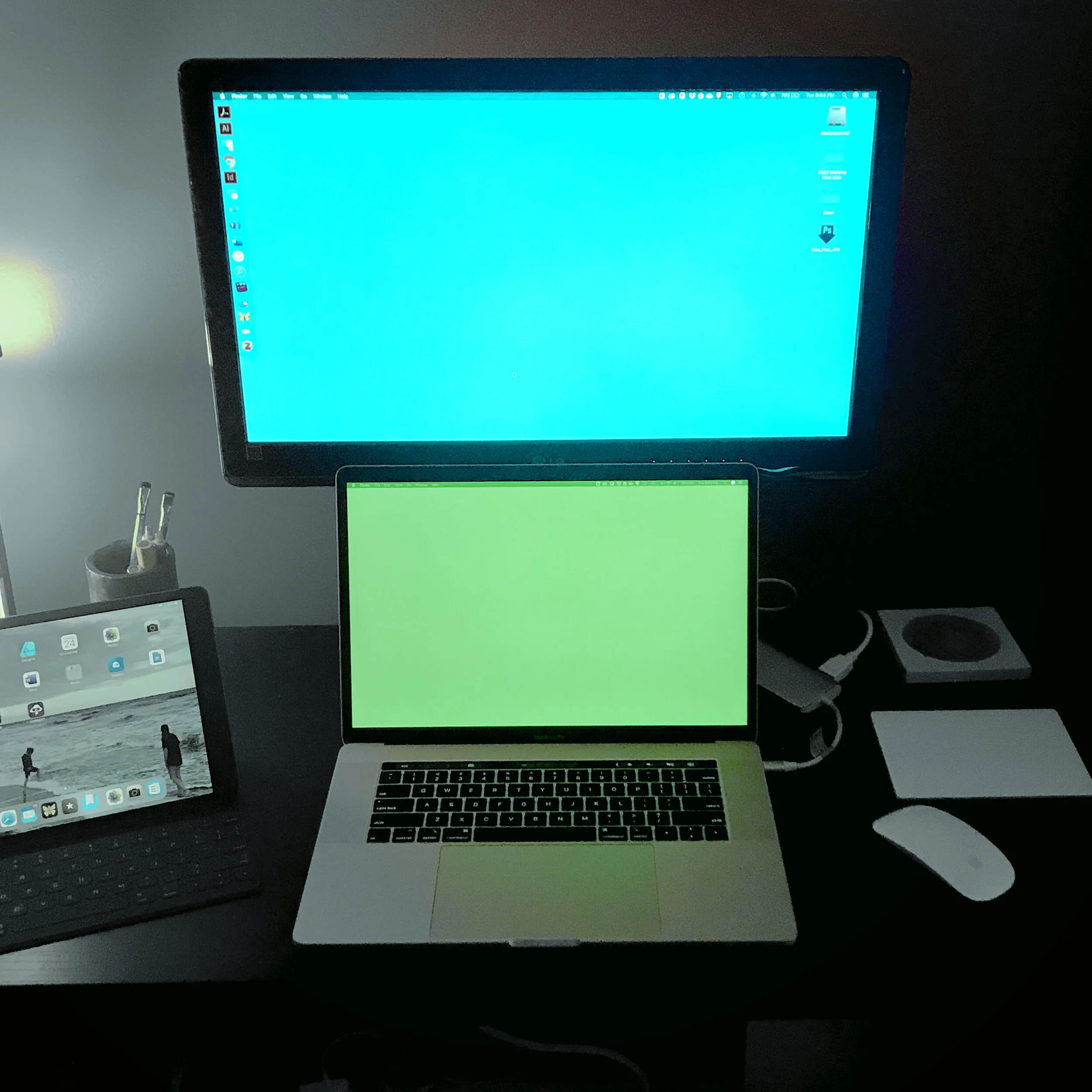
Lights out. When my desk lamp is on, I’m working. When it’s off, I’m not. It’s a simple little thing, but I feel like that literal flipping of a switch triggers a mental flipping of the switch.
Tidy up. At the end of the work day, I take my coffee mug or glass downstairs and put it in the dishwasher. It’s just another attempt at habit formation that indicates the work day is over.
Intentional spaces. For the last year or so, I’ve been trying to keep my iPhone and iPad out of our bedroom to build better sleep habits. (It was completely working by the way.) Now the challenge is a little different — I’m worried about being connected all the time. I’m intentionally trying to leave all my tech at my desk. This way, when I’m not working, the devices are upstairs and I’m able to be fully present with Liz and kiddos.
Notifications are off. If I’m at my desk, I’m working and I will see the email or message. If I’m away from my desk, it can wait until I get back. Plus, no random beeps or buzzes in the middle of the night. (I’m still working on my computer’s tendency to wake up in the middle of the night for a few seconds at full brightness. Sigh.)
In addition to these, I’m also trying to reestablish some old habits that have been demolished over the past couple weeks with the Coronavirus pandemic:
No devices within an hour of bedtime. I can’t help that my computer is parked in my bedroom, but I’m still concerned about a healthy night of sleep. When I’m getting ready to go to sleep, I try to avoid technology and focus instead on reading or sketching.
Limit social media. I’d really worked hard to build some boundaries for social media. It’s been an ongoing theme for a couple of years, but with the pandemic, it’s gone out the window. I’m actively looking at Twitter and Instagram and even take a look at Facebook sometimes. I’m ignoring all of the iOS Screen Time limits I set up. Those limits were helpful and while I need to recalibrate my expectations given the fact that I’m home all the time, I need to set some new, reasonable limits and stick to them.
I imagine when all this is over and everyone gets back to work, I’ll keep my little corner office. My plan is to move on to a Ph.D after I finish my Masters degree and having a dedicated space for writing will be essential. But establishing some clear boundaries and developing helpful habits will be essential to making this work over the long term.
* I actually miss studying at the Starbucks near my house.
** The door, in reality, does little to stop the kids. And really, that’s fine. No one on the call minds when Ryan pops in to give me a quick hug.
*** When the kids were little, we redecorated several times in a mostly futile attempt to childproof. A few things ended up in the attic or garage that we liked and just couldn’t get rid of. The tall lamp wasn’t steady enough with toddlers around and found its way to the garage. The chair was an old teacher desk chair that someone was going to throw out. Solid wood, sturdy as hell and surprisingly comfortable. I always felt a little foolish for not getting rid of this stuff sooner, but now I’m glad I kept them.
Bob Wertz writes about design, technology and pop culture at Sketchbook B. Bob is a Columbia, South Carolina-based designer, researcher, college instructor, husband and dad. He’s particularly obsessed with typography, the creative process and the tools we use to create.
This post was originally posted on March 25, 2020 on Sketchbook B. It’s reposted here as part of a project to move some of my favorite writing to my new site.
Adapting (poorly) to the new flow of things.
A little over a week ago, I made the conversion to working from home because of the Coronavirus outbreak.* Of course, it’s not just me working from home, the whole family is home, too. I have three kids — high school, middle school and elementary — and they are doing school from home, too.** My wife, Liz, is a teacher and she needs a workspace, too.
We’ve somewhat divided the house into zones. My son has the dining room for most of the morning and then it becomes arts-and-crafts central. My high schooler has set up at the small table in the kitchen. My middle schooler has carved out a place to work in the family room. Liz and I have rearranged furniture to fit two desks our bedroom. Our house isn’t particularly large, but we’ve made it work and developed somewhat of a routine.
I’m fortunate that Liz and I have jobs were we can switch to working remotely. I’ve been able to connect with my coworkers through Microsoft Teams and even presented a paper virtually for a conference from my home “office.” Liz is conducting morning meetings and sharing them with her kindergartners via Youtube.
I am working from home.
I’m doing my grad school classwork from home.
But…
I’m struggling to think. In particular, writing has been a challenge. I can do task related things. I’ve baked a red velvet cake and I made some bread, but projects that truly require thinking… I’m struggling.
I guess this isn’t really a surprise. Uninterrupted time is limited because everyone is home. I can’t slide out to the coffee shop if I need to get away. My schedule and my routines are off. My good habits are disintegrating. Let’s be honest, there’s a freaking global pandemic. It’s scary. I’m paying more attention to the news and social media than I normally do, and that’s not always helpful.
In time, I hope I can develop and form better habits for working from home. I know it’s only been a week and a half, but this is going to be the new normal for a little while. There are definitely aspects of working from home that I enjoy — like not having a commute — and I think that after a little while, as I settle into to new rhythms and routines, I’ll become more productive and creative. But right now, just thinking is a challenge.
* I’ll be direct. If you can stay home, stay home.
** My two oldest go to schools where they are assigned their own Chromebooks and use Google Classroom for everything. Their transition has been relatively seamless.
Bob Wertz writes about design, technology and pop culture at Sketchbook B. Bob is a Columbia, South Carolina-based designer, researcher, college instructor, husband and dad. He’s particularly obsessed with typography, the creative process and the tools we use to create.
This post was originally posted on March 25, 2020 on Sketchbook B. It’s reposted here as part of a project to move some of my favorite writing to my new site.
Reflections from presenting at a virtual conference
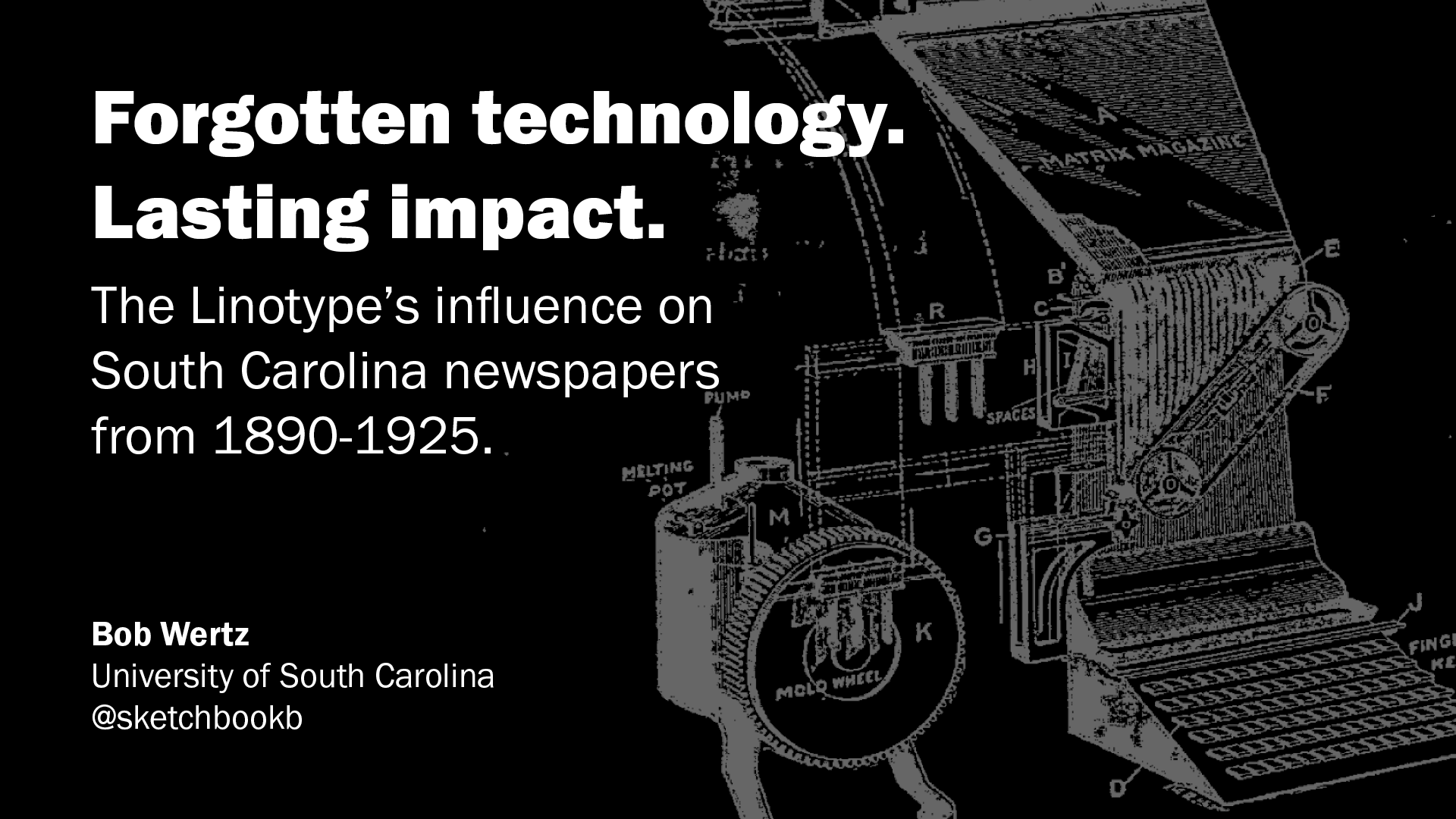
Last spring, I wrote a paper that looked at the impact of the Linotype on newspapers in rural South Carolina in the early 1900s. The Linotype brought the industrial revolution to the news industry and changed the newspaper industry radically over a couple of decades. I was proud of how the paper turned out and started to edit and revise, and prepare for the next step.
For those of you are aren’t familiar with the academic world, the next step is either presenting the paper at a conference or submitting it to a journal or publication. I submitted my paper in December to the AEJMC Southeast Colloquium and found out in February that it had been accepted. This year’s event was scheduled to be in Memphis and I was looking forward to checking out the city. I booked my flight and my hotel and started to research restaurants in Memphis.
Of course, plans changed.
Two weeks before the conference, the team at the University of Memphis announced that because of the spread of Coronavirus, they were going to conduct the conference online.
Last weekend, the Southeast Colloquium did indeed happen virtually, via Zoom. It’s really amazing how the team at Memphis was able to pivot from a physical gathering to a virtual one in just two weeks. I know that there were some bumps for some of the sessions, but the ones I attended all went perfectly.
I was happy with how my presentation turned out. I had 12 minutes and stayed under my allotted time. After I was done, I was thinking that it might be helpful to reflect on a few of the things that are different when presenting virtually.
Practice in the app. The night before the conference, I tested out presenting with Zoom. I set up at my desk upstairs and presented to my wife and son downstairs. I was able to try sharing my screen and get the feel of what it was like to present in Zoom. The first time through didn’t go well. It took a couple of times through to get comfortable. Spend the time to become familiar with the presenting software.
No audience feedback. I’m used to moving around when I present and trying to engage the audience, but when the audience mics are muted and their video is turned off, there is no audience feedback. It feels wrong. I couldn’t tell if the attendees were connecting with my presentation, or patiently waiting for it to end. My presentation was a little dry so I added a joke in the middle of the presentation and… no one laughed… or at least I couldn’t hear anyone laugh because everyone’s mic were muted.
Close everything you don’t need. If you are like me, you typically have a dozen apps open on your computer and a bunch of windows. My recommendation is that you close everything except your presentation and Zoom. When you go to share your screen, all of your open windows get presented as an option to share and it’s really easy to get flustered. You don’t want to start your presentation feeling rattled, do you? Plus, it eliminates the possibility that your email app will chime loudly at the most awkward time.
It was better than I thought. I was really nervous about this presentation — more nervous than I should have been — but I’ve never done a virtual presentation like this before. I was pleasantly surprised with how well it went. (I haven’t seen the recording and I may change my mind after I see it.) And people understand if things don’t go perfectly. We’re all learning together.
The next step for my paper involves revisions and probably another conference, AEJMC’s national convention in San Francisco in August. I’m hoping that everything is back to normal by then — I love San Fran — but if things are not back to normal, and if the conference is converted to an online event, I’ll be ready.
Bob Wertz writes about design, technology and pop culture at Sketchbook B. Bob is a Columbia, South Carolina-based designer, researcher, college instructor, husband and dad. He’s particularly obsessed with typography, the creative process and the tools we use to create.
This post was originally posted on March 14, 2020 on Sketchbook B. It’s reposted here as part of a project to move some of my favorite writing to my new site.
Uncertainly in the time of coronavirus
When I redrew my Sketchbook B fish logo a few months ago, I decided to draw him with a few different emotions by moving the eyes around and changing his expression. The nameless little fish has been a proxy of sorts for me and I thought it would be cute to switch out the logo on the site for how I was feeling. I even drew a few with hats and sunglasses for the summer.
Today, I decided to change the fish on Sketchbook B for the first time because of the coronavirus. The pandemic response is impacting everything in my life. My conference presentation in Memphis was moved online. My grad school classes next week are cancelled and going online only for a couple of weeks after that. For now, my wife and kids are still in school and my daughter’s lacrosse season continues, but all of that can change with an email.
Cancelling everything is completely the right call. Preventing the spread of the pandemic should be the priority for everyone, but everything has changed so quickly. Even for someone like me who has been following the coronavirus spread closely, things went from scary to terrifying so incredibly fast.
I opened the Affinity Designer file with all my fish variations and looked for the appropriate one for how I feel about the coronavirus pandemic. I fully intended to use one of my “disappointed” fish, but as I looked around the screen, at the top edge of the artboard was one of the last fish I drew: my “anxious” fish. I didn’t think I’d ever use him, but honestly, if I don’t use him now, I don’t know when I’d use him.
For now, I’ll go with the anxious fish. And as my emotions about things change, I’ll switch out the little guy. I look forward to the return of the happy fish and can’t wait to use the version with the Cubs hat for opening day.
My logo, for now.
Bob Wertz writes about design, technology and pop culture at Sketchbook B. Bob is a Columbia, South Carolina-based designer, researcher, college instructor, husband and dad. He’s particularly obsessed with typography, the creative process and the tools we use to create.
This post was originally posted on January 4, 2020 on Sketchbook B. It’s reposted here as part of a project to move some of my favorite writing to my new site.
It’s become trendy to bash Facebook — and everyone on Facebook — as unsophisticated. Dave’s especially pointing out how journalists have a tendency to dismiss Facebook and its audience. He’s not so much defending Facebook as he is pointing out that with over a billion users, you can’t ignore Facebook if you are trying to build a business.
I’ve been mostly off Facebook for a little over a year. I’ve decided that, for various reasons, Facebook was not an experience that I enjoyed anymore. I have issues with Facebook. I don’t approve of Facebook’s approach to privacy and I think the algorithm brings out the worst in people sometimes, but the reason I’ve left Facebook is that it doesn’t make me happy.**
That said, I completely agree with Dave. If you are trying to build a business, you can’t ignore Facebook. I’ll be honest, when I post links to my blog posts on Facebook, the articles get more traffic. Leaving behind Facebook meant leaving behind that audience. If we’re talking about my blog, that’s a trade off I’m willing to make. If you are starting a business venture, you don’t have the luxury to ignore an audience that large.
Dave’s follow up post brings up a second, maybe more important point:
I want to clear something up. I do not equate the net with Facebook. However a lot of people do. That’s where you have to meet them. If you want to go forward with them, Facebook is where they are. Why do you rob banks? That’s where the money is. ;-)
For those of us who have chosen to quit Facebook, it’s important to remember that we are in the minority. Most people enjoy their experience on Facebook. I’d actually say that most people find it impossible to imagine their lives without Facebook. To some people, Facebook is the internet. When we bring up the need to build a better internet, we need to talk about the ways that an open web improves on the things they like about their Facebook experience.
* RSS, Podcasting, etc.
** I don’t love Facebook, but I’m still on Instagram.
Bob Wertz writes about design, technology and pop culture at Sketchbook B. Bob is a Columbia, South Carolina-based designer, researcher, college instructor, husband and dad. He’s particularly obsessed with typography, the creative process and the tools we use to create.
This post was originally posted on December 31, 2019 on Sketchbook B. It’s reposted here as part of a project to move some of my favorite writing to my new site.
Defining who I want to be…
Like last year, I’m going to set some loose themes for this year. They aren’t goals or resolutions, but they do give me a nice guidepost for what I want to accomplish during the upcoming year. For 2020, I only have four themes.
One note about my themes this year: I’m thinking about them more as statements of identity. During this past year, I readAtomic Habits by James Clear and one anecdote in particular has stuck with me. When people are trying to quit smoking, people who say “I’m not a smoker” are more successful than people who say “I’m trying to quit.” Defining who you are can help shape your habits and actions. So I’m framing my themes as statements of who I am instead of what I want to do.
I’m a graduate student. I only have a handful of classes left and my thesis. Most of my time and energy will be focused on completing my Master’s degree and presenting at conferences. I’ll be doing a significant amount of reading and writing for classes and research this year. If all goes according to plan, I’ll graduate in December of 2020.
I’m a healthy person. I need to start taking better care of myself. Yes, that means eating better and working out regularly, but being healthy does just mean physical health. I’ve read a lot in the past year about meditation and mindfulness and I feel like I’d benefit from carving time out of my schedule to focus on mental health as well.
I’m a typeface designer. I love designing typefaces. Honestly, it’s my favorite thing to design and I don’t do it frequently enough. (This year, despite it being one of my themes, I only finished a single typeface.) I’ve got plans for a variable typeface and my plan is to finish it in 2020.
I’m a reader. It wasn’t one of my themes for 2019, but I decided in the spring that I’d like to read more books. I used Goodreads to track my reading, rediscovered my local library and finished 24 books over the course of the year (not including all those journal articles and books I read for class). I’d like to keep it going…
And that’s it. I have other projects and topics I’ll work on, but these are the four big themes. Last year, I wrote a follow up at the midpoint of 2019. For this year, I’m going to try and write about my progress at least once a month.
Bob Wertz writes about design, technology and pop culture at Sketchbook B. Bob is a Columbia, South Carolina-based designer, researcher, college instructor, husband and dad. He’s particularly obsessed with typography, the creative process and the tools we use to create.
This post was originally posted on December 30, 2019 on Sketchbook B. It’s reposted here as part of a project to move some of my favorite writing to my new site.
Adding some fiction to the mix
I tend to read mostly non-fiction*, but for 2019, I made a concerted effort to read more fiction and thoroughly enjoyed the change of pace. In all, I read 24 books during the year. According to Goodreads, that’s 8,410 pages.**
So how did I find the extra time to read more? As I started to change my relationship with social media, I also figured out that I needed to change how (and when) I used my phone. So most evenings, I avoided using my phone after dinner and read a book instead.
I also made sure I had a book to read at all times. I used Goodreads to track the books I wanted to read and then requested them from my local library. Richland Library has a online interface for requesting books. The book is typically ready for pick up in a couple of days although sometimes, it takes longer for popular books. It was much less expensive than buying them all new.
And finally, as I wrote about earlier this year, getting reading glasses might have contributed to reinforcing my reading habit.
For next year, I’m going to aim for 26 books — one every two weeks. It seems like a reasonable goal with all of the reading and writing I’ll have to do for graduate school this year. I looking forward to adding even more fiction to my reading mix.
* Even when I was a small child, I gravitated towards non-fiction books.
** That doesn’t count all the books and journal articles I read for work. Or articles I read online.
Bob Wertz writes about design, technology and pop culture at Sketchbook B. Bob is a Columbia, South Carolina-based designer, researcher, college instructor, husband and dad. He’s particularly obsessed with typography, the creative process and the tools we use to create.
This post was originally posted on December 29, 2019 on Sketchbook B. It’s reposted here as part of a project to move some of my favorite writing to my new site.
Complicated feelings…
Warning: Significant spoilers for Star Wars: The Rise of Skywalker.
Star Wars: The Rise of Skywalker premiered last week. I caught a late show on opening night and then saw it again with the family a couple of days later. After the first viewing, I was conflicted. I enjoyed the movie, but honestly, I left a little disappointed. There was just so much to process and I wasn’t sure I was satisfied with all the twists and turns. Chris Trainor at the Free Times posted a great review that pretty much summarized my initial feelings.
When I saw it a few days later, I enjoyed it much more. I knew what to expect and just sat back and enjoyed the ride. A couple of random thoughts…
Palpatine and Exegol. I have lots of questions about how Palpatine came back from the dead and where all those Sith disciples on Exegol came from.
Rey. I don’t necessarily love that Rey is a Palpatine, but I understand why they made that choice. Even so, I never felt Rey was going to really turn to the dark side, so all of the attempted fake outs felt a little flat to me.
Droids. They used C-3PO and D-0 well as comic relief. I especially loved when C-3PO declared Babu Frick “one of my oldest friends.”
“That’s not a navy, sir. It’s just… people.” I thought the final battle was entertaining. So many ships. (Maybe too many ships, to be honest.) The shock of General Pryde when the Resistance reinforcements show up, and the concept that the only way to defeat tyranny is for ordinary people to stand up to evil.
Leia. I think this movie would have been much stronger if Carrie Fisher were alive to deliver her lines instead of using repurposed footage from The Force Awakens. I think they did a good job piecing it together, but it would have been stronger. That said, I’d rather have this movie than one with a CGI Leia.
Media blitz. I didn’t seek out spoilers, but I couldn’t avoid the crush of promotional clips, trailers and commercials. I think it was a mistake to show so much. If I hadn’t already seen the clip of the Millennium Falcon coming to the rescue with thousands of ships, the moment in the end when Poe is giving up would have had more impact. Instead, I was waiting for the scene from the trailers when the reinforcements show up.
Where next? Will Rey start rebuilding the Jedi order? Will there be a new, New Republic or will the universe finally give up on the concept of a single galactic government? Have we finally seen the last of the Sith? I know this is the end of the Skywalker Saga, but they left more than a few direction for future movies and streaming shows.
In the end, I’m satisfied. I don’t plan to see it again in the theater, but will watch it again as soon as it comes out on Disney+. And we’re not done with Star Wars, we’re just ready to move on to other stories in the Star Wars universe.
Bob Wertz writes about design, technology and pop culture at Sketchbook B. Bob is a Columbia, South Carolina-based designer, researcher, college instructor, husband and dad. He’s particularly obsessed with typography, the creative process and the tools we use to create.
This post was originally posted on December 15, 2019 on Sketchbook B. It’s reposted here as part of a project to move some of my favorite writing to my new site.
Vincent visits Columbia.
Self portrait in a snazzy gold frame.
I spent Saturday afternoon at the art museum. My daughter — to celebrate her 15th birthday — wanted to visit the Van Gogh exhibit* at the Columbia Museum of Art with a couple of her friends.
The exhibition highlighted not just Van Gogh’s art, but also the artists that influenced him. It’s important to remember that everyone — even a master like Van Gogh — was influenced by the world and art around him.
I’ll also add that if you have an art museum near you, go visit it. We don’t visit the Columbia Museum of Art frequently enough. Today, we spent a little extra time upstairs looking at the permanent collection and I found a few new pieces that I don’t remember seeing before and found interesting.** It’s a great collection and we are lucky to have it here in Soda City.
* If you are in the Columbia area, check out the Van Gogh exhibit. It’s up through January 12, 2020.
** They recently expanded the galleries in the permanent collection. So it’s quite possible they are, indeed, newly on display.
Bob Wertz writes about design, technology and pop culture at Sketchbook B. Bob is a Columbia, South Carolina-based designer, researcher, college instructor, husband and dad. He’s particularly obsessed with typography, the creative process and the tools we use to create.
This post was originally posted on December 14, 2019 on Sketchbook B. It’s reposted here as part of a project to move some of my favorite writing to my new site.
This year flew by…
As 2019 comes to a close, here are my favorite shots from the last year:
My wife, Liz, and I celebrated our 20th wedding anniversary. This is one of my favorite shots of Liz, even if it wasn’t taken on our anniversary.
I’m still enjoying grad school and travelled to Toronto to present my first paper at an academic conference.
We took a couple of hikes as a family up near Asheville. Next year, we need take more hikes.
Ryan started soccer this year. There are lots of shots of him in motion, but I love this one of him crouched in goal — with all the action at the other end of the field.
Liz and I went to a “paint and pour.” I don’t really paint and I wasn’t sure what it would be like, but I had a lot of fun.
The girls and I went to Starbucks. They can be so silly, especially when it’s just them. Loved this moment, but I can’t actually remember what they are laughing about.
Jill was entertaining her cousin Gracie at one of Norah’s lacrosse games in Greenville.
The kids in front of the Christmas tree. I’ll be honest — getting pictures of the family in front of the tree almost broke me — but at least some of the shots turned out great.
If you are the kind of person who loves taking and sharing pictures, I encourage you to find your best eight images instead of using an algorithm to generate the nine images other people liked best. I’ve written a separate post on how I built my Fav8.
Bob Wertz writes about design, technology and pop culture at Sketchbook B. Bob is a Columbia, South Carolina-based designer, researcher, college instructor, husband and dad. He’s particularly obsessed with typography, the creative process and the tools we use to create.
This post was originally posted on December 14, 2019 on Sketchbook B. It’s reposted here as part of a project to move some of my favorite writing to my new site.
Forget ‘Best Nine.’ Why Fav8 is the way to go.
At the end of every year, Instagram is flooded with “Best Nine” posts — an automatically generated composite of the nine images on your feed that received the most likes. But last year, I tried something different… Fav8. I picked the eight images that meant the most to me and put them together into a “Best Nine” style format. Here’s what my Fav8 from 2018 looked like:
A couple of other folks did Fav8’s, too, and it seemed to work well for them. This year, I want to encourage more people to spend some time and make their own Fav8s. There isn’t an app or a spammy ad covered website to make a Fav8. It’s completely DIY. Curating your own compilation takes a little more time, but it’s got some definite benefits:
You can select the images that mean the most to you. I liked all of my Best Nine images from last year, but several of my favorite moments were left off. The system can’t tell which images mean the most to me, it can only tell how many likes each post got. The Fav8 approach lets you pick your favorite moments.
Memory lane. To select your favorite eight shots from the last year, you have to go through all of your images. It’s hard to believe how many amazing moments I had forgotten across the year. Going through the last year of images can be an amazingly affirming experience.
Pick the best shot from the sequence. I like to post multiple images in the same Instagram post, but the Best Nine generator automatically picks the first image in the sequence, which may not be the image you want to use.
So how do you make a Fav8?
It takes a little more time than clicking a button, but it’s pretty straightforward:
Pick the images you love. You can look at your Instagram feed or your camera roll, but pick the images you love. Don’t pay attention to how many people liked the image… just how much it means to you. I used Instagram’s bookmark feature to save my favorites. If you are using your camera roll, just start a new album. (If your images are on Instagram, there are several ways to download the images, but it depends on several factors like your operating system and where the images are stored. Your best bet is to Google the best option for your specific situation. UPDATE: Micro.Blog user Smokey Ardisson mentioned that Shortcuts on iOS and MacOS has a Photo Grid action.)
Narrow it down to the final eight. If you are like me, you liked more than 8 images last year. So think about which images tell the story of the last year? Which moments are most vivid? This might take a little bit of time, but it’s also one of the most fun parts.
Organize the images into a grid. There are many ways to do this. I’m a designer and I used Photoshop. If you want to only use your iPhone, I’ve used Instagram’s free Layout app to make a simple grid of images. (There are many, many apps that can do this.) Of course, there will be one spot left over in a 3x3 grid. Feel free to add whatever you want… your name, social media username, the year, an inspirational quote. Whatever feels right. (UPDATE: Micro.Blog user John Johnston is thinking about adding a map. Love that idea, too.)
Post your Fav8 wherever you like. This isn’t just an Instagram thing. Share it to your favorite social media site. Or write a blog post about your Fav8 and what each of the images mean to you. I’ve posted my Fav8 on my blog and will soon post it on Instagram and Twitter, too.
Bonus! Create something tangible. Too many of our images never leave the phone. This year, I’m going to create a printed version of my 2019 Fav8, frame it and put it in my office.
If you have fun making your image compilation, spread the word. Let others know about Fav8 and encourage your friends and family to do the same. You can use the hashtag #2019Fav8. Or for Micro.Blog, maybe we can use the 8️⃣ emoji?
Bob Wertz writes about design, technology and pop culture at Sketchbook B. Bob is a Columbia, South Carolina-based designer, researcher, college instructor, husband and dad. He’s particularly obsessed with typography, the creative process and the tools we use to create.
This post was originally posted on August 31, 2019 on Sketchbook B. It’s reposted here as part of a project to move some of my favorite writing to my new site.
More states should offer a minimalist ‘blackout’ option
Last summer, my family and I played a summer-long version of the license plate game. It took a while, but we found all 50 states — plus some Canadian provinces and a few other odd plates. We’ve seen many license plates, and while some are classic designs, honestly, most of them are ugly. There are technical challenges to designing a license plate and many of the designs were selected from design contests and saddled with colors, slogans and imagery.
South Carolina tag from 1975
My father loves visiting antique stores and a while back, he gave me an old South Carolina license plate that he’d found. It’s from 1975 and is a simple, minimal design. Garnet background, white letters. I’ve always liked this vintage look and wished that South Carolina had a license plate that was more refined.
It’s not surprising these blackout plates are popular. No one really wants an overly graphic and colorful license plate laden with tourism marketing slogans. Some people will always prefer a minimalist option and if South Carolina offered a similar “blackout” option, I know I’d order one for my car.
Bob Wertz writes about design, technology and pop culture at Sketchbook B. Bob is a Columbia, South Carolina-based designer, researcher, college instructor, husband and dad. He’s particularly obsessed with typography, the creative process and the tools we use to create.
This post was originally posted on August 24, 2019 on Sketchbook B. It’s reposted here as part of a project to move some of my favorite writing to my new site.
Apple Pay is exceptionally easy to use. Why aren’t more people using it?
Recently, I was in Canada and pretty much every single transaction was completed with Apple Pay.
But since I’ve been back, I’ve noticed just how rare it is for people to pay with Apple Pay in the United States — especially with an Apple Watch. I had a cashier at a Walgreens comment that she’s never seen anyone pay with their watch. A lady behind me at Target the other day told me that she didn’t even know you could pay with a watch. And today, a “helpful” cashier at Staples warned me that paying with an Apple Watch “was the easiest way for people to steal your identity.” (I explained to him that he was completely wrong.)
Apple Pay (and its peers) are more secure, more convenient and faster. Considering that so many people have iPhones and Android phones, why aren’t more Americans taking the leap to contactless payments? And why are some vendors slow to install the hardware that makes contactless payments as common in the U.S. as they are in other countries?
Bob Wertz writes about design, technology and pop culture at Sketchbook B. Bob is a Columbia, South Carolina-based designer, researcher, college instructor, husband and dad. He’s particularly obsessed with typography, the creative process and the tools we use to create.
This post was originally posted on August 21, 2019 on Sketchbook B. It’s reposted here as part of a project to move some of my favorite writing to my new site.
Celebrating two decades (!) of marriage
Twenty years ago today was a typical summer Saturday in South Carolina — sun-drenched, oppressively hot and miserably humid. A perfect day to be at the beach or in the pool with a cool drink in your hand.
I was wearing a black tux.
Getting married in the middle of summer wasn’t the best idea I’ve ever had, but marrying Liz was. Today, Liz and I celebrate our 20th wedding anniversary. Over the last two decades we’ve had our fair share of high and low points. We’ve welcomed three amazing kiddos into the world and we’ve mourned the loss of close family. We’ve struggled together through career changes and grad school. We’ve learned to be parents together. (Hell, we’ve learned to be adults together.) We’ve watched good movies and really cheesy made-for-TV Christmas movies.
Liz is an amazing partner. Smart, curious, patient, kind, talented, supportive. She’s my best friend and she’s even more amazing today than the day I met her.
The funniest thing about our August anniversary is how ridiculously inconvenient it is. Liz didn’t originally plan on being a teacher, so we didn’t think about the fact that our August anniversary would pretty much be the first day of school every year. It seems like every year — just like we did this morning — we celebrate our anniversary by taking the traditional first day of school pictures on the front steps before sunrise and then have dinner with the family to celebrate the new school year.
I wouldn’t have it any other way.
How we celebrate our anniversary now…
Bob Wertz writes about design, technology and pop culture at Sketchbook B. Bob is a Columbia, South Carolina-based designer, researcher, college instructor, husband and dad. He’s particularly obsessed with typography, the creative process and the tools we use to create.