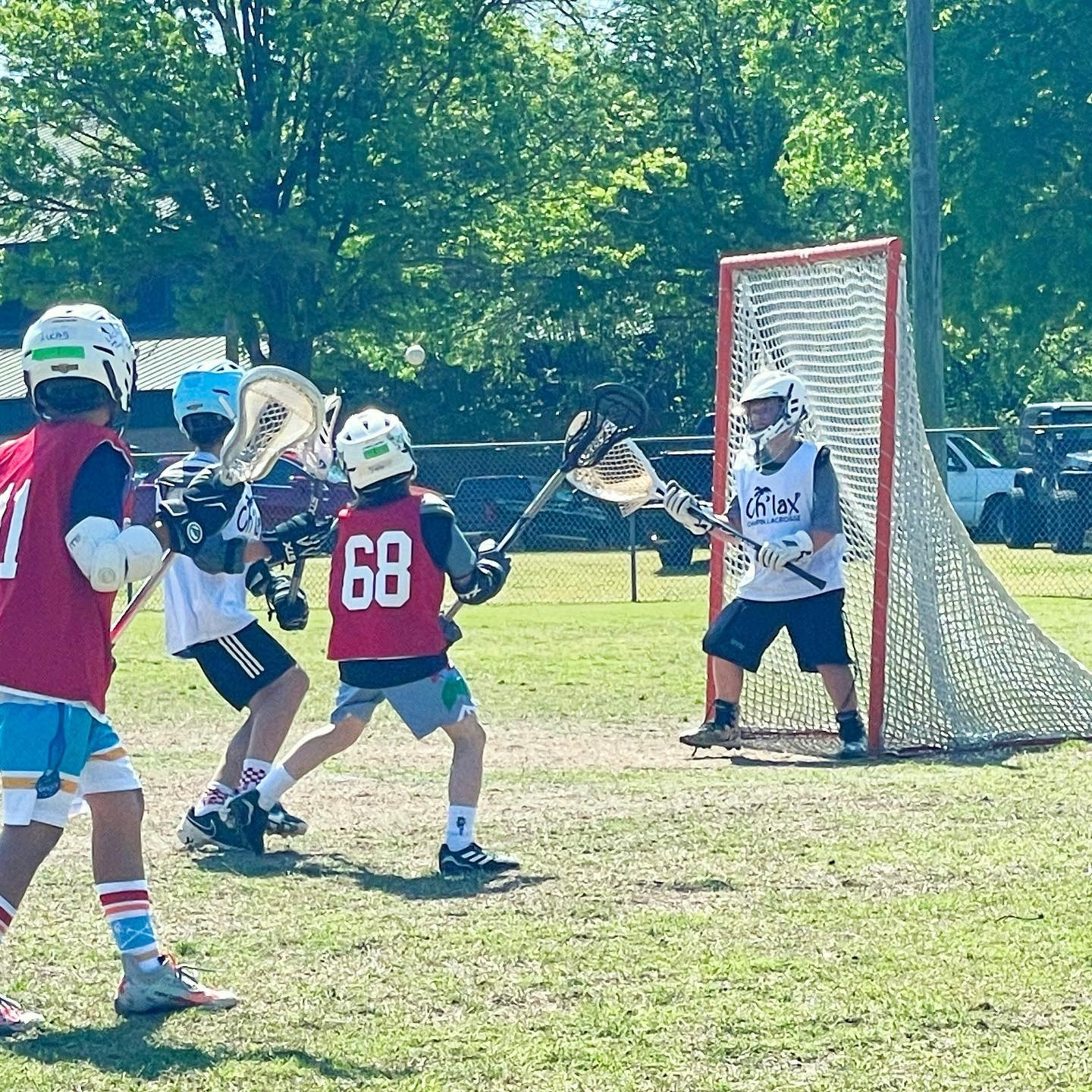
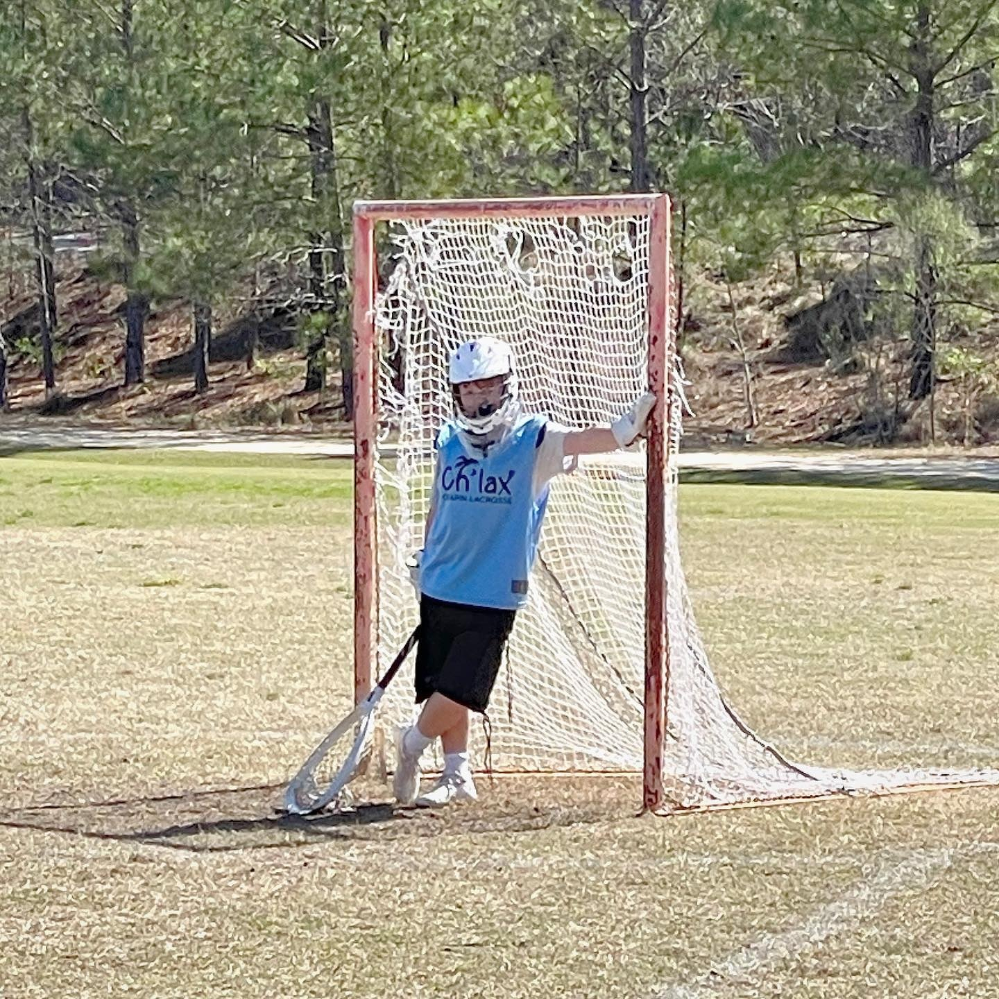
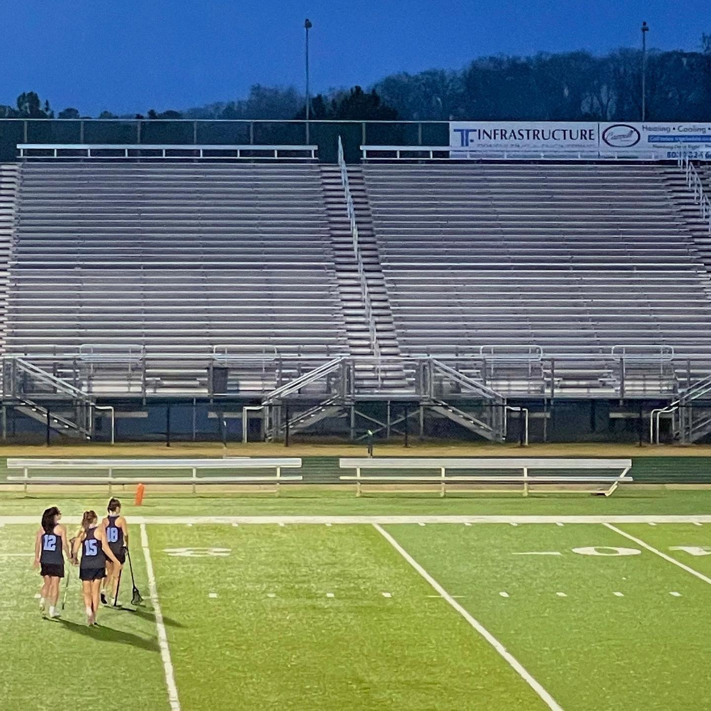
Little known fact: Before I was a lacrosse dad, I was a skate dad. Fun to see Norah back out on the ice today.

Tall Tale

This post was originally posted on December 12, 2021 on Sketchbook B. It’s reposted here as part of a project to move some of my favorite writing to my new site.


Remembering that time I had coffee with a design legend at the now-closed Vista Starbucks.

Chris Trainor at The State broke the news last week that the Vista Starbucks in Columbia is permanently closed. I used to meet people there from time-to-time when I needed a place downtown to work for a couple of hours.* I haven’t been to that store in years — lately, I’ve been more likely to stop by their new Bull Street location — but one of my favorite professional stories took place at that now-vacant storefront.

Back in April 2008, AIGA South Carolina hosted a lecture by Stefan Sagmeister. At the time, he was probably considered one of the most famous designers in the world and was doing a book tour. Sagmeister’s staff had arranged all of his travel so his stay in Columbia wasn’t our typical speaker visit. He was flying into Columbia on the morning of the lecture and then, after the event, was taking a car to Charlotte for another lecture the next day. I picked him up at the airport and we took him to lunch at Motor Supply with some board members and students from the design program at USC.

Our normal routine at the time was to take the speaker to the hotel after lunch so they could relax and get some work done, but Sagmeister wasn’t spending the night in Columbia so we didn’t have place for him to hang out. We offered him Marius’s office at the School of Art, but Stefan simply wanted a place where he could grab some coffee and check his email. Starbucks in the Vista was the location we settled on.

For three hours, we sat at the outside tables at the corner of Gervais and Lincoln. It was misting rain so we stayed at the tables with the green Starbucks umbrellas. He checked email, drank coffee and smoked, but mostly, we talked about design and the creative process.** We also talked about his “fame” and he noted that if he were truly famous, he wouldn’t be able to sit at an outside table at a busy intersection without being noticed.

This is the only picture I took of the Sagmeister lecture.

The lecture that night went exceptionally well. About 160 people from all over South Carolina gathered to hear his talk at the State Museum auditorium. But my strongest memory from his visit was sitting at the Starbucks in the Vista with Sagmeister and talking shop for a few hours. He was kind and thoughtful and I appreciated getting to chat with him.

Hopefully, soon, another store or restaurant will fill the vacant storefront, but every time I pass that intersection, I’ll think of the old Vista Starbucks and Stefan Sagmeister.


* Keep in mind that there were very few independent coffee shops in Columbia at the time. And reliable wifi wasn’t a given in 2008 like it is today.

** If you want to know what our conversation was like, take a look at the Answers page on his site.


Bob Wertz writes about design, technology and pop culture at Sketchbook B. Bob is a Columbia, South Carolina-based designer, University of South Carolina Ph.D. student, mass comm researcher, husband and dad. He’s particularly obsessed with typography, the creative process and the tools we use to create. He got vaccinated and boosted to protect his community. #TeamModerna

Happy birthday to my best friend. Hope you have an awesome birthday, Liz! 🎉🎉🎉

Unexpectedly warm December evening means extra time hanging out on the back deck.

Happy 10th birthday, Ryan.

Leaving McMaster after teaching this evening and Capstone is glowing garnet to celebrate the @gamecockwbb win over #2 UConn. #gogamecocks #networth

Sign at the coffee shop this morning. 🤯

Reintroducing Power Grid and Intermodal

This post was originally posted on November 17, 2021 on Sketchbook B. It’s reposted here as part of a project to move some of my favorite writing to my new site.


A couple of old typefaces get new versions.

This week I released a couple of new display typefaces based on some of my older designs: SbB Power Grid and SbB Intermodal Stencil. These designs have been available before in different forms, but these new versions are significantly refined and expanded. Both SbB Power Grid and SbB Intermodal Stencil are available for purchase at MyFonts.

SbB Power Grid

SbB Power Grid is a bold display typeface with an industrial feel. The family has four styles — Regular, Inline, Stencil and Rounded and corresponding italics. This is actually the third version of Power Grid. I spent time refining the look and feel of the design and I’m really happy with where it landed. The Stencil and Inline versions in particular would work well in athletic or industrial branding.

SbB Power Grid is available as a family for $19 at MyFonts. Individual fonts are $9 each.

SbB Intermodal Stencil

SbB Intermodal Stencil is my futuristic, sci-fi stencil system. I’ve written about Intermodal Stencil and my experiments with variable type. I’m happy to finally release a new version. I’ve refined the letterforms, added a couple of alternates and two italic angles. The variable version includes three axes — width, slant and stencil opening. The stencil opening serves as a type of optical correction. At smaller sizes, the larger stencil cuts work better.

What’s the deal with multiple italic* angles? When you are designing a typeface that intended to be used in large blocks of text, the designer needs to pick one consistent italic angle. But when you are talking about a display typeface, an italic angle is just an aesthetic choice. So I’ve decided to provide multiple angles for Intermodal. Intermodal features 5 degree and 10 degree obliques. If you use the variable font, you can pick any italic slant between 0 and 15 degrees.

SbB Intermodal Stencil is available as a family for $19 at MyFonts. Individual fonts are $9 each.

30% off for a limited time

To celebrate my new typeface releases, SbB Power Grid, SbB Intermodal Stencil and SbB Powertrain (which I released last year) are all 30% off at MyFonts through January 1, 2022. Individual fonts start at $6.30 and typeface families start at $13.30.


* Also, these are really obliques, not italics. An italic is typically drawn in a different style, while an oblique is a slanted version of the upright Roman. But most people and designers just call all slanted text “italics” so I decided it was time to abandon that particular linguistic fight.


Bob Wertz writes about design, technology and pop culture at Sketchbook B. Bob is a Columbia, South Carolina-based designer, University of South Carolina Ph.D. student, mass comm researcher, college instructor, husband and dad. He’s particularly obsessed with typography, the creative process and the tools we use to create. Bob occasionally and begrudgingly posts to Twitter and Instagram. He wears a mask and got vaccinated to protect his community. #TeamModerna