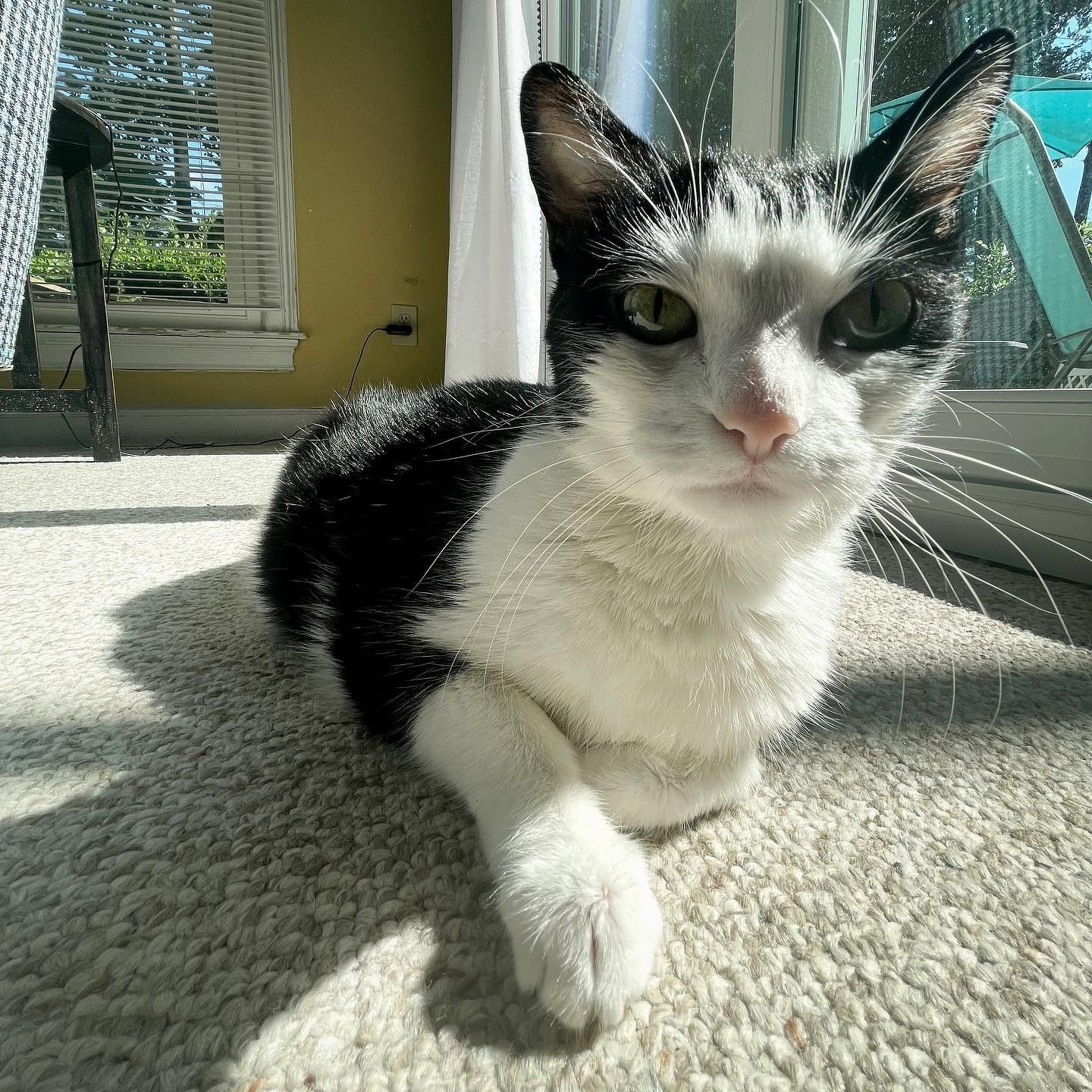
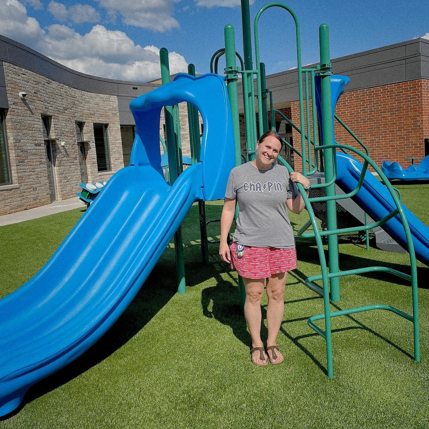
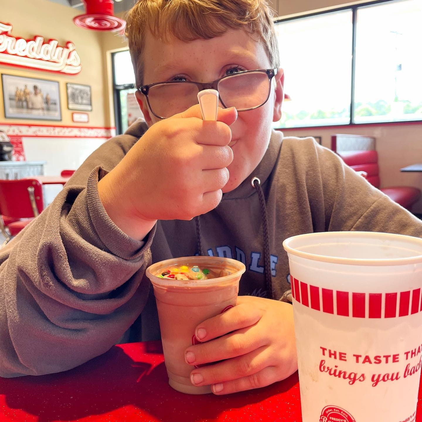
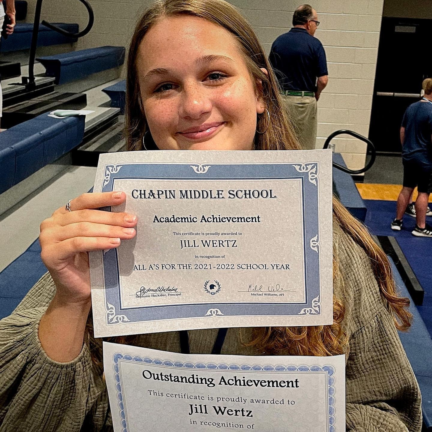
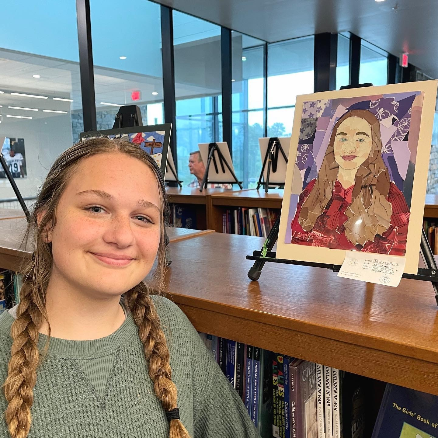
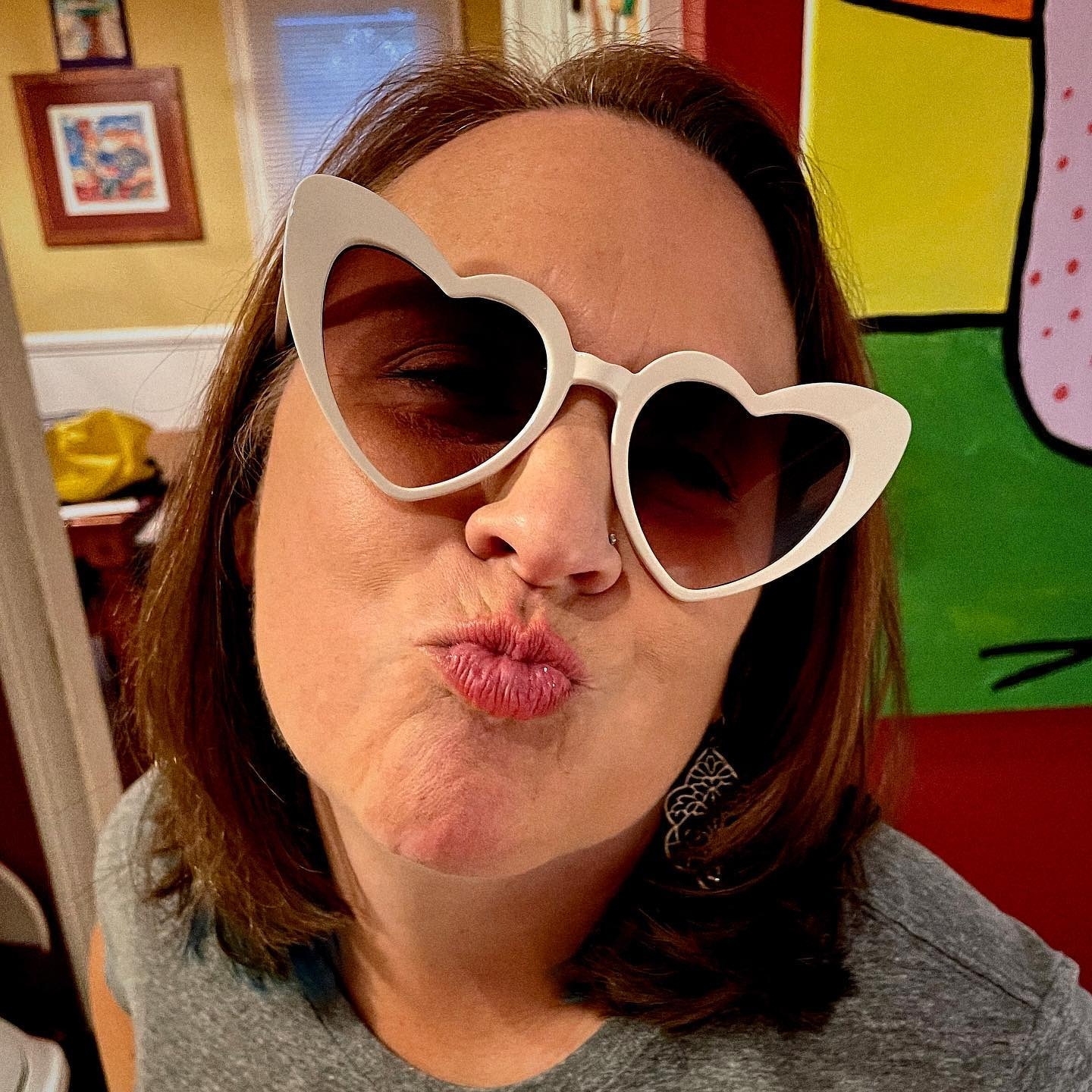
Happy birthday to my best friend. Hope you have an awesome birthday, Liz! 🎉🎉🎉

Unexpectedly warm December evening means extra time hanging out on the back deck.

Happy 10th birthday, Ryan.

Leaving McMaster after teaching this evening and Capstone is glowing garnet to celebrate the @gamecockwbb win over #2 UConn. #gogamecocks #networth

Sign at the coffee shop this morning. 🤯

Reintroducing Power Grid and Intermodal

This post was originally posted on November 17, 2021 on Sketchbook B. It’s reposted here as part of a project to move some of my favorite writing to my new site.


A couple of old typefaces get new versions.

This week I released a couple of new display typefaces based on some of my older designs: SbB Power Grid and SbB Intermodal Stencil. These designs have been available before in different forms, but these new versions are significantly refined and expanded. Both SbB Power Grid and SbB Intermodal Stencil are available for purchase at MyFonts.

SbB Power Grid

SbB Power Grid is a bold display typeface with an industrial feel. The family has four styles — Regular, Inline, Stencil and Rounded and corresponding italics. This is actually the third version of Power Grid. I spent time refining the look and feel of the design and I’m really happy with where it landed. The Stencil and Inline versions in particular would work well in athletic or industrial branding.

SbB Power Grid is available as a family for $19 at MyFonts. Individual fonts are $9 each.

SbB Intermodal Stencil

SbB Intermodal Stencil is my futuristic, sci-fi stencil system. I’ve written about Intermodal Stencil and my experiments with variable type. I’m happy to finally release a new version. I’ve refined the letterforms, added a couple of alternates and two italic angles. The variable version includes three axes — width, slant and stencil opening. The stencil opening serves as a type of optical correction. At smaller sizes, the larger stencil cuts work better.

What’s the deal with multiple italic* angles? When you are designing a typeface that intended to be used in large blocks of text, the designer needs to pick one consistent italic angle. But when you are talking about a display typeface, an italic angle is just an aesthetic choice. So I’ve decided to provide multiple angles for Intermodal. Intermodal features 5 degree and 10 degree obliques. If you use the variable font, you can pick any italic slant between 0 and 15 degrees.

SbB Intermodal Stencil is available as a family for $19 at MyFonts. Individual fonts are $9 each.

30% off for a limited time

To celebrate my new typeface releases, SbB Power Grid, SbB Intermodal Stencil and SbB Powertrain (which I released last year) are all 30% off at MyFonts through January 1, 2022. Individual fonts start at $6.30 and typeface families start at $13.30.


* Also, these are really obliques, not italics. An italic is typically drawn in a different style, while an oblique is a slanted version of the upright Roman. But most people and designers just call all slanted text “italics” so I decided it was time to abandon that particular linguistic fight.


Bob Wertz writes about design, technology and pop culture at Sketchbook B. Bob is a Columbia, South Carolina-based designer, University of South Carolina Ph.D. student, mass comm researcher, college instructor, husband and dad. He’s particularly obsessed with typography, the creative process and the tools we use to create. Bob occasionally and begrudgingly posts to Twitter and Instagram. He wears a mask and got vaccinated to protect his community. #TeamModerna

Date night selfie

Return of the Powerbook

This post was originally posted on November 6, 2021 on Sketchbook B. It’s reposted here as part of a project to move some of my favorite writing to my new site.


My new MacBook Pro

Y’all. I’ve only had it for less than two weeks, but I love this computer so much. I don’t really need to write a review. Every review that’s been written about the new MacBook Pro* essentially says the same thing. The computer is unbelievably fast. The battery life seems endless. The screen is insanely sharp. The ports are back. The keyboard is solid. The notch is strange at first, but then pretty much disappears.

I went with the 14-inch version in Space Gray. It’s the perfect size for what I need for writing and type design. Some of my designer friends have expressed surprise that I didn’t go with the 16-inch screen, but I don’t really want to carry around that computer (or the accompanying charger brick) in my bag.

If I need more screen real estate, I can easily plug it into an external display. I probably won’t do that often, though, because the MacBook Pro’s screen is beautiful and my external display is woefully inadequate in comparison. You have to see the MacBook Pro in person to understand just how sharp and bright this screen is. It’s an amazing piece of technology and it will be a while before an external screen of this quality is affordable.**

Could I have gotten by with the M1 MacBook Air and saved myself some money? Yes, absolutely. I’m not editing video or doing massively intensive computational tasks. But stepping up to the MacBook Pro gets you the gorgeous screen, the updated industrial design, MagSafe, some additional ports (that I probably won’t use) and some extra speed. Well worth the added investment to me.

So far, I’m happy with my purchase. The whole package feels premium — solid and durable. I look forward to using it in coffee shops, conference rooms and classrooms for many years to come.


* I understand why Apple switched the name to MacBook years ago, but this computer looks like more like a Powerbook to me. 😎

** Apple’s Pro Display XDR is not affordable.


Bob Wertz writes about design, technology and pop culture at Sketchbook B. Bob is a Columbia, South Carolina-based designer, University of South Carolina Ph.D. student, mass comm researcher, college instructor, husband and dad. He’s particularly obsessed with typography, the creative process and the tools we use to create. He wears a mask and got vaccinated to protect his community. #TeamModerna

Database official

This post was originally posted on November 6, 2021 on Sketchbook B. It’s reposted here as part of a project to move some of my favorite writing to my new site.


My thesis is finally available on Google Scholar

My master’s thesis, Brand New: How Visual Context Shapes Initial Response to Logos and Corporate Visual Identity Systems, has finally made it to ProQuest and appears in Google Scholar* searches. If you have access to the ProQuest database through a university or public library, you can download the full PDF. I’m proud of how it turned out, and look forward to continuing my research into visual context during my Ph.D. studies. Here’s the abstract:

When a new logo is released, it does not have an established meaning in the mind of the viewer. As logos have become more highly scrutinized by consumers and critics, it has become more important to understand consumers’ initial response to logos. While other studies have researched the impact of aesthetic choices on viewer reaction to logos, few researchers have attempted to understand the effect of the surrounding visual identity system when a new logo is introduced. This study combines a content analysis of the logo review website Brand New with the voting data from their polls to understand how visual context correlates with a viewer’s initial response. The study also takes into account the different types of context that can be presented – from logo variations and environmental examples to videos and animation – and their varied effects. Results show that most types of visual context correlate to improved viewer response.

Anyway, feel free to check it out. If you don’t have access and want a copy, reach out and I’ll send you a PDF. Now comes the difficult part — editing my 84-page, 17,000 word thesis into a 5,000 to 7,000 word journal article.


* Also, because I have an official publication, I now also have an official Google Scholar profile.


Bob Wertz writes about design, technology and pop culture at Sketchbook B. Bob is a Columbia, South Carolina-based designer, University of South Carolina Ph.D. student, mass comm researcher, college instructor, husband and dad. He’s particularly obsessed with typography, the creative process and the tools we use to create. He wears a mask and got vaccinated to protect his community. #TeamModerna

The quest for General Capstone

This post was originally posted on October 30, 2021 on Sketchbook B. It’s reposted here as part of a project to move some of my favorite writing to my new site.


Discovering the story behind a 50-year-old mistake

Like all great quests, this one starts with a story from my childhood. I was probably only 12 years old when my dad told me a story about how a postcard company had mistakenly claimed that the Capstone building on the campus of the University of South Carolina was named after a Confederate general. The postcards were sold around South Carolina, but then pulled some time later after the mistake was discovered.

I was fascinated by how this could happen. Was it a mistake? Some placeholder text left by accident? A prank? My dad didn’t know and guessed it was some kind of joke that accidentally got left in. How long was the postcard for sale? Did people notice the mistake right away? And did people really believe that Capstone was anything but a descriptive name?

As a kid, I collected baseball cards. And one of the things I always loved was the rare “error” card. Baseball card companies would make mistakes, then reissue corrected cards. (See: Billy Ripkin’s 1989 Fleer card.) The error cards would be worth more because they were less common and the Capstone postcard seemed like an error card to me. I set out to find a copy of the infamous postcard.

After I went to college in Columbia, whenever I happened to stop in an antique store or a used book store, I’d look for the postcard. I’d randomly search eBay or Google to see if I could find the postcard. I found plenty of vintage Capstone postcards, all with the same image, but none included a claim that the building was named after a Confederate general. I knew the story was true. When I started to work at the university, there were people around who had heard the same story that my dad had told me. But there were very few details, and no evidence. The search continued off and on for over 20 years, with no luck.


Let’s take a detour and talk about Capstone for a second. There are plenty of buildings around the South named for notable Confederates, but Capstone is clearly not one of them. Capstone is a 18-story tower that was built in a residential neighborhood next to the University of South Carolina campus. It’s a residence hall that features a rotating restaurant at the top and was intended to be the anchor of campus expansion. Today, it essentially marks the eastern edge of campus and the tower has been equipped with a garnet cap that lights up to celebrate campus achievements.


A couple of months ago, I was relaying the story of the postcard to a colleague as we discussed the final History Commission report on the naming of University of South Carolina buildings. I did a quick Google search for “Capstone postcard” and the first result was the image of the same Capstone postcard I’ve seen many times before. I followed it to the California-based Etsy seller and clicked to see the back:

Ultra-modern dormitory on the campus of the University of South Carolina is unique because of the gold-hued revolving restaurant on top of the structure. The building is name in honor of Commodore Epaminondas J. Capstone, famous for his service to his school, state and the Confederacy.

That was it! Every other vintage Capstone postcard I’d seen was exactly the same, but didn’t have that final sentence. I took screenshots and clicked purchase as quickly as I could.

So our fictitious “General Capstone” wasn’t a general… he was a “Commodore” in the Confederate Navy. Thankfully, Epaminondas J. Capstone is quite the unique name, which makes it simple to track down the rest of the story.

A Google search turned up an entry in “Correct Mispronunciations of South Carolina Names” for Capstone, mentioning that the postcard was “an unintentional hoax because the photographer (who wrote the description for the postcard) accepted as fact a facetious editorial in Columbia’s State newspaper.”

Jump over to Newsbank’s South Carolina Historical Newspapers database — thanks Richland Library for the access — and finding the State’s editorial was easy. Published on January 3, 1968 and titled “Sons of Carolina,” it takes the the university to task for giving buildings descriptive names instead of naming buildings after accomplished South Carolinians. The editorial even includes the exact language from the postcard. But reading the editorial, it’s hard to imagine that anyone would read this obvious parody and accept it as fact.


Another aside… I suppose I shouldn’t be surprised that in 1968 — in the middle of the Civil Rights Movement — that a Southern newspaper was demanding that state universities embrace their Southern heritage and name buildings after accomplished South Carolinians. In October of that year, the board of trustees at the University of South Carolina gave in to pressure and renamed many of their buildings after “honored” South Carolinians — several of which have now been recommended for renaming. The State*’s editorial board cheered this decision and took* a victory lap with a follow-up editorial in October 1968.

Capstone, however, was not renamed.


Further searching on other newspaper databases turned up a number of partial reprints of the editorial in the Greenwood Index-Journal and USC’s student newspaper, The Gamecock. This was common practice at the time. Newspapers would reprint a snippet of another publication’s editorials and sometimes provide their own commentary. These reprints were shortened and stripped of much of the humorous context of the editorial. The Index-Journal ran an editorial on January 5, 1968 titled “E.J. Capstone,” stripping most of the State’s more absurd examples and adding their own commentary, arguing that buildings should not be named for living people like legislators and board members. I imagine shortened editorials like these triggered the misunderstanding by the photographer, who probably never even saw the original State editorial.

The Record, Columbia’s afternoon paper, ran an article about the postcard on March 2, 1968, noting that “some people really do believe everything they read in the newspapers.” The Record noted that the postcard went into circulation around Columbia that week. Because of the immediate attention to the embarrassing error, I imagine most of the postcards were recalled and destroyed immediately, which is likely why very few of them still exist.

My postcard arrived from California a few days after I ordered it. It included a nice note from the seller commenting that my postcard was “a nice find.” Yes, it was. Quest completed. Now I just have to figure out how to display my “error card.”


Bob Wertz is a Columbia, South Carolina-based designer, University of South Carolina Ph.D. student, researcher, college instructor, husband and dad. He’s particularly obsessed with typography, the creative process and the tools we use to create. He wears a mask and got vaccinated to protect his community. #TeamModerna

Sometimes, you get the 8 am game on the last day of the lacrosse tournament and you get to the fields before the sun is fully up. @lake_murray_lacrosse

Practice.

Made it through my first week of waking up at 5 am to head to the gym. Turns out the only consistent block of time that I have is before 6 am every day. It worked out pretty well. Will try again next week.