Love my card… Happy Father’s Day everybody.

Love my card… Happy Father’s Day everybody.
More type from Soda City

Unexpected find at the Soda City Market.

Blowfish game

Ryan’s first baseball game.

This post was originally posted on June 11, 2013 on Sketchbook B. It’s reposted here as part of a project to move some of my favorite writing to my new site.
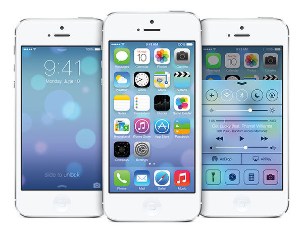
When Max Miedinger and Eduard Hoffmann developed Neue Haas Grotesk (eventually renamed Helvetica) in 1957, I’m sure they never imagined that a version of their typeface would be used on a mobile, handheld computer operating system.
And that the use of Helvetica would spark a worldwide bickering match over whether it was the right typeface for the task. And that the bickering match would take place across a global communications network using a microblogging service.
I’m not sure what I think of the iOS redesign. And I won’t form any opinions until it is installed on my iPhone and iPad. I imagine I’ll find design elements that I like and a few things I don’t like.
But I started to think about the fact that Helvetica, originally designed to be cast in metal and printed with letterpress, is in use today on a device that would have seemed like pure science fiction when the typeface was designed. Imagine for a second what Miedinger and Hoffmann would think?
Type has the ability to outlive its creators and be adapted for purposes far outside the original intent of the design. (The version that Apple is using - Helvetica Neue - was developed in 1983 to improve rendering on new devices.) In 50 years, are we going to be arguing about the proper use of Gotham? Or Neutraface? Or Proxima Nova? Or will we still be arguing about Helvetica?
In the garden.

Me.

My super reader

I had to work today, so Team Wertz had a picnic on the Horseshoe.

Spillway

Edventure

Lunch break at #uofsc

Ryan’s new favorite toy is one his sister’s favorite stuffed animals. Uh oh.

Smokestack

A client had this old “Daily 7” poster today. I don’t remember butter as a food group…

Rose Garden

Old guy

Parking spot of the devil. I’m glad I don’t have to park in spot “666.”

McKissick
