Date night.

Date night.
All three of my skaters.

When did we stop calling them speed bumps?

Two skaters.

Lunch with Lizzy. #dayoff

Post run #dayoff

Coffee

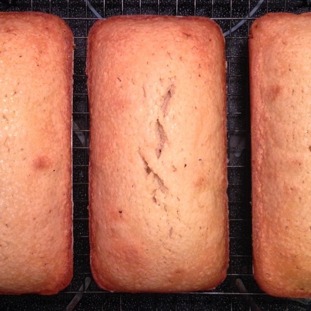
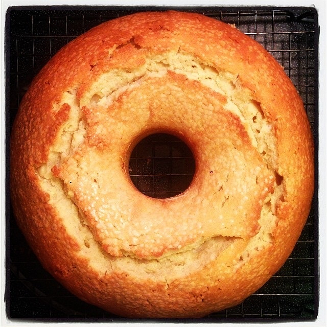
Operation #cake. Now in shareable loaf sizes.
Glasses

Glass
Stairs
Pull

This post was originally posted on June 4, 2014 on Sketchbook B. It’s reposted here as part of a project to move some of my favorite writing to my new site.
NOTE: While this page may have useful insights, be aware that it was published more than 10 years ago and may not be relevant for current software versions.
InDesign has a built-in ruler – the Measurement tool that hides behind the Eyedropper. You can use it in a couple of ways.
Select the Measurement tool and draw a line to measure something. The Info palette should open. Your measurement results will appear in the Info palette.
Below, measuring the left side of the magenta box, you can see the length (D1) and the angle. Also note that the width and height of the shape, the coordinates and the colors are also shown in the Info palette. And once you’ve drawn a measurement line, you can move it around to compare to other shapes.
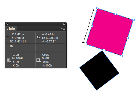
Distance and angle is easy to find.
But that’s not all. You may need to measure the angle between two lines. If I want to measure the angle between the pink and black boxes, InDesign has a hidden “protractor” measurement mode. Draw your first line. Then, holding down the option key, draw a second line that starts at the endpoint of the first line. Your cursor should change into a protractor that looks suspiciously like a compass. When you draw both lines, your measurements for the first line (D1), second line (D2) and the angle between them is shown.
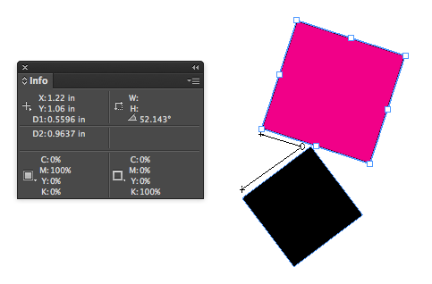
Protractor measurement mode in action.
Oddly, this ruler is more capable than the one in Illustrator where I would use it more often. The Illustrator measurement tool lacks a protractor mode. Seems like it would be an easy addition for them. (And if Adobe really wanted to improve the ruler in their apps, they should take some tips from the type design app, Glyphs, which has an amazingly functional measurement tool.)
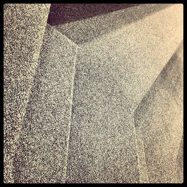
Steps, carpeted.
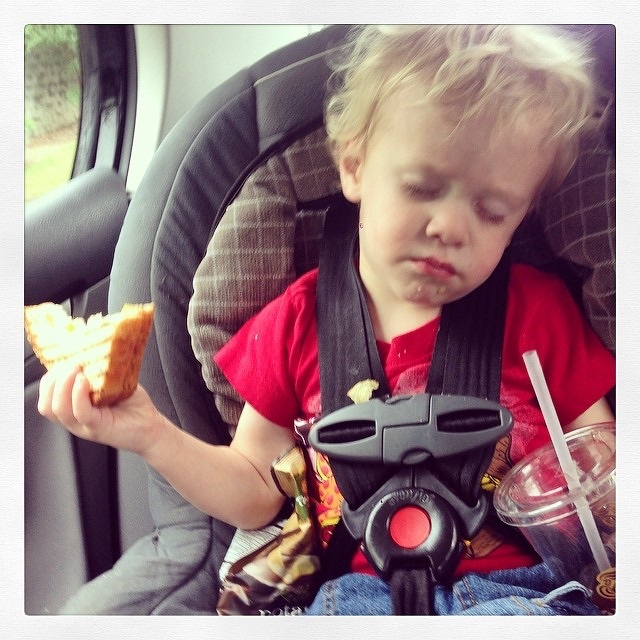
Somebody fell asleep eating his lunch.
Video game out of order.

#cake
War Memorial. #uofsc #peace

This post was originally posted on May 25, 2014 on Sketchbook B. It’s reposted here as part of a project to move some of my favorite writing to my new site.
As a kid, I loved going to the Chicago Auto Show every year. All of the car manufacturers in the world would show up with their current models. Celebrities signing autographs. And while it was cool to see all of that, the concept cars always stole the show.
Concept cars are prototypes that allow designers to experiment and play. They are typically half-car and half-work-of-art. Some are amazingly futuristic and others are relatively straightforward. But they all test concepts that may indicate a future design direction for that brand. And then, they add at least a few ridiculously impractical features that will never make it into production.
Mini released a concept car this week, the Mini Superleggera Vision. It’s a pure concept car – an electric sports car with a distinctly British roadster feel. It’s an elegant and clear design evolution of the Mini brand.
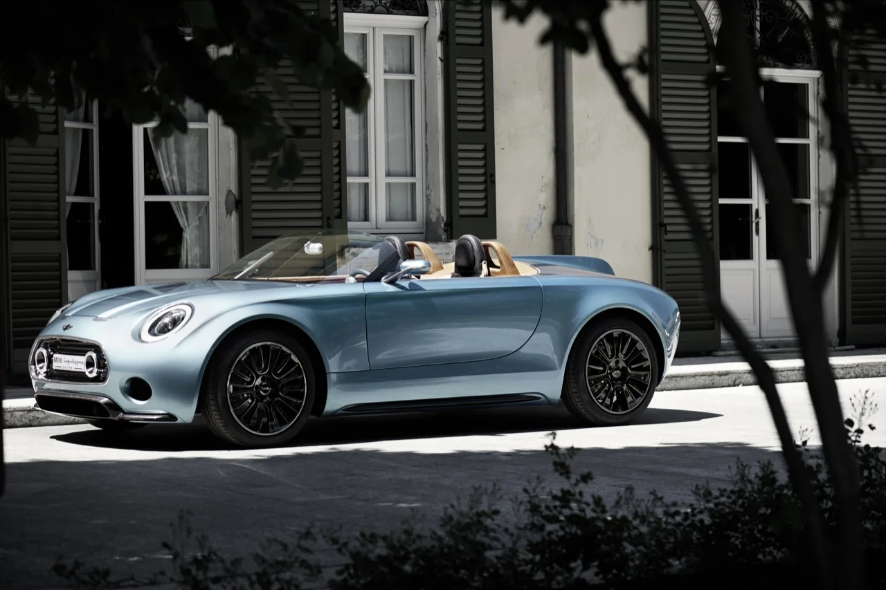
The Mini Superleggera concept car.
But it is clearly a concept car with lots of impractical features. The chassis and aluminum skin are produced in a way that could never be mass produced. It’s got a driver/passenger selfie camera. No door handles. Some awesome Union Jack tail lights and a rear fin.

Union Jack tail lights! And a rear fin!
And it’s beautiful. I absolutely love it. Even the fin.
That said, it’s always interesting to see where these design experiments land. Based on feedback from car show audiences, media and the web, the companies figure out what resonates with potential buyers. It then can attempt to simplify and refine those concepts into another concept car or a production model.
Or it may simply be a one-off experiment that goes no where, even if people love the concept. (For example, check out the Mini Rocketman. People are still clamoring to get that car produced.)
You can see the whole gallery of Mini Superleggera Vision images over at Autoblog or get lots of details at Motoring File, a Mini fan blog.
Juice.