I was recently listening to The Rest is History’s series on national anthems. I knew that the Star Spangled Banner was inspired by the War of 1812, but what I did not know was that it wasn’t adopted as the National Anthem until 1931!
In fact, many of our national symbols are no where near as old as we think they are. Lots of Americans probably think that the symbols were created alongside the Constitution, but that’s not the case. Like any brand, the marks and symbols that represent it evolve over time. I also don’t think it’s a coincidence that many of them were codified after the rise of Communism and in the Cold War that followed World War II.
To celebrate the 250th anniversary of the United States, I’ve pulled together a list of our national symbols, and the date that the current version was adopted:
The Great Seal of the United States (1885). The original seal was adopted in 1782, but was refined in 1885. The current version remains faithful to the 1885 version.
National Anthem (1931). The anthem was written in 1814 after the British siege of Ft. McHenry, but it would be over 100 years before it officially became the U.S. National Anthem.
Current version of the Pledge of Allegiance (1954). The original version of the pledge was written in 1892, but Congress didn’t recognize it officially until 1942. Then 12 years later, they added the phrase “under God,” which is the version that is still in use today.
In God We Trust (1956). The national motto of the United States was adopted in 1956, replacing E Pluribus Unum (Out of many, one). It previously had been used on coins starting in 1864.
Current version of the US Flag with 50 stars (1960). The basic formula for the flag was set in 1777, but it’s changed over time as the US has grown and stars were added. The current version was adopted when Hawaii was added to the union.1
Bald Eagle (2024). The bald eagle has been part of the US identity since 1782 when it was included as part of the seal design, but the US didn’t have an official “national bird” until a couple of years ago. Joe Biden signed it into law in 2024.
While these symbols feel like they’ve always been here, they really aren’t that old. When my grandparents were born, there was no official national anthem. My parents were born when the U.S. had a 48-star flag. And when I started kindergarten, the version of the Pledge of Allegiance that we recited was just over 20 years old. This all serves as a nice little reminder that symbols change and evolve over time as our society changes.
Bob Wertz is a type designer, Ph.D. student and researcher living in Columbia, South Carolina. He’s been blogging since 2008.
There is a table on the Flag of the United States Wikipedia page with all of the different official flag configurations over the last 250 years. Many of the flags only lasted a year. And who thought an inverted pentagram star pattern was a good idea? ↩︎
Being a type designer can be weird. You create your design. Share it with the world. And then someday, unexpectedly, it shows up again.
I designed SbB Powertrain over a decade ago and I was very surprised to see it pop up in a clip of Gamecock Women’s Basketball player Ali Tournebize dunking in the 2024 Eurobasket U18 bronze medal game. Turns out that FIBA uses Powertrain as part of the identity for their Eurobasket tournament. It was used heavily for the 2024 and it looks like they are still using it in some places. Here are a couple of examples that I stumbled across.
If you look closely to the videos, Powertrain is used for the 2024 at center court and on some of the courtside screens. So much fun to see my type design in use, especially in a global context. Learn more about SbB Powertrain and my other fonts at sbbfonts.com.
Bob Wertz is a type designer, Ph.D. student and researcher living in Columbia, South Carolina. He’s been blogging since 2008.
Apple seems to be one of the most tightly managed brands in the world, but they actually use their logo much more whimsically than any other big brands. I’ve written in the past about logo usagethat runs against typical brand management best practices. On the eve of their 50th anniversary, I’ve come across two more examples. I wanted to share them as a way to continue to document Apple’s approach to visual identity:
The 50th Anniversary “Logo”
Apple has artwork that essentially serves as an alternate logo for their anniversary. It’s a stylized treatment of their logo (below), which includes a rainbow of colors that harkens back to their old six color rainbow logo.
Both examples take the Apple logo shape and use it as a structure for artwork. You typically don’t see large companies allowing or promoting this kind of variability with their logo. And you rarely see an old logo pop up, even during an anniversary. The artwork feels true to the Apple brand, but runs counter to what other brands do. In brand management, rigid consistency is king. As designers, it’s worth noting that Apple of all companies allows such flexibility within their visual identity guidelines, and maybe we can learn something from how they use their logo and brand creatively.
Bob Wertz is a type designer, Ph.D. student and researcher living in Columbia, South Carolina. He’s been blogging since 2008.
I recently created a couple of new fonts over on Fontstruct: SbB Crunch’d and SbB Papaya 26.
SbB Crunch’d
SbB Crunch’d is a little random. Normally when I start working on a type design, I have an idea of how it will be used. In this case, I started with the shape of the “scalloped edges” and built out the font from there. I like how it turned out, even if I have no idea how I’d use it in a layout.
SbB Papaya 26
Last year, I built a font based on the numerals on McLaren’s F1 livery. The new SbB Papaya 26 updates the font to align with the look of the 2026 preseason McLaren social media graphics. Compared to my original interpretation, the 2026 font is a little more conservative and more readable.
Today, I saw another couple of variations to add to my list from the Apple Japan web site as part of their New Year’s Celebration:
For a company known for their branding, I think it’s fascinating to see all of these variations from Apple. Especially since it runs counter to what most brands do.
Bob Wertz is a type designer, Ph.D. student and researcher living in Columbia, South Carolina. He’s been blogging since 2008 and an Apple user since 1994.
Interesting that Microsoft released some process images on Instagram to explain the thinking behind their new icons. They are correctly treating this icon refresh as a type of logo rollout and people who care about the icons will appreciate the glimpse into the redesign process.
It’s always funny to me what pop culture symbols acquire added cultural meaning.
My son is a big fan of the manga series, One Piece. I haven’t watched much of it, but I know the basics… renegade pirates fighting against an authorization government in search of the ultimate treasure. It’s amazing to me that the One Piece Jolly Roger, with a grinning skull and a straw hat, has become the symbol of protests across the globe.
In a similar way, the logo for the Marvel vigilante and anti-hero Punisher has become a symbol controversially used by military, law enforcement and fascist groups. I often see it on pickup trucks, sometimes combined with an American Flag pattern. I doubt any of these people read the comics, but are instead attracted to concept of excessive violence that the symbol projects.
My Ph.D. research is focused on consumer response to logos and visual identity, so as you can imagine, I’ve talked about Cracker Barrel1 a lot over the last few weeks. Everyone has an opinion and is eager to share it. I held off writing this because the social media chatter was just chaotic, but now that things have calmed down, I wanted to share some quick thoughts based on my research.
People care about logos.
In my forthcoming study on logo attitudes with a sample of 1,000 American consumers2, over 60% of respondents agreed that if their favorite brand changed their logo, they’d want to know why. Cracker Barrel did a really poor job of explaining why they were changing their logo. It seemed to consumers like change for the sake of change and when challenged by consumers (plus a really strange political sideshow), they had no story to tell. And with no official rationale, people concocted their own narratives.
Context matters
When I saw the news of the Cracker Barrel rebranding, I only saw a picture of the logo on a white background. When news outlets ran their stories, the only picture they used was of the front of a Cracker Barrel with the old logo. After Cracker Barrel had announced they were going back to the old mark, I saw examples of the new logo in action, and you know what, it looks nice. I can see what they were going for.
My study published in the Journal of Product & Brand Management found that viewers reacted more favorably when the logo was shown with additional context — examples of the new logo in use, behind-the-scenes sketches, and implementation details.
Cracker Barrel provided none of these images at launch. All consumers had to go on was the logo on a white square. And in general, people dislike new logos without context.
Armchair quarterbacks are everywhere
Everyone seemed to have a solution to Cracker Barrel’s problem. I lost track of how many hot takes I saw on social media. Young designers quickly providing their versions like it was a design school exercise. Branding consultants rushing to talk about how Cracker Barrel had abandoned their loyal fans. And most of these people weren’t fans of Cracker Barrel, they just wanted to capitalize on the attention.
This is the reality of design criticism these days. It comes from everywhere. I’ve been digging into the literature on deprofessionalization and the democratization of design for my dissertation and it’s clear that some of this criticism is rooted in a skeptical view of the design profession.
This level of criticism is going to accompany any major rebranding and companies like Cracker Barrel need to expect and prepare for the inevitable criticism.
The launch is critical
Cracker Barrel seemed surprised and unprepared for obvious criticism. With no story and no context, they weren’t able to respond to critics effectively. This has nothing to do with whether the logo was “good” or “bad.” Instead, it shows how critically important the launch is for any rebranding. People will always have opinions. Logos are the tangible representation of a brand’s relationship with their consumers.
A good launch can go a long way to softening criticism, but a bad launch might completely sidetrack your branding strategy.
Bob Wertz is a type designer, Ph.D. student and researcher living in Columbia, South Carolina. He’s been blogging since 2008.
And to a lesser degree, the MSNBC -> MSNOW rebranding. ↩︎
The study was presented at AEJMC Detroit in 2022 and has been peer-reviewed and accepted for publication in Visual Communication Quarterly. Sadly, it’s not published yet. Reach out if you want details about the study. ↩︎
My PhD research is on how people respond to logos. One factor for a successful rollout appears to be context. How will the logo be used? What’s the story behind the change? More context = better response. Neither Cracker Barrel nor MSNBC gave any real context. Here’s my published study on context.
I missed that Lego released a refined visual identity a couple of weeks ago that includes a new typeface, Lego Typewell, based on brick proportions. I really like it. The best detail I’ve found on the typeface is on this review from BP&O.
Honda showed off two new EV concepts under the new Honda Zero brand at CES — the Saloon and the Space-Hub. Most of the coverage is focused on the futuristic looks of the concept cars. As someone who grew up going to the Chicago Auto Show and seeing the cars of the future, I’d temper any expectations that the final designs will be this radical.
The current Honda “H mark” has a long history, dating back to 1981. In launching the next-generation EVs, Honda designed a new H mark, to express the company’s determination to undergo a historic transformation as well as the ability to constantly pursue new challenges and advancements. This new design expression, which symbolizes two outstretched hands, represents Honda’s commitment to expand the possibilities of mobility and continue to meet the needs of its customers. The new H mark will be applied on future Honda EV models, including the Honda 0 Series.
The logo simplifies Honda’s current H, removing the outer bounding box and reshaping the mark. It does feel like a more modern mark and seems appropriate on the futuristic vehicles. As logo introductions go, this might be the slowest roll out in the history of visual branding since the first Honda Zero cars won’t be released until 2026. And since the logo is intended for just electric vehicles, that means that Honda is choosing to fragment their brand for a period of time.
It’s worth noting that the Honda Zero brand had its own mark at introduction. I’d be surprised if this is used in marketing when the models debut in 2026. I’m not sure what’s going on here, since the elements don’t really match anything.
Electric car branding is fascinating to me. VW and BMW add a letter or letters to the model number. Hyundai is using the Ioniq brand name for most, but not all of their EVs. Many vendors are rolling out EVs alongside their internal combustion engine lineup. VW is resurrecting the old Scout brand for a line of electric SUVs.1 But to my knowledge, Honda is the first company to create a version of their corporate logo especially for electric vehicles. As the transition to electric vehicles continues, it will be interesting to see how EV branding continues to shift and evolve.
Bob Wertz is a creative director, type designer, Ph.D. student and researcher living in Columbia, South Carolina.
Scout SUVs will be manufactured just north of my hometown – Columbia, South Carolina. ↩︎
Mr. Daunt has demonstrated that consistency doesn’t rank very high on his priority list. New York City has nine Barnes & Noble stores featuring four different logos above the front doors.
I’ve reached a big milestone in my academic career: my first published research paper.
Brand new: How visual context shapes initial response to logos and corporate visual identity systems has bene published in the Journal of Product and Brand Management. It’s available now online and will eventually be assigned to an issue. If you have access to journal articles through a university or public library, you can access the article.
If you can’t access the article, here’s the abstract:
When a new logo is released, it does not have an established meaning in the mind of the viewer. As logos have become more highly scrutinized by consumers and critics, it has become more important to understand viewers’ initial response to logos. While other studies have researched the impact of aesthetic choices on viewer reaction to logos, this study aims to understand the effect of the surrounding visual identity system when a new logo is introduced. This study combines a content analysis of 335 posts on the logo review website Brand New with the voting data from their polls to understand how visual context correlates with a viewer’s initial response. Increased amounts of visual context correlate to an improved response from viewers. Different types of context that can be presented – from logo variations and environmental examples to videos and animation – have varied effects.
Basically, my study finds that people respond better to new logos when they are shown more examples of the logo in use. This is one of those things that seems intuitive to designers, but hasn’t been researched or quantified. Because I’m a designer, most people are surprised that my research includes a fair amount of statistical analysis, but I’ve really taken to the quantitive side of things. This paper has been in review for over a year, working it’s way through the revision process.
It’s fitting that this is my first paper to be published. When I started grad school, I didn’t really know anything about scholarly research. In the spring of 2019 — my second semester as a grad student — I took a content analysis class with Carol Pardun. I was the only master’s level student in a class full of Ph.D. students. I felt so overwhelmed by the pressure to come up with an idea and learn methods and theories on the fly. The paper I wrote for that class was the first version of this paper. It was accepted to the AEJMC Conference that August and I presented in Toronto — my first academic conference presentation. I loved the concept for the study and got great feedback, but I was still learning and felt like I could improve it. I scrapped everything, started over with a larger sample and better methodology. After Dr. Pardun retired, I started working with Tara Mortensen on the next evolution of this work, which turned into my thesis. And that thesis eventually became this paper.
Thanks go out to so many people who’ve help me along the way:
Dr. Pardun for supporting my bizarre little project, especially in the early days when the project was taking shape.
All of the Ph.D. students in that content analysis class who helped me figure things out and took me under their wing.
Dr. Mortensen for taking over as my thesis director and helping guide me through the publication process.
Kevin Hull and Van Kornegay for serving on my committee and providing helpful feedback.
Robert McKeever and Jacob Long for giving me an appropriate foundation for analyzing data.
Editor Cleopatra Veloutsou who guided me through the process with the Journal of Product and Brand Management.
All of the reviewers and discussants at the conference level for AEJMC and in the peer review process whose feedback legitimately made this paper better.
And of course, this couldn’t have happened without the rest of Team Wertz. Liz and the kids have been so supportive and patient while I have embarked on this grad school journey. (And occasionally, Norah and Jill even joined me at Starbucks when I had to write.) I simply could not have done it without them.
I’ve still got a few years left until I finish my classwork and dissertation, but I’m exceptionally proud of this milestone and excited to see where my research goes next.
Bob Wertz is a creative director, type designer, Ph.D. student and researcher living in Columbia, South Carolina.
This post was originally posted on April 22, 2021 on Sketchbook B. It’s reposted here as part of a project to move some of my favorite writing to my new site.
Apple has one of the most recognizable logos in the world. Which isn’t surprising because they are the largest company in the world. I’ve been watching a couple of trends over the last few months about how Apple uses their logos and this week, those trends have become even more apparent. For brand managers and designers, I think there is something interesting going on and it’s worth digging into the mystery.
The logo is “missing.”
Apple isn’t afraid to use their logos. All of their computers have prominent logos. They include logo stickers in all of their boxes. Apple’s logo is everywhere. But on their new iMac, which was released this week, Apple’s logo is on the back, but not on the front. The last few generations of iMac’s have featured a prominent logo on the back and a second logo on the “chin,” facing the user. The new iMac has no user facing logo.1
The new iMac doesn’t have a logo on the front, but still sports a prominent mark on the back.
But the iMac isn’t the only recent Apple product with an interesting logo story. I first noticed Apple’s changing logo use with the introduction of the AirPod Max, which has no Apple logos at all on the product. There is plenty of room for a logo on the side of the headphones, but there is none to be found.
A large space for a logo… but there isn’t one.
I guessed the AirPods Max was the only Apple product without a logo, but I was wrong. For some reason I assumed that my AirPods case had the Apple logo on it, but guess what? It doesn’t. I checked Apple’s website and the AirPods Pro don’t have a logo either. (Although according to Apple’s website and an iFixit teardown, the chip inside the AirPods Pro has a tiny logo printed on it.) My Apple Watch has a tiny Apple logo on the bottom on it, but it’s not visible when it’s being worn. Apple doesn’t include logos on any of their wearable products.2
A promotional image from Apple of Apple Fitness+ trainers. I count five Nike logos.
But that’s not all. I’ve been trying out Apple Fitness+ and there are tons of visible logos. Nike logos. All of the instructors seem to be wearing Nike gear. There are no Apple logos. No special Apple Fitness+ shirts. No little Apple “watermark” in the corner of the screen. An Apple logo isn’t hidden somewhere on the set.
AirPod competitors, with prominent logos on the case or the earbud itself.
I checked Apple’s competitors. Amazon, Samsung and Microsoft all include their logo on the charging case for their AirPod competitors. Sony and Google even managed to get their logo on the earbud itself. None of the competing smartwatches that I looked at had logos, although Samsung etched “Galaxy Watch” into the crown for some reason.
In the fitness space, Peloton employees sport logo apparel while they lead classes. And the instructors on Nike’s fitness apps obviously sport Nike gear.
So what’s going on? I’m not sure.
My first reaction is it’s just an issue of taste. Placing logos all over a product is tacky — especially for wearables. And Apple is showing their superior taste by acknowledging that consumers don’t always want to be sporting company logos. Maybe? But lots of premium and luxury brands include logos on their products. And Apple isn’t exactly shy about using their logo.
It’s not about the logo size. Even the Apple Pencil has a logo. And as I mentioned, the chips inside the AirPods have logos printed on them. (The chips… inside the case… that the consumer never sees…)
The absence of a logo is even stranger when you realize the original intent of a trademarked logo: to clearly identify the manufacturer. With a company like Apple, whose designs are ripped off more than about any other tech company, their logo is the part of the design that absolutely can’t be legally copied.
My best guess is that Apple thinks that their product designs are unique enough, that they don’t even need a logo. People will know AirPods are an Apple product when they see them. The Apple Fitness+ workouts feel like Apple even if their logo isn’t present. I don’t think any other company can make a desktop computer that looks like the new iMac. Apple’s presence is understood because of the overall production quality and design. A logo isn’t necessary.
The logo is “incognito.”
Typical corporate logo standards are incredibly strict. Apple doesn’t publish their internal brand guidelines, but it’s clear they do allow some more playful uses of their mark. For example, they often use illustrated versions of their logo to promote their media events, like they did for this week’s Spring Forward event. Allowing logo variations in large corporate identity systems isn’t uncommon, but those variations are typically used for structural identifications between organizational divisions or product lines.
But Apple is using logo variants that align with their values.
Apple’s environmental logo version, on Earth Day.
In 2014, Apple started using a logo with a green leaf in their retail stores on Earth Day. This logo seems to be used mostly in Apple retail, but showed up this week on the Apple home page for Earth Day 2021 and their updated environmental statement.
Apple’s Privacy logo version is probably the most used of their variations.
And in this week’s presentation, they showed their privacy Apple variation, which is often animated and turns the leaf at the top of their logo into a lock. It’s used in ads, videos and sites when Apple is talking about their commitment to privacy. What’s smart about this approach is that Apple is using their logo to not just communicate their identity, but also their corporate values.
(It’s worth noting that there are a couple of other logo variants as well: a gift that is used during the holidays and a version for their Marina Bay Sands retail store in Singapore. And I’m sure there are others as well.)
What lessons can we take from Apple’s approach to logo management?
Apple’s visual branding is clearly effective. Repetition and consistency are the foundation of contemporary brand management, but Apple has decided to not use their logo in some places and change it in others. This ongoing shift in logo usage isn’t accidental or ill-considered. A couple of lessons to think about:
Everything doesn’t need a logo. In the 1990s, branding meant putting the logo on everything, but is it really necessary? (It isn’t.) Logos are important, but they aren’t the only way you communicate your identity. Apple’s using their logos smartly, and not over using their marks.
Differentiation happens with the design around the logo. Apple’s products are identified by their look and feel. Yes, the logo is part of that, but Apple’s visual branding extends far beyond just their logo. Their brand is expressed as much through the surrounding elements — type, color, materials — as it is through their logo. Their visual differentiation extends far beyond just their logo and their identity is stronger for it.
Think about how a visual identity can reflect a company’s values. Most of the time, visual identity reflects an organization’s structure, but connecting your visual brand to your corporate values is potentially more powerful. Apple uses logo variations that support their beliefs, not their hierarchy.
We’ll never hear from their branding team and Apple doesn’t publicly share their logo and branding guidelines. We’ll just have to watch as they rollout ads, events and products. But it’s clear that Apple is diverging from the standard brand playbook here and I think we should pay attention to where they go next.
Bob Wertz is a creative director, type designer, Ph.D. student and researcher living in Columbia, South Carolina. He’s been blogging since 2008.
This post was originally posted on April 8, 2019 on Sketchbook B. It’s reposted here as part of a project to move some of my favorite writing to my new site.
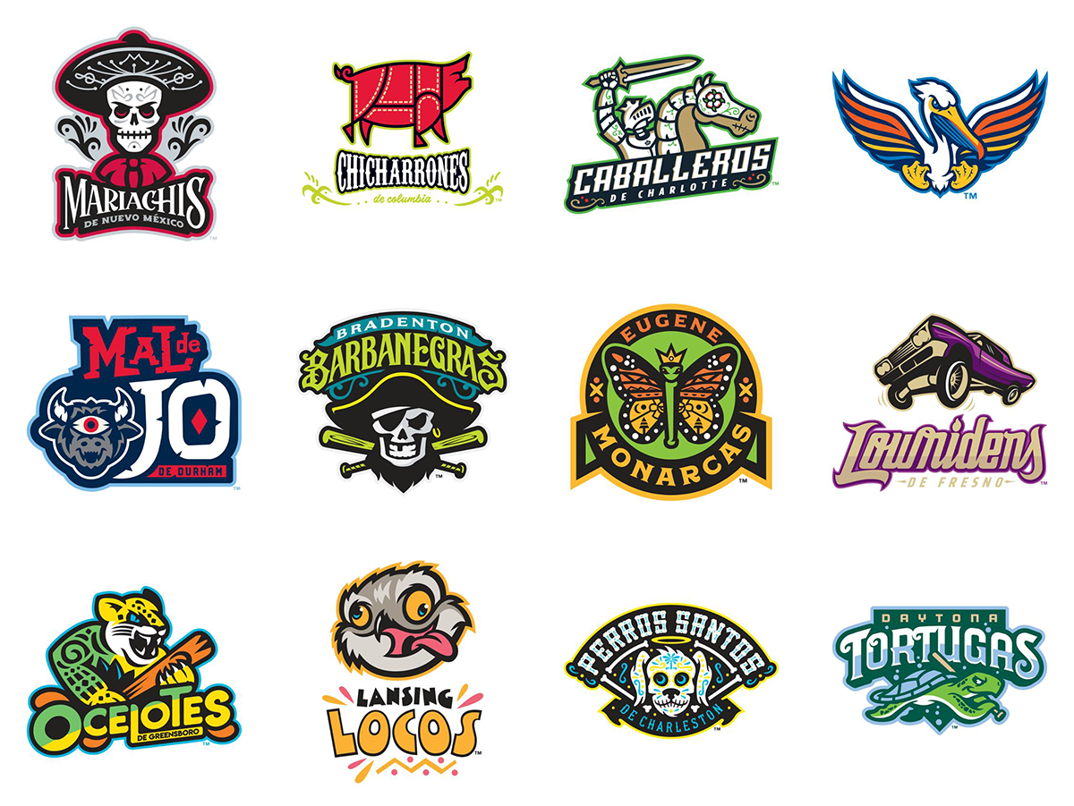
Minor league baseball having fun with logos.
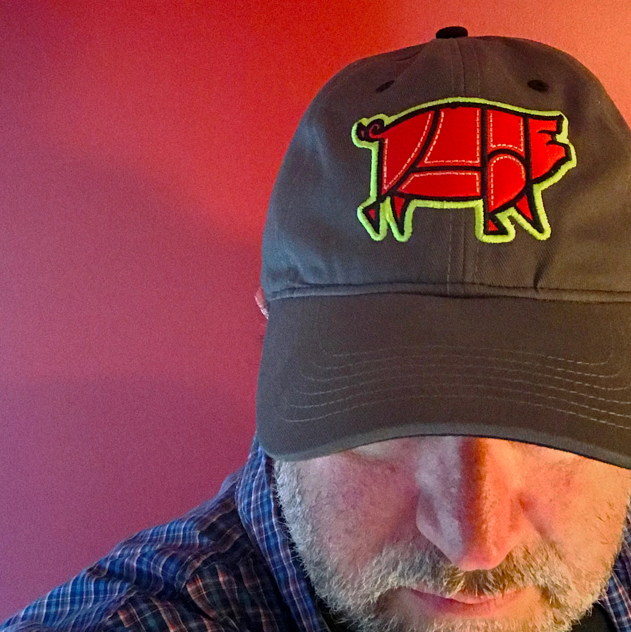
I’m a big fan of minor league baseball. Our home team, the Columbia Fireflies, play in a great park and we typically go to a few games each season. We took the whole family to a game this past weekend and had a blast. I stopped by the team store to see the new Chicharrones de Columbia branding for the Copa de la Diversión, a program where 72 minor league baseball teams rebrand themselves for a few games as a visual reflection of the hispanic culture that’s an important part of baseball today. You can take a look at all the rebrandings, but here are a few of my favorites:
Obviously, this is minor league baseball’s attempt to sell more merchandise. (They are always trying to sell more merchandise.) Minor league designers often have fun with logos and I love how playful these redesigns are. Some are better than others, but they look really great on hats and shirts and if you see a logo you like, you can order some merch online.
Bob Wertz writes about design, technology and pop culture at Sketchbook B. Bob is a Columbia, South Carolina-based designer, creative director, grad student, college instructor, husband and dad. He’s particularly obsessed with typography, the creative process and the tools we use to create. He recently finished a project to design a new shirt a week for an entire year.
This post was originally posted on April 5, 2017 on Sketchbook B. It’s reposted here as part of a project to move some of my favorite writing to my new site.
As a rule, I don’t normally critique work by other firms. I don’t know what they discovered in their research. And I didn’t work with their clients and deal with their constraints. I will say that like most designs, there are things I like and things I don’t like. But this blog post isn’t about the new Columbia logo.
Instead, it’s about how we rollout new identities.
It occurs to me that more than ever, the rollout of a logo is a critical part of it’s reception. New designs spread quickly across social media. Opinions form. Criticism starts immediately. And people start asking questions.
I first saw the logo on the article from the Free Times. And the main image was an ad, that used the new Brick C* as an element in the word “crafted.” Of course, it read “rafted.” Much of the early criticism I saw was centered around this ad… not the logo. There was confusion about how much was spent on the logo and research. Questions about why the work wasn’t done in Columbia. Every question about inspiration, cost, how the vendor was chosen could have been easily predicted and shared proactively on a web site at launch.
Would it have eliminated criticism? Absolutely not. There are people in any community who are going to hate anything you do and complain about any money you spend on design.** But being more strategic about the rollout might have helped rally some support, especially from designers and communications professionals.***
In today’s world, design firms need to start building extensive rollout planning into their budgets and plans. It’s not good enough to do the work for the client anymore — you have to help sell the final solution to stakeholders.
And clients need to accept that their audiences may be resistant to new identities and be prepared for strong — and likely critical — opinions. An extensive rollout plan is going to add to the time and cost, but is a critical part of your overall investment.
I don’t know when I’ll rollout a brand new identity again. But when I do, I will spend as much time planning the rollout as I do the fine tuning the design.
* USC’s athletic logo is the real block C. So I’m calling the new Columbia logo the brick C, since bricks are the inspiration for the mark. A local firm would have known that a prominent mark in town was already referred to as the block C.
** I saw some comments on social media asking why we couldn’t have a design contest like we did for the new flag. Sigh… it’s a slippery slope, y’all.
*** This week, the IABC chapter in town had a presentation on the new identity. I didn’t get to go, but from the reaction on Twitter, it seemed filled with insights and explanations for the approach. Imagine if the IABC presentation had been given the same day as the rollout. Or even the day before as a sneak preview…
Bob Wertz writes about design, technology and pop culture at Sketchbook B. Bob is a Columbia, South Carolina-based designer, creative director, college instructor, husband and dad. He’s particularly obsessed with typography, the creative process and the tools we use to create. In his spare time, he attempts to be diplomatic.
This post was originally posted on November 15, 2016 on Sketchbook B. It’s reposted here as part of a project to move some of my favorite writing to my new site.
4 steps to simplifying URLs
I was behind a truck in traffic yesterday with an URL boldly printed across the back. And since traffic was moving slowly, I got a nice long look at it:
Okay. I may have changed the address to protect the innocent. But it was a really long address. And it looked really awkward.
I see addresses like this all the time and I’m not sure why designers don’t instinctively take steps to make these addresses more readable and easier to remember. I’m guessing that designers are simply using the addresses that are provided to them by copywriters and clients, but it really is easy to clean up.
Step one, get rid of the protocol.
You really don’t need to put ““ at the beginning of a URL. It’s called the protocol identifier and if you type the address into a web browser without it, the browser will add it for you. So all it adds is clutter.
Most websites don’t need the “www” to take you to the proper address. Again, unnecessary clutter. If your web site does require the www for the URL to resolve properly, you have two options: leave the www. in the address; or contact the person who set it up and have them fix it.
reallylongwebaddress.com/home
Definitely better. But can we make it easier to read?
Step three, do you really need that specific page?
Sometimes, you need to direct someone to a specific page on a site — a landing page or specific bit of content. But if it’s just “/home” or “/index” you can usually drop it:
reallylongwebaddress.com
Just make sure the shortened address takes you to the desired location.
And finally, can you improve it with intercapping or some other design treatment?
Web addresses sometimes have hidden words. And that’s not always good. For example, a reader may not see “Really Long Web Address,” but may instead see “ Really Long We Bad Dress.” Same letters, but completely different. Sometimes, you can insert capital letters into the middle of the URL to help the viewer read the address as intended. Or use color and type weight to make the address read correctly. For example:
ReallyLongWebAddress.com
URLs are not typically case sensitive so the capitalization doesn’t alter the address in any way. It’s just easier to read.
The bottom line: Use the shortest URL possible that takes the viewer where you want them to go.
Bob Wertz is a creative director, type designer, Ph.D. student and researcher living in Columbia, South Carolina. His blogging journey started in 2008 with a Squarespace hosted blog.