Girls enjoying the deck at Liberty.

Girls enjoying the deck at Liberty.
Ryan discovers the train table.

Rutledge Chapel
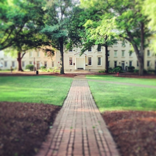
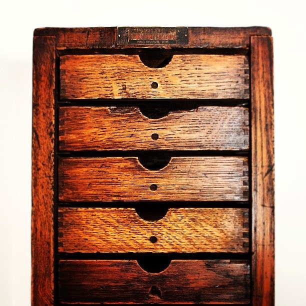
Small type case.
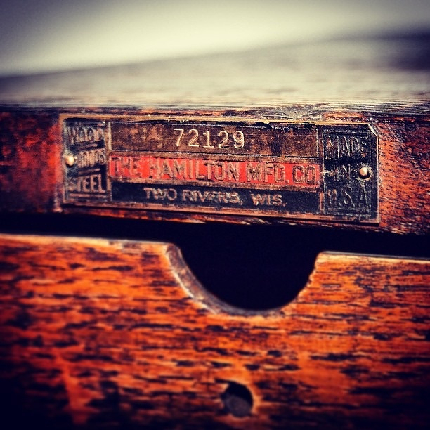
72129
This post was originally posted on June 23, 2013 on Sketchbook B. It’s reposted here as part of a project to move some of my favorite writing to my new site.
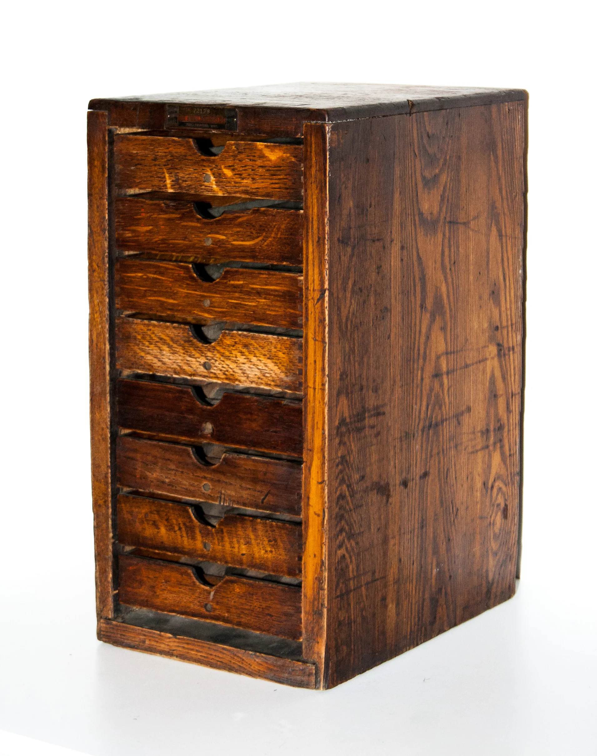
A small Hamilton type case
I’ve mentioned before that my dad is always on the lookout for type and printing antiques for me. Recently he found a small Hamilton type case. I’m familiar with large cabinets, but this case is much smaller. It’s about 17 inches high, 9 inches wide and 12 inches deep.
I did a quick google search and couldn’t find any other cases this size. I’m guessing this case was intended for a hobbyist. It would only fit a few small fonts of type. Hopefully I can find out some more about it…
UPDATE! My friend Nikki Villagomez happened to run into some folks from Hamilton at HOW and asked about the case. The last two digits of the serial number indicates that it was made in 1929. Also, it probably wasn’t intended for type and was instead made to hold metal spaces used in typesetting. But they hadn’t actually seen a case like this before so they were just speculating. If you know more about this amazing find, post in the comments below.
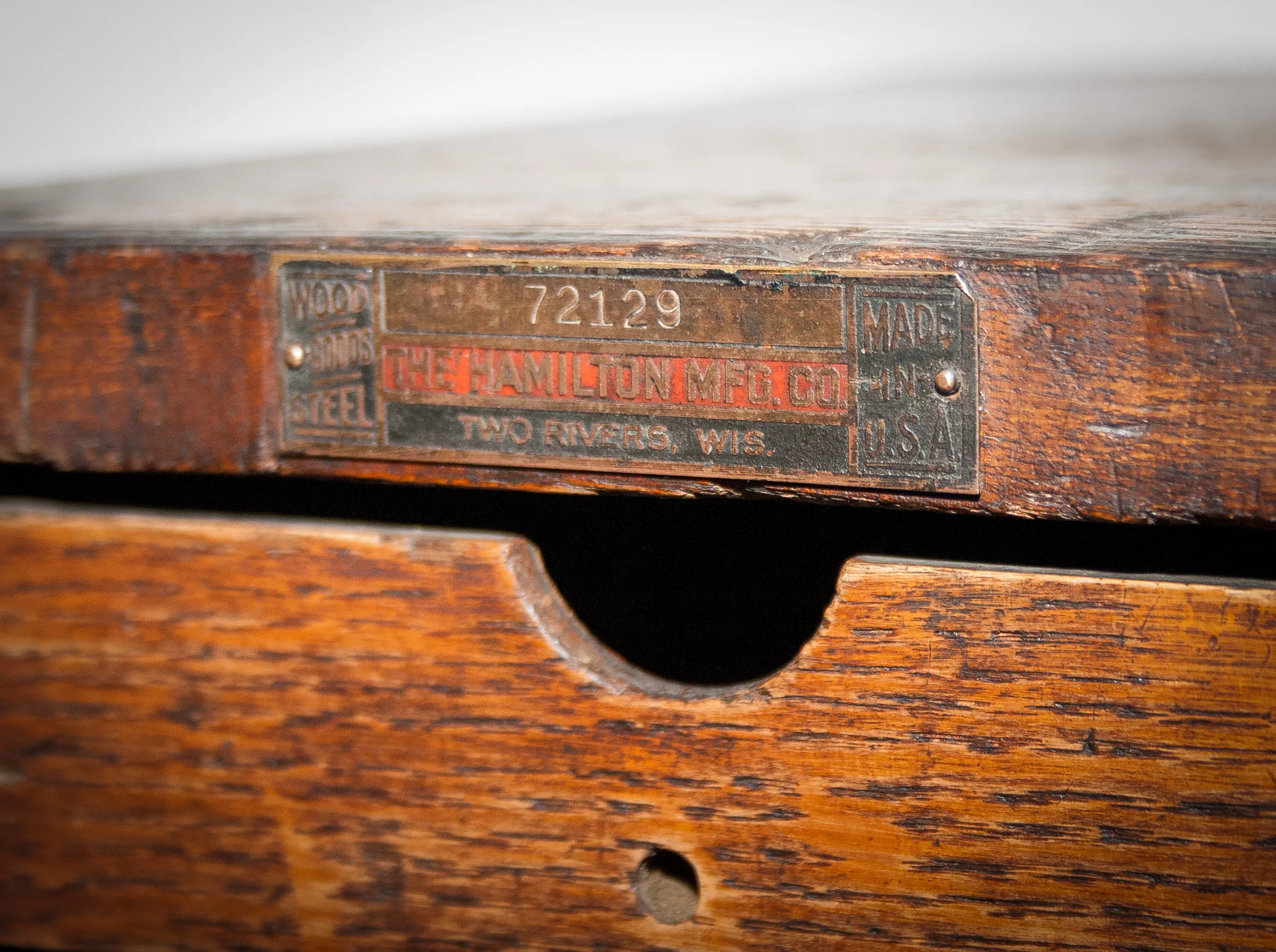
Made in the USA by Hamilton.
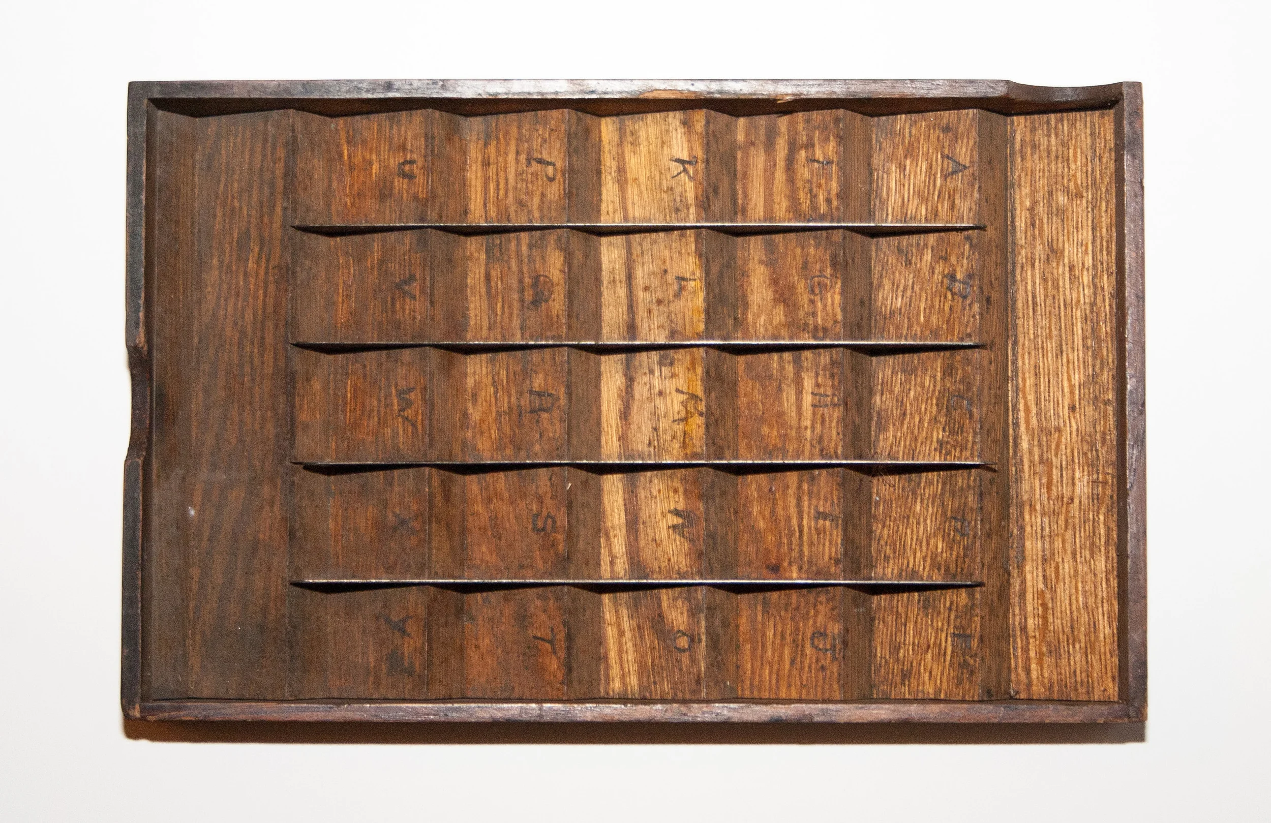
Each try has 25 divisions. Y and Z shared a spot.
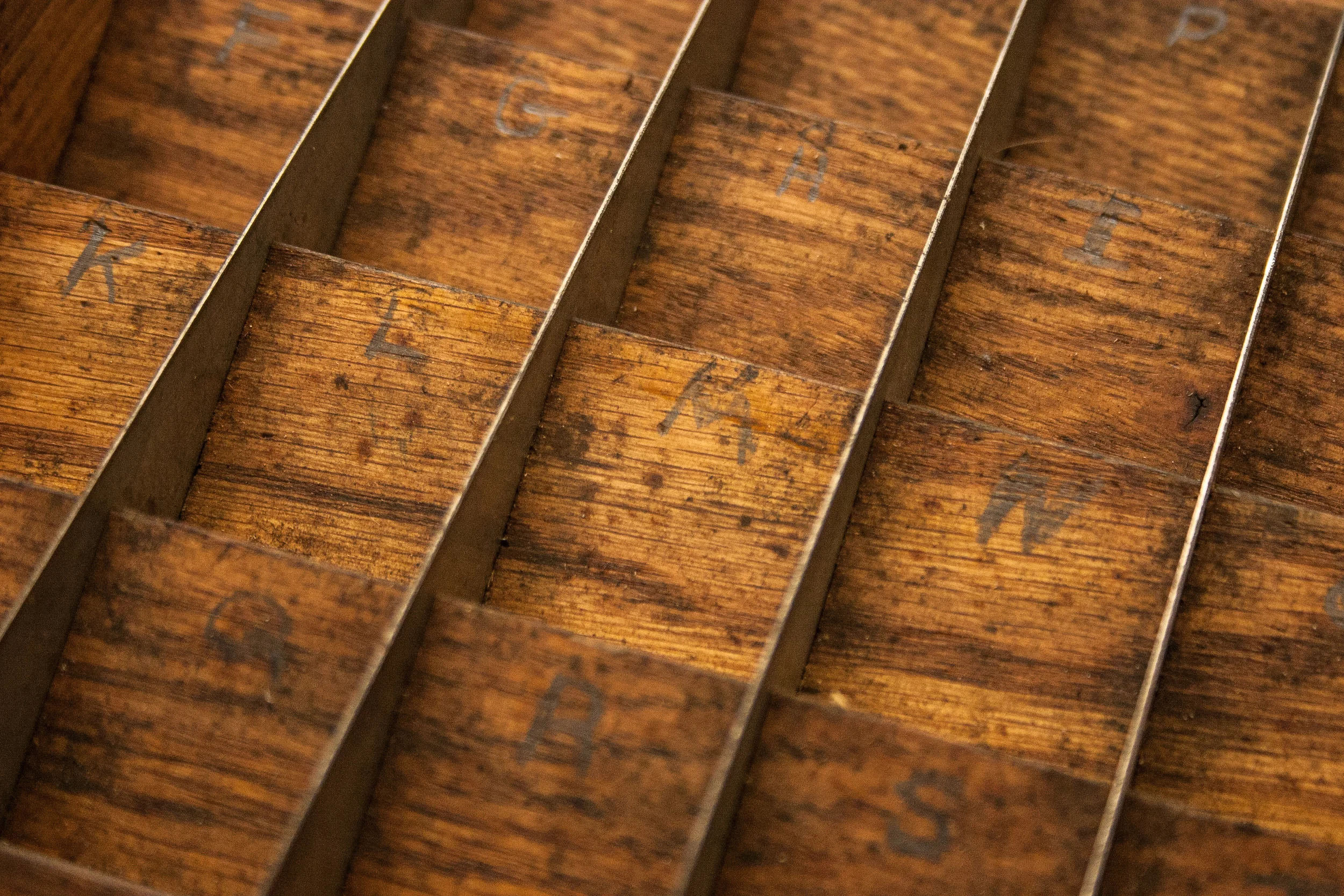
You can still see the pencil marks denoting where the individual letters should go.
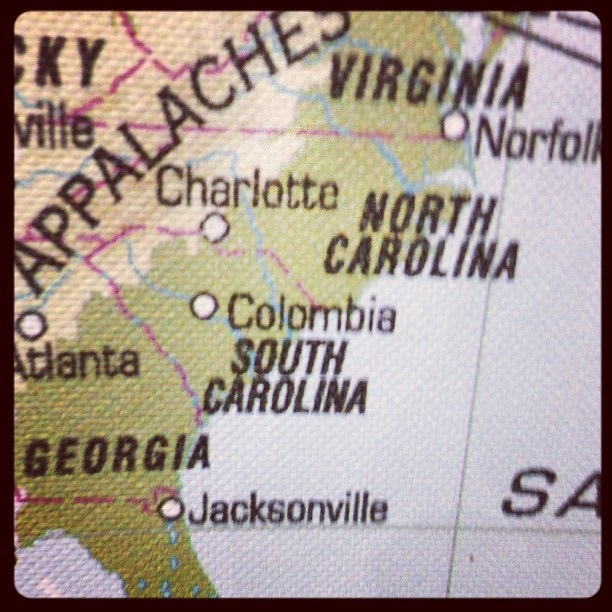
No respect. Columbia is misspelled on the world map canvas for sale at Ikea.
Brother and sisters hanging out. (I have no idea why J is wearing a Santa hat.)

Gibbes Green #uofsccarolinian
This hat is way too big for my head.

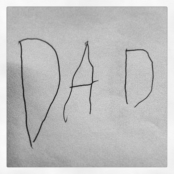
Love my card… Happy Father’s Day everybody.
More type from Soda City
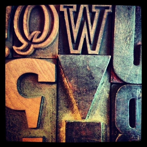
Unexpected find at the Soda City Market.
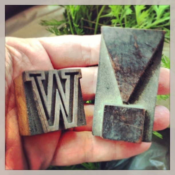
Blowfish game
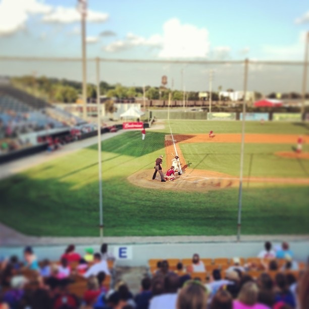
Ryan’s first baseball game.

This post was originally posted on June 11, 2013 on Sketchbook B. It’s reposted here as part of a project to move some of my favorite writing to my new site.
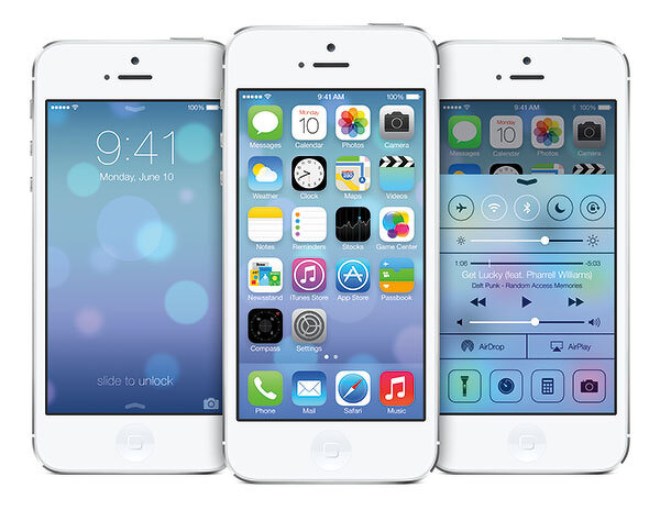
When Max Miedinger and Eduard Hoffmann developed Neue Haas Grotesk (eventually renamed Helvetica) in 1957, I’m sure they never imagined that a version of their typeface would be used on a mobile, handheld computer operating system.
And that the use of Helvetica would spark a worldwide bickering match over whether it was the right typeface for the task. And that the bickering match would take place across a global communications network using a microblogging service.
I’m not sure what I think of the iOS redesign. And I won’t form any opinions until it is installed on my iPhone and iPad. I imagine I’ll find design elements that I like and a few things I don’t like.
But I started to think about the fact that Helvetica, originally designed to be cast in metal and printed with letterpress, is in use today on a device that would have seemed like pure science fiction when the typeface was designed. Imagine for a second what Miedinger and Hoffmann would think?
Type has the ability to outlive its creators and be adapted for purposes far outside the original intent of the design. (The version that Apple is using - Helvetica Neue - was developed in 1983 to improve rendering on new devices.) In 50 years, are we going to be arguing about the proper use of Gotham? Or Neutraface? Or Proxima Nova? Or will we still be arguing about Helvetica?
In the garden.

Me.
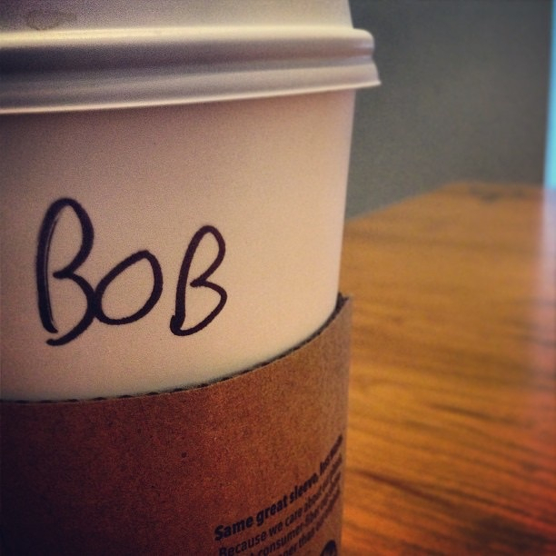
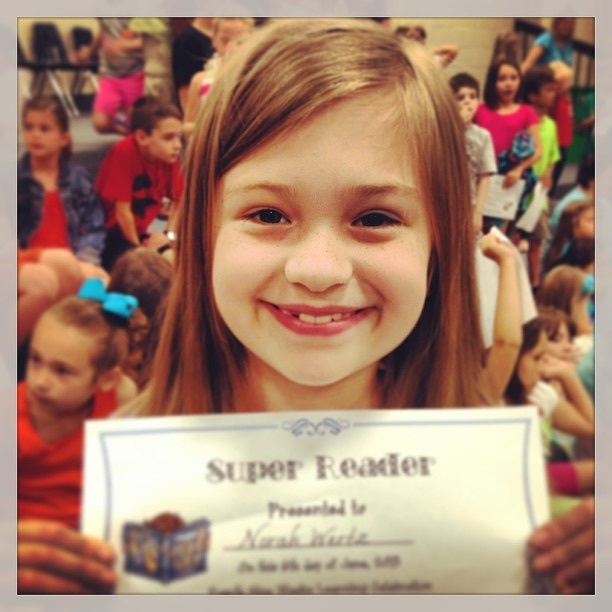
My super reader
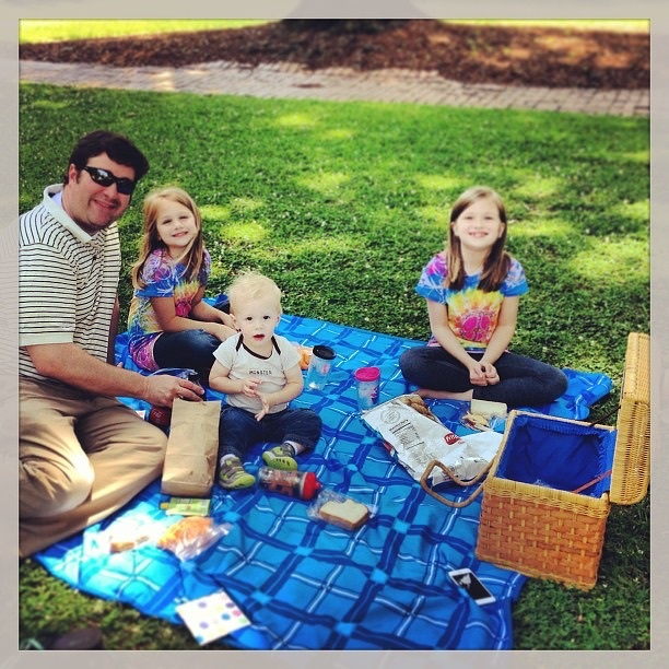
I had to work today, so Team Wertz had a picnic on the Horseshoe.