Hey @kerryrm! Found this in Columbia. Must be time to visit. #SodaCity

Hey @kerryrm! Found this in Columbia. Must be time to visit. #SodaCity
Wall restoration is looking good.

This post was originally posted on June 17, 2015 on Sketchbook B. It’s reposted here as part of a project to move some of my favorite writing to my new site.
NOTE: While this page may have useful insights, be aware that it was published more than 10 years ago and may not be relevant for current software versions.
Adobe has released the 2015 version of Creative Cloud. And that, of course, brings new versions of InDesign, Illustrator and Photoshop. Lots of blogs are covering the headline features, but I often find that the small improvements often impact my workflow the most. I’m still exploring the applications, but figured I’d start posting new features as I discover them.
The first one in InDesign that jumped out at me is paragraph shading. You can now apply shading to any paragraph… so no more drawing a color block behind a block of text you want to highlight.
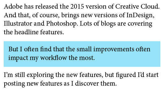
The blue box is created using paragraph shading. Here, I’ve ALSO inset the paragraph margins.
A couple of obvious advantages to this:
You can apply basic paragraph shading from the Control Palette or Paragraph Palette, but to gain full control, select “Paragraph Shading…” from the flyout menu on the Paragraph palette. The dialog box provides options to use a tint, set an offset and control how the shading is applied.
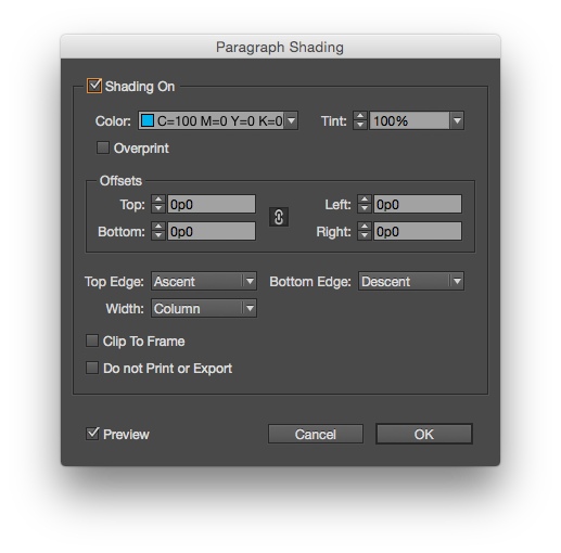
The full paragraph shading dialog box offers more options.
There is also an option for “Do not Print or Export*,” which is pretty cool if you want to highlight a passage that needs to be updated, but don’t want it to print. (I often set text that needs to be updated in 100% magenta. Now I have the option to shade it…)
* Not sure about the capitalization here, Adobe…
Book Depository. #UofSC

Davis #uofsc

My new lime green Lamy Safari arrived today. Thanks, Pen Chalet. #penaddict

Limited Edition

Early morning processing. #aigaretreat

Downtown Grand Rapids at night.

I tried to take a shot of Grand Rapids at night from my hotel room. Got freaky unintended selfie.

Lobby

Rapids.

Ford’s Tomb

Ford Presidential Museum #aigaretreat

Ford #aigaretreat

Grand Rapids.

War Memorial Day #myoffice

Five shadows

Chasing the kids. #bikes

This post was originally posted on May 14, 2015 on Sketchbook B. It’s reposted here as part of a project to move some of my favorite writing to my new site.
Why are so many people and organizations obsessed with acronyms? Especially acronyms that spell another word. From small nonprofits and churches to schools and large corporations, really bad acronyms are everywhere.
NASA’s Messenger Probe crashed into Mercury after a long and successful mission. And as I read CNN’s account of the mission, I was stunned by the fifth paragraph:
Messenger (an acronym for MErcury Surface, Space ENvironment, GEochemistry, and Ranging) was launched in 2004 and traveled more than 6½ years before it started circling Mercury on March 18, 2011.
Wait. So the Messenger probe is actually M.E.S.S.E.N.G.E.R.? Or is it Me.S.S.En.Ge.R.?
NASA designed a space probe to fly to a planet named after the messenger of the gods. And NASA feels like they need to construct some bogus acronym to justify the name “Messenger.”

Acronyms are fine if they really help people remember and understand the program or product name. But in most cases, the acronym simply becomes a name and slowly loses all connection to the meaning.
And the worse case scenario is that you are so obsessed with creating an acronym, that you select a poor name in the process. Avoid creating acronyms just to be clever or just to justify a name choice.
Your best bet is always to give products, organizations and programs strong, appropriate names.
–
Bob Wertz is a creative director, type designer, Ph.D. student and researcher living in Columbia, South Carolina. He’s been blogging since 2008.