This post was originally posted on March 24, 2018 on Sketchbook B. It’s reposted here as part of a project to move some of my favorite writing to my new site.
No one ever wants to eat there…
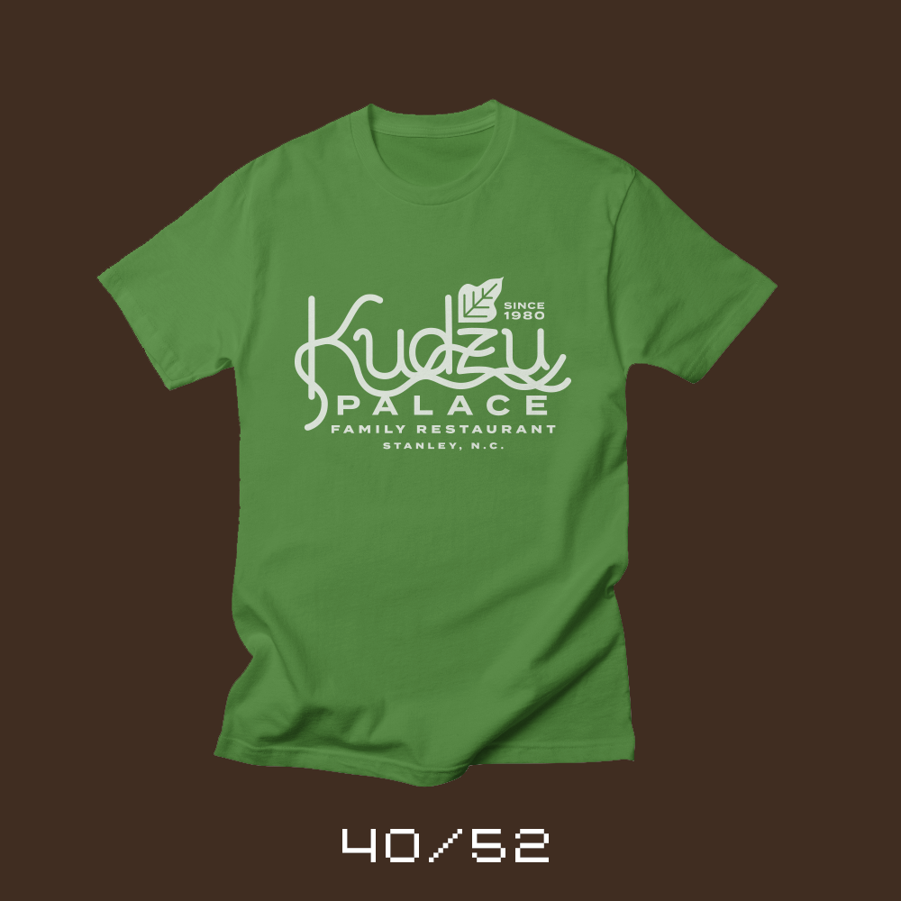
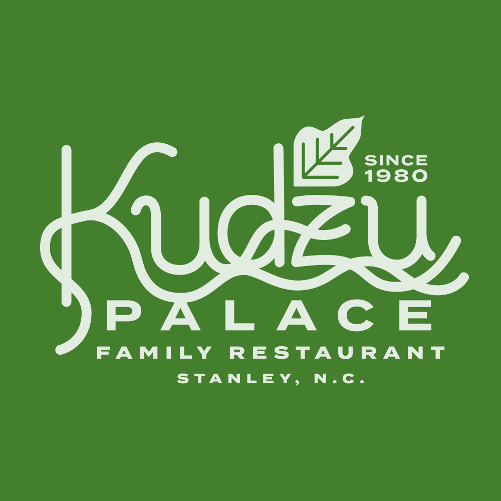
Each week for a year, I’m designing a shirt and releasing it on my Threadless store. This is the design for week 40.
When I was little, we lived in Stanley, North Carolina. Every so often on the weekend, we’d make the trek over to Gastonia to have dinner, go shopping or catch a movie. We’d drive along a road where every tree seemed to be covered in kudzu. If you aren’t familiar with kudzu, it’s a vine that grows relatively uncontrolled across the southeastern United States. It’s legendarily impossible to kill.
At some point on the trip, my dad would ask us where we wanted to eat. He’d give us three options, but the third option was always “Kudzu Palace.” Kudzu Palace didn’t exist, of course, but every time, my siblings and I would yell “Not Kudzu Palace!”
Now that I have kids, I often offer up Kudzu Palace as a dining option. Surprisingly, they never pick it either.
When I started this project, I actually planned to do a bunch of fake restaurants and brands. Kudzu Palace was one of the original ideas from my first set of sketches. The project has taken a different direction and the designs have been more conceptual, but I’m glad I finally got around to creating a shirt for my favorite fictional restaurant. Now, I’m wondering what’s on the menu.
Bob Wertz writes about design, technology and pop culture at Sketchbook B. Bob is a Columbia, South Carolina-based designer, creative director, college instructor, husband and dad. He’s particularly obsessed with typography, the creative process and the tools we use to create. He’s currently in the middle of a project to design a new shirt a week for an entire year.
This post was originally posted on March 18, 2018 on Sketchbook B. It’s reposted here as part of a project to move some of my favorite writing to my new site.
You can believe in both.
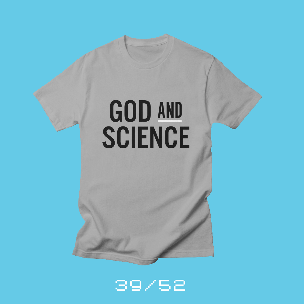
Each week for a year, I’m designing a shirt and releasing it on my Threadless store. This is the design for week 39.
I recently read an article by Don Lincoln, a physicist at Fermilab* describing a potential new discovery that sheds light — pun intended — on the formation of the universe. But what struck me about the article is his discussion of what happened after the Big Bang, how the universe expanded and formed planets and stars.
For some reason, science advocates and religious advocates are diametrically opposed these days. If you believe in basic scientific principles, some people assume that you don’t believe in God. And if you are Christian, some people assume that you believe that science is a hoax and the earth is only 6,000 years old.
But I’ve never felt my faith in God and my belief in science have been at odds with one another. I believe in evolution, climate change and vaccination. I also believe in the Father, Son and the Holy Spirit. I feel that modern science is just one of the tools that God has given us to experience and understand his creation. I can believe in God while accepting that the Earth formed in more than 6 days.
* I grew up in Batavia, Illinois, a suburb of Chicago and the location of Fermilab. I took many a field trip to the particle accelerator in our neighborhood.
Bob Wertz writes about design, technology and pop culture at Sketchbook B. Bob is a Columbia, South Carolina-based designer, creative director, college instructor, husband and dad. He’s particularly obsessed with typography, the creative process and the tools we use to create. He’s currently in the middle of a project to design a new shirt a week for an entire year.
This post was originally posted on March 11, 2018 on Sketchbook B. It’s reposted here as part of a project to move some of my favorite writing to my new site.
Everything is in the cloud now.
Each week for a year, I’m designing a shirt and releasing it on my Threadless store. This is the design for week 38.
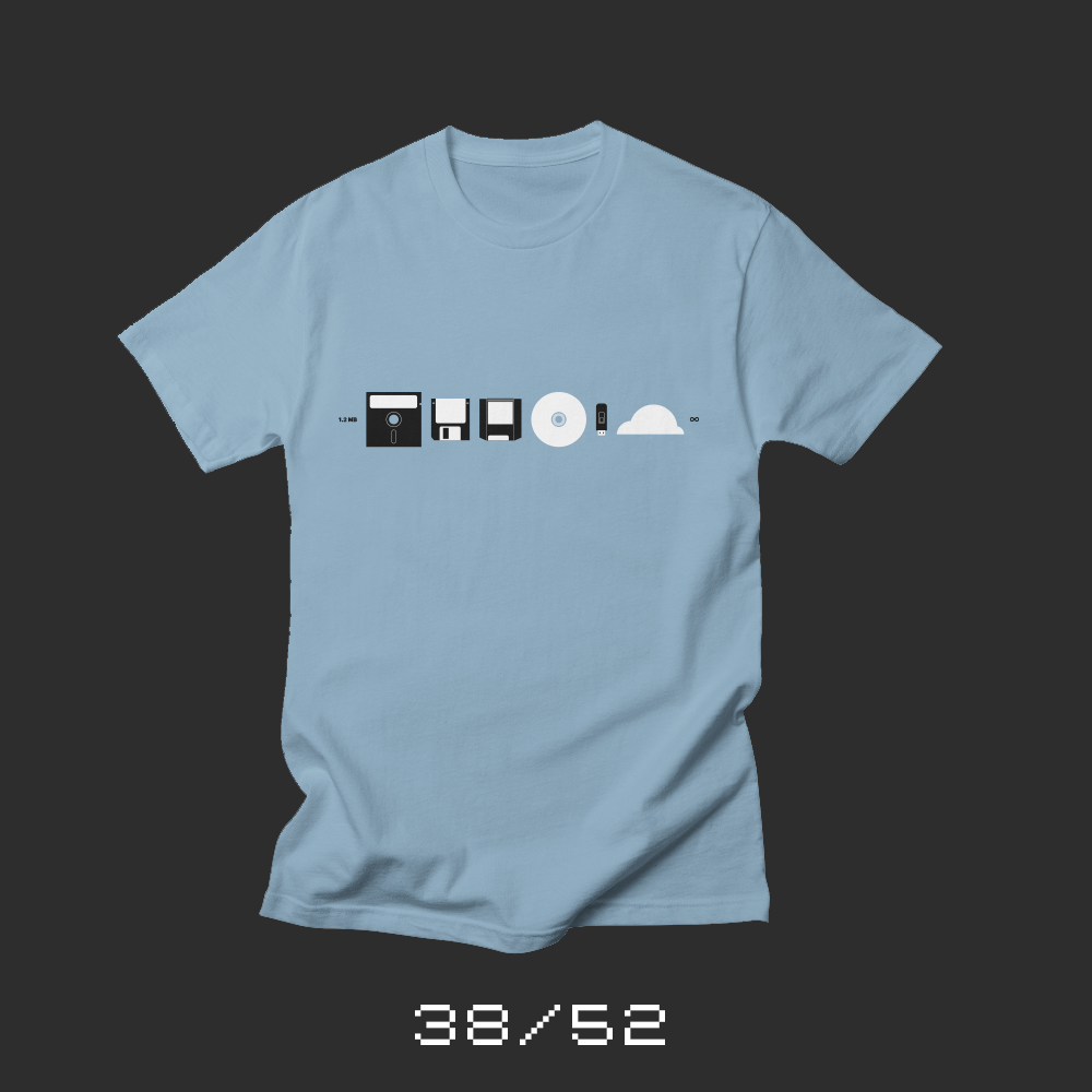
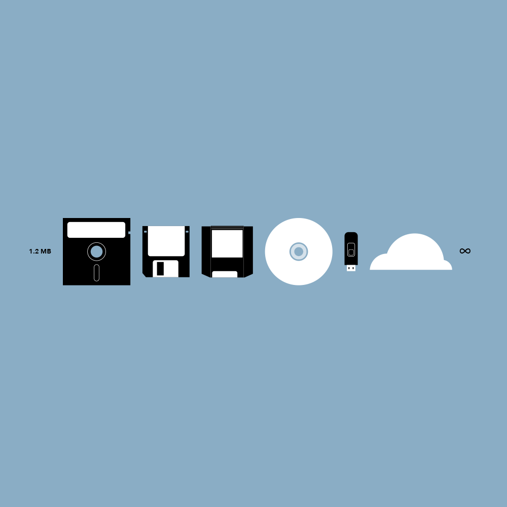
My first computer, a Commodore Vic 20, actually used cassette tapes for data storage. We upgraded to a Commodore 64 and it used a 5.25 inch floppy. So did the TRS-80 at school and the IBM PC at my dad’s office. When I got to high school, the 5.25 in drives gave way to 3.5 inch floppies. And while I was in college, the 3.5 inch floppy was replaced by a Iomega Zip drive that held an “amazing” 100 MB. Zip drives were popular until writeable CD-ROM drives became commonplace. Writeable DVDs seemed to be the natural next step, but USB thumb drives were cheaper and more convenient. Now, everything pretty much lives in the cloud.
There were — of course — storage devices that never caught on… I remember 44 MB and 88 MB SyQuest Drives. Iomega had a 1 GB Jaz Drive and introduced a 250 MB Zip drive to capitalize on the success on the 100 MB Zip Drive. Portable hard drives are still popular with people who need a lot of storage, but USB thumb drives are getting cheaper and increasing in capacity. Writable Blu-ray discs are expensive and take forever to burn.
I’ve watched computer storage evolve over the last 30+ years and now, we’ve reached a point where everything is in the cloud and there is very little reason to have physical media at all. There’s a part of me that misses carrying around all my files and projects and a collection of Zip disks, but I won’t miss the fear of losing a disk or having one fail catastrophically. Now, all my files are available to me on pretty much any device at pretty much any time.
This week’s shirt, “The Evolution of Storage” is a look back to the changes of how we store our important files and projects. Starting with 1.2 MB and spanning to the now seemingly infinite cloud.
Bob Wertz writes about design, technology and pop culture at Sketchbook B. Bob is a Columbia, South Carolina-based designer, creative director, college instructor, husband and dad. He’s particularly obsessed with typography, the creative process and the tools we use to create. He’s currently in the middle of a project to design a new shirt a week for an entire year.
This post was originally posted on March 4, 2018 on Sketchbook B. It’s reposted here as part of a project to move some of my favorite writing to my new site.
It matters what you write with…
Each week for a year, I’m designing a shirt and releasing it on my Threadless store. This is the design for week 37.
Several years ago, I was looking for new podcasts to listen to. I was regularly listening to Upgrade with Jason Snell and Myke Hurley and Myke mentioned that he had another podcast, The Pen Addict. An entire podcast on pens? I was curious and so I downloaded an episode to check it out. It didn’t take long before I had a collection of different writing utensils, inks, bags and sketchbooks.
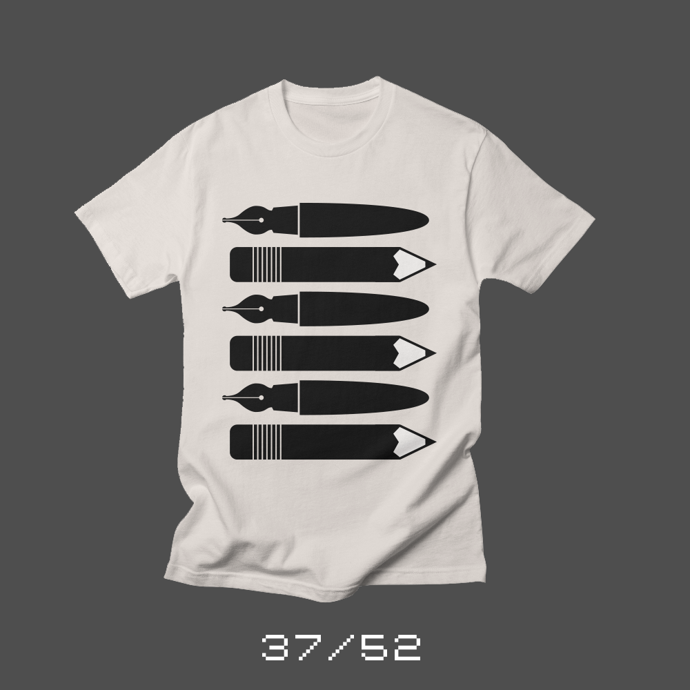
I’ve mentioned before how uncomfortable I am with my handwriting and writing in general, but with better tools, writing was far more enjoyable. I really like writing with a fountain pen. Choosing the ink and the right nib style. Cleaning and taking care of them. I love the feel of drawing with a good mechanical pencil. I adore sharpening a wooden pencil and getting a perfect point.
Most people don’t think about what they write with. They use the pen in the office supply cabinet or whatever happens to be laying around the house. The last wooden pencil they used was a cheap #2 in elementary school. There is nothing wrong with that approach, but I believe the experience of writing changes when you use a good pen or pencil.
One of my earliest sketches for this shirt-a-week project was a short, fat pencil and I refined it into this shirt, Pens and Pencils. I’m going to the Atlanta Pen Show in April and figured I’d release the shirt now so I can order one and wear it to the show.
Bob Wertz writes about design, technology and pop culture at Sketchbook B. Bob is a Columbia, South Carolina-based designer, creative director, college instructor, husband and dad. He’s particularly obsessed with typography, the creative process and the tools we use to create. He’s currently in the middle of a project to design a new shirt a week for an entire year.
This post was originally posted on February 25, 2018 on Sketchbook B. It’s reposted here as part of a project to move some of my favorite writing to my new site.
My lucky streaked started with a Commodore 64 game
Each week for a year, I’m designing a shirt and releasing it on my Threadless store. This is the design for week 36.
I was in 6th grade and had saved my paper route money to buy “California Games” for my Commodore 64. I opened the box in the car on the drive home to look at the instructions and found a scratch off game card. Scratch off three circles and if they match, you win that prize. I scratched off three circles and they matched. I shouted in a mix of confusion and joy… “I won a jet ski! What’s a jet ski?” My mom didn’t believe me — and since she was driving, she got my older brother to take a look. He confirmed that I had, indeed, won a jet ski.
And that started one heck of a lucky streak. Over a couple of decades, I won a bunch of stuff… radio contests, door prize drawings, golf clubs, an iPod, season tickets for minor league hockey, software, a watch, a framed print and more. For a number of years, every time there was a door prize, I knew I was going to win it.* It was fun, although occasionally embarrassing. The streak seems to have ended a number of years ago, but I always wonder if the streak will ever kick back in.
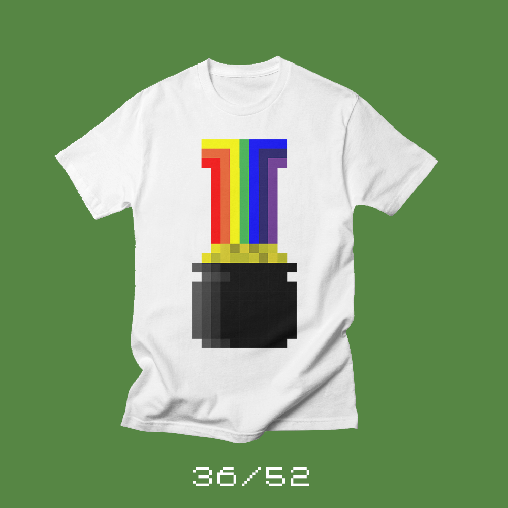
In honor of St. Patrick’s Day and my own crazy luck, I wanted to create a “lucky” shirt. And since my beloved Commodore 64 had lovely eight bit graphics, I figured a pixelated pot of gold was the perfect tribute to my amazing lucky streak.
*Everyone asks if I ever won the lottery. I have not. Some odds are too impossible.
Bob Wertz writes about design, technology and pop culture at Sketchbook B. Bob is a Columbia, South Carolina-based designer, creative director, college instructor, husband and dad. He’s particularly obsessed with typography, the creative process and the tools we use to create. He’s currently in the middle of a project to design a new shirt a week for an entire year.
This post was originally posted on February 18, 2018 on Sketchbook B. It’s reposted here as part of a project to move some of my favorite writing to my new site.
You are responsible for every meme you share.
Each week for a year, I’m designing a shirt and releasing it on my Threadless store. This is the design for week 35.
The school shooting in Florida this week was heartbreaking. Heartbreaking because of the loss of life. Heartbreaking because this keeps happening and no one acts to try and prevent it from happening again. Heartbreaking because I send my wife — a teacher — and three kids to school every day and pray that they are never placed in harm’s way.*
In the aftermath of the shooting, social media was … chaos. I know that friends were hurting and angry like I was. They wanted to make a point that something has to change. I get it, and yet, many of them were retweeting things that were false or exaggerated. Bogus stats. Exaggerated claims. Speculation.
Gun advocates were rushing to similarly harshly drawn conclusions. Recommending “solutions” like arming teachers. Tweeting and retweeting false or inflammatory statements — anything they could do to shift the blame towards something other than the American gun culture.
And as if that wasn’t enough chaos, Russian bots jumped into the fray stirring up trouble in their own way.
Here’s the thing, though. When you push false or hastily checked information, your side in the debate suffers. Even if you are mostly right, the minute you stop offering facts and a path forward, you lose credibility.
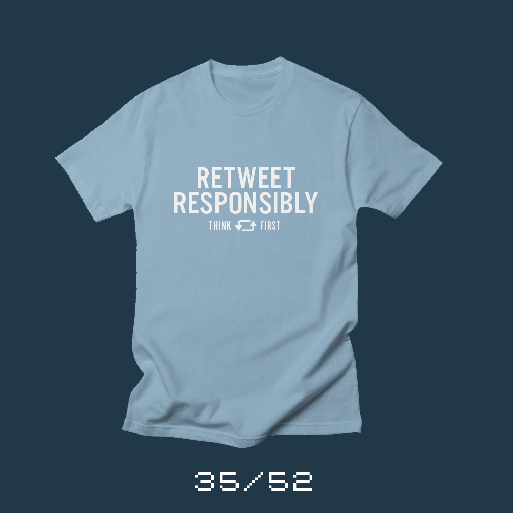
Retweeting — or sharing on Facebook — information that you don’t know is true, but you want to be true… it does more harm than good. You are as responsible for the things you retweet as the posts your write yourself. When you share something, you personally endorse that you believe it. So spend a few minutes researching before you hit the retweet button.
Twitter and Facebook reward the quick retweet or share.** They are designed to allow you to react with minimal thought. Don’t fall for it. Don’t feed the outrage machine — there’s enough to genuinely be outraged by. Think and help advance the discussion, because something has to change and we have to get there together.
* Heartbreaking because I know the feeling of fear that comes with a lockdown. I’ve been in a active shooter situation twice in the last five years. Once at the University of South Carolina because of a murder-suicide. And once with my entire family at a local mall when there was an apparent shooting.
** I’m beginning to appreciate Manton’s hesitation in introducing reposting to Micro.Blog.
Bob Wertz writes about design, technology and pop culture at Sketchbook B. Bob is a Columbia, South Carolina-based designer, creative director, college instructor, husband and dad. He’s particularly obsessed with typography, the creative process and the tools we use to create. He’s currently in the middle of a project to design a new shirt a week for an entire year.
This post was originally posted on February 11, 2018 on Sketchbook B. It’s reposted here as part of a project to move some of my favorite writing to my new site.
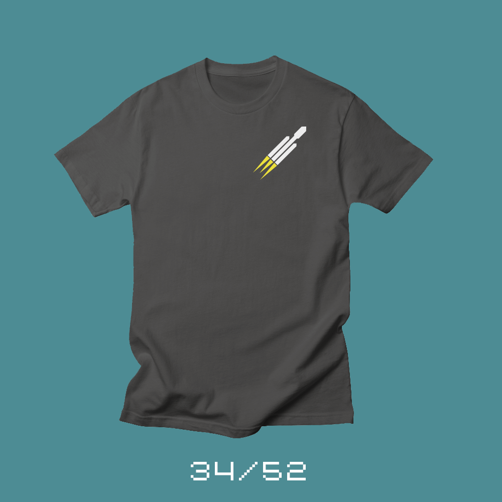
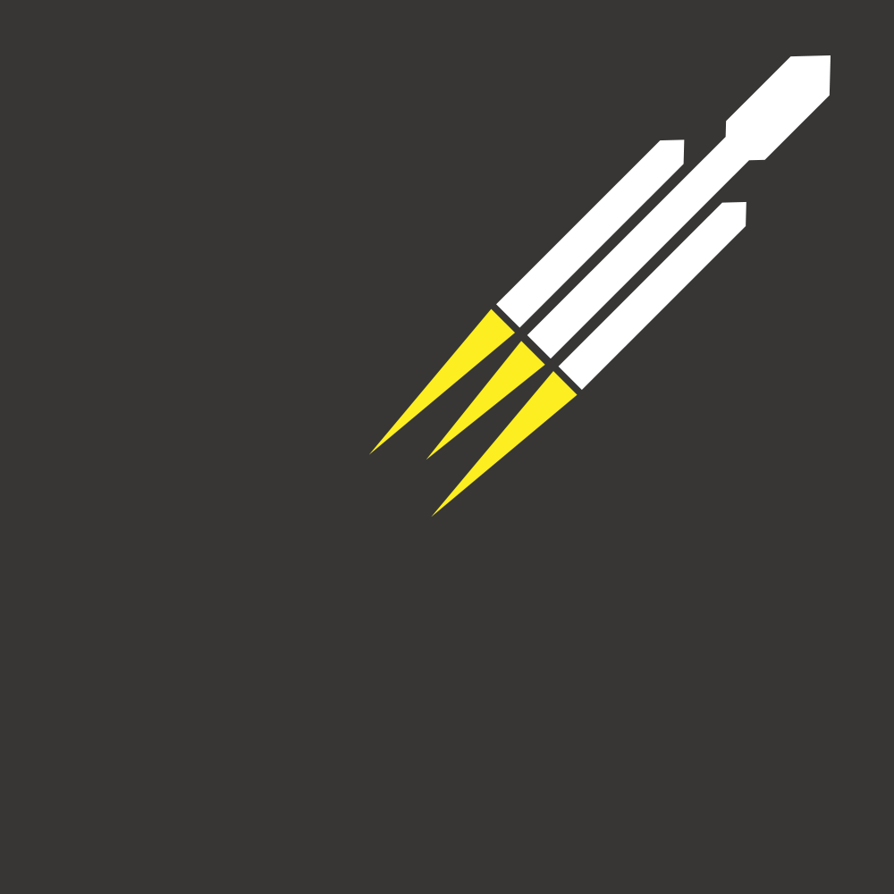
Getting excited about space again.
Each week for a year, I’m designing a shirt and releasing it on my Threadless store. This is the design for week 34.
I grew up fascinated with space. I had books on the space shuttle. I wanted to go to Space Camp.* I watched movies and documentaries about the Apollo program. I remember the loss of Challenger. And the loss of Columbia. As the shuttle program came to an end, I followed along with the International Space Station and all the probes and rovers that we’ve sent out to the solar system. I listen to a podcast about space regularly. But with our future of space exploration in doubt, I admit that my excitement has waned a bit over the years.
This week, Space X reignited that excitement.
Falcon Heavy — the largest rocket launched since the Saturn 5 took astronauts to the moon — completed a successful test launch.
The launch was spectacular, but for me the highlight was the landing of two boosters in unison. Online, I saw too many people focused on the Tesla Roadster now floating towards the Kiper belt, or the loss of the third booster. But the Falcon Heavy represents the next step to returning to the moon, and maybe someday heading to Mars. Falcon Heavy is a big deal, and the test was a massive success.
“The launch was spectacular, but for me the highlight was the landing of two boosters in unison.”
I started the day as the only one I knew excited about the launch. I gathered my coworkers around the screen as I watched the launch live — with commentary from Jason and Stephen from the Liftoff Podcast. Some of them weren’t sure what it was a big deal. Others had no idea there was a launch happening. But it was wonderful to share the experience with my friends.
Later, after dinner, I shared the video with my wife and kids when I got home and talked about the launch and space exploration in general. Space X and Falcon Heavy have given people a reason to be excited about space again. I hope they continue to push forward.
* And yes, this probably had something to do with the movie, Space Camp.
Bob Wertz writes about design, technology and pop culture at Sketchbook B. Bob is a Columbia, South Carolina-based designer, creative director, college instructor, husband and dad. He’s particularly obsessed with typography, the creative process and the tools we use to create. He’s currently in the middle of a project to design a new shirt a week for an entire year.
This post was originally posted on February 5, 2018 on Sketchbook B. It’s reposted here as part of a project to move some of my favorite writing to my new site.
Ten years of Sketchbook B
Ten years ago today, I launched this blog. My plan was to use Sketchbook B as a home for a bunch of side projects that were rattling around in my head. Typefaces and photography, mostly. I’d spent most of my career up to that point as an art director in the insurance industry and I needed a home for more creative endeavors — projects that would keep me energized when the day job was a little too straightforward.
Over the last decade, I’ve averaged about a post a week. Roughly 520 posts. And while I’ve posted about creative projects, I’ve also written about just about everything else you can imagine. I’ve written about my community. I’ve gone through phases where I was providing weekly InDesign tips. I split out an entire “off-topic” blog. And then I merged it back in with the main blog. I added Google ads. I took them out. I’ve written long posts and short posts. I’ve written about social media, pens, cars and popular culture. It’s been an ongoing experiment.
In 2016, I tried to get serious about Sketchbook B. And by serious, I mean that I tried to have a publishing schedule and build an audience. In the process, I stopped writing the things I wanted to write and started writing things I thought my “audience” would read. Two things happened… my traffic increased slightly and I no longer enjoyed writing posts.
As 2016 came to an end, I knew I needed to make a change and started to think back to why I started Sketchbook B. It was a creative outlet. It was my creative outlet. I needed to start writing for me and stop writing for statistics.
“I needed to start writing for me and stop writing for statistics.”
I spent a day at a coffee shop that December thinking and sketching. Planning. In January, I stumbled across the Micro.Blog kickstarter that made me think even more critically about my writing online. I read Stephen King’s “On Writing” which really challenged me to think about what I was writing — and more importantly — why I was writing.
That process led directly to the 52 Shirts project that I’m in the middle of. I love designing the shirts, but I also love writing the blog post that explains what I’ve created. I tell people all the time that the project isn’t just the shirt design, it’s the design and the explanation.
I’m writing about topics that interest me again. And two things have happened… my traffic has increased slightly and I love writing.
So here I am, ten years into this blog and I feel like I’ve finally found my voice. I’m excited to be writing regularly. I’m becoming a stronger writer and recognizing areas where I need to improve. I’m working hard to push outside my comfort zone.
I’ve got some plans for what I want to do over the next couple years with Sketchbook B. Plans can change, but I’m looking forward to what’s ahead.
And most importantly, I can honestly say that I’m more excited about Sketchbook B today than I was ten years ago when I launched it.
Bob Wertz writes about design, technology and pop culture at Sketchbook B. Bob is a Columbia, South Carolina-based designer, creative director, college instructor, husband and dad. He’s particularly obsessed with typography, the creative process and the tools we use to create. He’s currently in the middle of a project to design a new shirt a week for an entire year.
This post was originally posted on February 4, 2018 on Sketchbook B. It’s reposted here as part of a project to move some of my favorite writing to my new site.
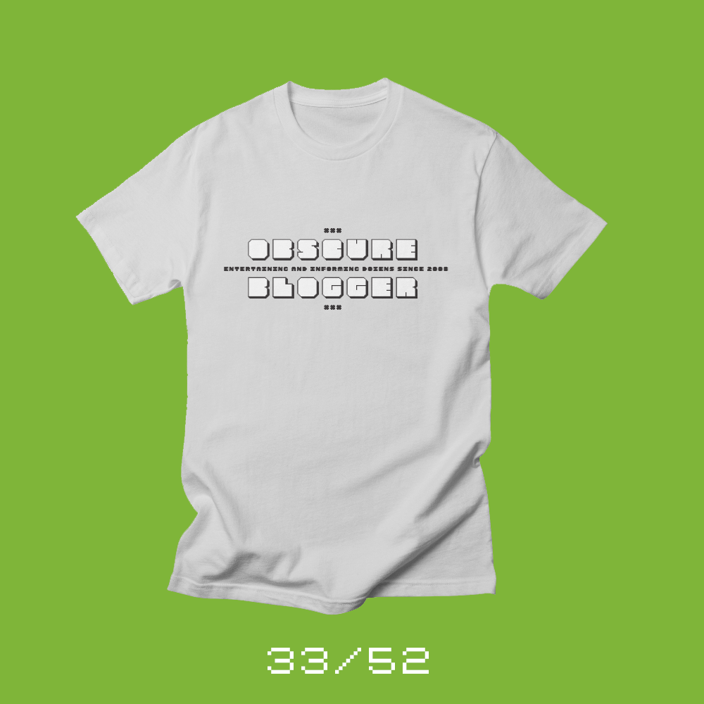
Entertaining and informing dozens since 2008
Each week for a year, I’m designing a shirt and releasing it on my Threadless store. This is the design for week 33.
I’ve been writing here on Sketchbook B for ten years this week — about 520 posts. Basically averaging a post a week for ten years. Most blogs don’t make it ten posts, but I’ve kept this site going consistently for a full decade.
Recently I started to talk to friends who had blogs, and now don’t. And their reasons for abandoning their blogs were all pretty much the same… it didn’t feel like anyone was reading. No one cared. And so, they stopped writing.
Believe me, I understand that feeling. I’ll craft a blog post that I think is great, and ten people will read it. Being an obscure blogger can be discouraging.
Over the last year, I’ve recommitted to writing for myself and I’ve been happier with the posts I’m publishing. Every so often, I’ll look at my analytics and slip into the “no one cares about what I’m writing” trap, but for the most part, I don’t allow traffic — or more precisely, the lack of traffic — bother me. I write for me, and I hope people like it and go away inspired.
I wanted to design a shirt to commemorate not just the ten years of Sketchbook B, but also the struggle of the obscure blogger. The person who writes in relative anonymity, because they love writing.
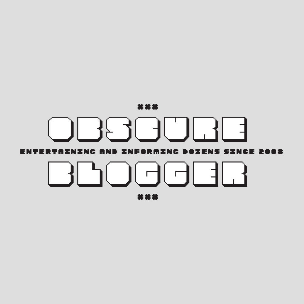
This week’s shirt, Obscure Blogger, I wanted to use one of my typeface designs, so it features one of my Fontstruct designs — SbB Epyx — and the tagline “Entertaining and informing dozens since 2008.” 2008 was the year I started Sketchbook B, but I’m happy to make custom variants with different dates if you want them. Just reach out and let me know what year you started your obscure blog and I’ll add it to the Threadless store, too.
A closeup, since it’s a little hard to read on the mockup.
Bob Wertz writes about design, technology and pop culture at Sketchbook B. Bob is a Columbia, South Carolina-based designer, creative director, college instructor, husband and dad. He’s particularly obsessed with typography, the creative process and the tools we use to create. He’s currently in the middle of a project to design a new shirt a week for an entire year.
This post was originally posted on January 28, 2018 on Sketchbook B. It’s reposted here as part of a project to move some of my favorite writing to my new site.
Hitting reset on my digital life.
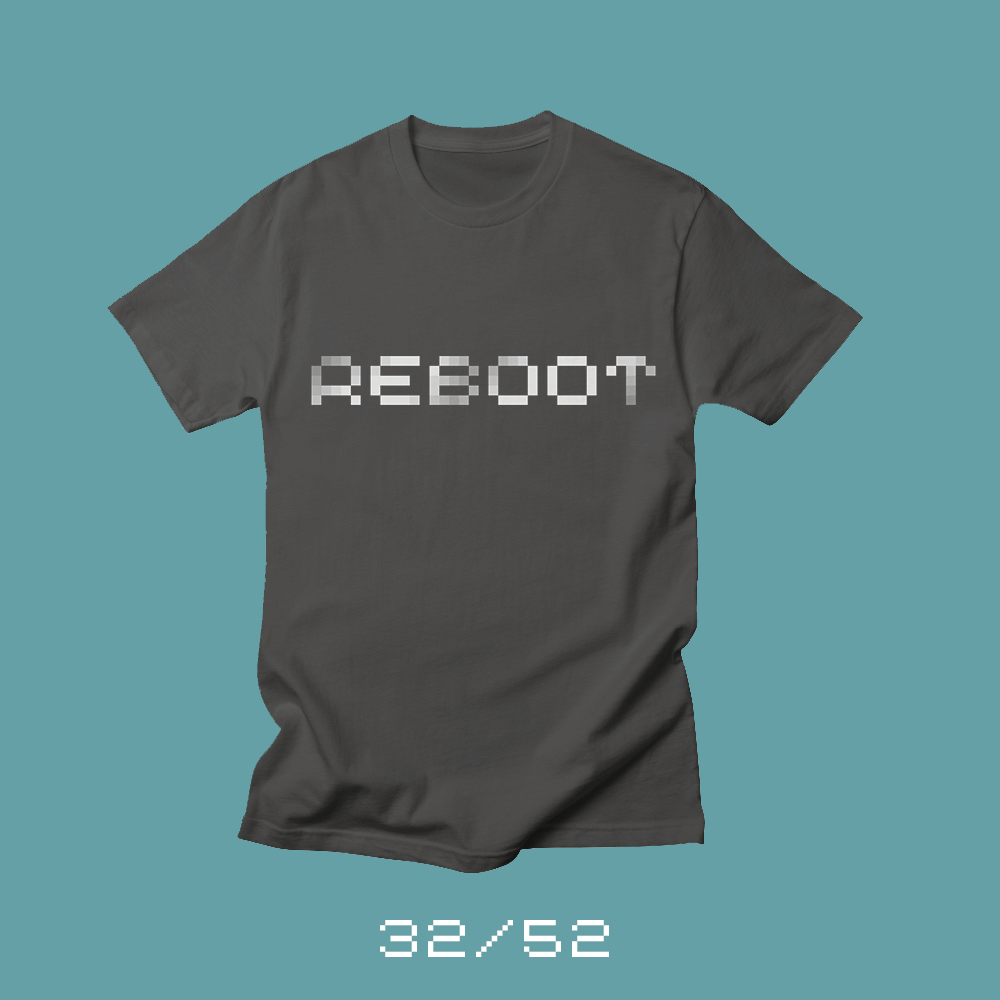
Each week for a year, I’m designing a shirt and releasing it on my Threadless store. This is the design for week 32.
I love technology. I’ve had a computer around since our family bought a Commodore VIC-20 in the mid 1980s. And yet, lately, I’ve been feeling as though my digital world — with social media, Slack, email, blogging, streaming video — is slowly burning me out. I used to enjoy Twitter and Facebook, but I enjoy them less now. Slack works great for small groups, but I have no idea how anyone can cope with the volume of messages. Email is still email — and work email is still work email — but I feel like I have a grip on how to handle email. I’ve built a system for how to handle my email, but I have no idea how to manage the volume and impact of everything else.
It’s time to reboot my relationship with technology.
When something goes wrong with technology, 99.9% of the time, the solution is to reboot. Start over. Turn it off and turn it back on. So I’m rebooting my digital world before I burn out. It’s a work in progress. I’ve eliminated many of my notifications — and I need to eliminate more. I’ve started to pay less attention to stats and numbers on my personal accounts and sites. I’m going to start implementing some device-free time.* I’m thinking about shifting task management back to paper.** I’m going to drop services that I don’t get value from and change the way I use the web. I’ve already started some of this — and I can already feel a difference.
* I’m pretty hard core with my kids about device free time, but I need to look in the mirror and put my own phone away.
** I’m a devoted Todoist user, so this is a big change. I have my reasons why I think this will make a difference and will write about it soon.
Bob Wertz writes about design, technology and pop culture at Sketchbook B. Bob is a Columbia, South Carolina-based designer, creative director, college instructor, husband and dad. He’s particularly obsessed with typography, the creative process and the tools we use to create. He’s currently in the middle of a project to design a new shirt a week for an entire year.
This post was originally posted on January 21, 2018 on Sketchbook B. It’s reposted here as part of a project to move some of my favorite writing to my new site.
What’s old is new again.
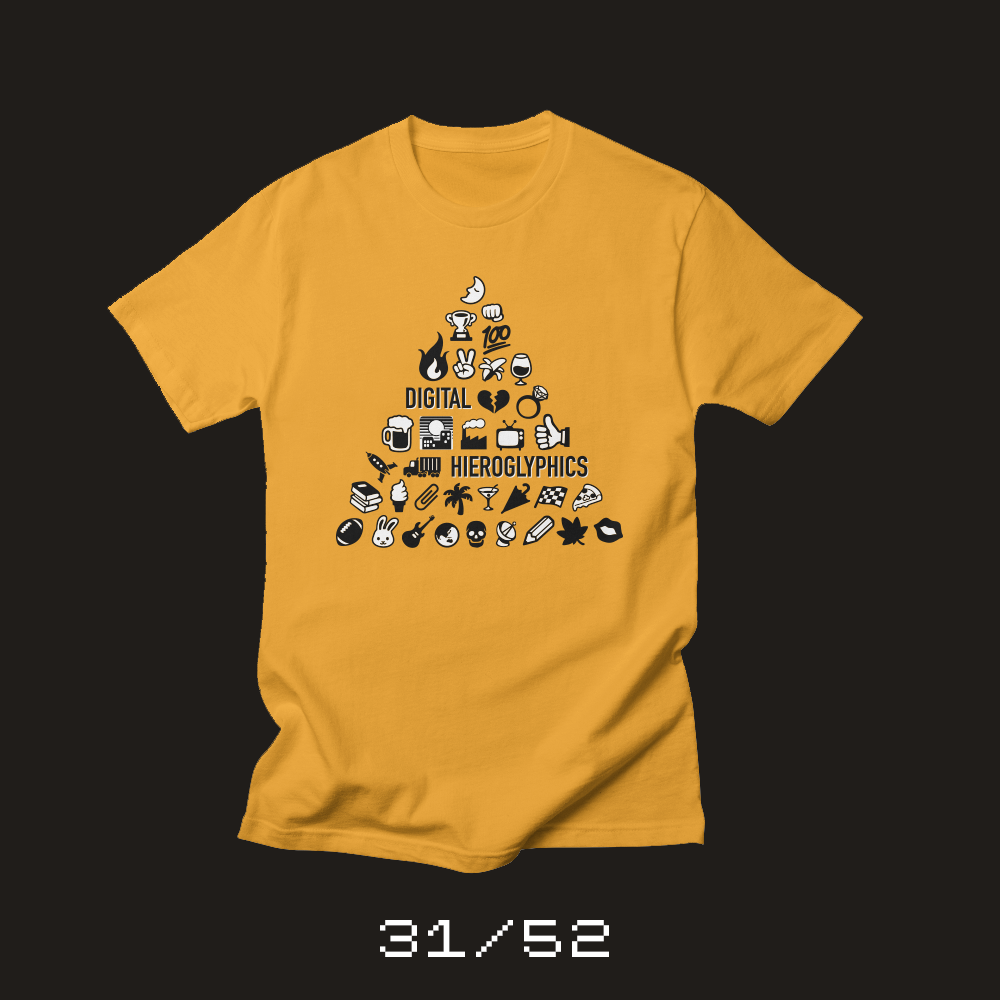
Each week for a year, I’m designing a shirt and releasing it on my Threadless store. This is the design for week 31.
I remember learning about hieroglyphics in elementary school. Hieroglyphics, we were taught, were an early form of written communication in ancient Egypt, less advanced* than our modern writing system. We were given the assignment to make our own pictograms and write messages with them. (I’m pretty sure my daughter had the same assignment last year.) It was a fun experiment, but I remember thinking: Who would ever want to communicate with pictograms?
Well, turns out hieroglyphics are making a comeback. This time, they are called emoji.
I was a little late to the emoji train. I will freely admit that I thought they were a complete waste of time for a while, but I eventually came around. Emoji are fun and convey emotion and concepts well. I’m still pretty conservative with my emoji use — I rarely use more than one at at time — but I absolutely use them.
We as a society have embraced emoji. One of the biggest incentives for upgrading our smartphone operating system is to get new emoji. There are heated discussions about what emoji should be included in the next Unicode release. Micro.blog is experimenting with using emoji as tags — similar to how hashtags are used on Twitter — and it’s awesome. Communicating with pictograms isn’t primitive. It’s an effective way to get your message across.
“Communicating with pictograms isn’t primitive. It’s an effective way to get your message across.”
I wanted to make an emoji shirt and reference the similarity to hieroglyphics, so I built a pyramid** of emoji. It was tough to find an emoji font that I could use for a product like this one.*** Most charge extra for using their design in a commercial product. I finally found Google’s open source Noto family, which includes two emoji fonts. I didn’t like the faces in Noto, but the rest of the set was great and perfect for my pyramid. I decided to use the black and white version because I fell in love with the high contrast look.
* Of course, I later learned that Egyptian hieroglyphics were much more advanced than we were taught in elementary school. I’m pretty sure this is another example of Western cultural bias here. Modern society assumed pictograms were primitive and letterforms were superior. Turns out pictograms can be a powerful way to communicate, too.
** I was fascinated by pyramids, mostly because of David Macaulay’s book, Pyramids. For a period of time, I loved to read about all things ancient Egyptian.
*** Have you tried to use emoji in print? Let’s just say it’s much harder than you’d think it would be.
Bob Wertz writes about design, technology and pop culture at Sketchbook B. Bob is a Columbia, South Carolina-based designer, creative director, college instructor, husband and dad. He’s particularly obsessed with typography, the creative process and the tools we use to create. He’s currently in the middle of a project to design a new shirt a week for an entire year.
This post was originally posted on January 18, 2018 on Sketchbook B. It’s reposted here as part of a project to move some of my favorite writing to my new site.
Some notes on how I’ve connected Micro.blog to my existing Squarespace site.
I’ve enjoyed using Micro.blog for the last couple months. It’s developing as an interesting writing and sharing platform and it’s already become my first destination for finding new content.
There are several ways to set up your Micro.blog feed. The easiest way is to use Micro.blog hosting. Everything just works for $5/month. If you don’t have an existing site, this is the way to go.
But one of the interesting things about Micro.blog is that you can use it with pretty much any blogging platform as long as it has an RSS feed, so I decided to see if I could connect my existing Squarespace hosted site to Micro.blog. I’ve had my Squarespace site for almost 10 years. I’m happy with Squarespace so I don’t really want to move Sketchbook B over to another service like Wordpress.
For anyone interested in using Squarespace with Micro.blog, I wanted to detail how I’ve configured my Micro.blog account with Squarespace and talk about two options for how to set it up and my workflow for posting to Micro.blog.
Option 1: Add a new blog page
I added a new blog page to my Squarespace site and named it “Microblog.” It’s just a standard Squarespace blog page, so you can add text to the header and footer. My microblog lives at [**sketchbookb.com/micro**](https://www.sketchbookb.com/micro).
Then I headed over to Micro.blog and added the new RSS feed. On the Micro.blog web interface, you edit these settings on the Account page, in the Feeds section. I originally tried to add **www.sketchbookb.com/micro/ to Micro.blog, which worked, but didn’t seem to work consistently. After a little experimentation and some research, it seems that **sketchbookb.squarespace.com/micro/ works better as the feed address.*
And that’s it. Now, anything I post to my Squarespace microblog page posts to Micro.blog.
Option 2: Use a category on your main blog
I was also able to connect my main blog to Micro.blog. Any post I tag with the category “micro” is added to Micro.blog. All I had to do was add **sketchbookb.squarespace.com/journal/ as a feed in Micro.blog. Since I typically post longer content to my blog, Micro.blog pulls just the title and provides a link to the post. It’s a pretty elegant solution.
Micro.blog lets you add multiple feeds to your account. So I have both option 1 and option 2 set up. I use the microblog page for my twitter-like posts. And if I want to share one of my longer essays — like this one — on Micro.blog, I just tag it with “micro” and the title and link are posted automatically.
What works.
Once it’s configured, everything pretty much just works. I post to Squarespace and it shows up on Micro.blog (with cross-posting to Twitter). Some other things that just work:
Formatting for inline links, bold and italics is really easy.
If you change a post with 24 hours, it edits it in the Micro.blog feed.
Cross posting to Twitter works great. I didn’t think it would be useful, but it completely is. I don’t post directly to Twitter anymore. All of my posts start on my own site.
What doesn’t work.
Connecting Squarespace and Micro.blog works well, but there are some minor tradeoffs. Since you are hosting your own feed and Micro.blog doesn’t have API access for Squarespace, you can’t start new posts from the Micro.blog app. Instead, you start your post on your Squarespace site, and then do replies and engagement in the Micro.blog app. It’s an extra step. Some other issues:
There isn’t a character counter in the web interface or iOS app. So you can’t easily tell how close you are to 280 characters.
Sometimes there is a short delay between when you add the post to your site and when it appears on Micro.blog.
If you want to have a list of all your Micro.blog posts someplace on your Squarespace site using a Summary block… yeah… that’s not going to work. Squarespace doesn’t really know what to do with a post in that context with no title or summary.
Because Squarespace doesn’t have an API or any hooks into services like IFTTT, you can’t automate some processes. For example, I’d love to copy my Instagram posts to the microblog using IFTTT, but that doesn’t seem possible.***
My workflow
My workflow for posting to Micro.blog is simple. I add a new blog post via the Squarespace web interface or using the Squarespace Blog iOS app. The microblog post has no title and consists of 280 characters or less. For a photo blog post, I add a picture to the post.
If I want to read other user posts or comment, I do that from within the Micro.blog app on my phone or on the Mac.
This workflow is more complicated than just posting and responding in one app like I used to do with Twitteriffic or like I could do with Micro.blog if I had a different hosting set up. But I prefer having all my content originate from Sketchbook B so for me, it’s worth the minor inconvenience.
Squarespace and open social
One last thought… I really wish that Squarespace would reintroduce an API that allows for interconnectivity with a new class of open social networks like Micro.blog that rely on RSS, JSON feeds, webmentions and more. I’ve been using Squarespace long enough, that I remember when they had an API. If open social networks take off — and I realize that’s a big if — expanded support for microblogging and connections to supporting apps and services are the kind of premium features that a product like Squarespace could offer.
It’s still early
Micro.blog is still in the early days, with Manton having just recently opened signups to the general public. The service is evolving in really interesting and fascinating ways.**** As Micro.blog changes, it’s possible my Squarespace setup will become less than ideal, but for now, I’m sticking with my Squarespace site and I’m happy that I’ve been able to integrate the two services.
* Squarespace recommends that for podcasts, it’s best to use the username.squarespace.com structure for that feed. I’m not sure why, but I guess the same logic applies to Micro.blog.
** I use the iOS app. There is an Android app as well.
*** I have a couple of ideas of how I might work around this, but it’s going to becomplex.
**** I 💚 Emoji tags
Bob Wertz writes about design, technology and pop culture at Sketchbook B. Bob is a Columbia, South Carolina-based designer, creative director, college instructor, husband and dad. He’s particularly obsessed with typography, the creative process and the tools we use to create.
This post was originally posted on January 14, 2018 on Sketchbook B. It’s reposted here as part of a project to move some of my favorite writing to my new site.
It’s simple, really.
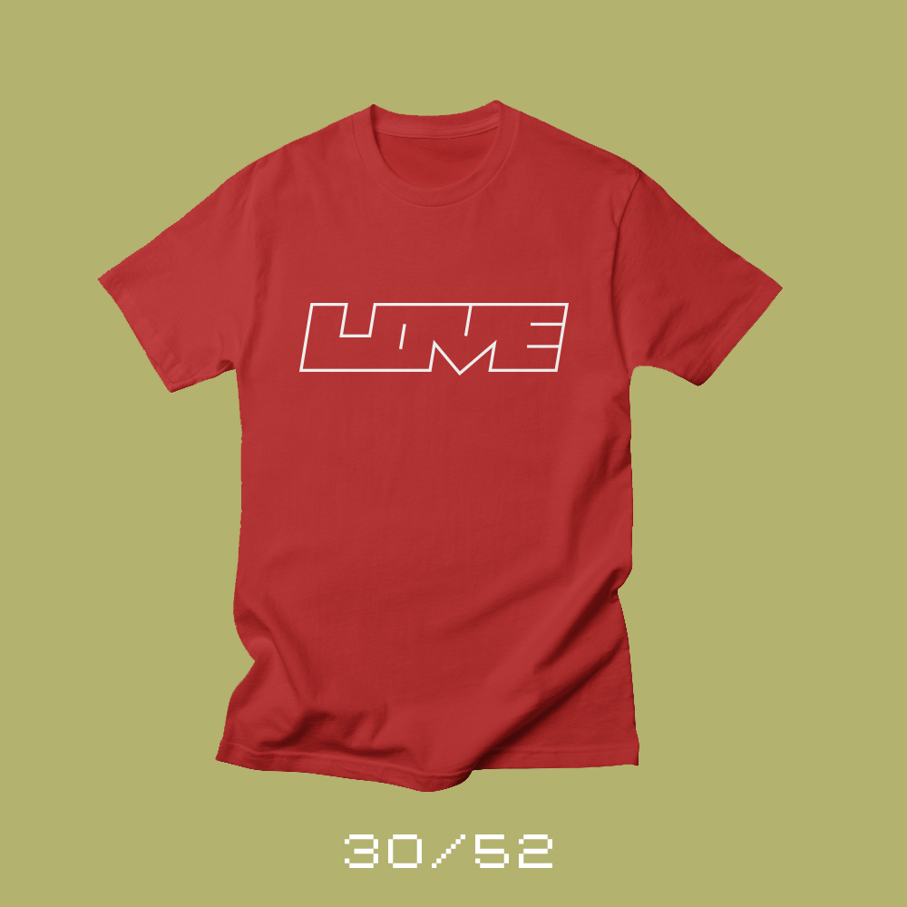
Each week for a year, I’m designing a shirt and releasing it on my Threadless store. This is the design for week 30.
Love takes many forms. We love our partner or spouse. We love our children, our family and our friends. We love our pets. We love our neighbors, even if they are different than we are. We love others, even if they are in a different part of the world.*
We show love in many ways. We show it through our actions and our words. We show it through our compassion. We use our time and energy to serve others. Love is the foundation of a positive world.
Tomorrow is a holiday to celebrate the life of Martin Luther King, Jr. Love was his guiding compass. And it should be ours today.
Visually for my “love” shirt, I wanted to take a minimalist approach to the word love. I didn’t want to design anything flashy or do a bunch of hand lettering. Just simple and straightforward.
* And especially if their corner of the world isn’t as nice and safe as ours.
Bob Wertz writes about design, technology and pop culture at Sketchbook B. Bob is a Columbia, South Carolina-based designer, creative director, college instructor, husband and dad. He’s particularly obsessed with typography, the creative process and the tools we use to create. He’s currently in the middle of a project to design a new shirt a week for an entire year.
This post was originally posted on January 7, 2018 on Sketchbook B. It’s reposted here as part of a project to move some of my favorite writing to my new site.
I made a red velvet cake last week.
From scratch. It was a recipe that my mom made when I was growing up, but it was originally my Grandmother Wertz’s recipe. My grandmother died when I was very young, so to me, red velvet always makes me think of my mom.
My mom passed away almost 17 years ago. She taught me to cook many things, but this red velvet cake was not one of them. All I knew was that it was difficult, and that she messed up the icing the first time she tried to make it. I can make pretty much anything that she made, but I had never tried to make the red velvet cake. I’ll be honest – I was scared. Scared to fail. Afraid that if I messed it up, I wouldn’t have someone to call for advice. I was on my own. So I never attempted it.
A few weeks ago, I started thinking about making her red velvet cake. I don’t know what triggered my urge to bake the unbakeable, but I couldn’t get the idea out of my head. I got the recipe from my sister and decided to bake the cake Christmas Eve. (Because obviously, we had nothing else to do that night…) I ran to the grocery store and got the ingredients. I found our fanciest cake stand. And I pulled out the Kitchen Aid mixer that my parents gave us as a wedding gift.
The recipe wasn’t that hard, but like most older recipes, it was procedural. Lots of steps and precise measurements. The cake batter came together okay, but the icing was another story. This recipe doesn’t use a cream cheese icing like a lot of modern red velvet cakes do. It’s more like a butter cream. I ruined the first batch of icing and had to make a second batch. About 1:00 Christmas morning, I finished icing the cake. It looked exactly like I remembered.
Christmas evening, after dinner, we cut into the red velvet cake – giant pie-sized wedges like my mom used to cut. It tasted like I remembered. Not too sweet, perfect texture. Even the kids loved it. I will freely admit that I teared up a little upon realizing that I had successfully pulled it off.
As I think about the year ahead, I realize that many of the things I’ve been scared of… many of the things I’ve put off attempting… the fear is all in my head. In 2018, I’m going to put those fears aside, branch out and try new things.
(And now that I can make the red velvet cake, I’m definitely going to bake it again.)
Bob Wertz is a creative director, type designer, Ph.D. student and researcher living in Columbia, South Carolina. He’s been blogging since 2008.
This post was originally posted on January 7, 2018 on Sketchbook B. It’s reposted here as part of a project to move some of my favorite writing to my new site.
Photography was one of my earliest artistic influences.
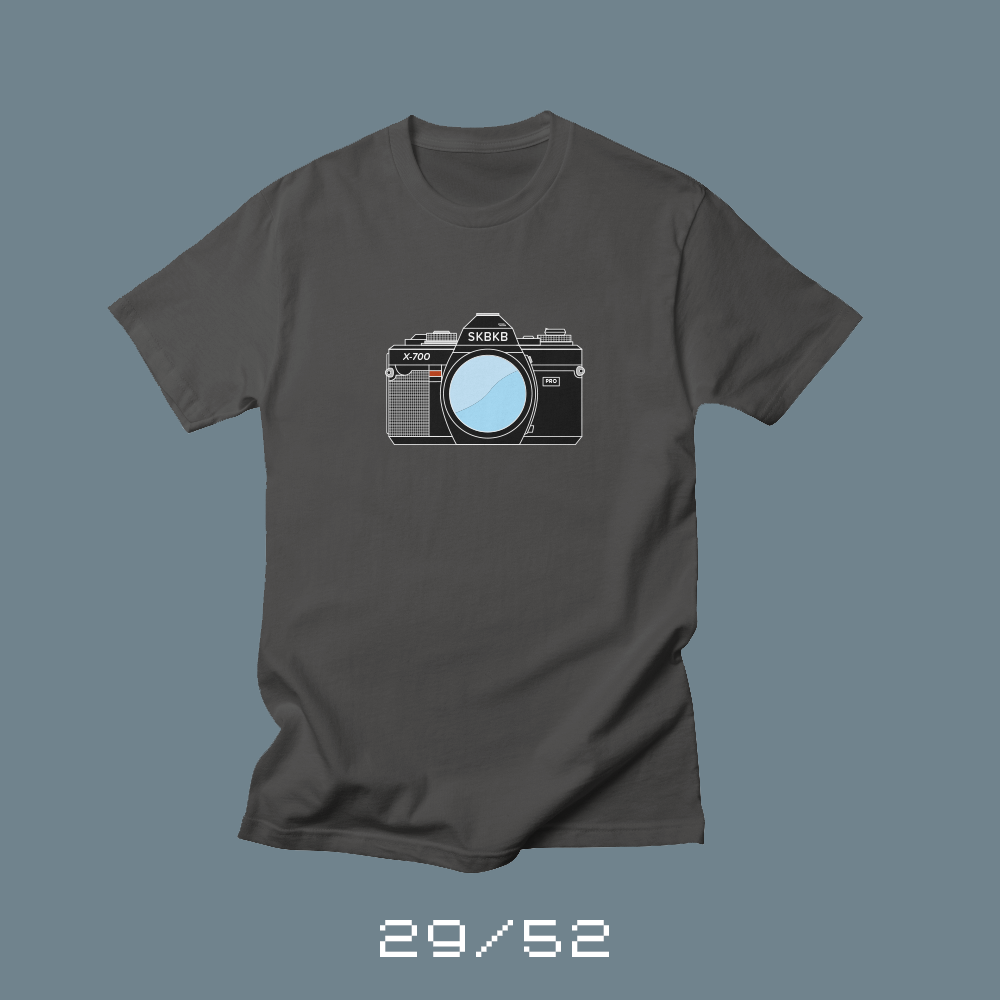
Each week for a year, I’m designing a shirt and releasing it on my Threadless store. This is the design for week 29.
I was a photographer long before I was a designer. My father loved cameras and had a selection of Minolta 35mm cameras, lens, flashes and other accessories. They were often used for family pictures after church and vacation photos. My parents kept tons of photo albums around and so I grew up with photography everywhere.
When I started high school, I took pictures for the yearbook and newspaper. I signed up for a class at Midlands Tech on photography and darkroom skills. I worked in USC Aiken’s darkroom some — my high school didn’t have it’s own darkroom — but I eventually got an enlarger at home and printed my own images in the bathroom.
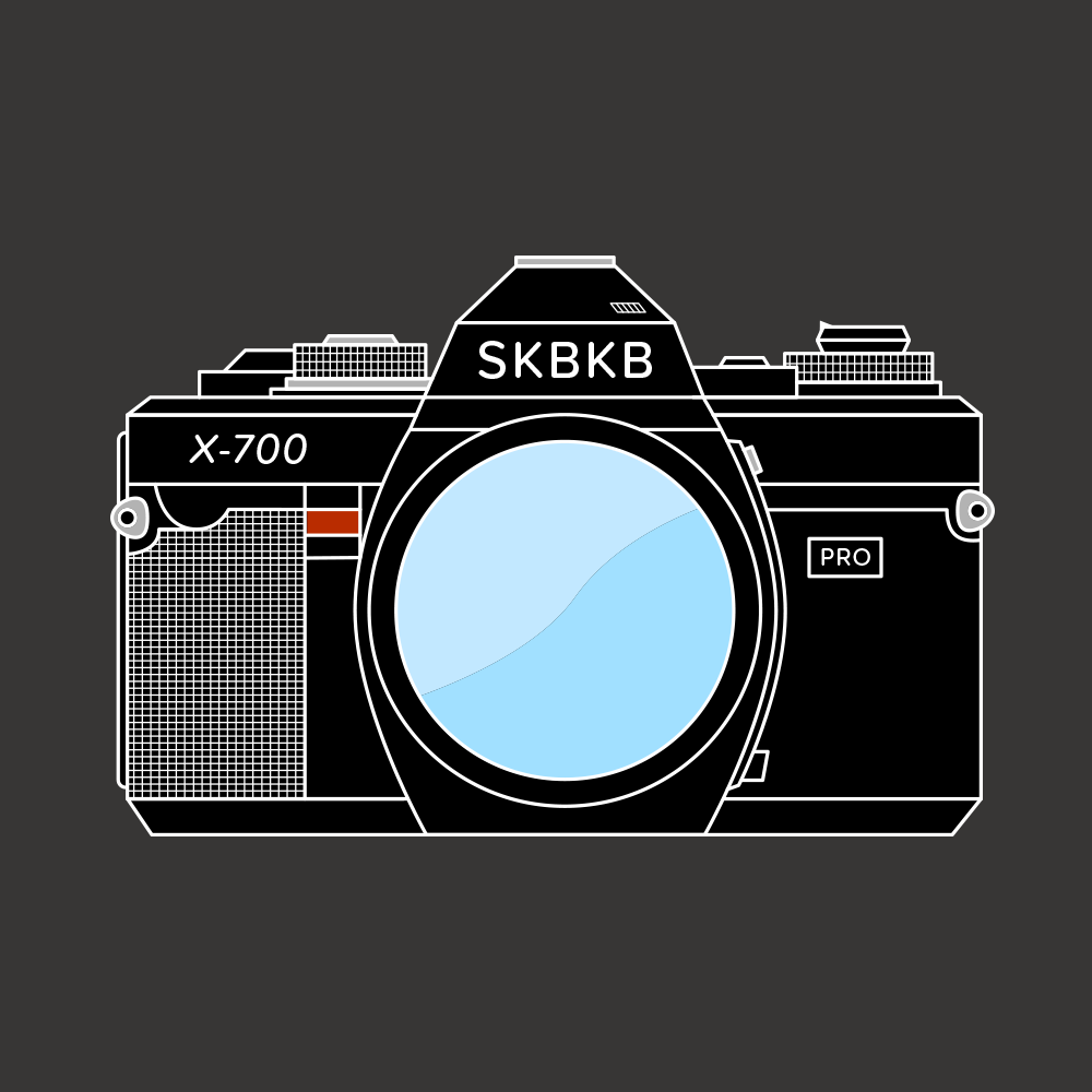
I used my dad’s cameras for most of this, but at some point during my senior year, I picked up a used Minolta X-700 to be my camera. I shot a bunch of high school sports and needed a long, but affordable lens so I used an old 200mm f3.5 lens that we purchased from KEH in Atlanta. I borrowed one of my dad’s motor drives and that combo was my primary camera set up for a number of years. When I went to college at the University of South Carolina, I worked in student media and shot football and basketball games with it. I also worked a bunch of concerts with that camera — Beastie Boys, Nine Inch Nails, Gin Blossoms, Green Day and more.
I discovered design when I was in college, but photography was my first love and one of my oldest artistic influences. I’m glad I got the experience of shooting on film and working in a darkroom. I’m grateful that I had to learn to shoot with manual focus before autofocus happened. I’m thankful for autofocus and digital photography, but I feel like I understand photography better because I had to do things manually.
“I discovered design when I was in college, but photography was my first love and one of my oldest artistic influences.”
At some point, I switched to Canon autofocus when I purchased an A2E with “eye-control focus.” And then to digital SLRs when my oldest child was born. I gave my old Minolta gear to my dad who collected cameras and he had them displayed with other old cameras he had used or found at yard sales. A couple of years ago, he was cleaning out some things and asked if I wanted some of his old camera gear. I took several of the old Minolta bodies, including my X-700, and displayed them in my office — next to my darkroom clock.
I wanted to create a shirt based on my love of photography. And that X-700 kept popping in my head. So I recreated it, taking some editorial license. It’s one of the most detailed vector illustrations I’ve ever done and I had a blast with it.
Bob Wertz writes about design, technology and pop culture at Sketchbook B. Bob is a Columbia, South Carolina-based designer, creative director, college instructor, husband and dad. He’s particularly obsessed with typography, the creative process and the tools we use to create. He’s currently in the middle of a project to design a new shirt a week for an entire year.
A year ago, I decided to lessen my reliance on Twitter. Here’s my progress so far…
This post was originally posted on January 3, 2018 on Sketchbook B. It’s reposted here as part of a project to move some of my favorite writing to my new site.
In the last year, the narrative has shifted from Twitter’s possible sale to issues with abuse and hatred. Twitter increased the character count to 280 and that’s worked out fine, but its user growth is still flat. As Twitter tries to jumpstart the service, I still believe the likelihood of Twitter imploding within the next few years is high.
I thought I’d revisit my areas of concern from my previous post and share what I’ve done to mitigate those issues.
I’d lose a bunch of contacts. My first concern was that I’d lose a bunch of contacts that I only had on Twitter. I’m a little less concerned about this than I was a year ago. I’ve slowly started to connect with more people, experts and brands on other services like LinkedIn and Facebook. I’ve still got a ways to go and will continue to expand the roster of people I follow on other services.
I’d change how I watch live events. I’m still using Twitter during live events. For me, this is the hardest to replace. During the Sugar Bowl and the Rose Bowl this week,1 I kept up with commentary from reporters and friends on Twitter. Following commentary on live events is challenging through Facebook. Posts don’t appear in sequential order because of their algorithm.
Twitter is simply the best option to handle streaming written commentary during an event. I’m sure I could use something like Snapchat, but I don’t know enough people on Snapchat for it to be useful for me.2
I’d have to rethink how I find articles and stories. This was a big issue for me, but I’ve kind of solved it… by cheating a little bit. I’ve started using Nuzzel3 to surface headlines from my social media services. Not familiar with Nuzzel? It’s a pretty simple service. You connect your social media services — Twitter, Facebook and LinkedIn — and Nuzzel tells you what links your friends (and friends of your friends) are sharing. This works really well for finding the links and articles that your social circle is talking about… without actually going into Twitter or Facebook. It’s cheating because 95% of the links that come up are from people I follow on Twitter. I really like the service and I see lots of links I would have otherwise missed. I highly recommend it.
I’ve upgraded to Feedly Pro and I’m being more intentional about subscribing to interesting RSS feeds. I’m going to continue to expand my use of Feedly.
I find Facebook useless for finding actual news stories unless I want to know “27 Secrets from The Last Jedi” or some crappy, clickbait slideshow link. And LinkedIn seems equally useless for finding content that I’m interested in.
I need to give Medium another chance, but for some reason, I just haven’t been interested in building an account on Medium with people I follow and read regularly. Maybe that’s something to look into more in 2018.
I’d have to rethink how I share content. Sharing the content I create is another issue. I’m sharing more widely on other services, but I’m still using Twitter. For 2018, I’m shifting most of my short format posting to Micro.Blog with automatic cross posting to Twitter.
And to promote most of my blog posts or interesting content, I schedule posts through Buffer to several different services.
I’ve thought about reposting my blog posts and articles on Medium, but it seems like a lot of work to post everything twice. (And only posting to Medium is not an option for me. I want everything hosted on my site.) I may try Medium again.
I’ve tried and I’ve tried, but I can’t get into Dribbble. I love the concept and I love the community, but it just doesn’t match up with the way I work. Still, the community is great so maybe I’ll give it another shot in 2018.
And finally, Pinterest. For some of my content — specifically my shirt and product designs — Pinterest is a great service. But I haven’t really spent that much time in Pinterest personally, so that might be another avenue I explore in 2018.
I’d change the way I use Facebook. So Facebook… I really do think that we’ve reached the point where you have to have a Facebook account, unfortunately. In today’s communications environment, Facebook is a necessary evil. Over the last year, Facebook has had its own problems with hatred, fake news and discrimination, though, and I’d love to reduce my reliance on Facebook, too.
Facebook is a great place to share family photos, but for serious content, I don’t think it works well. I’ve started to build an audience for the Sketchbook B Facebook page and I’m going to continue to promote the page and hopefully expand the number of followers. That said, I feel like Facebook’s algorithm is going to hide my content unless I pay to promote it, which I may start to do selectively.
I’d spend more time on Instagram. I still love Instagram.4 A couple years ago, I switched my account from a personal account to a business account. The bonus was that I could see viewer metrics, but the drawback was that it would only let me cross post to my Facebook Sketchbook B business page, not my personal profile. Since most of my Instagram shots are family or fun shots, I want to cross post those to my personal Facebook page. I don’t really care about metrics so I recently switched back to the personal account.
I plan to cross post my fun family Instagram images to Twitter and Facebook more regularly. I also plan to manually repost from Instagram to Micro.Blog. It’s a little bit of work, but I like having everything on my site.
I’d try to find a replacement. A little over a year ago, I was guessing that if Twitter disappeared, someone would rise up and meet the needs of its former user base. I didn’t have to wait until Twitter disappeared. A few months after I wrote my post, Manton Reece launched his Micro.Blog Kickstarter project. Micro.Blog is a service that allows me to host my microblog posts — basically, tweets — on my own site and then share through a social media service. Manton’s done a great job so far, and I really think that Micro.Blog is the tip of the iceberg for a resurgence of the independent web. The service isn’t for everyone and it’s in the early days. Manton is still figuring out how some features will work, but I think it’s a great fit for me. (I’m going to write a lot more about Micro.Blog this month, including why I’m excited about it, and detailing how I configured my Squarespace blog to work with Micro.Blog.)
Reality check. I’m not completely giving up on Twitter, though. I’ve been a Twitter user since 2007 and Twitter is part of my daily routine. It’s just a less enjoyable part of my daily routine now. This year, I backed Twitteriffic for Mac on Kickstarter because I wanted my favorite Twitter client on my Mac.
Times are changing, though, and I honestly believe that we all need to be diversifying — and if possible, owning — our social media presence. Becoming less reliant on the big social media behemoths is the first step.
I look forward to revisiting my progress next year.
Bob Wertz is a creative director, type designer, Ph.D. student and researcher living in Columbia, South Carolina. He’s been blogging since 2008.
I joke that I’m a grouchy old guy that doesn’t “get” Snapchat. The truth is that very few of my friends are on Snapchat and so it really isn’t that useful to me. If I had a bunch of friends active on Snapchat, I’d be there. Even if the interface is crap. ↩︎
I tried out Nuzzel based on Jason Snell’s recommendation on one of his many podcasts. ↩︎
This post was originally posted on December 31, 2017 on Sketchbook B. It’s reposted here as part of a project to move some of my favorite writing to my new site.
More than just an art lesson.
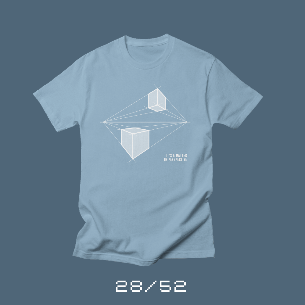
Each week for a year, I’m designing a shirt and releasing it on my Threadless store. This is the design for week 28.
I can’t remember what year of elementary school I was introduced to the concept of perspective. All I know is that once I was introduced to single point perspective, I drew cubes on everything. Later, when I was introduced to two-point perspective, I’d break out a ruler and draw massive cityscapes.
Perspective, for some reason, was an early art lesson that made an impression. I think it was because once you understood the concept of perspective, you looked at the world in a different way. What something looks like depends entirely on your point of view.
Perspective, it turns out, is more than just an art lesson. Learning to take into account other people’s point of view is critical to understanding and working with other people. Everything is a matter of perspective.
Bob Wertz writes about design, technology and pop culture at Sketchbook B. Bob is a Columbia, South Carolina-based designer, creative director, college instructor, husband and dad. He’s particularly obsessed with typography, the creative process and the tools we use to create. He’s currently in the middle of a project to design a new shirt a week for an entire year.
This post was originally posted on December 24, 2017 on Sketchbook B. It’s reposted here as part of a project to move some of my favorite writing to my new site.
Escaping the margins.
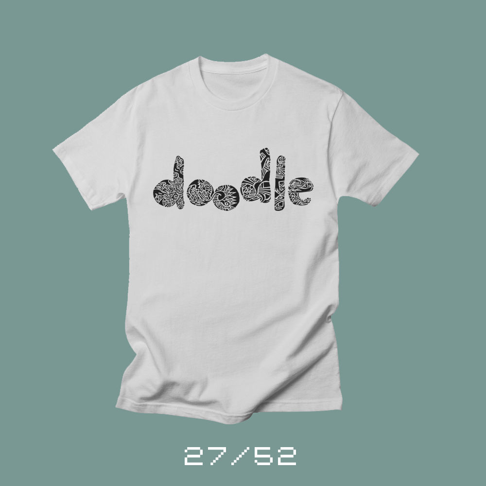
Each week for a year, I’m designing a shirt and releasing it on my Threadless store. This is the design for week 27.
First of all, Merry Christmas. Today is Christmas Eve and I wish all of you a joyous Christmas and a Happy New Year. I released a couple of Christmas shirts earlier — First Tree and Secret Santa. I released them early so people could have them in time for Christmas if they wanted to order them, so it feels a little odd releasing a non-Christmas shirt on Christmas Eve.
I love to doodle. During a conference call or a long meeting, I’ll fill the margin of my notes with mindless little sketches that just kind of flow from the discussion. Sometimes I’ll sketch ideas out that are stuck in my head. But often, I create patterns. Really detailed patterns that form some kind of shape.
These sketches rarely leave my sketchbook or notes. I once did a massive pattern for an InShow poster, but I don’t use the pattern in my artwork much. When I started to think of ideas for this shirt, I was struggling to finalize an idea that I was happy with when my wife mentioned that she’d love to see me do something with my pattern doodles.
Close up of the pattern.
I broke out the Microns and some smooth, heavyweight paper. And I spent the evening doodling the word “doodle.” I photographed the pattern in sections, assembled it in Photoshop and cleaned it up slightly. I really love the look of the pattern and I need to find other ways to use this technique.
Bob Wertz writes about design, technology and pop culture at Sketchbook B. Bob is a Columbia, South Carolina-based designer, creative director, college instructor, husband and dad. He’s particularly obsessed with typography, the creative process and the tools we use to create. He’s currently in the middle of a project to design a new shirt a week for an entire year.
This post was originally posted on December 23, 2017 on Sketchbook B. It’s reposted here as part of a project to move some of my favorite writing to my new site.
Some quick thoughts on The Last Jedi
I saw Star Wars: The Last Jedi for the second time the other night. I caught a late showing on opening night and then a matinee this week with my whole family. I’ve got a few thoughts I want to share… spoiler-filled thoughts…
So if you still haven’t seen the movie, don’t read any further…
…seriously…
…spoilers coming…
…last chance….
…
I really enjoyed The Last Jedi. It has flaws and a couple of scenes seem unnecessary. But it was a blast. Honestly, I think I enjoyed it more than The Force Awakens. It was even better on the second viewing. There are lots of reviews, blog posts and commentary on the internet that break it down in detail. You can read those if you want specific commentary, but I’ve got a couple of things I wanted to mention specifically.
The retreat! The entire movie is a retreat. The rebels are running away and trying everything just to stay alive. I suppose the Empire Strikes Back is somewhat similar, but the retreat from Hoth goes well compared to the retreat in The Last Jedi. At the end of the movie, the entire resistance can fit on the Millennium Falcon.
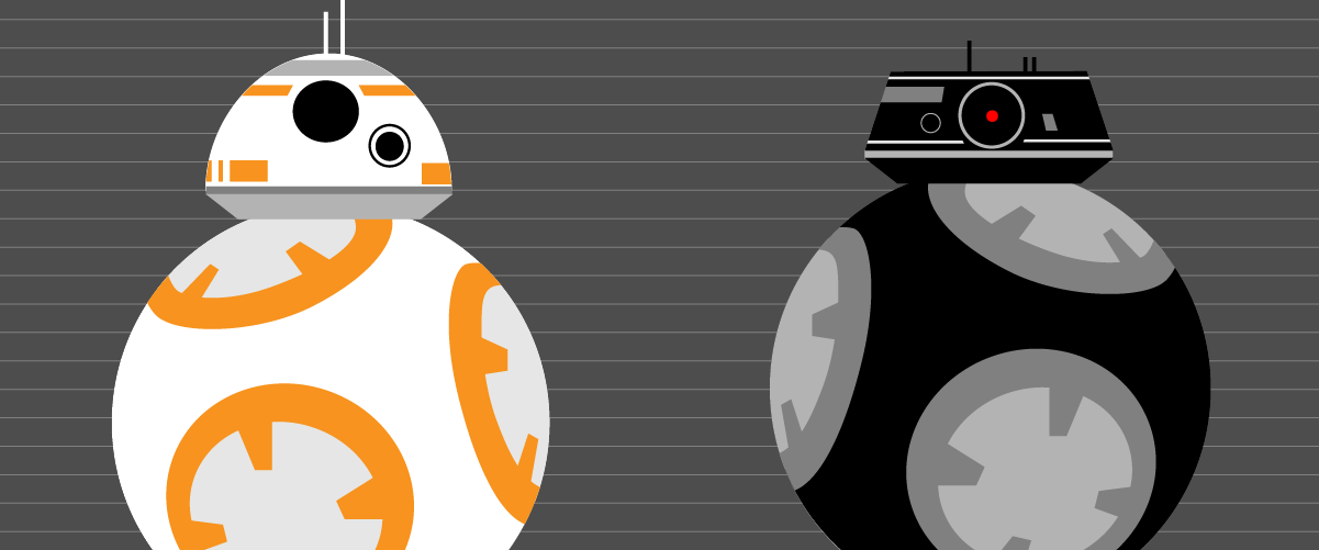
Evil BB-8! Its name is officially BB-9E, but to me, he’s the evil BB-8. We don’t see much of it, but BB-9E makes the best of the time on screen.*
The ships! I’m one of those science fiction fans that love the space ships. And the production design on The Last Jedi is great. From the Rebel bombers and First Order dreadnaught to Snoke’s ship and Kylo Ren’s Tie Silencer. I can’t wait to head to a bookstore and take a look at the cross sections book and visual encyclopedia for The Last Jedi.
“This is not going to go the way you think.”
— Luke Skywalker
The women! When I was in college, I took a class on gender and language. And one of our assignments was to take an element of popular culture and dissect its use of gender and language. I chose the original Star Wars trilogy.** And other than Leia, only one woman had a speaking part — Mon Mothma in Return of the Jedi. All men. Well, that’s not a problem any more. Many of the main characters in The Last Jedi are women. From main characters to background characters, the new Star Wars world is much richer and more diverse. And the series is better because of it.
The action sequences! Poe’s pyrrhic victory against the dreadnaught. Rey and Kylo fighting back-to-back in Snoke’s chamber. The standoff at Crait with the red sand.*** All beautiful, complex battle scenes that were fun and unpredictable.
Yoda! Snoke’s guards! Porgs! Luke and R2 on the Falcon! Holdo slamming into the First Order fleet at light speed! Everything you just said is wrong! Rey lifting rocks! There’s so much I love about The Last Jedi.
I’m looking forward to seeing where J.J. Abrams takes the series in the next film. I assume that some time will have passed between The Last Jedi and Episode 9. I have a feeling that the plan was for Episode 9 to be all about Leia, but with the loss of Carrie Fisher, I think the focus will be solidly on Rey as leader of a new Jedi Order. But this entire new trilogy has surprised me at every turn, and I’m sure they’ve got something up their sleeve for the final installment of this trilogy.
* I’ve seen the droid’s name jokingly listed as BB-H8, which is hysterical.
** I had the original trilogy on VHS. I’m old.
*** On second viewing, Luke’s feet don’t disturb the red sand. Nice touch.
Bob Wertz writes about design, technology and pop culture at Sketchbook B. Bob is a Columbia, South Carolina-based designer, creative director, college instructor, husband and dad. He’s particularly obsessed with typography, the creative process and the tools we use to create. He’s currently in the middle of a project to design a new shirt a week for an entire year.
This post was originally posted on December 17, 2017 on Sketchbook B. It’s reposted here as part of a project to move some of my favorite writing to my new site.
Simply determined.
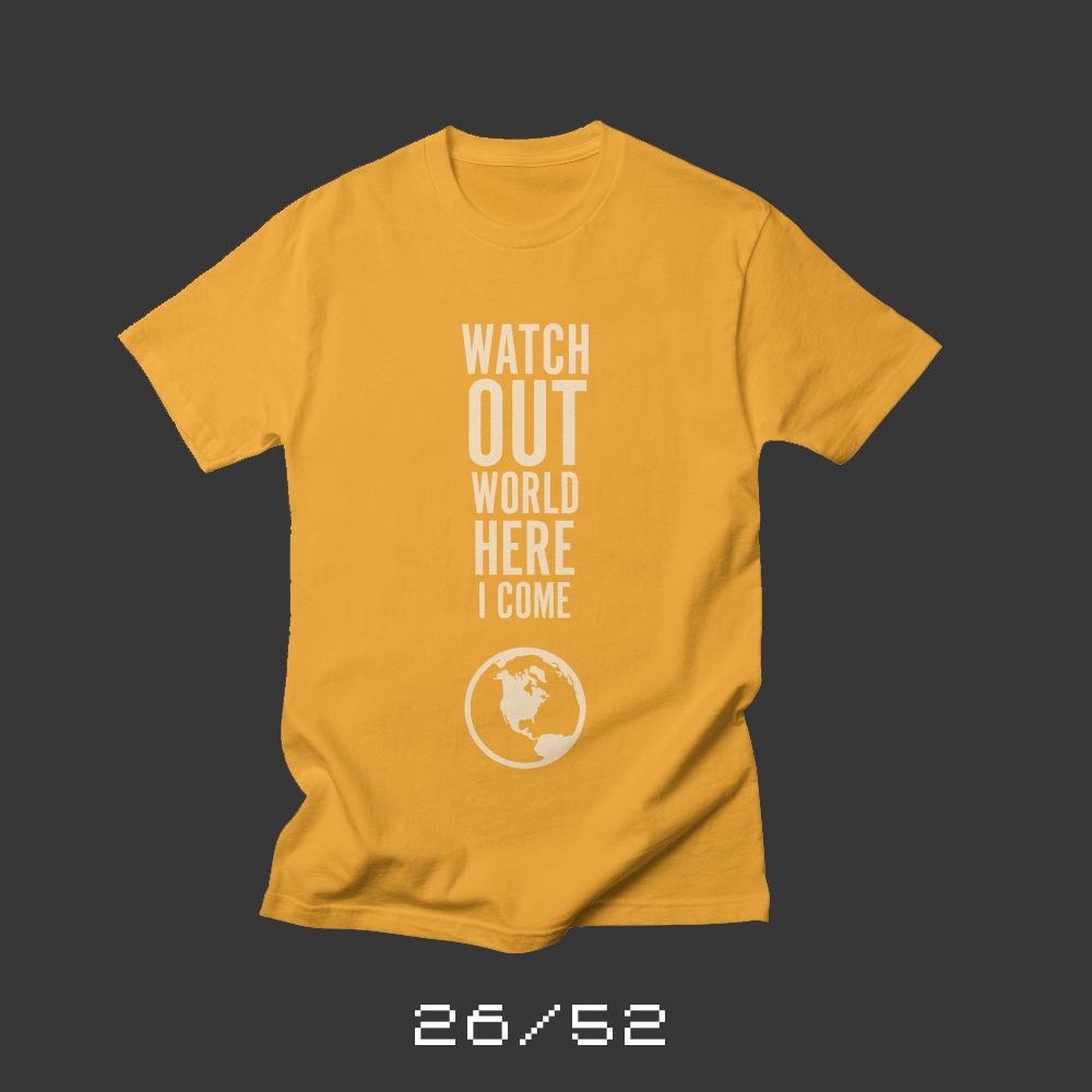
Each week for a year, I’m designing a shirt and releasing it on my Threadless store. This is the design for week 26 and marks the halfway point for my 52 Shirts project.
My oldest became a teenager this week, so it was her turn to work with me to design a shirt.* We had everything completely planned out, but when I finished it, neither of us liked it.** While we sat at the dining room table trying to improve the design, she doodled on a sheet of paper “Watch out world, here I come.”
“What’s that?” I asked, pointing to her doodle.
“I don’t know. Sometimes, you need a plan B, right? It’s always good to have a plan B.”
It was, indeed, time for plan B. I took her phrase and shaped it into an exclamation point.
Norah’s determined. She’s one of those kids who just won’t quit. Smart, strong and kind. “Watch out world, here I come” seemed perfectly appropriate to celebrate her 13th birthday.
* Now that Norah’s shirt is done, we’ve completed birthday shirts for all of Team Wertz — Me, Jill, Ryan, Liz and now, this shirt for Norah. It’s been fun — and challenging — partnering with each of them on their shirt.
** The original shirt was going to say: “I’m afraid of clowns, snakes and being like everyone else.” Alas, choosing a typeface we both liked proved to be impossible.
Bob Wertz writes about design, technology and pop culture at Sketchbook B. Bob is a Columbia, South Carolina-based designer, creative director, college instructor, husband and dad. He’s particularly obsessed with typography, the creative process and the tools we use to create. He’s currently in the middle of a project to design a new shirt a week for an entire year.
This post was originally posted on December 10, 2017 on Sketchbook B. It’s reposted here as part of a project to move some of my favorite writing to my new site.
The first day of many.
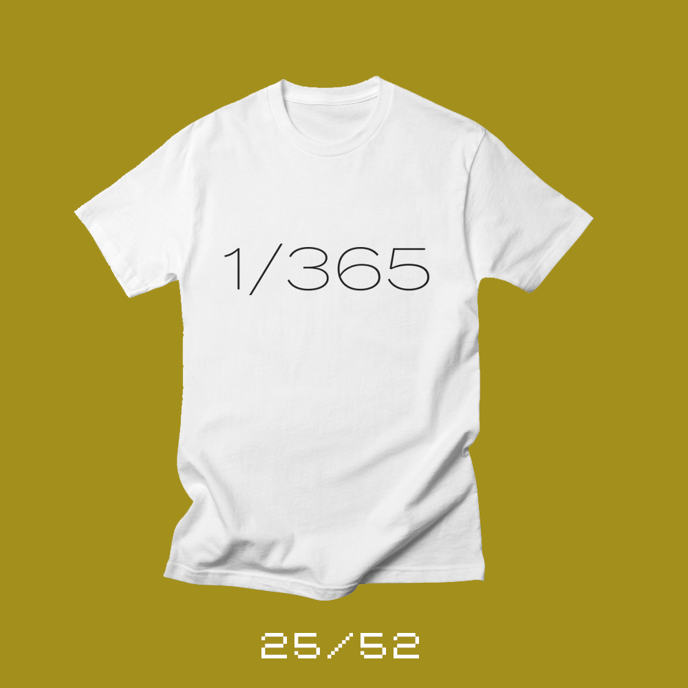
Each week for a year, I’m designing a shirt and releasing it on my Threadless store. This is the design for week 25.
2017 wasn’t a great year for me, but I’ve got a bunch planned for 2018 and I’m really looking forward to the year ahead.
January 1, 2018 is the first day of the new year, but it’s also only one day. One day of 365. We pay special attention to New Year’s Day. We make resolutions and we celebrate the start of a new year — a clean slate. But we need to spend the rest of the year making good on those resolutions and living out those best intentions.
I also need a reminder that one day is only one day. Some days will be really awesome and exceptionally productive. And others will seem like a complete waste of time. But it’s only one day. I can’t get too high or too low. I need to trust the plan and keep working toward my goals.
Bob Wertz writes about design, technology and pop culture at Sketchbook B. Bob is a Columbia, South Carolina-based designer, creative director, college instructor, husband and dad. He’s particularly obsessed with typography, the creative process and the tools we use to create. He’s currently in the middle of a project to design a new shirt a week for an entire year.
This post was originally posted on December 3, 2017 on Sketchbook B. It’s reposted here as part of a project to move some of my favorite writing to my new site.
You can love both.
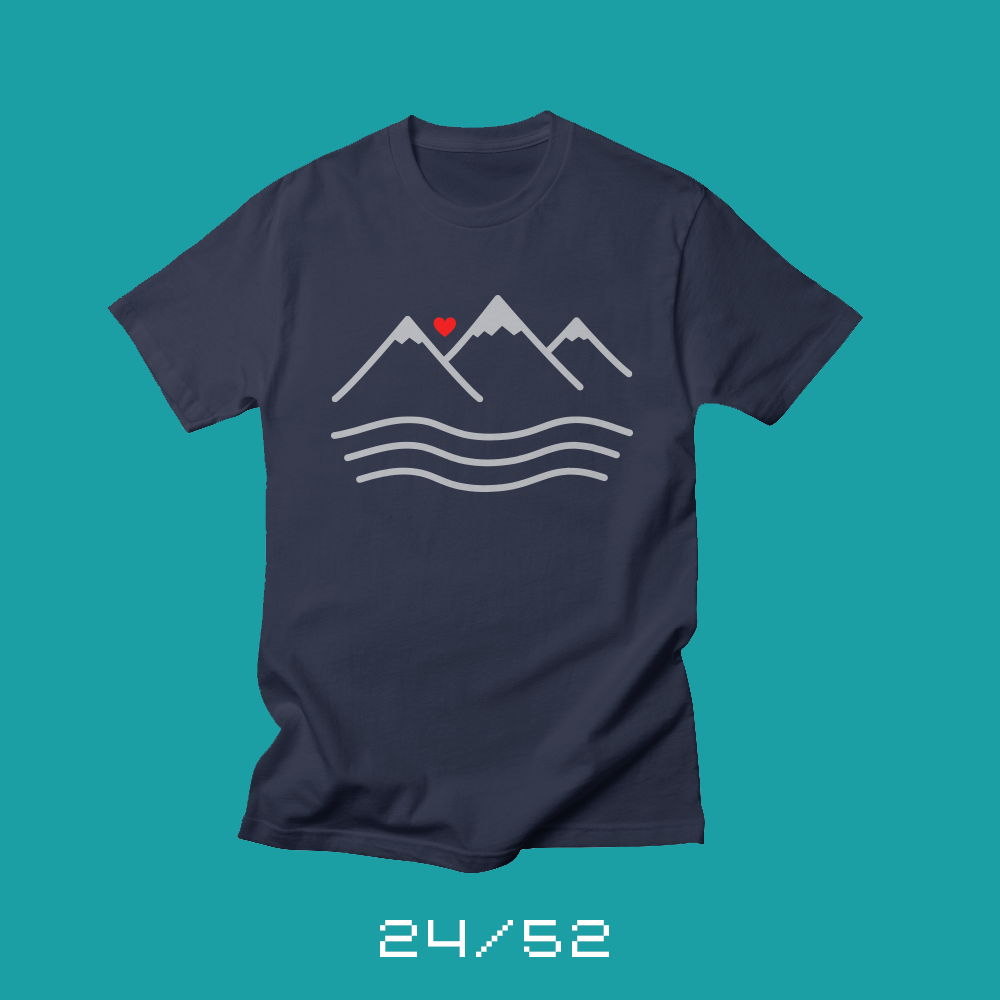
Each week for a year, I’m designing a shirt and releasing it on my Threadless store. This is the design for week 24.
When I started this project, one of the first shirts I sketched out was for my wife’s birthday. I liked the concept, but when I went to execute it… It was fine, but it didn’t look like Liz. So I worked on some other ideas and none of them seemed quite right. Liz has been one of the biggest cheerleaders for this shirt project and I really wanted her shirt to be perfect… it wasn’t.
I took Liz to Hilton Head* to celebrate her birthday and we went for a long walk on the beach. One of the many topics of discussion was our mutual love of both the ocean and the mountains. Liz grew up out west with amazing mountains, but never really went to the ocean. When she moved east, closer to the ocean, Liz discovered that she loved the ocean as much as she loved the mountains.**
* Hilton Head in the winter is wonderful. I highly recommend it.
** Living in Columbia, SC, we are two hours from the coast and two hours from Asheville. For people like us who love both the mountains and the sea, being in Columbia is a perfect location.
Bob Wertz writes about design, technology and pop culture at Sketchbook B. Bob is a Columbia, South Carolina-based designer, creative director, college instructor, husband and dad. He’s particularly obsessed with typography, the creative process and the tools we use to create. He’s currently in the middle of a project to design a new shirt a week for an entire year.
This post was originally posted on November 26, 2017 on Sketchbook B. It’s reposted here as part of a project to move some of my favorite writing to my new site.
Really, I’m fine.
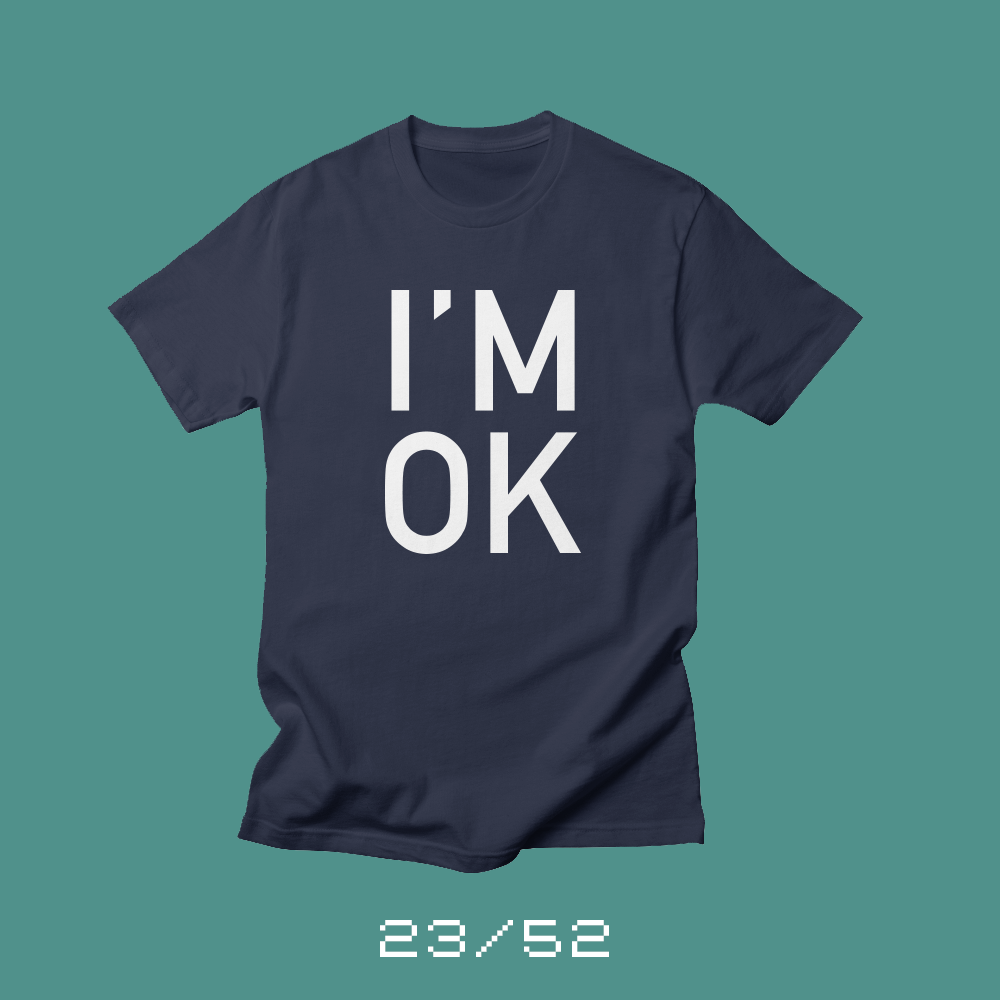
Each week for a year, I’m designing a shirt and releasing it on my Threadless store. This is the design for week 23.
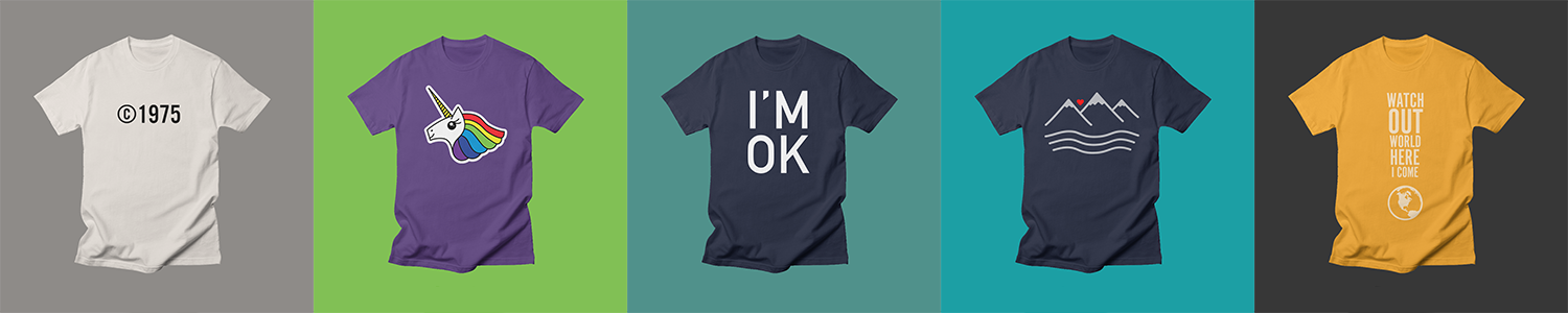
My son Ryan turned 6 this week. And as I mentioned when I designed Jill’s Team Rainbow Unicorn shirt, I let the kids help design the shirt on the week of their birthday.
We locked in very quickly on what the shirt would say. Whenever Ryan falls, stumbles or gets hurt, he immediate shouts “I’m okay!” He started this when he was very little — pretty much when he started to talk. Once, when he fell and smashed out a tooth at daycare, the first thing he said to me when I picked him up was “I’m okay!” Sometimes, he starts saying “I’m okay!” when he starts to fall, before he hits the ground. It’s become like a catchphrase for him.
But what the shirt looked like, though… that was challenging.
At first Ryan wanted something really complicated, with paper airplanes crashing and little stick figures and a speech bubble with “I’m okay.” But I wanted to do something a little cleaner. We went around and around with other ideas. After all the back and forth, we settled on just having “I’M OK” on the shirt. Bold and straightforward.*
* One variation was a bold “I’M OK” all cracked up into pieces. And while it looked cool, and Ryan really liked it, it looked completely depressing, all shattered and broken. It really didn’t fit the message we wanted.
Bob Wertz writes about design, technology and pop culture at Sketchbook B. Bob is a Columbia, South Carolina-based designer, creative director, college instructor, husband and dad. He’s particularly obsessed with typography, the creative process and the tools we use to create. He’s currently in the middle of a project to design a new shirt a week for an entire year.
This post was originally posted on November 19, 2017 on Sketchbook B. It’s reposted here as part of a project to move some of my favorite writing to my new site.
I would tell you, but it’s claus-ified.
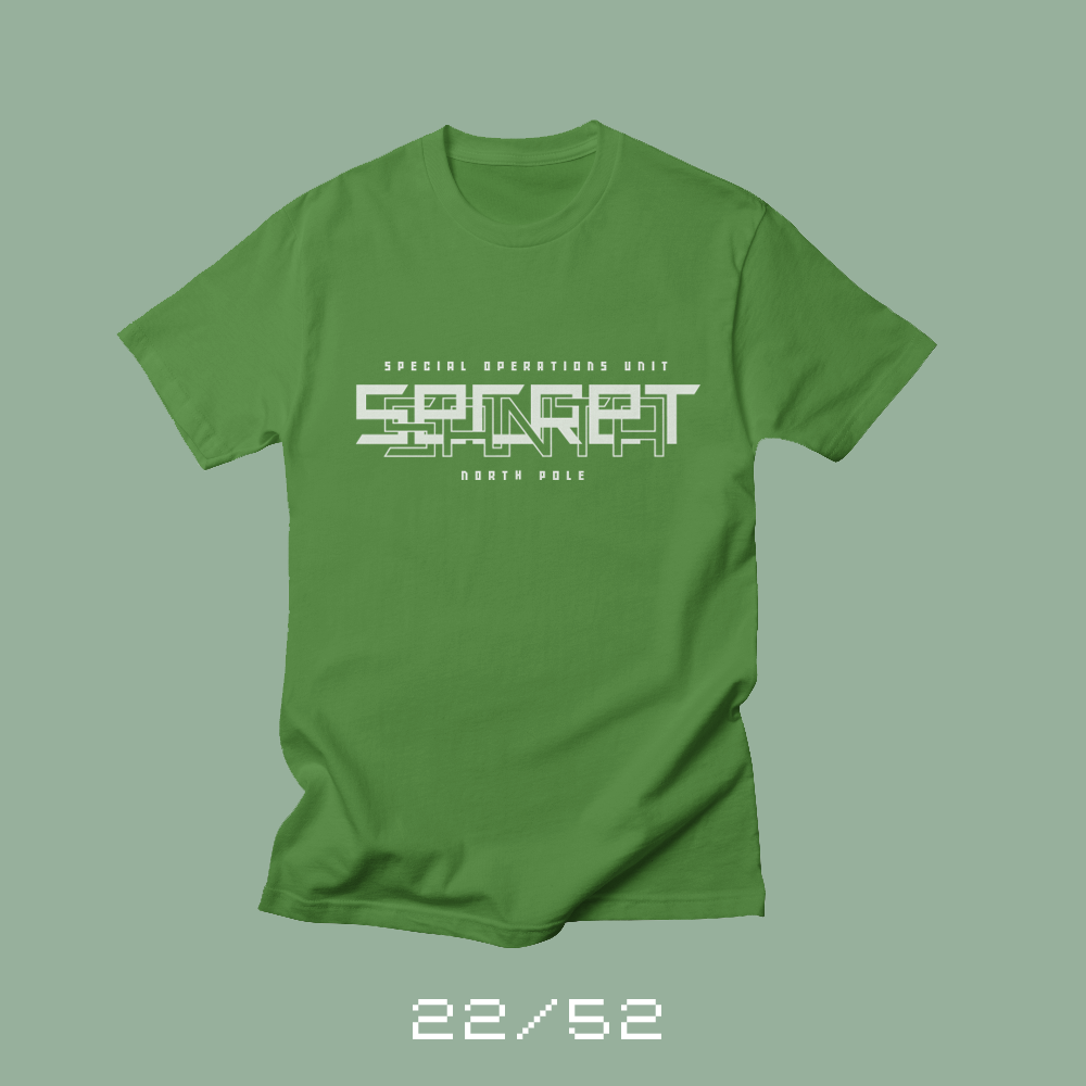
Each week for a year, I’m going to be designing a shirt and releasing it on my Threadless store. This is the design for week 22.
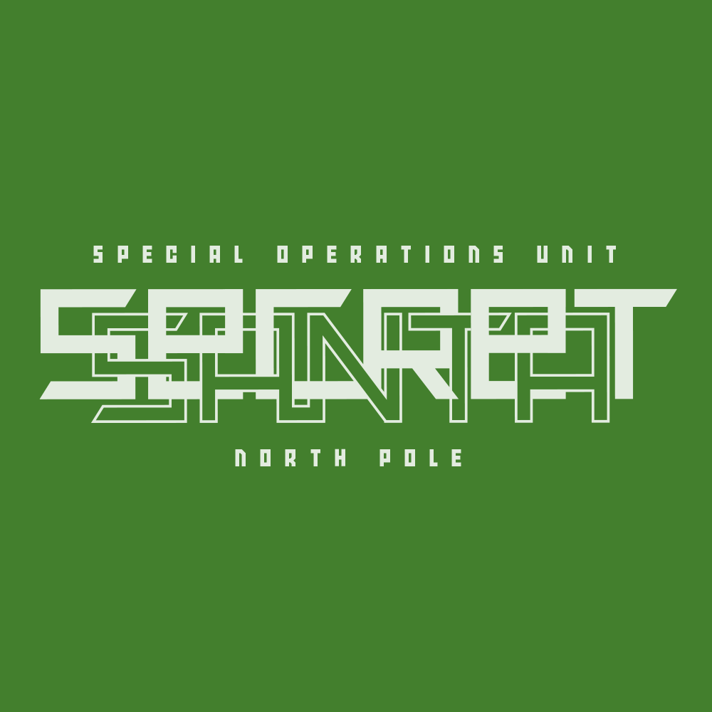
I’ve always loved the phrase “Secret Santa.” Of course, it’s intended to be an exchange of gifts where no one knows who is giving them gifts. I’ve done Secret Santa’s at the office and I’ve volunteered to be a Secret Santa for a local children’s shelter. I’ve always fun buying presents for others.
But I’ve always thought that phrase sounded more like a comic book. Santa delivers presents on Christmas, but the rest of the year, he uses his magic to solve crimes. Something of a cross between Sherlock Holmes and Columbo. Or like the old Disney Channel animated show, Kim Possible. Maybe Santa is a secret agent in the off season, with an entire team based out of the North Pole. More 007 than Sherlock Holmes.
Or maybe my Secret Santa comic would follow Mrs. Claus as she moves from town-to-town solving murders. Sort of like Murder She Wrote, but with magic. And candy canes.
Bob Wertz writes about design, technology and pop culture at Sketchbook B. Bob is a Columbia, South Carolina-based designer, creative director, college instructor, husband and dad. He’s particularly obsessed with typography, the creative process and the tools we use to create. He’s currently in the middle of a project to design a new shirt a week for an entire year.
This post was originally posted on November 11, 2017 on Sketchbook B. It’s reposted here as part of a project to move some of my favorite writing to my new site.
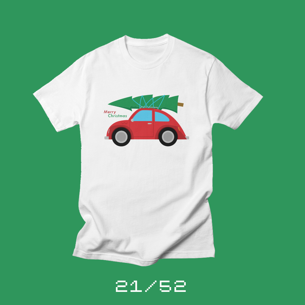
A tree as big as our car.
Each week for a year, I’m going to be designing a shirt and releasing it on my Threadless store. This is the design for week 21.
When my wife and I first got married, we lived in a little duplex in downtown Columbia. Christmas came and we needed to get a tree. I’d never had an artificial tree and was dead set against anything but a real tree.
We went to a little Christmas tree lot on Garners Ferry not too far from home and picked out the perfect tree. Perfect, except for the fact that we still had to get it home.
You see, we had two small cars, and this Christmas tree wasn’t fitting in either of them. The guy at the tree lot didn’t seem concerned. “Happens all the time.” So he broke out some twine and scissors and tied it to the roof of our Blue Ford Focus.
The sight was so ridiculous, that I drew a picture of it for our first Christmas card as a married couple. The tree tied onto the top of our Ford Focus was almost as big as the car. We got back to the duplex and discovered that the tree was too tall and it didn’t fit in the tree stand we had purchased. I had to go to the store to buy a saw to cut part of the bottom off.*
Once we got the tree up and decorated, it looked awesome. But the process… that was an adventure.
Eventually, I overcame my dislike of fake trees and now I don’t have to strap a tree to the top of my car, but Liz and I laugh about that first Christmas tree every year.
“Once we got the tree up and decorated, it looked awesome. But the process… that was an adventure.”
So for my first Christmas shirt for this year, I wanted to draw something that reminded me of our first Christmas together. I switched the car from a Blue Ford Focus — who wants a shirt with that car on it — to an old VW Rabbit. This was one of my first sketches that I completed when I started working on this project in the summer. I’ve been excited about this shirt idea for months.
Yesterday, I saw a similar shirt design floating around Facebook and I was kind of bummed that someone else had the same idea. But then I remembered the words of the attendant at the tree lot. “Happens all the time.” Most people probably do have a memory of strapping a too-big tree on top of a too-small car.
Shirts make great Christmas gifts. And I’m offering a 20% off promotion on all my shirts through the end of 2017. It should save you a few bucks per shirt. And Threadless is offering free shipping on orders over $40 through December 15 – just use the code “CHEER10cc62.”
* Also, that’s the Christmas we learned that taking the tree to the recycling place after Christmas is much tougher than bringing it home.
Bob Wertz writes about design, technology and pop culture at Sketchbook B. Bob is a Columbia, South Carolina-based designer, creative director, college instructor, husband and dad. He’s particularly obsessed with typography, the creative process and the tools we use to create. He’s currently in the middle of a project to design a new shirt a week for an entire year.
This post was originally posted on November 5, 2017 on Sketchbook B. It’s reposted here as part of a project to move some of my favorite writing to my new site.
It’s tough being in the middle.
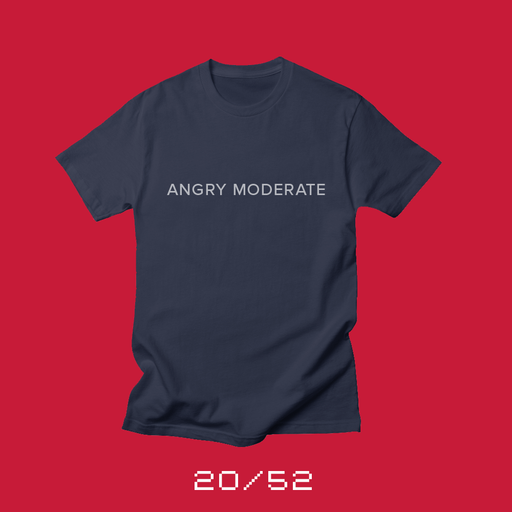
Each week for a year, I’m going to be designing a shirt and releasing it on my Threadless store. This is the design for week 20.
When I was in high school, a friend asked whether I considered myself conservative or liberal. I told him that I was more of a moderate.
“You can’t be a moderate,” he said, “That means you don’t stand for anything.”
It’s tough being moderate in today’s hyper partisan world. But I think now, more than ever, moderates are the key to stabilizing our country.
Moderates are not the same thing as independents. Independent voters don’t claim one party or the other, but they’re views aren’t necessarily in the middle. For example, some independents think the Republican Party is too liberal.
Moderates on the other hand tend to be pragmatic. They look for ways to solve problems for their state or country. They work with people from other parties to craft solutions, not division. Moderates can be Republicans or Democrats (or independents), but they believe you can achieve more by working together than constantly demonizing each other. For many of our problems (but not all*), compromise is a solution to the issues that challenge America.
Today, with highly gerrymandered districts and campaigns financed increasingly by SuperPACs and the influential donors, it’s tough for a moderate to make it through the primaries, let alone win a general election.
On Facebook, my political beliefs are listed simply as “Angry Moderate.” It frustrates me that people can’t work together. I’m baffled by political parties that put their needs above the needs of the nation. And I’m completely pissed off by politicians who want everything to be about them, instead of realizing that they were elected to serve this nation, not rule it.
But the problem with moderates is that they typically don’t get angry. There is no moderate equivalent of the Tea Party. There isn’t a group of radical moderates that will band together to defeat a hyper partisan candidate in a primary. People don’t build moderate Super PACs. I can’t think of any billionaires wanting to fund moderate candidates.
When I decided to make an Angry Moderate shirt, the design approach was straightforward. Pick a sans serif designed by an American** and select a medium weight. Set the type in white and make it available on red, blue, grey and purple shirts. The result is appropriately the most subtle “angry” shirt you can make, perfect for a moderate.
* There are many things that you can’t compromise on. Basic human rights, for example.
** Proxima Nova Medium, designed by Wisconsin native Mark Simonson.
Bob Wertz writes about design, technology and pop culture at Sketchbook B. Bob is a Columbia, South Carolina-based designer, creative director, college instructor, husband and dad. He’s particularly obsessed with typography, the creative process and the tools we use to create. He’s currently in the middle of a project to design a new shirt a week for an entire year.
This post was originally posted on October 29, 2017 on Sketchbook B. It’s reposted here as part of a project to move some of my favorite writing to my new site.
“Strike me down and I will become more powerful than you can possibly imagine.”
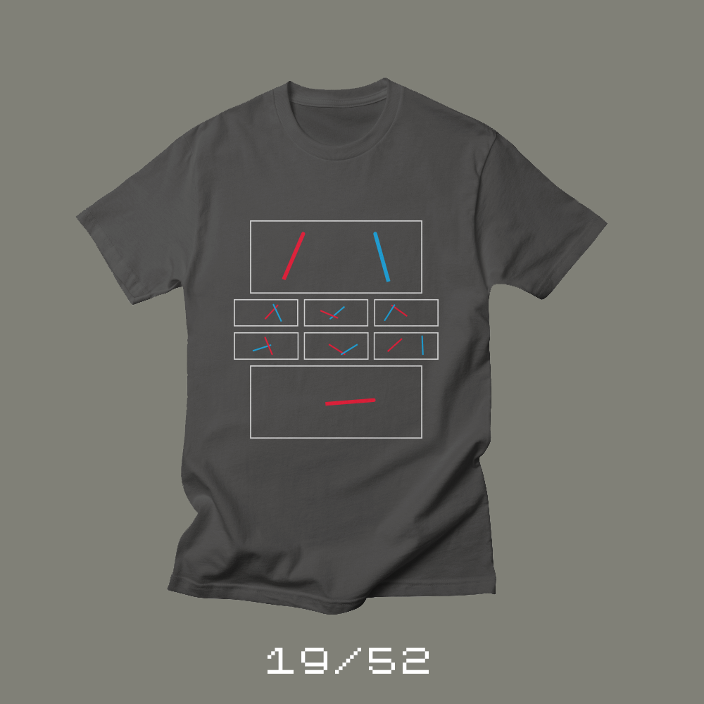
Each week for a year, I’m going to be designing a shirt and releasing it on my Threadless store. This is the design for week 19.
I was two when Star Wars came out in 1977. I don’t know when I saw the movie for the first time. Back then we obviously didn’t have DVDs or video-on-demand. We had to wait for the movie to be rereleased to the theaters. But I remember seeing the lightsaber dual between Darth Vader and Obi-Wan Kenobi, which ends with — SPOILER — Kenobi inexplicably sacrificing himself and disappearing.
“Strike me down and I will become more powerful than you can possibly imagine.”
— Obi-Wan Kenobi
Later his disembodied voice reminds Luke to use the force when destroying the Death Star. And of course, we find out later he becomes a “force ghost” and continues to guide and help Luke through the next two movies.
Star Wars (and all science fiction) has been a major influence on my life. Most of my toys growing up were Star Wars toys. And the rest were Legos that I used to make spaceships. But Star Wars — the original — started it all.
This December, the eighth Star Wars Saga film is released — The Last Jedi. I wanted to shirt to wear to the movie that subtly referenced the first film. And so we have Duel. A rough approximation of the lightsaber fight between Obi-Wan and Vader. Each frame is in a 2.35:1 ratio, the proportions that Star Wars was filmed in. And of course it ends with only one red lightsaber.
I’ll be wearing Duel for opening night of Star Wars: The Last Jedi. You can grab one, too, at my Threadless store.
Bob Wertz writes about design, technology and pop culture at Sketchbook B. Bob is a Columbia, South Carolina-based designer, creative director, college instructor, husband and dad. He’s particularly obsessed with typography, the creative process and the tools we use to create. He’s currently in the middle of a project to design a new shirt a week for an entire year.
This post was originally posted on October 28, 2017 on Sketchbook B. It’s reposted here as part of a project to move some of my favorite writing to my new site.
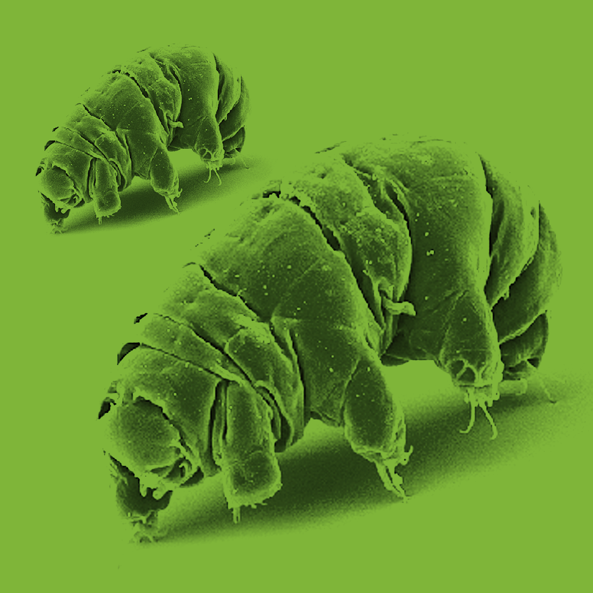
Apparently, giant tardigrades are all the rage on television today.
My son* loves the animated show, The Deep, and he recently discovered that the second season was on Netflix. Our whole family loves the show, and we binge watched a bunch of episodes together over a weekend.
One of the episodes of Deep deals with a giant tardigrade — a normally microscopic animal that is one of the toughest animals in existence. Tardigrades are so tough, that they can survive pretty much anywhere, even in the vacuum of space.
Fast forward to that Sunday night, while watching CBS’s new Star Trek Discovery, where the show featured — you guessed it — a giant tardigrade.
I guarantee neither creative team was thinking someone would beat them to using a giant tardigrade as a plot device. These two shows couldn’t be more different. One is an under-the-radar Australian animated show about futuristic sea exploration that streams on Netflix. And the other is the latest television iteration of one of the best known science fiction series. These ideas obviously developed in parallel and were inspired by the same creature.
“I guarantee neither creative team was thinking someone would beat them to using a giant tardigrade as a plot device.”
I guess, for me, this coincidence demonstrates that in today’s environment — with so many people creating so much content — truly original concepts seem like an impossible task. Even when you think you are creating something new, the reality is, someone else may be working on the same idea at the same time.
* Okay. I may love the show, too.
Bob Wertz writes about design, technology and pop culture at Sketchbook B. Bob is a Columbia, South Carolina-based designer, creative director, college instructor, husband and dad. He’s particularly obsessed with typography, the creative process and the tools we use to create. He’s currently in the middle of a project to design a new shirt a week for an entire year.
This post was originally posted on October 22, 2017 on Sketchbook B. It’s reposted here as part of a project to move some of my favorite writing to my new site.
A chance for family to gather and celebrate
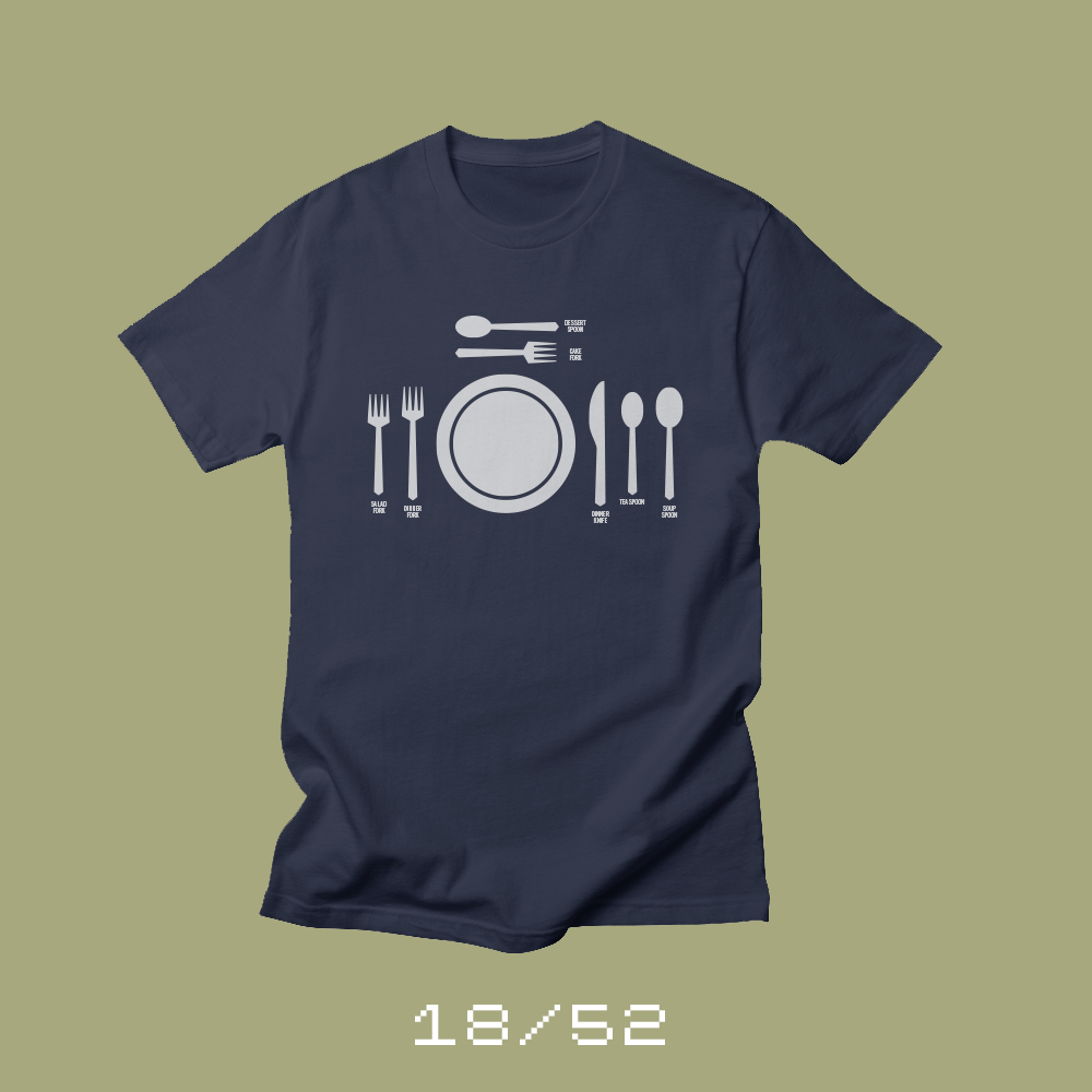
Each week for a year, I’m going to be designing a shirt and releasing it on my Threadless store. This is the design for week 18.
Once a year, we prepare an irrationally large meal. We make a turkey and use a stuffing recipe that’s been in the family for decades. We cook the same casseroles and side dishes that we have at Thanksgiving every year. My wife makes a Kentucky Derby Pie, which is like a giant cookie, because most of our crew won’t eat pecan or pumpkin pie.
We pull all of the special dishes and silverware out. China that belonged to my wife’s grandmother. Goblets that were gifts from our wedding. Serving dishes that my mom used. We use the fancy table cloth and set the table correctly, with all the silverware in the right spots.
“We use the fancy table cloth and set the table correctly, with all the silverware in the right spots.”
And then we gather around the table — with as much family as we can — and have the fanciest meal we’ll have all year. We tell stories about past get togethers and the time my wife went into labor right before we were about to have our Thanksgiving meal. We eat way too much and have plenty left over. We pack up the leftovers and send them home so that everyone can have turkey sandwiches for days.
Thanksgiving is a chance to be together with family, and for me, the big meal, with a formal place setting, is a perfect symbol of that. So this week’s shirt, Fancy, is in honor of Thanksgiving — and released early so you can wear one while you prepare your own Thanksgiving feast.
Bob Wertz writes about design, technology and pop culture at Sketchbook B. Bob is a Columbia, South Carolina-based designer, creative director, college instructor, husband and dad. He’s particularly obsessed with typography, the creative process and the tools we use to create. He’s currently in the middle of a project to design a new shirt a week for an entire year.
This post was originally posted on October 21, 2017 on Sketchbook B. It’s reposted here as part of a project to move some of my favorite writing to my new site.
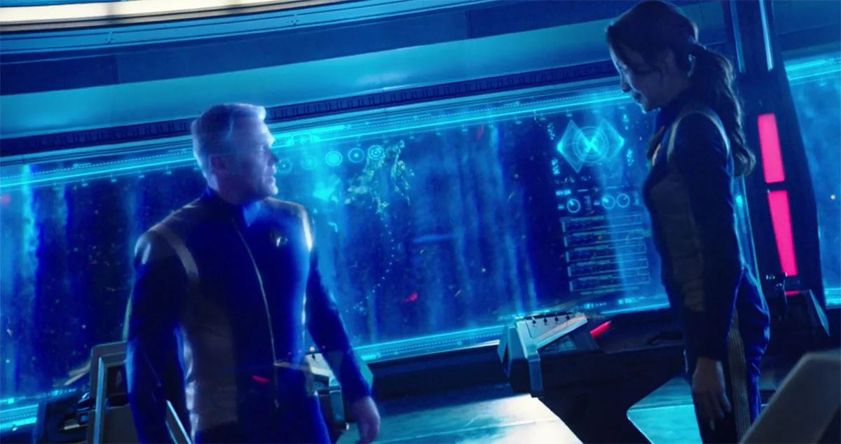
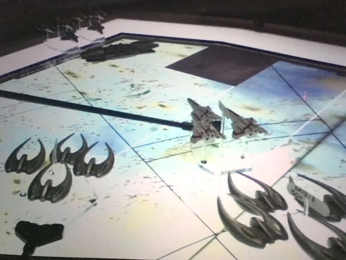
Sometimes you need to break with continuity
Admiral Hologram appears on the bridge.
I’ve been enjoying the new Star Trek Discovery, and yes, I subscribed to CBS’s streaming service so I can watch it. It seems to be getting mixed reviews from fans who feel it strays a little too far from the Star Trek mold. It is different, but I guess I don’t see that as a bad thing. Personally, I think it’s an engaging show and I look forward to watching it each week.
Star Trek Discovery is a prequel, set after Enterprise, but 10 years before the original Star Trek. I am fascinated by the creative decisions the art directors have made to try to help the show visually fit with the other series. The challenge is to make the show look futuristic to a modern audience, while using enough of the earlier material — which occurs later in the timeline — to connect the show for the true fans.*
For Star Trek, this is especially challenging because the original series was filmed in the 1960s and include lots of buttons and switches. In today’s world, buttons and switches are anything but futuristic.
Among fans, one of the most controversial elements** of the new show is holographic communications. In the premiere, several conversations occur with holograms on the bridge. In another episode, a main character looks at herself in a holographic “mirror” program.
“In today’s world, buttons and switches are anything but futuristic.”
This “controversy” reminded me of an episode of Ronald D. Moore’s Battlestar Galactica podcast.*** He did an episode commentary for every single show of the rebooted Battlestar while drinking scotch. I used to listen to them religiously.
To visualize space battles, Battlestar Galactica used seeming archaic models on a table to show what was happening. It seemed odd, considering that we were flying though space, and looked like something out of the German high command in the movie Patton. Moore explained that it was the best way to show the viewer how the battle was unfolding. And he was right, the models on the table were much easier to understand than blips on a screen.
The Cylons are closing in.
It’s true that these holograms aren’t used in any other Star Trek****, but I like the addition. Being able to have your cast interact with a hologram is much more dynamic visually than having them talk to a view screen. And just like Ron Moore’s decision to use models on a table to show a space battle, the use of the holograms is simply the best way to engage today’s viewer.
Sometimes, the best creative choice is to break with tradition.
* This is a problem with all sci-fi prequels. Take a look at how the Star Wars prequels handled technology and art direction and compare that to a more faithfully-aligned Rogue One.
** And also, small caps subtitles.
*** Sadly, they are not available online anymore. They were a fabulous companion for watching the show.
**** I’m probably wrong, but the entirely of the series is too vast for me to find a specific reference.
Bob Wertz writes about design, technology and pop culture at Sketchbook B. Bob is a Columbia, South Carolina-based designer, creative director, college instructor, husband and dad. He’s particularly obsessed with typography, the creative process and the tools we use to create. He’s currently in the middle of a project to design a new shirt a week for an entire year.