Spent my morning working on some typeface designs in Glyphs. I really enjoy working with fonts, and I have several designs that I’ve started and not finished. I need to prioritize creative time – not just writing, but also sketching and type design.
Fonts
I design fonts. I write about fonts. I love fonts.
Finally got around to adding a fonts page to my Micro.Blog site.
Reintroducing Power Grid and Intermodal
11/16/21 • 3 min read
This post was originally posted on November 17, 2021 on Sketchbook B. It’s reposted here as part of a project to move some of my favorite writing to my new site.
A couple of old typefaces get new versions.
This week I released a couple of new display typefaces based on some of my older designs: SbB Power Grid and SbB Intermodal Stencil. These designs have been available before in different forms, but these new versions are significantly refined and expanded. Both SbB Power Grid and SbB Intermodal Stencil are available for purchase at MyFonts.
SbB Power Grid
SbB Power Grid is a bold display typeface with an industrial feel. The family has four styles — Regular, Inline, Stencil and Rounded and corresponding italics. This is actually the third version of Power Grid. I spent time refining the look and feel of the design and I’m really happy with where it landed. The Stencil and Inline versions in particular would work well in athletic or industrial branding.
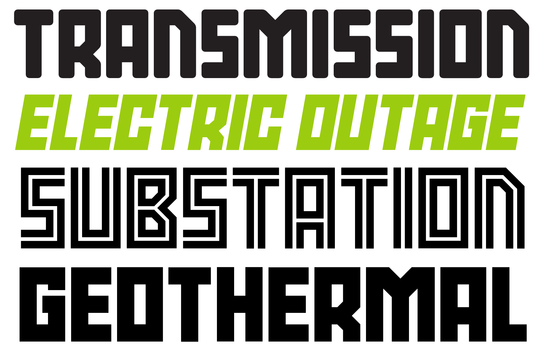
SbB Power Grid is available as a family for $19 at MyFonts. Individual fonts are $9 each.
SbB Intermodal Stencil
SbB Intermodal Stencil is my futuristic, sci-fi stencil system. I’ve written about Intermodal Stencil and my experiments with variable type. I’m happy to finally release a new version. I’ve refined the letterforms, added a couple of alternates and two italic angles. The variable version includes three axes — width, slant and stencil opening. The stencil opening serves as a type of optical correction. At smaller sizes, the larger stencil cuts work better.
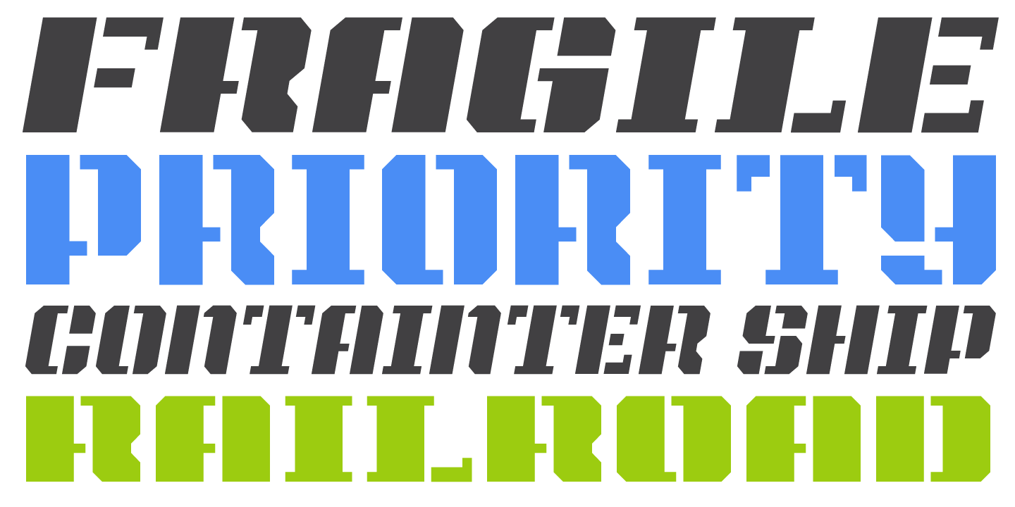
What’s the deal with multiple italic* angles? When you are designing a typeface that intended to be used in large blocks of text, the designer needs to pick one consistent italic angle. But when you are talking about a display typeface, an italic angle is just an aesthetic choice. So I’ve decided to provide multiple angles for Intermodal. Intermodal features 5 degree and 10 degree obliques. If you use the variable font, you can pick any italic slant between 0 and 15 degrees.
SbB Intermodal Stencil is available as a family for $19 at MyFonts. Individual fonts are $9 each.
30% off for a limited time
To celebrate my new typeface releases, SbB Power Grid, SbB Intermodal Stencil and SbB Powertrain (which I released last year) are all 30% off at MyFonts through January 1, 2022. Individual fonts start at $6.30 and typeface families start at $13.30.
* Also, these are really obliques, not italics. An italic is typically drawn in a different style, while an oblique is a slanted version of the upright Roman. But most people and designers just call all slanted text “italics” so I decided it was time to abandon that particular linguistic fight.
Bob Wertz writes about design, technology and pop culture at Sketchbook B. Bob is a Columbia, South Carolina-based designer, University of South Carolina Ph.D. student, mass comm researcher, college instructor, husband and dad. He’s particularly obsessed with typography, the creative process and the tools we use to create. Bob occasionally and begrudgingly posts to Twitter and Instagram. He wears a mask and got vaccinated to protect his community. #TeamModerna
Introducing SbB Powertrain
10/17/20 • 6 min read
This post was originally posted on October 18, 2020 on Sketchbook B. It’s reposted here as part of a project to move some of my favorite writing to my new site.
Bold, angular and flexible
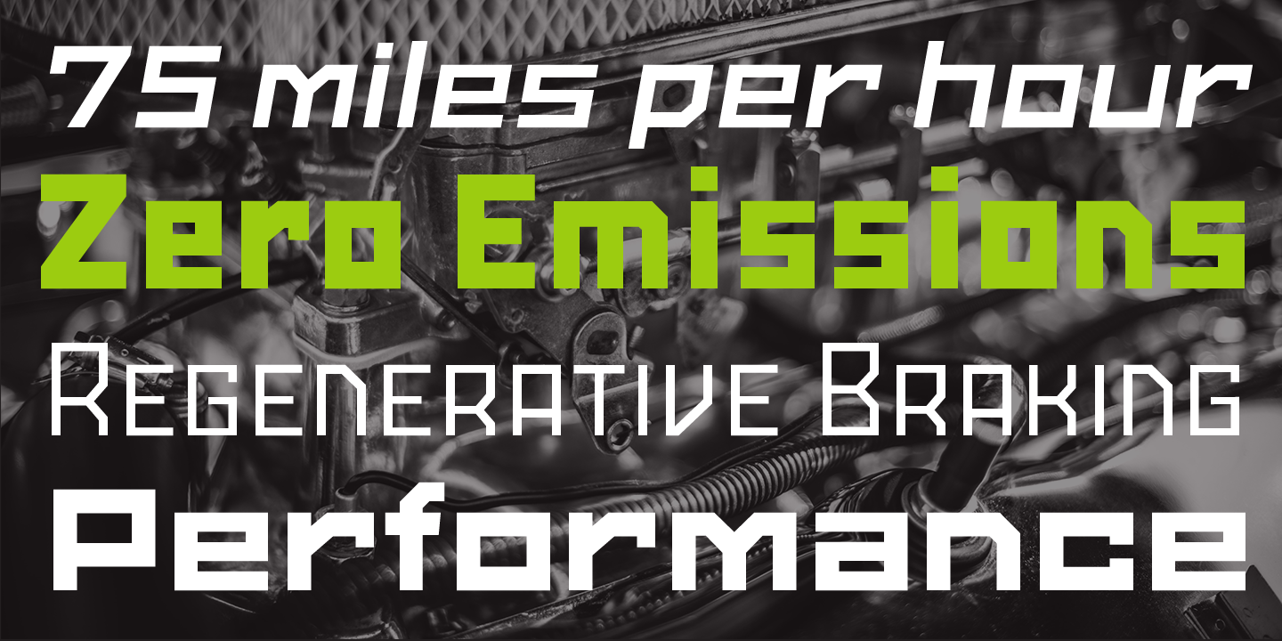
Last spring, in the midst of the pandemic, I decided to revisit, revise and expand some of my existing typefaces, and I pretty much spent every spare minute of the summer working on them. The first release from these updated designs is also the most ambitious of them – SbB Powertrain, a massive family of 100 fonts. Five widths and 10 weights. And it’s available today at MyFonts.
Powertrain is inspired by a bunch of random things I like: 1920s constructivist posters, comic book lettering and early pixel fonts. I’ve been sketching letters on graph paper since I was a kid and a bunch of that DNA is here, too. Obviously, my experimentation with modular type at Fontstruct has been an influence as well.
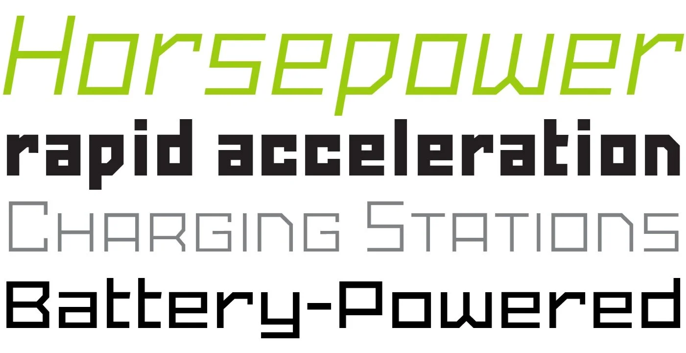
Powertrain meets a specific need that I had as a designer. I like creating logos and illustrations that are sharp and angular, but I never had the type to complete the look. I needed a wide range of weights and widths to work with a variety of concepts, but I struggled to find options that I liked and that I had the flexibility I wanted. Something that could work for everything from headlines and logotypes to paragraphs and web addresses. Powertrain serves that need for me, and hopefully, it will work for you, too. I think that SbB Powertrain will work well in corporate, industrial and athletic branding projects.
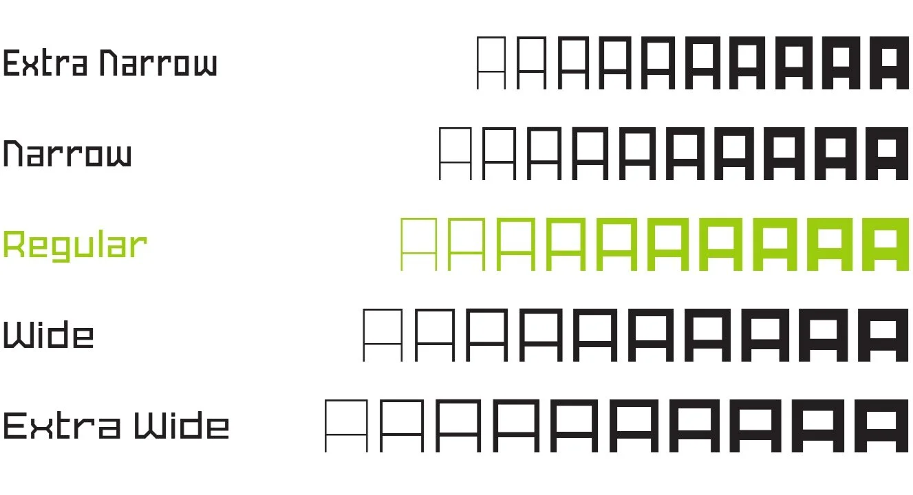
I’ll be honest. Five widths and ten weights is probably overkill. But the more I played around with Powertrain, the more I enjoyed having maximum flexibility in picking exactly the weight I wanted to use.
- Five Widths: Extra Narrow, Narrow, Regular, Wide and Extra Wide
- Ten Weights: Thin, Extra Light, Light, Regular, Medium, Semibold, Bold, ExtraBold, Black and Heavy.
I’ve included support for many languages, but I plan to expand that further in the near future.
Powertrain vs. Powerlane
Powertrain is a massive extension and revision of my first commercial typeface, Powerlane. Powerlane was very narrow — and actually forms the basis of the SbB Powertrain Extra Condensed. I’ve spent a significant amount of time refining the letterforms, spacing and features. SbB Powertrain will replace Powerlane.
So why change the name? Powertrain is a significantly different typeface and I felt it needed a new name. Plus, I never really loved the name Powerlane. I know why I picked it, but when I started working on this version, I knew it was time to make the change.
Opentype Features
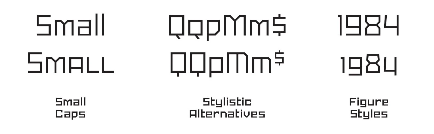
As a designer, I like (and use) Opentype features. So SbB Powertrain features a range of features and alternate characters.
-
Small Caps. I hate fake small caps where the uppercase letters are just crudely scaled down. So Powertrain includes a full set of small caps.
-
Alternates. I’ve included a handful of alternate letters. I especially like the alternate M and $.
-
Figure Sets. Powertrain includes proportional lining numbers, tabular lining numbers and even a version of “old style” numerals. (I really like how the old style numbers look in a block of text.)
Software support for Opentype features varies widely, but Adobe Creative Cloud apps have solid — if inconsistent — support for features.
Sans Serif? Or something else?
Traditionally, typefaces fall into some specific categories. Clearly Powertrain isn’t a serif typeface. It’s not a script. I wouldn’t classify it as a decorative or display typeface because it’s more useful than that. I guess that means it’s a geometric sans serif of some sort? That’s what I’m going with.
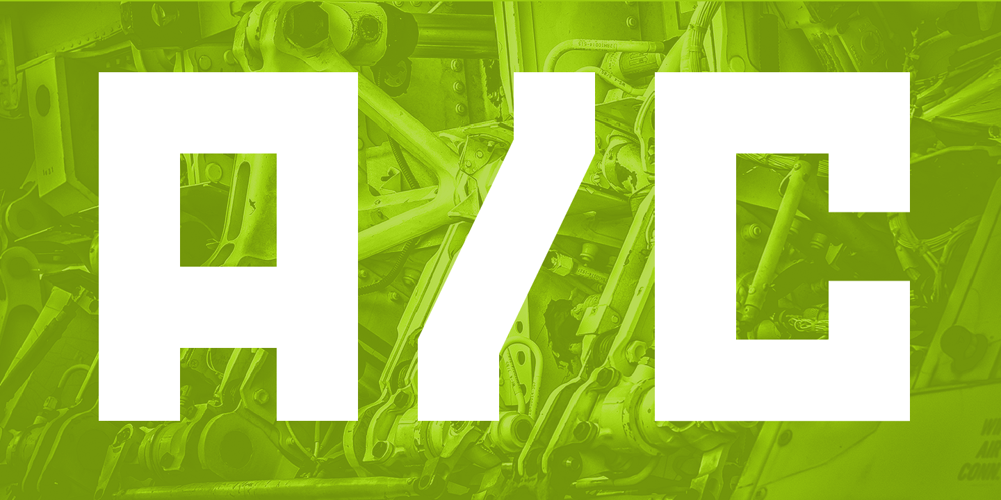
Geometric sans are normally curvy, though, so I don’t love grouping Powertrain into that category. (Powertrain has virtually no curves.) I think I actually prefer the term “constructed” to describe Powertrain. It’s not designed to follow a historical, written model, but it is intended to be used beyond just decorative use. Maybe I should call it a “Constructed Sans Serif.”
Variable Font
Variable fonts allow you to customize aspects of the typeface. SbB Powertrain Variable has three axes — width, weight and slant. One font file takes the place of 100. If you want to pick a size in between the defined sizes, you can. If you need a different slant angle, pick any angle up to 15 degrees.
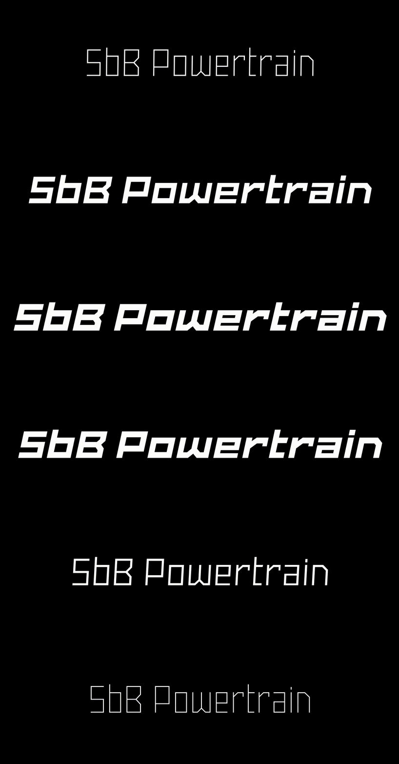
I knew when variable fonts were announced, that I wanted to play around with them. It’s pretty impressive technology, but… it’s early. Support from software is iffy. It works reasonable well in Adobe’s Creative Cloud apps — they just fixed an issue in Indesign. Browser support is coming along slowly.
Since the variable font file can generate any font in the entire family, SbB Powertrain Variable is included when you buy the complete family on MyFonts or Creative Market. I still feel like the variable font is a beta and I plan on updating it as the technology continues to mature.
Price
The type industry is changing. Type is being offered for free through Google Fonts and as part of an Adobe Type subscription. It’s always been tough to get people to pay for type. It’s just getting harder.
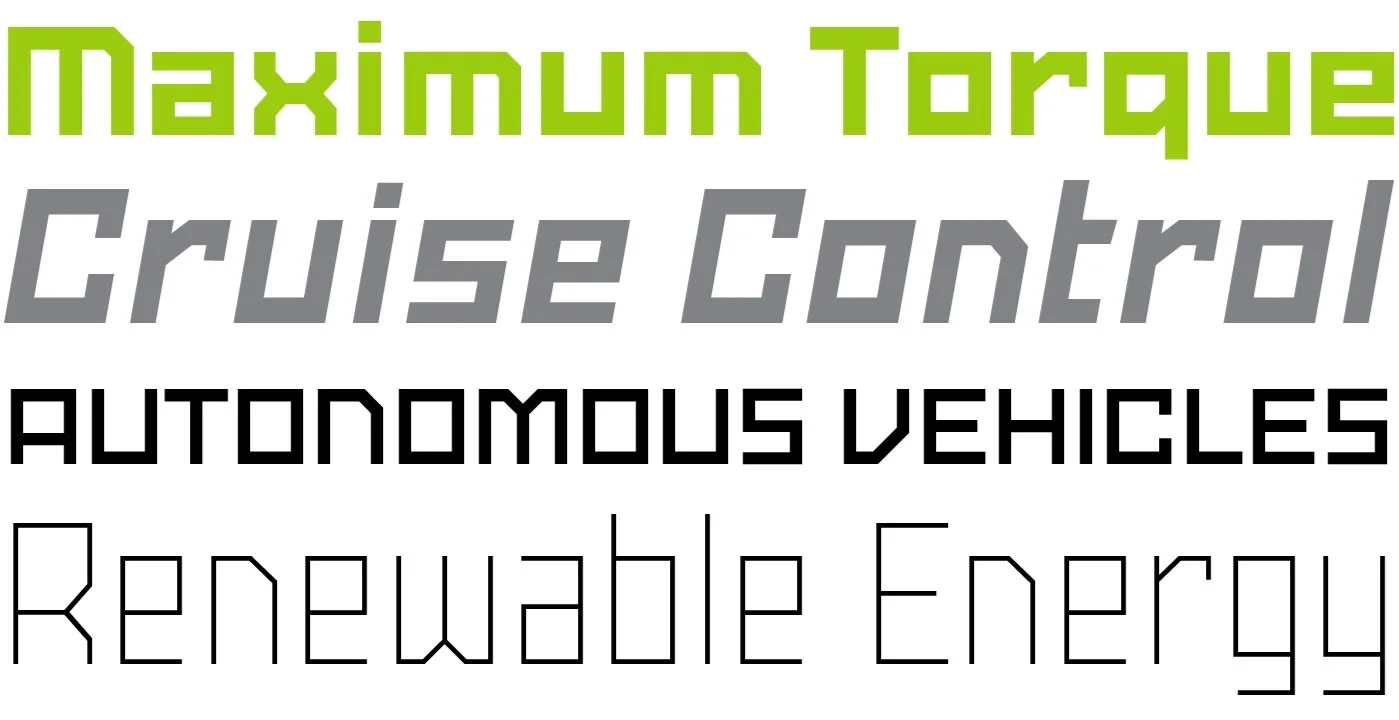
I’ve decided to experiment with a different pricing structure. You can buy the whole family — SbB Powertrain, SbB Powertrain Extra Narrow, SbB Powertrain Narrow, SbB Powertrain Wide and SbB Powertrain Extra Wide plus the variable font — for $39. If you need just one width, it’s just $19. (Although I’m offering introductory pricing… Until the end of November, you can purchase the complete SbB Powertrain family — or any of the widths — for 25% off at MyFonts.)
Is it priced too low? Probably, but it’s hard to compete with free. I feel like given the current market, these are reasonable prices.
Wrap up
I designed SbB Powertrain to fill some needs that I had as a designer and I’m thrilled with how it turned out. Powertrain is angular and flexible and will work well for branding projects — especially for industrial, athletic or corporate clients. I designed it for me, but I hope you find it useful as well.
(And look for a few more display typefaces coming later this Fall.)
Purchase SbB Powertrain from MyFonts
Bob Wertz writes about design, technology and pop culture at Sketchbook B. Bob is a Columbia, South Carolina-based designer, researcher, college instructor, husband and dad. He’s particularly obsessed with typography, the creative process and the tools we use to create. And he wears a mask to protect his community.
LED bumper “stickers”
9/19/17 • 2 min read
This post was originally posted on September 20, 2017 on Sketchbook B. It’s reposted here as part of a project to move some of my favorite writing to my new site.
Honda’s onto something with their new Urban EV Concept Car
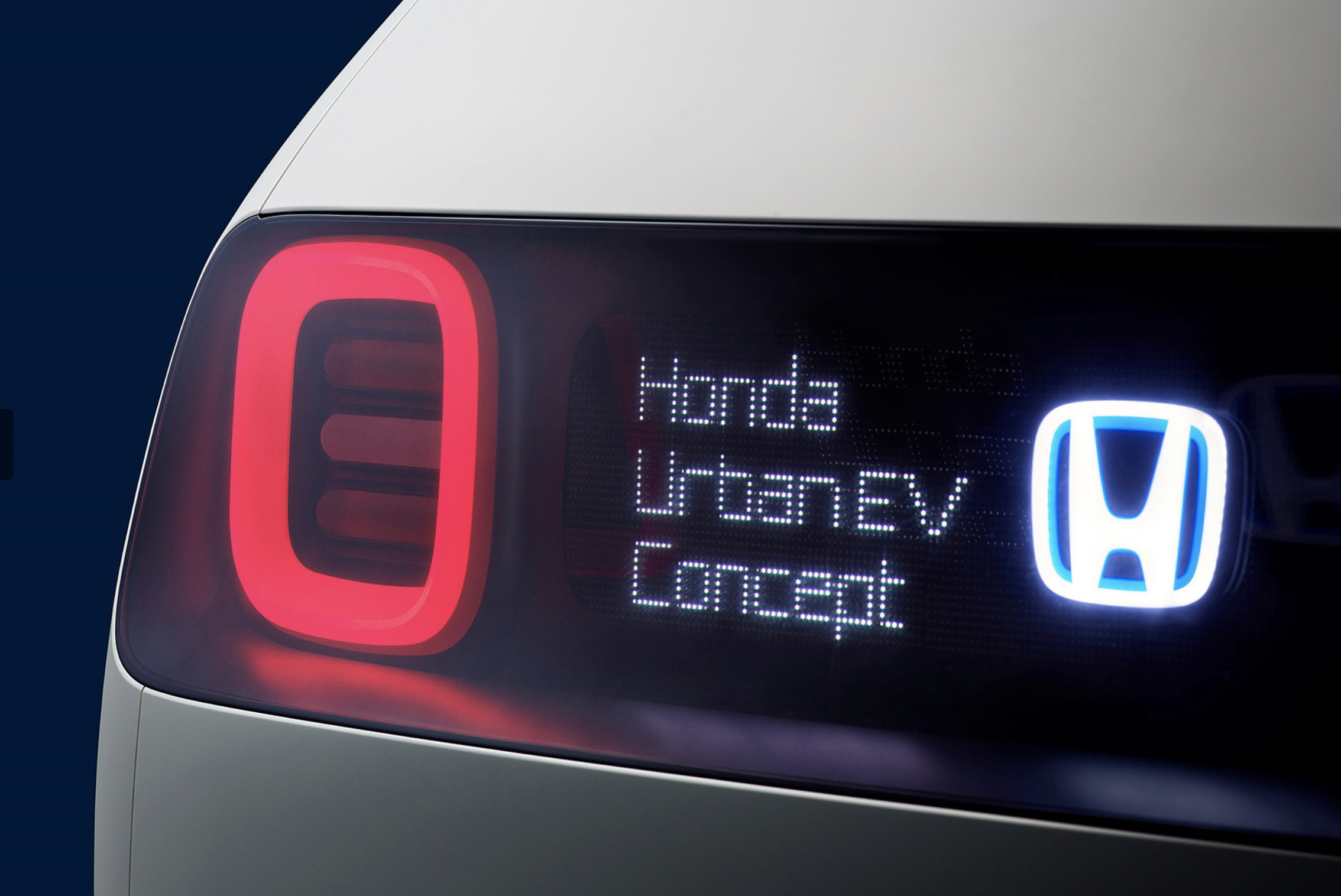
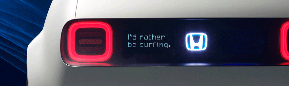
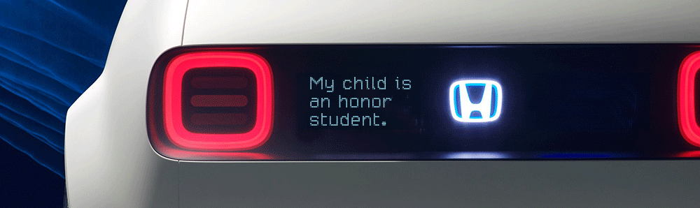
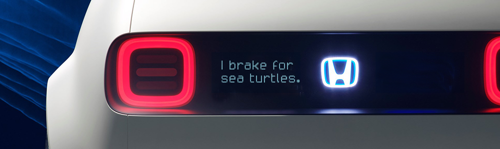
I posted yesterday about Honda’s new Urban EV concept car. And the more I thought about it, the more I realized every new car should come with a programable LED display. The car at the Frankfurt auto show had “#UrbanEV” on the screen, but that only scratches the surface. Imagine all of the potential uses…
Practical messages…
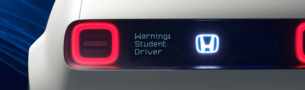
Sweet sentiments…
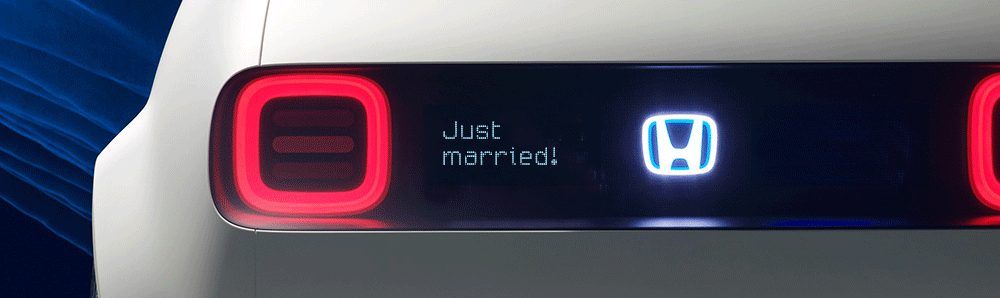
Wishful thinking…
Of course you are proud of your kid…
Maybe a little mild humor…
A gentle reminder not to tailgate…
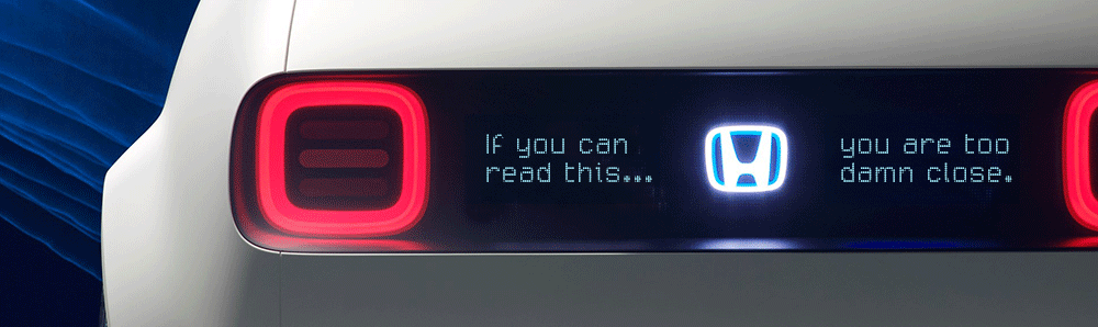
I can see a future when every car has an electronic bumper “sticker” that can be changed with an iPhone app. So when your candidate loses unexpectedly, you can change it to “Don’t blame me, I voted for the other guy!” Maybe the anti-tailgating reminder can be triggered by a proximity sensor. Want to build a social media following? Maybe you can go with “You’re already following me in traffic, why not follow me on Twitter?”
And by the way, I built these quick Photoshop mockups with my new typeface, SbB Drivetrain 209. You can get it for free from Fontstruct if you are interested.
Bob Wertz writes about design, technology and pop culture at Sketchbook B. Bob is a Columbia, South Carolina-based designer, creative director, college instructor, husband and dad. He’s particularly obsessed with typography, the creative process and the tools we use to create. He’s currently in the middle of a project to design a new shirt a week for an entire year.
Honda Urban EV and Modular Typefaces
9/16/17 • 2 min read
This post was originally posted on September 17, 2017 on Sketchbook B. It’s reposted here as part of a project to move some of my favorite writing to my new site.
I love concepts cars and modular type, so Honda’s Urban EV is right up my alley.
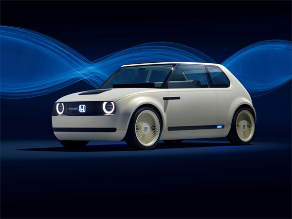
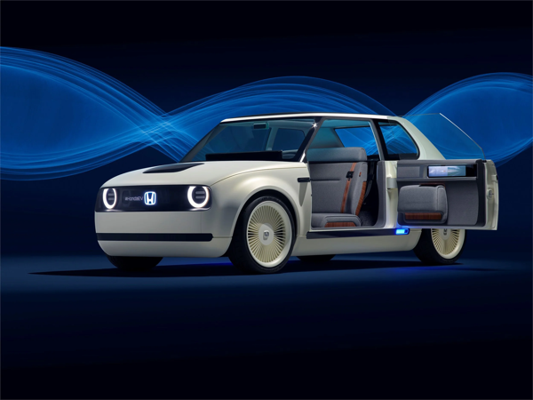
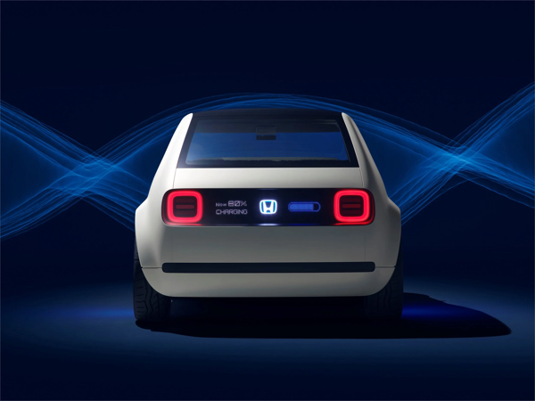
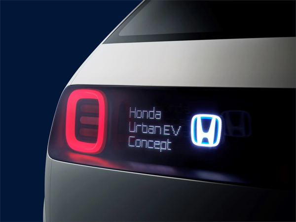
I grew up going to the Chicago Auto Show and love to see a fun concept car. And the Urban EV is definitely fun. I think it’s interesting to see how car companies are designing electric vehicles, when most of the design constraints from traditional cars — engines, transmissions, gas tanks, etc. — are completely eliminated.
But the thing that really grabbed my attention was the screen and typeface that Honda used on the outside of the car. It includes the name of the car and other details like the charging status. The typeface Honda created for the Urban EV reminds me of an experimental design I created in 2009, Micro 205, but with dots instead of squares.
I took Micro 205 and the Urban EV as a starting point and created an all new typeface on Fontstruct. SbB Drivetrain 209 uses two dots of different sizes to create the alphabet. I’m pretty happy with how it turned out.
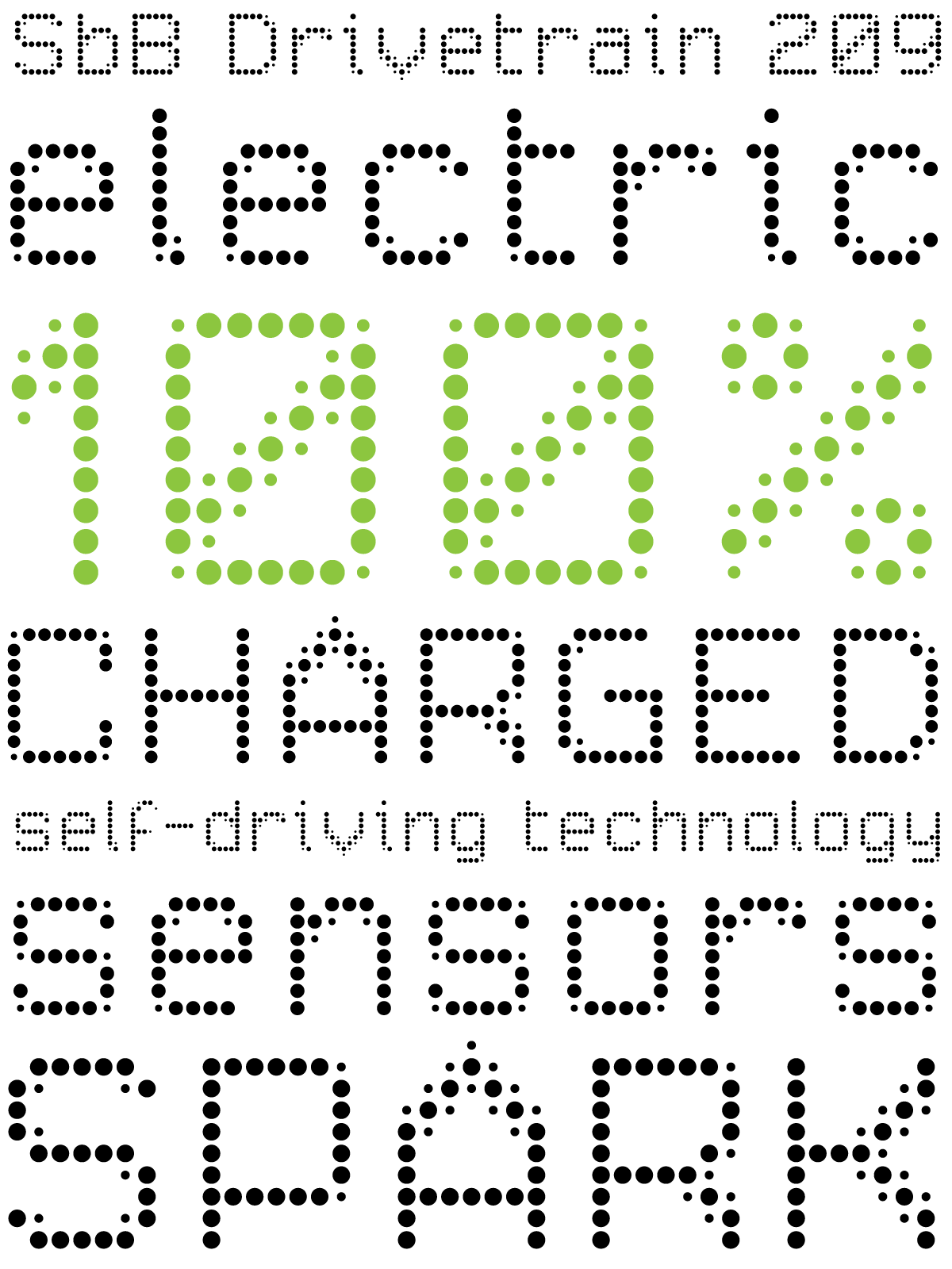
A note about the “209” in the name of SbB Drivetrain 209. When I created Micro 205, I had this idea that I would add numbers to all my Fontstruct designs. Each number would combine the number of block styles used with the cap height in blocks, separated by a zero. Micro used 2 blocks and was 5 blocks high, so it became Micro 205. Another example… SbB Codebreaker with 1 block style and a cap height of 43 blocks would be SbB Codebreaker 1043. I never used the numbering convention after Micro 205, but figured it would be fun to dust off for Drivetrain since Micro 205 was part of the inspiration.
You can download SbB Drivetrain 209 from Fontstruct for free.
Bob Wertz writes about design, technology and pop culture at Sketchbook B. Bob is a Columbia, South Carolina-based designer, creative director, college instructor, husband and dad. He’s particularly obsessed with typography, the creative process and the tools we use to create. He’s currently in the middle of a project to design a new shirt a week for an entire year.
13/52: Ampersand
9/16/17 • 2 min read
This post was originally posted on September 17, 2017 on Sketchbook B. It’s reposted here as part of a project to move some of my favorite writing to my new site.
5 years ago this week, I released my first commercial typeface.
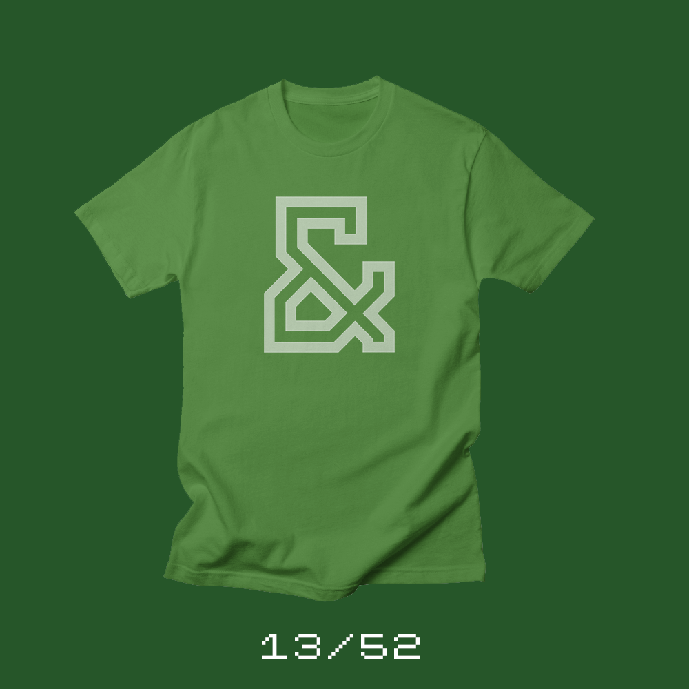
Each week for a year, I’m going to be designing a shirt and releasing it on my Threadless store. This is the design for week 13.
I released a couple of free typefaces in the early days of Sketchbook B. But five years ago, I took a big step and released my first commercial typeface, Powerlane.
Powerlane is a massive typeface family. 20 different fonts. And when you count all of the letters and numbers, foreign characters and special OpenType alternates, the family has more than 8,000 glyphs.
I’m proud of Powerlane. I spent years designing Powerlane and learning all about the process of finalizing a commercial typeface. And even though I haven’t sold a ton of copies, I have sold copies on five continents — North America, South America, Europe, Asia and Australia — which I think is pretty amazing.
I’ve released four other commercial fonts since Powerlane: Valdes Clarendon, Power Grid 2.0, Intermodal and Saluda. You can buy all of them on Creative Market. Powerlane and Valdes Clarendon are available on MyFonts, too. You can check out all of my type designs on my Fonts page.
This week’s shirt features my favorite character from Powerlane — the ampersand from Powerlane Outline. The shirt is available on Threadless in a range of colors.
Also, a quick side note… With the release of the 13th shirt, I’m a quarter of the way through my 52 Shirts project. 39 to go.
Bob Wertz writes about design, technology and pop culture at Sketchbook B. Bob is a Columbia, South Carolina-based designer, creative director, college instructor, husband and dad. He’s particularly obsessed with typography, the creative process and the tools we use to create. He’s currently in the middle of a project to design a new shirt a week for an entire year.
Honorable Mention
7/21/17 • 2 min read
This post was originally posted on July 22, 2017 on Sketchbook B. It’s reposted here as part of a project to move some of my favorite writing to my new site.
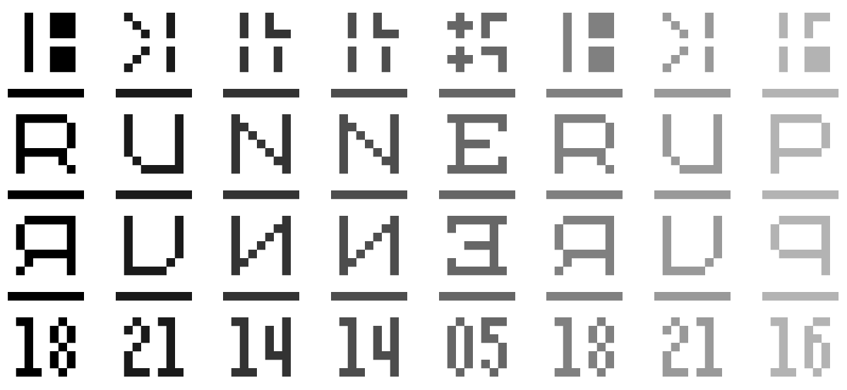
SbB Codebreaker selected as an honorable mention for the Fontstruct Reverse Competition and a Top Pick.
SbB Codebreaker was selected as an honorable mention for the Fontstruct Reverse Competition and also awarded a Top Pick. I really enjoy working in Fontstruct, but what I love about these competitions is that the theme pushes you in new creative directions. Over the years, my competition entries have been different from my normal approach. I’ve had fun, but I’ve only been mentioned in the wrap up blog post one other time — for Dingbots and Monsters XL for the Illustrative Competition. SbB Commodora is one of my favorite Fontstructions and was my entry for the Connected Script Competition. And Infield was my Sports Competition entry.
Thanks to the whole Fontstruct crew and the amazing community. Can’t wait for the next competition.
Bob Wertz writes about design, technology and pop culture at Sketchbook B. Bob is a Columbia, South Carolina-based designer, creative director, college instructor, husband and dad. He’s particularly obsessed with typography, the creative process and the tools we use to create. He’s currently in the middle of a project to design a new shirt a week for an entire year.
SbB Codebreaker
7/7/17 • 2 min read
This post was originally posted on July 8, 2017 on Sketchbook B. It’s reposted here as part of a project to move some of my favorite writing to my new site.
My odd entry for the Fontstruct Reverse Competition
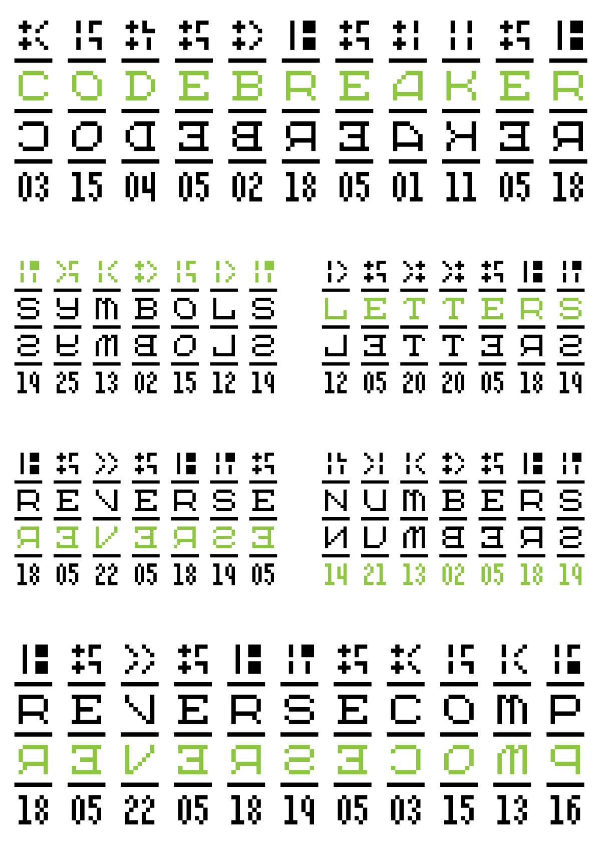
I don’t have time to play around on Fontstruct much these days, but I noticed that they were having a competition centered around the theme, “Reverse.” I sketched out a couple of ideas and was able to pull together SbB Codebreaker before the deadline tonight.
So Codebreaker has four tiers: symbols, letters, reversed letters and alphanumeric. The idea is that you can use Codebreaker to translate to other letters, numbers or symbols, kind of like the Rosetta Stone. It’s completely impractical, but really distinctive looking.
Because I’m a bit of a Fontstruct purist, I usually try to execute my ideas with the fewest number of bricks. And this one is no exception. I used only one brick to build Codebreaker.
I miss playing around on Fontstruct and need to remember to get back there more frequently.
Check out SbB Codebreaker on Fontstruct. And remember that you can download my free fonts and Fontstruct fonts from my Fonts page. (And learn about my pro fonts that are available on My Fonts and Creative Market.)
Bob Wertz writes about design, technology and pop culture at Sketchbook B. Bob is a Columbia, South Carolina-based designer, creative director, college instructor, husband and dad. He’s particularly obsessed with typography, the creative process and the tools we use to create. He’s currently in the middle of a project to design a new shirt a week for an entire year.
Introducing Intermodal
11/4/15 • 2 min read
This post was originally posted on November 5, 2015 on Sketchbook B. It’s reposted here as part of a project to move some of my favorite writing to my new site.
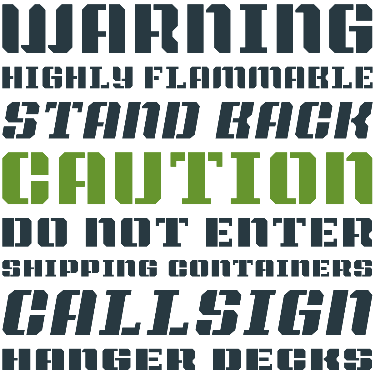
I’ve been fascinated by stenciled type for a while. Stencils started as a practical necessity – an easy and utilitarian way to reproduce type. But the use of stencils has evolved and is now visually representative of industry and military.
A few weeks ago, I quietly rolled out my latest stencil typeface on Creative Market: Intermodal.

Intermodal started as an experiment. I wanted to create a design that had only vertical stencil cuts. I didn’t like how the cuts on other stencil designs didn’t line up cleanly. By only using vertical cuts, I didn’t have to worry about the horizontal alignment.*
Intermodal is an all cap design, but includes a wide range of foreign language characters, a set of Opentype tabular numerals and an alternate “9.” Intermodal doesn’t have traditional weights. Instead, there are five widths, from A to E. A is more narrow and E is wider. The different versions can be used together to create a utilitarian look. I’ve also got an oblique version of each width for a total of 10 fonts in the family.
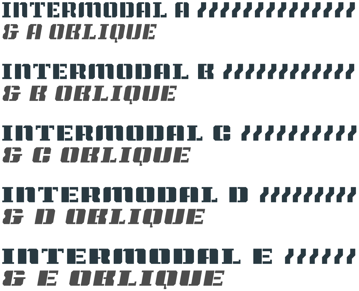
For now, the entire Intermodal family — 10 fonts in all — is available exclusively at Creative Market for $29.
Intermodal is one of my favorite creations. I hope you like it.
* After my first set of sketches, I noticed that it was structurally very similar to Power Grid. So I added a stencil version to Power Grid 2.0 and I continued to refine Intermodal. Different look, but similar design approach.
1957
6/10/13 • 2 min read
This post was originally posted on June 11, 2013 on Sketchbook B. It’s reposted here as part of a project to move some of my favorite writing to my new site.
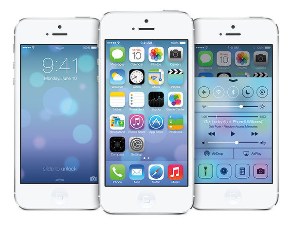
When Max Miedinger and Eduard Hoffmann developed Neue Haas Grotesk (eventually renamed Helvetica) in 1957, I’m sure they never imagined that a version of their typeface would be used on a mobile, handheld computer operating system.
And that the use of Helvetica would spark a worldwide bickering match over whether it was the right typeface for the task. And that the bickering match would take place across a global communications network using a microblogging service.
I’m not sure what I think of the iOS redesign. And I won’t form any opinions until it is installed on my iPhone and iPad. I imagine I’ll find design elements that I like and a few things I don’t like.
But I started to think about the fact that Helvetica, originally designed to be cast in metal and printed with letterpress, is in use today on a device that would have seemed like pure science fiction when the typeface was designed. Imagine for a second what Miedinger and Hoffmann would think?
Type has the ability to outlive its creators and be adapted for purposes far outside the original intent of the design. (The version that Apple is using - Helvetica Neue - was developed in 1983 to improve rendering on new devices.) In 50 years, are we going to be arguing about the proper use of Gotham? Or Neutraface? Or Proxima Nova? Or will we still be arguing about Helvetica?
Pixels in Print
7/4/11 • 1 min read
This post was originally posted on July 5, 2011 on Sketchbook B. It’s reposted here as part of a project to move some of my favorite writing to my new site.
I’ve been wanting to get Sketchbook B business cards for a while. And I wanted to use my own fonts for the identity system. I’ve played around with several different looks, but never pulled the trigger and ordered them. Finally, my new cards are printed and they use two typefaces that started life on Fontstruct: SbB Dradis Alpha and Periodic.
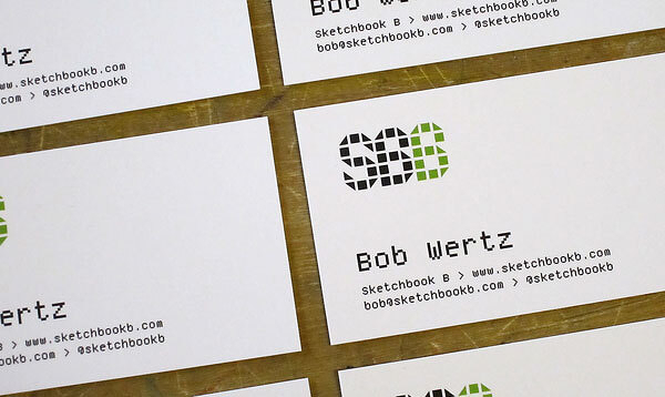
I just released the SbB Dradis family. It’s an odd experimental display typeface that can be used without spaces in between the letters. I’ve updated the masthead on the site with a new Sketchbook B logo in Dradis.
Periodic is a monospaced, pixel font with old style numerals that I designed to be used in print. For most designs, visible pixels are a no-no, but I think they add some texture and interest. I’m using a version of Periodic that I’m still tweaking. It’s a refined version of the one I quietly released on FontStruct. Once I finish polishing Periodic, I’ll release it here.
TypeCon 2009 Thursday and Friday Highlights
7/17/09 • 2 min read
This post was originally posted on July 18, 2009 on Sketchbook B. It’s reposted here as part of a project to move some of my favorite writing to my new site.
So I’ve been at TypeCon 2009 in Atlanta for the last day and a half. Here are some of the highlights from preliminary workshops and the first full day of sessions.
Historical Calligraphy – This workshop focused on the calligraphic roots of modern letter forms. To demonstrate the process, the instructor, Joey Hannaford – covered the walls with paper and we experimented with letterforms on a large scale with foam brushes and tempera paint. A really engaging way to teach the relationship between historical and modern forms.
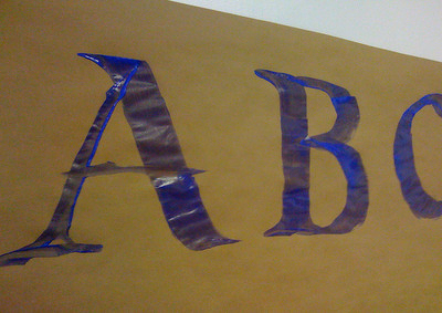 A great way to teach the calligraphic roots of modern lettering. On a large scale…
Hatch Show Print – I’ve seen Jim Sherraden’s lecture twice before when he visited AIGA South Carolina. He has expanded his normal presentation and it’s more inspirational than ever. He’s a great guy and the presentation is amazing.
Gail Anderson from SpotCo – Gail gave a delightful talk about her love of type and her history. She also gave a preview of her upcoming book with Stephen Heller, New Ornamental Type, and showed some fascinating typographic videos done by her students. Great presentation.
The “Playroom” – Local Atlanta printer Jessica Germaine brought in her gear to allow TypeCon attendees to experiment with letterpress printing. We were able to use three small presses and a selection of metal and wood type.
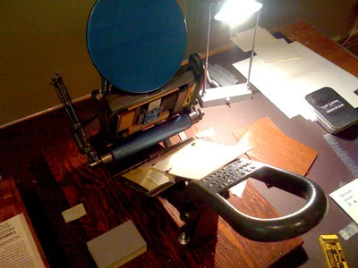 Printing my notecards on a small letterpress.
Jessica walked us through all the details and helped with the process. I was able to select and set my type and made some Sketchbook B notecards. I’d never had an opportunity to work with letterpress and the whole experience was amazing.
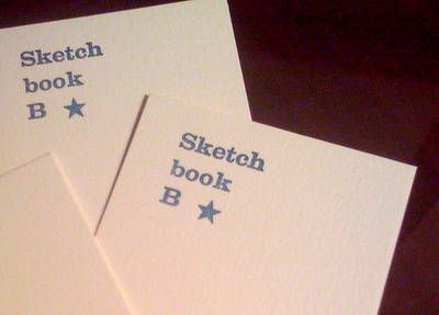 My completed notecards.
Coming Up – I’m looking forward to the next two days of sessions. Lots of stuff on the schedule, including… Armin Vit from Under Consideration will be talking about the TypeCon identity for this year. REM’s Creative Director Chris Bilheimer (and a former AIGA South Carolina speaker) was added to the agenda. Also on the schedule is a two hour panel discussion on web typography with a various foundries and designers. I’ll post more highlights as the weekend progresses.